
Hello,
Welcome to my new weekly Design Notes, written especially for my inner circle of colour nuts, design obsessives and all-round interiors homies. This is where I’ll be sharing the decorating advice, ideas and inspiration.
And what a week to begin! London Design Festival is upon us, the design shows are popping up all over town, and the interiors world is busy telling us what we will all be putting in our homes next. I’ll admit it, I find the whole circus rather thrilling and a big part of my job is keeping up with what’s new, spotting ideas at the shows, and talking about with you.
But...however much fun trends can be, I don’t believe we should blindly follow any of them.
Over the next few weeks, I’m going to explore some of the ideas beginning to shape our homes for 2027, from colour and pattern to craftsmanship, materials and the growing desire for homes that feel more personal. Naturally, colour is where I want to start.
Two colour camps go head to head
The really interesting thing about the latest forecasts is that two apparently opposite palettes are emerging at once.
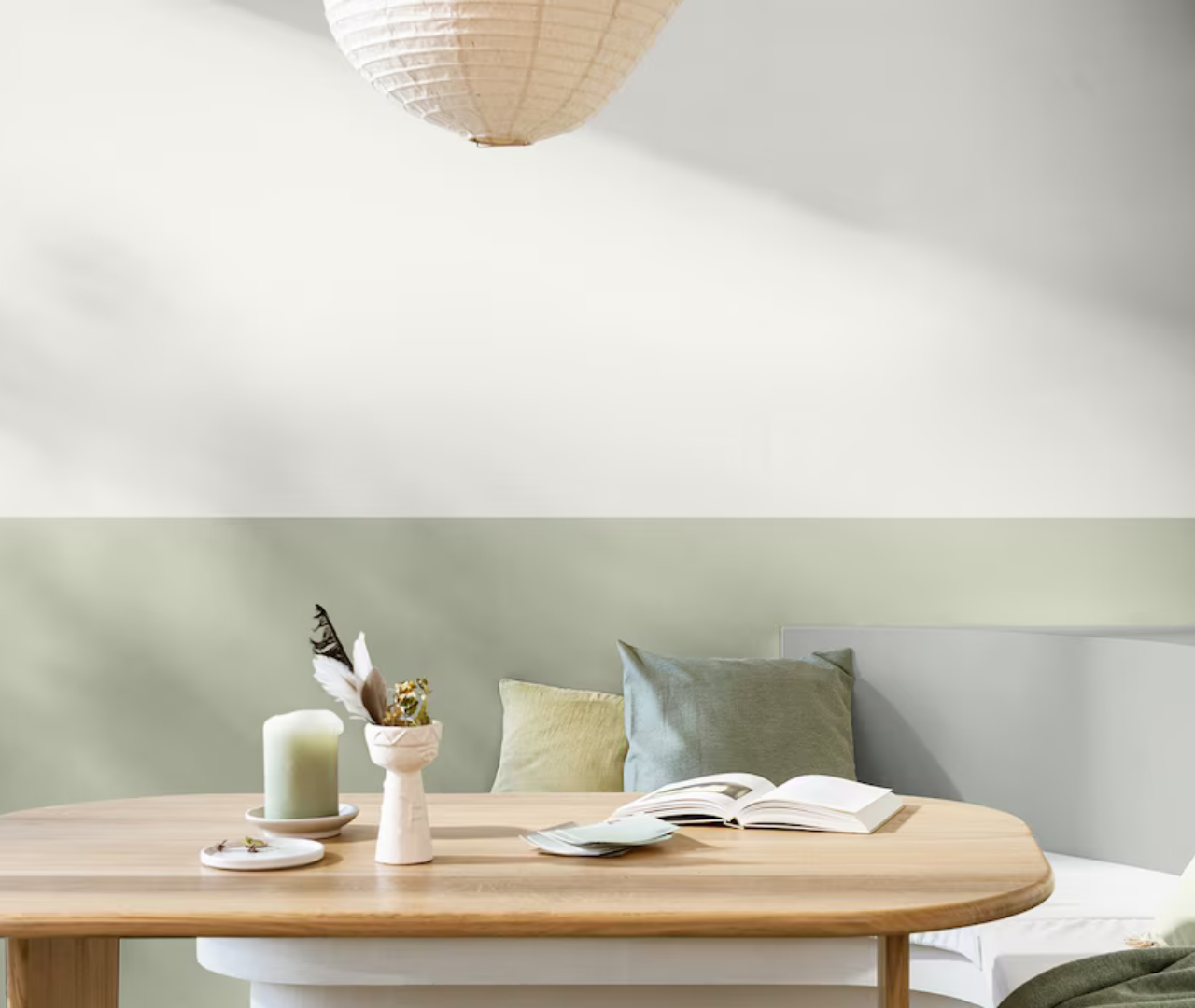
On one side, we have soothing shades with inspiration taken from the natural world. Dulux Colour Of The Year has gone green with Soulful Sage, a soft, silvery, subtle shade. Behr has followed the same vein but chosen a richer mossy olive called Grounded while Graham & Brown has selected the earthy pink Rose Earth. What I particularly like about Dulux’s forecast is that it is not simply telling us to paint everything sage green and call it a day. Its three accompanying colour stories, Glow, Light and Lift, demonstrate how the same shade can create quite different moods depending on what you put around it.
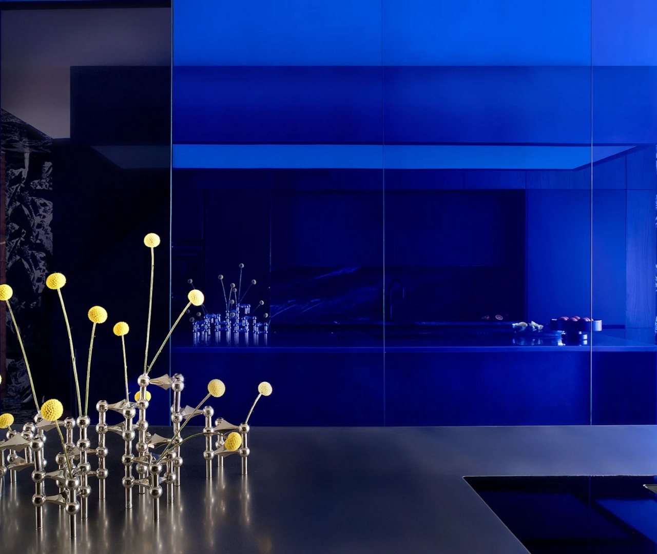
At the brighter end of the spectrum, WGSN have named Luminous Blue their Colour of the Year for 2027, which I’m a particular fan of!
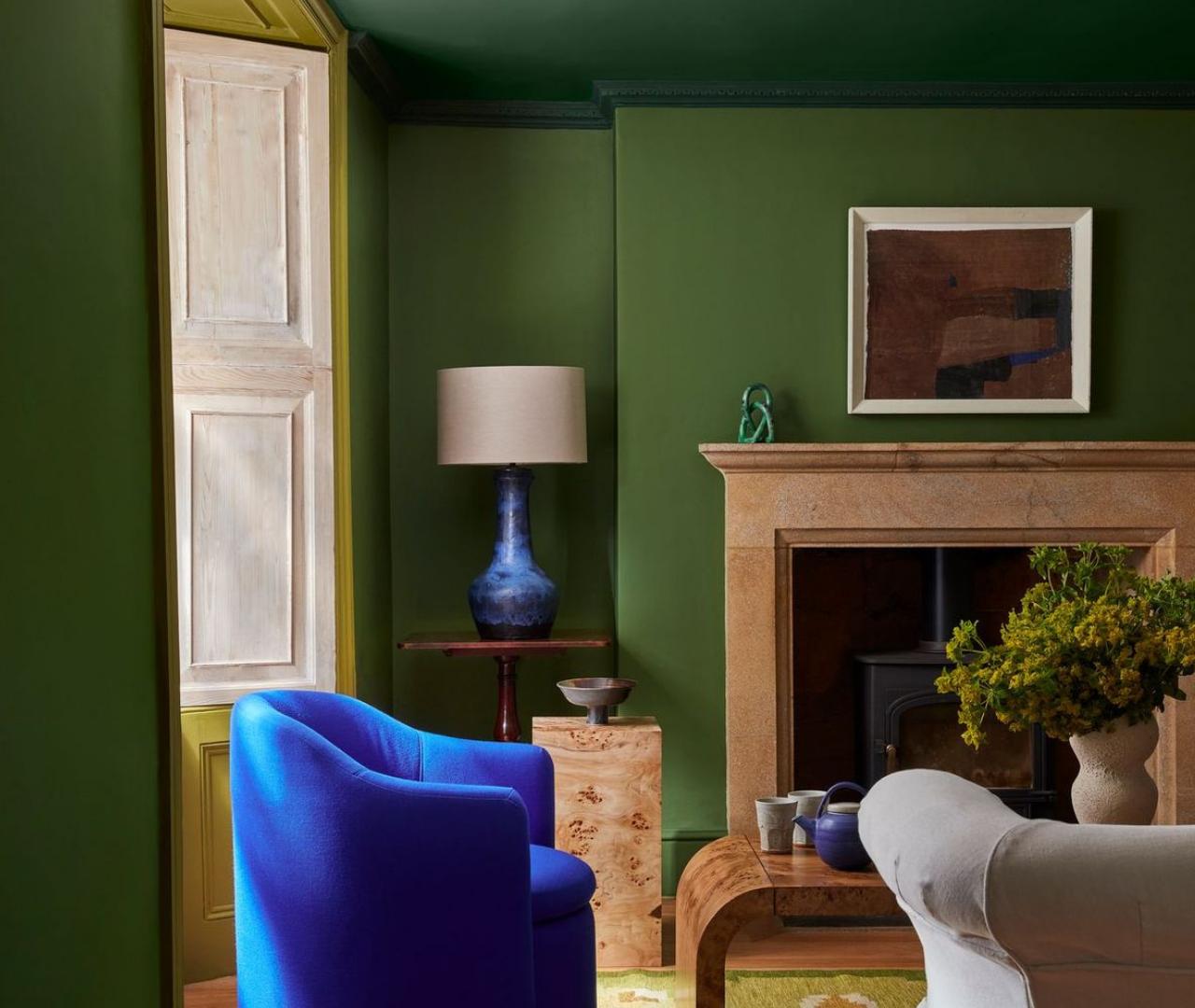
But for me, the magic happens when these two trends meet. Imagine muddy pink with a jolt of cobalt, mossy green with lilac, or warm brown with a flash of something wonderfully acidic. We still want our homes to feel grounded and reassuring, but that does not mean they have to be overly sensible.
And just for those at the back, not paying attention, grey as the default neutral has absolutely had its day. A warm beige has been the go to neautral for those who aspire to live in a beige box but my feeling is we are being encouraged to see that colour itself can act as the neutral when drenched on all walls, creating a room that feels calm, cocooning and full of personality at the same time.
Your decorating takeaway
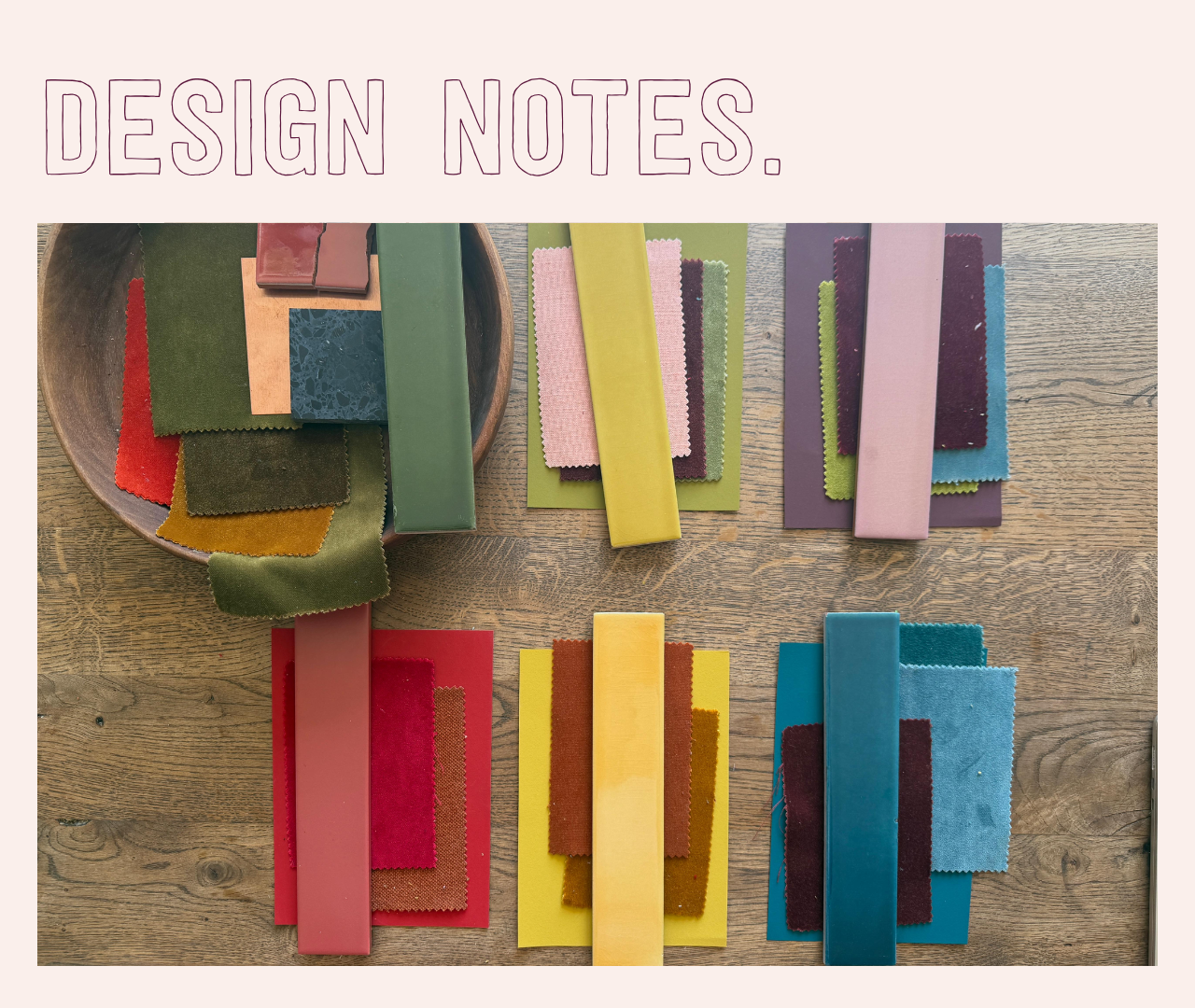
If you are thinking about refreshing a room, try choosing one colour that makes you feel grounded and then add a bolt of a bolder shade that makes your heart sing. Perhaps that is restful olive with an accent of rich cobalt, or wrap the walls in cocooning chocolate and pop a hot pink, or stay safe with soft clay and then add a dash of sharp citrus green.
Gather a few samples and see how they work together in your own light. You might discover that the colour you thought was too bold is exactly what your room has been missing. And please, I’m sure you won’t, but do not feel you need to repaint your living room sage green because Dulux says so. The useful thing about a colour forecast is not the instruction to buy a particular tin of paint. It is the invitation to look at colour in a new way and lean into why we surround ourselves the colours we choose.
Next week, we are moving on to pattern trends, and why I am delighted to see decorative heritage having another moment in the spotlight.
As I always say, march to the beat of your own drum.
Until next time,
Sophie x
Sources & further reading
If you are planning a trip to London, swing by some of these interesting show cases, including my friend Kate Watson-Smyth at Bizazza. Kat Burroughs lists her 26 things to see at London Design Festival.
Dulux Colour of the Year 2027: Soulful Sage
Explore Soulful Sage and the Glow, Light and Lift colour stories.
Behr Colour of the Year 2027: Grounded
A mossy olive with earthy brown undertones.
Graham & Brown Design and Colour of the Year 2027
Meet Rose Earth and see how it works alongside the decorative Roselle Grove wallpaper.
WGSN x Coloro: Luminous Blue and the 2027 Key Colours
The brighter side of the forecast, including Luminous Blue, Energy Orange, Pop Pink, Meadowland Green and Clay.

Responses