
Hello, my colour-loving friends,
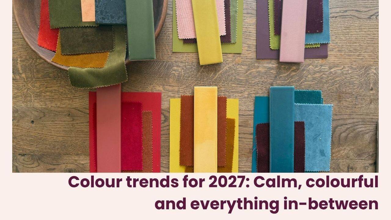
Last time we talked about the colour trends beginning to shape our homes for 2027. This time, I want to turn our attention to pattern, and one of the decorating directions that makes my heart sing.
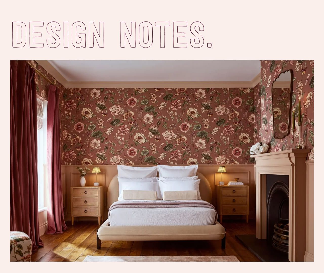
Chintz, florals and decorative heritage are enjoying a very welcome moment. Graham & Brown’s Design of the Year for 2027 is Roselle Grove, a hand-painted reinterpretation of Indian chintz, and it is a lovely example of how traditional decorative ideas can feel fresh again.
Now, you know I have never needed much persuading when it comes to a floral, a stripe or a fabulous bit of wallpaper. But what interests me is not simply that these patterns are fashionable again. It is the way we are using them.
Old Meets New
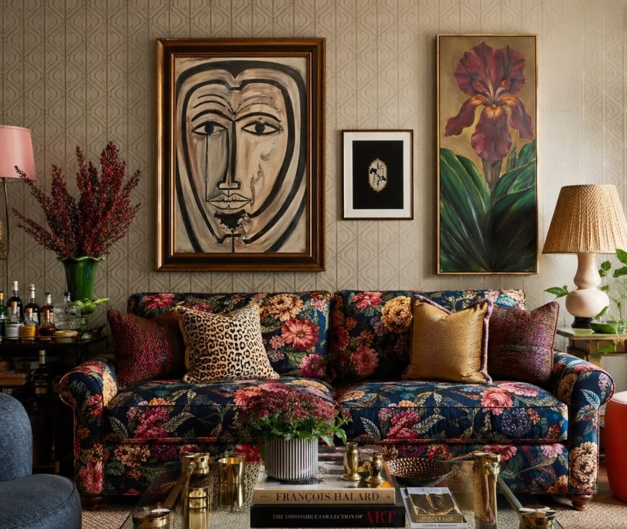
The most interesting interiors are rarely those that belong entirely to one period. A room full of antiques can feel rather heavy, while a room full of brand-new furniture can sometimes lack soul. Put the two together, however, and something rather wonderful happens.
Hang a traditional floral wallpaper behind a modern sofa. Put an abstract artwork above an antique sideboard. Throw an unexpected colour into an otherwise nostalgic scheme. A beautiful old piece of furniture can look even better when it is not surrounded by other beautiful old pieces of furniture. Give it something to play against.
This is what I mean by heritage with a wink, rather than a home that feels like a museum.
And please do not think that embracing a romantic pattern means you have to commit to a completely traditional room. A chintz can look fabulous alongside a contemporary geometric. A vintage floral can be brought to life with a sharp stripe. A little clash often stops a scheme from becoming too predictable.
Why pattern gives a room personality
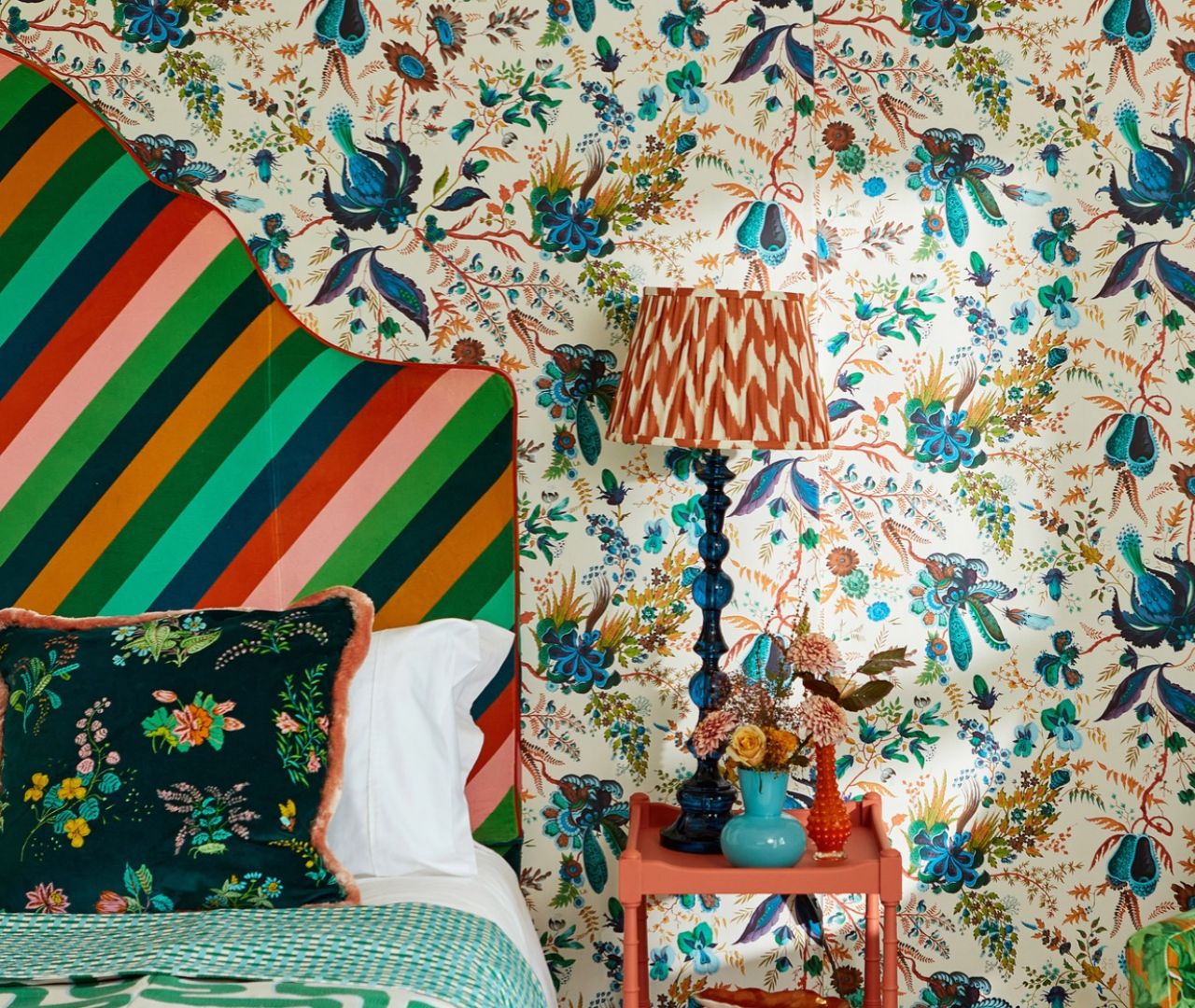
Pattern has a wonderful ability to make a room feel collected rather than simply decorated. It can introduce a sense of history, movement, humour or romance, depending on what you choose.
It also gives you a brilliant starting point for a colour scheme. A patterned fabric or wallpaper might contain five or six colours, and you can pull out whichever ones you want to emphasise. Choose the quieter shades for a softer room, or pick up on the unexpected accent colour if you fancy something with a bit more punch.
That is one of my favourite ways to build a scheme. Rather than trying to make every colour match perfectly, I look for the little relationships between them. A colour in a cushion might reappear in a lampshade, a piece of art or the piping on a chair. It is those connections that make a room feel considered.
Your Decorating Takeaway
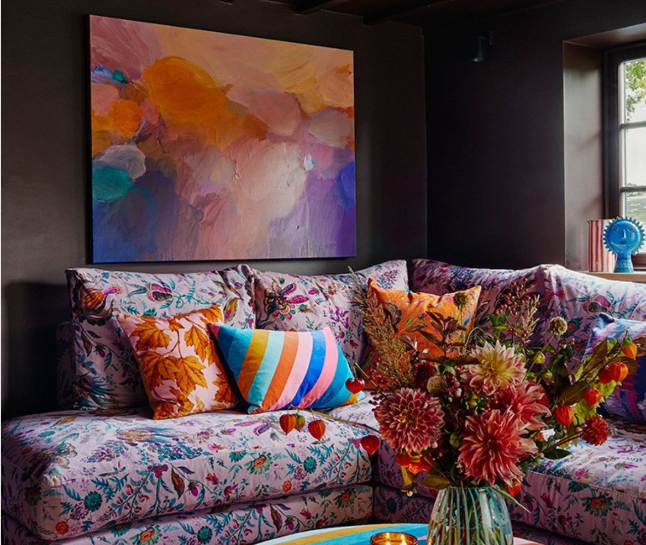
If you have a traditional piece of furniture or a pattern you love, try pairing it with something that feels completely different. Perhaps a contemporary lamp on an antique chest, a bold abstract artwork against a floral wallpaper, or a modern stripe alongside an inherited chair.
The aim is not to make everything match. It is to create a conversation between the pieces.
And if you have been holding on to a floral fabric because you thought it was a little old-fashioned, perhaps it is time to get it out again. I would be delighted to see what you have tucked away.
Next time, we are moving from pattern to the things our homes are actually made of, and why craftsmanship, texture and the visible human hand are becoming increasingly important.
Until next time,
Sophie x
Sources & further reading
Graham & Brown Design and Colour of the Year 2027
Explore Roselle Grove, the chintz-inspired Design of the Year, alongside Rose Earth.
Heimtextil Trends 26/27: Craft is a Verb
A wider look at decorative detail, craftsmanship and the relationship between traditional making and contemporary design.

Responses