ULTIMATE MAXIMALIST COURSE BUNDLE - £400+ Savings - JANUARY SALE

Sophie Robinson
  • Home
  • Workshops
    • Marrakech Retreat
    • Home Masterclass
  • Online Courses
  • Collaboration
  • Podcasts
  • Blog
  • About
    • About me
    • Work with me
    • Press
  • FAQs
  • Contact
  • Home Tours
  • Interior Design
  • Interiors
  • podcast
30 Sep 22

A Mad About the House tour

FOX9108

This is a big moment in history…my podcast co-host and partner in design crime Kate Watson- Smyth Aka Mad About the House has sold up! This house is iconic with almost 275,000 followers on instagram, over a 100,000  readers of the blog, and starring in the best selling interiors book of the same name. Kates beautifully designed home has inspired us all over the years she has shared it with us. It felt very emosh visiting it for the last time recently to record the podcast.

So I thought it would be a great idea to look back in pictures at the Mad House mark 1 and appreciate what Kate did to make it such a special home and internet sensation.

Situated in North London, the house is that lust-worthy classic Victorian, three story terrace complete with sash windows, a front bay, cornicing and original fire places. It has great bones!

The entrance is welcoming, light and airy. Floors, walls and woodwork are painted out in a soft white which gives the traditional architectural details a modern feel and makes the home feel fresh and bright. I also love the way that this is a shoes-on house, so even though it’s always immaculately presented, you are encouraged to feel relaxed and don’t have to patter around in stocking feet ( I really hate that personally, but each to their own, your house your rules). But man, how does she keep those floors so clean!

The focal point is the splendid deep burgundy stair runner by Alternative flooring, which draws your eye up to the fabulous wall mural with a tromp l’oeil bookcase, which is in fact a hidden door into Kates study. You are also enticed to look through to the light filled open plan kitchen dining room at the back of the house. I love the way the light bounces up off the white painted floor boards that flow throughout the ground floor.

Interior Designer and colour lover Sophie Robinson talks about making the most of hallways on the Great Indoors Podcast, Kate Watson-Smyth's hallway

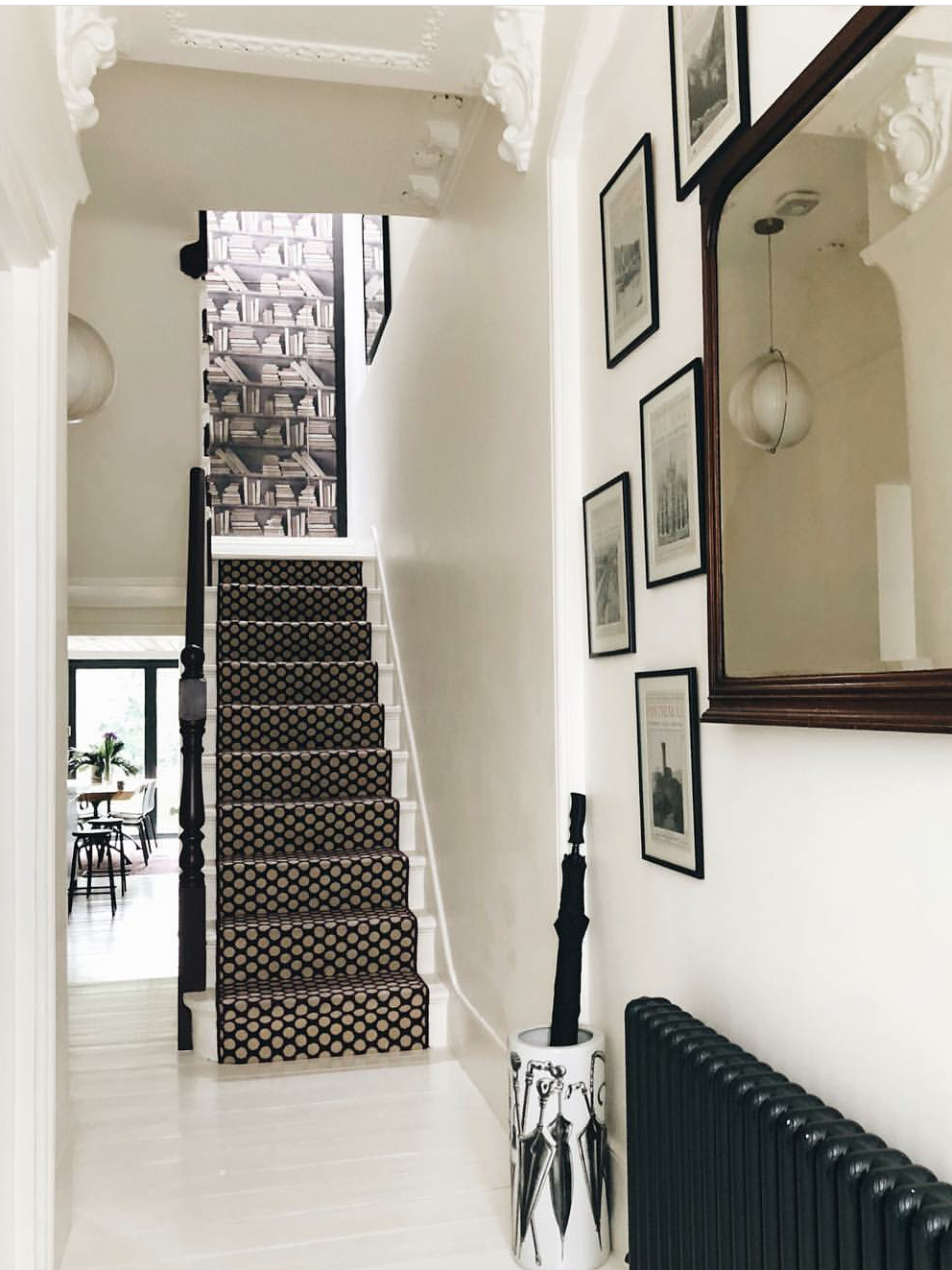
Walls and floor painted in Wimbourne white by Farrow and Ball. Bookcase mural from Mineheart. Stair runner by Alternative Flooring.

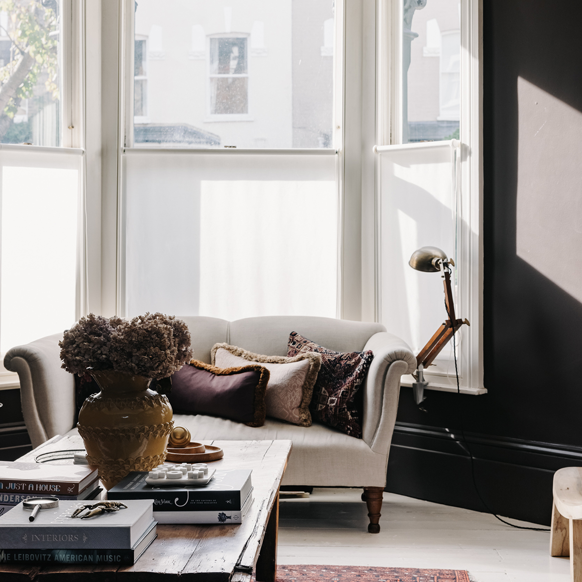
One thing you will notice as proceed on this house tour, is Kate’s clever use of colour. Her go-to palette is warm and earthy from a soft warm white, through to blush pink, burgundy red and deep chocolate brown. This palette threads throughout her home and while every room is decorated differently, it all feels very harmonious and coherent. For those of you who have studied my Colour Psychology course will note that Kates palette is very Autumnal and as a result feels cosy, inviting and rich. However her secondary season is Winter, which gives the aesthetic a cleaner more designer edge. While this is not my personal palette, which is naturally a tad much more vibrant, I really love Kates use of red based neutrals- they are very easy to live with, warm and luxurious.

Walls painted in Fallen plum by Atelier Ellis. Walls painted . Photo by Mark Anthony Fox

This South facing living room with its deep velvety chocolate walls, and that iconic brass palm light in the corner is striking. Kate has embraced the dark side with this colour scheme, which creates a cosy and inviting mood with sumptuous (KWS hates that word- ha!) velvet fabrics, layered antique Persian rugs and vintage wood. Brass is a warm metallic and forms part of her core palette, again repeated throughout the house.


The library is off the main living room and is sunken down by a couple of steps. It only has a small window and is at the back so is naturally dark. Shrouding the room in floor to ceiling bookcases is a triumph creating a really inviting and cocooning feeling. And as Kate and her husband are crazy book worms, it is ample space for their collection of tomes. The oversized artichoke light is also a lovely statement and a nod to Kates love of Midcentury design. Again Kates palette of chocolate, blush pink, warm white and wood is coherent throughout.

Woodwork painted in Fallen Plum by Atelier Ellis

Kate is passionate about sustainability and you’ll find plenty of vintage pieces throughout her home. These beautiful armchairs were recovered by Kate in this iconic Orla Kiely fabric in a super soft velvet. You’ll find plenty of mid century design classics throughout Kates home which nestle beautifully with the Victorian elements, which helps create a slow cooked, organic, and not overly co-ordinated vibe. If you have an eclectic collection of furniture, you can make it work and hang together if you keep to a tight colour palette to pull it all together.

Walls are painted in Ferdinand by Little Greene. The kitchen is by Naked Kitchens with quartz worktops from Caesarstone


Into the kitchen  and the overall feeling is light and bright, helped along by all the soft white walls and floors. The chocolate is pulled through into this room but found on the cabinets, which are a striking contrast against the white. I particularly love the open shelves, with the blush pink set behind. They show off Kates stunning collection of pottery and glassware, as well as keeping them easily accessible. All the tins and packets are hidden away behind the pink pantry door.

The checked waterproof indoor/outdoor rug from La Redoute makes a practical yet eye catching addition.

Ahhh THAT ceiling!!! Vintage tin tiles where sourced and fixed to the ceiling to a dazzling effect. Kate noted that the ceiling felt quite low in this part of the house and the subtly reflective ceiling bounces the light down and into the room gloriously. The mid century chairs were found on Ebay and work beautifully with the more contemporary table.

This is where the magic happens! Kates study is the small box room at the back of the house. So many Victorian houses have this type of room which is only ever big enough for a single bed, and it was indeed Kates youngest bedroom for many years. I love how Kate has embraced the rooms small proportions with a rich deep red in a gloss paint finished on panelling and bookcases. By using a creamy white above helps the room retain a feeling of light. The blush pink is pulled in via this signature armchair from Soho Home.

Shelves and panelling are painted in Arras by Little Greene

I think the layout of this room is really clever. In a small room like this you could be tempted to push the desk up against the wall. However it’s well researched that staring at a blank wall is terrible for creativity and motivation. By putting her (vintage Ebay find) desk in the middle of the room, Kate has the natural light falling onto her desk and a view that allows her eyes to have a longer gaze when she looks up.

Walls painted Threadneedle by Mylands

Into the bedroom and a new colour is introduced which is this stunning forest green found on the headboard and partition wall. Kate had painted this a soft pink that looks cool in the south facing light and I always think pink and green is a winning combination.

Partition Wall painted in Spruce it up by Dowsling and Reynolds

This shows the clever partition wall to better effect. Typically a lot of Victorian terraces have very large front bedrooms and can end up with dead floor space. Kate put in this partition wall which features a walk in closet behind it. I think this is a great take away- don’t assume the layout should be a certain way, or that you should follow the furniture layout of the previous home owner. You can make some really clever space saving solutions like this which also means that all the unsightly clothes storage is clear from view when you are lying in bed.

Walls painted in Kates own bespoke colour, Mad about the bathroom by Mylands

Off the bedroom is a generous sized bathroom with double basins, walk in shower and a freestanding bath centre stage. Kate for went a bedroom to have a generous sized ensuite bathroom and it really works! The deep green which is an accent in the bedroom goes full throttle on all walls in the bathroom creating a more cocooning vibe. The white painted floor boards are back to bounce the light around and vintage finds and reclaimed wood softens the look.

Walls in Aquamarine mid by Little Greene. Ostuni floor tiles, bamboo white tiles both Otto;  burgundy grout by Mapei

This tiny shower room is a real triumph but  Kate admits it was the ‘most expensive and tricky to get right.’ It was worth it though as she utilised every inch and made it into a stylish yet functional space for her two teenage boys. I love how she has colour matched her radiator, window, basin, even the tile grout in her signature burgundy red.

So that includes the tour! Kate and her family are now all shipped out and plotting exciting colour schemes to go in her new home. But I have very many happy memories of recording the podcast here in this library nook over the past 4 years. And on that note, we are so excited to be back with the Great Indoors podcast, which will continue to plot our own home renovations as well as sharing our our expert industry insights. Meanwhile our Facebook group is the next place to hang out and if you haven’t already, listen, sign up and follow the podcast here.

See you in the Great Indoors!

  • Home Tours
  • Interior Design
  • Interiors
  • podcast
It’s my birthday! Colour crush: Sunshine yellow
  • Christmas
  • Interiors
    • colour crush
    • colour psychology
    • DIY
    • dream home makeovers
    • Home Office
    • Home Tours
    • Interior Design
    • Interior Styling
    • podcast
    • Sophie Robinson X Dunelm
    • Sophie Robinson x Harlequin
    • trends
  • Lifestyle
    • Business
    • Fashion/Beauty
    • Life
    • My House
    • Nosh
    • Travel
  • Rooms
    • Bathrooms
    • Bedrooms
    • Kids rooms
    • Kitchens
    • Living rooms
    • Outside
  • Videos
online influence award winner 2019
Interior Design Winner Sophie Robinson Insta
Videos

Listen

Listen Here

Online courses
by popular demand

Catch Sophie In All Her Colourful Glory On Instagram

Not going to lie, this might be one of my proudest Not going to lie, this might be one of my proudest makeovers ever…
My Dad and Mary’s modern French villa was all beige tiles, white walls and zero personality. So I did what I do best: turned it into a technicolour dreamscape inspired by the countryside views outside those gorgeous bifold doors.

Inspired by early  autumn leaves, emerald green fields, and piercing blue skies we set about making the inside of their home feel as joyful as the outside … now imagine all that bottled up into wallpaper, fabrics, cushions and colour-drenched furniture.

If you’ve ever thought bold colour overwhelming or that pattern was too much for open-plan spaces… this one’s for you. Because colour and pattern sings in nature, and it can work just as well in your home decor.

All wallpapers, rug and cushion fabrics are from my collection with @harlequinfw. Painting by @sophieabbottartist 

Full sourcing list, extra styling tips and a deeper dive into the design story are up now on A Life In Colour: head to my Substack via the link in bio to read more!
End of January check-in… and yes, the struggle to End of January check-in… and yes, the struggle to stay joyful is very real right now. Dark mornings, grey skies, energy running low.

That’s exactly why our homes matter so much at this time of year. They are our sanctuary. The place that should lift your mood, calm your nervous system and make you feel held when the outside world feels a bit, how can I put this...relentless. And this isn’t just a feeling or a design philosophy. It’s backed up by science. Research shows that colour, light, beauty and nature in our homes have a direct impact on mood, wellbeing and happiness. Small, intentional changes really can shift how you feel day to day.

I’d love to know… what brings you the most joy in your home right now? A colour, a room, a plant, a view, a ritual? Share it in the comments 💛

And if you’re ready to go deeper, my big January Sale ends this week.

If you want to truly understand colour psychology and learn how to curate a home that feels joyful, confident and completely you, comment ULTIMATE and I’ll send you the link to my online design school and your opportunity to make the biggest saving of the year.
These are the ingredients to making your home feel These are the ingredients to making your home feel as good as it looks. 

• Confident colour that creates the mood
• Beautiful pattern that delights the eye
• Layered texture that brings it all alive
• Personality in every corner, so it feels like home

Magic happens when you stop playing it safe and start designing a home that truly reflects you. A home that feels joyful, expressive and alive. But designing a home can feel overwhelming. Where do you start? How do you combine colours without it feeling chaotic? How do you clash patterns so it looks considered? How to express your unique personality without merely copying other people’s style?

That is exactly why I created my online design school. After more than 25 years as an interior designer, I have distilled my design process into clear, easy-to-follow courses that take you step by step through combining colours, balancing patterns and adding texture, so you can decorate with confidence and creativity.

And right now, my January Sale is on. You can save a huge 60% on my transformational courses, designed to completely change how you approach your home and how it makes you feel. If you are ready to embrace your creativity and deepen your passion for interior design  comment ULTIMATE and I will send you all the details.
Think Maximalism is ‘too much’, too messy, or only Think Maximalism is ‘too much’, too messy, or only for other people? 

I’m here to tell you: maximalism isn’t chaotic. It’s just misunderstood.

Once you understand how colour and pattern work together, decorating like a maximalist stops feeling intimidating and starts feeling instinctive. Your home starts feeling like you.

If you want to design your home with confidence, my Ultimate Interiors Bundle is exactly what you need. It includes three self-paced online courses that take you inside my design process, teaching you how to use colour and pattern so you can make bold choices that actually work, again and again. 

Right now, the Ultimate Interiors Bundle is a massive 60% off. Buy now, enjoy the saving, and start whenever you are ready to create a home that is completely yours.

Comment ULTIMATE and I’ll DM you the link to find out more.
Welcome to my witchy era! Who else wants to harnes Welcome to my witchy era! Who else wants to harness the Year of the Horse and use this dynamic energy to manifest your best year yet! 

A vision board is like a compass that will lead your goal settings and intentions with total clarity. To prepare i like to take lots of long walks and meditate on what it is so want more of in my life while gratefully letting go of what no longer serves me. 

Join me Wednesday for a live webinar on how to I create a Vision board that will ignite your passion and motivation to live a bold, creative and colourful life! Comment VB26 for the link.
Dark and moody colours can feel intimidating, but Dark and moody colours can feel intimidating, but my TV snug shows just how well they can work. The deep tones soften the space and create a calm, cocooning atmosphere, perfect for evenings spent watching TV, or retreating from the day.

Contrary to what you might think, this room really comes into its own in winter. Low light and long evenings make the colour feel enveloping and cosy. It’s a space that invites you to slow down, sink in, and make yourself comfortable.

I sampled so many different paints but Cordoba by Little Greene was the perfect choice for this room. It’s full of depth and warmth, and just the right amount of drama. 

And if you’re thinking about taking the leap yourself, my tip is: don’t fight the natural light you have, lean into it. Don’t be shy about colour drenching walls, woodwork and ceiling so the room feels seamless and intentional. In my snug, that richness is what makes it feel cosy and complete.

There’s no place I’d rather be on chilly evenings.
How do I explain this feeling to a minimalist? To How do I explain this feeling to a minimalist?

To some people this might look like too much, but for me, maximalism isn’t excessive, it’s pure self expression. I decorate my home to reflect the way I live and that’s full of bold uplifting, joy-giving colour. Every patterned textile, every artwork, every joyful little object earns its place because it makes me feel happy. 

And if I’m being honest a neutral room doesn’t make me feel calm, it makes me feel slightly depressed. My home lifts my mood, fires my creativity and gives me a little thrill every single day.

Now tell me… are you Team Minimal or Team Maximal? And what makes your heart sing at home?
There’s something about walking that has quietly h There’s something about walking that has quietly held me together this past year.

When life threw its challenges my way, my anxiety went into overdrive. I lost clarity, my head was foggy, and the overwhelm shut me down. But walking, one step in front of the other, slowly moved me in the right direction.

We all know walking is good for the body, but it’s also one of the most powerful tools for the mind. Moving helps process stuck emotions, those steady steps soothe racing thoughts, and the changing scenery opens up fresh ways of thinking. Being in nature grounds you. And the best part is, it’s free.

Whenever I’m preparing a new vision for my year or any creative project, I always start with a long solo walk. I take my journal, let the thoughts tumble out, and begin to find a clarity and direction again. Next step is to use my creativity to create a powerful vision board full of images that resonate with how I want to feel and who I want to be. Less of a to do list, more of an emotional reset. This works for me as it brings in the light, and more importantly keeps me inspired and motivated.

If you’re ready to gently clear the fog and get clear on what you want more of, my ‘Life in Colour Vision Board Masterclass’ is now on sale. I’m hosting on the 21st January, 7pm GMT (with a recorded replay available). Comment VB26 below and I’ll send you all the details. 

Can’t wait to see what we can create together this year!
Follow on Instagram
Sophie Robinson
  • © 2025 Sophie Robinson

    /
  • Contact/
  • About/
  • Design by MW

You're almost inside!

Leave me your best email to sign up for the Webinar

MG0001 Magnet Sophie using Tap 021 copy

You're almost inside!

Leave me your best email to sign up for the Webinar