fbpx
Sophie Robinson
  • Home
  • Workshops
    • Marrakech Retreat
    • Ban the beige
    • Masterclasses
  • Online Courses
  • Collaboration
  • Podcasts
  • Blog
  • About
    • About me
    • Work with me
    • Press
  • FAQs
  • Contact
  • colour crush
  • Interior Design
  • Interior Styling
  • Interiors
17 Jan 19

Colour crush: Teal

interior designer sophie robinson shows you how to decorate with teal, painted panelled wall and velvet armchair

Teal feels like a perennial fashionable favourite in terms of interior design. It’s always being touted as being in vogue that I think it’s just become such an on trend classic. Floating between blue and green, Teal is a very versatile shade to use in a scheme. What it has going for it is first up it’s its blue, the nations favourite colour, but secondly it defies type because its warm. A warm blue- the perfect hue, well who knew! Quite often we want our spaces to feel soft, warm and snugly and typical blues like navy and cobalt can feel chilly. But teal has a deep, rich and jewel like quality, along with that element of green for a dash of warmth. Whether you daub it on all walls, or just add it as a pop for punch it’s worth getting acquainted with this colour and its versatility.

Ombre painted wall effect in Aubusson Blue Wall Paint and Provence Chalk Paint avaialble from Annie Sloan. Teal is the perfect interior design trend for your home decor as reported by interior designer Sophie Robinson by

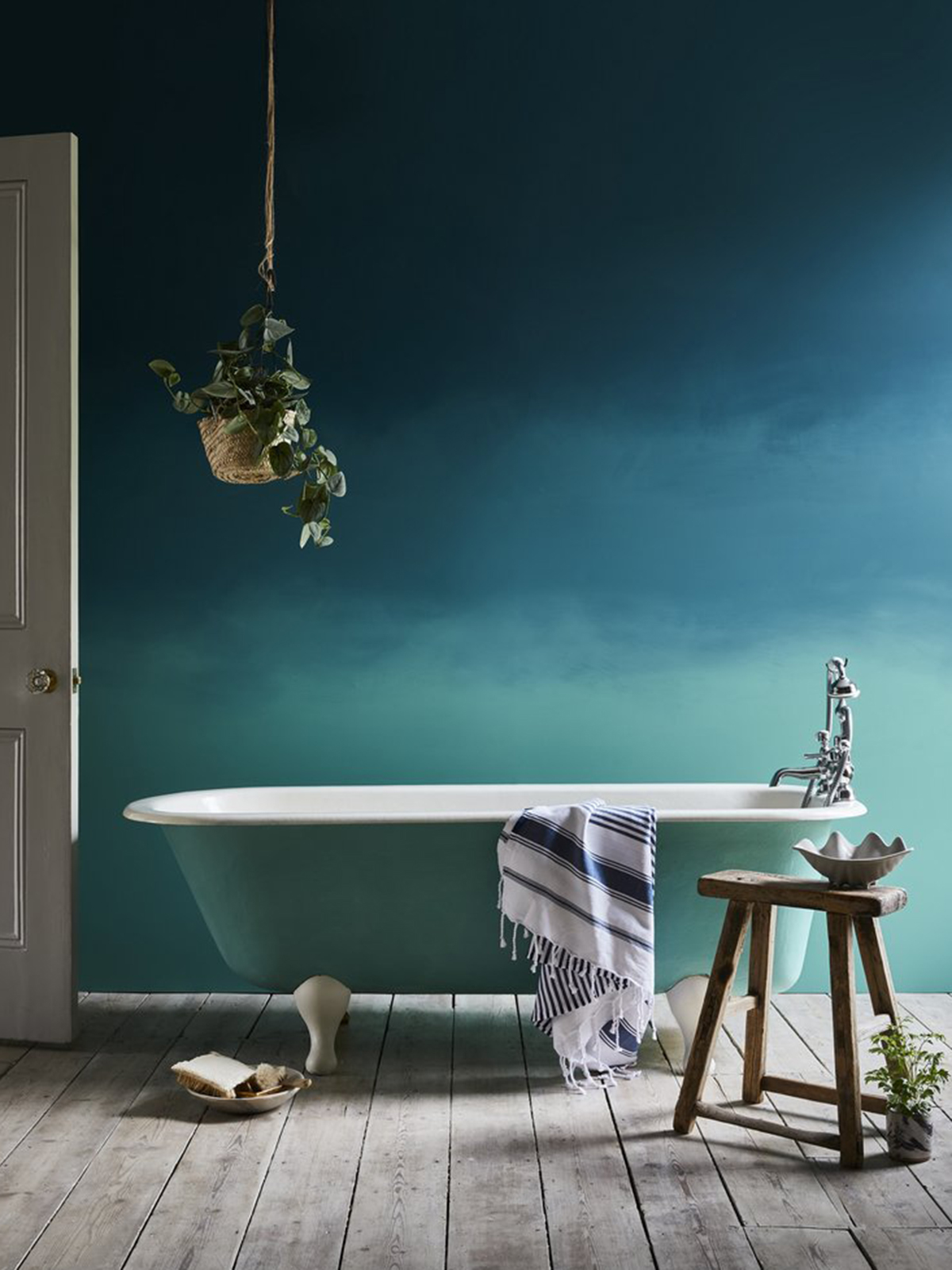
Ombre wall in Aubusson Blue Wall Paint and Provence Chalk Paint, bath in Provence Chalk Paint by Annie Sloan

Be immersive

Teal looks lush in every room of your home but I’m currently crushing it in the bathroom. Indeed the teal Lampas peacock tile from Topps was voted Tile of the year at the end of last year (you can see the room I designed here).  In a delicious rich shade of teal, it looked totally lush for a bathroom. It echoes the watery blues that are a top choice for bathroom colour schemes but with a depth, you just want to dive straight into. For an immersive feel, take the colour all the way up to the ceiling and on all four walls and while you are at it I’d urge you to paint the ceiling too. Then keep a sense of light with a grey oak floor or concrete stone. I’m loving this ombre effect by paint specialist Annie Sloan, which utilises teals full appeal from inky dark towards it’s more buoyant aqua tones.

Savina Sofabed in teal velvet by DFS is totally on trend as reported by designer and colour expert Sophie Robinson

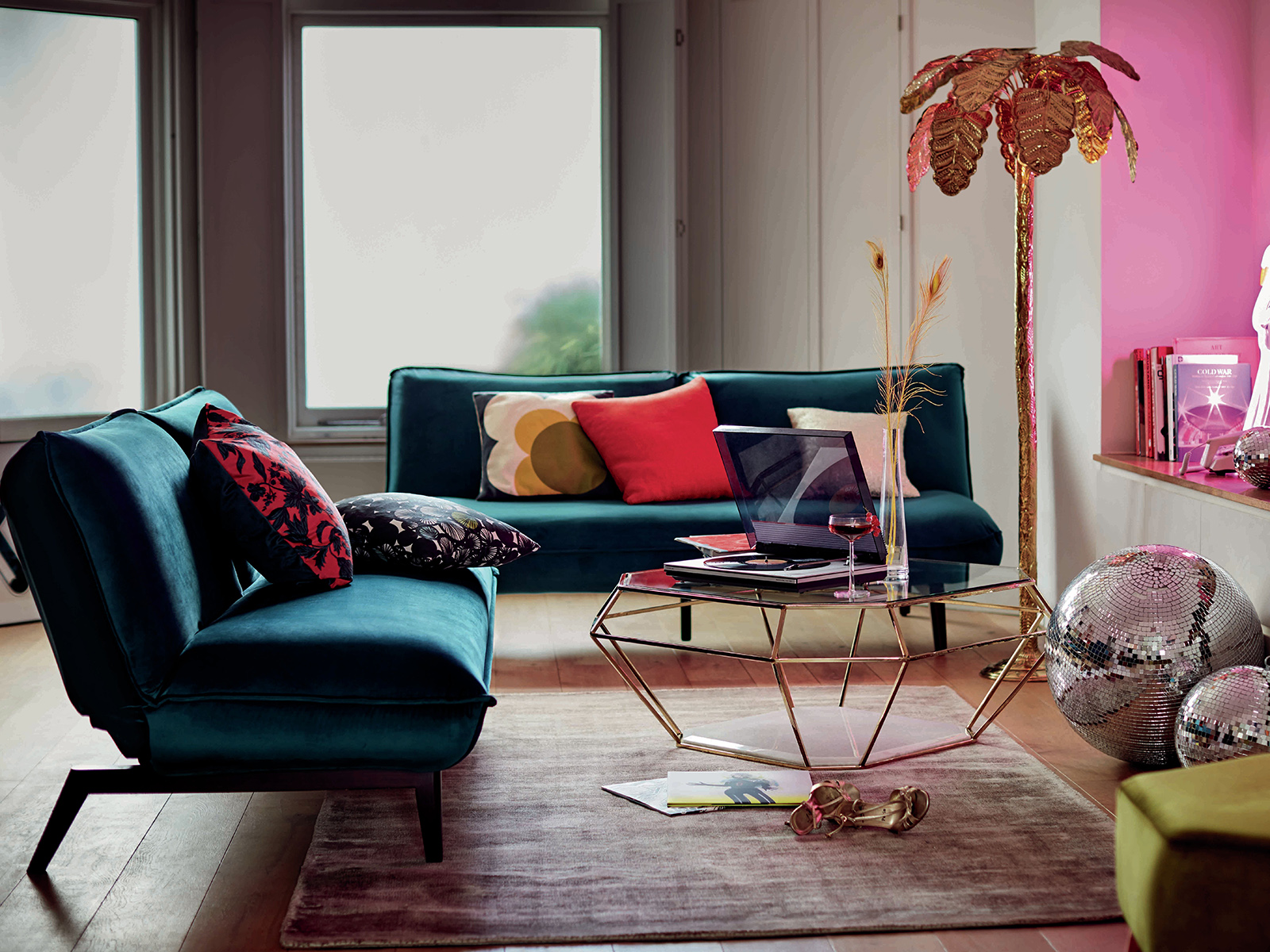
Savina Sofabed in teal velvet by Dfs

Pair with velvet

Teals perfect partner has to be velvet and I think a teal velvet sofa is an absolute joy. It just invites you to snuggle down and relax in luxury yet at the same time holds a contemporary appeal. Velvet really works with deep and rich colours and the effect is something that looks like its drenched in colour. Teals perfect partner is other jewel colours like a hot sexy pink or a robust mustard so pick these out for scatter cushions and accents. And the perfect metallic to accompany teal has to be brass and gold. They have the same warmth and richness that plays off the teal perfectly.

Otto kitchen In Bespoke Painted Teal And Concrete is on trend for interior design

Otto kitchen In Bespoke Painted Teal And Concrete by Burbidge

Balance with grey

To keep teal looking modern I think it sits perfectly next to cool greys and concretes, washed out woods. Its a symbiotic relationship – they need each other. Without the teal, grey is left looking pale and uninteresting and yet the coolness of the grey can help teal from becoming too overwhelming. I think it looks awesome in a kitchen and as this image shows, colourful kitchens are becoming more and more an accepted interiors trend and really worth investing in. The warmth of teal goes well with other natural materials that have an inherent warmth like stone, marble, wood, leather and rusted metals.

Mix the masculine with the feminine

One of my favourite ways to colour combine with teal has to be with soft blush pink tones. It is a marriage made in heaven. I believe pink is the best hue to use in bedrooms, so soft, loving and cosseting- just what we need. However, so many men feel affronted by the feminine connotations so pairing pink with a masculine teal is the perfect compromise. Teal has a quietness and warmth that makes it an ideal choice for bedrooms too and don’t they just look so good together! You can introduce teal in lots of different ways in your scheme, as a wall colour or in larger blocks like a sofa or bed linen. There is plenty of teal on the high street and I don’t think it’s going anywhere soon.

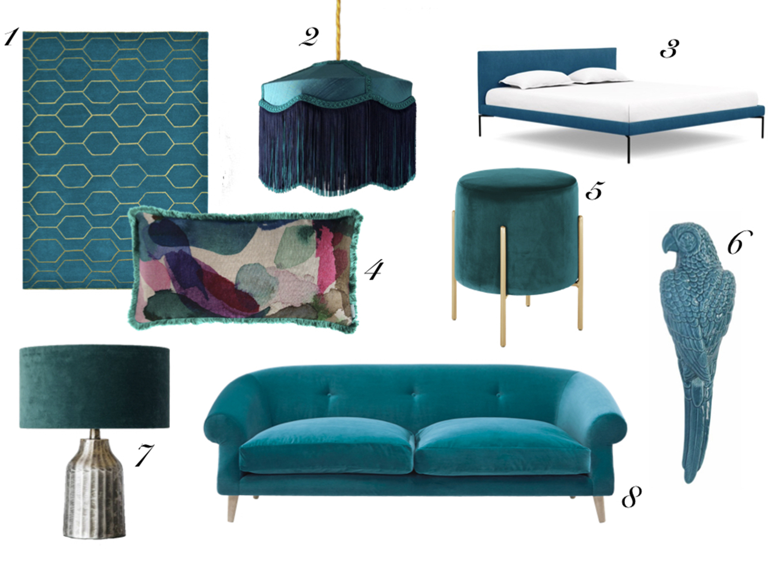
1.Arris rug in teal, Wedgwood at Amara| 2. Teal silk Tiffany lampshade, Tin Design | 3. Matera bed in St Moritz wool team, Heal’s | 4. Teddy cushion, Bluebell Gray | 5. Baltimore low stool in teal velvet, Cult Furniture | 6. Teal parrot wall art, The Contemporary Home at Not on the High Street | 7.  Ashby lamp base and ocean velvet lampshade, Graham & Green | 8. Schnaps sofa in Pacific clever velvet, Loaf.


CREDITS: Feature compiled by Sophie Robinson and Luisa Ferdenzi-Rouse. Featured image at the top of the post is panelled wall painted in Mid Azure green by Little Greene.

  • colour crush
  • Interior Design
  • Interior Styling
  • Interiors
Update your kitchen with an instant boiling water tap Designer Spotlight: 2LG Studio

comments

Natalia on 22.01.19

My all time fav! Living room is partially teal with one teal sofa and one grey, plus lots of colourfull cushions and velvety throws and plants, it goes so well with plants!
Next to go teal is my bathroom 🙂

Reply

Leave a Comment

Cancel Reply

Your email address will not be published.

  • Interiors
    • colour crush
    • DIY
    • Home Tours
    • Interior Design
    • Interior Styling
    • podcast
    • trends
  • Lifestyle
    • Business
    • Fashion/Beauty
    • Life
    • My House
    • Nosh
    • Travel
  • Rooms
    • Bathrooms
    • Bedrooms
    • Kids rooms
    • Kitchens
    • Living rooms
    • Outside
  • Videos

mailing
list

Videos

Listen

Listen Here

Bedlinen range

Shop

Colour Psychology for professionals

book your place!

Catch Sophie In All Her Colourful Glory On Instagram

How’s your Monday? Did you get to the shops? Dri How’s your Monday? Did you get to the shops? Drink a beer in a pub garden?! I’ve attempted train travel today  and three cancelled trains later I’m wishing I stayed at home! Anyone else not ready for this new normal yet! I’ve grown very attached to my sofa and cosy clothes this past few months! 

CREDITS Cardigan @jumper_1_2_3_4  Trousers @me_andem Trainers @nike Sofa @sofaworkshop (discontinued) in magnolia @gpjbaker  Tiger print cushion @trashvelvetuk pink cushion @grahamandgreen Flowers @sageandco.floraldesign Curtains @habitatuk (discontinued) 

#nonewnormal #banthebeige #colourlover #myhomevibe #noplacelikehome #pink #ihavethisthingwitpink 

📷 @aluncallenderphoto
I do love some HEAVY PETAL action. Florals are eve I do love some HEAVY PETAL action. Florals are everywhere in my home and it gives me full on joy to see them layered up on walls, on furnishings and my latest edition this hollyhock cushion. But they don’t  love me. As the blossom is bursting out this spring my hay fever is in full flow. 🤧sending love and tissues to my fellow sufferers! 

CREDITS Wallpaper is Artemis @houseofhackney . Painting by @beckyblairartist . Side board is vintage from @vinestreetvintage . Vases and chair are @grahamandgreen . Hollyhocks heavy petal cushion @houseofhackney . Flowers by @sageandco.floraldesign . Wall light @pookylights . Floor is intenso parquet @quickstepfloors 

#heavypetal #floralwallpaper #floraldesign #flowerpower #colourlover #banthebeige #bbbinteriors #mycolourfulinterior #mycolourfulhome #howivintage #sodomino #interiors123 #interiordesign #countryinteriors .
Had a very busy day filming today and I got my mak Had a very busy day filming today and I got my makeup done all fancy and put on some pretty clothes. I’m exhausted because it was hard work but I also feel like I’ve had a real boost to play with some all the pretty things in all the pretty colours. Like these new pumps from @roguematilda which are giving me life! And they are flat so my feet are happy to. 😍

Thanks @swainy2021 for the style inspiration and @jadefarmiloemua for the eye bag hack! (See my stories)
It’s podcast day! And on today’s show @mad_abo It’s podcast day! And on today’s show @mad_about_the_house and I discuss the pitfalls of shopping online, because admit it, we’ve all fallen down one! Whether it’s find out your forest green sofa is shiny teal (mentioning no names Callum) to discovering the dining room chandelier is no bigger than one of pat butchers earrings. 
Swiftly moving on we interview the fabulous @_paintgirl , creative director of paint brand @littlegreenepaintcompany who explains why there is a thirst for neutrals right now and how to pick the perfect shade. I’m currently giving my living room a refresh and for one nano second considered a neutral for the walls. 😳 But then I had a chat with myself and remembered that leopard is a neutral. There, I feel so much better! I hope you love the show, it’s the last in the current series. Kate and I will be having a short lie down and then back with a bang on 15th of April. I can promise you an awesome series we have planned with some know guests! So make sure you subscribe and why not leave us a little review if you get a moment. We read them all you know! Thanks to @katetaylorldn for producing the show. 

#leopardisaneutral #banthebeige #thegreatindoors #thegreatindoorspodcast #livingroom #interiorrefresh #colourlover #maximalistinteriors #maximalistinteriors
Interior design masters final is TONIGHT! I’m be Interior design masters final is TONIGHT! I’m beyond thrilled to be invited back to help @michelleogundehin judge this final along with the rather fabulous @matthewwilliamson and the ever dashing @chattyman . Hasn’t the entire series just been incredible? The extraordinary talent, innovation, grit and determination that has been on show week after week has been an inspiration and credit to our industry. And tonight will not disappoint. The designers @lynseyforddesign and @interiorcurve have a whole house to design and get to bring back their favourite past contestant to help them with the challenge. Delighted to see @moneypennyinteriors and @amywilsoninteriors return for one night only. Buckle up for some serious interior design mastery. See you on BBC2 at 8pm. 

Dress is @stinegoyastudio 

# interiordesignmasters #interiordesignmasterstv
Everyone talks about a room with a view but making Everyone talks about a room with a view but making a view through to a room is just as satisfying. It’s something I always think about when designing a house and I love the way colour and pattern can link one room into the next. I use repetition of pattern, colour and materials to help a home have flow. This gorgeous blue is my main linking colour, rolled out in the hall then picked up in the ticking stripe fabric in the curtains and Artemis wallpaper. When you have maximalist tendencies like me, having a tight palette helps make it all work, and repeating colours and similar patterns help make a rather eclectic home feel cohesive. I’ll be sharing more insights into how to make the maximalist style work on my live masterclass on Thursday evening. Come join me, link up in my profile to book your place because once you embrace the maximalist in you, you open up to the pleasure of decorating from your hearts desire!

Tap the pic for any credits. 

#banthebeige #colourlover #maximalistinteriors #maximalistdecor #bbbinteriors #ihavethisthingwithcolour #colourisaneutral #colourmyhome #interiordesign #interiordecor #interiorinspo #sodomino #apartmenttherapy
Happy Sunday! I’m relaxing on the sofa enjoying Happy Sunday! I’m relaxing on the sofa enjoying the view of one of my favourite paintings by my dear friend @bethpartridgeart . Filling your home with wonderful artwork is a great way to bring the colour joy, create a stunning focal point and help your home feel unique. Installing a striking piece of art in my room schemes is integral to helping a room hang together. This piece has the most incredible palette of colours that link to other parts of the room, like the fabrics and furnishings. I love the neon pop of yellow and pink you can find amongst all the beautiful inky blues. You don’t need to match you artwork to your colour scheme but it can help to make the whole thing really sing. Picking a piece of artwork you love can be the starting point to creating something wonderful. So big love to all you amazing artists out there for making our homes feel wonderful. 

#artforyourhome #artforinteriors #colourlover #banthebeige #focalpoint #interiordesign #interiorstyling #interiordecor #interiorinspo #colourmyhome #mycolourfulinterior #colourfullivingroom
Morning! I’ve got so much work on at the moment Morning! I’ve got so much work on at the moment I’ve got up with the birds to tuck a few hours in before the weekend starts. Sat here listening to the birdsong I could not  feel more blessed! Here’s a little insight into the creative chaos that is my office! Happy Saturday everyone x

#morning #birdsong #colourlover #banthebeige
Load More… Follow on Instagram
Sophie Robinson
  • © 2017 Sophie Robinson

    /
  • Contact/
  • About/
  • Design by MW

Don't forget to join!