ULTIMATE MAXIMALIST COURSE BUNDLE - £400+ Savings - JANUARY SALE

Sophie Robinson
  • Home
  • Workshops
    • Marrakech Retreat
    • Home Masterclass
  • Online Courses
  • Collaboration
  • Podcasts
  • Blog
  • About
    • About me
    • Work with me
    • Press
  • FAQs
  • Contact
  • colour crush
  • Interior Design
  • Interiors
03 Dec 18

Colour crush: Ultramarine

Secret Linen Store Pompom coral bed linen set 1 £14 99 original crop

I’m not just currently crushing on this hue; I’ve been having a yearlong love affair with this all things Ultra marine, Lapis, Lazuli and Cobalt. It was the basis of my bed linen collection for The Secret Linen Store, that I launched earlier this year, it’s popping up everywhere in my home. The good news is I’m now seeing it being touted by the trend forecasters as the colour that will supersede its rather sombre cousin Navy. So be prepared to daub over all those Hague blue walls in favour of a colour with more warmth and vitality. Because that what we all need right now, some warmth and positivity in our homes and this vibrant colour is the ultimate pick me up, whilst also being soothing. How does it do that, I don’t know it really is that clever! Colour experts know that blue is calming but this particular shade also has an energy to it. I’ve just decorated my home in Lazuli by Zoffany and it’s an absolutely off-the-hook marvellous hue! For my hallway it creates just the right amount of ‘Wow!’ that you want the entrance of you home to make, whilst retaining an air of sophistication. (My love of bright colour means I walk the fine line between sheer sophistication and Mr Tumbles house). It’s deep rich and expensive looking and everyone who see’s it adores it. And it absolutely sings with my colourful collection of artwork. I’m so thrilled with how it’s working and is the perfect linking colour to all the other areas in my home. That’s one of the things I love most about this colour, it sits so well with so many other hues. It looks perky with pinks, deep and moody with forest greens, fresh and alive with white, and joyful and vital against its playmate yellow. Consider it a truly versatile colour and something really worth experimenting with. Blue is universally the globes favourite colour, and so it shows no sign of going out of fashion any time soon. One of my favourite pieces of jewellery is a lapis lazuli ring that I inherited from my Grandma. And my school jumper was a very bright cobalt blue. (I loved it and hated the grey skirt we had to wear with it!) Make sure you sign up to my newsletter to be one of the first to see the final hallway reveal in this  particularly delicious shade… But will it be ready by Christmas is the big question in this household right now!


Luca bed by 2LG Studio and Love Your Home collaboration. Photography Megan Taylor

The new furniture collection from 2LG studio is absolutely to die for. Always at the forefront of trends the boys have designed their Luca bed in a deep and sexy Electric blue velvet. Velvet is the perfect fabric for this colour as it really saturates the colour and soaks up the light.

Interior Designer Sophie Robinson talks colour crush Cobalt blue - rug and floral wallpaper

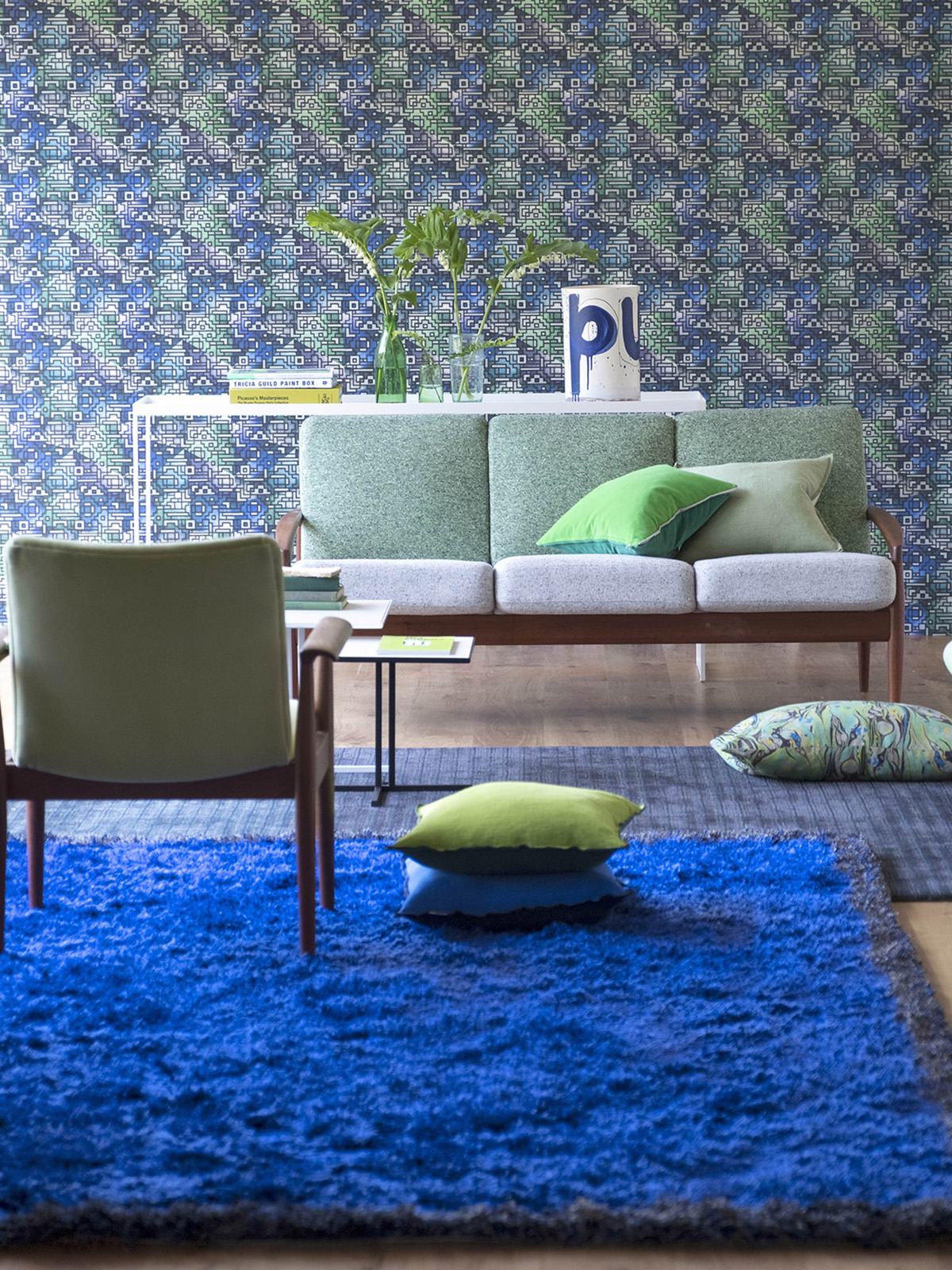
A bold plain rug will add a strong focal point to a room, Rossolo cobalt rug, Designers Guild 

For the faint hearted consider packing a punch of colour on the floor instead. I love this deep pile rug from designers Guild that ties in nicely with the patterned wallpaper, helping the room to feel cohesive.

Nara twelve piece dinner set, Made.com

Blue has always been a classic colour for tableware but this colour drenched range from Made.com looks incredible. I think teaming it with gold cutlery is genius. Brass or old gold would be the perfect accent colour to this cool rich colour, so think of using it for lights, furniture and acccessories.

Zoffany boutique Serpentine Malachite carpet, Alternative Flooring.

The new range of Zoffany designed carpets at Alternative flooring had me stop in my tracks at London design week. Amongst all the acres of beige was this incredible colour soaked malachite design. I adore deep and dark coloured carpets for adding real luxey drama to a scheme.

Atlantic scalloped porcelain tiles in Ultramarine by Ca Pietra

These scalloped shaped tiles are so on trend. Imagine diving into a bathroom tiles head to toe in this gorgeous sea deep colour. It might seem a cliche to decorate your bathroom in blue but it brings with it all the soothing feelings of the vastness of the ocean. I think it would work particularly well in a small bathroom on all four walls.

marine blue kitchen by naked kitchens designed by sophie robinson for the ideal home show. gold kitchen splash back, gold kitchen taps and ercol mid century modern table and chairs

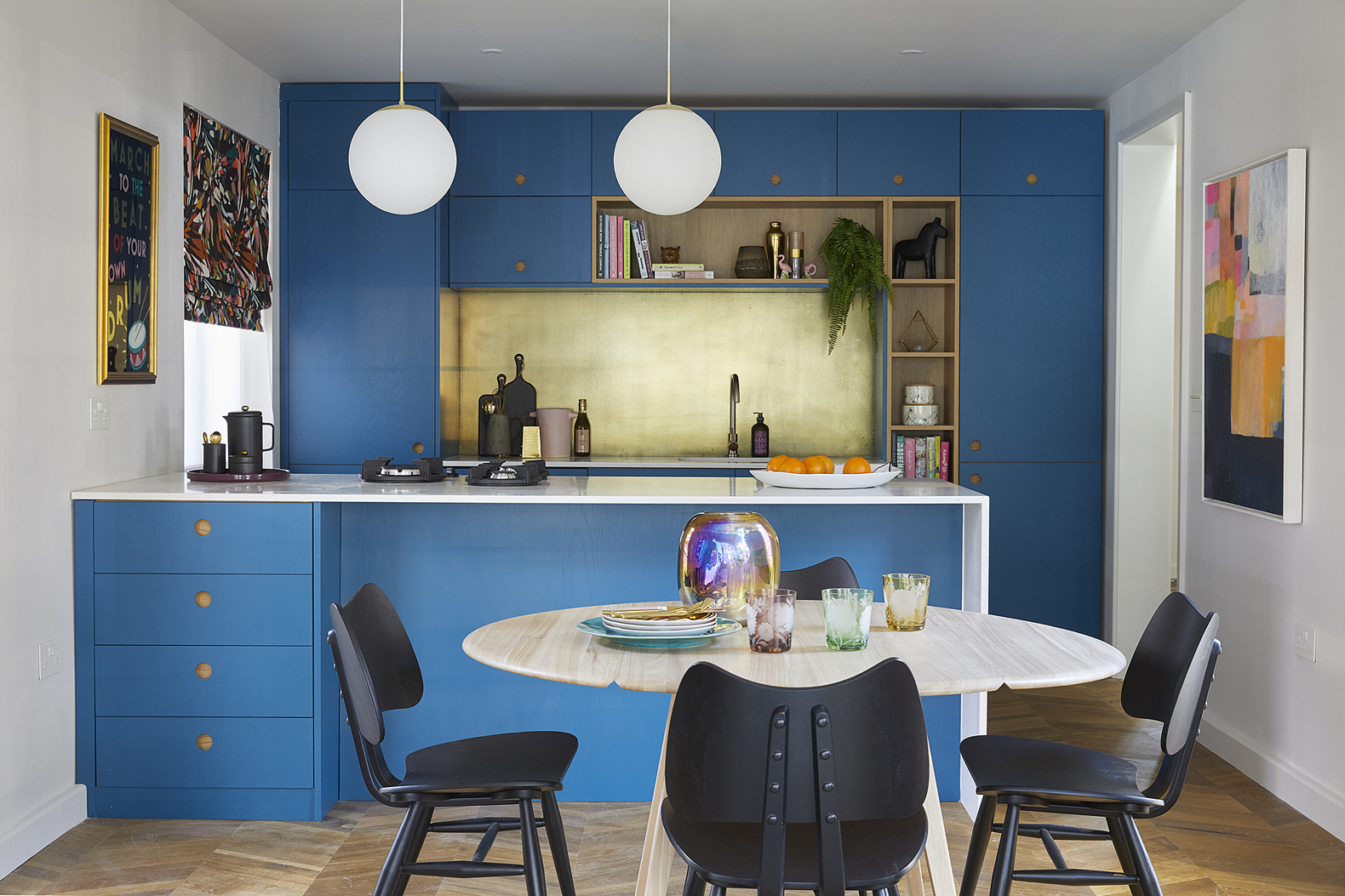
Kitchen by Naked Kitchens, finished in Marine Blue by Little Greene. Intenso parquet floor by Quickstep. Gold splash back by Quirky Interiors, table and butterfly chairs by Ercol, Blind fabric by Kitty McCall. Pendant lights by Habitat.

I keep banging on about it but it’s true – colourful kitchens are going to be the next big thing. I was thrilled to work with Naked Kitchens earlier this year to design this kitchen and what I loved about the process is that I got to choose whatever colour I wanted! If I was designing this kitchen again, I’d pump up the colour even more! I just love the way it sings against the gold accessories.

Dazzling blue 100% linen bedlinen in cobalt blue bedroom designed by sophie robinson for the secret linen store

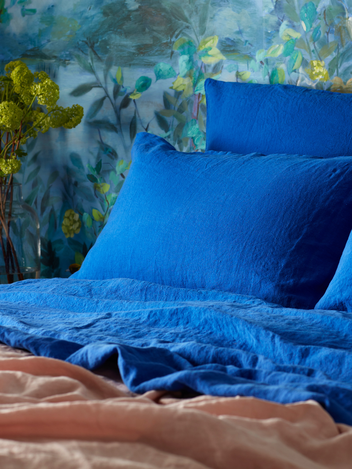
The 100% linen range in Dazzling blue that I designed for my collection at The Secret Linen Store

This is the bedding I have on my own bed. Its called dazzling blue by Secret linen and isn’t it just that! Like taking a deep dive into sleep every night. The powers of blue to relax and calm are not to be underestimated, but go for this rich tone and it never feels cold, just purely luxurious.


Beth has created a limited-edition print for COS, which you can buy there for a short time only.

I’m deeply moved by artist Beth Partridge‘s work. She has an incredible depth and movement to her work and is a master of colour. Her love of deep indigos and marine blues often pop up in her work and I think choosing a bold piece of artwork for your walls is one of the best ways to add colour and personality. Beth has a show on at COS in the achingly cool Coal Drops Yard in Kings Cross, London at the moment which is really worth a visit. Work remains until February 2019. You can find out more here.

TOP IMAGE CREDIT:  Walls in Smalt by Little Greene. Pom Pom coral bedlinen and 100% Dazzling blue linen sheet, Coral frilled linen cushions, all by Sophie Robinson at The Secret Linen Store. Kubrick cushion by Kit Miles.


  • colour crush
  • Interior Design
  • Interiors
Christmas gift guide for colour lovers Quick and easy Kitchen updates that make an impact
  • Christmas
  • Interiors
    • colour crush
    • colour psychology
    • DIY
    • dream home makeovers
    • Home Office
    • Home Tours
    • Interior Design
    • Interior Styling
    • podcast
    • Sophie Robinson X Dunelm
    • Sophie Robinson x Harlequin
    • trends
  • Lifestyle
    • Business
    • Fashion/Beauty
    • Life
    • My House
    • Nosh
    • Travel
  • Rooms
    • Bathrooms
    • Bedrooms
    • Kids rooms
    • Kitchens
    • Living rooms
    • Outside
  • Videos
online influence award winner 2019
Interior Design Winner Sophie Robinson Insta
Videos

Listen

Listen Here

Online courses
by popular demand

Catch Sophie In All Her Colourful Glory On Instagram

Not going to lie, this might be one of my proudest Not going to lie, this might be one of my proudest makeovers ever…
My Dad and Mary’s modern French villa was all beige tiles, white walls and zero personality. So I did what I do best: turned it into a technicolour dreamscape inspired by the countryside views outside those gorgeous bifold doors.

Inspired by early  autumn leaves, emerald green fields, and piercing blue skies we set about making the inside of their home feel as joyful as the outside … now imagine all that bottled up into wallpaper, fabrics, cushions and colour-drenched furniture.

If you’ve ever thought bold colour overwhelming or that pattern was too much for open-plan spaces… this one’s for you. Because colour and pattern sings in nature, and it can work just as well in your home decor.

All wallpapers, rug and cushion fabrics are from my collection with @harlequinfw. Painting by @sophieabbottartist 

Full sourcing list, extra styling tips and a deeper dive into the design story are up now on A Life In Colour: head to my Substack via the link in bio to read more!
End of January check-in… and yes, the struggle to End of January check-in… and yes, the struggle to stay joyful is very real right now. Dark mornings, grey skies, energy running low.

That’s exactly why our homes matter so much at this time of year. They are our sanctuary. The place that should lift your mood, calm your nervous system and make you feel held when the outside world feels a bit, how can I put this...relentless. And this isn’t just a feeling or a design philosophy. It’s backed up by science. Research shows that colour, light, beauty and nature in our homes have a direct impact on mood, wellbeing and happiness. Small, intentional changes really can shift how you feel day to day.

I’d love to know… what brings you the most joy in your home right now? A colour, a room, a plant, a view, a ritual? Share it in the comments 💛

And if you’re ready to go deeper, my big January Sale ends this week.

If you want to truly understand colour psychology and learn how to curate a home that feels joyful, confident and completely you, comment ULTIMATE and I’ll send you the link to my online design school and your opportunity to make the biggest saving of the year.
These are the ingredients to making your home feel These are the ingredients to making your home feel as good as it looks. 

• Confident colour that creates the mood
• Beautiful pattern that delights the eye
• Layered texture that brings it all alive
• Personality in every corner, so it feels like home

Magic happens when you stop playing it safe and start designing a home that truly reflects you. A home that feels joyful, expressive and alive. But designing a home can feel overwhelming. Where do you start? How do you combine colours without it feeling chaotic? How do you clash patterns so it looks considered? How to express your unique personality without merely copying other people’s style?

That is exactly why I created my online design school. After more than 25 years as an interior designer, I have distilled my design process into clear, easy-to-follow courses that take you step by step through combining colours, balancing patterns and adding texture, so you can decorate with confidence and creativity.

And right now, my January Sale is on. You can save a huge 60% on my transformational courses, designed to completely change how you approach your home and how it makes you feel. If you are ready to embrace your creativity and deepen your passion for interior design  comment ULTIMATE and I will send you all the details.
Think Maximalism is ‘too much’, too messy, or only Think Maximalism is ‘too much’, too messy, or only for other people? 

I’m here to tell you: maximalism isn’t chaotic. It’s just misunderstood.

Once you understand how colour and pattern work together, decorating like a maximalist stops feeling intimidating and starts feeling instinctive. Your home starts feeling like you.

If you want to design your home with confidence, my Ultimate Interiors Bundle is exactly what you need. It includes three self-paced online courses that take you inside my design process, teaching you how to use colour and pattern so you can make bold choices that actually work, again and again. 

Right now, the Ultimate Interiors Bundle is a massive 60% off. Buy now, enjoy the saving, and start whenever you are ready to create a home that is completely yours.

Comment ULTIMATE and I’ll DM you the link to find out more.
Welcome to my witchy era! Who else wants to harnes Welcome to my witchy era! Who else wants to harness the Year of the Horse and use this dynamic energy to manifest your best year yet! 

A vision board is like a compass that will lead your goal settings and intentions with total clarity. To prepare i like to take lots of long walks and meditate on what it is so want more of in my life while gratefully letting go of what no longer serves me. 

Join me Wednesday for a live webinar on how to I create a Vision board that will ignite your passion and motivation to live a bold, creative and colourful life! Comment VB26 for the link.
Dark and moody colours can feel intimidating, but Dark and moody colours can feel intimidating, but my TV snug shows just how well they can work. The deep tones soften the space and create a calm, cocooning atmosphere, perfect for evenings spent watching TV, or retreating from the day.

Contrary to what you might think, this room really comes into its own in winter. Low light and long evenings make the colour feel enveloping and cosy. It’s a space that invites you to slow down, sink in, and make yourself comfortable.

I sampled so many different paints but Cordoba by Little Greene was the perfect choice for this room. It’s full of depth and warmth, and just the right amount of drama. 

And if you’re thinking about taking the leap yourself, my tip is: don’t fight the natural light you have, lean into it. Don’t be shy about colour drenching walls, woodwork and ceiling so the room feels seamless and intentional. In my snug, that richness is what makes it feel cosy and complete.

There’s no place I’d rather be on chilly evenings.
How do I explain this feeling to a minimalist? To How do I explain this feeling to a minimalist?

To some people this might look like too much, but for me, maximalism isn’t excessive, it’s pure self expression. I decorate my home to reflect the way I live and that’s full of bold uplifting, joy-giving colour. Every patterned textile, every artwork, every joyful little object earns its place because it makes me feel happy. 

And if I’m being honest a neutral room doesn’t make me feel calm, it makes me feel slightly depressed. My home lifts my mood, fires my creativity and gives me a little thrill every single day.

Now tell me… are you Team Minimal or Team Maximal? And what makes your heart sing at home?
There’s something about walking that has quietly h There’s something about walking that has quietly held me together this past year.

When life threw its challenges my way, my anxiety went into overdrive. I lost clarity, my head was foggy, and the overwhelm shut me down. But walking, one step in front of the other, slowly moved me in the right direction.

We all know walking is good for the body, but it’s also one of the most powerful tools for the mind. Moving helps process stuck emotions, those steady steps soothe racing thoughts, and the changing scenery opens up fresh ways of thinking. Being in nature grounds you. And the best part is, it’s free.

Whenever I’m preparing a new vision for my year or any creative project, I always start with a long solo walk. I take my journal, let the thoughts tumble out, and begin to find a clarity and direction again. Next step is to use my creativity to create a powerful vision board full of images that resonate with how I want to feel and who I want to be. Less of a to do list, more of an emotional reset. This works for me as it brings in the light, and more importantly keeps me inspired and motivated.

If you’re ready to gently clear the fog and get clear on what you want more of, my ‘Life in Colour Vision Board Masterclass’ is now on sale. I’m hosting on the 21st January, 7pm GMT (with a recorded replay available). Comment VB26 below and I’ll send you all the details. 

Can’t wait to see what we can create together this year!
Follow on Instagram
Sophie Robinson
  • © 2025 Sophie Robinson

    /
  • Contact/
  • About/
  • Design by MW

You're almost inside!

Leave me your best email to sign up for the Webinar

MG0001 Magnet Sophie using Tap 021 copy

You're almost inside!

Leave me your best email to sign up for the Webinar