GET THE REPLAY OF THE VISION BOARD MASTERCLASS - LIFE IN COLOUR

Sophie Robinson
  • Home
  • Workshops
    • Marrakech Retreat
    • Home Masterclass
  • Online Courses
  • Collaboration
  • Podcasts
  • Blog
  • About
    • About me
    • Work with me
    • Press
  • FAQs
  • Contact
  • Interior Design
  • Interiors
25 Nov 15

How natural light effects your the colour choice for your scheme

Lilac dining room

One of the things you guys have GOT to think about when picking out a lush new paint colour is the light in your room, because if colour is light- then the light is going to make a massive difference to how we read the colour.

So what is colour anyway? Well if your going to get your physics lab coat on- its just light- refracted into different wavelengths that bounce off the old optic nerve in the eyeballs, which our clever brain ‘reads’ in different ways. This affects how we ‘see’ different colours. All colours, whether seen in nature or applied artificially with pigments through painting, dyeing, or printing, are created by light and the way light affects the eyes. There is loads to the theory involving Isaac Newton and rainbows and prisms, but I don’t know about you, but I always couldn’t WAIT to get out of Physics at school (favourite subject= art) so that’s what we’re going to do here- get straight onto the creative stuff.

White sunny dining room

One thing that’s often advisable to do when you move into a new house is to paint it all out white and live with it a little while before you get all committed with the paint chart. Because the other sneaky thing about light is it darn well changes throughout the day! So you’ve also got to give some thought to WHEN you use a room too.

So the aspect of geographic orientation of the room is a big player in the colour choices we make. Rooms that face south benefit from the maximum amount of lovely warm tinted sunlight while those that face north or east can be tinged with a darker blue light. So the same hue can look fresh and invigorating in a sunny south facing room, while appearing gloomy and dingy in a north facing one. Light levels can also vary from room to room. For example if you live in a terraced property, your south facing garden room with large French doors at the back will be flooded with warm sunlight, while the thoroughfares and hallways in the center of the house will be starved of any natural light while your dark north facing front room, swathed in voiles or shutters to hide the street view is feeling gloomy. When a rooms lacks natural light then artificial light is bought into play.


While tungsten bulbs emit a warmer more yellow light that interior designers love for its golden qualities- they are all but phased out now and efficient LED lights have replaced them. They produce a cleaner more white light that is closer to daylight, and so won’t affect the colours you choose as much as tungsten would have, but you’ve lost the homely glow. However if you want your rooms to feel cosy- especially in the evening you’re going to need to choose colours that deliver that warmth. A great tip however is to use gold or gold lined drum shades which will recreate that warm light glow.

Image from House Beautiful USA

Image from House Beautiful USA


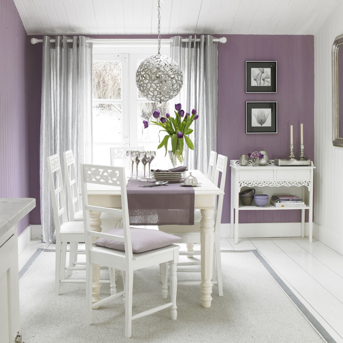
Just because a room lacks natural light, I’d urge you to resist the voice in your head, telling you that you must paint it white, in order to maximise the feeling of light. Rooms starved of sunlight, painted white, look deathly! Cold, chilling and depressing. This is due in part beciase pure brillinat white actually has a far bit of blue in it. My approach is to embrace the darkness- and daub a really snug dark colour on the walls- saturated in colour. I’d then pop some mirrors on the wall- preferably opposite the window, so the help to reflect some light back into the room. I’d then add some punchy accent colours around the room, to lift the contrast, prevent it looking too ironed out. Where there is a lack of light, there is a lack of light and shade so it helps to use colour contrast to add the depth. And then add plenty of moody lighting- no overhead spots please, but wall sconces, lamps, back lit shelving, to again again depth with light.


Different colour schemes work for either south or northfacing rooms. These two home offices have a completely different colour scheme. Source: Styled by Sophie Robinson. Image from Decora.

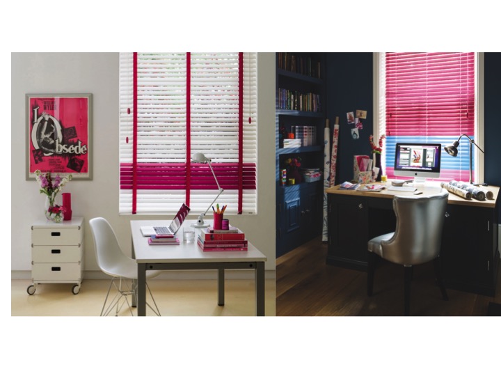
Different colour schemes work for south or north facing rooms. These two home offices have a completely different colours and moods, affected by the natural light source.  Image Styled by Sophie Robinson for  Timberlux.

In your sunny South facing room, I think anything goes! Although again be wary of very stark colours, white may appear too bright and won’t be easy to relax in. Similarly black my contrast to harshly. Bright’s, mid tones and pastels however can all work a treat in a sunny room. If you get very bright sun, I think it’s a good idea to have some options on how to control the light. So have voiles and curtains on separate tracks, or a discreet roller blind is a great addition. Shutters or venetian blinds often work well in sunny rooms as you can control the glare. It’s a nice problem to have!


A combination of curtains and blinds allows you to diffuse the light in a sunny room. Source: Room styled by Sophie Robinson. Image from Decora

A combination of curtains and blinds allows you to diffuse the light in a sunny room. Source: Room styled by Sophie Robinson. Image from The Fabric Box

Whatever room you are decorating, rule number one is to invest in a tester pot of your chosen colour. Now I may have said it once or twice before, but I’ll say it again, DO NOT PAINT A TINY SQUARE ON THE WALLS! Instead empty the whole pot out and slather it on a large sheet of paper- an old roll of wallpaper or lining paper will do. Try and do a couple of coats and then walk it round the room. The colour will look completely different tucked inside the alcove to the wall surrounding the window. This way you can hang it up with some masking tape and study it- and you’re decorator will love you for it (not having to paint out all those pesky squares of paint)! Another trick is to paint inside a large white box- or fold a piece of card in half and paint all round. This is because again, paint colours can alter when they reflect onto one another- usually the effect is more intense.


  • Interior Design
  • Interiors
How to sort your storage Colour crush: Gold
  • Christmas
  • Interiors
    • colour crush
    • colour psychology
    • DIY
    • dream home makeovers
    • Home Office
    • Home Tours
    • Interior Design
    • Interior Styling
    • podcast
    • Sophie Robinson X Dunelm
    • Sophie Robinson x Harlequin
    • trends
  • Lifestyle
    • Business
    • Fashion/Beauty
    • Life
    • My House
    • Nosh
    • Travel
  • Rooms
    • Bathrooms
    • Bedrooms
    • Kids rooms
    • Kitchens
    • Living rooms
    • Outside
  • Videos
online influence award winner 2019
Interior Design Winner Sophie Robinson Insta
Videos

Listen

Listen Here

Online courses
by popular demand

Catch Sophie In All Her Colourful Glory On Instagram

January. A grateful round up. Rolling into 2026 an January. A grateful round up.
Rolling into 2026 and chasing colour in all its forms, from piercing blue winter suns to raspberry red Moroccan sunrises. I knew I’d be ready for you, 2026. And we have started beautifully.

1. A quiet promise to myself to make 2026 as colourful as possible
2. New Year’s Eve… exactly as it began
3. And then how it went. A proper sweaty dance at @alphabetbrighton 
4. Hosting a bonfire at home with friends to burn away 2025. @jothornephotography 
5. Watching embers glow beneath a full moon. Emotional in the best way
6. Snow, low sun and the most perfect winter palette
7. Still walking it out! Bracing the cold with @sophieabbottartist @edwinaboase 
8. A much needed colour hit, hosting my interiors retreat with @elfennmarrakech 
9. Me and partner in crime @em_lappin  at @lallamarrakech 
10. The joyful jolt of colour only the Marrakech souks can deliver
11. Discovering the new @ritaalaoui_artist art installation at El Fenn
12. New moon meditation with the wonderful @alexadecastilho 
13. Gently shaping a new vision for 2026
14. Harnessing that wild horse energy for my vision board webinar
15. Proud moments unveiling my latest collection to the press at @dunelmuk 
16. Catch ups with my lovely TV chums @hardcastletowers @francescarowanplowden @jackkinsey @ritamillat 
17. Feeling genuinely excited about this collection and all the squeals it is delivering
18. Finally ticking off my 360 health scan at @nekohealth 
19. Becoming mildly obsessed with pastel, colour drenched interiors
20. It looks busy, but January has mostly been this. Rest. Reflection. Happy wintering.
Not going to lie, this might be one of my proudest Not going to lie, this might be one of my proudest makeovers ever…
My Dad and Mary’s modern French villa was all beige tiles, white walls and zero personality. So I did what I do best: turned it into a technicolour dreamscape inspired by the countryside views outside those gorgeous bifold doors.

Inspired by early  autumn leaves, emerald green fields, and piercing blue skies we set about making the inside of their home feel as joyful as the outside … now imagine all that bottled up into wallpaper, fabrics, cushions and colour-drenched furniture.

If you’ve ever thought bold colour overwhelming or that pattern was too much for open-plan spaces… this one’s for you. Because colour and pattern sings in nature, and it can work just as well in your home decor.

All wallpapers, rug and cushion fabrics are from my collection with @harlequinfw. Painting by @sophieabbottartist 

Full sourcing list, extra styling tips and a deeper dive into the design story are up now on A Life In Colour: head to my Substack via the link in bio to read more!
End of January check-in… and yes, the struggle to End of January check-in… and yes, the struggle to stay joyful is very real right now. Dark mornings, grey skies, energy running low.

That’s exactly why our homes matter so much at this time of year. They are our sanctuary. The place that should lift your mood, calm your nervous system and make you feel held when the outside world feels a bit, how can I put this...relentless. And this isn’t just a feeling or a design philosophy. It’s backed up by science. Research shows that colour, light, beauty and nature in our homes have a direct impact on mood, wellbeing and happiness. Small, intentional changes really can shift how you feel day to day.

I’d love to know… what brings you the most joy in your home right now? A colour, a room, a plant, a view, a ritual? Share it in the comments 💛

And if you’re ready to go deeper, my big January Sale ends this week.

If you want to truly understand colour psychology and learn how to curate a home that feels joyful, confident and completely you, comment ULTIMATE and I’ll send you the link to my online design school and your opportunity to make the biggest saving of the year.
These are the ingredients to making your home feel These are the ingredients to making your home feel as good as it looks. 

• Confident colour that creates the mood
• Beautiful pattern that delights the eye
• Layered texture that brings it all alive
• Personality in every corner, so it feels like home

Magic happens when you stop playing it safe and start designing a home that truly reflects you. A home that feels joyful, expressive and alive. But designing a home can feel overwhelming. Where do you start? How do you combine colours without it feeling chaotic? How do you clash patterns so it looks considered? How to express your unique personality without merely copying other people’s style?

That is exactly why I created my online design school. After more than 25 years as an interior designer, I have distilled my design process into clear, easy-to-follow courses that take you step by step through combining colours, balancing patterns and adding texture, so you can decorate with confidence and creativity.

And right now, my January Sale is on. You can save a huge 60% on my transformational courses, designed to completely change how you approach your home and how it makes you feel. If you are ready to embrace your creativity and deepen your passion for interior design  comment ULTIMATE and I will send you all the details.
Think Maximalism is ‘too much’, too messy, or only Think Maximalism is ‘too much’, too messy, or only for other people? 

I’m here to tell you: maximalism isn’t chaotic. It’s just misunderstood.

Once you understand how colour and pattern work together, decorating like a maximalist stops feeling intimidating and starts feeling instinctive. Your home starts feeling like you.

If you want to design your home with confidence, my Ultimate Interiors Bundle is exactly what you need. It includes three self-paced online courses that take you inside my design process, teaching you how to use colour and pattern so you can make bold choices that actually work, again and again. 

Right now, the Ultimate Interiors Bundle is a massive 60% off. Buy now, enjoy the saving, and start whenever you are ready to create a home that is completely yours.

Comment ULTIMATE and I’ll DM you the link to find out more.
Welcome to my witchy era! Who else wants to harnes Welcome to my witchy era! Who else wants to harness the Year of the Horse and use this dynamic energy to manifest your best year yet! 

A vision board is like a compass that will lead your goal settings and intentions with total clarity. To prepare i like to take lots of long walks and meditate on what it is so want more of in my life while gratefully letting go of what no longer serves me. 

Join me Wednesday for a live webinar on how to I create a Vision board that will ignite your passion and motivation to live a bold, creative and colourful life! Comment VB26 for the link.
Dark and moody colours can feel intimidating, but Dark and moody colours can feel intimidating, but my TV snug shows just how well they can work. The deep tones soften the space and create a calm, cocooning atmosphere, perfect for evenings spent watching TV, or retreating from the day.

Contrary to what you might think, this room really comes into its own in winter. Low light and long evenings make the colour feel enveloping and cosy. It’s a space that invites you to slow down, sink in, and make yourself comfortable.

I sampled so many different paints but Cordoba by Little Greene was the perfect choice for this room. It’s full of depth and warmth, and just the right amount of drama. 

And if you’re thinking about taking the leap yourself, my tip is: don’t fight the natural light you have, lean into it. Don’t be shy about colour drenching walls, woodwork and ceiling so the room feels seamless and intentional. In my snug, that richness is what makes it feel cosy and complete.

There’s no place I’d rather be on chilly evenings.
How do I explain this feeling to a minimalist? To How do I explain this feeling to a minimalist?

To some people this might look like too much, but for me, maximalism isn’t excessive, it’s pure self expression. I decorate my home to reflect the way I live and that’s full of bold uplifting, joy-giving colour. Every patterned textile, every artwork, every joyful little object earns its place because it makes me feel happy. 

And if I’m being honest a neutral room doesn’t make me feel calm, it makes me feel slightly depressed. My home lifts my mood, fires my creativity and gives me a little thrill every single day.

Now tell me… are you Team Minimal or Team Maximal? And what makes your heart sing at home?
Follow on Instagram
Sophie Robinson
  • © 2025 Sophie Robinson

    /
  • Contact/
  • About/
  • Design by MW

You're almost inside!

Leave me your best email to sign up for the Webinar

MG0001 Magnet Sophie using Tap 021 copy

You're almost inside!

Leave me your best email to sign up for the Webinar