GET THE REPLAY OF THE VISION BOARD MASTERCLASS - LIFE IN COLOUR

Sophie Robinson
  • Home
  • Workshops
    • Marrakech Retreat
    • Home Masterclass
  • Online Courses
  • Collaboration
  • Podcasts
  • Blog
  • About
    • About me
    • Work with me
    • Press
  • FAQs
  • Contact
  • Interior Design
  • Interiors
05 Aug 20

Colour pop bathroom in my colourful signature style

Geberit Sophies Set 17

When our podcast sponsor Geberit asked Kate Watson-Smyth and me to design a bathroom in our signature style, to celebrate their Inspiring Bathrooms campaign, we jumped at the chance! For all of you who listen to the show, you will already know that Kate and I don’t always agree on colour schemes, and this no-holes-barred brief was going to allow us to go head to head! It was a fascinating exercise in what different looks you can create given the same space and how to add personality to your bathroom.

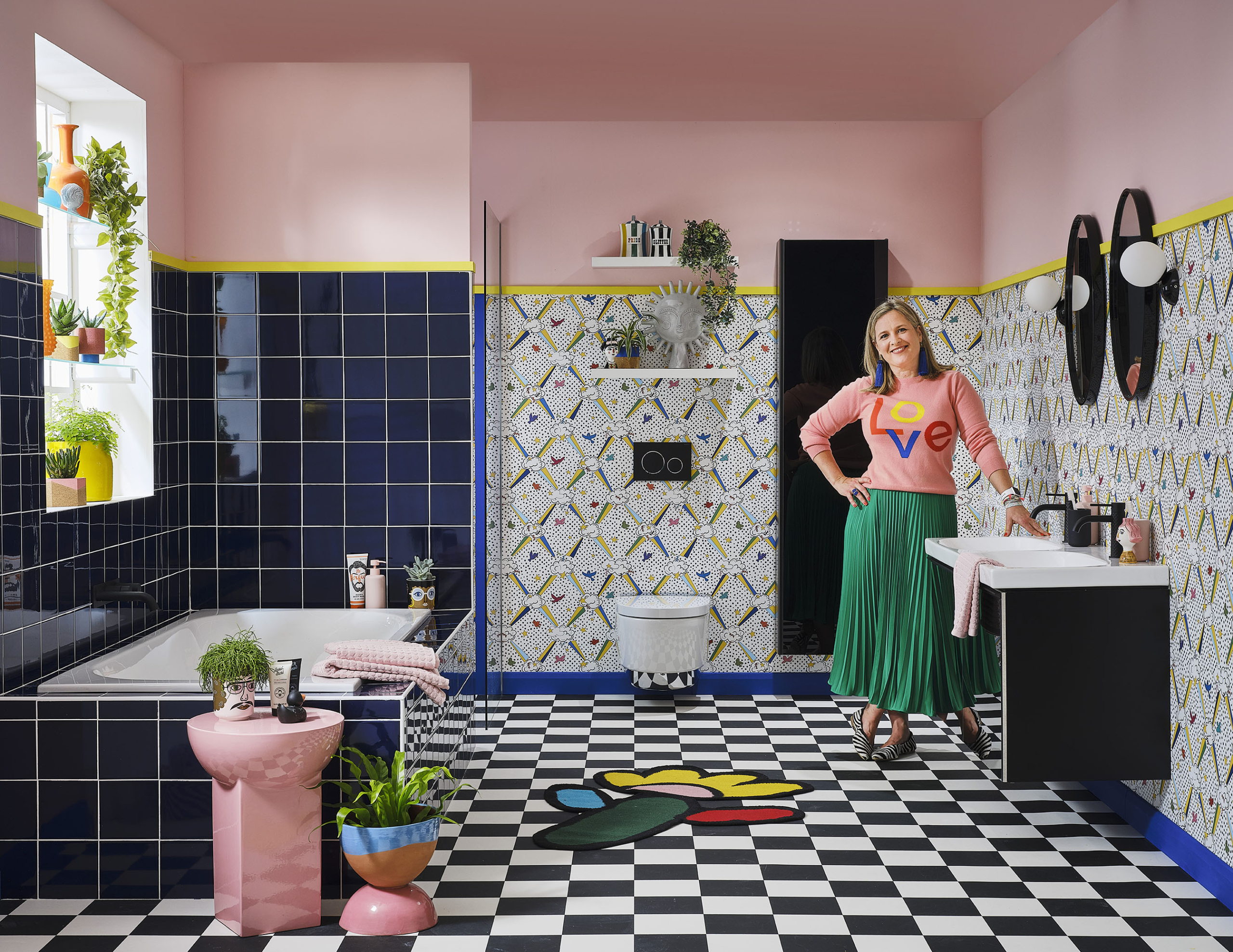
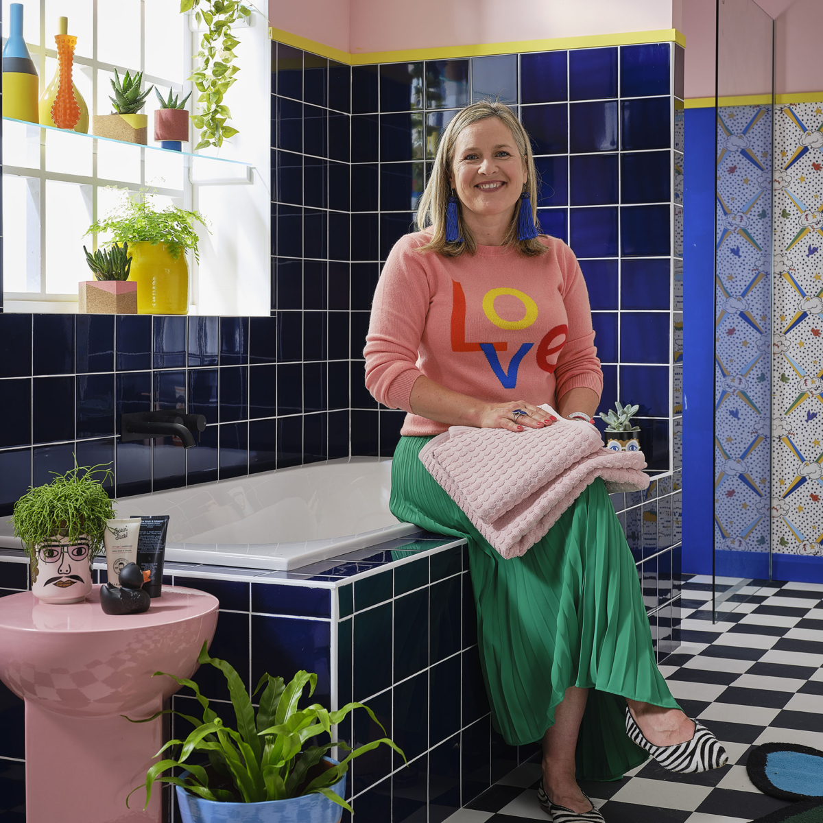
Geberit Soana bathtub, Acanto basin, Acanto cabinet for basin, Acanto tall cabinet, Aqua clean Mera shower toilet, all Geberit.Gessi taps in black finish #299 by Gessi.

We were given the same layout, bathroom suite and storage cabinets from Geberit, but the colour scheme was totally up to us. My first hurdle was the Geberit Acanto storage was jet black and black is a colour I rarely use in my decorating schemes. I find it too heavy against my preferred palette of joyful brights. I did a few mood boards and none of them felt quite right, but then I struck lucky when I unearthed a sample of this Sky Candy wallpaper by one of my favourite print designers, Ottoline De Vries. Her playful design was perfect for the spirit of the ‘family bathroom’ brief that Geberit had supplied and the design combined black and white along with my favourite bright colours. Finding a fabric or wallpaper or indeed a piece of artwork is often how I springboard my colour palettes for room schemes.

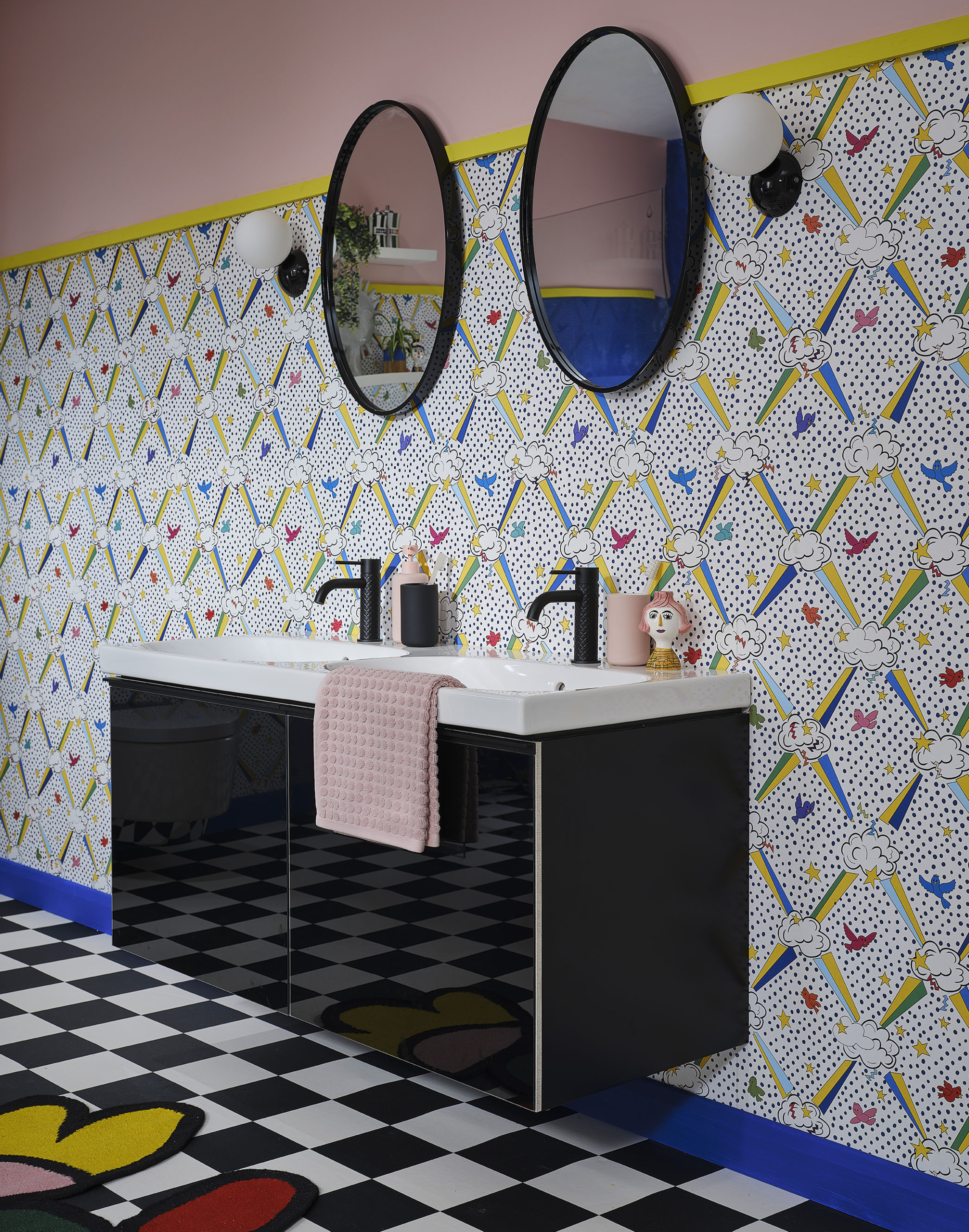
Walls papered in Sky candy wallpaper by Ottoline De Vries. Walls painted in Angie and trim in Trumpet, Little Greene. Chequered vinyl floor by Tatlow carpets. Bex mirror and Vetro wall lights by Made.com. Kitsch candle holder, WA Green. Towels by Dunelm Mill.

From this, it was easy to spin off the design. I sourced cobalt blue for the tiles, as its very much my signature colour, from CDT Tiles. I only ran then three quarters up the wall as personally I personally don’t like too many tiles in a bathroom, it can make the room sound echoey. So I created a racing stripe of yellow all around the room with Angie Pink, by Little pink above, wrapping all the way across the ceiling. Pink is one of my favourite colours to decorate with as it feels like, soft and warm all at once. For this reason, I think it’s a great colour for the bathroom and helps to soften the black elements. Wallpaper is fine for the bathroom as long as you make sure your walls are prepped really well before applying, that the paper is stuck down securely and the room is well ventilated. If you still worry you can apply a coat of matt varnish to protect it from the moisture.

Reflections cobalt blue tiles, CDT Tiles. Mila pink ceramic stool, Blue and pink chubby egg plant pot, Pablo face pot, all WA Green.

A built-in bath with a ledge is a really practical option for a family bathroom, if space allows. It offers a place to perch and also a surface to keep toiletries close to hand. I paired the striking tiles with white grout to tie in with the floor and wallpaper designs and I love the graphic effect. A chequerboard floor is a classic but my signature style is all about clashing the patterns and floors are often an overlooked opportunity. It also helps to really integrate the black cabinets into the scheme. I broke up the geometric pattern with this glorious Daisy Flower rug by John Booth at Floor story. I personally love to use rugs in the bathroom, as a way to add more softness, pattern and colour. So don’t feel you have to just stick to tiny bath mats!

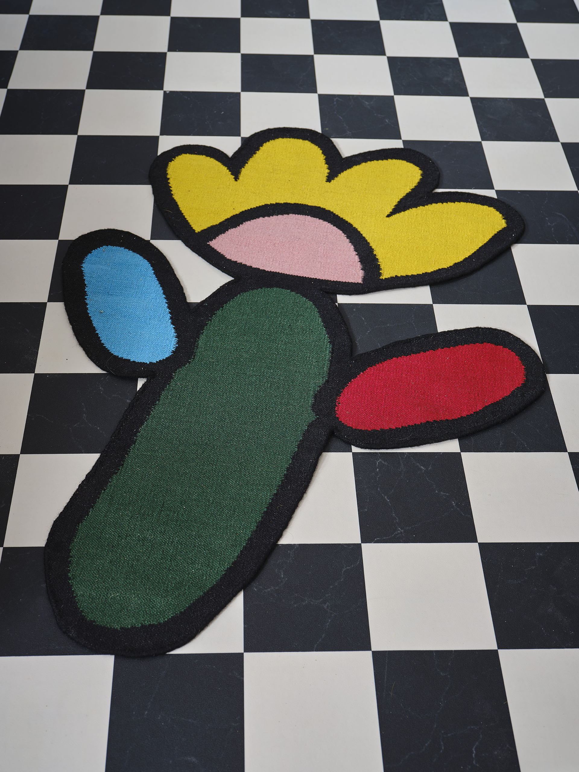
Daisy flower rug by John Booth at Floor Story.

On a practical level, a good looking bathroom falls flat on its face as soon as all the plastic toiletry bottles come out! Make sure you plan in enough storage and in my experience you can never have enough! The Acanto storage is ideal as it comes in plenty of different configurations. The tall and slender cabinet raised off the floor is ideal for a small bathroom, making the most of the wall space while not taking up much floor space. However I think it’s also lovely to have some open shelving for displays too as bathrooms can quickly become too clinical looking. I sourced most of the decorative objects from one of my favourite online shops WA Green. Their moniker is #dopamineforthehome and I’m signing up to that!

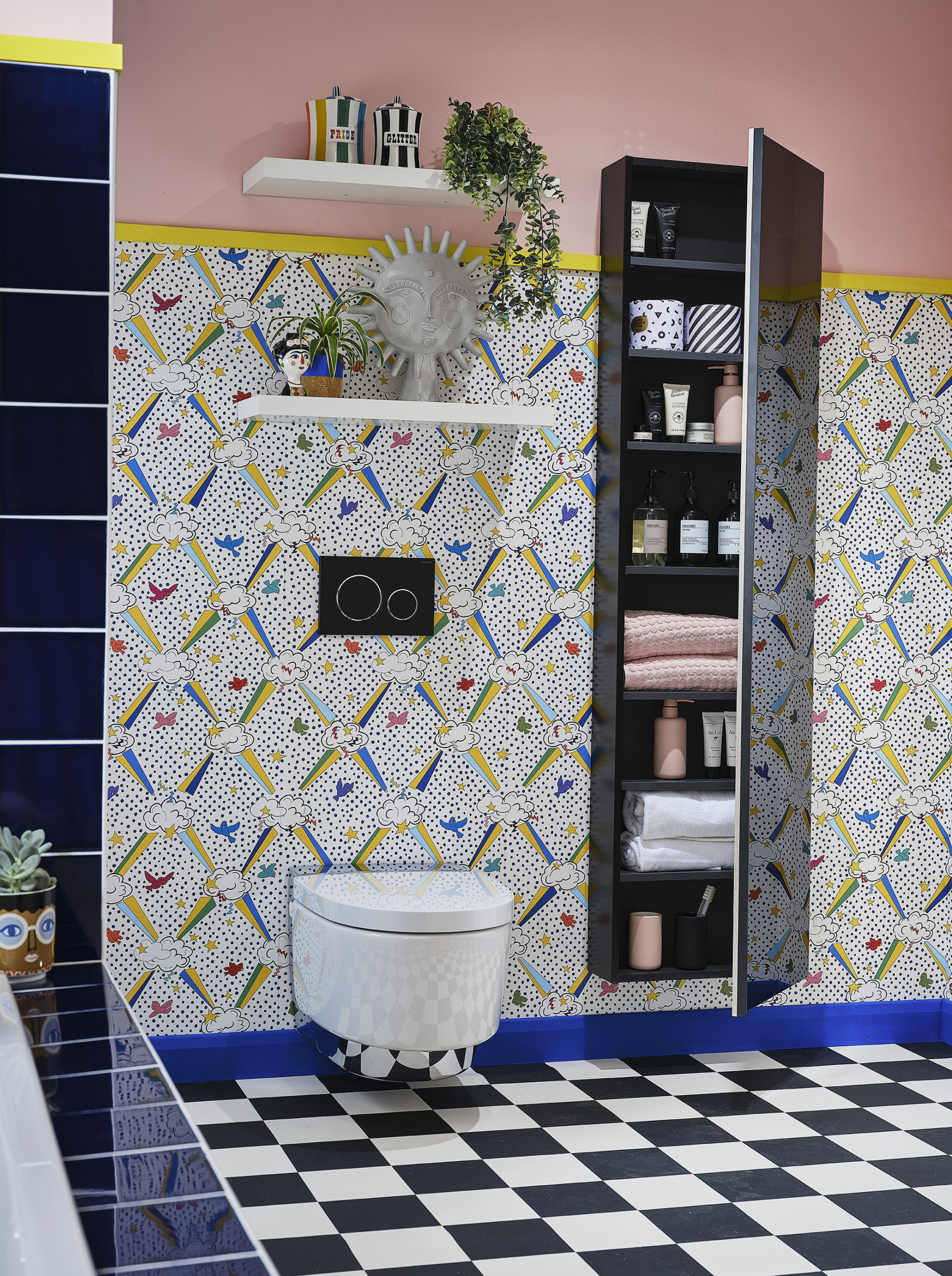
Glitter vice rainbow canister, Pride rainbow vice canister, utopian sun statue, kitsch candle holder, all WA Green. Cork plant pot, Mind the cork.

Another visual trick you can play to help your bathroom feel more spacious is with a wall-hung loo. It also makes it much easier to keep this area clean, and as a Mum of boys, this is a real bonus! This Geberit Aqua clean Mera shower toilet even has a no-touch open and close lid so win-win! I also love the way the chrome detail reflects the floor pattern, very snazzy. The devil is in the detail as they say and I’d say this is especially important in small bathrooms were I think it’s important that you create a coherent thread with regards to the finishes. I selected a Geberit Sigma 20 matt black flush plate to match the black Gessi taps, which all tie in with the black Acanto cabinets. Because I’m being playful with pattern it’s then important to keep the materials limited, otherwise, the whole look can start to become messy and incoherent.

Cork plant pots, Mind the Cork.

In your bathroom you’ll want to create a level of privacy and I’ve done that here by fitting glass shelves and a collection of pots and plants. This will obscure the view looking in during the day and then you can drop a blind at night. A selection of decorative pots and plenty of plants also help soften the overall look. And ‘soften soften soften’ is my mantra when designing a bathroom. There are so many hard surfaces and practical elements you need to add softness wherever you can. You can do this with plants and textiles and tactile materials like cork. I love the brand Mind the Cork, not just for the gorgeous contemporary designs but also their sustainable credentials.

Meanwhile, Kate styled her bathroom in an uncharacteristically colourful way! She’s notoriously always been very rude about the colour yellow but lockdown has obviously messed with her mind as she’s become very experimental with this Pretty in Pink bathroom. I personally think the saffron yellow ceiling is genius, harnessing a warm glow over the room. However, it’s pretty scalloped decorative detail that crosses from the tiles and into the painted border around the room that I particularly love. You can see more of Kate’s bathroom over on her blog here. 

For more information on the Inspirational bathroom campaign, you can hop over to the Geberit web page here. For more bathroom inspiration check out the hashtag #inspiredbyGeberit

This feature is part of a paid collaboration with Geberit. Photography by Stewart Rowen.

  • Interior Design
  • Interiors
Focal points and Gordon Whistance interview,Podcast show notes S8 ep3 Garden offices, United in Design, podcast show notes s8 ep2
  • Christmas
  • Interiors
    • colour crush
    • colour psychology
    • DIY
    • dream home makeovers
    • Home Office
    • Home Tours
    • Interior Design
    • Interior Styling
    • podcast
    • Sophie Robinson X Dunelm
    • Sophie Robinson x Harlequin
    • trends
  • Lifestyle
    • Business
    • Fashion/Beauty
    • Life
    • My House
    • Nosh
    • Travel
  • Rooms
    • Bathrooms
    • Bedrooms
    • Kids rooms
    • Kitchens
    • Living rooms
    • Outside
  • Videos
online influence award winner 2019
Interior Design Winner Sophie Robinson Insta
Videos

Listen

Listen Here

Online courses
by popular demand

Catch Sophie In All Her Colourful Glory On Instagram

February. Rain. More rain. And then just for varie February. Rain. More rain. And then just for variety… rain. The dog and I relished the excuse to stay tucked up at home. But inside? Big plans and some serious plotting around the kitchen table. February has that quiet, held-breath quality. Everything looks still, yet beneath the surface it’s all quietly preparing to burst into life. I’m more than ready for that spring light to unleash some very exciting plans! Who else is ready?!

FEBRUARY ROUND UP
	1.	Just how much rain?! Honestly. Biblical.
	2.	Creating shape and big ideas with @teamyo_weight_training .
	3.	Major shoot energy for my AW 2026 collection. So proud of this one.
	4.	Celebrating the fabulous new scents at @vyraoworld . Heaven in a bottle.
	5.	Catch-ups with these sirens @micboehm77  @yasminsewell Creative refuel.
	6.	Photoshoot at the house. @jadefarmiloemua claims best mug, obviously.
	7.	Lucy ready for hair and make-up. Born for backstage life.
	8.	I finally caved and bought an air fryer. Brilliant but why do Ugly.
	9.	Watching the pond like it’s Netflix. What will spawn this spring? 🐸
	10.	My lovely Dad staying with us and recuperating after a nasty illness. Tender days.
	11.	Healing sunlight breaking through when we needed it most.
	12.	Three generations, sofa-bound, watching the rugby. Proper joy.
	13.	14. The wonderful Wes Anderson exhibition at the @designmuseum . Go. Get inspired.
	15. February has its own special bleakness. I’m ready for sunshine on that sea.
	16.	Lucy fully committed to hibernation season. Respect.
	17.	An elegant mess. Story of my life.
	18.	Lucy taking the minutes at a very exciting team meeting. Promotion pending.
	19.	First signs of spring 🌼 Always right on time.
AD Still smiling after revealing my latest colourf AD Still smiling after revealing my latest colourful homewares collection with @Dunelmuk. Bringing a collection like this to life takes months of dreaming, designing and attention to detail, so sharing it with everyone felt incredibly special. Expect joyful colour, layered pattern and all the maximalist touches you know I love. The whole collection is now available to shop in store, online and on the Dunelm app. I could not be prouder. 💛
January. A grateful round up. Rolling into 2026 an January. A grateful round up.
Rolling into 2026 and chasing colour in all its forms, from piercing blue winter suns to raspberry red Moroccan sunrises. I knew I’d be ready for you, 2026. And we have started beautifully.

1. A quiet promise to myself to make 2026 as colourful as possible
2. New Year’s Eve… exactly as it began
3. And then how it went. A proper sweaty dance at @alphabetbrighton 
4. Hosting a bonfire at home with friends to burn away 2025. @jothornephotography 
5. Watching embers glow beneath a full moon. Emotional in the best way
6. Snow, low sun and the most perfect winter palette
7. Still walking it out! Bracing the cold with @sophieabbottartist @edwinaboase 
8. A much needed colour hit, hosting my interiors retreat with @elfennmarrakech 
9. Me and partner in crime @em_lappin  at @lallamarrakech 
10. The joyful jolt of colour only the Marrakech souks can deliver
11. Discovering the new @ritaalaoui_artist art installation at El Fenn
12. New moon meditation with the wonderful @alexadecastilho 
13. Gently shaping a new vision for 2026
14. Harnessing that wild horse energy for my vision board webinar
15. Proud moments unveiling my latest collection to the press at @dunelmuk 
16. Catch ups with my lovely TV chums @hardcastletowers @francescarowanplowden @jackkinsey @ritamillat 
17. Feeling genuinely excited about this collection and all the squeals it is delivering
18. Finally ticking off my 360 health scan at @nekohealth 
19. Becoming mildly obsessed with pastel, colour drenched interiors
20. It looks busy, but January has mostly been this. Rest. Reflection. Happy wintering.
Not going to lie, this might be one of my proudest Not going to lie, this might be one of my proudest makeovers ever…
My Dad and Mary’s modern French villa was all beige tiles, white walls and zero personality. So I did what I do best: turned it into a technicolour dreamscape inspired by the countryside views outside those gorgeous bifold doors.

Inspired by early  autumn leaves, emerald green fields, and piercing blue skies we set about making the inside of their home feel as joyful as the outside … now imagine all that bottled up into wallpaper, fabrics, cushions and colour-drenched furniture.

If you’ve ever thought bold colour overwhelming or that pattern was too much for open-plan spaces… this one’s for you. Because colour and pattern sings in nature, and it can work just as well in your home decor.

All wallpapers, rug and cushion fabrics are from my collection with @harlequinfw. Painting by @sophieabbottartist 

Full sourcing list, extra styling tips and a deeper dive into the design story are up now on A Life In Colour: head to my Substack via the link in bio to read more!
End of January check-in… and yes, the struggle to End of January check-in… and yes, the struggle to stay joyful is very real right now. Dark mornings, grey skies, energy running low.

That’s exactly why our homes matter so much at this time of year. They are our sanctuary. The place that should lift your mood, calm your nervous system and make you feel held when the outside world feels a bit, how can I put this...relentless. And this isn’t just a feeling or a design philosophy. It’s backed up by science. Research shows that colour, light, beauty and nature in our homes have a direct impact on mood, wellbeing and happiness. Small, intentional changes really can shift how you feel day to day.

I’d love to know… what brings you the most joy in your home right now? A colour, a room, a plant, a view, a ritual? Share it in the comments 💛

And if you’re ready to go deeper, my big January Sale ends this week.

If you want to truly understand colour psychology and learn how to curate a home that feels joyful, confident and completely you, comment ULTIMATE and I’ll send you the link to my online design school and your opportunity to make the biggest saving of the year.
These are the ingredients to making your home feel These are the ingredients to making your home feel as good as it looks. 

• Confident colour that creates the mood
• Beautiful pattern that delights the eye
• Layered texture that brings it all alive
• Personality in every corner, so it feels like home

Magic happens when you stop playing it safe and start designing a home that truly reflects you. A home that feels joyful, expressive and alive. But designing a home can feel overwhelming. Where do you start? How do you combine colours without it feeling chaotic? How do you clash patterns so it looks considered? How to express your unique personality without merely copying other people’s style?

That is exactly why I created my online design school. After more than 25 years as an interior designer, I have distilled my design process into clear, easy-to-follow courses that take you step by step through combining colours, balancing patterns and adding texture, so you can decorate with confidence and creativity.

And right now, my January Sale is on. You can save a huge 60% on my transformational courses, designed to completely change how you approach your home and how it makes you feel. If you are ready to embrace your creativity and deepen your passion for interior design  comment ULTIMATE and I will send you all the details.
Think Maximalism is ‘too much’, too messy, or only Think Maximalism is ‘too much’, too messy, or only for other people? 

I’m here to tell you: maximalism isn’t chaotic. It’s just misunderstood.

Once you understand how colour and pattern work together, decorating like a maximalist stops feeling intimidating and starts feeling instinctive. Your home starts feeling like you.

If you want to design your home with confidence, my Ultimate Interiors Bundle is exactly what you need. It includes three self-paced online courses that take you inside my design process, teaching you how to use colour and pattern so you can make bold choices that actually work, again and again. 

Right now, the Ultimate Interiors Bundle is a massive 60% off. Buy now, enjoy the saving, and start whenever you are ready to create a home that is completely yours.

Comment ULTIMATE and I’ll DM you the link to find out more.
Welcome to my witchy era! Who else wants to harnes Welcome to my witchy era! Who else wants to harness the Year of the Horse and use this dynamic energy to manifest your best year yet! 

A vision board is like a compass that will lead your goal settings and intentions with total clarity. To prepare i like to take lots of long walks and meditate on what it is so want more of in my life while gratefully letting go of what no longer serves me. 

Join me Wednesday for a live webinar on how to I create a Vision board that will ignite your passion and motivation to live a bold, creative and colourful life! Comment VB26 for the link.
Follow on Instagram
Sophie Robinson
  • © 2025 Sophie Robinson

    /
  • Contact/
  • About/
  • Design by MW

You're almost inside!

Leave me your best email to sign up for the Webinar

MG0001 Magnet Sophie using Tap 021 copy

You're almost inside!

Leave me your best email to sign up for the Webinar