GET THE REPLAY OF THE VISION BOARD MASTERCLASS - LIFE IN COLOUR

Sophie Robinson
  • Home
  • Workshops
    • Marrakech Retreat
    • Home Masterclass
  • Online Courses
  • Collaboration
  • Podcasts
  • Blog
  • About
    • About me
    • Work with me
    • Press
  • FAQs
  • Contact
  • Interior Design
  • Interiors
03 Sep 19

How to create a colour scheme

Sanderson Paint 2019 35 1

Picking the perfect colour scheme to daub on your walls can be a very daunting decision, and ‘what colour should I paint my walls?!’ is something I get asked alot!  I think it’s possibly one of the reasons people go for the oh-so-obvious beige tones. If you are a neutral type of soul then there’s nothing wrong with that, but if you have an inkling that you’re a colour lover- its time to get empowered!

When it comes to pulling together a colour scheme you need to get a feeling for what goes with what and create a palette of colours that sit together pleasingly. Rule number one is you can’t pick a wall colour in isolation, you need to think about what other colours you will combine with it too. Myself, as well as many designers do this instinctively but for some it can feel like you just don’t now where to start. It’s sometimes a good idea for all of us to go back to the basics and look at a tried and tested way to combine colour and consider the effects of these combinations. The colour wheel is a fail-safe way of working out what works with what- anyone who works with colour; interior designers, artists and architects have all learned the theory in order to create colour palettes.

The classic colour wheel is made up of 12 hues- one half features the cool colours (lilacs, blues, greens) and the other the warm hues (reds, oranges, yellows). You’ve then got your Primary, secondary and tertiary colours as you work away from the primary- you keeping up?!


In the modern colour wheel, you begin with red, blue and yellow as they are what all colours derive from. The secondary colours are then made by mixing two of the primaries together…remember doing this in primary school! Tertiary colours are then made by mixing a primary with a secondary to give us lime green, turquoise, magenta, peach, deep purple and so much more. There are boundless tints, shades and tones wheeled out, by mixing different combinations, all called tertiary colours. We are very lucky that our paint manufactures know all this stuff, which is why we have such a mind-boggling choice on offer!

A monochromatic scheme of varying shades of a warm teal blue which uses accents of natural wood and texture to add interest. Image by Overstock

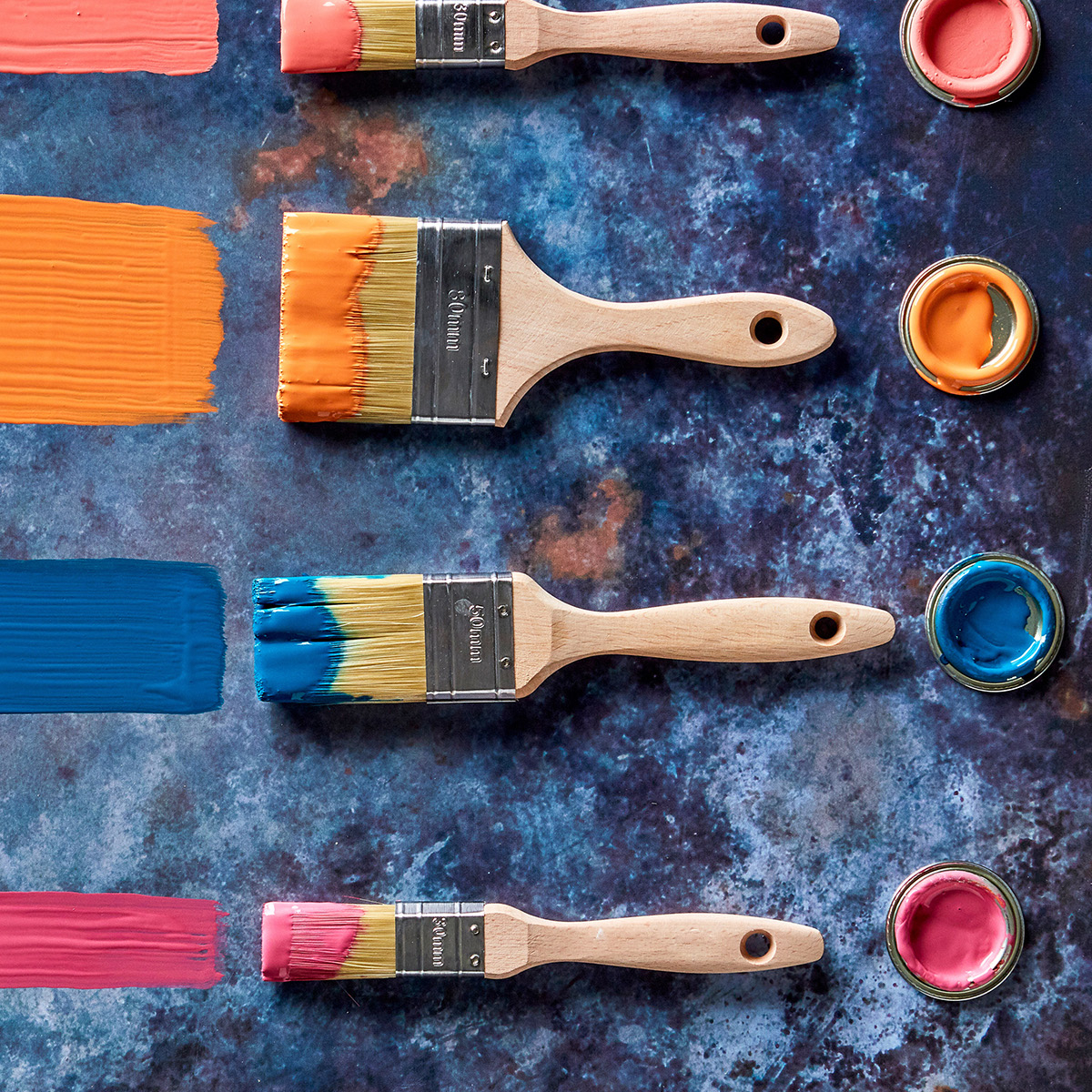
So all the technical bit aside, you probably just want to know what looks good with what!

Monochromatic style

When you hear the term monochrome you probably instinctively think black and white.  But that’s not the case, you can easily pull a monochromatic colour scheme together, using different tones and tints of your chosen colour that will sit harmoniously. This is what will keep it interesting. Plus, it makes using bold or contrasting patterns very simple to incorporate- as you just match them by colour. You can add interest by being creative with varying textures and choose a colour that will then work with different shades and tones. Take a look at a strip of Dulux or Crown paint chart- to see how it works. To be truly monochromatic, everything should be in your chosen hue- but I think it’s totally fine to mix neutrals like white, grey, metal and wood into the mix. You don’t need to look like you live in the emerald city!


Harmonious colours

The jewel-like tones in blue and green are a complimentary colour palette. While still strong the effect isn’t so high contrast and striking and suits an elegant scheme – and who could resist a velvet button-back sofa like the Oscar from Sofa.com

Choose two or more colours that sit side by side on the colour wheel and you get what’s called an Analogous colour scheme (you learn something new every day- not your everyday conversation starter), or more commonly known as harmonious colour scheme. What you need to know is that this is where all the colours are from the same family so to speak.  So sit red next to orange, blue next to violet or yellow with green. One old saying I don’t think washes is – ‘blue and green should never be seen’ – I think they look fab together, don’t you agree? They are colour wheel neighbours after all. The effect of harmonious colours is cohesive and elegant and therefore often calm. Nothing jars or pops out. However if this was me designing the above scheme, I couldn’t resist adding a little fuchsia pink vase of flowers just to give the room a little ‘pop’. So while these are rules, don’t be afraid to be creative and playful too.

The mix of bright and bold colours isn’t too over powering due to the limited use of harmonoius colours. The cool neutral white paint stops the warm colours from feeling too ‘hot’. The signature rug by Carpetright adds a cohesive focal point where all the colours come together.

Contrasting colours

They often say opposites attract and it couldn’t be more true when we’re talking about contrasting colour schemes- but like any winning relationship just make sure they complement each other. The contrast of the colours positioned opposite one another on the colour wheel make for interesting and arresting combinations. I also think it works well when you mix warm and cool shades together as they can balance each other out. For example I love the way the orange tones in real wood warms up an otherwise chilly blue scheme or fresh green cuts through a over bearing red scheme. But the really important thing to know here is your complimentary colours create dynamic colour schemes! They certainly create an impact and demand attention. This is why I love using them, but they are rarely relaxing!

A striking inky blue and orange scheme is what we call a contrasting colour palette. The added white acts as a neutral to balance the strong colour contrast. I love the bold geometric floor in contrasting balack and white that gives this room extra ‘wow’. Image by Annie Sloan

So there we have it- the colour wheel in a brief nutshell. Personally, I don’t tend to use it when I design a room scheme as I generally like to go with my gut- and I’m sure that’s how a lot of designers work. So I’d advise that your next step would be to have some fun and play around with a mood board and some paint chips. Interior design shouldn’t be painting by numbers and following rules – it’s all about how the colours make you feel and you’ll soon get the feeling when something looks amazing- so have a go…it’s only paint!!

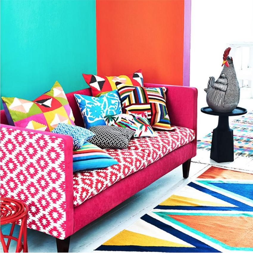
A riot of contrasting colours creates a fun and eye-catching scheme. Image by Homes & Gardens

Don’t forget there are digital visualisers available too such as the Dulux one where you upload a photo of your room and just have a play with different colours to help you ‘visualise’ how the room will look.

Check out my video here, where I share my secret to picking the perfect paint colour.

Featured image at top: Sanderson

Image research and editing by Luisa Ferdenzi-Rouse

  • Interior Design
  • Interiors
New interior book reviews, Maximalism vs. Minimalism, Podcast show notes, S4 Ep5 Boilers get a modern makeover with Worcester Bosch
  • Christmas
  • Interiors
    • colour crush
    • colour psychology
    • DIY
    • dream home makeovers
    • Home Office
    • Home Tours
    • Interior Design
    • Interior Styling
    • podcast
    • Sophie Robinson X Dunelm
    • Sophie Robinson x Harlequin
    • trends
  • Lifestyle
    • Business
    • Fashion/Beauty
    • Life
    • My House
    • Nosh
    • Travel
  • Rooms
    • Bathrooms
    • Bedrooms
    • Kids rooms
    • Kitchens
    • Living rooms
    • Outside
  • Videos
online influence award winner 2019
Interior Design Winner Sophie Robinson Insta
Videos

Listen

Listen Here

Online courses
by popular demand

Catch Sophie In All Her Colourful Glory On Instagram

February. Rain. More rain. And then just for varie February. Rain. More rain. And then just for variety… rain. The dog and I relished the excuse to stay tucked up at home. But inside? Big plans and some serious plotting around the kitchen table. February has that quiet, held-breath quality. Everything looks still, yet beneath the surface it’s all quietly preparing to burst into life. I’m more than ready for that spring light to unleash some very exciting plans! Who else is ready?!

FEBRUARY ROUND UP
	1.	Just how much rain?! Honestly. Biblical.
	2.	Creating shape and big ideas with @teamyo_weight_training .
	3.	Major shoot energy for my AW 2026 collection. So proud of this one.
	4.	Celebrating the fabulous new scents at @vyraoworld . Heaven in a bottle.
	5.	Catch-ups with these sirens @micboehm77  @yasminsewell Creative refuel.
	6.	Photoshoot at the house. @jadefarmiloemua claims best mug, obviously.
	7.	Lucy ready for hair and make-up. Born for backstage life.
	8.	I finally caved and bought an air fryer. Brilliant but why do Ugly.
	9.	Watching the pond like it’s Netflix. What will spawn this spring? 🐸
	10.	My lovely Dad staying with us and recuperating after a nasty illness. Tender days.
	11.	Healing sunlight breaking through when we needed it most.
	12.	Three generations, sofa-bound, watching the rugby. Proper joy.
	13.	14. The wonderful Wes Anderson exhibition at the @designmuseum . Go. Get inspired.
	15. February has its own special bleakness. I’m ready for sunshine on that sea.
	16.	Lucy fully committed to hibernation season. Respect.
	17.	An elegant mess. Story of my life.
	18.	Lucy taking the minutes at a very exciting team meeting. Promotion pending.
	19.	First signs of spring 🌼 Always right on time.
AD Still smiling after revealing my latest colourf AD Still smiling after revealing my latest colourful homewares collection with @Dunelmuk. Bringing a collection like this to life takes months of dreaming, designing and attention to detail, so sharing it with everyone felt incredibly special. Expect joyful colour, layered pattern and all the maximalist touches you know I love. The whole collection is now available to shop in store, online and on the Dunelm app. I could not be prouder. 💛
January. A grateful round up. Rolling into 2026 an January. A grateful round up.
Rolling into 2026 and chasing colour in all its forms, from piercing blue winter suns to raspberry red Moroccan sunrises. I knew I’d be ready for you, 2026. And we have started beautifully.

1. A quiet promise to myself to make 2026 as colourful as possible
2. New Year’s Eve… exactly as it began
3. And then how it went. A proper sweaty dance at @alphabetbrighton 
4. Hosting a bonfire at home with friends to burn away 2025. @jothornephotography 
5. Watching embers glow beneath a full moon. Emotional in the best way
6. Snow, low sun and the most perfect winter palette
7. Still walking it out! Bracing the cold with @sophieabbottartist @edwinaboase 
8. A much needed colour hit, hosting my interiors retreat with @elfennmarrakech 
9. Me and partner in crime @em_lappin  at @lallamarrakech 
10. The joyful jolt of colour only the Marrakech souks can deliver
11. Discovering the new @ritaalaoui_artist art installation at El Fenn
12. New moon meditation with the wonderful @alexadecastilho 
13. Gently shaping a new vision for 2026
14. Harnessing that wild horse energy for my vision board webinar
15. Proud moments unveiling my latest collection to the press at @dunelmuk 
16. Catch ups with my lovely TV chums @hardcastletowers @francescarowanplowden @jackkinsey @ritamillat 
17. Feeling genuinely excited about this collection and all the squeals it is delivering
18. Finally ticking off my 360 health scan at @nekohealth 
19. Becoming mildly obsessed with pastel, colour drenched interiors
20. It looks busy, but January has mostly been this. Rest. Reflection. Happy wintering.
Not going to lie, this might be one of my proudest Not going to lie, this might be one of my proudest makeovers ever…
My Dad and Mary’s modern French villa was all beige tiles, white walls and zero personality. So I did what I do best: turned it into a technicolour dreamscape inspired by the countryside views outside those gorgeous bifold doors.

Inspired by early  autumn leaves, emerald green fields, and piercing blue skies we set about making the inside of their home feel as joyful as the outside … now imagine all that bottled up into wallpaper, fabrics, cushions and colour-drenched furniture.

If you’ve ever thought bold colour overwhelming or that pattern was too much for open-plan spaces… this one’s for you. Because colour and pattern sings in nature, and it can work just as well in your home decor.

All wallpapers, rug and cushion fabrics are from my collection with @harlequinfw. Painting by @sophieabbottartist 

Full sourcing list, extra styling tips and a deeper dive into the design story are up now on A Life In Colour: head to my Substack via the link in bio to read more!
End of January check-in… and yes, the struggle to End of January check-in… and yes, the struggle to stay joyful is very real right now. Dark mornings, grey skies, energy running low.

That’s exactly why our homes matter so much at this time of year. They are our sanctuary. The place that should lift your mood, calm your nervous system and make you feel held when the outside world feels a bit, how can I put this...relentless. And this isn’t just a feeling or a design philosophy. It’s backed up by science. Research shows that colour, light, beauty and nature in our homes have a direct impact on mood, wellbeing and happiness. Small, intentional changes really can shift how you feel day to day.

I’d love to know… what brings you the most joy in your home right now? A colour, a room, a plant, a view, a ritual? Share it in the comments 💛

And if you’re ready to go deeper, my big January Sale ends this week.

If you want to truly understand colour psychology and learn how to curate a home that feels joyful, confident and completely you, comment ULTIMATE and I’ll send you the link to my online design school and your opportunity to make the biggest saving of the year.
These are the ingredients to making your home feel These are the ingredients to making your home feel as good as it looks. 

• Confident colour that creates the mood
• Beautiful pattern that delights the eye
• Layered texture that brings it all alive
• Personality in every corner, so it feels like home

Magic happens when you stop playing it safe and start designing a home that truly reflects you. A home that feels joyful, expressive and alive. But designing a home can feel overwhelming. Where do you start? How do you combine colours without it feeling chaotic? How do you clash patterns so it looks considered? How to express your unique personality without merely copying other people’s style?

That is exactly why I created my online design school. After more than 25 years as an interior designer, I have distilled my design process into clear, easy-to-follow courses that take you step by step through combining colours, balancing patterns and adding texture, so you can decorate with confidence and creativity.

And right now, my January Sale is on. You can save a huge 60% on my transformational courses, designed to completely change how you approach your home and how it makes you feel. If you are ready to embrace your creativity and deepen your passion for interior design  comment ULTIMATE and I will send you all the details.
Think Maximalism is ‘too much’, too messy, or only Think Maximalism is ‘too much’, too messy, or only for other people? 

I’m here to tell you: maximalism isn’t chaotic. It’s just misunderstood.

Once you understand how colour and pattern work together, decorating like a maximalist stops feeling intimidating and starts feeling instinctive. Your home starts feeling like you.

If you want to design your home with confidence, my Ultimate Interiors Bundle is exactly what you need. It includes three self-paced online courses that take you inside my design process, teaching you how to use colour and pattern so you can make bold choices that actually work, again and again. 

Right now, the Ultimate Interiors Bundle is a massive 60% off. Buy now, enjoy the saving, and start whenever you are ready to create a home that is completely yours.

Comment ULTIMATE and I’ll DM you the link to find out more.
Welcome to my witchy era! Who else wants to harnes Welcome to my witchy era! Who else wants to harness the Year of the Horse and use this dynamic energy to manifest your best year yet! 

A vision board is like a compass that will lead your goal settings and intentions with total clarity. To prepare i like to take lots of long walks and meditate on what it is so want more of in my life while gratefully letting go of what no longer serves me. 

Join me Wednesday for a live webinar on how to I create a Vision board that will ignite your passion and motivation to live a bold, creative and colourful life! Comment VB26 for the link.
Follow on Instagram
Sophie Robinson
  • © 2025 Sophie Robinson

    /
  • Contact/
  • About/
  • Design by MW

You're almost inside!

Leave me your best email to sign up for the Webinar

MG0001 Magnet Sophie using Tap 021 copy

You're almost inside!

Leave me your best email to sign up for the Webinar