NOVEMBER RETREAT - DISCOVER YOUR TRUE COLOURS - TICKETS AVAILABLE

Sophie Robinson
  • Home
  • Workshops
    • Marrakech Retreat
    • Home Masterclass
  • Online Courses
  • Collaboration
  • Podcasts
  • Blog
  • About
    • About me
    • Work with me
    • Press
  • FAQs
  • Contact
  • Interior Design
  • Interiors
  • trends
04 Mar 21

How to decorate with New Neutrals

Sofacom Isaac Sofa 1640

Yes, you read that right, I’m talking about neutrals despite my crusade to #banthebeige. I just can’t swerve the topic any longer because the new neutrals are one of interiors biggest trends in 2021. While the new neutrals are not a million miles away from my arch enemy beige,  there in one thing to be thankful for, the new trend for warmer neutrals is finally kicking out the colder tones of grey for good!

Ruminating on why more people are pulled towards the warmer paler shades right now, I think it’s all to do with how we want to feel. During this unsettling year spending more time at home than ever before, so many of us are seeking solace and comfort, peace and reassurance. There is something very non threatening about a warm ecru, cream, stone, or bamboo. And it’s no surprise the words we use to describe these neutral shades are based in nature. The colours of the natural earth are grounding and calming so it follows that the ‘new neutrals’ trend has come to the forefront of how we decorate.

Colours and tones

All the paint companies are on board with the new neutral trend as seen in their new collections.

Little Greene has launched a new colour card dedicated to warm neutrals called the Stone collection, which it describes as ‘a new palette of natural colours offering warmth, tranquillity, timelessness and harmony.’ Doesn’t it sound compelling! And helpfully they have created scales which means they have grouped families of colours together that you could use throughout your scheme or indeed your home with the confidence that they all sit next together harmonioulsy because they share the same undertone.

I love how that yellow chair slices through the warm tones and textures in this hallway. Ceiling & Arch, Slaked Lime 105 in Absolute Matt Emulsion; Upper Wall, Lute 317 in Intelligent Matt; Lower Wall, Pompeian Ash 293 in Intelligent Matt; Dado Rail & Skirting, Pompeian Ash 293 in Intelligent Eggshell, all Little Greene.

Little Greene’s Creative Director, Ruth Mottershead says:

‘Our households have become our haven, whether working or relaxing we are all spending an increased amount of time at home. We are searching for interiors that are comforting, which is driving the desire to create cocooning, cosy spaces – the colours of stone are indefinably beautiful, so pleasing to the eye and soothing for the soul. There is certainly a shift away from cooler greys towards warmer hues and the warm neutrals that the Stone palette provides are perfect for creating restful living spaces, whilst absolutely attaining elegance in both contemporary and classical settings. This is not about a return to beige or magnolia, it’s about using these new neutrals to create interiors that are smart and inviting.’

But to take neutrals to the next level, it’s all about what you put with your perfectly chic shade of taupe. I’d of course opt for an accent colour every time and I just adore how well this citrus yellow chair slices across the neutral backdrop. So if you love vibrant artwork, flamboyant accessories or plush furniture, your soft neutral back drop with allow it to be the start of the show.

With this warmer neutral as a backdrop you know you can add other warm hues like pink, coral, saffron and chocolate effortlessly. Crumpet Sofa by Loaf.

Designing a neutral scheme may sound like an easy task but it is probably one of the most difficult things to get right. My biggest bugbear with the beige is that I think too many people opt for it out of fear or lack of confidence and think it’s easy. I’m here to tell you it’s not! You may think neutrals go with anything and you can just layer the beige upon more beige! But beware that you may end up with a scheme that just looks a bit meh. I maintain that to make a neutral scheme sing you need to invest. Where there is a lack of colour the eye needs texture and line to delight in. So make sure you choose elegantly shaped furniture. Play with contrasting textures and mix rough next to smooth and I, of course, recommend a neutral backdrop needs even the smallest touches of colour and pattern to help it sing!

The light inducing milky tones create a sense of space and the combination of natural textures add the much needed warmth. The Heritage collection by Dulux.

Without colour to distract us, texture becomes your biggest weapon. Dulux introduces the Heritage collection, (as the name suggests, colours are modern interpretations of classic shades from the history of British architecture and design) which includes a ton of warm neutrals but more importantly boasts a new finish they are calling Velvet;  a silky finish to add texture and depth. 

Marianne Shillingford, Creative Director of Dulux, was instrumental in the curation of the range and explains how  “the rich, creamy formulation is easy to apply and dries to a premium matt finish which is tough enough to deal with everything real life throws at it.  But the pure delight lies in how it feels to the touch.  Soft and smooth like silk velvet. Now that is the kind of luxury every wall deserves. Who wouldn’t want to drape themselves and their walls in the finest velvet?”

The new neutrals is all about the feels!


Walls in School House White no.291, Modern Emulsion; Units in Setting Plaster no.231 in Modern Eggshell, both Farrow & Ball.

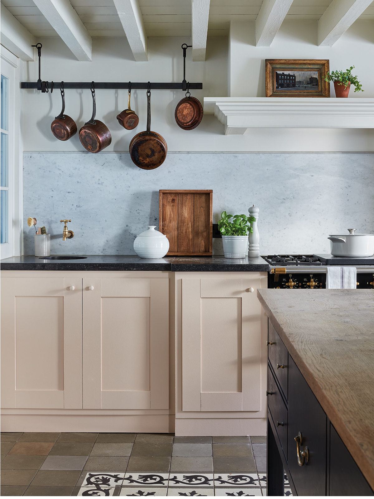
Farrow & Ball are on my bus and maintain that pink is a neutral! I just adore a pale warm pink as a neutral backdrop and  I feel it has more interest then it’s beige based counterpart and yet see how happily it sits with all the natural tones like timber, stone, marble and copper.

Colour Curator and author at Farrow & Ball, Joa Studholme maintains that “the palette of colours we want to use in the home has expanded, we’re looking to introduce warmer tones, which add personality and elegance while still feeling comfortable.”

Shape and texture

The large Merlin pendant light by Pooky adds interest and texture and hits the perfect balance of surfaces with the polished floor, textured concrete effect wall and rattan. For similar wall effects, take a look at the concrete effect paint by Craig & Rose.

Aside from paint, the new neutrals are all about the textures and materials in our furnishings too. I’ve already written about the huge trend for natural bamboo and rattan but these artisan materials coupled with their warm honey tones really bring the neutral scheme to life! This image above is just a riot of texture; from the glossy concrete floor to the woven bamboo furniture, from the patina on the metal to the glossy glazed pottery and finally wow, that plaster effect wall treatment is giving me the thrills! There is not a lot of colour here but the effect is a feast for the eyes.


So what do you think of the new neutrals? I’ll admit I’m struggling to find much that’s ‘new’ apart from by moving away from the cool tones towards the warm, they are not grey. And grey has been the dominant story for the past ten years. But despite the hype, I’m not seeing anything ground breaking or particularly innovative with these palettes- but maybe that’s the whole point. The new neutrals are comforting in their familiarity!

My top tips for using neutrals
  • This isn’t just about wall colour, there must be a rich palette including the right balance of texture, pattern and tones to stop it looking flat and dull.
  • Up the texture with panelled walls and decorative mouldings
  • Add depth and interest with different tones of a similar colour and don’t be afraid to add an accent colour. Make sure it is harmonious with the overall warm neutral palette.
  • When you have a room that’s pared down something has to create a visual feast for the eye so choosing interesting shapes and silhouettes will help bring the scheme to life.
  • If your room is South facing be aware that the warmth of the sunlight could turn your warm neutral more yellow than you intended.
  • Paler shades will maximise the feeling of daylight, giving you another dose of Mother Natures mood boost.
  • Let the natural light flood in! If you have a dark north-facing room warm based colours work well but beware that unless you have layered lighting the overall effect will fall flat.

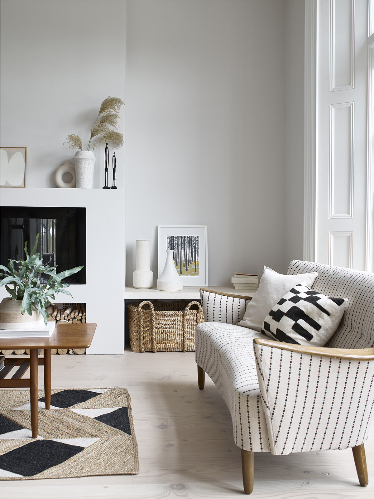
Image at top: Issac sofa by Sofa.com

Image below: Habitat

  • Interior Design
  • Interiors
  • trends
Interior Design Masters and interview with Drew Pritchard Podcast show notes S10 ep5 Interview with Nicola Harding, Podcast show notes S10 E4
  • Christmas
  • Interiors
    • colour crush
    • colour psychology
    • DIY
    • dream home makeovers
    • Home Office
    • Home Tours
    • Interior Design
    • Interior Styling
    • podcast
    • Sophie Robinson X Dunelm
    • Sophie Robinson x Harlequin
    • trends
  • Lifestyle
    • Business
    • Fashion/Beauty
    • Life
    • My House
    • Nosh
    • Travel
  • Rooms
    • Bathrooms
    • Bedrooms
    • Kids rooms
    • Kitchens
    • Living rooms
    • Outside
  • Videos
online influence award winner 2019
Interior Design Winner Sophie Robinson Insta
Videos

Listen

Listen Here

Online courses
by popular demand

Catch Sophie In All Her Colourful Glory On Instagram

Just back from the most magical girls’ trip to B Just back from the most magical girls’ trip to Barbados  and my heart feels so full. There’s something truly special about taking time out with your girlfriends. No schedules, no responsibilities, just sunshine, swims, long lunches, deep chats, and laughter that rolls late into the night. All set against the back drop of @zoe_brewer_ beautiful villa @skybluepink_barbados which felt the most perfect home from home.

Great girlfriends lift me, ground me, inspire me and remind me who I am. The power of great friendship is something to be celebrated and cherished, and I’ve come home recharged, reset and ready for what’s next. And @sophieabbottartist  is inspired for a fresh set of new paintings. Imagine the pink sunsets! 

Here’s to more sunshine, sisterhood and soul-nourishing adventures. Tag friend you’d love to spend some quality time with, preferably under the sun! And good news is Zoe’s just put her gorgeous villa available to rent. It’s honestly the perfect base for a gorgeous girls getaway ❤️
Is this your sign? I first read The Secret by Rho Is this your sign?

I first read The Secret by Rhonda Byrne twenty years ago, and it opened my eyes to the power of manifestation. Since then, I’ve used those principles to create a life filled with joy, colour and adventure. More recently, I’ve been inspired by neuroscientist @drtaraswart and her new book The Signs, which brings the science to the spiritual.

This year has been a tough one, and I’ve spent much of it in “doing” mode. But when we stay there too long, it’s easy to lose the openness that creativity needs to flow.

Travel has always been a big part of my vision. It fuels my creativity, connects me with inspiring people, and fills me with fresh ideas and energy for my work. My recent trip to Barbados reminded me of that; those colours, that light, that joy. I came home renewed and re-inspired.

While I was there, I found myself dreaming about hosting a retreat somewhere just as magical. But for now, the universe has opened a few spaces on my @elfennmarrakech retreats this December (1–5) and January (12–16).

If you’ve been waiting for a sign to travel, reconnect, and recharge your creative energy… this might just be it.

✨ Link in bio to find out more and to grab the last few spots!
AD It’s a real pinch me moment… my brand new t AD It’s a real pinch me moment… my brand new tableware collection for @dunelmuk Dunelm has officially landed!

We’ve created four joyful colourways, designed so you can mix and match like a true maximalist, or pick your favourite palette and play with the patterns. i wanted every plate, bowl and mug to have that perfectly imperfect painterly, handmade feel that makes it feel just a little bit more special.

Look out for my signature wavy edge and the tiny bug motif that pops up throughout the collection and there’s even more from the new festive collection that will mix in perfectly with this if you’re planning your Christmas table!

All dishwasher safe and ready to bring colour, charm and personality to your table. Available in store and online at @dunelmuk now. Dinner plates and pasta bowls, £8. Side plates £6. Large serving platter £25.

Because why should your plates be beige when they can be this beautiful?! 
Which is your favourite, let me know in the comments
AD It’s not often I find a holiday home that get AD It’s not often I find a holiday home that gets colour just right – but this Barbados villa had me at hello. A joyful mix of tropical brights and soft pastels set against crisp white walls, with a playful nod to Palm Springs mid-century style. Think banana prints, bold stripes and even a few traditional British antiques woven in for charm. It felt like a true home-from-home, full of personality and thoughtful details, all taken care of by my friend and fellow interior stylist Zoe @skybluepink_barbados 

With four bedrooms and three bathrooms it is situated in St James, super central and just a 5 min drive from the Paynes Bay and Sandy lane. It was the perfect backdrop to our girls get away! 

Good news is you can book it yourself via @_oliverstravels_  and yes, there’s still plenty availability, even for Christmas! Wouldn’t that be the ultimate gift! 

#ad #prstay
Welcome to my happy place! Every room in my home Welcome to my happy place!

Every room in my home is bursting with colour, pattern and joy. It’s where I found my colour confidence and created a space that feels perfectly me. And now, I’m opening the doors and inviting you in too.

Join me here for my new Discover Your True Colours masterclass, an intimate, hands-on creative day at my home near Lewes. We’ll gather around the kitchen table, play with palettes, and have transformative conversations about how knowing your true colours can change your life.

I’ll share the tricks, tips, and mindset shifts I’ve learned over years of designing, so you can start creating spaces that feel joyful and authentic.

It’s a cosy day with laughter, lunch and proper connection, a chance to soak up some inspiration, and to see what being surrounded by colour can unlock for you.

Thursday 20th November, only a few spots left.

If you’d love to spend the day with me and leave with the gift of confidence in your own style, write the word RETREAT in the comments and I’ll send you the link.
October is always a special one for me. My birthda October is always a special one for me. My birthday month, and true to my Libran nature, it’s been all about celebrating beauty, balance and connection. A month that honours the changing of the season and filled with gratitude in equal measure.

1. Warm sunny days and short sleeves to start the month
2. The best birthday cake ever from my brilliant brother @edwardrobinsonid “Drunk Barbie” will go down in history
3. Birthday with close friends as and family over lunch at home, a favourite way to celebrate.
4. The Harvest supermoon was spectacular and a signal to let go and reset 
5. Captured my moon shadow
6. Fabulous private tour of the awe inspiring Brighton pavilion with @yes.colours 
7. Blue skies over a lake swim at Swanborough lakes
8. I’ve made a pact with @jothornephotography to wake early and walk each sunrise. Feels great so far!
9. Started accupuncture with the beautiful @smallpointseast  and neck feels better already! 
10. Embarked on a four day solo walk along the SDW.
11. A fortuitous meeting with @bloominguniquesoul soul the bare foot energy coach along the way.
12. Annual pilgrimage to decorex for design inspiration
13. Delighted to bump into so many industry friends including @interiordesignmasters finalists @john_cooper_design @ritamillat 
14. Mind blowingly heart filling gig with the life force @littlesimz 
15. Beautiful Aufguss sauna experience with @firebirdsaunamaster 
16. Cold plunging @saunadelic_ 
17. Noticing the colours changing on my daily dog walk
18. And then transferred to barbados with @skybluepink_barbados 
19. Soaking up all the sea and sunshine energy 
20. Walking into November like…
There’s something really satisfying about a quic There’s something really satisfying about a quick kitchen makeover. Probably one of the most expensive and stressful rooms to design, I love it when you can make a big impact, without having to call the builders in.

When my Dad and step Mum moved into their new place, the kitchen was all very… beige. Perfectly good quality, just not to their taste. They craved more colour and personality to infuse their new home with more joy.  Nothing that a roll (or eight in this case) of my @harlequinfw Woodland Floral wallpaper, some paint, and a whole lot of DIY spirit couldn’t rescue. 

Dad hung the wallpaper himself, and to match in the ceiling and woodwork painted it in White Tie by Farrow & Ball which is the closest match we found to the back ground of the wallpaper. We finished it off with a toughened glass splashback to the hob and sink areas, made to order by a local glazier, and added but a few colourful accessories.

The transformation is major. It’s fresh, it’s joyful, it’s bold and just FULL of personality… and it proves, once again, that wallpaper in kitchens? Totally allowed.

Would you be brave enough to go all in like Dad did? If you fancy having a browse, my full Harlequin collection is now live over on harlequin.design. Link’s in the bio!

I’ll also be talking about this makeover and sharing my tips about using wallpaper in kitchens over on my new Substack ‘A Life In Colour’.
Some projects simply live in your heart forever, a Some projects simply live in your heart forever, and my collection with @harlequinfw is one of them.

This reel takes you behind the scenes of our creative process. I walked into that studio with 25 years of design experience and still learnt so much; from the design studio where patterns are created by hand, to the colour alchemy of the print rooms (where inks are mixed by eye). The creative artistry and manufacturing craftsmanship was inspiring.

A real pinch me moment was witnessing the final collection being showcased in my home.

Now the whole maximalist collection is shining on Harlequin’s beautiful new website and I could not be prouder.

I hope the collection inspires you to embrace colour and mix pattern to create a maximalist home that feels completely you. And to chase your career goals, because they might just come true!

Explore the full collection via the link in my bio

#HarlequinxSophieRobinson
Follow on Instagram
Sophie Robinson
  • © 2025 Sophie Robinson

    /
  • Contact/
  • About/
  • Design by MW

You're almost inside!

Leave me your best email to sign up for the Webinar

MG0001 Magnet Sophie using Tap 021 copy

You're almost inside!

Leave me your best email to sign up for the Webinar