

How to Mix Patterns: Master Bedroom Reveal
When it comes to decorating your bedroom, this is a great opportunity to really dig in to how you want to feel in a room. It’s common opinion that you should decorate your bedroom in calm, soothing colours that will help you unwind at the end of the day. In order to achieve this you need to reign back on the high contrast colours, stick to the mid tones as they are the least straining for the eye, and play it down when it comes to pattern.
But for me that just leaves me feeling a bit ‘meh’. And my bedroom isn’t just for sleep afterall. It’s also the room where I get up and go every day, where I prepare my face and get dressed, and generally launches me into my working day. I want my room to make me feel empowered and fabulous and set me up!
I am also lucky enough to be a really good sleeper, so I don’t have to dwell too heavily on creating the overly calming vibe. However once the lights are off or turned down low, the patterns and colours dim into the back ground anyway. So if you fancy yourself a full on maximalist bedroom, I really don’t think it’s something that will keep you up at night.
So step away from the taupes, the greys, the pale pinks and into this luxurious combination of textures, rich tones and expressive pattern that work towards making a room that feels gorgeous, and makes me feel pretty fabulous too!
Here’s how I did it…

My new collection of fabrics and wallpapers have formed the basis for the bedroom transformation. A maximalists dream, they can be mixed and matched with ease to create something truly original.
The key to successful pattern mixing is a strong colour palette that unifies all the different patterns togther. You can then be creative by mixing different pattern motifs, from stripes, to plains, checks to florals, even a beetle! I also like to think of a wide mix of textures too so include cottons, eaves, and velvets in your palette. This is a selection of fabrics from my new collection with Harlequin that means you can mix and match maximalist patterns with ease as i’ve made sure the colours sing togther in harmony and the the scale of the different patterns create plenty of interest.
The View

Ceiling Pendant Goddess in Gold by National Lighting; Wallpaper ‘Wonderland Floral in Lapis/Emerald/Carnelian’, Harlequin; Armchair on the right ‘Dappled Leaf in Emerald/Amber’, Harlequin; Armchair on the left covered in Wonderland Floral in Lapis. Cushion in Paper straw stripe both Harlequin. Curtains made in Linara in Alabaster by Romo. Jumbo PomPom Trim in Blueberry Pie, Samuel and Sons
Whenever designing a room, I always asses from the get go, which is the rooms best bits. Having recently installed this floor length window in order to enjoy the view, I’d have to say that this is the area of the room you are instantly drawn to as you walk in. I’ve kept my plain off white curtains as they frame the view beautifully and the jumbo pom pom trim is just enough to add some much needed detail and elevate the simple plain fabric. The plain fabric also balances against the expressive Wonderland floral wallpaper and helps to create a visual pause.

It’s key to think how you will use the room and with the new view I really wanted to embrace it. By positioning two chairs next to the window draws you in and urges you to sit down, relax and take in the beautiful view of the tree tops beyond. In a busy household my bedroom is my sanctuary so having a seat to sit is a real treat. I’ve had two old armchairs recovered in different florals, and I love how they almost take on their own personality, dictated by the fabric I’ve chosen, one a bold dappled leaf velvet and the other in a loose covered chintz, complete with pretty skirt.
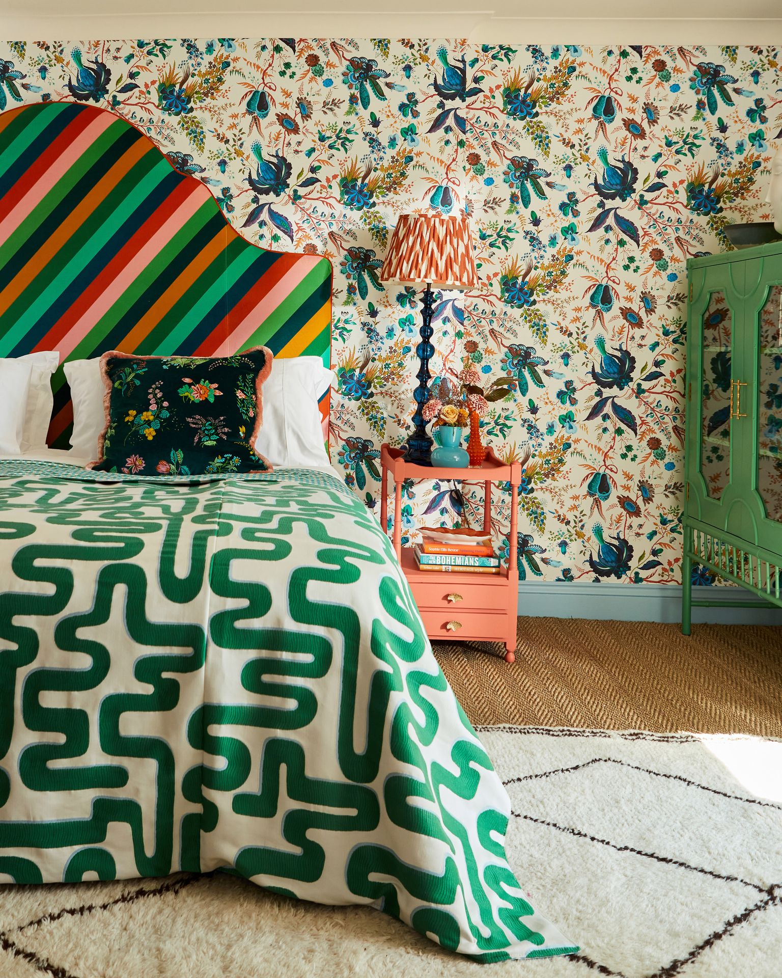
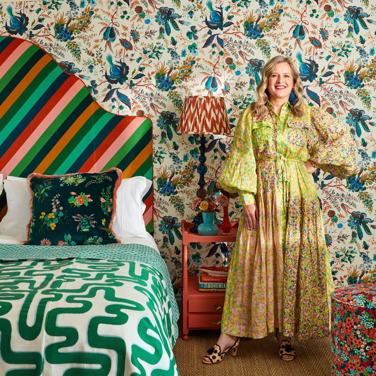
Bedspread made in Meander Emerald/Aquamarine fabric, Harlequin and Basket Weave Emerald /Aquamarine fabric, Harlequin; Cushion in Woodland Floral Jade/Malachite/Rose Quartz fabric, Harlequin; Headboard in Sherbet Stripe Emerald/Amber/Rose fabric, Harlequin; Bedside Table is vintage, painted in Heat by Little Green; Lamp Shade, Pooky; Lamp Base, Pooky (discontinued)
Next up is to tackle the bed and oh boy do I love a statement headboard! My bedroom is a generous 5m x 5.5m so can really take it although I’d say that the size of your headboard is not dictated by the size of your room- a huge headboard in a small bedroom can look utterly fantastic. For the headboard I chose the striking Sherbert Stripe, and I love the twist on a classic by having the stripe on the diagonal, combined with a classic shaped headboard. This fabric also helps act as a lynch pin for the colour scheme- as it includes all the key colours that are spun out onto the scatters, bedding and upholstery.

Bedspread made in Meander Emerald/Aquamarine fabric, Harlequin and Basket Weave Emerald /Aquamarine fabric, Harlequin; Cushion in Woodland Floral Jade/Malachite/Rose Quartz fabric, Harlequin; Lamp Shade, Pooky; Lamp Base, Pooky (dsicontinued)
With the wallpaper and hero Sherbert Stripe fabric in position, it’s now possible to add many other patterns on top and this can be done quickly by dressing the bed. Luxurious velvet cushions, siuper soft woven bedspreads and patterned silk lampshades all bustle together to create this luscious layered and luxurious loook. I absolutely love fabrics and textiles so incorporating as much as possible into a scheme brings me untold joy!

Dressing Table Bambou Green Mahogany Desk and Dressing Table, Oliver Bonas; Mirror John Lewis x Matthew Williamson; Large Ornamental Lidded Pot Frida Vase by Jonathan Adler, Footstool in Wildflower Meadow Carnelian/Aquamarine/Peridot fabric, Harlequin; Carpet is Seagrass Herringbone by Alternative Flooring
In order to pull the whole scheme together, I invested in a couple of new pieces of furniture. I was thrilled when I saw this vibrant shade of emerald green in highstreet store Oliver Bonas- it was like it was meant to be. My antique furniture, while not shown, also goes really well with this wallpaper due to the beautiful autumnal tones in the leaves. But for a pop you cannot beat this green. I’ll admit Tom was not a fan of this furniture, he prefers the patina of real wood, but as it’s my dressing table, I got my way!
This is a room that makes me feel fabulous! I finally have a dressing table, for the first time in my life, and an armchair to relax and reflect which overlooks the tree tops. I’ve surrounded myself in luxurious fabrics and jewel coloured patterns with the purpose of this room to embrace and indeed celebrate who I am when I feel my best.
Remember there is no limit to how many patterns you can have, have as many as your heart desires! However, here’s a few tips to keep in mind which will help your mix of patterns truly sing!!
5 tips for mixing patterns:
- Choose a hero fabric or wallpaper that has all the colours in it that you would like to use in your scheme. Use this as your reference point when finding other patterns and colours to mix with it.
- Ensure you have a good mix of patterns from floral, to stripe, check and geometric. And don;t forget a plain, it can create a welcome pause, or break up a fight if you feel there is too much going on.
- Play with the scale of your patterns so areas are still defined and the different patterns don’t just ‘merge into one’. I like a big sacle floral, a wide stripe and a narrow stripe and a smaller ditsy floral to create pace.
- Don’t forget texture, as this can add pattern too. From the stripe of a jumbo cord, the swirls of wood grain, the weave of the sisal flooring, subtle patterns add depth and interest too.
- If you don’t have the budget for a full room makeover, add bold pattern as an instant update. Switch plain lampshades for a patterned, change up your plain bedlinen or add a dazzling patterned throw, add some jazzy cushions or roll out a patterned rug for a bit of wow.


