fbpx
Sophie Robinson
  • Home
  • Workshops
    • Marrakech Retreat
    • Ban the beige
    • Masterclasses
  • Online Courses
  • Collaboration
  • Podcasts
  • Blog
  • About
    • About me
    • Work with me
    • Press
  • FAQs
  • Contact
  • Interior Design
  • Interiors
  • Kitchens
03 Sep 20

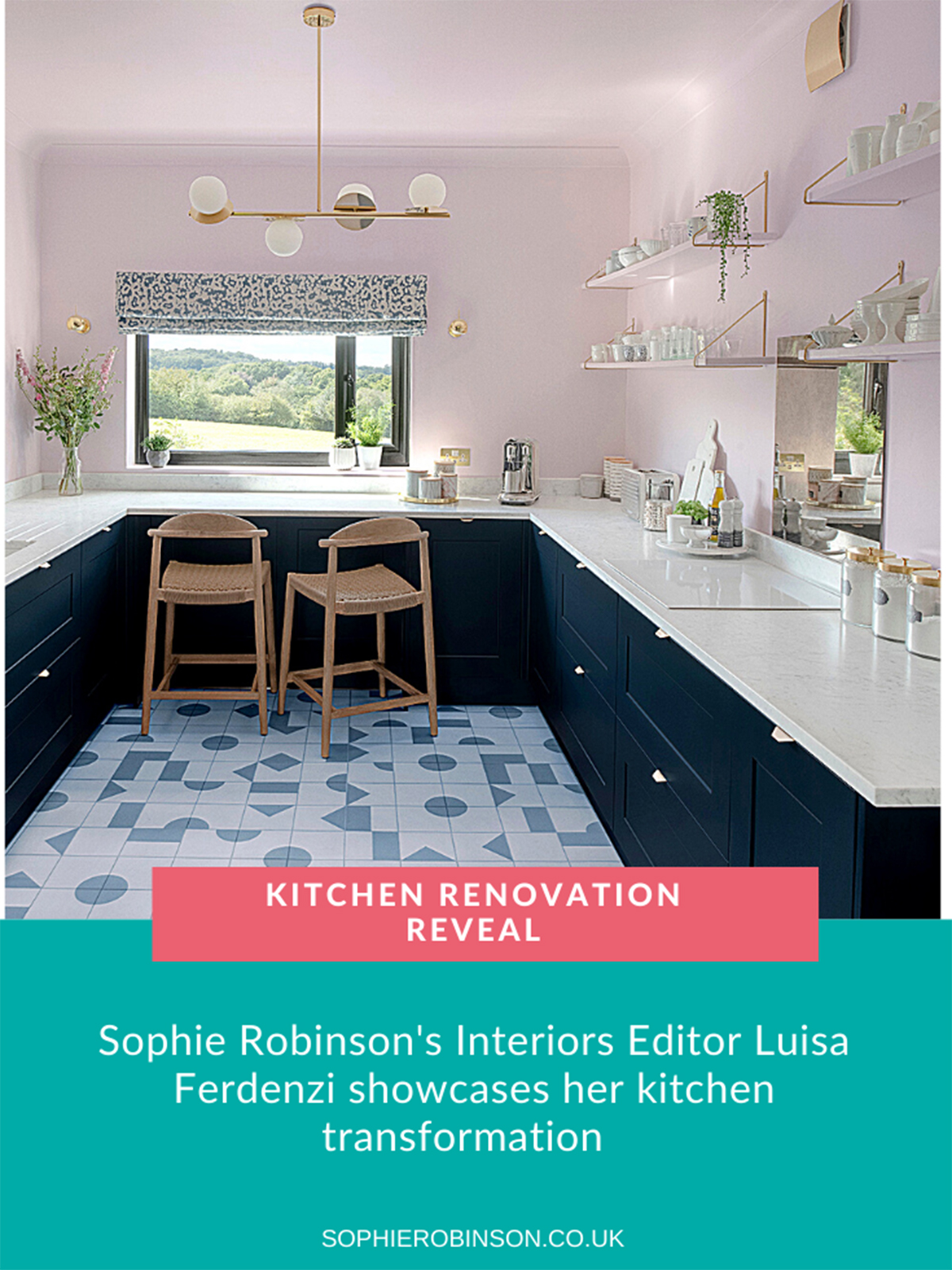
Luisa’s kitchen renovation reveal

Kitchen renovation. Pale pink walls and ceiling, pale blue and white geometric floor, navy Howdens units and open shelving. Farrow & Ball pink kitchen

Welcome to my blog takeover, I’m Luisa, Sophie’s Interiors Editor and you may have seen over on Sophie’s Insta stories that I’ve just renovated my kitchen. Firstly though a huge thanks to Sophie for letting me loose on here to share the journey. For those of you who love an explosion of colour, as you would expect from Sophie, may be a little surprised to see a bit more of a gentle exploration of colour instead!

The before…

As you can see from the before picture below, not an ounce of colour to be seen and this was pretty much the kitchen when we moved into our East Sussex ex-industrial house almost 7 seven years ago.

Our old kitchen – monochrome yes, stylish no!

The first thing we wanted to make the most of was the view. Our house is a little upside down, as in the kitchen is upstairs, so the first thought was to create a breakfast bar at the window. I couldn’t wait to get rid of the eyesore of an extractor fan in the corner, I felt the combination of that and the wall cabinets made the space feel more enclosed and a bit depressing.

My first port of call was Howdens for the units as my brilliant project manager, Steve Coe, works with them on a regular basis and couldn’t recommend them enough. Initially, I wanted pale pink cabinets which meant getting paintable units which would incur an additional cost. So I went with my next choice, navy cabinets although I didn’t want anything with a grain effect. By chance, the same day as my consultation they had just launched the Chelford in navy so it was decided.

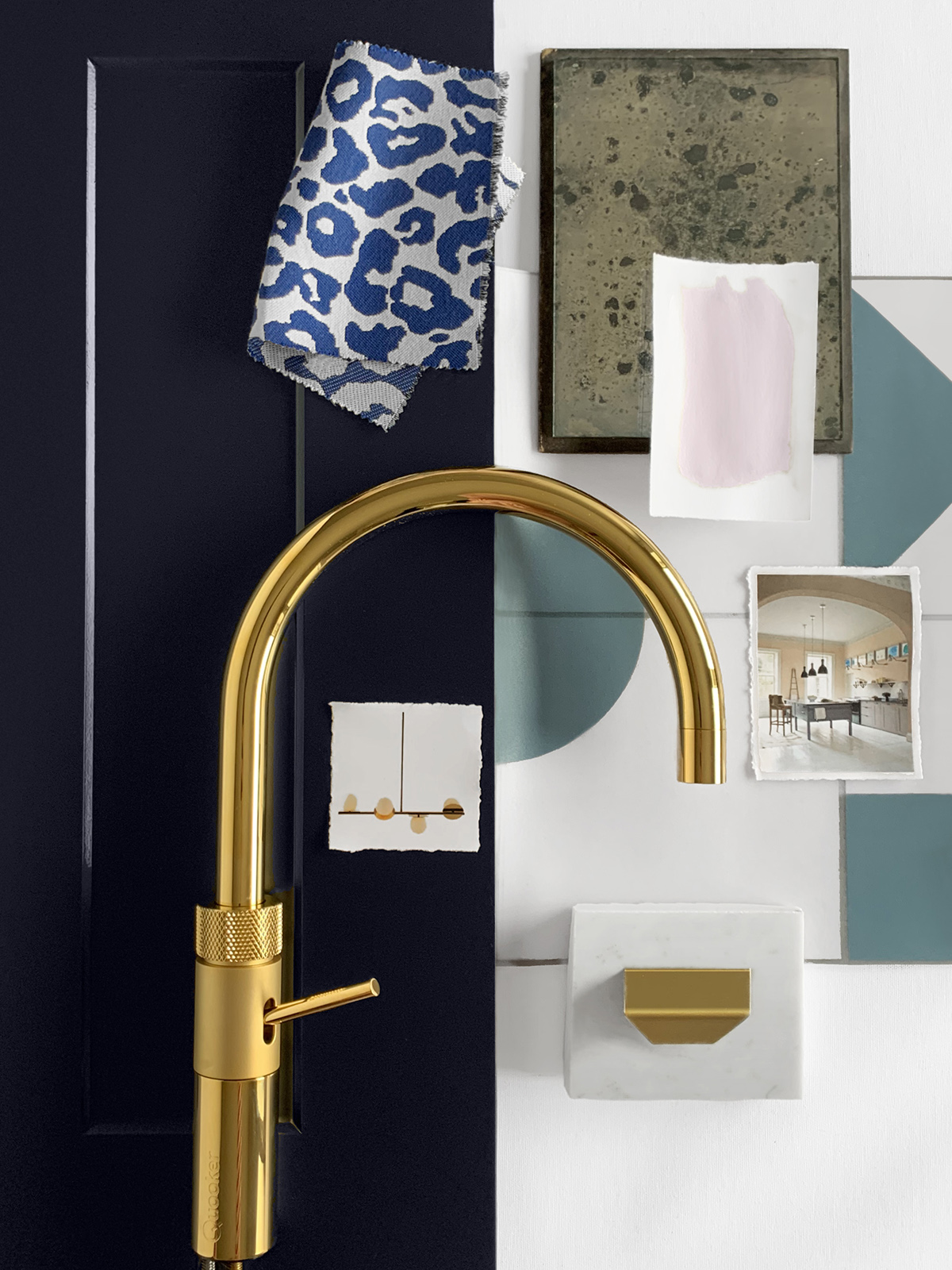
The next major part was the worktop. I had always dreamed of white marble but always thought it was way out of reach for me – until the lovely folks at Cullifords stepped in. The only way to choose a stone was a visit their yard in Kingston Upon Thames where there’s an abundance of natural and man-made materials. Director, Oliver Webb showed me around and was so helpful and so knowledgeable that I finally landed on the beautiful white Carrara. I know that marble is not very forgiving as a worktop but I didn’t want to regret my choice and so stuck with my gut decision. If you need any help on deciding on a surface do check out Cullifords guide to buying stone here. For any further information, you can contact them on info@geraldcullifords.co.uk.

The Culliford’s yard. With so many amazing stones it took a while to decide on just one!

The poor decorators had a bit of a job covering up that blue as the undercoat just slid off, but with a bit of perseverance and some trusted Zinsser primer the boys created the perfect backdrop for the open shelving.

After….

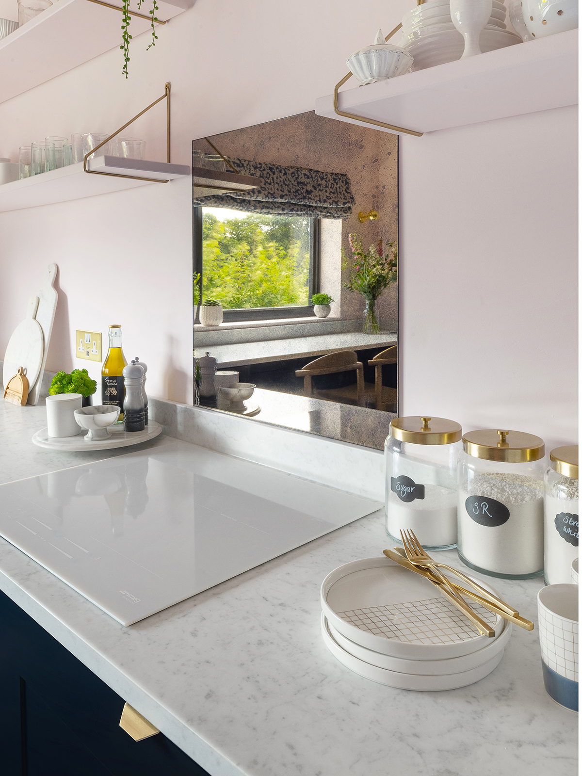
I painted the ceiling and the wall the same colour to accentuate the high ceiling and to create a uniform look. It took quite a few tester pots to find the right shade, but the fabulous pastel Middleton pink (modern emulsion) by Farrow & Ball was a winner. I also painted the shelves the same colour (modern eggshell) so they recede into the space to allow the pieces on them to stand out. It’s quite a difficult one to photograph but hopefully, you can see that’s it’s not a sickly sugary pink but a delicate pastel shade to add just a touch of warmth to the space.

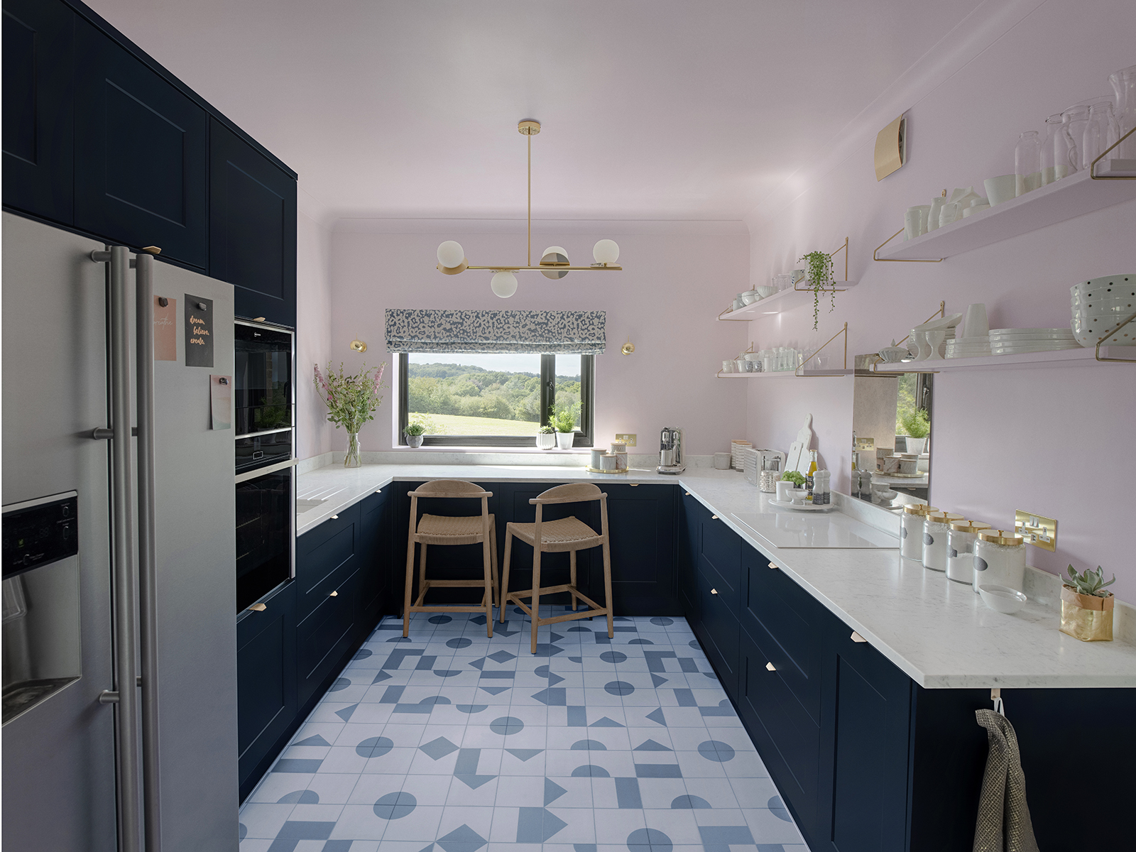
Carrara marble worktop, Cullifords; Walls and ceiling in Middleton Pink modern emulsion, Farrow & Ball; Maddox Cement Tile Vinyl Flooring, Atra Floor; Burnley 62cm bar stools, Wayfair; Brass opal disk ceiling light, HouseOf; Bronze tinted antiqued mirrored splashback, Rough Old Glass; White induction hob, Smeg; Paco Storage Jars with brass lids, La Redoute; Gold double socket with USB, Dowsing & Reynolds.

I’ve always loved the look of encaustic tiles but with the uncertainty of the condition of the floor underneath and the added cost of underfloor heating, I chose a vinyl. But not just any vinyl, I have always loved the modern and unique designs at Atra Floor and I finally chose the Maddox for the fab cement tile vibe and the soft blue tones tie in with the scheme perfectly.

I was conscious that going for open shelving will reduce the storage space somewhat but I’m glad I stuck with it as I get to show off some of my beloved ceramics but they also have a practical use too. We didn’t forego storage under the breakfast bar as we chose half-depth wall units for things we may not need to access all the time and added push release latches – so no need for handles.

After quite a bit of searching, I found these subtle profile handles from East Coast Kitchens, so Cullifords’ fabricator Steve did the minimum overhang of the worktop as possible so the handles were not hidden. Photo by @ljrouse

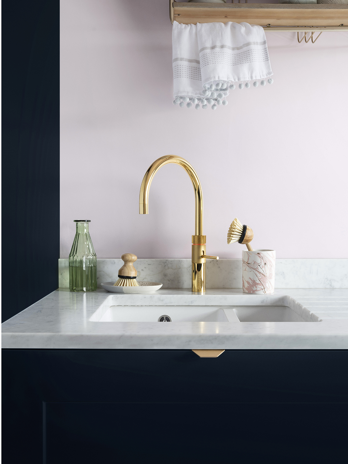
I just love the contrast of the navy units and beautiful Cullifords marble worktop and not to mention the stand-out piece, the ever so clever, Quooker tap. Photo by @ljrouse

Absolutely loving my new Fusion cube tap by Quooker. Not only does it provide instant boiling water but also chilled filtered still and sparkling water – my saviour during the heatwave in the UK. Photo by @ljrouse

Really rough on bronze mirrored splashback, Rough Old Glass; Acao Porcelain Dessert Plates, Acao porcelain cups, all La Redoute. Gold double socket with USB, Dowsing & Reynolds. Photo by @ljrouse

I was so delighted with the beautiful marble worktop that I couldn’t quite bring myself to have a square of black for the hob that would look out of place. So after a bit of research, I discovered that Smeg had just launched a white induction hob, which is just perfect for the scheme. As you can see from the moodboard, I’ve held onto a sample of antiqued mirror for ages as I just love the finish and always hoped that I could use it someday.  And here it is in all it’s glory, in a bronze tint, for the splashback, by Rough Old Glass. You may notice that there is no extractor fan above the hob – they are a pet hate of mine. But I remember when Sophie designed her mum’s annexe she used a standard extractor fan, which before then I didn’t think was an option. So I found that Awenta do them in different finishes and so I ordered one in gold on Amazon –  do note: you need 150mm when using in the kitchen.

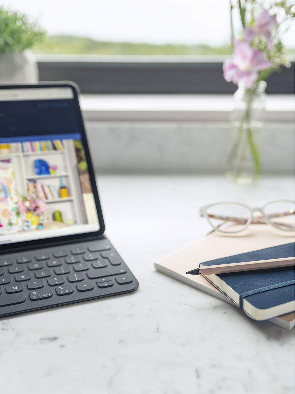
The new breakfast bar has become my new workspace, a welcome change from the dining table.

Our budget didn’t quite stretch to a brand new blind so I covered the existing Roman with some fabric I’ve had at home for a while. It’s very simple to do and you can find loads of how to’s on You Tube. Another tip –  may be obvious but do measure the height for where you plan to use the stools. These Burnley wooden stools with rope seats at Wayfair are 65cm high and are just perfect for counter stools.

As you may have heard in the latest episode of the Great Indoors podcast, Sophie and Kate said to go with your gut and don’t hold back otherwise you’ll regret it. I certainly don’t regret any choices, not just yet anyway!

A huge thanks to the brands who gifted their wonderful products:

Cullifords, geraldculliford.co.uk

Quooker quooker.co.uk

Atra Floor, atrafloor.com

Rough Old Glass, rougholdglass.co.uk

Wayfair, wayfair.co.uk

HouseOf, houseof.com

La Redoute, laredoute.co.uk

Thanks to all the following who made this project happen!

Steve Coe & Sons, facebook.com/stevecoeandsons

Nick South Carpentry, @nicksouthcarpentry_building

Michael Charles Painting & Decorating Services, @michaelcharles_painting

Greg Walker Painting & Decorating, @thegregar

Charlie Campbell plumbing services, @plumbingheatinggas

Rise Electrical, @rise.electrical

  • Interior Design
  • Interiors
  • Kitchens
Dulux colour of the year, interview with Skin, Podcast show notes S8 ep5 Kitchen and bathroom special, Podcast show notes S8 ep4

comments

Kirri Hendriksen on 03.09.20

Thanks for this post, I’m also looking at new kitchen from Howdens I was wondering how much the marble worktop cost you as I currently have a compact laminate quoted.

Reply
Sophie Robinson on 27.09.20

you are best to get a quote for your particular design as all quotes will be different, depending on the kitchen deisgn and size

Reply
Henny Swan on 04.09.20

This is stunning – beautifully put together. I am moving to a 1950s house with an L shaped kitchen. Am planning pink and blue using Lick Pink 02 and Blue 06 but am still undecided. What was the blue you used with the Middleton Pink? Also where did the shelving brackets come from?

Am also wondering about painting the ceiling pink too. There are small French doors by the seating area and a window in the kitchen bit. It gets the light in the afternoon. What do you reckon?

Thanks for sharing he details on this.

Reply
Sophie Robinson on 27.09.20

I love the idea of the pink ceiling- a pale pink can really take it!

Reply
Priya Dharshini on 28.01.21

The transformation is a spot on, Sophie! I loved the marble and the open shelves. It looks simple and elegant.

Reply

Leave a Comment

Cancel Reply

Your email address will not be published.

  • Interiors
    • colour crush
    • colour psychology
    • DIY
    • dream home makeovers
    • Home Tours
    • Interior Design
    • Interior Styling
    • podcast
    • trends
  • Lifestyle
    • Business
    • Fashion/Beauty
    • Life
    • My House
    • Nosh
    • Travel
  • Rooms
    • Bathrooms
    • Bedrooms
    • Kids rooms
    • Kitchens
    • Living rooms
    • Outside
  • Videos

mailing
list

Videos

Listen

Listen Here

Online courses
by popular demand

Catch Sophie In All Her Colourful Glory On Instagram

Relaxed wild flowers are having their moment. The Relaxed wild flowers are having their moment. The award winning gardens at the recent Chelsea flower show all showcased wild style flower gardens, celebrating the diversity of nature, supporting wildlife.  Their soft willowy randomness is a lovely antidote to the strict structures of life. I love to see wild flowers ( and a fair fee weeds!) in my garden and in the motifs I choose to decorate my house in. But partnered with a tight geometric creates the tension I enjoy. A little bit of structure, a little bit dishevelled, it is the perfect balance for me, shown here in the patterned tiled floor and botanical print chest. Helps me go with the flow without losing my way. ❤️ are you up for taking it to the wild side?!
Ban the beige hey?! Popping the colour as usual l Ban the beige hey?!

Popping the colour as usual lols. I’m lusting after this green and purple combo right now. What colours are lifting your vibe today?

Tap for credits 😉x 
#bantgebeige #colourlover 
#dopaminedressing
Who else is absolutely struggling today after the Who else is absolutely struggling today after the four day party weekend! I’ve abandoned my desk and resorted to tidying the house instead. Here is a rare glimpse of my sons tidy room! 
While Arthur chose this colour scheme 5 years ago, it’s still going strong but I’ve updated it with a large area rug from @alternativeflooring designed by @margoselbystudio . I’m a BIG FAN of big rugs and what I like about this one is you can order it in a specific size. I recommend 30-50cm clear of the skirting boards all round, tucked under the bed and armchair it feels luxurious and fills the room with more colour and pattern. Floors often go unthought of but is another place to add impact to your schemes. ✅

CREDITS [ad: press product]
Walls painted Atomic red, ceiling gentle sky @littlegreenepaintcompany 
Made to measure rug in Margo Selby loop @alternativeflooring Pouffe in Aluro green @evasonaike 
Blind made in textile Hawai by Joseph Franks @svenskttenn 
Bed linen in liberty Margaret Annie @cocoandwolf 
Kantha bed throw by @matthewwilliamson at @johnlewis 
Bed bolster in Casper Seagreen @linwood_fabric 
Cushions @finecellwork 
Wire Shelf @cotswoldco 
seletti bird lamp @amaraliving 
Armchair is vintage 
📷 @aluncallenderphoto 

#bedroom #boysroom #kidsroom #banthebeige #colourlover #mycolourfulinterior #colourfulhome
Happy jubilee! It has been a weekend of parties an Happy jubilee! It has been a weekend of parties and celebrations and a much needed 4 day break! I felt like a queen in this @needleandthreadlondon gown for the school jubilee ball and am wearing it again tonight for the @thefeverclub jubilee shenanigans. Dancing is so good for the soul, I’ve not done enough of it for too long! Feet are feeling it though so I’m ditching the heels and wearing the air max  with this dress tonight! How have you celebrated this weekend? 

Ad @needleandthreadlondon dress bought with press discount. 
#schoolball #ballgown  #costperwear #redress #jubilee #platinumjubilee
According to some recent research 24% of us look t According to some recent research 24% of us look to friends and family for design Inspiration, 21% to makeover tv shows and 18% to instagram. But while it’s great gathering ideas and opinions, ultimately creating a stylish home has to come from you if you are going to love the home you live in. The extraordinary Colour Psychology framework helps you unlock the colour palette that is perfect for you and gives you the superpower to create rooms that feel as good as they look. Suddenly other peoples opinions, trends, and influencers no longer hold sway. Creating a home is deeply personal, an exploration of what makes YOU happy. For me it’s all about the pattern, texture and plenty of intense colour. Tasteful grey interiors leave me feeling flat, I love the energy of a colour clash! If you want to understand your relationship with colour and how to design schemes that affect your emotions in a positive way, this is the last weekend to enrol in my online course, Colour Psychology for interiors. You can find the link to learn more up in my bio. It’s my most popular course to date and has transformed the way thousands of people feel about their interior spaces. 
Let me know what your happy colours are down in the comments below. 

Tap for credits 

📷 @aluncallenderphoto styling @katemcphee #colourpsychology #colourpsychologyforinteriors #banthebeige #ihavethisthingwithcolour #myeclectichome #patternclash #maximalistdecor #colourcourse #mycolourfulinterior #punchyhome #cosyhome #countryliving #bedroom
Did you know 50% of people use social media to fin Did you know 50% of people use social media to find inspiration on how to decorate their living rooms? I’m definitely one of them! That’s according to a study by Sky Glass, the streaming TV from @sky_uk . I’ve been investigating the latest interior trends we are lusting after, and how our living rooms are changing- as we say goodbye to three piece suites, and hello to sustainable vintage furniture, statement rugs, wall prints and cosy-ing up the sofa with throws and cushions. As you can see I’m all over the trends! If you head over to the @sky_uk channel today, I’ll also be answering some interior design questions all about styling your TV. Would love to hear what you think are the living room trends to watch. 
 #skyglass #ad 

#banthebeige #colourlover #livingroomdecor #livingroom #maximalistinteriors #livingroomdecore #livingroomdecorideas #homestyle #instahomedecor #chintz #colourmyhome #colourmehappy #cushionlove #styleithappy #florals #gallerywall #berberrugs #ihavethisthingwithpatterns #ihavethisthingwithcolour
Ah @the_rhs Chelsea! What a feast for the eyes! In Ah @the_rhs Chelsea! What a feast for the eyes! Inbetween biblical downpours, thunder and lightning, it was a wonderful day of colour, design and chatter with some wonderful women! I’m slowly falling in love with gardening and my phone roll is full of inspiration after being immersed in natures finest. Thanks @michelleogundehin and @hazelgardinerdesign @thesohoagencyuk for the company. And a big congratulations Hazel on this stunning floral installation. And don’t forget if you want to hang out and be inspired by all things colour then my FREE live webinar is on tonight (25th) at 7pm tonight! Hop on to my profile for the link to sign up. Cannot wait to share some inspirational colour filled time with you all 

#rhschelsea
This is the first room we decorated after our reno This is the first room we decorated after our renovations. The entrance to your home creates the first impression. It’s also the room you walk into first thing in the morning and when you return home at the end of a long day. It needs to create the right welcome and what that feels like is hugely personal. For me I chose my favourite colours, this powerful cobalt  blue has always been a colour I’m drawn to. My wardrobe is full of it. And the bright pink is another one that always makes me instantly happy. Together they are a striking combination and I think anyone who walks through my front door, immediately gets a sense of what I’m about. I’m passionate about creating interiors that authentically  reflect the people who live there. Studying the psychology of colour made it so much easier for me, giving me a deeper understanding on the affects of colour and streamlining my process. If you’d like to know how to unlock your colour super power, join me for a free webinar this Wednesday evening (available to up for 48 hours after). It an introduction into colour psychology for interiors and my hope is it inspires you to have the courage and conviction to know what’s right for you.  And for a deeper dive my online course Colour Psychology for interiors has opened for enrolment. All links to sign up are in my bio on my profile @sophierobinsoninteriors 
What does your hallway say about you? 
📷 @aluncallenderphoto 
CREDITS walls in lazuli by @zoffanyfw stair runner @roger_oates floor tiles @claybrookstudio door painted in rose ash @sanderson1860 

#colourpsychology #colourpsychologyforinteriors #banthebiege #punchyhome #hallway #boldcolourinteriors #colourlover
Load More… Follow on Instagram
Sophie Robinson
  • © 2017 Sophie Robinson

    /
  • Contact/
  • About/
  • Design by MW

Don't forget to join!

You're almost inside!

Leave me your best email to sign up for the Webinar