fbpx
Sophie Robinson
  • Home
  • Workshops
    • Marrakech Retreat
    • Ban the beige
    • Masterclasses
  • Online Courses
  • Collaboration
  • Podcasts
  • Blog
  • About
    • About me
    • Work with me
    • Press
  • FAQs
  • Contact
  • Interior Design
  • Interiors
  • My House
12 Mar 19

My hallway reveal!

At home with interior designer Sophie Robinson. Her bright and cheery hallway has dramatic bluewalls painted in Lapis by Zoffany, blue patterned tiles by Claybrook and a bright Rose stair runner by Roger Oates
Quite possibly my favourite room in the house right now, okay the only one that’s actually finished, is my hallway. Hallways can so often be overlooked, and kind of just painted out in some neutral shade of white at the end of a renovation because you’ve simply run out of money and inspiration. For my own renovation, controversially I decided to decorate the hallway first. The very clever builder husband was quick to point out the folly of my ways, as the hallway should on a practical level be decorated last. This is because it gets wrecked while you are trying to finish the other rooms in the house. Which this hallway did indeed get scuffed and battered as iron beds were carried up the stairs, dinging the paintwork and builders continued to get dust everywhere. Well, it had its second coat and paint and is ready to be revealed to you in all its glory.
But before we do that, we all love a good before and after, so let me tell you the full story behind my hallway reveal
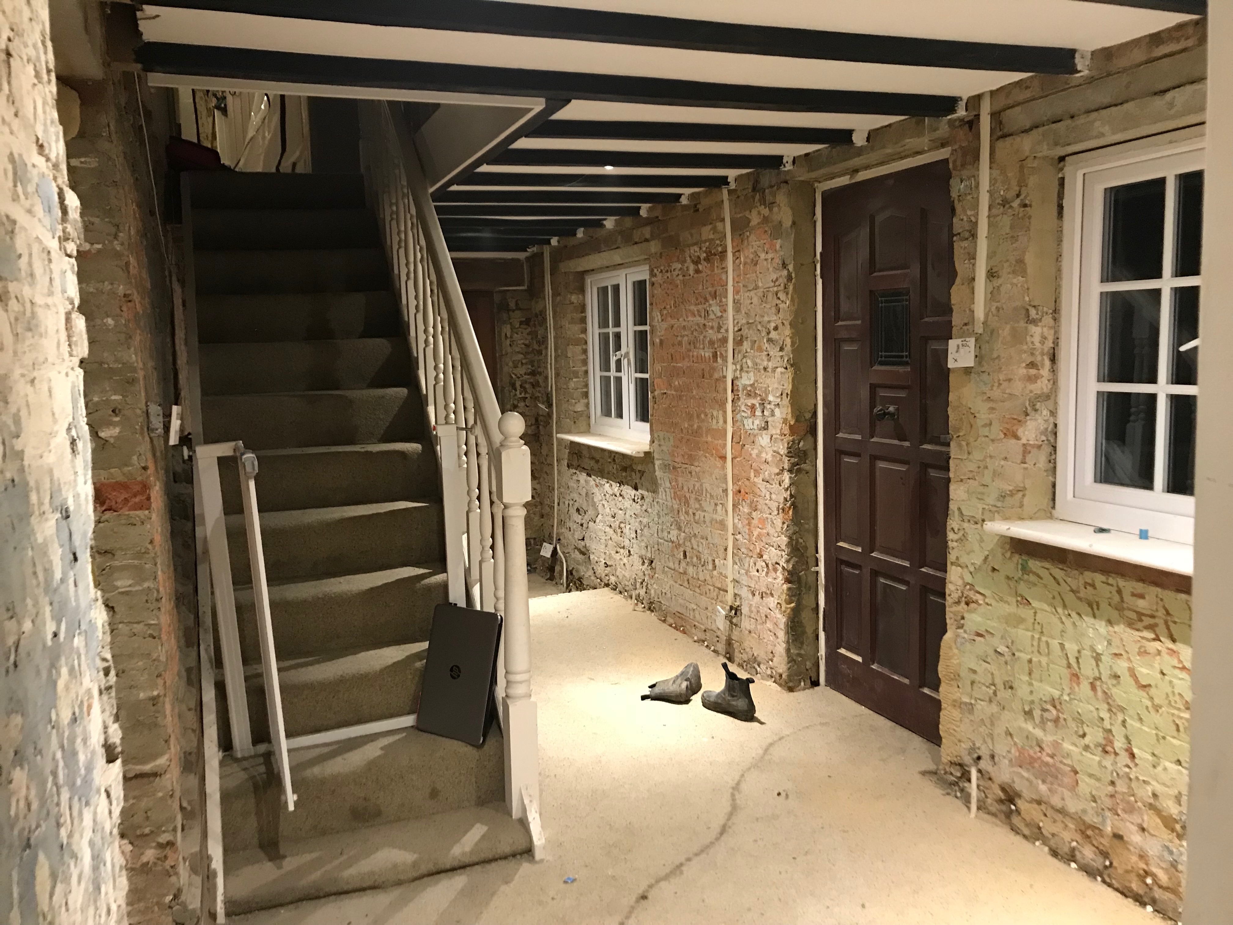
The before shots…
The house when we moved in was a horror of magnolia. There were design crimes at every turn. The beige carpet, the short curtains, the fake brick slip wall, the naff black beams… the list goes on
Everywhere you looked there was fake character and no real character. And for a busy family home set in the countryside, the carpet was a nightmare. I’m completely baffled why anyone would want carpet in a hallway wherever you are. It’s really impractical and just wrong!
The original bread oven, from the early 1900s, was the first victim of my redesign. Cute detail it might have been it was pointless, hidden behind an open door most of the time and we needed the location to house the new underfloor heating system. So it got sledgehammered.
Next the staircase was up for the chop. The previous owners had bought an off- the -peg staircase, but didn’t seem to matter to them that it didn’t actually fit the house! Shall we add that to the list of design crimes!
Because we found rising damp throughout the ground floor of the old part of our house we had to hack off all the plaster. This meant all the radiators had to come off too. However, this did give us the idea to put in retro fit overlay underfloor heating, which wasn’t in our original plan. To read more about our underfloor heating system, which I have to say a year on is the best thing ever, then read my post here.
So are you ready for the big reveal…..!
At home with interior designer Sophie Robinson. Her bright and cheery hallway has dramatic bluewalls painted in Lapis by Zoffany, blue patterned tiles by Claybrook and a bright Rose stair runner by Roger Oates
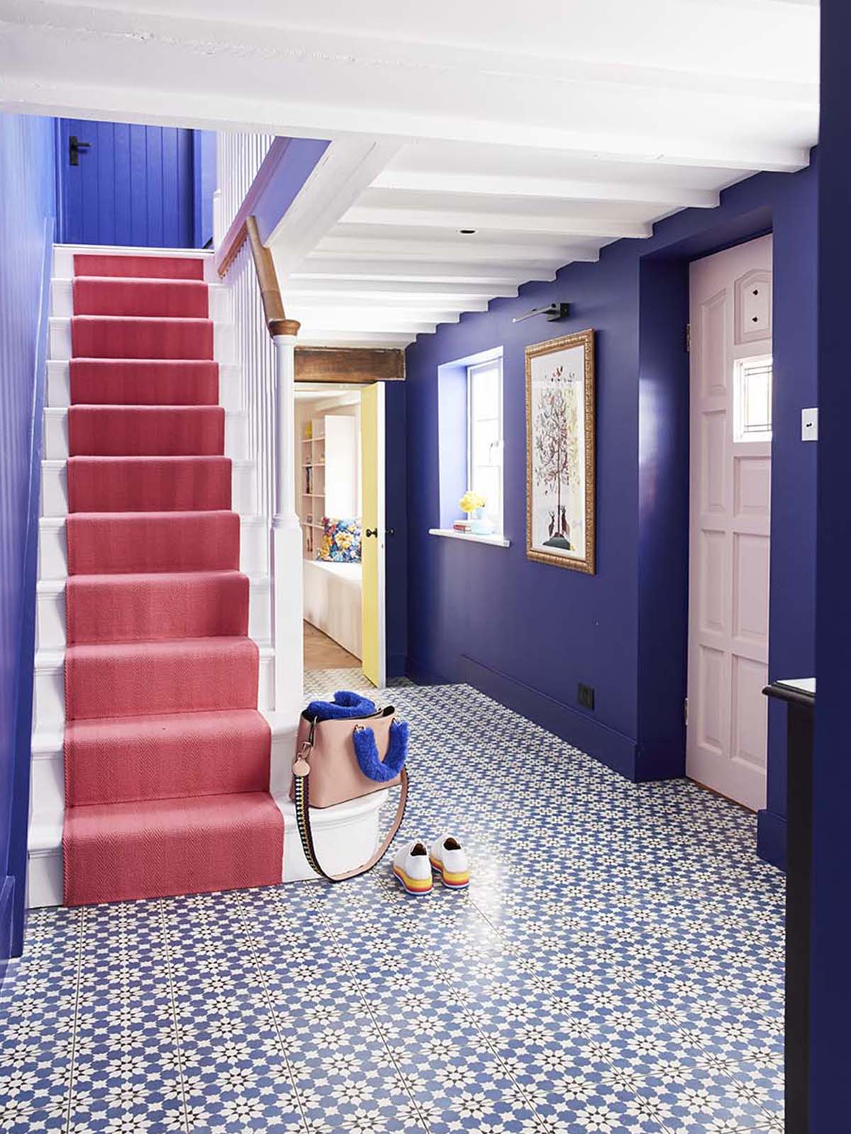
Pick a colour scheme you love that will set the tone for the rest of the house
Where do I begin! Well, I began with the wall colour. Zoffany sent me their latest paint chart and collection of colours and this Lazuli just leapt off the colour card. At the time I was designing my mum’s house but I banked it and just knew I had to use it somewhere in my house. It has ended up being the perfect choice for my hallway, as I wanted something dramatic, that said “HELLO AND WELCOME HOME”  as you walked through the door and I find this colour especially spiritually uplifting. Notice too how lighter the hallway feels since we painted out the black beams.
You can also see our new staircase in this shot which we had built, designed and fitted by a local staircase joiner. It cost us around £3000 but we feel it’s a real investment in the house and my husband loves it. He worked with the carpenter to design the oak handrail, the newel post and the extended sweeping first step. Nothing off the peg was going to be right and Tom really enjoyed this design process. Which was fine by me as it left me to choose the paint colours!
Colour queen Sophie Robinson reveals her renovated hallway featuring vibrant blue walls painted in Zoffany's Lapis and a unique black sideboard with multi-coloured floral design
Create a feature floor
From this view, you get a real feel for the luxurious cement tiles. Again I agonised over these as investing in a patterned floor tile is a big commitment. However again I think a hallway is a great space to be a little experimental. This beautiful tile, called Old Havanna Bauta, fitted in so well with my scheme. I sourced them from Claybrook Studio and found their prices to be massively competitive so do check them out. Cement tiles are a labour of love to lay and need plenty of sealing while you are laying them, so they don’t go down fast. However, I think they are worth it and give an old house a feeling of provenance, which was important to me. You can read more about the pros’ and cons of cement tiles in my blog post here. I continued the classic blue and white story by painting the ceiling and staircase in Perfect White by Zoffany.
Colour queen Sophie Robinson reveals her renovated hallway featuring vibrant blue walls painted in Zoffany's Lapis and a unique black sideboard with multi-coloured floral design

Sophie Robinson’s Hall – at home with Sophie Robinson photographed by Alun Callender

Create a pretty display

This cabinet is an absolute favourite, and I sourced it from Rockett St George. However, I don’t think they are doing it anymore. You could easily get this effect by painting an old piece of furniture in chalk paint and adding decoupage flowers to the fronts of the drawers. If you aren’t crafty then I’d recommend Muck N Brass to make one for you. The Artur large table lamp in turquoise, with Empire gathered shade, is from Pooky and the framed March to the Beat Picture is by one of my favourite artists, Alex May Hughes

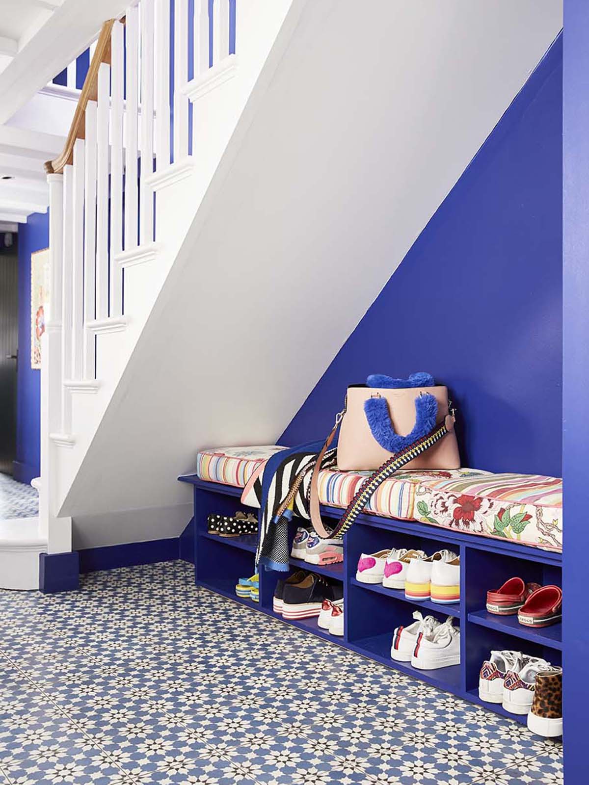
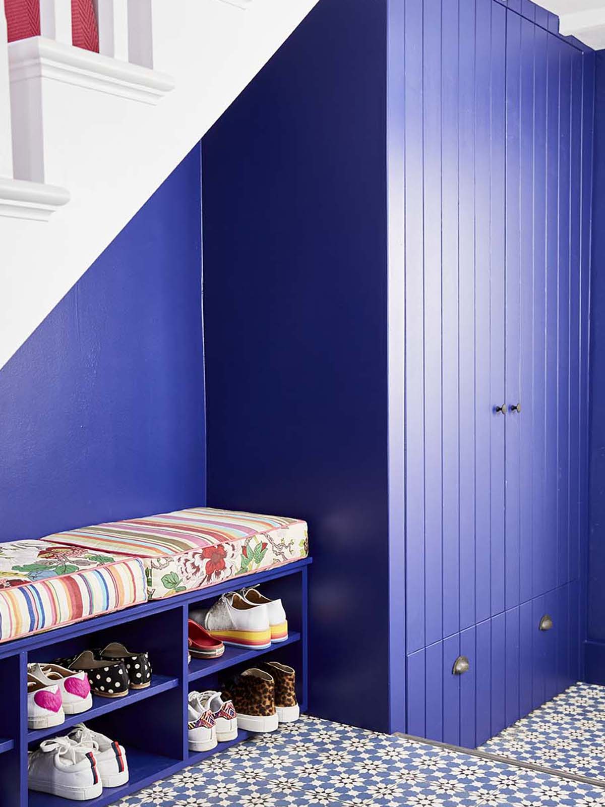
Factor in plenty of fitted storage
So now to the pièce de résistance, my show storage! There comes a point in your life where nothing can make you happier than a bit of well planned storage, and I am at that stage! After three years of living in a house that’s upside down in renovation, it makes me so happy that I am no longer tripping over shoes and boots. We asked our joiner Huw to make some storage to fit under our stairs that would fit all our shoes, boots and coats. The hats and scarves and dog leads etc all live in the chest of drawers.
Interior designer Sophie Robinson has re-designed and renovated her hallway into and bright and welcoming space with under-stair show storage and cupboard all painted the same colour as the walls

Sophie Robinson’s Hall – at home with Sophie Robinson photographed by Alun Callender

Disguise the large cupboards by painting them in with the walls
I worked with Huw to design this piece of carpentry. We worked out what would fit neatly under the stairs, also housing the underfloor heating system, and yet at the same time I chose not to block it all in, so the hallway still felt spacious. I painted all the joinery in the same colour as the walls so that it merges into the back ground and used the simple tongue and groove motif on the doors and drawer that I’ve also used on the kitchen cupboards, living room cupboards and internal doors. It helps to make a little visual link throughout the house which I enjoy. Its the white painted stairs and the pink runner which is the main focal point in this room. The cushions were very serendipitous. I owned a sofa once upon a time and had these covers made for it out of scarps of fabric remnants. Long after the sofa died, I kept the cushions, thinking they would be useful one day and here they are! This would be very easy to re create though by having foam cut to size and covers made by a seamstress.
The renovated hallway of colour loving interior designer Sophie Robinson features a bright pink stair runner by Roger Oates and Lapis blue walls by Zoffany

Sophie Robinson’s Hall – at home with Sophie Robinson photographed by Alun Callender

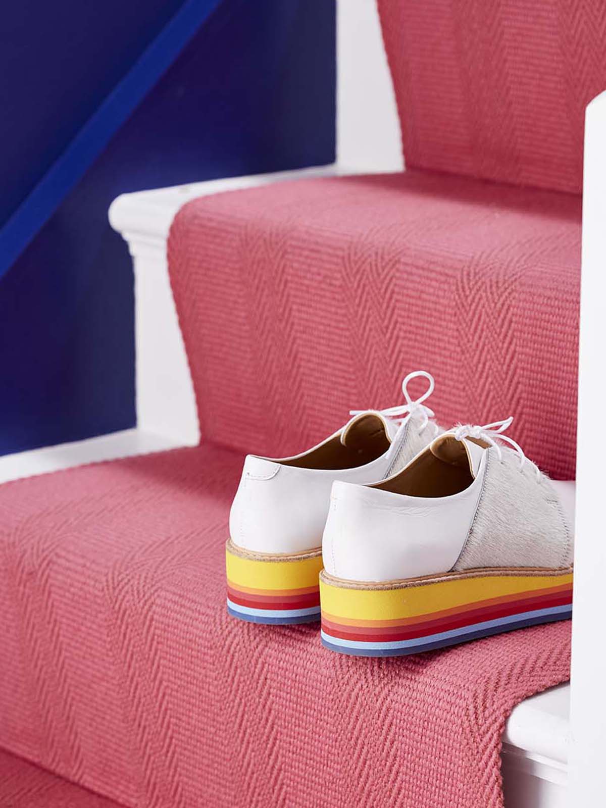
Go bold on the stairs
The stair runner in this amazing Bright Rose pink is the absolute show stopper in the room and gives me squeals of delight. Getting a good strong colour in a floor covering isn’t easy but Roger Oates have the best selection of stripes and plains. As I’d gone for a patterned floor tile it wouldn’t have worked with a contrasting patterned runner, so the plain Hadley stair runner is just perfect. I particularly love the gentle weave detail. So it’s shoes off going upstairs in our house now! The blue continues up te stairs and wraps around the landing. I’m still finishing off hanging our epic family gallery wall up there, so as soon as that is finished I’ll get it photographed and share the full reveal with you here!
SHOPPING LIST
Lazuli Elite Emulsion and Eggshell paint, Zoffany
Perfect White Eggshell, Zoffany
Light Rose Eggshell on door,  Sanderson
Old Havanna Bauta floor tiles, Claybrook Studio
Hadley stair runner in Bright Rose, Roger Oates
Artur large table lamp in turquoise, with Empire gathered shade, Pooky
Framed March to the Beat Picture, Alex May Hughes
For similar chest of drawers try, Muck N Brass
Thank you to Alun Callender for the photography
  • Interior Design
  • Interiors
  • My House
Colour Crush: Citrus yellow and how to decorate with it The Great Indoors podcast S2 Episode 5

comments

Miruska on 14.03.19

Absolutely amazing! It sets the stage for the rest of the house. I would be very happy to come to this hallway every day. Looking forward to seeing the other rooms as they are slowly finished.

Reply
Linda on 14.03.19

Awesome hallway ! There are so many different and flashy colours, and they blend together soooo well. Even the shoes and the bag match perfectly (is the handbag from “Essentiel” ? The belgian fashion brand ? I almost bought a similar one in the sales lost month).
I followed the complete reveal of your Mum’s annex, and i will follow your reveal too. Although i am not as colourfull as you (i am the Autumn type according to your Ban the beige session in October), i begin to add and mix more colour in my home. Thanks for your lovely advice and blogs and instagrams, they bring me instantly in the decoration mood. Linda from Belgium

Reply

Leave a Comment

Cancel Reply

Your email address will not be published.

  • Interiors
    • colour crush
    • colour psychology
    • DIY
    • dream home makeovers
    • Home Tours
    • Interior Design
    • Interior Styling
    • podcast
    • trends
  • Lifestyle
    • Business
    • Fashion/Beauty
    • Life
    • My House
    • Nosh
    • Travel
  • Rooms
    • Bathrooms
    • Bedrooms
    • Kids rooms
    • Kitchens
    • Living rooms
    • Outside
  • Videos

mailing
list

Videos

Listen

Listen Here

Online courses
by popular demand

Catch Sophie In All Her Colourful Glory On Instagram

Ah @the_rhs Chelsea! What a feast for the eyes! In Ah @the_rhs Chelsea! What a feast for the eyes! Inbetween biblical downpours, thunder and lightning, it was a wonderful day of colour, design and chatter with some wonderful women! I’m slowly falling in love with gardening and my phone roll is full of inspiration after being immersed in natures finest. Thanks @michelleogundehin and @hazelgardinerdesign @thesohoagencyuk for the company. And a big congratulations Hazel on this stunning floral installation. And don’t forget if you want to hang out and be inspired by all things colour then my FREE live webinar is on tonight (25th) at 7pm tonight! Hop on to my profile for the link to sign up. Cannot wait to share some inspirational colour filled time with you all 

#rhschelsea
This is the first room we decorated after our reno This is the first room we decorated after our renovations. The entrance to your home creates the first impression. It’s also the room you walk into first thing in the morning and when you return home at the end of a long day. It needs to create the right welcome and what that feels like is hugely personal. For me I chose my favourite colours, this powerful cobalt  blue has always been a colour I’m drawn to. My wardrobe is full of it. And the bright pink is another one that always makes me instantly happy. Together they are a striking combination and I think anyone who walks through my front door, immediately gets a sense of what I’m about. I’m passionate about creating interiors that authentically  reflect the people who live there. Studying the psychology of colour made it so much easier for me, giving me a deeper understanding on the affects of colour and streamlining my process. If you’d like to know how to unlock your colour super power, join me for a free webinar this Wednesday evening (available to up for 48 hours after). It an introduction into colour psychology for interiors and my hope is it inspires you to have the courage and conviction to know what’s right for you.  And for a deeper dive my online course Colour Psychology for interiors has opened for enrolment. All links to sign up are in my bio on my profile @sophierobinsoninteriors 
What does your hallway say about you? 
📷 @aluncallenderphoto 
CREDITS walls in lazuli by @zoffanyfw stair runner @roger_oates floor tiles @claybrookstudio door painted in rose ash @sanderson1860 

#colourpsychology #colourpsychologyforinteriors #banthebiege #punchyhome #hallway #boldcolourinteriors #colourlover
My kitchen, the heart of my home. The smallest, da My kitchen, the heart of my home. The smallest, darkest room in the house with no view, but that’s old houses for you! You’ll often find the kitchen in the worst place. So to amp up the joy I chose a forest green (hunters green by @zoffanyfw) for the cabinets to mirror the woodland outside. We sourced reclaimed school science lab work tops and I wrapped the room in one of my favourite papers, Rubarber by @borastapeter. Tom put in retro fit underfloor heating and we used reclaimed terracotta tiles from @ca_pietra_  so the floor looks as old as the house but feels so warm! . For the ugliest darkest room in the house it’s become our favourite because of the colours, patterns and rustic textures.that’s the power of great interior design! 
Next up in my series of posts about the psychology of colour is the Autumn personality. You’ll have a love of rich deep warm Colours, natural finishes, nature inspired patterns and period features. The autumn palette is warm, earthy abs rich and perfect for making spaces feel cosy and inviting. 
To learn more about the autumn personality, hop on up to my bio and click the link to be taken to the blog. And you can sign up to my FREE webinar I’m hosting next Wednesday if you’d like to learn more about this powerful framework. 
Meanwhile have a gorgeous weekend! 
📷 @aluncallenderphoto Styling @katemcphee 

#colourpsychology #banthebeige #autumnpersonality #colourpsychologyforinteriors #kitchen #greenkitchen #countryhomesandinteriors #countrykitchen #ihavethisthingwithcolor #myeclectichome #maximalistdecor
Come and join my FREE webinar on Colour Psychology Come and join my FREE webinar on Colour Psychology next Wednesday 25th at 7pm GMT 🤩 hop on up to the link in my bio @sophierobinsoninteriors to register.
My brilliant online course, Colour Psychology for Interiors, is open for enrolment this month, so if you fancy finding out a bit more about this utterly game changing framework I’d love to have you join. It’s SO MUCH more than ‘ red is energising’, ‘blue is calming’ stuff you’ve all heard before. This is a deep dive into discovering how colours work, how to harmonise them and discovering your own unique and authentic style. Only then can you create a home you live and one that supports you emotionally. I LOVE teaching this stuff because the feedback I get from students is mind blowing! Don’t take my word for it, sign up for the free webinar today! 😍 and if you’ve already done my course, please share in the comments below what you loved about it. 

#colourfulhome #colourpsychology #colourpsychologyforinteriors #banthebeige #colourlover #confidentcolour #confidentcolourscheming
Have you found your design mojo? Do you gravitate Have you found your design mojo? Do you gravitate towards a style of interiors that just feels so ‘you’. Making a home is so much more than creating beautiful squares for Instagram. It has to FEEL right and this is where the psychology of colour comes in. Colour is light, it has an energy which directly impacts your brain and emotions. And we all have a unique relationship to it. So rather than follow the crowd, be swayed by trends it’s so important to understand your own authentic relationship with colour. Over on the blog today I’m starting a series of posts all about the seasonal colour personalities. First up is spring which is all the joy, uplift and energy. My bathroom, pictured above, is very ‘spring’ with light reflecting walls, energetic patterns and bright colours. The mood  is uplifting, fresh and feel-good. Hop on up to my link in my profile to read the blog post in full and discover if you are a Spring personality and how to create rooms that reflect this joyful mood. 
Tap for credits
📷 @aluncallenderphoto 

#colourpsychology #colourpsychologyforinteriors #banthebeige #colourfulhome #colourlover #ihavethisthingwithcolor #spring #springbpersonality #colourfuldecorchallenge #homedecor #myeclecticmix #bathroom #bathroominspo
So proud of mr best mate @sophieabbottartist who o So proud of mr best mate @sophieabbottartist who opens her house this weekend to showcase her artwork in her home as part of Brightons artists open houses. She’s always been a creative whirlwind and keeps the joy of colour alive in her paintings inspired by the sea, and the local woodlands that surround her home in Brighton. For Sophie, colour gives her life, she’s the ultimate joy monger and I’m so blessed to have her as my side kick in life. If you get a chance today, pop round to heed for a bolt if the feel good vibes

#artistopenhouses #brighton #colourlover #banthebiege #ihavethisthingwithcolour
When you find the palette of colours you love, you When you find the palette of colours you love, you just wantto surround yourself  in every part of your home! This painting by @studiocoverdale really hits the mark for me, with all my favourites on one place. Today I’m opening my most popular online course, ‘Colour Psychology for a interiors’, ready  for your enrolment. This is my most popular and indeed  powerful course. It gets to the core of how colours work in harmony , how they effect you emotionally and how to bring all the design and pattern  elements together to make your home and your heart sing! I’m a Spring personality, and with that I adore all the busy patterns, bright and vibrational colours, plenty of pretty details and preferably all at once! While typical spring personalities prefer a more delicate and soft colour palette, my secondary season is Autumn, which prefers richer and punchier shades. Combined together my home is unique and perfect for me. I honestly rarely want to leave the house! And while this framework is an amazing tool for interior design, it’ll also give you colour confidence in every area of your life including your wardrobe. I can’t recommend it enough. When I started implementing this framework  in my own design practice six years ago it was absolutely game changing! While I’ve  always been confident with bold colour, this insight gave me the clarity to speed up my design process and get it right every time! Hop on over to the link in my bio to find out more. 
📷 @aluncallenderphoto 
#colourpsycholgy #colourlover #banthebiege #colourfulhome #colourmyhome #maximalistinteriors #boldbravebeautifulinteriors #dopaminedressing #dopaminedecor
The power of paint! I’ve been extolling it’s v The power of paint! I’ve been extolling it’s virtues my entire career. Roll a bold new hue on your walls and voila! Game changer. But on our recent podcast @mad_about_the_house explored the wider impact of paint on the environment. An astonishing 50 million litres makes it into landfill each year so it feels like, as serial decorators, we could all club together and do our bit to bring that figure down. 
It’s a minefield but over on my blog today I sum up my tips on how we can easily use less of it and round up the paint brands who are doing their bit to tackle the issues. From the ingredients in the tin, to recycling waste paint, to using pouches rather than tins, there is plenty of innovative ideas. Choosing natural paint feels like a good option and if you’re hooked on designer paint colours, it’s no more expensive. Last year I painted my bedroom Turquoise by @edwardbulmerpaint and I’m thrilled with the colour, quality and durability. Just goes to show lovely paint doesn’t have to cost the earth. Hop onto the link in my profile for the full post and if you know if a paint brand who are tackling the environmental issues raised, please give them a mention in the comments below.

#ecopaint #ecodecor #ecohome #paint #turquoise #bedroom #podcast #banthebiege #colourfulhome #colourlover #itsonlypaint #interiordecorating #interiordesign #colourscheme
Load More… Follow on Instagram
Sophie Robinson
  • © 2017 Sophie Robinson

    /
  • Contact/
  • About/
  • Design by MW

Don't forget to join!

You're almost inside!

Leave me your best email to sign up for the Webinar