ULTIMATE MAXIMALIST COURSE BUNDLE - £400+ Savings - JANUARY SALE

Sophie Robinson
  • Home
  • Workshops
    • Marrakech Retreat
    • Home Masterclass
  • Online Courses
  • Collaboration
  • Podcasts
  • Blog
  • About
    • About me
    • Work with me
    • Press
  • FAQs
  • Contact
  • Interiors
24 Sep 19

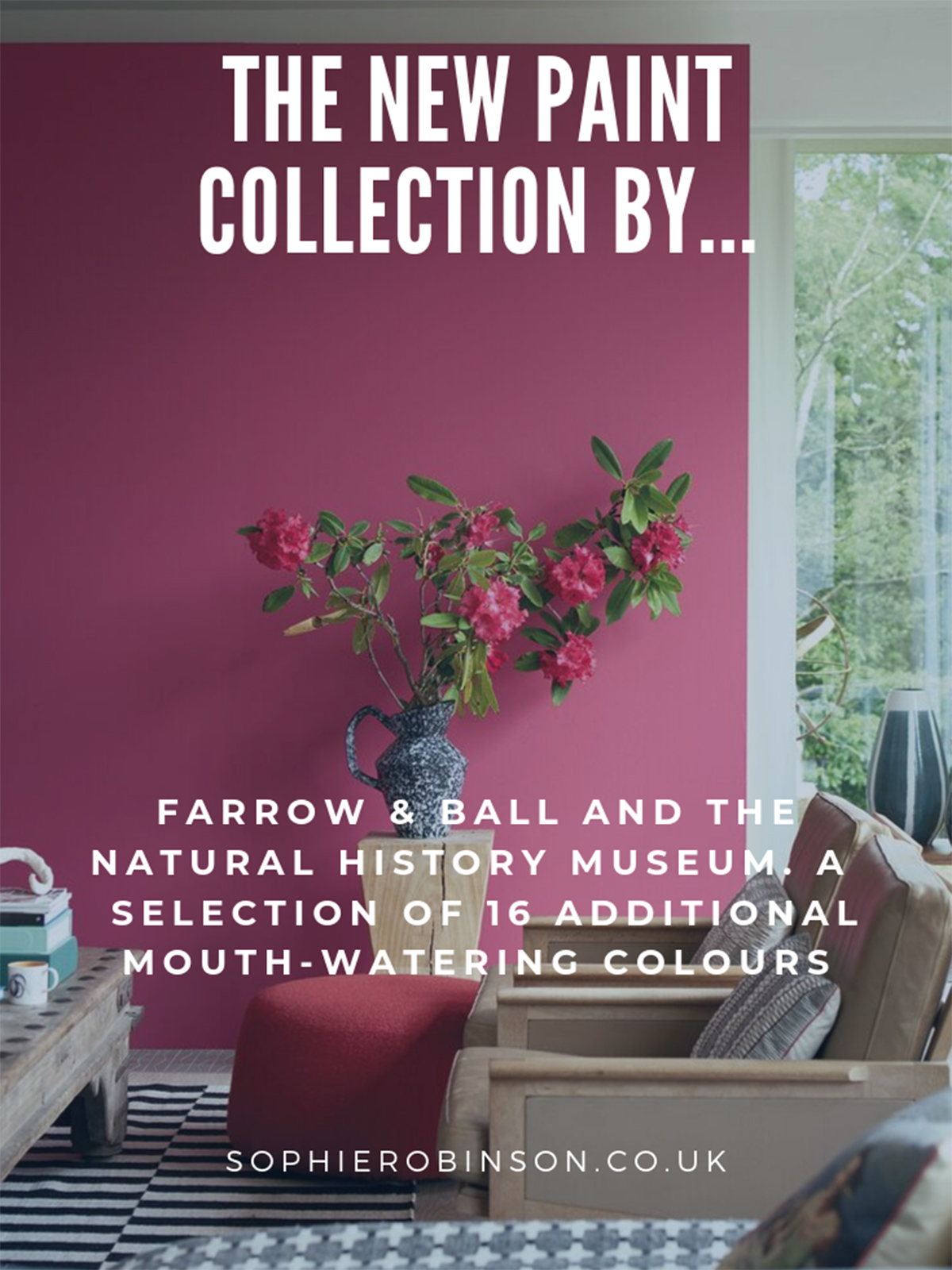
New colours by Farrow & Ball with the Natural History Museum

W53MEM W40MEG 2

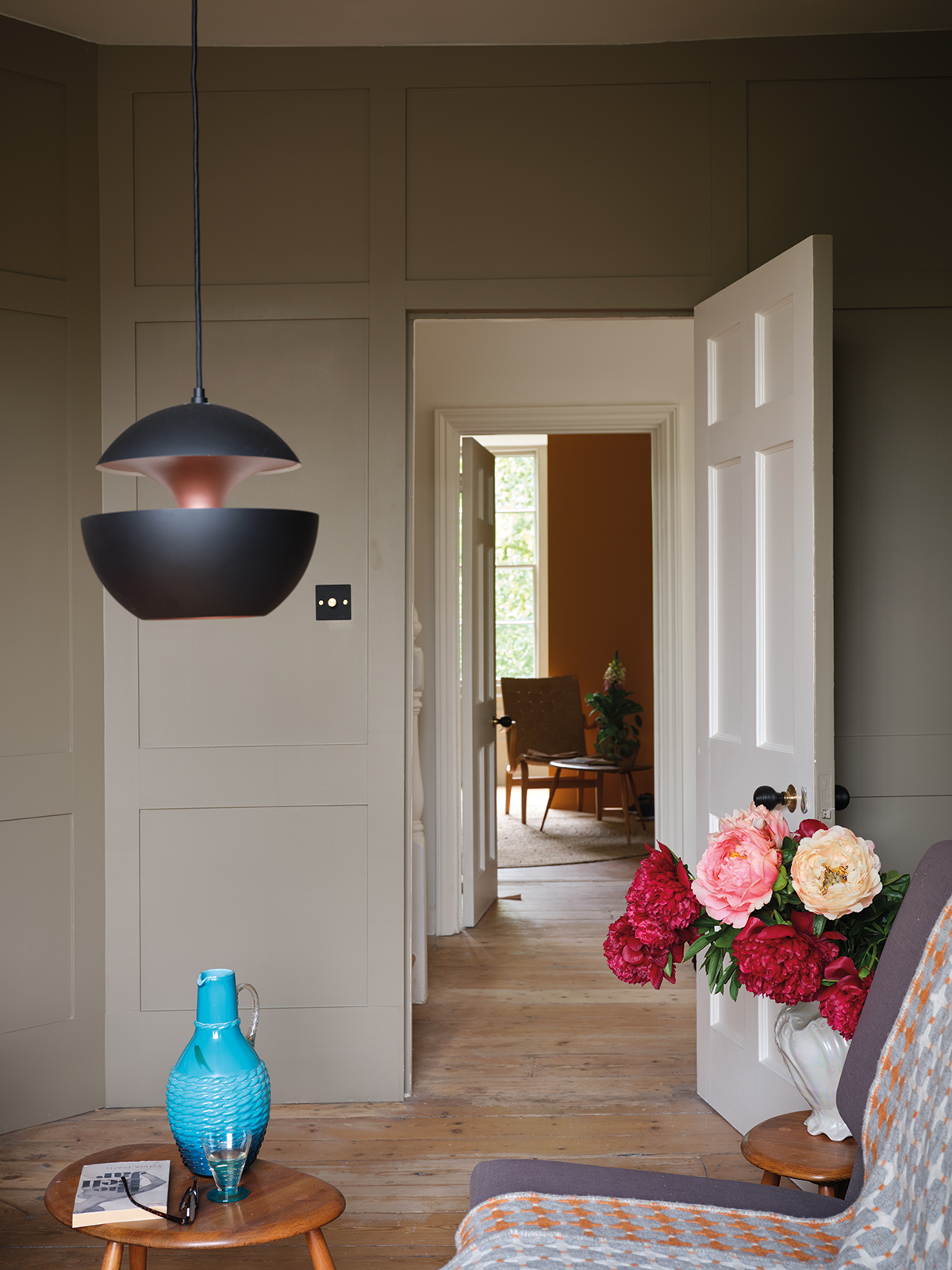
Whenever everyone’s colour card favourite, Farrow & Ball, launch new paint colours I’m always keen to find out what’s in store as I know it will be a treat. Their ability to make colours that look effortlessly chic in British homes is simply breathtaking and I take my hat off to them. They deeply research their colours and palettes and know what works in our cool northern light and what suits our period properties. That said, I rarely use F&B in my own home as while I quite often love their colours they don’t have enough warmth, depth and energy for my personal palette, but things look to change!

Farrow & Ball launch a new paint collection in conjunction with the Natural History Museum. The Lake Red colour is a classic tone and is brought up-to-date with modern wooden living room furniture and a focal floral display. Sophie Robinson looks at overall collection, find out more here #farrowandball #sophierobinson #livingroom

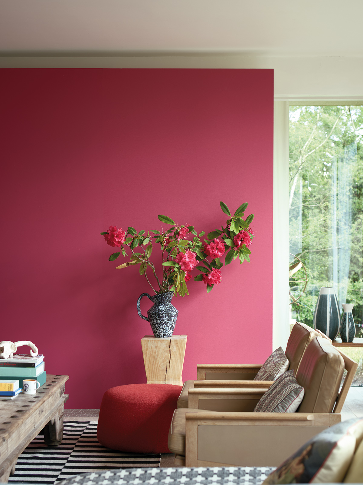
Lake Red is an adventurous colour which F&B says appears red to some and pink to others but either way, it’s an energising and happy colour don’t you think?

The way they keep their colour palette looking so sophisticated is each colour seems to have an undertone of grey or black. (It’s the perfect paint chart for anyone who is a Summer personality or an Autumn personality, depending on the warmth of tone). But this new collection, with it’s mouth-watering addition of 16 colours to their current 132 on the colour card, is more vibrant than we usually expect.  Bold colour is being fully embraced by the old guard!

The strong pigment shows in this intense shade of blue on kitchen cabinets, it creates a welcoming feel against the bare red brick wall. Just one of the new paint collection by Farrow & Ball and The Natural History Museum. Interior designer Sophie Robinson takes a look through the whole collection here. #farrowandball #bluekitchen #barebrick #sophierobinson

You should know by now how I feel about an intense blue – look at my hallway. I’m loving the new Scotch Blue in the kitchen, it makes a welcoming addition to any space.

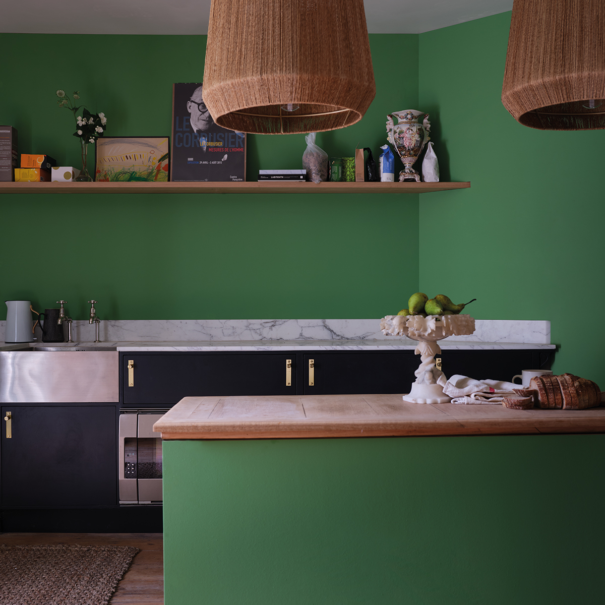
The new colours include opulent reds, juicy oranges and gem likes blues. There is even a lush emerald green as well as some versatile warm neutrals. The new collection is called ‘Colour by Nature’ and is a celebration of colours found in the natural world. The collaboration draws on the Natural History Museum’s rare book library, which holds Werner’s Nomenclature of Colours, a colour guide used by Charles Darwin on his seminal voyage on HMS Beagle that inspired the palette. This groundbreaking book was published in 1814 and became an invaluable tool for scientists and artists alike. Every colour described in Werner’s book evokes a vision inspired by the natural world and I think that it’s just magical that we are drawing inspiration from the collection once again to inspire our interior design schemes.

Interior Designer Sophie Robinson takes a look at the new paint collection by Farrow & Ball and the Natural History Museum. The Verdigris Green is used in the entrance hall with a modern black metal bannister yet creates a welcoming space. #sophierobinson #farrowandball #entrancehall

This reassuring hue is Verdigris Green, with its rich blend of pigments it certainly holds its own and works particularly well with lighter tones.

With a love of nature comes a need to be more eco-friendly and sustainable and F&B’s eco credentials were paramount to the Natural History museum entering into the collaboration. Says Maxine Lister, head of licensing, Natural History Museum: “Ware very excited to be working alongside a company that is so committed to minimising their environmental impact. The collaboration has been a delight to bring to life and has proved to be such a great opportunity to not only highlight an important historical artefact but also to encourage families to bring the true beauty of nature into their homes.”And the connection to nature is evident in the names the team have given the colours. 

Sap Green has an earthy and welcoming feel and can create a dramatic look when used in small spaces

For example, Duck green, is the neck of a mallard, the upper disk of yew trees and also the colour of the mineral Ceylanite. Skimmed milk white is matched to the white of human eyeballs, petals of the blue Hepatica and the common opal. You can order through the Farrow & Ball website or in any of their nationwide stores. Meanwhile, I’m thinking some Broccoli Brown might be just the hue for my currently all-white office. I think my bright colours will really pop against it! Let me know what your favourite colour is from the collection


Contemporary lighting and accessories sit happily with the classic panelled wall is painted in Broccoli Brown, one of the new Farrow & Ball and Natural History Museum new colours. Sophie Robinson looks at the new paint collection here. #farrowandball #panelledwall #livingroom #sophierobinson

Broccoli brown is a soft and warm neutral which allows bright accessories to really pop

Top image credit: Emerald Green, a fab bright and uncompromising tone.

New paint collection from Farrow & Ball and The Natural History museum. Find out more with Sophie Robinson here. #farrowandball #paintcollection #sophierobinson

  • Interiors
Luke Edward Hall designs for habitat House tour with Laura Jackson – Podcast show notes S4 Ep6
  • Christmas
  • Interiors
    • colour crush
    • colour psychology
    • DIY
    • dream home makeovers
    • Home Office
    • Home Tours
    • Interior Design
    • Interior Styling
    • podcast
    • Sophie Robinson X Dunelm
    • Sophie Robinson x Harlequin
    • trends
  • Lifestyle
    • Business
    • Fashion/Beauty
    • Life
    • My House
    • Nosh
    • Travel
  • Rooms
    • Bathrooms
    • Bedrooms
    • Kids rooms
    • Kitchens
    • Living rooms
    • Outside
  • Videos
online influence award winner 2019
Interior Design Winner Sophie Robinson Insta
Videos

Listen

Listen Here

Online courses
by popular demand

Catch Sophie In All Her Colourful Glory On Instagram

Not going to lie, this might be one of my proudest Not going to lie, this might be one of my proudest makeovers ever…
My Dad and Mary’s modern French villa was all beige tiles, white walls and zero personality. So I did what I do best: turned it into a technicolour dreamscape inspired by the countryside views outside those gorgeous bifold doors.

Inspired by early  autumn leaves, emerald green fields, and piercing blue skies we set about making the inside of their home feel as joyful as the outside … now imagine all that bottled up into wallpaper, fabrics, cushions and colour-drenched furniture.

If you’ve ever thought bold colour overwhelming or that pattern was too much for open-plan spaces… this one’s for you. Because colour and pattern sings in nature, and it can work just as well in your home decor.

All wallpapers, rug and cushion fabrics are from my collection with @harlequinfw. Painting by @sophieabbottartist 

Full sourcing list, extra styling tips and a deeper dive into the design story are up now on A Life In Colour: head to my Substack via the link in bio to read more!
End of January check-in… and yes, the struggle to End of January check-in… and yes, the struggle to stay joyful is very real right now. Dark mornings, grey skies, energy running low.

That’s exactly why our homes matter so much at this time of year. They are our sanctuary. The place that should lift your mood, calm your nervous system and make you feel held when the outside world feels a bit, how can I put this...relentless. And this isn’t just a feeling or a design philosophy. It’s backed up by science. Research shows that colour, light, beauty and nature in our homes have a direct impact on mood, wellbeing and happiness. Small, intentional changes really can shift how you feel day to day.

I’d love to know… what brings you the most joy in your home right now? A colour, a room, a plant, a view, a ritual? Share it in the comments 💛

And if you’re ready to go deeper, my big January Sale ends this week.

If you want to truly understand colour psychology and learn how to curate a home that feels joyful, confident and completely you, comment ULTIMATE and I’ll send you the link to my online design school and your opportunity to make the biggest saving of the year.
These are the ingredients to making your home feel These are the ingredients to making your home feel as good as it looks. 

• Confident colour that creates the mood
• Beautiful pattern that delights the eye
• Layered texture that brings it all alive
• Personality in every corner, so it feels like home

Magic happens when you stop playing it safe and start designing a home that truly reflects you. A home that feels joyful, expressive and alive. But designing a home can feel overwhelming. Where do you start? How do you combine colours without it feeling chaotic? How do you clash patterns so it looks considered? How to express your unique personality without merely copying other people’s style?

That is exactly why I created my online design school. After more than 25 years as an interior designer, I have distilled my design process into clear, easy-to-follow courses that take you step by step through combining colours, balancing patterns and adding texture, so you can decorate with confidence and creativity.

And right now, my January Sale is on. You can save a huge 60% on my transformational courses, designed to completely change how you approach your home and how it makes you feel. If you are ready to embrace your creativity and deepen your passion for interior design  comment ULTIMATE and I will send you all the details.
Think Maximalism is ‘too much’, too messy, or only Think Maximalism is ‘too much’, too messy, or only for other people? 

I’m here to tell you: maximalism isn’t chaotic. It’s just misunderstood.

Once you understand how colour and pattern work together, decorating like a maximalist stops feeling intimidating and starts feeling instinctive. Your home starts feeling like you.

If you want to design your home with confidence, my Ultimate Interiors Bundle is exactly what you need. It includes three self-paced online courses that take you inside my design process, teaching you how to use colour and pattern so you can make bold choices that actually work, again and again. 

Right now, the Ultimate Interiors Bundle is a massive 60% off. Buy now, enjoy the saving, and start whenever you are ready to create a home that is completely yours.

Comment ULTIMATE and I’ll DM you the link to find out more.
Welcome to my witchy era! Who else wants to harnes Welcome to my witchy era! Who else wants to harness the Year of the Horse and use this dynamic energy to manifest your best year yet! 

A vision board is like a compass that will lead your goal settings and intentions with total clarity. To prepare i like to take lots of long walks and meditate on what it is so want more of in my life while gratefully letting go of what no longer serves me. 

Join me Wednesday for a live webinar on how to I create a Vision board that will ignite your passion and motivation to live a bold, creative and colourful life! Comment VB26 for the link.
Dark and moody colours can feel intimidating, but Dark and moody colours can feel intimidating, but my TV snug shows just how well they can work. The deep tones soften the space and create a calm, cocooning atmosphere, perfect for evenings spent watching TV, or retreating from the day.

Contrary to what you might think, this room really comes into its own in winter. Low light and long evenings make the colour feel enveloping and cosy. It’s a space that invites you to slow down, sink in, and make yourself comfortable.

I sampled so many different paints but Cordoba by Little Greene was the perfect choice for this room. It’s full of depth and warmth, and just the right amount of drama. 

And if you’re thinking about taking the leap yourself, my tip is: don’t fight the natural light you have, lean into it. Don’t be shy about colour drenching walls, woodwork and ceiling so the room feels seamless and intentional. In my snug, that richness is what makes it feel cosy and complete.

There’s no place I’d rather be on chilly evenings.
How do I explain this feeling to a minimalist? To How do I explain this feeling to a minimalist?

To some people this might look like too much, but for me, maximalism isn’t excessive, it’s pure self expression. I decorate my home to reflect the way I live and that’s full of bold uplifting, joy-giving colour. Every patterned textile, every artwork, every joyful little object earns its place because it makes me feel happy. 

And if I’m being honest a neutral room doesn’t make me feel calm, it makes me feel slightly depressed. My home lifts my mood, fires my creativity and gives me a little thrill every single day.

Now tell me… are you Team Minimal or Team Maximal? And what makes your heart sing at home?
There’s something about walking that has quietly h There’s something about walking that has quietly held me together this past year.

When life threw its challenges my way, my anxiety went into overdrive. I lost clarity, my head was foggy, and the overwhelm shut me down. But walking, one step in front of the other, slowly moved me in the right direction.

We all know walking is good for the body, but it’s also one of the most powerful tools for the mind. Moving helps process stuck emotions, those steady steps soothe racing thoughts, and the changing scenery opens up fresh ways of thinking. Being in nature grounds you. And the best part is, it’s free.

Whenever I’m preparing a new vision for my year or any creative project, I always start with a long solo walk. I take my journal, let the thoughts tumble out, and begin to find a clarity and direction again. Next step is to use my creativity to create a powerful vision board full of images that resonate with how I want to feel and who I want to be. Less of a to do list, more of an emotional reset. This works for me as it brings in the light, and more importantly keeps me inspired and motivated.

If you’re ready to gently clear the fog and get clear on what you want more of, my ‘Life in Colour Vision Board Masterclass’ is now on sale. I’m hosting on the 21st January, 7pm GMT (with a recorded replay available). Comment VB26 below and I’ll send you all the details. 

Can’t wait to see what we can create together this year!
Follow on Instagram
Sophie Robinson
  • © 2025 Sophie Robinson

    /
  • Contact/
  • About/
  • Design by MW

You're almost inside!

Leave me your best email to sign up for the Webinar

MG0001 Magnet Sophie using Tap 021 copy

You're almost inside!

Leave me your best email to sign up for the Webinar