GET THE REPLAY OF THE VISION BOARD MASTERCLASS - LIFE IN COLOUR

Sophie Robinson
  • Home
  • Workshops
    • Marrakech Retreat
    • Home Masterclass
  • Online Courses
  • Collaboration
  • Podcasts
  • Blog
  • About
    • About me
    • Work with me
    • Press
  • FAQs
  • Contact
  • colour crush
  • Interior Design
  • Interior Styling
  • Interiors
18 Dec 18

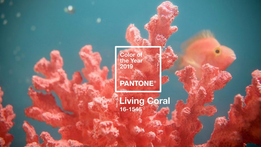
Pantone’s colour of the year: Living Coral

Secret Linen Store Hot Coral pompom throw £95 1600x1200px crop

I love it when a new colour gets touted as a ‘trend’ and Pantone never disappoints. And this year, it’s another contentious choice to get everyone’s feathers in a ruffle! This is what trend predictions are all about in my view – to stop us getting too cosy, and to keep pushing the parameters of ‘good taste.’ So let’s get my cards on the table straight away.  Pantone has declared their colour of the year 2019 a rather fabulous Living Coral, and I’m very much on board! In fact, I might be sailing the ship!

“An animating and life-affirming coral hue with a golden undertone that energises and enlivens with a softer edge”

PANTONE

pantone-colour-of-year-2019-living-coral-design_

It’s another colour that Pantone feel we need to give us all a big dose of the feel-good factor. Another strong, forward-facing strident hue that holds no prisoners. The colour for 2018 was an equally ‘shocking’ Ultra Violet – you can catch up on my report here. Pantone once again, acknowledges that we feel swamped by the digital, fearful about our politics and freaked out by the state of the planet. Quite frankly it’s all got a bit serious and heavy. So rather than give us a nice calm shade of green to go and have a lie down under, they feel it’s time to lighten up and have some fun! And that sentiment is embodied in this shade of sherbet, eighties lipstick and tropical sunsets.

Interior designer and colour lover Sophie Robinson picks her favourite interior products following the Pantone colour of the year Living Coral, fashionistas Jennifer Lopez and Gigi Hadid

Both J-Lo and Gigi Hadid stepped out in Pantone’s Living Coral within hours of the announcement, as featured in Vogue showing that this on-trend colour has buckets of sass but requires confidence and conviction to wear head to toe. Image credit: Getty Images


“Living Coral welcomes and encourages lighthearted activity. Symbolising our innate need for optimism and joyful pursuits, PANTONE 16-1546 Living Coral embodies our desire for playful expression.”

PANTONE

I have to say that I wholeheartedly concur (of course I do!). I personally find it a jolly, uplifting and rather edgy colour. Sitting in between red and orange, it loses the aggressive edge of one whilst being way sexier than the other. Like all of these trends, you need to ignore it if it isn’t for you – don’t get your knickers in a twist if it’s making you run to the hills (under an apricot sunset). If you prefer things a little more pale and uninteresting, then you could play around with it’s paler cousin peach, which has been touted as the new pink for some time.

Interior designer and colour lover Sophie Robinson picks her favourite interior products following the Pantone colour of the year Living Coral Bavero wallpaper in Coral, Zapara collection by Harlequin

Bavero wallpaper in Coral, Zapara collection by Harlequin

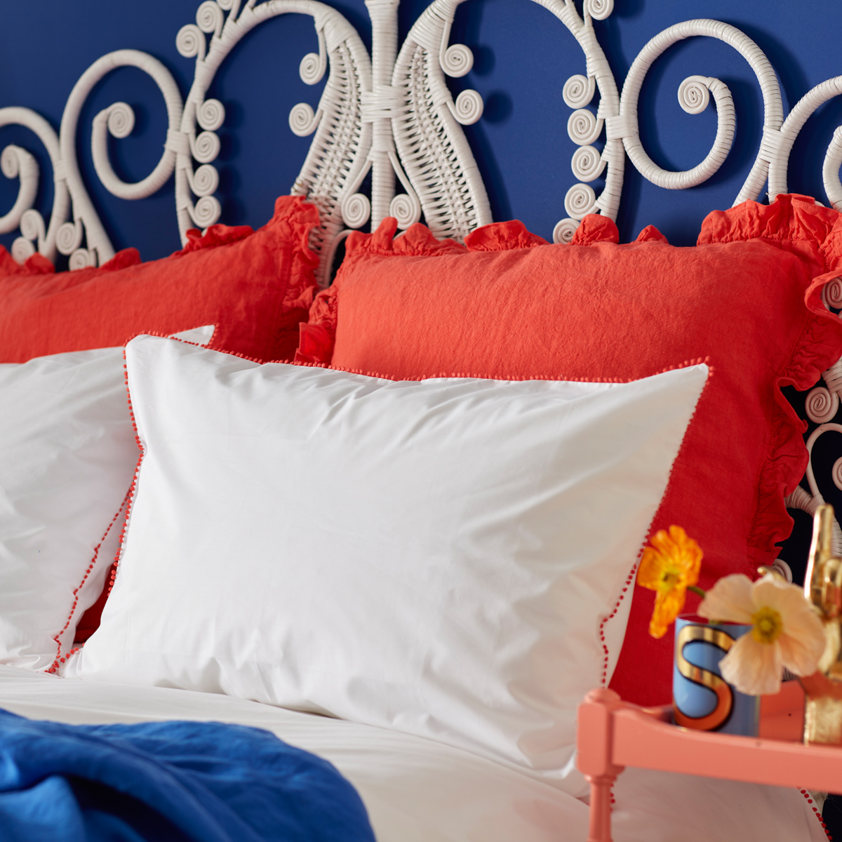
I think these orangey shades are the perfect progression from the all-things-pink obsession. Peach and coral shades have more warmth and my overriding trend forecast for the next few years, is that we will be turning our back on the cool greys and sophisticated navy in favour of colours which have warmth at their core. While the trend-setters will make a splash with it on all four walls, I think for most that it creates too much energy in a room to actually be able to live with. Instead, it will be popping up as a great accent in our interior schemes. If you have already signed up to a cool grey interior then a pop of Living Coral could be just what you need to stop taking it all too seriously. Similarly, it would look delicious with navy – or my personal favourite teamed with cobalt blue.

pantone colour of the year living coral features in this pom pom fringed bedlinen designed by sophie robinson for the secret linen store

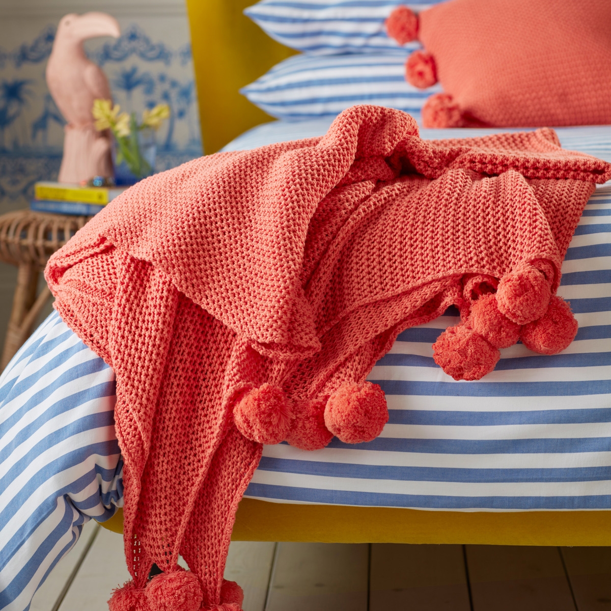
My collection of bedlinen for The Secret Linen Store uses a hot coral as an accent for cushions and a trim on the pom pom bedlinen which updates the classic white.

I’d like to say I had a crystal ball, or that I’m just so smoking hot and on trend – but either way, I chose coral as one of my key colours when designing my new range of bedlinen for The Secret Linen Store earlier this year. My reasons were because it felt more modern than pink, I loved it next to the deep blue I was already smitten with and felt that in small splashes it was a great way to add pep to an existing scheme. You can buy it as a pom pom cushion and throw or as a delicate micro trim on all white bed linen. So my advice with this trend is to dip your toe in. And next time you think it has to be pink, think of adding peach or coral red instead.

My pick of the best coral accessories to add some punch and instantly update your interior

Interior designer and colour lover Sophie Robinson picks her favourite interior products following the Pantone colour of the year Living Coral

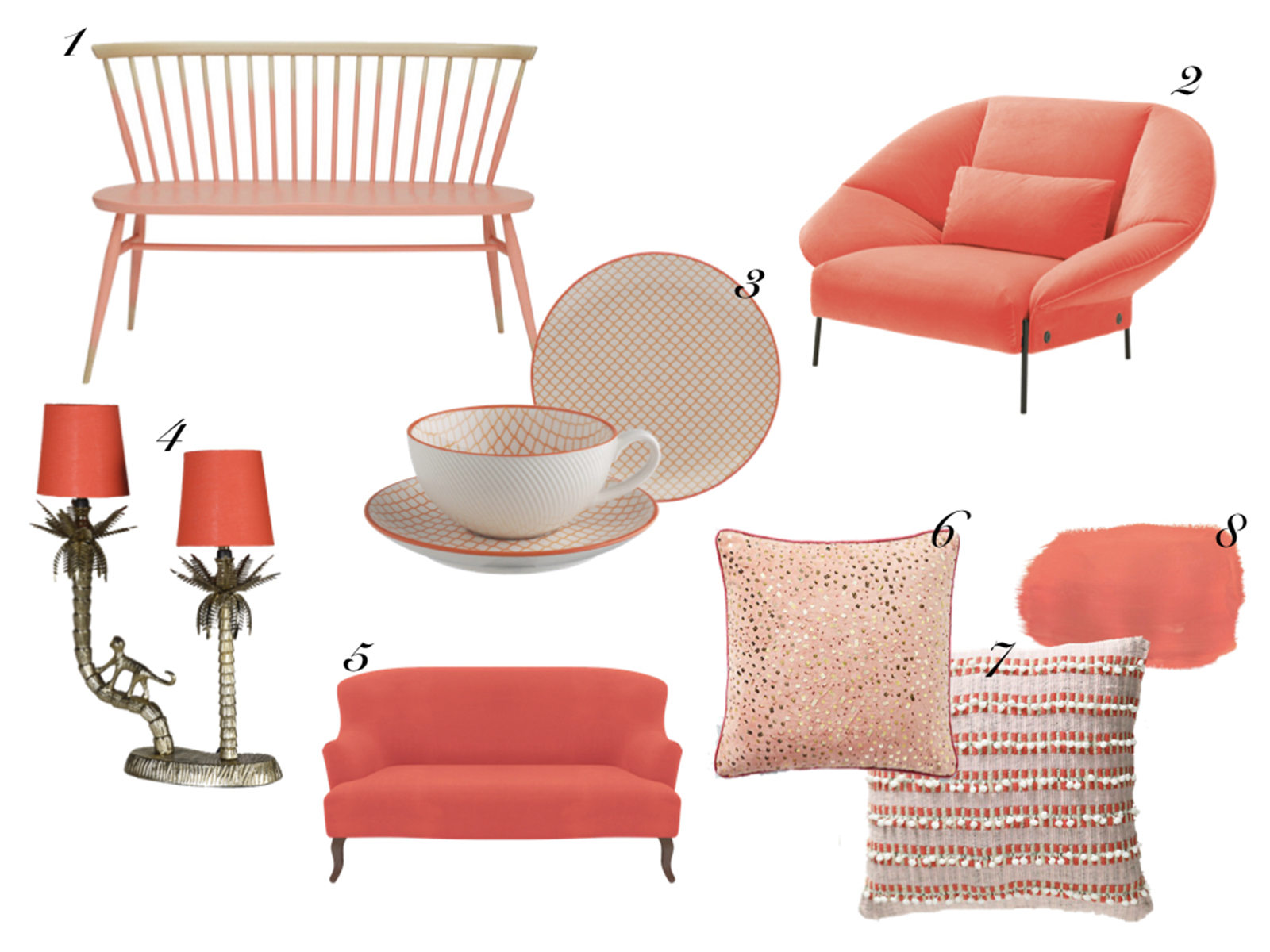
1. Ercol Originals loveseat in half rose, (bespoke order) available at Heal’s | 2. Paipai Coral Velvet Armchair, Ligne Roset | 3. Brookland orange plate and cup & saucer, Habitat | 4. Brass monkey table lamp with orange shades, Audenza (available Feb-Mar) | 5. Grassington 2 seater sofa in Tango Flamingo, Sofas & Stuff | 6. Embellished cushion in coral, Anthropologie | 7. Metallic woven pommed cushion, Anthropologie | 8. Chalk Paint, Coral Mix using Tilton and Emperor’s Silk, Annie Sloan


  • colour crush
  • Interior Design
  • Interior Styling
  • Interiors
Merry Christmas- 2018 it’s a wrap! The Great Indoors Podcast S1 Episode 6 show notes
  • Christmas
  • Interiors
    • colour crush
    • colour psychology
    • DIY
    • dream home makeovers
    • Home Office
    • Home Tours
    • Interior Design
    • Interior Styling
    • podcast
    • Sophie Robinson X Dunelm
    • Sophie Robinson x Harlequin
    • trends
  • Lifestyle
    • Business
    • Fashion/Beauty
    • Life
    • My House
    • Nosh
    • Travel
  • Rooms
    • Bathrooms
    • Bedrooms
    • Kids rooms
    • Kitchens
    • Living rooms
    • Outside
  • Videos
online influence award winner 2019
Interior Design Winner Sophie Robinson Insta
Videos

Listen

Listen Here

Online courses
by popular demand

Catch Sophie In All Her Colourful Glory On Instagram

February. Rain. More rain. And then just for varie February. Rain. More rain. And then just for variety… rain. The dog and I relished the excuse to stay tucked up at home. But inside? Big plans and some serious plotting around the kitchen table. February has that quiet, held-breath quality. Everything looks still, yet beneath the surface it’s all quietly preparing to burst into life. I’m more than ready for that spring light to unleash some very exciting plans! Who else is ready?!

FEBRUARY ROUND UP
	1.	Just how much rain?! Honestly. Biblical.
	2.	Creating shape and big ideas with @teamyo_weight_training .
	3.	Major shoot energy for my AW 2026 collection. So proud of this one.
	4.	Celebrating the fabulous new scents at @vyraoworld . Heaven in a bottle.
	5.	Catch-ups with these sirens @micboehm77  @yasminsewell Creative refuel.
	6.	Photoshoot at the house. @jadefarmiloemua claims best mug, obviously.
	7.	Lucy ready for hair and make-up. Born for backstage life.
	8.	I finally caved and bought an air fryer. Brilliant but why do Ugly.
	9.	Watching the pond like it’s Netflix. What will spawn this spring? 🐸
	10.	My lovely Dad staying with us and recuperating after a nasty illness. Tender days.
	11.	Healing sunlight breaking through when we needed it most.
	12.	Three generations, sofa-bound, watching the rugby. Proper joy.
	13.	14. The wonderful Wes Anderson exhibition at the @designmuseum . Go. Get inspired.
	15. February has its own special bleakness. I’m ready for sunshine on that sea.
	16.	Lucy fully committed to hibernation season. Respect.
	17.	An elegant mess. Story of my life.
	18.	Lucy taking the minutes at a very exciting team meeting. Promotion pending.
	19.	First signs of spring 🌼 Always right on time.
AD Still smiling after revealing my latest colourf AD Still smiling after revealing my latest colourful homewares collection with @Dunelmuk. Bringing a collection like this to life takes months of dreaming, designing and attention to detail, so sharing it with everyone felt incredibly special. Expect joyful colour, layered pattern and all the maximalist touches you know I love. The whole collection is now available to shop in store, online and on the Dunelm app. I could not be prouder. 💛
January. A grateful round up. Rolling into 2026 an January. A grateful round up.
Rolling into 2026 and chasing colour in all its forms, from piercing blue winter suns to raspberry red Moroccan sunrises. I knew I’d be ready for you, 2026. And we have started beautifully.

1. A quiet promise to myself to make 2026 as colourful as possible
2. New Year’s Eve… exactly as it began
3. And then how it went. A proper sweaty dance at @alphabetbrighton 
4. Hosting a bonfire at home with friends to burn away 2025. @jothornephotography 
5. Watching embers glow beneath a full moon. Emotional in the best way
6. Snow, low sun and the most perfect winter palette
7. Still walking it out! Bracing the cold with @sophieabbottartist @edwinaboase 
8. A much needed colour hit, hosting my interiors retreat with @elfennmarrakech 
9. Me and partner in crime @em_lappin  at @lallamarrakech 
10. The joyful jolt of colour only the Marrakech souks can deliver
11. Discovering the new @ritaalaoui_artist art installation at El Fenn
12. New moon meditation with the wonderful @alexadecastilho 
13. Gently shaping a new vision for 2026
14. Harnessing that wild horse energy for my vision board webinar
15. Proud moments unveiling my latest collection to the press at @dunelmuk 
16. Catch ups with my lovely TV chums @hardcastletowers @francescarowanplowden @jackkinsey @ritamillat 
17. Feeling genuinely excited about this collection and all the squeals it is delivering
18. Finally ticking off my 360 health scan at @nekohealth 
19. Becoming mildly obsessed with pastel, colour drenched interiors
20. It looks busy, but January has mostly been this. Rest. Reflection. Happy wintering.
Not going to lie, this might be one of my proudest Not going to lie, this might be one of my proudest makeovers ever…
My Dad and Mary’s modern French villa was all beige tiles, white walls and zero personality. So I did what I do best: turned it into a technicolour dreamscape inspired by the countryside views outside those gorgeous bifold doors.

Inspired by early  autumn leaves, emerald green fields, and piercing blue skies we set about making the inside of their home feel as joyful as the outside … now imagine all that bottled up into wallpaper, fabrics, cushions and colour-drenched furniture.

If you’ve ever thought bold colour overwhelming or that pattern was too much for open-plan spaces… this one’s for you. Because colour and pattern sings in nature, and it can work just as well in your home decor.

All wallpapers, rug and cushion fabrics are from my collection with @harlequinfw. Painting by @sophieabbottartist 

Full sourcing list, extra styling tips and a deeper dive into the design story are up now on A Life In Colour: head to my Substack via the link in bio to read more!
End of January check-in… and yes, the struggle to End of January check-in… and yes, the struggle to stay joyful is very real right now. Dark mornings, grey skies, energy running low.

That’s exactly why our homes matter so much at this time of year. They are our sanctuary. The place that should lift your mood, calm your nervous system and make you feel held when the outside world feels a bit, how can I put this...relentless. And this isn’t just a feeling or a design philosophy. It’s backed up by science. Research shows that colour, light, beauty and nature in our homes have a direct impact on mood, wellbeing and happiness. Small, intentional changes really can shift how you feel day to day.

I’d love to know… what brings you the most joy in your home right now? A colour, a room, a plant, a view, a ritual? Share it in the comments 💛

And if you’re ready to go deeper, my big January Sale ends this week.

If you want to truly understand colour psychology and learn how to curate a home that feels joyful, confident and completely you, comment ULTIMATE and I’ll send you the link to my online design school and your opportunity to make the biggest saving of the year.
These are the ingredients to making your home feel These are the ingredients to making your home feel as good as it looks. 

• Confident colour that creates the mood
• Beautiful pattern that delights the eye
• Layered texture that brings it all alive
• Personality in every corner, so it feels like home

Magic happens when you stop playing it safe and start designing a home that truly reflects you. A home that feels joyful, expressive and alive. But designing a home can feel overwhelming. Where do you start? How do you combine colours without it feeling chaotic? How do you clash patterns so it looks considered? How to express your unique personality without merely copying other people’s style?

That is exactly why I created my online design school. After more than 25 years as an interior designer, I have distilled my design process into clear, easy-to-follow courses that take you step by step through combining colours, balancing patterns and adding texture, so you can decorate with confidence and creativity.

And right now, my January Sale is on. You can save a huge 60% on my transformational courses, designed to completely change how you approach your home and how it makes you feel. If you are ready to embrace your creativity and deepen your passion for interior design  comment ULTIMATE and I will send you all the details.
Think Maximalism is ‘too much’, too messy, or only Think Maximalism is ‘too much’, too messy, or only for other people? 

I’m here to tell you: maximalism isn’t chaotic. It’s just misunderstood.

Once you understand how colour and pattern work together, decorating like a maximalist stops feeling intimidating and starts feeling instinctive. Your home starts feeling like you.

If you want to design your home with confidence, my Ultimate Interiors Bundle is exactly what you need. It includes three self-paced online courses that take you inside my design process, teaching you how to use colour and pattern so you can make bold choices that actually work, again and again. 

Right now, the Ultimate Interiors Bundle is a massive 60% off. Buy now, enjoy the saving, and start whenever you are ready to create a home that is completely yours.

Comment ULTIMATE and I’ll DM you the link to find out more.
Welcome to my witchy era! Who else wants to harnes Welcome to my witchy era! Who else wants to harness the Year of the Horse and use this dynamic energy to manifest your best year yet! 

A vision board is like a compass that will lead your goal settings and intentions with total clarity. To prepare i like to take lots of long walks and meditate on what it is so want more of in my life while gratefully letting go of what no longer serves me. 

Join me Wednesday for a live webinar on how to I create a Vision board that will ignite your passion and motivation to live a bold, creative and colourful life! Comment VB26 for the link.
Follow on Instagram
Sophie Robinson
  • © 2025 Sophie Robinson

    /
  • Contact/
  • About/
  • Design by MW

You're almost inside!

Leave me your best email to sign up for the Webinar

MG0001 Magnet Sophie using Tap 021 copy

You're almost inside!

Leave me your best email to sign up for the Webinar