ULTIMATE MAXIMALIST COURSE BUNDLE - £400+ Savings - JANUARY SALE

Sophie Robinson
  • Home
  • Workshops
    • Marrakech Retreat
    • Home Masterclass
  • Online Courses
  • Collaboration
  • Podcasts
  • Blog
  • About
    • About me
    • Work with me
    • Press
  • FAQs
  • Contact
  • DIY
  • Interior Design
  • Interiors
13 Dec 18

The Great Indoors Podcast S1 Episode 6 show notes

IMG 3692

In episode 6 of Series one of The Great Indoors Podcast we discuss if we think designer paint is worth the money, we share our pick of new book launches to inspire you and finally how to plan the hallway. You can find out where to listen to the Great Indoors here.

Is designer paint worth the money?

First of all what does it cost…

Designer paint like Farrow & Ball and Little Greene: 2.5 litres of emulsion paint £40-45

Mass manufactured paint like Dulux and Crown: 2.5ltrs of emulsion paint from around £15- £18

India Yellow, Green Smoke and Wimborne White emulsion, Farrow & Ball

Key points:

  • Paint is the one of most transformative things you can do to a room so worth investing in.
  • We agreed that picking the right colour is key to the success of a room
  • Designer paint brands give you a great edit. UK designer paint brands are great at palettes that suit the Northern hemisphere and our blue light. Dulux has over 3,000 colours on offer
  • Designer paints have natural pigments that increase the quality and depth of colour
  • Designer paint has a softer chalkier feel, although this can mark more easily and needs repainting more frequently so consider the traffic in the room before picking the paint finish.
  • Use a large piece of paper to paint your tester pot onto – check out my video here
  • Mylands have a finish called marble matt, which has a matt finish, and scrubbable. Crushed Italian Carrara marble is added making it the most durable premium paint on the market (class 1 scrub test).
Sophie Robinson and Kate Watson Smyth discuss if designer paint is worth the money. this blue living room with geometric floor and deep blue walls is by Eco paint brand Earth born

Consider eco paint brands like Earthborn paints too

  • Decorators are generally happy with the performance of Dulux
  • It’s often hard to successfully match designer paints to the Dulux mixing system, as they can only match a Dulux colour closest on their 3,000 swatch list
  • Valspar claim that they will colour match to a colour you bring in however, again the pigments used and finish will be different.
  • Farrow & Ball is reputably (word from professional decorators I’ve spoken to)  thinner than many other paint brands and therefore requires more coats, which should be taken into account when budgeting time and money.
  • In summary use more affordable paint where the wall colour isn’t so important to the overall scheme and invest in designer paint when a particular colour nuance is critically important.
  • If you are on a very tight budget, then it’s not necessary, as the colour choice and performance from the trade brands is good.

Como Blue and Musk Pink, Elite emulsion by Zoffany


Our book launch recommendations

Love Colour: Choosing colours to live with by Anna Starmer.

Beautiful musings on colour, great pictures and inspirational colour palettes to kick-start your room schemes.

Sophie says “ The book that I wished I’d written”

Instagram @luminary_colour Website luminarycolour.com Buy the book here

Be Bold: Interiors for the brave at heart by Emily Henson.

Interior stylist Emily Henson shares practical ideas and advises how to use bold colour and maximalist styling in your home. How to mix pattern and colour as well as plenty of unusual styling ideas.

Instagram @lifeunstyled Website emilyhensonstudio.com Buy the book here

Conscience creativity: Look. Connect. Create by Philippa Stanton

Inspirational and practical guide on how to untap your creativity by big hit instagrammer 5ftinf. An essential book to have in your library for anyone needing to remotely tap into their creativity.

Instagram @5ftinf  Website 5ftinf.com Buy the book here

Design Crimes

Sophie declares an armistice on design crimes this month, as Christmas is the one time of year to embrace all the design crimes. Tinsel, flashing Santas and poinsettias are all allowed in wild abandon. Bring on the naff-ness!


How to plan the hallway

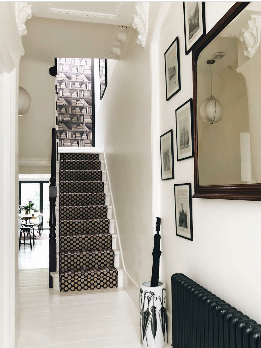
The ever so smart hallway of Kate Watson-Smyth . Stair runner in Quirky B Dotty in Damson by alternative flooring. Walls painted in Winbourne white by Farrow and Ball. Bookcase wallpaper by Young & Battaglia at mineheart design.

  • Make a big statement in your hallway with bold design statements to create an impactful first impression
  • Paint your hallway a dark colour to make the rooms off it appear lighter
  • Consider a bright or bold patterned stair runner to draw your eye up the stairs.
  • Go bolder than you dare in the hallway as you only have to walk through it
  • When renovating your home, decorate the hallway last when all the builders have left
  • Hallways are a great place to display artwork
  • Consider feature wallpaper up the double height wall and accentuate the height of this wall
  • Hang a stunning piece of artwork or wallpaper on the landing at the top of the stairs to draw the light up
  • In dark hallways hang a large mirror. If it can be positioned opposite an open doorway this can increase the sense of light and space.
  • Don’t store all your coats in a small hallway if it chokes up the space
  • Consider shoe storage. A basket and/or a shoe bench works well
  • Plenty of sturdy hooks at heights for bags, and coats. You can even give each member of the family their own hook.
  • Chose practical finishes like hard flooring and scrubbable paint.
  • The inside of your front door is an opportunity to add an accent colour, don’t just leave it white!
interopr designer Sophie Robinsons hallway is painted in Zoffanys Lazuli blue and has a bright pink stair runner. The cement tiles are by Claybrook studio

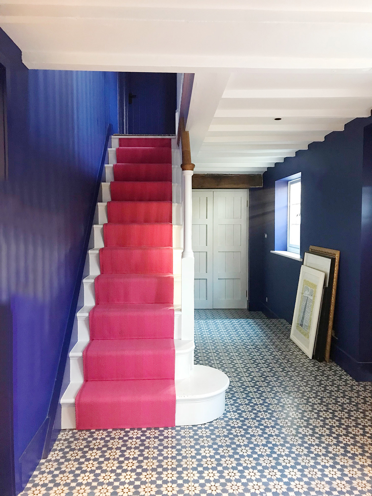
My hallway is painted in Lazuli by Zoffany. Henley bright rose stair runner by Roger Oates. Havana cement tiles by Claybrook Studio. Pictures yet to be hung!

Thanks so much to Dfs for sponsoring the series and to Kate Taylor our producer. This is the end of series 1 of the Great Indoors. We will be back in the new year on January 10th with series 2! Make sure you subscribe so you don’t miss out. All the available places to listen and subscribe are linked on my Podcast page here.


  • DIY
  • Interior Design
  • Interiors
Pantone’s colour of the year: Living Coral Creative & crafty Christmas gifts
  • Christmas
  • Interiors
    • colour crush
    • colour psychology
    • DIY
    • dream home makeovers
    • Home Office
    • Home Tours
    • Interior Design
    • Interior Styling
    • podcast
    • Sophie Robinson X Dunelm
    • Sophie Robinson x Harlequin
    • trends
  • Lifestyle
    • Business
    • Fashion/Beauty
    • Life
    • My House
    • Nosh
    • Travel
  • Rooms
    • Bathrooms
    • Bedrooms
    • Kids rooms
    • Kitchens
    • Living rooms
    • Outside
  • Videos
online influence award winner 2019
Interior Design Winner Sophie Robinson Insta
Videos

Listen

Listen Here

Online courses
by popular demand

Catch Sophie In All Her Colourful Glory On Instagram

Not going to lie, this might be one of my proudest Not going to lie, this might be one of my proudest makeovers ever…
My Dad and Mary’s modern French villa was all beige tiles, white walls and zero personality. So I did what I do best: turned it into a technicolour dreamscape inspired by the countryside views outside those gorgeous bifold doors.

Inspired by early  autumn leaves, emerald green fields, and piercing blue skies we set about making the inside of their home feel as joyful as the outside … now imagine all that bottled up into wallpaper, fabrics, cushions and colour-drenched furniture.

If you’ve ever thought bold colour overwhelming or that pattern was too much for open-plan spaces… this one’s for you. Because colour and pattern sings in nature, and it can work just as well in your home decor.

All wallpapers, rug and cushion fabrics are from my collection with @harlequinfw. Painting by @sophieabbottartist 

Full sourcing list, extra styling tips and a deeper dive into the design story are up now on A Life In Colour: head to my Substack via the link in bio to read more!
End of January check-in… and yes, the struggle to End of January check-in… and yes, the struggle to stay joyful is very real right now. Dark mornings, grey skies, energy running low.

That’s exactly why our homes matter so much at this time of year. They are our sanctuary. The place that should lift your mood, calm your nervous system and make you feel held when the outside world feels a bit, how can I put this...relentless. And this isn’t just a feeling or a design philosophy. It’s backed up by science. Research shows that colour, light, beauty and nature in our homes have a direct impact on mood, wellbeing and happiness. Small, intentional changes really can shift how you feel day to day.

I’d love to know… what brings you the most joy in your home right now? A colour, a room, a plant, a view, a ritual? Share it in the comments 💛

And if you’re ready to go deeper, my big January Sale ends this week.

If you want to truly understand colour psychology and learn how to curate a home that feels joyful, confident and completely you, comment ULTIMATE and I’ll send you the link to my online design school and your opportunity to make the biggest saving of the year.
These are the ingredients to making your home feel These are the ingredients to making your home feel as good as it looks. 

• Confident colour that creates the mood
• Beautiful pattern that delights the eye
• Layered texture that brings it all alive
• Personality in every corner, so it feels like home

Magic happens when you stop playing it safe and start designing a home that truly reflects you. A home that feels joyful, expressive and alive. But designing a home can feel overwhelming. Where do you start? How do you combine colours without it feeling chaotic? How do you clash patterns so it looks considered? How to express your unique personality without merely copying other people’s style?

That is exactly why I created my online design school. After more than 25 years as an interior designer, I have distilled my design process into clear, easy-to-follow courses that take you step by step through combining colours, balancing patterns and adding texture, so you can decorate with confidence and creativity.

And right now, my January Sale is on. You can save a huge 60% on my transformational courses, designed to completely change how you approach your home and how it makes you feel. If you are ready to embrace your creativity and deepen your passion for interior design  comment ULTIMATE and I will send you all the details.
Think Maximalism is ‘too much’, too messy, or only Think Maximalism is ‘too much’, too messy, or only for other people? 

I’m here to tell you: maximalism isn’t chaotic. It’s just misunderstood.

Once you understand how colour and pattern work together, decorating like a maximalist stops feeling intimidating and starts feeling instinctive. Your home starts feeling like you.

If you want to design your home with confidence, my Ultimate Interiors Bundle is exactly what you need. It includes three self-paced online courses that take you inside my design process, teaching you how to use colour and pattern so you can make bold choices that actually work, again and again. 

Right now, the Ultimate Interiors Bundle is a massive 60% off. Buy now, enjoy the saving, and start whenever you are ready to create a home that is completely yours.

Comment ULTIMATE and I’ll DM you the link to find out more.
Welcome to my witchy era! Who else wants to harnes Welcome to my witchy era! Who else wants to harness the Year of the Horse and use this dynamic energy to manifest your best year yet! 

A vision board is like a compass that will lead your goal settings and intentions with total clarity. To prepare i like to take lots of long walks and meditate on what it is so want more of in my life while gratefully letting go of what no longer serves me. 

Join me Wednesday for a live webinar on how to I create a Vision board that will ignite your passion and motivation to live a bold, creative and colourful life! Comment VB26 for the link.
Dark and moody colours can feel intimidating, but Dark and moody colours can feel intimidating, but my TV snug shows just how well they can work. The deep tones soften the space and create a calm, cocooning atmosphere, perfect for evenings spent watching TV, or retreating from the day.

Contrary to what you might think, this room really comes into its own in winter. Low light and long evenings make the colour feel enveloping and cosy. It’s a space that invites you to slow down, sink in, and make yourself comfortable.

I sampled so many different paints but Cordoba by Little Greene was the perfect choice for this room. It’s full of depth and warmth, and just the right amount of drama. 

And if you’re thinking about taking the leap yourself, my tip is: don’t fight the natural light you have, lean into it. Don’t be shy about colour drenching walls, woodwork and ceiling so the room feels seamless and intentional. In my snug, that richness is what makes it feel cosy and complete.

There’s no place I’d rather be on chilly evenings.
How do I explain this feeling to a minimalist? To How do I explain this feeling to a minimalist?

To some people this might look like too much, but for me, maximalism isn’t excessive, it’s pure self expression. I decorate my home to reflect the way I live and that’s full of bold uplifting, joy-giving colour. Every patterned textile, every artwork, every joyful little object earns its place because it makes me feel happy. 

And if I’m being honest a neutral room doesn’t make me feel calm, it makes me feel slightly depressed. My home lifts my mood, fires my creativity and gives me a little thrill every single day.

Now tell me… are you Team Minimal or Team Maximal? And what makes your heart sing at home?
There’s something about walking that has quietly h There’s something about walking that has quietly held me together this past year.

When life threw its challenges my way, my anxiety went into overdrive. I lost clarity, my head was foggy, and the overwhelm shut me down. But walking, one step in front of the other, slowly moved me in the right direction.

We all know walking is good for the body, but it’s also one of the most powerful tools for the mind. Moving helps process stuck emotions, those steady steps soothe racing thoughts, and the changing scenery opens up fresh ways of thinking. Being in nature grounds you. And the best part is, it’s free.

Whenever I’m preparing a new vision for my year or any creative project, I always start with a long solo walk. I take my journal, let the thoughts tumble out, and begin to find a clarity and direction again. Next step is to use my creativity to create a powerful vision board full of images that resonate with how I want to feel and who I want to be. Less of a to do list, more of an emotional reset. This works for me as it brings in the light, and more importantly keeps me inspired and motivated.

If you’re ready to gently clear the fog and get clear on what you want more of, my ‘Life in Colour Vision Board Masterclass’ is now on sale. I’m hosting on the 21st January, 7pm GMT (with a recorded replay available). Comment VB26 below and I’ll send you all the details. 

Can’t wait to see what we can create together this year!
Follow on Instagram
Sophie Robinson
  • © 2025 Sophie Robinson

    /
  • Contact/
  • About/
  • Design by MW

You're almost inside!

Leave me your best email to sign up for the Webinar

MG0001 Magnet Sophie using Tap 021 copy

You're almost inside!

Leave me your best email to sign up for the Webinar