ULTIMATE MAXIMALIST COURSE BUNDLE - £400+ Savings - JANUARY SALE

Sophie Robinson
  • Home
  • Workshops
    • Marrakech Retreat
    • Home Masterclass
  • Online Courses
  • Collaboration
  • Podcasts
  • Blog
  • About
    • About me
    • Work with me
    • Press
  • FAQs
  • Contact
  • Home Tours
  • Interiors
  • podcast
08 Oct 20

Tour of my house renovation, Podcast show notes S9 ep1

IMG 6485 resized

This is a very exciting episode, not only does it kick off series 9 of the Podcast but Kate escaped London to visit me in the country for a tour of my newly decorated abode. It was so lovely to be able to record in person and not confined to our duvet dens, struggling with the joys of technology. I was so intrigued to see what Kate made of my colourful haven and whether she would remove her sunglasses – yes she arrived with sunglasses on a very overcast day – as she was ‘scared’ to enter the house! As always, you can catch the full episode here, and do head on over to our ever-resourceful Facebook book community to share and chat about all things interiors.

First, though we wanted to say a huge thank you to each and every one of you as we were over the moon to reach over 1 million downloads (and beyond) we are truly blown away and didn’t expect our cushion plumping chat would achieve this, so thank you!

On with the tour…

My hallway, now complete with fabulous blinds, made in Spot & Arrow fabric by Ottoline de Vries. Photographed by Alun Callender

First up, the hallway, which Kate has seen before but this time there’s the addition of new blinds. I couldn’t decide on what fabric to choose for these and I hate to admit it – but it was Kate’s idea to go with a fabric that will tie-in with the blue and white theme and let my pink runner take centre stage. She does make a valid point though, if like me, you go for a bold scheme, it’s important to get the balance right, reign it in, otherwise you’ll be looking at a hot mess. The hallway is the perfect place to experiment with colour as it’s a room you tend to move through and choose a colour you really love. I have always been a huge fan of the intense blue and I will never tire of it and I don’t care if it’s ‘in fashion’ or not. Yes, I have used it in the hallway, up the stairs and the landing, I just love it and it links all my rooms together.

As Kate pointed out, when you come home from work, shopping or in from the rain you need a space that will welcome you and make you feel happy and I do feel that when I walk through the door.

My office

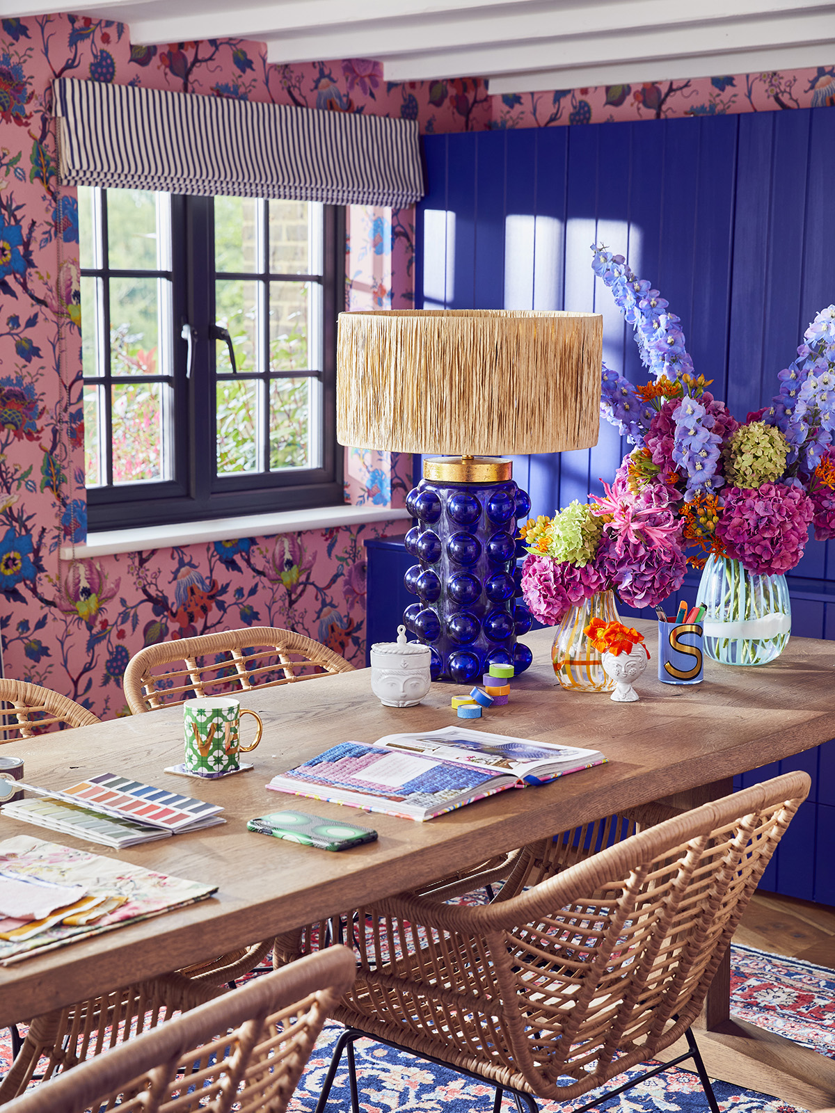
My home office is now complete, a far cry from the white painted walls – what was I thinking! Photographed by Alun Callender

I’ve had this House of Hackney wallpaper on my wish list when it first launched in this fabulous colourway, it made my heart sing and so I held on to it in the hope I could use it somewhere – much to my husband’s dismay. This is part of my philosophy, you have to listen to those heartfelt reactions and if you don’t have a place for it there and then hold onto it and pop it in your inspiration box. You have to listen to your gut and see it through – I should have listened to my own mantra when I first painted the office white.  When you chicken out of something it’s usually the wrong choice and later down the line, you will wish you’d gone for the braver choice. One phrase that sticks in my mind is ‘in order to be confident you have to be courageous first.’

I finally found the perfect sideboard on my doorstep at Vine Street Vintage. Photographed by Alun Callender

This isn’t a feature wall scenario – it’s on all four walls and it now has the thumbs up from the hubby. As I’ve said before, you have to really go for it, otherwise, it will look like you weren’t quite brave enough. Decorate for yourself and not to impress other people, I know that my decorating choices may not be Kate’s cup of tea but it won’t stop her coming over for a drink and recording the odd podcast – even if it is wearing sunglasses!

The key to a successful maximalist scheme is to keep to a tight colour palette and I say go for three hero colours and use them in different proportions. If you have a quick glance at my office, you’ll see pink, blue and white are the foundation colours, yes you’ll also see a hint of orange, lilac and yellow but these are in much smaller doses. So, find your own colours and then follow the recipe to get it right – I don’t believe in copycat interiors!

The living room

The star of the show, my Lady May sofa by Sofa Workshop covered in Magnolia chintz fabric by GP&J Baker. Photographed by Alun Callender

On to the living room and I wondered how the chintz sofa would go down! We got a thumbs-up as she liked the soft colour palette, even though they are my family of colours, they are against a neutral backdrop. As you will discover there is a bit of chintz in each room – my red thread if you like and although they are different colours they are similar in theme. You’ll also see stripes in varying form, the Ottoline blinds in the hallway, ticking stripe curtains in the office and my striped curtains here in the living room. As much I love the energy and movement of a floral I think a scheme needs the calming effects of a stripe to stop the space looking too crazy.

My living room in all it’s colourful glory. photographed by Alun Callender

There wasn’t any mention of my new rug and there’s a reason for that I must confess. Well actually Kate explained – she wanted a Moroccan Beni rug to go in her library and apparently there was a pause, then a snort and then I said don’t be so cliché, I won’t let you have a rug like that, everyone has one! I have to hold my hands up. I’ve been working in the design field for many years and it still can be difficult to make the right choices when it comes to your own home. I’ve got pattern on the sofa, footstool and the gallery wall is pretty full-on needed something a little calmer. As I dig myself out of a hole, the Beni is a classic and not a cliché – it is perfect for my living room which is quite dark and it helps bounce the light around.
Onwards and upwards

Pink sanitaryware, Burlington, Blind In Sporty Stripes Pink By Ottoline De Vries; Seaton Ceramic Wall Tiles In Sunshine, Ca Pietra. Photographed by Alun Callender

The bijou shower room features a yellow that Kate approves of especially the mustard tone of it and also the two-tone effect with the band of white tiles at the top. I put the band of white not only to break up the yellow but to also bring a little more light into the space. It is a very small room (1x2m) but by not having a glass screen it opens it up and you don’t feel squashed in a cubicle while taking a shower. You did need to think about the splash zone within a wetroom – I get a little splash on the sink but it doesn’t go as far as the loo. I think small rooms can really lack character so I always try and get a really bold pattern, preferably oversized and you’ll notice that the fab flooring features my colour palette, including the blue that links to the hallways and a hint of red linking to the room next door……

Weathered Barn planks by Claybrook Studio; Roll top bath Burlington painted in Blazer by Farrow & Ball;  Improvisation wallpaper in red by Ottoline de Vries; Vintage Moroccan rug, by Sunday and Story; Photographed by Alun Callender

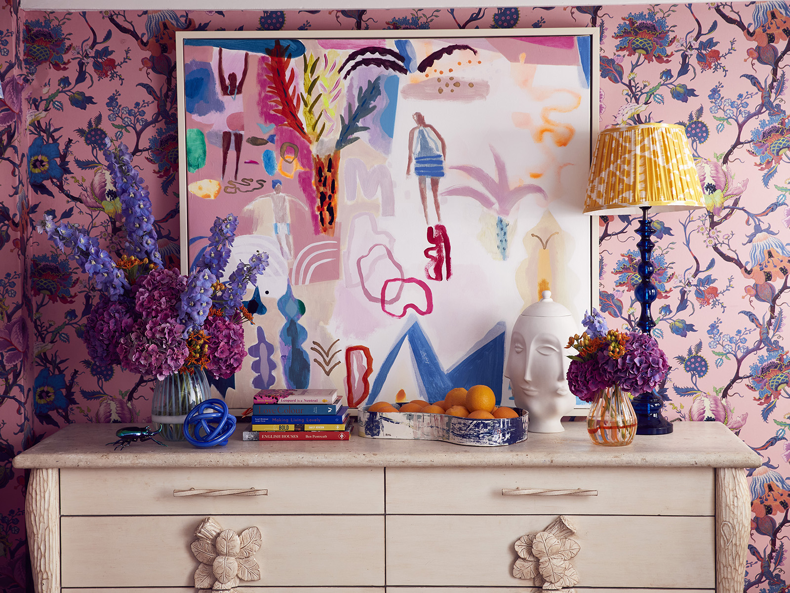
Having the wetroom keeps the loo and the shower out of the bathroom which has allowed me to have a room with a bath! Without those elements, I designed this room as I would a living room, with wooden floor. Do bear in mind most companies will not offer the warranty if used in a bathroom, but I’m confident about using here as there is no shower and I’m not bathing toddlers every night. I can get my pattern in with some fabulous artwork which I spotted at Ardingly antique fair and because I firmed up my colour palette very early on, I only had eyes for things in my colours. I got a message on Insta about the painting being off-centre, not only do I just like it that way but when designing a room I always think about the viewpoint outside the room – so the lesson here is don’t design a room in isolation.

Rattan wall lights by Pooky; Roll Top Basin with Stainless Steel Stand, Burlington. photographed by Alun Callender

In hush voices, Kate noticed that there is a rail around the sink ready for a skirt as I’m hoping the husband won’t notice if I just pop it on one day!  I am on the hunt for a piece of vintage floral fabric to use here, a remnant is a perfect solution for small projects such as this as it will be much more cost-effective.

A work in progress

Tom’s office painted in Sage & Onions by Little Greene

As you can see, Tom’s office is getting there, we added batoning to create some interesting detail and we can’t ignore the colour! Kate did question whether Tom actually likes it or was he coerced into having it in HIS office. I went the green as if he had his way he would live outside so this is the ideal link to nature plus it fits his Autumn personality. Kate did actually ask his thoughts and his reply: “Don’t judge a scheme until it’s finished.” I’ve trained him well!

The kitchen

Finally, we come to the kitchen and you will notice my red thread continues with some more floral pattern. We had white uPVC windows here which in themselves are a design crime on a Victorian farmhouse, but we stuck with them and painted them. We used an undercoat by Zinsser (Little Greene has since launched a primer) and then painted them in Lamp Black by Little Greene and as the wallpaper is quite dark the windows now disappear within the scheme and draw the eye to the view beyond – they no longer shout out for attention.  Colour is such a great tool to distract the eye from things you don’t really like, especially when it comes to budget – replacing these windows would be a hefty sum so they’re staying.

So, in summary, I always abide by my room recipe – bringing together all your ingredients of colour, texture and pattern and stick with it. If you want to explore the colourful side, my latest online course How to Create Maximalist Interiors is where I share my design principles and help you create a beautiful home in your own way.

A huge thank you for listening to the show and please do rate and review, it really does help!

  • Home Tours
  • Interiors
  • podcast
How to design a wetroom WE HIT A MILLION!
  • Christmas
  • Interiors
    • colour crush
    • colour psychology
    • DIY
    • dream home makeovers
    • Home Office
    • Home Tours
    • Interior Design
    • Interior Styling
    • podcast
    • Sophie Robinson X Dunelm
    • Sophie Robinson x Harlequin
    • trends
  • Lifestyle
    • Business
    • Fashion/Beauty
    • Life
    • My House
    • Nosh
    • Travel
  • Rooms
    • Bathrooms
    • Bedrooms
    • Kids rooms
    • Kitchens
    • Living rooms
    • Outside
  • Videos
online influence award winner 2019
Interior Design Winner Sophie Robinson Insta
Videos

Listen

Listen Here

Online courses
by popular demand

Catch Sophie In All Her Colourful Glory On Instagram

Not going to lie, this might be one of my proudest Not going to lie, this might be one of my proudest makeovers ever…
My Dad and Mary’s modern French villa was all beige tiles, white walls and zero personality. So I did what I do best: turned it into a technicolour dreamscape inspired by the countryside views outside those gorgeous bifold doors.

Inspired by early  autumn leaves, emerald green fields, and piercing blue skies we set about making the inside of their home feel as joyful as the outside … now imagine all that bottled up into wallpaper, fabrics, cushions and colour-drenched furniture.

If you’ve ever thought bold colour overwhelming or that pattern was too much for open-plan spaces… this one’s for you. Because colour and pattern sings in nature, and it can work just as well in your home decor.

All wallpapers, rug and cushion fabrics are from my collection with @harlequinfw. Painting by @sophieabbottartist 

Full sourcing list, extra styling tips and a deeper dive into the design story are up now on A Life In Colour: head to my Substack via the link in bio to read more!
End of January check-in… and yes, the struggle to End of January check-in… and yes, the struggle to stay joyful is very real right now. Dark mornings, grey skies, energy running low.

That’s exactly why our homes matter so much at this time of year. They are our sanctuary. The place that should lift your mood, calm your nervous system and make you feel held when the outside world feels a bit, how can I put this...relentless. And this isn’t just a feeling or a design philosophy. It’s backed up by science. Research shows that colour, light, beauty and nature in our homes have a direct impact on mood, wellbeing and happiness. Small, intentional changes really can shift how you feel day to day.

I’d love to know… what brings you the most joy in your home right now? A colour, a room, a plant, a view, a ritual? Share it in the comments 💛

And if you’re ready to go deeper, my big January Sale ends this week.

If you want to truly understand colour psychology and learn how to curate a home that feels joyful, confident and completely you, comment ULTIMATE and I’ll send you the link to my online design school and your opportunity to make the biggest saving of the year.
These are the ingredients to making your home feel These are the ingredients to making your home feel as good as it looks. 

• Confident colour that creates the mood
• Beautiful pattern that delights the eye
• Layered texture that brings it all alive
• Personality in every corner, so it feels like home

Magic happens when you stop playing it safe and start designing a home that truly reflects you. A home that feels joyful, expressive and alive. But designing a home can feel overwhelming. Where do you start? How do you combine colours without it feeling chaotic? How do you clash patterns so it looks considered? How to express your unique personality without merely copying other people’s style?

That is exactly why I created my online design school. After more than 25 years as an interior designer, I have distilled my design process into clear, easy-to-follow courses that take you step by step through combining colours, balancing patterns and adding texture, so you can decorate with confidence and creativity.

And right now, my January Sale is on. You can save a huge 60% on my transformational courses, designed to completely change how you approach your home and how it makes you feel. If you are ready to embrace your creativity and deepen your passion for interior design  comment ULTIMATE and I will send you all the details.
Think Maximalism is ‘too much’, too messy, or only Think Maximalism is ‘too much’, too messy, or only for other people? 

I’m here to tell you: maximalism isn’t chaotic. It’s just misunderstood.

Once you understand how colour and pattern work together, decorating like a maximalist stops feeling intimidating and starts feeling instinctive. Your home starts feeling like you.

If you want to design your home with confidence, my Ultimate Interiors Bundle is exactly what you need. It includes three self-paced online courses that take you inside my design process, teaching you how to use colour and pattern so you can make bold choices that actually work, again and again. 

Right now, the Ultimate Interiors Bundle is a massive 60% off. Buy now, enjoy the saving, and start whenever you are ready to create a home that is completely yours.

Comment ULTIMATE and I’ll DM you the link to find out more.
Welcome to my witchy era! Who else wants to harnes Welcome to my witchy era! Who else wants to harness the Year of the Horse and use this dynamic energy to manifest your best year yet! 

A vision board is like a compass that will lead your goal settings and intentions with total clarity. To prepare i like to take lots of long walks and meditate on what it is so want more of in my life while gratefully letting go of what no longer serves me. 

Join me Wednesday for a live webinar on how to I create a Vision board that will ignite your passion and motivation to live a bold, creative and colourful life! Comment VB26 for the link.
Dark and moody colours can feel intimidating, but Dark and moody colours can feel intimidating, but my TV snug shows just how well they can work. The deep tones soften the space and create a calm, cocooning atmosphere, perfect for evenings spent watching TV, or retreating from the day.

Contrary to what you might think, this room really comes into its own in winter. Low light and long evenings make the colour feel enveloping and cosy. It’s a space that invites you to slow down, sink in, and make yourself comfortable.

I sampled so many different paints but Cordoba by Little Greene was the perfect choice for this room. It’s full of depth and warmth, and just the right amount of drama. 

And if you’re thinking about taking the leap yourself, my tip is: don’t fight the natural light you have, lean into it. Don’t be shy about colour drenching walls, woodwork and ceiling so the room feels seamless and intentional. In my snug, that richness is what makes it feel cosy and complete.

There’s no place I’d rather be on chilly evenings.
How do I explain this feeling to a minimalist? To How do I explain this feeling to a minimalist?

To some people this might look like too much, but for me, maximalism isn’t excessive, it’s pure self expression. I decorate my home to reflect the way I live and that’s full of bold uplifting, joy-giving colour. Every patterned textile, every artwork, every joyful little object earns its place because it makes me feel happy. 

And if I’m being honest a neutral room doesn’t make me feel calm, it makes me feel slightly depressed. My home lifts my mood, fires my creativity and gives me a little thrill every single day.

Now tell me… are you Team Minimal or Team Maximal? And what makes your heart sing at home?
There’s something about walking that has quietly h There’s something about walking that has quietly held me together this past year.

When life threw its challenges my way, my anxiety went into overdrive. I lost clarity, my head was foggy, and the overwhelm shut me down. But walking, one step in front of the other, slowly moved me in the right direction.

We all know walking is good for the body, but it’s also one of the most powerful tools for the mind. Moving helps process stuck emotions, those steady steps soothe racing thoughts, and the changing scenery opens up fresh ways of thinking. Being in nature grounds you. And the best part is, it’s free.

Whenever I’m preparing a new vision for my year or any creative project, I always start with a long solo walk. I take my journal, let the thoughts tumble out, and begin to find a clarity and direction again. Next step is to use my creativity to create a powerful vision board full of images that resonate with how I want to feel and who I want to be. Less of a to do list, more of an emotional reset. This works for me as it brings in the light, and more importantly keeps me inspired and motivated.

If you’re ready to gently clear the fog and get clear on what you want more of, my ‘Life in Colour Vision Board Masterclass’ is now on sale. I’m hosting on the 21st January, 7pm GMT (with a recorded replay available). Comment VB26 below and I’ll send you all the details. 

Can’t wait to see what we can create together this year!
Follow on Instagram
Sophie Robinson
  • © 2025 Sophie Robinson

    /
  • Contact/
  • About/
  • Design by MW

You're almost inside!

Leave me your best email to sign up for the Webinar

MG0001 Magnet Sophie using Tap 021 copy

You're almost inside!

Leave me your best email to sign up for the Webinar