GET THE REPLAY OF THE VISION BOARD MASTERCLASS - LIFE IN COLOUR

Sophie Robinson
  • Home
  • Workshops
    • Marrakech Retreat
    • Home Masterclass
  • Online Courses
  • Collaboration
  • Podcasts
  • Blog
  • About
    • About me
    • Work with me
    • Press
  • FAQs
  • Contact
  • Interior Design
  • Interiors
21 Jan 21

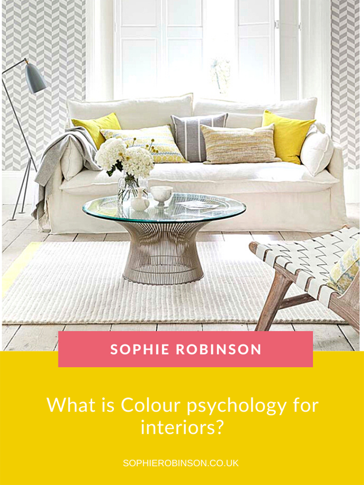
What is Colour psychology for interiors?

Sophie Robinson  0295

Colour causes emotion. It’s energy light waves that hit our retina, send signals to the brain and boom. We feel it. But…and here’s the exciting part, we don’t all feel it in the same way. So, it follows that understanding your own unique relationship to colour is fundamental in creating a home that supports you emotionally which is why I enjoy teaching this subject the most. Angela Wright, the psychologist who researched how colour affects our emotions and behaviour uncovered that different personality types have different colour palettes that resonate with them in a positive way. This has been game-changing for me as a professional designer- helping me read my clients much more quickly and create a home for them that feels, well truly perfect for them. And it has literally blown the minds of hundreds of students I’ve taught this technology to.

It’s so easy to quickly feel overwhelmed with all the mouth-watering images on Pinterest, magazines and Instagram. But which look is right for you? How to you piece together a colour scheme that is harmonious and creates flow and cohesion throughout the house while also making each room feel different.

The answers to these common questions are solved with colour psychology. I love to feel inspired by the trends, but you mustn’t feel beholden to them. Talking to friends and families about your schemes can be a great sounding board, but ultimately the decision has to be made by you because here’s the thing. Only YOU know how to design a home that feels right for you.

Colour psychology offers up an easy to follow framework that first of all helps you understand more about who you are and your unique preferences and then how to harmonise a palette that will create successful schemes. With clarity and complete confidence. My wish is of course that it helps you make bolder design decisions, and ones that you love to live with for years to come!

So how does it all work? Ultimately the Wright theory establishes four different personality types. These are labelled Spring, Summer, Autumn, Winter for illustrative purposes that I will go into later. (This is not ‘Colour me Beautiful’ that some of you may remember from the ’90s, where bits of fabric were matched to your skin tone!) Colour Psychology for interiors, it isn’t just about what personality you are but the personality of the room too. The hues, patterns, textures and indeed decorative style of the room can really change the mood and behaviour in a space. Read on to find out which decorating style and colour palette resonates with you.


SPRING PERSONALITY

Spring is all about new life and that burst of energy as the sun comes to warm up the earth after a cold winter. Nature is busy this time of year for nature and for gardeners. So naturally, the Spring personality is full of optimism, youthful energy and fresh creativity. Spring people are typically bubbly, social and love outdoor pursuits. It follows that their company is infectious, and their homes fulfil that purpose as places to entertain family and friends, preferably with doors thrown open so everyone can spill outside. The connection to nature and the outdoors is strong, so sunlit rooms with large windows, botanical motifs and plenty of plants is one of the ways a Spring personality will keep this connection.

A Spring interior feels fresh, modern and full of light. Colours are soft, joyful and uplifting to maximise the sense of space and positivity. Image by California Shutters.

The decorative style that suits a Spring personality is one that avoids heaviness or darkness. Colours are light, bright and buoyant and decorative styles help to maximise this feeling of lightness. Think twinkly chandeliers, glass furniture, mirrors. But like the Spring season there is a gentle softness, so think less bling and more twinkle! Spring people love a feeling of spaciousness and so the open-plan space where everyone can be together would be an ideal way for them to live. They are attracted to newness and the excitement of new trends, so interiors will look fashionable. And for rooms that you want to feel upbeat, joyful and energising you can borrow elements from the Spring palette.


SUMMER PERSONALITY

If summer conjures up images of inflatable flamingos’, garish sombrero’s and turquoise seas in the Caribbean- banish those thoughts for a moment. Instead, picture a quintessential European summer that’s more faded and subdued and dare I say it elegant. The perky greens and daffodil yellows of spring fade to a more subtle palette of sun-bleached hayfields, powdery hydrangeas and dripping wisteria. The warm sun signifies a time to relax, bathe and take a break.

With this seasonal landscape in mind, the summer personality is graceful and elegant and more reserved in character. Summer personalities are cool, calm and collected, composed and organised. In terms of interiors, they are not so interested in keeping up with the pace of ever-changing trends and would much rather stick to their own sense of timeless style, not particularly attached to the past or the future.

A summer room is all about understated elegance. A cool and muted colour palette and painterly patterns create a graceful and calming mood. Image by Romo.

Just as the summer landscape is faded and sun-bleached, this personality is drawn towards soft, cool, muted and chalky colours. Where there is a lack of colour contrast, quality and tactility become more important to invest in the real thing; wool, cashmere, linen and the finest velvets. Summer people are drawn to flowing fabrics like the drape of heavy French linen or faded painterly floral. Rooms are impeccably well-curated, planned and organised. Rooms where you want to create an air of calm and understated elegance borrow from the Summer palette.


AUTUMN

A change in pace again Autumn has all the fiery energy of bonfire night. Colours intensify as leaves turn burning russet red, rich golds. The Autumn palette is warm and intense. And like Spring the energy is very forward moving with plenty of work to be done in the garden and for the harvest. This robust and abundant energy, in preparation for the coming winter, is at the heart of the Autumn personality.

Autumn personalities are externally motivated and busy people. They are typically fiery, full of passion, integrity and drive and have a deep connection to the natural world in all its glory and are the most likely to be concerned with its preservation.

Rustic textures, organic materials and a warm, cosy and welcoming vibe sum up the Autumn vibe. Image by Carpetright.

This is reflected in their homes with the choice of materials; wood, exposed stone and brick, cotton, jute and pottery and anything organic and sustainable. They love to celebrate craftsmanship so objects with often have the thumbprint of the handmade on them. Rarely inspired by modern trends, they look to the past for inspiration, and feel most at home in a period property and will fill it with vintage and up-cycled items. The colour palette is inherently warm and intense from the colours of the autumn landscape through to rich jewel tones. Autumn interiors feel warm cosy and grounding so if you want to create a room with this feel, borrow from the Autumn palette.


WINTER

In my view Winter, as a season, is massively underestimated. When you embrace it, you can appreciate the striking stillness. While nature hibernates, and everything goes underground we are left with an arresting landscape. The bare branches appear architectural against the bright winter sun making a strong visual statement in its starkness.

Similarly, the Winter personality is non-comprising and no-nonsense. They tend to speak their mind and don’t suffer fools. They are decisive with sharp wit and clarity.

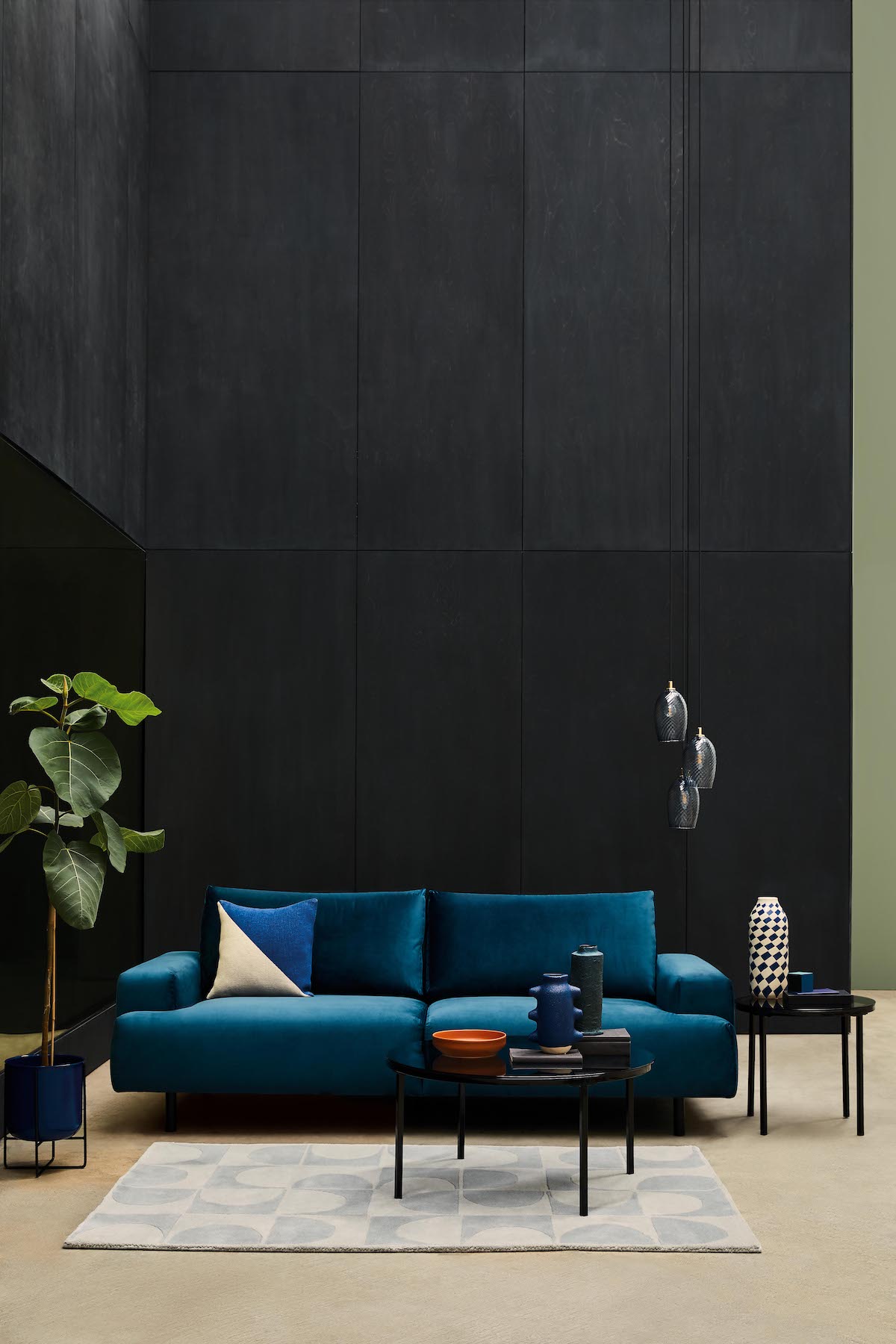
Less is more in a winter scheme and the eye is taken to making a statement and unabashed luxury. Image by Habitat.

A winter room scheme will be considered and efficient with no unnecessary embellishments. It’s more about creating one powerful statement and if it comes with a big price tag, that’s a plus as Winter personalities are not afraid to show off and celebrate their success. It’s less about following the trends and more about setting them.

In terms of colour again they favour the extremes, stark contrasted with dark.  They are the only season that could live with pure bright white or pure jet black. Any accent colour added to this neutral backdrop would be sharp, saturated and cool in tone for max visual impact.

Their love of high-end luxury will be reflected in the materials they choose, shiny metallic’s, leather and marble. I can’t help thinking that Winter people must have been in their hay-day in the 1980s with all the chrome, black leather and geometric prints that were popular of that time. A room that wants to appear impressive and make a striking statement can borrow from the winter palette.

I hope this has given you some insight. We rarely fall into one season neatly so you may find that a couple of these seasonal personalities resonate with you. You may now begin to realise why some rooms in your home have never felt quite ‘right’ and why some spaces make you feel the best version of yourself.

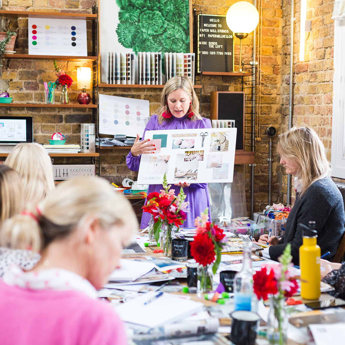
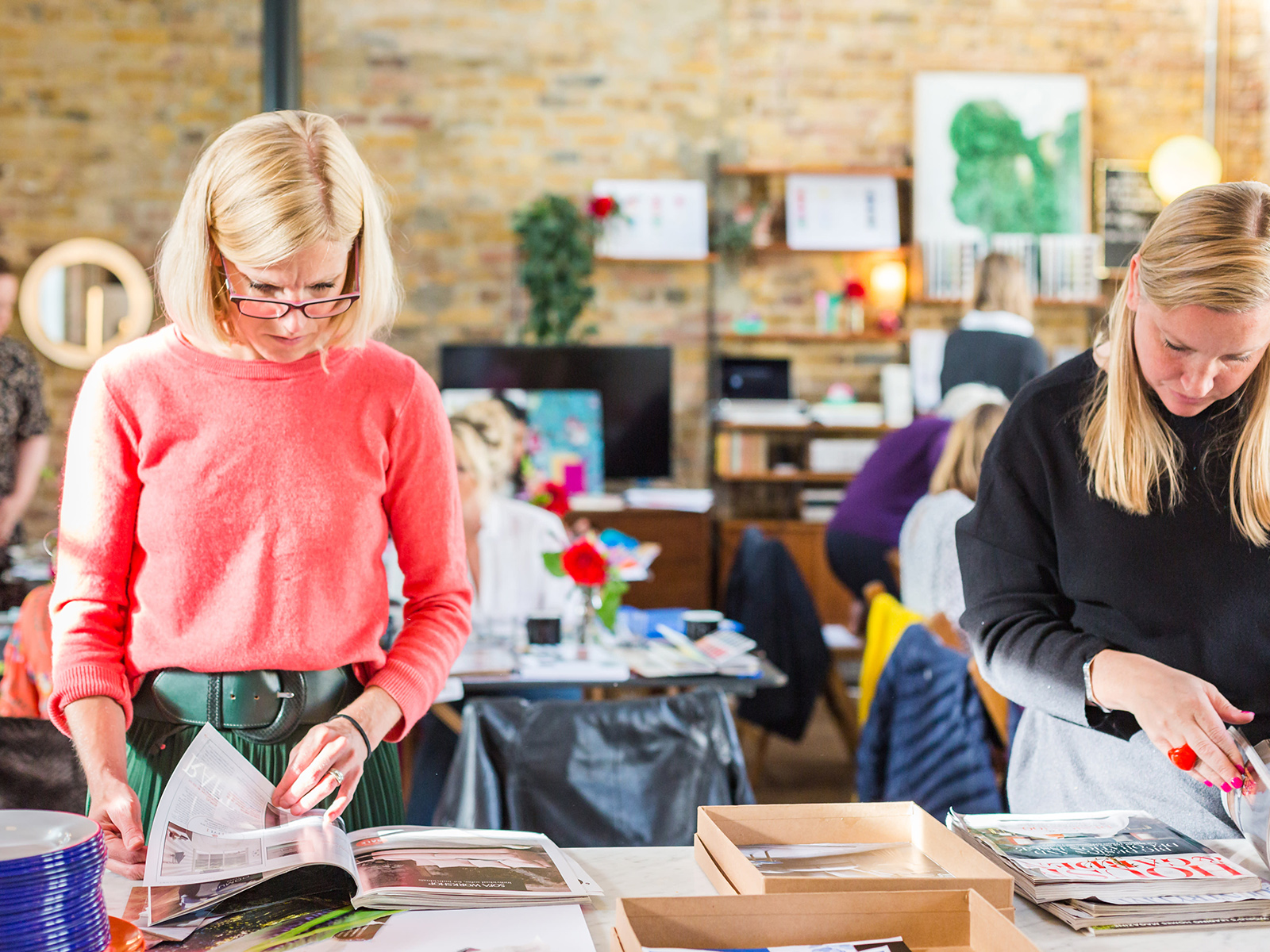
My online course ‘Colour Psychology for interiors’ has been devised to take you through an easy to follow process to firstly discover more about yourself, but mostly on how to create rooms that feel as good as they look. First and foremost, I’m an interior designer, not a psychologist, but this technology has been a game-changer in helping me find my creative flow. Which ultimately takes out the wasted time procrastinating so whole decoration process more creative, fun and empowering. You can learn more about my course here.


  • Interior Design
  • Interiors
Easy decorating wins and e-design, Podcast show notes, S10 Ep2 5 ways to get inspired for your interior schemes
  • Christmas
  • Interiors
    • colour crush
    • colour psychology
    • DIY
    • dream home makeovers
    • Home Office
    • Home Tours
    • Interior Design
    • Interior Styling
    • podcast
    • Sophie Robinson X Dunelm
    • Sophie Robinson x Harlequin
    • trends
  • Lifestyle
    • Business
    • Fashion/Beauty
    • Life
    • My House
    • Nosh
    • Travel
  • Rooms
    • Bathrooms
    • Bedrooms
    • Kids rooms
    • Kitchens
    • Living rooms
    • Outside
  • Videos
online influence award winner 2019
Interior Design Winner Sophie Robinson Insta
Videos

Listen

Listen Here

Online courses
by popular demand

Catch Sophie In All Her Colourful Glory On Instagram

February. Rain. More rain. And then just for varie February. Rain. More rain. And then just for variety… rain. The dog and I relished the excuse to stay tucked up at home. But inside? Big plans and some serious plotting around the kitchen table. February has that quiet, held-breath quality. Everything looks still, yet beneath the surface it’s all quietly preparing to burst into life. I’m more than ready for that spring light to unleash some very exciting plans! Who else is ready?!

FEBRUARY ROUND UP
	1.	Just how much rain?! Honestly. Biblical.
	2.	Creating shape and big ideas with @teamyo_weight_training .
	3.	Major shoot energy for my AW 2026 collection. So proud of this one.
	4.	Celebrating the fabulous new scents at @vyraoworld . Heaven in a bottle.
	5.	Catch-ups with these sirens @micboehm77  @yasminsewell Creative refuel.
	6.	Photoshoot at the house. @jadefarmiloemua claims best mug, obviously.
	7.	Lucy ready for hair and make-up. Born for backstage life.
	8.	I finally caved and bought an air fryer. Brilliant but why do Ugly.
	9.	Watching the pond like it’s Netflix. What will spawn this spring? 🐸
	10.	My lovely Dad staying with us and recuperating after a nasty illness. Tender days.
	11.	Healing sunlight breaking through when we needed it most.
	12.	Three generations, sofa-bound, watching the rugby. Proper joy.
	13.	14. The wonderful Wes Anderson exhibition at the @designmuseum . Go. Get inspired.
	15. February has its own special bleakness. I’m ready for sunshine on that sea.
	16.	Lucy fully committed to hibernation season. Respect.
	17.	An elegant mess. Story of my life.
	18.	Lucy taking the minutes at a very exciting team meeting. Promotion pending.
	19.	First signs of spring 🌼 Always right on time.
AD Still smiling after revealing my latest colourf AD Still smiling after revealing my latest colourful homewares collection with @Dunelmuk. Bringing a collection like this to life takes months of dreaming, designing and attention to detail, so sharing it with everyone felt incredibly special. Expect joyful colour, layered pattern and all the maximalist touches you know I love. The whole collection is now available to shop in store, online and on the Dunelm app. I could not be prouder. 💛
January. A grateful round up. Rolling into 2026 an January. A grateful round up.
Rolling into 2026 and chasing colour in all its forms, from piercing blue winter suns to raspberry red Moroccan sunrises. I knew I’d be ready for you, 2026. And we have started beautifully.

1. A quiet promise to myself to make 2026 as colourful as possible
2. New Year’s Eve… exactly as it began
3. And then how it went. A proper sweaty dance at @alphabetbrighton 
4. Hosting a bonfire at home with friends to burn away 2025. @jothornephotography 
5. Watching embers glow beneath a full moon. Emotional in the best way
6. Snow, low sun and the most perfect winter palette
7. Still walking it out! Bracing the cold with @sophieabbottartist @edwinaboase 
8. A much needed colour hit, hosting my interiors retreat with @elfennmarrakech 
9. Me and partner in crime @em_lappin  at @lallamarrakech 
10. The joyful jolt of colour only the Marrakech souks can deliver
11. Discovering the new @ritaalaoui_artist art installation at El Fenn
12. New moon meditation with the wonderful @alexadecastilho 
13. Gently shaping a new vision for 2026
14. Harnessing that wild horse energy for my vision board webinar
15. Proud moments unveiling my latest collection to the press at @dunelmuk 
16. Catch ups with my lovely TV chums @hardcastletowers @francescarowanplowden @jackkinsey @ritamillat 
17. Feeling genuinely excited about this collection and all the squeals it is delivering
18. Finally ticking off my 360 health scan at @nekohealth 
19. Becoming mildly obsessed with pastel, colour drenched interiors
20. It looks busy, but January has mostly been this. Rest. Reflection. Happy wintering.
Not going to lie, this might be one of my proudest Not going to lie, this might be one of my proudest makeovers ever…
My Dad and Mary’s modern French villa was all beige tiles, white walls and zero personality. So I did what I do best: turned it into a technicolour dreamscape inspired by the countryside views outside those gorgeous bifold doors.

Inspired by early  autumn leaves, emerald green fields, and piercing blue skies we set about making the inside of their home feel as joyful as the outside … now imagine all that bottled up into wallpaper, fabrics, cushions and colour-drenched furniture.

If you’ve ever thought bold colour overwhelming or that pattern was too much for open-plan spaces… this one’s for you. Because colour and pattern sings in nature, and it can work just as well in your home decor.

All wallpapers, rug and cushion fabrics are from my collection with @harlequinfw. Painting by @sophieabbottartist 

Full sourcing list, extra styling tips and a deeper dive into the design story are up now on A Life In Colour: head to my Substack via the link in bio to read more!
End of January check-in… and yes, the struggle to End of January check-in… and yes, the struggle to stay joyful is very real right now. Dark mornings, grey skies, energy running low.

That’s exactly why our homes matter so much at this time of year. They are our sanctuary. The place that should lift your mood, calm your nervous system and make you feel held when the outside world feels a bit, how can I put this...relentless. And this isn’t just a feeling or a design philosophy. It’s backed up by science. Research shows that colour, light, beauty and nature in our homes have a direct impact on mood, wellbeing and happiness. Small, intentional changes really can shift how you feel day to day.

I’d love to know… what brings you the most joy in your home right now? A colour, a room, a plant, a view, a ritual? Share it in the comments 💛

And if you’re ready to go deeper, my big January Sale ends this week.

If you want to truly understand colour psychology and learn how to curate a home that feels joyful, confident and completely you, comment ULTIMATE and I’ll send you the link to my online design school and your opportunity to make the biggest saving of the year.
These are the ingredients to making your home feel These are the ingredients to making your home feel as good as it looks. 

• Confident colour that creates the mood
• Beautiful pattern that delights the eye
• Layered texture that brings it all alive
• Personality in every corner, so it feels like home

Magic happens when you stop playing it safe and start designing a home that truly reflects you. A home that feels joyful, expressive and alive. But designing a home can feel overwhelming. Where do you start? How do you combine colours without it feeling chaotic? How do you clash patterns so it looks considered? How to express your unique personality without merely copying other people’s style?

That is exactly why I created my online design school. After more than 25 years as an interior designer, I have distilled my design process into clear, easy-to-follow courses that take you step by step through combining colours, balancing patterns and adding texture, so you can decorate with confidence and creativity.

And right now, my January Sale is on. You can save a huge 60% on my transformational courses, designed to completely change how you approach your home and how it makes you feel. If you are ready to embrace your creativity and deepen your passion for interior design  comment ULTIMATE and I will send you all the details.
Think Maximalism is ‘too much’, too messy, or only Think Maximalism is ‘too much’, too messy, or only for other people? 

I’m here to tell you: maximalism isn’t chaotic. It’s just misunderstood.

Once you understand how colour and pattern work together, decorating like a maximalist stops feeling intimidating and starts feeling instinctive. Your home starts feeling like you.

If you want to design your home with confidence, my Ultimate Interiors Bundle is exactly what you need. It includes three self-paced online courses that take you inside my design process, teaching you how to use colour and pattern so you can make bold choices that actually work, again and again. 

Right now, the Ultimate Interiors Bundle is a massive 60% off. Buy now, enjoy the saving, and start whenever you are ready to create a home that is completely yours.

Comment ULTIMATE and I’ll DM you the link to find out more.
Welcome to my witchy era! Who else wants to harnes Welcome to my witchy era! Who else wants to harness the Year of the Horse and use this dynamic energy to manifest your best year yet! 

A vision board is like a compass that will lead your goal settings and intentions with total clarity. To prepare i like to take lots of long walks and meditate on what it is so want more of in my life while gratefully letting go of what no longer serves me. 

Join me Wednesday for a live webinar on how to I create a Vision board that will ignite your passion and motivation to live a bold, creative and colourful life! Comment VB26 for the link.
Follow on Instagram
Sophie Robinson
  • © 2025 Sophie Robinson

    /
  • Contact/
  • About/
  • Design by MW

You're almost inside!

Leave me your best email to sign up for the Webinar

MG0001 Magnet Sophie using Tap 021 copy

You're almost inside!

Leave me your best email to sign up for the Webinar