ULTIMATE MAXIMALIST COURSE BUNDLE - £400+ Savings - JANUARY SALE

Sophie Robinson
  • Home
  • Workshops
    • Marrakech Retreat
    • Home Masterclass
  • Online Courses
  • Collaboration
  • Podcasts
  • Blog
  • About
    • About me
    • Work with me
    • Press
  • FAQs
  • Contact
  • Interior Design
  • Interiors
05 Mar 25

A Maximalist’s Guide to wallpaper

Wallpaper is maximalist magic and I have to admit at being obsessed! It can be bold, expressive, or quiet and textural but the one thing I love about it most is it often comes packed with pattern personality. I can’t understand why you’d settle for plain walls when you could have charming florals, or elegant chinoiserie, bold geometrics, or a scene-stealing mural?! It’s not just decoration—it’s a style statement. Question is which pattern personality are you?

You may have heard that latest interior buzz is all about colour drenching right now—this is using one shade of paint across walls, ceilings, and woodwork to create an immersive effect. But for maximalists we can do one better and pattern drenching is where it’s at. Wrap walls, ceilings, even cabinetry in a glorious prints. The effect is confident, layered, and utterly indulgent.

If you’re ready to transform your space with wallpaper, here’s how I’ve done it in my own home, the maximalist way…

Pick a print that suits your personality

One of my key design threads is to choose a pattern motifs and repeat it throughout your home. Are you tropical jungle vibes, English country florals, zig zags or stripes? I’ve taken inspiration from the location of my home, a Sussex country farm house, nestled amongst woodland and wild flowers. When I worked on my collection of wallpapers with Harlequin, we used this as a jumping off point for the whole collection, and I urge you to do the same when it comes to your own home. It helps give a sense of coherence, personality and flow to your home. Myself and the Harlequin design team took inspiration from their incredible archive and updated classic English country florals with a modern colour palette. This summed up my personal style which loves to straddle old and new. I love vintage finds along side contemporary art and ceramics. I feel that my bedroom design sums up my style perfectly with this incredible Eighteenth century floral, recoloured and renamed Wonderland Floral. I love the way it dances around the room and mimics the view of the tree tops from my bedroom window. And yes, you’ve guessed it, I’ve wrapped the whole room around in this wonderful pattern. If you live by the sea, you may be inspired by watery blues and dreamy fluid patterns. A city home I think allows for a little more poetic licence, and really anything goes.
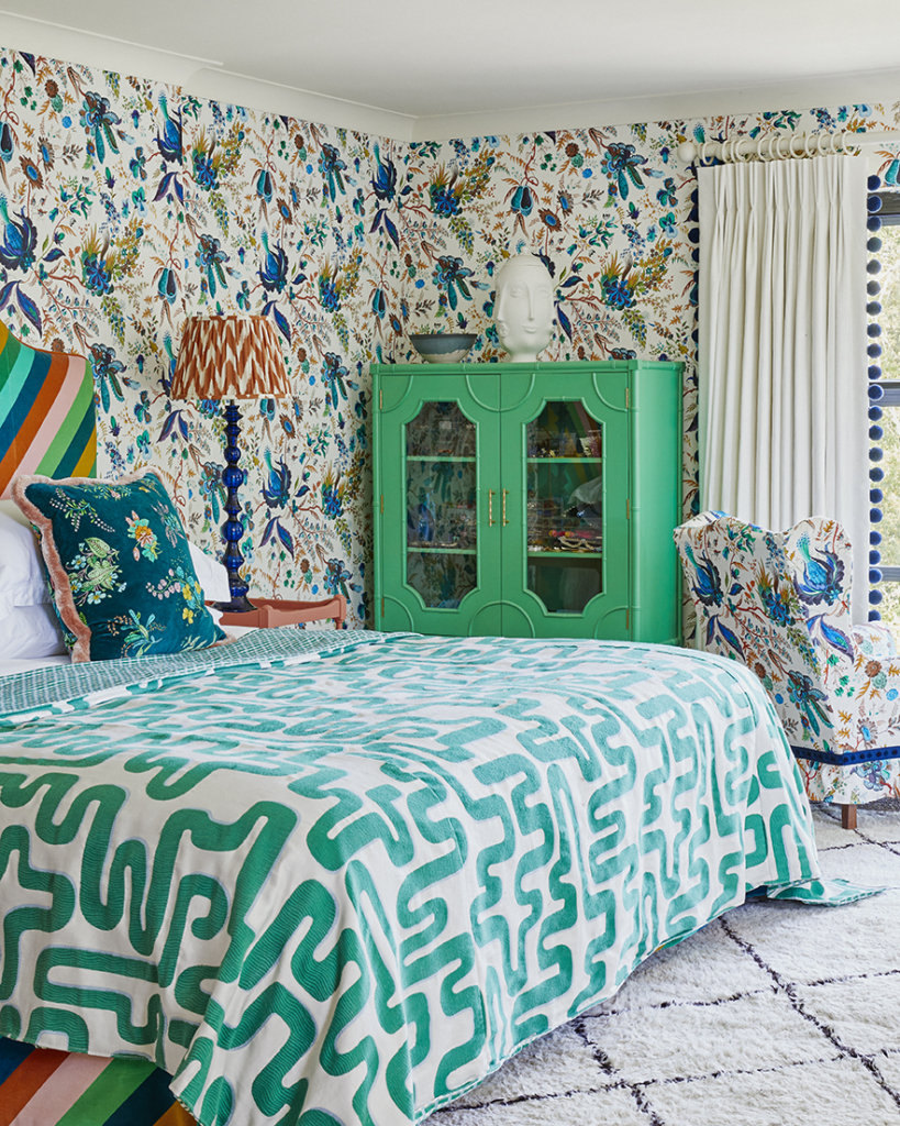
Sophie Robinson Maximalist Master Bedroom Interior

Wonderland floral wallpaper in lapis, Harlequin x Sophie Robinson, available at John Lewis.

Yes, you can wallpaper a bathroom!

This has to be one of my most asked questions over on Instagram.  As long as you keep it away from splash zones, like behind the basin and bath and if you are concerned by humidity you can give it a coat of  decorator’s varnish (which is matt in appearance) to protect it against the moisture. My bathroom doesn’t have a shower in it so I’ve not bothered and all I can say is that after 5 years, it’s holding up strong! 

Because most bathrooms are small but mighty, they can handle bold prints. A dramatic floral wrapping around all four walls would look so luxurious or like me, go for a joyful geometric that dances around the room. Bathrooms can be so hard to add a stamp of personality to so if you can get some pattern in here it will really elevate the space, and bring in some much needed colour and interest. 

Wallpaper is “Improvisations” by Ottoline De Vries

The kitchen – let the wallpaper do the talking

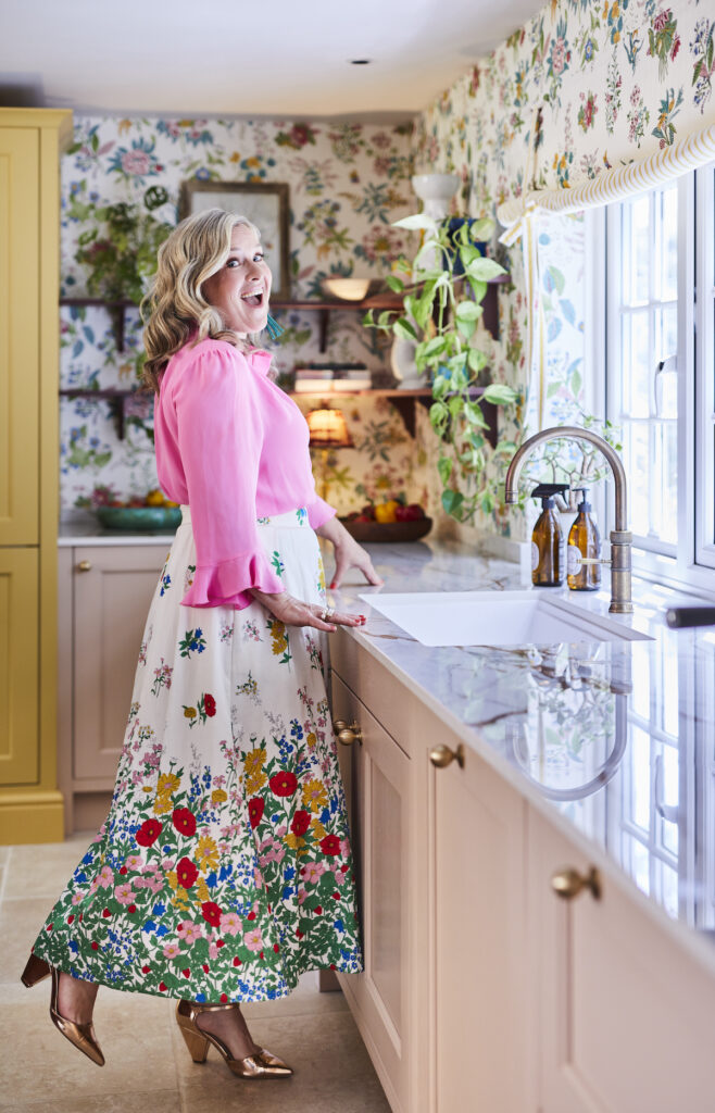
This fabulous Woodland floral wallpaper totally sets the tone in my kitchen. Just like bathrooms, there is a misconception that you can’t wallpaper in this heavy traffic room but again, a few practical things to consider and it’ll hold up fine. Again avoid splash back areas like around the sink and hob. I’m lucky (or did I cleverly plan it) but my sink is positioned in front of the window and the hob is in the island. If either are against the wall you’d need tiles or a glass splash back. I recommend an up-stand all around the worktops so you aren’t wiping up against the wallpapered wall. Again you can apply a couple of coats of decorators varnish and the wallpaper will become wipeable.

Sophie Robinson and her dog Lucy in her maximalist kitchen

Woodland floral wallpaper, Harlequin x Sophie Robinson, available at John Lewis.

When designing my overall kitchen scheme I picked the wallpaper first, then pulled my cabinet colours, work surface, and even the curtains from its palette. The result? A space that looks effortlessly put together, like everything was meant to be.

If you don’t want to go for an all four wall strategy in your kitchen you could consider zoning an area in pattern, like a dining nook, behind open shelves, or even inside cupboards for an unexpected pattern pop! 

pink kitchen cabinets with floral wallpaper and open shelves

I used the colour palette within the Woodland floral wallpaper to pick cabinetry colours, and anchors the maximalist scheme. Kitchen Cabinets: Magnet

Murals: the ultimate statement

Murals are wallpaper on steroids. They turn walls into giant works of art and while commonly used on a single feature wall, I say… why stop there?! In my office, I wrapped the entire room in this glorious mural , and now it feels like I’m working inside a woodland glade. This ‘Into the woods’ mural is particularly special as its been digitally printed on a textured vinyl that makes it feel like an artists canvas, it’s so clever. It was painted for my collection with Harlkequin, and Flora from the studio hand painted this scene which is the actual view from my office window! Pretty special huh? I have to say, I LOVE IT.


Sophie Robinson in her bold and beautiful home office with outdoor inspired wall mural and striped chair

‘Into The Woods’ mural from my collection with Harlequin x Sophie Robinson, available at John Lewis.

One thing to consider with any mural or wallpaper is what to paint the adjacent walls, wood work and ceilings because this must be considered. You absolutely cannot default to white. In my office I painted the ceiling Pale Berlin, by Little Greene, as it matched into the blue sky at the top of the mural. I did consider painting all my wood work in one of the forest greens, but instead chose to keep my lazuli blue, from Zoffany, as it’s part of my design thread and ties in as there are streaks of this colour throughout the mural.

Maximalist office with clashing patterned rug, and curtains with painted woodwork and ceiling

Ceiling in Pale Berlin, by Little Greene. woodwork in lazuli blue, Zoffany. Curtains and blinds made in Garden terrace, Chair covered in wonderland Floral, Harlequin x Sophie Robinson.

Want to make a room feel bigger? Wallpaper it!

It’s a misplaced preconception that wallpaper crowds a room and makes it feel smaller when in fact the right pattern can make a room feel bigger, and definitely more interesting.

Take my petite guest bedroom, just 3 m x 3m, it’s not huge. I chose this delightfully delicate daisy trellis wallpaper, which has a light white ground which helps the eye travel through the pattern, and beyond.  It’s a maximalist optical illusion, and I adore the way it makes this little cottage style bedroom feel extra special too. You could try a scenic mural for extra depth, a vertical stripe to stretch the ceiling height, or a large-scale floral to bring an unassuming room to life.

Daisy Trellis wallpaper in Sophie Robinsons home. Blue and yellow schemed room with double bed and bedside table

Daisy Trellis wallpaper: Sophie Robinson X Harlequin

Instead of going for a contrasting colour on woodwork, here I’ve pulled the white from the wallpaper and colour matched it to a particular white paint colour then applied it on doors, skirting, panelling. This allows the subtle pattern to do the talking. Thing to note here is the wrong white would really shine out, so take your time getting the right one. It’s good to establish who the hero in the room is, and here I didn’t want anything competing. However I have pulled out the yellow from the daisy motif and painted our cottage style windows in it, in order to draw attention to the stunning view outside. But the key take away here is always match your paint colours, even whites, to the wallpaper. 
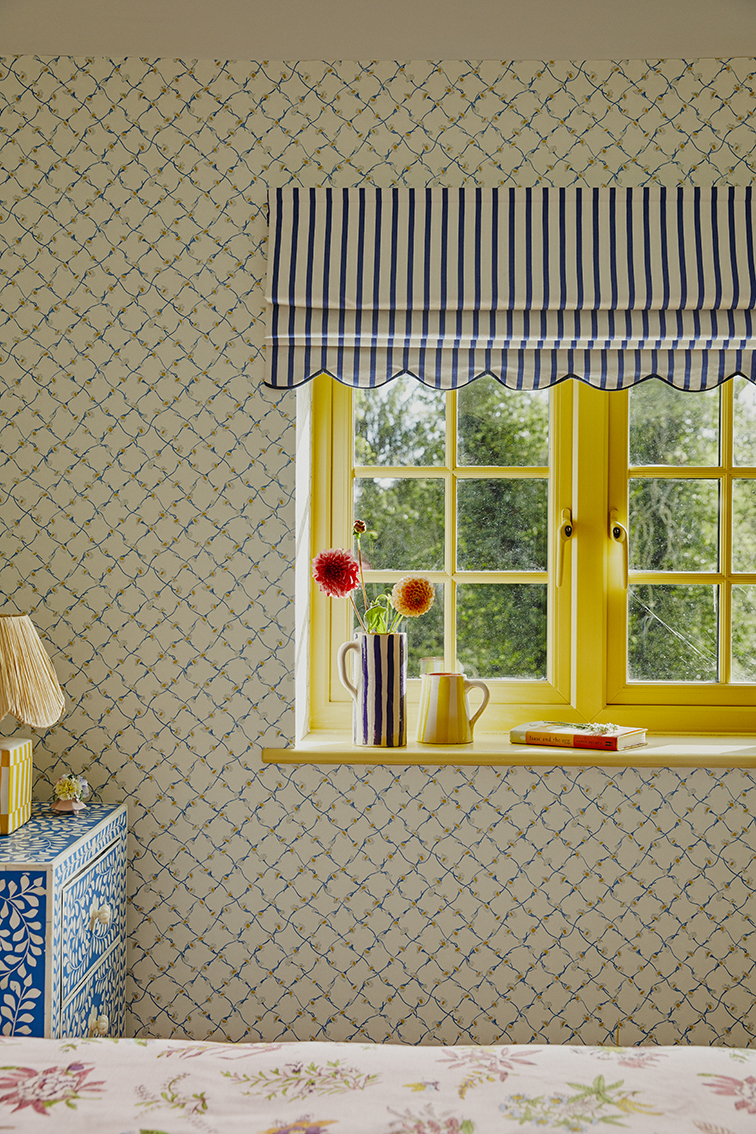
Window painted in Grandiflora by Sanderson.

Wallpaper is your best friend – use it everywhere!

So to recap. We all know now that wallpaper is not just for feature walls but can give you so much charm and visual impact wrapped around all four walls, even the ceiling too! It’s what will instantly supercharge your room in the style stakes.

I particularly love to pattern drench a space. This may be taking a mural all the way around the room or choosing a contrasting pattern and applying it to alcoves or the ceiling. Pick a paint colour from your wallpaper for woodwork and ceilings and bring cohesion to the whole scheme. Because maximalism is all about MORE, wallpaper is one of the best way to get there.

Feeling inspired? If you’ve enjoyed this post and would love to deepen your knowledge on how to add all the other elements that make up a successful patterned room scheme then let’s turn that excitement into action! My online course How to Create Maximalist Interiors is jam packed with all my interior design know-how and trade secrets, with a foolproof process to help you craft a home bursting with pattern personality. No pressure, no deadlines, no homework—just pure design joy to be enjoyed at your own pace.

So, ready to ditch the beige and embrace the bold? Let’s do this!


  • Interior Design
  • Interiors
Spring Forward: A Joyful Refresh For Your Home How to Build a Colour Palette – The Art of Colour Psychology
  • Christmas
  • Interiors
    • colour crush
    • colour psychology
    • DIY
    • dream home makeovers
    • Home Office
    • Home Tours
    • Interior Design
    • Interior Styling
    • podcast
    • Sophie Robinson X Dunelm
    • Sophie Robinson x Harlequin
    • trends
  • Lifestyle
    • Business
    • Fashion/Beauty
    • Life
    • My House
    • Nosh
    • Travel
  • Rooms
    • Bathrooms
    • Bedrooms
    • Kids rooms
    • Kitchens
    • Living rooms
    • Outside
  • Videos
online influence award winner 2019
Interior Design Winner Sophie Robinson Insta
Videos

Listen

Listen Here

Online courses
by popular demand

Catch Sophie In All Her Colourful Glory On Instagram

Not going to lie, this might be one of my proudest Not going to lie, this might be one of my proudest makeovers ever…
My Dad and Mary’s modern French villa was all beige tiles, white walls and zero personality. So I did what I do best: turned it into a technicolour dreamscape inspired by the countryside views outside those gorgeous bifold doors.

Inspired by early  autumn leaves, emerald green fields, and piercing blue skies we set about making the inside of their home feel as joyful as the outside … now imagine all that bottled up into wallpaper, fabrics, cushions and colour-drenched furniture.

If you’ve ever thought bold colour overwhelming or that pattern was too much for open-plan spaces… this one’s for you. Because colour and pattern sings in nature, and it can work just as well in your home decor.

All wallpapers, rug and cushion fabrics are from my collection with @harlequinfw. Painting by @sophieabbottartist 

Full sourcing list, extra styling tips and a deeper dive into the design story are up now on A Life In Colour: head to my Substack via the link in bio to read more!
End of January check-in… and yes, the struggle to End of January check-in… and yes, the struggle to stay joyful is very real right now. Dark mornings, grey skies, energy running low.

That’s exactly why our homes matter so much at this time of year. They are our sanctuary. The place that should lift your mood, calm your nervous system and make you feel held when the outside world feels a bit, how can I put this...relentless. And this isn’t just a feeling or a design philosophy. It’s backed up by science. Research shows that colour, light, beauty and nature in our homes have a direct impact on mood, wellbeing and happiness. Small, intentional changes really can shift how you feel day to day.

I’d love to know… what brings you the most joy in your home right now? A colour, a room, a plant, a view, a ritual? Share it in the comments 💛

And if you’re ready to go deeper, my big January Sale ends this week.

If you want to truly understand colour psychology and learn how to curate a home that feels joyful, confident and completely you, comment ULTIMATE and I’ll send you the link to my online design school and your opportunity to make the biggest saving of the year.
These are the ingredients to making your home feel These are the ingredients to making your home feel as good as it looks. 

• Confident colour that creates the mood
• Beautiful pattern that delights the eye
• Layered texture that brings it all alive
• Personality in every corner, so it feels like home

Magic happens when you stop playing it safe and start designing a home that truly reflects you. A home that feels joyful, expressive and alive. But designing a home can feel overwhelming. Where do you start? How do you combine colours without it feeling chaotic? How do you clash patterns so it looks considered? How to express your unique personality without merely copying other people’s style?

That is exactly why I created my online design school. After more than 25 years as an interior designer, I have distilled my design process into clear, easy-to-follow courses that take you step by step through combining colours, balancing patterns and adding texture, so you can decorate with confidence and creativity.

And right now, my January Sale is on. You can save a huge 60% on my transformational courses, designed to completely change how you approach your home and how it makes you feel. If you are ready to embrace your creativity and deepen your passion for interior design  comment ULTIMATE and I will send you all the details.
Think Maximalism is ‘too much’, too messy, or only Think Maximalism is ‘too much’, too messy, or only for other people? 

I’m here to tell you: maximalism isn’t chaotic. It’s just misunderstood.

Once you understand how colour and pattern work together, decorating like a maximalist stops feeling intimidating and starts feeling instinctive. Your home starts feeling like you.

If you want to design your home with confidence, my Ultimate Interiors Bundle is exactly what you need. It includes three self-paced online courses that take you inside my design process, teaching you how to use colour and pattern so you can make bold choices that actually work, again and again. 

Right now, the Ultimate Interiors Bundle is a massive 60% off. Buy now, enjoy the saving, and start whenever you are ready to create a home that is completely yours.

Comment ULTIMATE and I’ll DM you the link to find out more.
Welcome to my witchy era! Who else wants to harnes Welcome to my witchy era! Who else wants to harness the Year of the Horse and use this dynamic energy to manifest your best year yet! 

A vision board is like a compass that will lead your goal settings and intentions with total clarity. To prepare i like to take lots of long walks and meditate on what it is so want more of in my life while gratefully letting go of what no longer serves me. 

Join me Wednesday for a live webinar on how to I create a Vision board that will ignite your passion and motivation to live a bold, creative and colourful life! Comment VB26 for the link.
Dark and moody colours can feel intimidating, but Dark and moody colours can feel intimidating, but my TV snug shows just how well they can work. The deep tones soften the space and create a calm, cocooning atmosphere, perfect for evenings spent watching TV, or retreating from the day.

Contrary to what you might think, this room really comes into its own in winter. Low light and long evenings make the colour feel enveloping and cosy. It’s a space that invites you to slow down, sink in, and make yourself comfortable.

I sampled so many different paints but Cordoba by Little Greene was the perfect choice for this room. It’s full of depth and warmth, and just the right amount of drama. 

And if you’re thinking about taking the leap yourself, my tip is: don’t fight the natural light you have, lean into it. Don’t be shy about colour drenching walls, woodwork and ceiling so the room feels seamless and intentional. In my snug, that richness is what makes it feel cosy and complete.

There’s no place I’d rather be on chilly evenings.
How do I explain this feeling to a minimalist? To How do I explain this feeling to a minimalist?

To some people this might look like too much, but for me, maximalism isn’t excessive, it’s pure self expression. I decorate my home to reflect the way I live and that’s full of bold uplifting, joy-giving colour. Every patterned textile, every artwork, every joyful little object earns its place because it makes me feel happy. 

And if I’m being honest a neutral room doesn’t make me feel calm, it makes me feel slightly depressed. My home lifts my mood, fires my creativity and gives me a little thrill every single day.

Now tell me… are you Team Minimal or Team Maximal? And what makes your heart sing at home?
There’s something about walking that has quietly h There’s something about walking that has quietly held me together this past year.

When life threw its challenges my way, my anxiety went into overdrive. I lost clarity, my head was foggy, and the overwhelm shut me down. But walking, one step in front of the other, slowly moved me in the right direction.

We all know walking is good for the body, but it’s also one of the most powerful tools for the mind. Moving helps process stuck emotions, those steady steps soothe racing thoughts, and the changing scenery opens up fresh ways of thinking. Being in nature grounds you. And the best part is, it’s free.

Whenever I’m preparing a new vision for my year or any creative project, I always start with a long solo walk. I take my journal, let the thoughts tumble out, and begin to find a clarity and direction again. Next step is to use my creativity to create a powerful vision board full of images that resonate with how I want to feel and who I want to be. Less of a to do list, more of an emotional reset. This works for me as it brings in the light, and more importantly keeps me inspired and motivated.

If you’re ready to gently clear the fog and get clear on what you want more of, my ‘Life in Colour Vision Board Masterclass’ is now on sale. I’m hosting on the 21st January, 7pm GMT (with a recorded replay available). Comment VB26 below and I’ll send you all the details. 

Can’t wait to see what we can create together this year!
Follow on Instagram
Sophie Robinson
  • © 2025 Sophie Robinson

    /
  • Contact/
  • About/
  • Design by MW

You're almost inside!

Leave me your best email to sign up for the Webinar

MG0001 Magnet Sophie using Tap 021 copy

You're almost inside!

Leave me your best email to sign up for the Webinar