fbpx
Sophie Robinson
  • Home
  • Workshops
    • Marrakech Retreat
    • Ban the beige
    • Masterclasses
  • Online Courses
  • Collaboration
  • Podcasts
  • Blog
  • About
    • About me
    • Work with me
    • Press
  • FAQs
  • Contact
  • colour crush
  • Interiors
22 Feb 17

Colour crush: Pale pink

pale pink walls in livingroom is freshened up with lime yellow mid century modern chair. walls painted in Dorchester mid by Little Green paint

For any of you following me on Instagram stories you’ll know that the only colour I’m obsessing about right now is pale pink. Its been so fashionable in Interior Design for the past couple of years it’s almost on it’s way to being the new beige. ‘Blush’ and ‘nude’ have been the types of lingo used to rebrand our favourite sugary shade.

Living room with pastel pink walls

Image: Clive Tompsett

I’m so thrilled that my Mum is up for having a pink bedroom in the new Annex we’re currently renovating. It’s the perfect colour choice as it’s a really relaxing, cosseting and nurturing colour so spot on for a place where you want to rejuvenate. Sadly its become labelled ‘girly’ so for many of us husbands give it the veto. I know mine has. But my Mum is however building her own home and for the first time in her life making all the deisgn decisions for herself. It’s a wonderful experience for her.

So a pink bedroom it is, but getting the right hue, really hard!  Anything towards lilac looks too fresh and chilly for a bedroom and anything to warm could nudge over to peach. And my Mum already did peach in the 80’s and is not ready for the re run. I’ll keep you posted here and on Instagram on how we get on with our pink seeking mission. Meanwhile here is some pink inspiration.

Pale pink bedroom with matching pale pink curtains

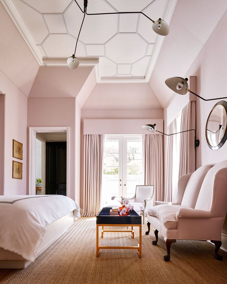
This image just goes to show that pink doesn’t have to look frilly or girly. The rather grand architecture is softened by this perfect shade and I love how the curtains match in with the walls.

soft pink walls and white painted floor in a victorain living room
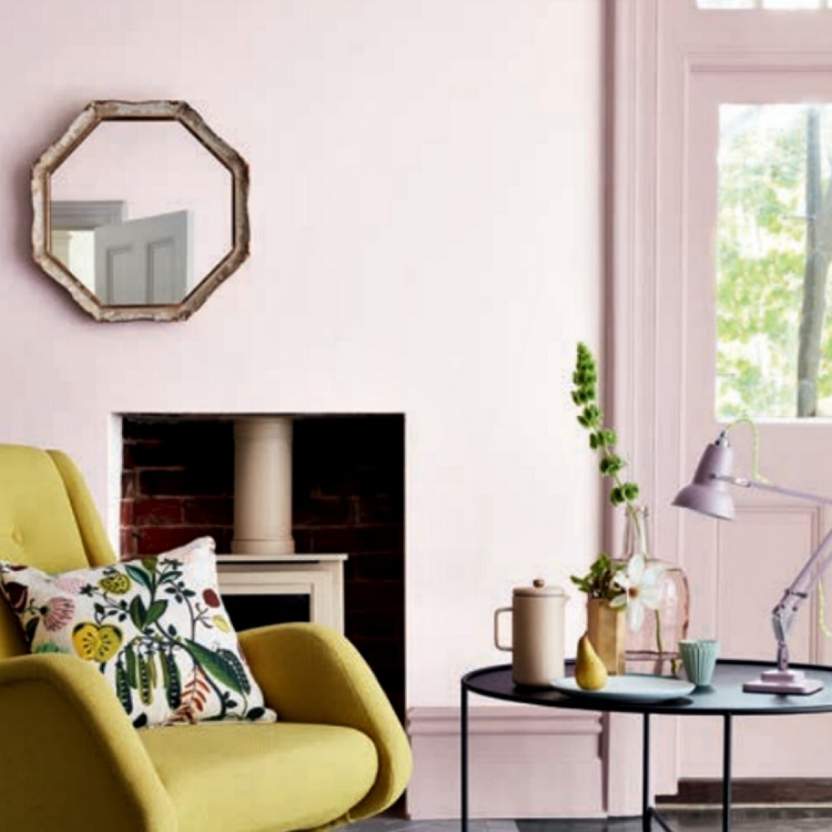
Pale pink walls look super fresh and modern  with white painted floor and clean lined furniture. I love the way the wood work is painted in a pink shade too which completes the softness.

Pink+master+bedroom+with+grey+chairs

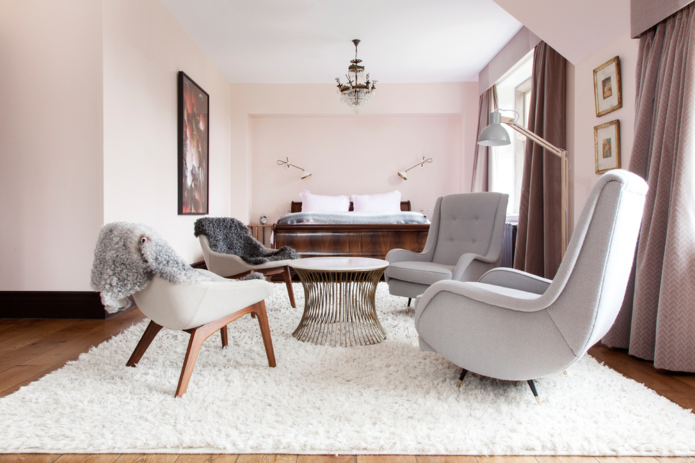
Image from The Pink House. Photo Susie Lowe

This is such a super subtle pink you barely notice it. It’s Middleton Pink by Farrow and Ball and is a very fresh and pretty colour. Pairing it with sleek mid century furniture and soft greys creates a very sophisticated look indeed. I’m also loving the dark wood floor and furniture that lifts the otherwise pastel scheme.

pale-pink-kitchen-via-light-locations

Image from Light Locations

Isn’t this kitchen just absolutely to die for. I love to see pink in a kitchen as it’s rather unexpected. Here its teamed with darks, black and gold, a colour palette made in heaven. And loving the cheeky pop of blue, so unexpected in the corner. This room looks very Calamine from Farrow and ball to me which has been a huge favourite with you guys over on Instagram.

Pale-Pink-Bedroom-with-Mirrored-nightstand-kreyv-tocrave.blogspot.com_

I’ve had this image on my Pinterest boards for years. While its a bit trad for my tastes I just love the soothing vibe this soft pink creates, with the clever darker grey pink on the ceiling. The white furniture and mirrored furniture is all it needs to lift the look.

pale pink dining room with black chairs and gold sputnik lamp. Styled by Emily Henderson

Image: Emily Henderson

There are so many things I love about this image. First up it’s styled by my girl crush, Stylist Emily Henderson. Secondly its sharing my love of pale pink with black but if that wasn’t sexy enough some gold brass is thrown in too. Super cool and just how pink should be. Soft but sexy.

So as you can see there is no shortage of pink love out there. I’ll keep you posted with how we get on on our quest for the perfect hue. And if you have any advice on how you find the perfect pink, please don’t hesitate to leave me your comments below.

  • colour crush
  • Interiors
Construction of the Annex Build renovation Furniture layout and electrical plan for the Annex project

comments

Heather on 23.02.17

Dulux have a lovely pink called Tea Rose. It’s a pale ‘dirty’ pink and not at all sugary. My husband was not keen on pink, and it’s not usually something I would go for but we both love this shade in our hallway and landing which makes a perfect contrast with the blues in the rest of the house. Good luck on finding your favourite hue.

Reply
Sophie Robinson on 23.02.17

Thats a great recommendation, I’ll def look it up. I think a colour mixed paint, like Dulux, might be on the cards. All the pre-mixed brands seem too warm or too cool!

Reply
Katie on 23.02.17

Just thinking about my mum’s pink and grey bathroom in the 80’s hearing about your mum’s peach.

Reply
Sophie Robinson on 23.02.17

Yes pale pink and grey was a thing back then too. Well it all comes around again!

Reply
Jess on 23.02.17

Went through the same process with pale pink for our office/spare room. Soooo many choices, but I just couldn’t find ‘the one’. The room is very small and can be a bit dark and cold in winter, so I definitely wanted a shade that would warm it up, but without overpowering the space (and as an office space I didn’t want to go too crazy). In the end I also went for a Dulux colour-mixed (Caribbean Dawn 4) which is I think on the coral end of the scale. It looks fab with the brass light fixture, tropical cushions, and lots of plants under the skylight. I threw in some touches of neon pink and black too. Best of all our little nieces love coming to visit and staying in the pink room! Good luck with your search – I am completely enjoying following the progress on Instagram. X

Reply
Sophie Robinson on 24.02.17

It sounds like you’ve made a lovely space. I’m loving all these stories of rooms painted pink. I think I want to do my whole house in it!!!

Reply
SarahCiel on 26.02.17

Loving the pale pink rose quartz it’s a beautiful colour to add as an accent too in a cushion or something I have a pink floral sofa with bold poppy and rose cushions I made in a liberty print silk we put soft rose cushions with copper and some hot pink too it’s quite gorgeous!!

Reply
Sophie Robinson on 10.03.17

This sounds heaven! I love to see patterned sofas. And with copper too- LOVE!

Reply

Leave a Comment

Cancel Reply

Your email address will not be published.

  • Interiors
    • colour crush
    • colour psychology
    • DIY
    • dream home makeovers
    • Home Tours
    • Interior Design
    • Interior Styling
    • podcast
    • trends
  • Lifestyle
    • Business
    • Fashion/Beauty
    • Life
    • My House
    • Nosh
    • Travel
  • Rooms
    • Bathrooms
    • Bedrooms
    • Kids rooms
    • Kitchens
    • Living rooms
    • Outside
  • Videos

mailing
list

Videos

Listen

Listen Here

Online courses
by popular demand

Catch Sophie In All Her Colourful Glory On Instagram

Ah @the_rhs Chelsea! What a feast for the eyes! In Ah @the_rhs Chelsea! What a feast for the eyes! Inbetween biblical downpours, thunder and lightning, it was a wonderful day of colour, design and chatter with some wonderful women! I’m slowly falling in love with gardening and my phone roll is full of inspiration after being immersed in natures finest. Thanks @michelleogundehin and @hazelgardinerdesign @thesohoagencyuk for the company. And a big congratulations Hazel on this stunning floral installation. And don’t forget if you want to hang out and be inspired by all things colour then my FREE live webinar is on tonight (25th) at 7pm tonight! Hop on to my profile for the link to sign up. Cannot wait to share some inspirational colour filled time with you all 

#rhschelsea
This is the first room we decorated after our reno This is the first room we decorated after our renovations. The entrance to your home creates the first impression. It’s also the room you walk into first thing in the morning and when you return home at the end of a long day. It needs to create the right welcome and what that feels like is hugely personal. For me I chose my favourite colours, this powerful cobalt  blue has always been a colour I’m drawn to. My wardrobe is full of it. And the bright pink is another one that always makes me instantly happy. Together they are a striking combination and I think anyone who walks through my front door, immediately gets a sense of what I’m about. I’m passionate about creating interiors that authentically  reflect the people who live there. Studying the psychology of colour made it so much easier for me, giving me a deeper understanding on the affects of colour and streamlining my process. If you’d like to know how to unlock your colour super power, join me for a free webinar this Wednesday evening (available to up for 48 hours after). It an introduction into colour psychology for interiors and my hope is it inspires you to have the courage and conviction to know what’s right for you.  And for a deeper dive my online course Colour Psychology for interiors has opened for enrolment. All links to sign up are in my bio on my profile @sophierobinsoninteriors 
What does your hallway say about you? 
📷 @aluncallenderphoto 
CREDITS walls in lazuli by @zoffanyfw stair runner @roger_oates floor tiles @claybrookstudio door painted in rose ash @sanderson1860 

#colourpsychology #colourpsychologyforinteriors #banthebiege #punchyhome #hallway #boldcolourinteriors #colourlover
My kitchen, the heart of my home. The smallest, da My kitchen, the heart of my home. The smallest, darkest room in the house with no view, but that’s old houses for you! You’ll often find the kitchen in the worst place. So to amp up the joy I chose a forest green (hunters green by @zoffanyfw) for the cabinets to mirror the woodland outside. We sourced reclaimed school science lab work tops and I wrapped the room in one of my favourite papers, Rubarber by @borastapeter. Tom put in retro fit underfloor heating and we used reclaimed terracotta tiles from @ca_pietra_  so the floor looks as old as the house but feels so warm! . For the ugliest darkest room in the house it’s become our favourite because of the colours, patterns and rustic textures.that’s the power of great interior design! 
Next up in my series of posts about the psychology of colour is the Autumn personality. You’ll have a love of rich deep warm Colours, natural finishes, nature inspired patterns and period features. The autumn palette is warm, earthy abs rich and perfect for making spaces feel cosy and inviting. 
To learn more about the autumn personality, hop on up to my bio and click the link to be taken to the blog. And you can sign up to my FREE webinar I’m hosting next Wednesday if you’d like to learn more about this powerful framework. 
Meanwhile have a gorgeous weekend! 
📷 @aluncallenderphoto Styling @katemcphee 

#colourpsychology #banthebeige #autumnpersonality #colourpsychologyforinteriors #kitchen #greenkitchen #countryhomesandinteriors #countrykitchen #ihavethisthingwithcolor #myeclectichome #maximalistdecor
Come and join my FREE webinar on Colour Psychology Come and join my FREE webinar on Colour Psychology next Wednesday 25th at 7pm GMT 🤩 hop on up to the link in my bio @sophierobinsoninteriors to register.
My brilliant online course, Colour Psychology for Interiors, is open for enrolment this month, so if you fancy finding out a bit more about this utterly game changing framework I’d love to have you join. It’s SO MUCH more than ‘ red is energising’, ‘blue is calming’ stuff you’ve all heard before. This is a deep dive into discovering how colours work, how to harmonise them and discovering your own unique and authentic style. Only then can you create a home you live and one that supports you emotionally. I LOVE teaching this stuff because the feedback I get from students is mind blowing! Don’t take my word for it, sign up for the free webinar today! 😍 and if you’ve already done my course, please share in the comments below what you loved about it. 

#colourfulhome #colourpsychology #colourpsychologyforinteriors #banthebeige #colourlover #confidentcolour #confidentcolourscheming
Have you found your design mojo? Do you gravitate Have you found your design mojo? Do you gravitate towards a style of interiors that just feels so ‘you’. Making a home is so much more than creating beautiful squares for Instagram. It has to FEEL right and this is where the psychology of colour comes in. Colour is light, it has an energy which directly impacts your brain and emotions. And we all have a unique relationship to it. So rather than follow the crowd, be swayed by trends it’s so important to understand your own authentic relationship with colour. Over on the blog today I’m starting a series of posts all about the seasonal colour personalities. First up is spring which is all the joy, uplift and energy. My bathroom, pictured above, is very ‘spring’ with light reflecting walls, energetic patterns and bright colours. The mood  is uplifting, fresh and feel-good. Hop on up to my link in my profile to read the blog post in full and discover if you are a Spring personality and how to create rooms that reflect this joyful mood. 
Tap for credits
📷 @aluncallenderphoto 

#colourpsychology #colourpsychologyforinteriors #banthebeige #colourfulhome #colourlover #ihavethisthingwithcolor #spring #springbpersonality #colourfuldecorchallenge #homedecor #myeclecticmix #bathroom #bathroominspo
So proud of mr best mate @sophieabbottartist who o So proud of mr best mate @sophieabbottartist who opens her house this weekend to showcase her artwork in her home as part of Brightons artists open houses. She’s always been a creative whirlwind and keeps the joy of colour alive in her paintings inspired by the sea, and the local woodlands that surround her home in Brighton. For Sophie, colour gives her life, she’s the ultimate joy monger and I’m so blessed to have her as my side kick in life. If you get a chance today, pop round to heed for a bolt if the feel good vibes

#artistopenhouses #brighton #colourlover #banthebiege #ihavethisthingwithcolour
When you find the palette of colours you love, you When you find the palette of colours you love, you just wantto surround yourself  in every part of your home! This painting by @studiocoverdale really hits the mark for me, with all my favourites on one place. Today I’m opening my most popular online course, ‘Colour Psychology for a interiors’, ready  for your enrolment. This is my most popular and indeed  powerful course. It gets to the core of how colours work in harmony , how they effect you emotionally and how to bring all the design and pattern  elements together to make your home and your heart sing! I’m a Spring personality, and with that I adore all the busy patterns, bright and vibrational colours, plenty of pretty details and preferably all at once! While typical spring personalities prefer a more delicate and soft colour palette, my secondary season is Autumn, which prefers richer and punchier shades. Combined together my home is unique and perfect for me. I honestly rarely want to leave the house! And while this framework is an amazing tool for interior design, it’ll also give you colour confidence in every area of your life including your wardrobe. I can’t recommend it enough. When I started implementing this framework  in my own design practice six years ago it was absolutely game changing! While I’ve  always been confident with bold colour, this insight gave me the clarity to speed up my design process and get it right every time! Hop on over to the link in my bio to find out more. 
📷 @aluncallenderphoto 
#colourpsycholgy #colourlover #banthebiege #colourfulhome #colourmyhome #maximalistinteriors #boldbravebeautifulinteriors #dopaminedressing #dopaminedecor
The power of paint! I’ve been extolling it’s v The power of paint! I’ve been extolling it’s virtues my entire career. Roll a bold new hue on your walls and voila! Game changer. But on our recent podcast @mad_about_the_house explored the wider impact of paint on the environment. An astonishing 50 million litres makes it into landfill each year so it feels like, as serial decorators, we could all club together and do our bit to bring that figure down. 
It’s a minefield but over on my blog today I sum up my tips on how we can easily use less of it and round up the paint brands who are doing their bit to tackle the issues. From the ingredients in the tin, to recycling waste paint, to using pouches rather than tins, there is plenty of innovative ideas. Choosing natural paint feels like a good option and if you’re hooked on designer paint colours, it’s no more expensive. Last year I painted my bedroom Turquoise by @edwardbulmerpaint and I’m thrilled with the colour, quality and durability. Just goes to show lovely paint doesn’t have to cost the earth. Hop onto the link in my profile for the full post and if you know if a paint brand who are tackling the environmental issues raised, please give them a mention in the comments below.

#ecopaint #ecodecor #ecohome #paint #turquoise #bedroom #podcast #banthebiege #colourfulhome #colourlover #itsonlypaint #interiordecorating #interiordesign #colourscheme
Load More… Follow on Instagram
Sophie Robinson
  • © 2017 Sophie Robinson

    /
  • Contact/
  • About/
  • Design by MW

Don't forget to join!

You're almost inside!

Leave me your best email to sign up for the Webinar