GET THE REPLAY OF THE VISION BOARD MASTERCLASS - LIFE IN COLOUR

Sophie Robinson
  • Home
  • Workshops
    • Marrakech Retreat
    • Home Masterclass
  • Online Courses
  • Collaboration
  • Podcasts
  • Blog
  • About
    • About me
    • Work with me
    • Press
  • FAQs
  • Contact
  • Interior Design
  • Interiors
  • Lifestyle
  • My House
16 Mar 17

Creating a neutral grey interior colour palette

Greys material palette

The interior design schemes for the Granny Annex (I promised my Mum I wouldn’t use that term but sorry Mum, it’s what it is!!) anyway, the interior design schemes are coming along really nicely and we are beginning to see the background colour scheme pulling together. Mum actually moves in this weekend! She’s keen to move out of her rented place and although the annex will be habitable, it won’t be finished in terms of the furnishings. But we’re cool with that as we love a slow cooked design and it gives us plenty of time to shop for those special pieces.

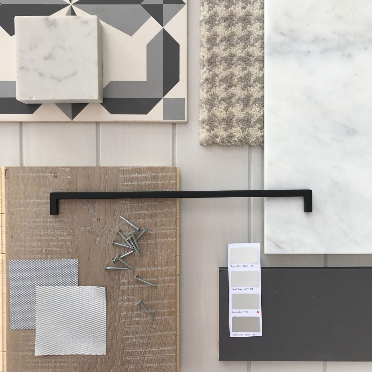
The one thing I have put in place is the neutral back drop that will sit against all the delicious pops of colour and pattern that we intend to introduce further down the road. As its a 2 bedroom single story building with an open plan kitchen dining and living area I felt it important to rein in the colour scheme to help give the building flow from room to room and from space to space. As the exterior is black it felt right to use a soft grey inside on which to base our neutral palette. We tried a few different wall colours, but many felt too cool and stark. My Mum was also keen that it look like a grey not just white so we needed a grey with some depth. We plumbed for one of my favourite neutrals, French Grey by Little Green Paint Company. This colour is then scaled up and down from dark to light, so I picked out French Grey Pale for the ceilings. For me bright white ceilings can be too harsh, especially if you have a nice soft colour on the walls.

The next big investment is the flooring and as its such a large expanse in the open plan area, we wanted something with character. The Rough grey oak floor by Quickstep was the perfect fit for this scheme. Mum loved the raw saw marks throughout each board, and we felt it tied in nicely with the rustic exterior of the building. It also had a washed grey oak appearance which would look softer than the orange tones in natural oak against the wall colour. The preference is for carpet in the bedrooms and we just couldn’t bare the thought of a drab grey so I spotted this totally delicious Houndstooth carpet that has a distinct pattern that looks more of a texture from afar. I can’t wait to see it down! Pattern for floors is a ‘thing’ right now and I’m loving it!

When designing a neutral room scheme it is so important to think of texture and tone and lots of contrast between the two. The T&G paneling across the walls would add texture and interest and the soft smudgy veins in the white Cararra marble bathroom tiles would mirror the composite worktop in the kitchen. I think it’s really important to create these subtle links from room to room. Then in terms of tone we chose a family of warm greys that worked well together and then added some dark black highlights, in the floor tiles and ironmongery. All the switches and sockets and door furniture in the property is matt black, which again links in with the exterior colour. And looks damn sexy!

All that’s wanted now is a dash of vibrant colour, so watch this space!

A pallete of soft grey tones for a grey interior design scheme. Colour palette is amde of of samples and materials that have great contrast

  1. Teltos Carrara worktop, Landford Stone.
  2. Lewtrenchard floor tile, Original Style.
  3. Pebble houndstooth carpet, Brintons.
  4. Serac marble tiles, Topps Tiles.
  5. Painted in Drakensburg, Paint and Paper Library
  6. T&G panelling painted in French Grey, Little Greene Paint Company.
  7. Rough grey oiled oak engineered floor Imperio IMP1628, Quick Step.
  8. Panama Pro white pearl window blind fabric, Brite Blinds.

Save

  • Interior Design
  • Interiors
  • Lifestyle
  • My House
Interior Design Masterclass with Sophie and Daniel House tour with Oliver Thomas
  • Christmas
  • Interiors
    • colour crush
    • colour psychology
    • DIY
    • dream home makeovers
    • Home Office
    • Home Tours
    • Interior Design
    • Interior Styling
    • podcast
    • Sophie Robinson X Dunelm
    • Sophie Robinson x Harlequin
    • trends
  • Lifestyle
    • Business
    • Fashion/Beauty
    • Life
    • My House
    • Nosh
    • Travel
  • Rooms
    • Bathrooms
    • Bedrooms
    • Kids rooms
    • Kitchens
    • Living rooms
    • Outside
  • Videos
online influence award winner 2019
Interior Design Winner Sophie Robinson Insta
Videos

Listen

Listen Here

Online courses
by popular demand

Catch Sophie In All Her Colourful Glory On Instagram

January. A grateful round up. Rolling into 2026 an January. A grateful round up.
Rolling into 2026 and chasing colour in all its forms, from piercing blue winter suns to raspberry red Moroccan sunrises. I knew I’d be ready for you, 2026. And we have started beautifully.

1. A quiet promise to myself to make 2026 as colourful as possible
2. New Year’s Eve… exactly as it began
3. And then how it went. A proper sweaty dance at @alphabetbrighton 
4. Hosting a bonfire at home with friends to burn away 2025. @jothornephotography 
5. Watching embers glow beneath a full moon. Emotional in the best way
6. Snow, low sun and the most perfect winter palette
7. Still walking it out! Bracing the cold with @sophieabbottartist @edwinaboase 
8. A much needed colour hit, hosting my interiors retreat with @elfennmarrakech 
9. Me and partner in crime @em_lappin  at @lallamarrakech 
10. The joyful jolt of colour only the Marrakech souks can deliver
11. Discovering the new @ritaalaoui_artist art installation at El Fenn
12. New moon meditation with the wonderful @alexadecastilho 
13. Gently shaping a new vision for 2026
14. Harnessing that wild horse energy for my vision board webinar
15. Proud moments unveiling my latest collection to the press at @dunelmuk 
16. Catch ups with my lovely TV chums @hardcastletowers @francescarowanplowden @jackkinsey @ritamillat 
17. Feeling genuinely excited about this collection and all the squeals it is delivering
18. Finally ticking off my 360 health scan at @nekohealth 
19. Becoming mildly obsessed with pastel, colour drenched interiors
20. It looks busy, but January has mostly been this. Rest. Reflection. Happy wintering.
Not going to lie, this might be one of my proudest Not going to lie, this might be one of my proudest makeovers ever…
My Dad and Mary’s modern French villa was all beige tiles, white walls and zero personality. So I did what I do best: turned it into a technicolour dreamscape inspired by the countryside views outside those gorgeous bifold doors.

Inspired by early  autumn leaves, emerald green fields, and piercing blue skies we set about making the inside of their home feel as joyful as the outside … now imagine all that bottled up into wallpaper, fabrics, cushions and colour-drenched furniture.

If you’ve ever thought bold colour overwhelming or that pattern was too much for open-plan spaces… this one’s for you. Because colour and pattern sings in nature, and it can work just as well in your home decor.

All wallpapers, rug and cushion fabrics are from my collection with @harlequinfw. Painting by @sophieabbottartist 

Full sourcing list, extra styling tips and a deeper dive into the design story are up now on A Life In Colour: head to my Substack via the link in bio to read more!
End of January check-in… and yes, the struggle to End of January check-in… and yes, the struggle to stay joyful is very real right now. Dark mornings, grey skies, energy running low.

That’s exactly why our homes matter so much at this time of year. They are our sanctuary. The place that should lift your mood, calm your nervous system and make you feel held when the outside world feels a bit, how can I put this...relentless. And this isn’t just a feeling or a design philosophy. It’s backed up by science. Research shows that colour, light, beauty and nature in our homes have a direct impact on mood, wellbeing and happiness. Small, intentional changes really can shift how you feel day to day.

I’d love to know… what brings you the most joy in your home right now? A colour, a room, a plant, a view, a ritual? Share it in the comments 💛

And if you’re ready to go deeper, my big January Sale ends this week.

If you want to truly understand colour psychology and learn how to curate a home that feels joyful, confident and completely you, comment ULTIMATE and I’ll send you the link to my online design school and your opportunity to make the biggest saving of the year.
These are the ingredients to making your home feel These are the ingredients to making your home feel as good as it looks. 

• Confident colour that creates the mood
• Beautiful pattern that delights the eye
• Layered texture that brings it all alive
• Personality in every corner, so it feels like home

Magic happens when you stop playing it safe and start designing a home that truly reflects you. A home that feels joyful, expressive and alive. But designing a home can feel overwhelming. Where do you start? How do you combine colours without it feeling chaotic? How do you clash patterns so it looks considered? How to express your unique personality without merely copying other people’s style?

That is exactly why I created my online design school. After more than 25 years as an interior designer, I have distilled my design process into clear, easy-to-follow courses that take you step by step through combining colours, balancing patterns and adding texture, so you can decorate with confidence and creativity.

And right now, my January Sale is on. You can save a huge 60% on my transformational courses, designed to completely change how you approach your home and how it makes you feel. If you are ready to embrace your creativity and deepen your passion for interior design  comment ULTIMATE and I will send you all the details.
Think Maximalism is ‘too much’, too messy, or only Think Maximalism is ‘too much’, too messy, or only for other people? 

I’m here to tell you: maximalism isn’t chaotic. It’s just misunderstood.

Once you understand how colour and pattern work together, decorating like a maximalist stops feeling intimidating and starts feeling instinctive. Your home starts feeling like you.

If you want to design your home with confidence, my Ultimate Interiors Bundle is exactly what you need. It includes three self-paced online courses that take you inside my design process, teaching you how to use colour and pattern so you can make bold choices that actually work, again and again. 

Right now, the Ultimate Interiors Bundle is a massive 60% off. Buy now, enjoy the saving, and start whenever you are ready to create a home that is completely yours.

Comment ULTIMATE and I’ll DM you the link to find out more.
Welcome to my witchy era! Who else wants to harnes Welcome to my witchy era! Who else wants to harness the Year of the Horse and use this dynamic energy to manifest your best year yet! 

A vision board is like a compass that will lead your goal settings and intentions with total clarity. To prepare i like to take lots of long walks and meditate on what it is so want more of in my life while gratefully letting go of what no longer serves me. 

Join me Wednesday for a live webinar on how to I create a Vision board that will ignite your passion and motivation to live a bold, creative and colourful life! Comment VB26 for the link.
Dark and moody colours can feel intimidating, but Dark and moody colours can feel intimidating, but my TV snug shows just how well they can work. The deep tones soften the space and create a calm, cocooning atmosphere, perfect for evenings spent watching TV, or retreating from the day.

Contrary to what you might think, this room really comes into its own in winter. Low light and long evenings make the colour feel enveloping and cosy. It’s a space that invites you to slow down, sink in, and make yourself comfortable.

I sampled so many different paints but Cordoba by Little Greene was the perfect choice for this room. It’s full of depth and warmth, and just the right amount of drama. 

And if you’re thinking about taking the leap yourself, my tip is: don’t fight the natural light you have, lean into it. Don’t be shy about colour drenching walls, woodwork and ceiling so the room feels seamless and intentional. In my snug, that richness is what makes it feel cosy and complete.

There’s no place I’d rather be on chilly evenings.
How do I explain this feeling to a minimalist? To How do I explain this feeling to a minimalist?

To some people this might look like too much, but for me, maximalism isn’t excessive, it’s pure self expression. I decorate my home to reflect the way I live and that’s full of bold uplifting, joy-giving colour. Every patterned textile, every artwork, every joyful little object earns its place because it makes me feel happy. 

And if I’m being honest a neutral room doesn’t make me feel calm, it makes me feel slightly depressed. My home lifts my mood, fires my creativity and gives me a little thrill every single day.

Now tell me… are you Team Minimal or Team Maximal? And what makes your heart sing at home?
Follow on Instagram
Sophie Robinson
  • © 2025 Sophie Robinson

    /
  • Contact/
  • About/
  • Design by MW

You're almost inside!

Leave me your best email to sign up for the Webinar

MG0001 Magnet Sophie using Tap 021 copy

You're almost inside!

Leave me your best email to sign up for the Webinar