fbpx
Sophie Robinson
  • Home
  • Workshops
    • Marrakech Retreat
    • Ban the beige
    • Masterclasses
  • Online Courses
  • Collaboration
  • Podcasts
  • Blog
  • About
    • About me
    • Work with me
    • Press
  • FAQs
  • Contact
  • Interior Design
  • Interiors
  • Living rooms
  • Rooms
21 Mar 18

How to design an open plan living room

open plan living room with pale off white walls and oak parquet floor. Signauture armchair by kitty mcall creates the focal point and pink side board from naked kitchens. Abstract art by sophie abbott. Interior design by Sophie Robinson

Here’s the latest room reveal from the show house I designed at the current Ideal Home Show.

Open plan spaces are often one of the hardest rooms to decorate. How to make the whole space work as one while still honoring the different zones is not straightforward. For example the vibe you want in the kitchen is very different from the one you are looking to create in the living room. So creating different feels in the same room takes a little thought. But what it doesn’t mean is you have to go all neutral! Heavens forbid! This living room was open plan to the kitchen dining room in my previous post but as you can see I have still gone hard on colour. For me it’s all about using colour to link the spaces while not making them all match. Because that would just be boring wouldn’t it. And if you’re reading this I’m guessing you don’t do boring.

A pale pink sideboard from Naked Kitchens matches nicely with the abract artwork by Sophie Abbitt. Interior design by Sophie Robinson

So the key to using colour in an open plan space to establish a harmonious colour palette. One thing I recommend is to find a colourful fabric you love, or a painting and pick out the colours within it to work around the room. Artists and textile designers are amazing at putting colours that work together. This colour palette can then be used to link artwork, cushions, accessories, fabrics, tiles and window treatments. Also with a definitive colour palette you can also have fun mixing patterns, which is something I love to do.

open plan living room with pale off white walls and oak parquet floor. Signauture armchair by kitty mcall creates the focal point and pink side board from naked kitchens. Abstract art by sophie abbott. Interior design by Sophie Robinson

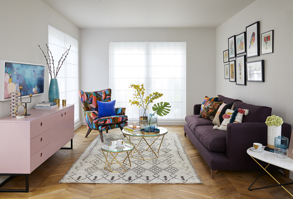
It’s unusual for me to paint a space white but I wanted to create an open and light feel in this fist floor extension. Slaked lime was the perfect choice as its soft and warm without being too yellow. When I’m using bright colours I like a soft colour as the background to stop it appearing to stark and jarring. I then chose to put simple Bergen voile roman blinds at the window to help maximise the natural light in an attempt to extend the sense of openess. I find lot’s natural light really energising and uplifting and this is the feel I wanted to harness in this family open plan space added to the fact it’s a room that would mostly be enjoyed throughout the day light hours. Then a level of warmth is introduced with this most amazing Intenso oak floor . While parquet has been so fashionable I love what’s been achieved here with this modern chevron layout. It’s super easy and fast to install too as the planks just click together.

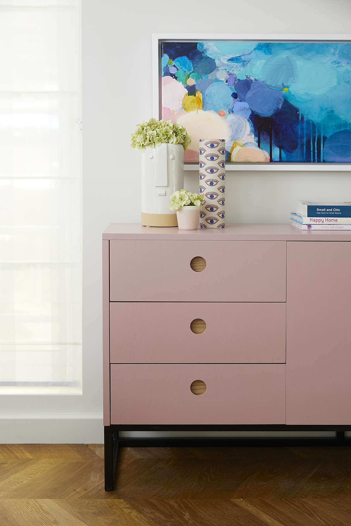
One nice way to link the two spaces was asking Naked Kitchens to make a side board in the same style of the kitchen units so there is a visual link, but rather than match the blue I chose a beautiful pale pink colour, which links in with the Bert and May tiles in the kitchen floor. It’s these little colour and design references, which will help make your scheme look coherent. So think about how you can link the colours throughout the entire room.

As dedicated followers to this blog (!) you’ll know my disdain for the matchy-matchy. I think a scheme as much more personality and verve when you blend different patterns and styles together. A mixture of patterned and plain scatter cushions on the sofa, create a lovely bit of interest. The deep damson Little Jon wool sofa really helps to anchor the space. A gallery wall of pictures is an all time favourite styling trick of mine which allows you to make a strong visual focal point. It’s important to do this in an open plan space- it kind of works like punctuation mark. Think about having a few key focal points in the room that help drawer the eye. In this room it’s the sofa with gallery wall, moving round to the bright patterned Tom Collins armchair in Ola Berry fabric through to the striking Sophie Abbott painting above the sideboard. The fabrics and the painting all help to tell the colour story and link different parts of the room together. It’s also a good idea to plum for one metallic and in this scheme it’s gold. From the brass Aman coffee tables, through to the accessories, the odd picture frame and the gold taps and splash back in the kitchen, using the same metallic throughout will also help to unify the space.

a gallery wall is a great way to add a focal point to an open plan space. Arrange centrally and nice and low over the sofa. Open plan spaces can be hard to interior design but Interior designer Sophie Robinson uses colour to unify the different areas

Finally I think open plan spaces are in danger of feeling a little chilly so this large Amira wool rug really adds some much needed texture and warmth. The textiles I chose for the sofa are a mixture of wool, crewel work and velvet which again helps makes this otherwise cool space feel homely.

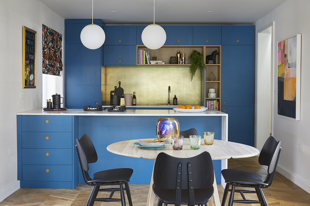
The living room opens up into the kitchen dining room which you can see here in the previous post.


6 ways to make an open plan space work

Unify the space with a single wall colour or carry the same flooring throughout

Signify the different zones with colour blocks. A statement rug, a large piece of artwork, pendant lights, a bold piece of furniture will all do the trick

Work up a coherent colour palette and use this throughout the entire space. Used in different proportions will add interest. Even down to the small accessories will help to link the different areas.

Have your lighting on different circuits. From recessed lights, pendants and lamps they all need to be operated in different ways to create different moods depending on how you’re using the space.

Often open plan spaces can feel quite large. Soften the look with plenty of plants and artwork.

Use the same metallic throughout. From taps to light switches, cffe tables to trinket boxes.


CREDITS

Walls painted Slaked lime mid www.littlegreene.com

Flooring in Intenso oak traditional www.quick-step.co.uk

Bergen soft voiles www.hillarys.co.uk

Little Jon sofa in Tor damson www.sofaworkshop.com

Tom Collins chair in Kitty McCall www.sofaworkshop.com

Chair covered in Ola Berry fabric www.kittymccall.com

Aman geometric glass 2-piece coffee table set www.wayfair.co.uk

Detroit side table’s www.grahamandgreen.co.uk

Amira wool rug www.rockettstgeorge.co.uk

ACCESSORIES

Selection of vases www.habitat.co.uk

Table lamp www.bhs.com

Silk flowers www.amarathineblooms.co.uk

Painting www.sophieabbott.net

Switches and sockets in white and brass by www.dowsingandreynolds.com

Palm cushion, www.kittymccall.com

Geometric woven cushion, www.laredoute.co.uk

Yellow knitted cushion, www.bhs.com

Gees multicolored cushion www.habitat.co.uk

Handwoven cushion www.etsy.com/uk/shop/CathChamberlain

Blue velvet cushion, www.habitat.co.uk

Bird picture, www.kingandmcgaw.com

Swan print, www.kingandmcgaw.com

Zoo print, www.kingandmcgaw.com

Ballet Dancer photo, www.kingandmcgaw.com

Flowers in vase print, www.kittymccall.com

Altered Cover Print, www.wayfair.co.uk

Inaluxe print, www.kingandmcgaw.com

Teal round tray, www.laredoute.co.uk

Pink ceramic cups, www.laredoute.co.uk

Bangle Glass vases www.lsa-international.com

Eyes cylinder vase www.habitat.co.uk

Face cylinder vase www.habitat.co.uk

Blossom glasses www.grahamandgreen.co.uk

Peony glasses www.grahamandgreen.co.uk


  • Interior Design
  • Interiors
  • Living rooms
  • Rooms
Colour scheme for a colourful and cool nursery The Ideal Home Show Innovation home kitchen revealed!

comments

Alison North on 22.05.18

Thanks for the awesome ideas to decorate an open plan living room, I must appreciate your choice of color “Slaked Lime” is perfect for all weather.
http://www.niki-jones.co.uk/

Reply
Sophie Robinson on 24.05.18

I agree- I’m going to use it in my own home too

Reply

Leave a Comment

Cancel Reply

Your email address will not be published.

  • Interiors
    • colour crush
    • colour psychology
    • DIY
    • dream home makeovers
    • Home Tours
    • Interior Design
    • Interior Styling
    • podcast
    • trends
  • Lifestyle
    • Business
    • Fashion/Beauty
    • Life
    • My House
    • Nosh
    • Travel
  • Rooms
    • Bathrooms
    • Bedrooms
    • Kids rooms
    • Kitchens
    • Living rooms
    • Outside
  • Videos

mailing
list

Videos

Listen

Listen Here

Online courses
by popular demand

Catch Sophie In All Her Colourful Glory On Instagram

Ah @the_rhs Chelsea! What a feast for the eyes! In Ah @the_rhs Chelsea! What a feast for the eyes! Inbetween biblical downpours, thunder and lightning, it was a wonderful day of colour, design and chatter with some wonderful women! I’m slowly falling in love with gardening and my phone roll is full of inspiration after being immersed in natures finest. Thanks @michelleogundehin and @hazelgardinerdesign @thesohoagencyuk for the company. And a big congratulations Hazel on this stunning floral installation. And don’t forget if you want to hang out and be inspired by all things colour then my FREE live webinar is on tonight (25th) at 7pm tonight! Hop on to my profile for the link to sign up. Cannot wait to share some inspirational colour filled time with you all 

#rhschelsea
This is the first room we decorated after our reno This is the first room we decorated after our renovations. The entrance to your home creates the first impression. It’s also the room you walk into first thing in the morning and when you return home at the end of a long day. It needs to create the right welcome and what that feels like is hugely personal. For me I chose my favourite colours, this powerful cobalt  blue has always been a colour I’m drawn to. My wardrobe is full of it. And the bright pink is another one that always makes me instantly happy. Together they are a striking combination and I think anyone who walks through my front door, immediately gets a sense of what I’m about. I’m passionate about creating interiors that authentically  reflect the people who live there. Studying the psychology of colour made it so much easier for me, giving me a deeper understanding on the affects of colour and streamlining my process. If you’d like to know how to unlock your colour super power, join me for a free webinar this Wednesday evening (available to up for 48 hours after). It an introduction into colour psychology for interiors and my hope is it inspires you to have the courage and conviction to know what’s right for you.  And for a deeper dive my online course Colour Psychology for interiors has opened for enrolment. All links to sign up are in my bio on my profile @sophierobinsoninteriors 
What does your hallway say about you? 
📷 @aluncallenderphoto 
CREDITS walls in lazuli by @zoffanyfw stair runner @roger_oates floor tiles @claybrookstudio door painted in rose ash @sanderson1860 

#colourpsychology #colourpsychologyforinteriors #banthebiege #punchyhome #hallway #boldcolourinteriors #colourlover
My kitchen, the heart of my home. The smallest, da My kitchen, the heart of my home. The smallest, darkest room in the house with no view, but that’s old houses for you! You’ll often find the kitchen in the worst place. So to amp up the joy I chose a forest green (hunters green by @zoffanyfw) for the cabinets to mirror the woodland outside. We sourced reclaimed school science lab work tops and I wrapped the room in one of my favourite papers, Rubarber by @borastapeter. Tom put in retro fit underfloor heating and we used reclaimed terracotta tiles from @ca_pietra_  so the floor looks as old as the house but feels so warm! . For the ugliest darkest room in the house it’s become our favourite because of the colours, patterns and rustic textures.that’s the power of great interior design! 
Next up in my series of posts about the psychology of colour is the Autumn personality. You’ll have a love of rich deep warm Colours, natural finishes, nature inspired patterns and period features. The autumn palette is warm, earthy abs rich and perfect for making spaces feel cosy and inviting. 
To learn more about the autumn personality, hop on up to my bio and click the link to be taken to the blog. And you can sign up to my FREE webinar I’m hosting next Wednesday if you’d like to learn more about this powerful framework. 
Meanwhile have a gorgeous weekend! 
📷 @aluncallenderphoto Styling @katemcphee 

#colourpsychology #banthebeige #autumnpersonality #colourpsychologyforinteriors #kitchen #greenkitchen #countryhomesandinteriors #countrykitchen #ihavethisthingwithcolor #myeclectichome #maximalistdecor
Come and join my FREE webinar on Colour Psychology Come and join my FREE webinar on Colour Psychology next Wednesday 25th at 7pm GMT 🤩 hop on up to the link in my bio @sophierobinsoninteriors to register.
My brilliant online course, Colour Psychology for Interiors, is open for enrolment this month, so if you fancy finding out a bit more about this utterly game changing framework I’d love to have you join. It’s SO MUCH more than ‘ red is energising’, ‘blue is calming’ stuff you’ve all heard before. This is a deep dive into discovering how colours work, how to harmonise them and discovering your own unique and authentic style. Only then can you create a home you live and one that supports you emotionally. I LOVE teaching this stuff because the feedback I get from students is mind blowing! Don’t take my word for it, sign up for the free webinar today! 😍 and if you’ve already done my course, please share in the comments below what you loved about it. 

#colourfulhome #colourpsychology #colourpsychologyforinteriors #banthebeige #colourlover #confidentcolour #confidentcolourscheming
Have you found your design mojo? Do you gravitate Have you found your design mojo? Do you gravitate towards a style of interiors that just feels so ‘you’. Making a home is so much more than creating beautiful squares for Instagram. It has to FEEL right and this is where the psychology of colour comes in. Colour is light, it has an energy which directly impacts your brain and emotions. And we all have a unique relationship to it. So rather than follow the crowd, be swayed by trends it’s so important to understand your own authentic relationship with colour. Over on the blog today I’m starting a series of posts all about the seasonal colour personalities. First up is spring which is all the joy, uplift and energy. My bathroom, pictured above, is very ‘spring’ with light reflecting walls, energetic patterns and bright colours. The mood  is uplifting, fresh and feel-good. Hop on up to my link in my profile to read the blog post in full and discover if you are a Spring personality and how to create rooms that reflect this joyful mood. 
Tap for credits
📷 @aluncallenderphoto 

#colourpsychology #colourpsychologyforinteriors #banthebeige #colourfulhome #colourlover #ihavethisthingwithcolor #spring #springbpersonality #colourfuldecorchallenge #homedecor #myeclecticmix #bathroom #bathroominspo
So proud of mr best mate @sophieabbottartist who o So proud of mr best mate @sophieabbottartist who opens her house this weekend to showcase her artwork in her home as part of Brightons artists open houses. She’s always been a creative whirlwind and keeps the joy of colour alive in her paintings inspired by the sea, and the local woodlands that surround her home in Brighton. For Sophie, colour gives her life, she’s the ultimate joy monger and I’m so blessed to have her as my side kick in life. If you get a chance today, pop round to heed for a bolt if the feel good vibes

#artistopenhouses #brighton #colourlover #banthebiege #ihavethisthingwithcolour
When you find the palette of colours you love, you When you find the palette of colours you love, you just wantto surround yourself  in every part of your home! This painting by @studiocoverdale really hits the mark for me, with all my favourites on one place. Today I’m opening my most popular online course, ‘Colour Psychology for a interiors’, ready  for your enrolment. This is my most popular and indeed  powerful course. It gets to the core of how colours work in harmony , how they effect you emotionally and how to bring all the design and pattern  elements together to make your home and your heart sing! I’m a Spring personality, and with that I adore all the busy patterns, bright and vibrational colours, plenty of pretty details and preferably all at once! While typical spring personalities prefer a more delicate and soft colour palette, my secondary season is Autumn, which prefers richer and punchier shades. Combined together my home is unique and perfect for me. I honestly rarely want to leave the house! And while this framework is an amazing tool for interior design, it’ll also give you colour confidence in every area of your life including your wardrobe. I can’t recommend it enough. When I started implementing this framework  in my own design practice six years ago it was absolutely game changing! While I’ve  always been confident with bold colour, this insight gave me the clarity to speed up my design process and get it right every time! Hop on over to the link in my bio to find out more. 
📷 @aluncallenderphoto 
#colourpsycholgy #colourlover #banthebiege #colourfulhome #colourmyhome #maximalistinteriors #boldbravebeautifulinteriors #dopaminedressing #dopaminedecor
The power of paint! I’ve been extolling it’s v The power of paint! I’ve been extolling it’s virtues my entire career. Roll a bold new hue on your walls and voila! Game changer. But on our recent podcast @mad_about_the_house explored the wider impact of paint on the environment. An astonishing 50 million litres makes it into landfill each year so it feels like, as serial decorators, we could all club together and do our bit to bring that figure down. 
It’s a minefield but over on my blog today I sum up my tips on how we can easily use less of it and round up the paint brands who are doing their bit to tackle the issues. From the ingredients in the tin, to recycling waste paint, to using pouches rather than tins, there is plenty of innovative ideas. Choosing natural paint feels like a good option and if you’re hooked on designer paint colours, it’s no more expensive. Last year I painted my bedroom Turquoise by @edwardbulmerpaint and I’m thrilled with the colour, quality and durability. Just goes to show lovely paint doesn’t have to cost the earth. Hop onto the link in my profile for the full post and if you know if a paint brand who are tackling the environmental issues raised, please give them a mention in the comments below.

#ecopaint #ecodecor #ecohome #paint #turquoise #bedroom #podcast #banthebiege #colourfulhome #colourlover #itsonlypaint #interiordecorating #interiordesign #colourscheme
Load More… Follow on Instagram
Sophie Robinson
  • © 2017 Sophie Robinson

    /
  • Contact/
  • About/
  • Design by MW

Don't forget to join!

You're almost inside!

Leave me your best email to sign up for the Webinar