GET THE REPLAY OF THE VISION BOARD MASTERCLASS - LIFE IN COLOUR

Sophie Robinson
  • Home
  • Workshops
    • Marrakech Retreat
    • Home Masterclass
  • Online Courses
  • Collaboration
  • Podcasts
  • Blog
  • About
    • About me
    • Work with me
    • Press
  • FAQs
  • Contact
  • DIY
  • Home Tours
  • Interior Design
19 Sep 23

Dream Kitchen – the Reveal!

MG0001 Magnet Sophie using Tap 021 copy

And now my dear readers, it’s time for the grand kitchen reveal! Who doesn’t love a big ta-da moment?! After several weeks of enjoying the splendours of our new kitchen, with some sneak peeks over on Instagram, I invite you to dive a little deeper here on the blog. We can delve into the design details, explore my favourite aspects of our dream kitchen, and if I could do it all again, what I would change.

The true litmus test for any room’s success lies in how it makes you feel and let me tell you this room just boosts my mood and slaps a grin on my face every time I step into it. The kitchen reigns as the heart of our home, it’s the most used space and so it’s absolutely paramount to get it right. It’s not just about mere practicality, but also the emotional resonance a space can bring to our daily lives.

The feeling of space, the abundance of natural light, the joyful décor, the sight of all my favourite things displayed, the way the light bounces off the gleaming worktops and the impeccable organisation is nothing short of exhilarating!  The colour palette, while it looked great on paper is just mouth-watering in real life.  We chose three shades from Magnet’s hand-painted range and in real life they are perfection. This harmonious blend of Harvest Yellow and Chalk Blush pink and deep warm Burlington Red performs magically in this space, crafting the convivial, uplifting and joyful atmosphere that I envisioned for this family room. The enchanting Woodland Floral wallpaper dances around the room infusing it with infectious optimism while the striking Paper Straw stripe curtains frame the glorious garden view. Dare I say it, we’ve absolutely aced it!

Island in Burlington Red, with tall pantry and built in fridge freezer in Harvest Yellow. Kitchen cabinets in Chalk Blush Pink with open shelving above and floral wallpaper on the walls. Floor is a large beige tile, handles are brass, and the worktop is a qhite quartz with gold vein running through it.

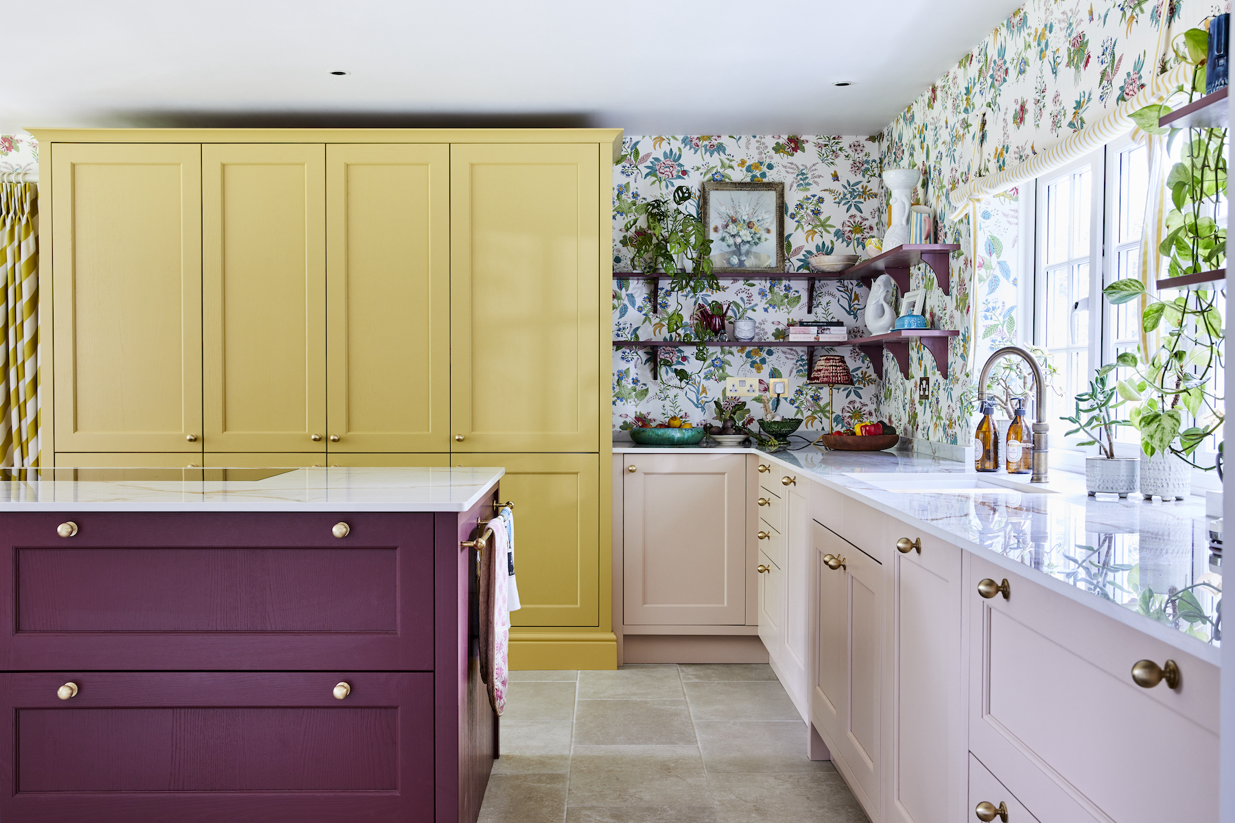
Ludlow units in Harvest Yellow, Chalk Blush and Burlington Red, Magnet; Dekton Worktop in decor ‘Awake’, Magnet; Quintili biege floor tiles, Fired Earth; Quooker  4 in 1 Fusion Tap, Quooker at Magnet; Douglas Handles in Satin Brass, Magnet; Integrated fridge, Smeg; Integrated freezer, Smeg.

Now, let’s roll up our sleeves and delve into the practical aspects of kitchen design because the kitchen serves as the engine room of your home. When you get it just right, you’ve effectively oiled the gears of your daily routines.

The Pantry Cupboard

One of the standout features of this layout is undoubtedly the stunning pantry cupboard, from Magnet’s Ludlow range. We’ve used a pop of colour-blocking using the lush Harvest Yellow, creating a statement piece that masquerades as a free-standing cupboard. It works like a charm, functions brilliantly, storing all the family’s food in one place: from pantry staples through to frozen and refrigerated foods thanks to the integrated appliances. It made organising everything a delightful experience!

Close up of double oven in kitchen island with round brass handles on drawers next to it.

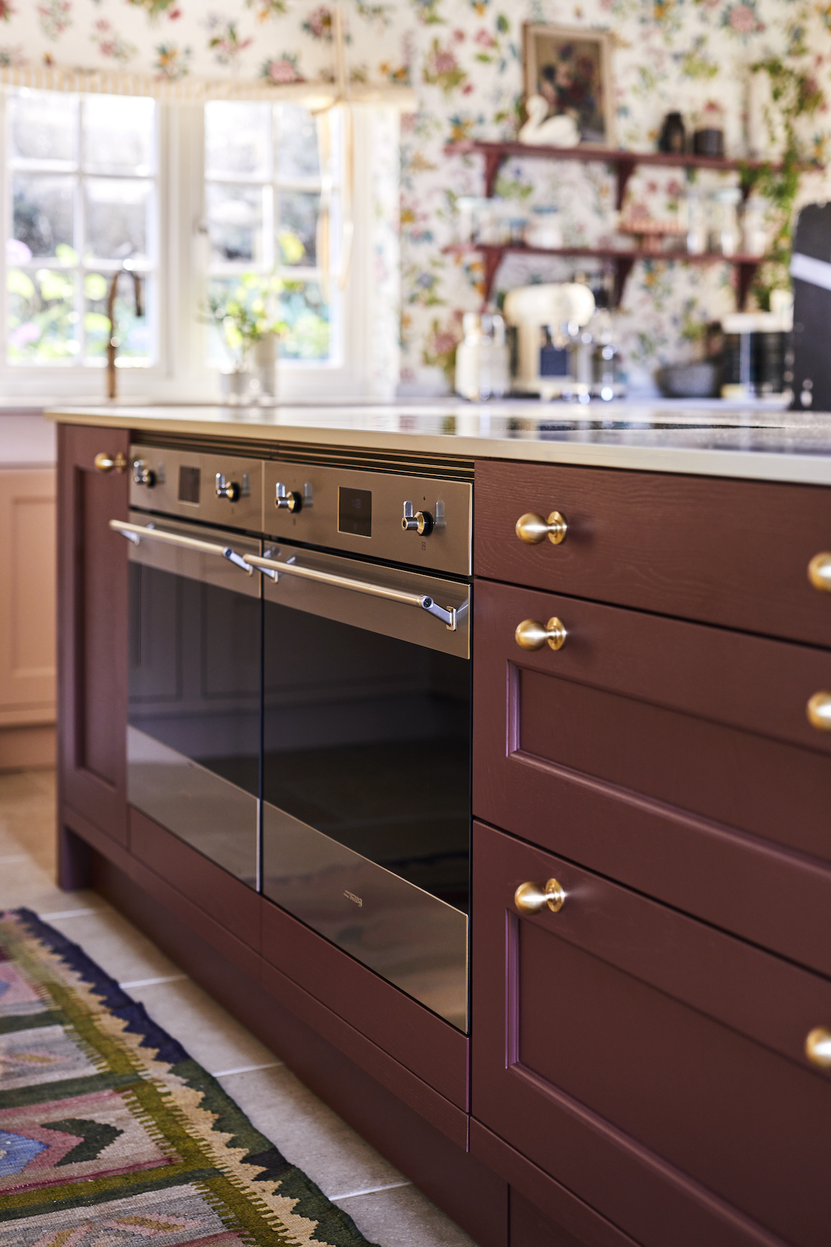
Stainless steel classic Galileo Speedwave XL cooker, Smeg; Douglas Satin Brass Handles, Magnet. Ludlow deep drawers in  Burlington Red, Magnet

When it comes to the layout, zoning different areas with regards to the different activities is a fantastic approach to consider. The pantry cupboard is situated opposite the double oven and hob, integrated within the large island. This means preparing meals, is (almost) a joy, as everything is close to hand, from the fresh food in the fridge to the dry pantry ingredients. Pans and utensils are stored either side of the ovens. I chose twin Galileo cookers from Smeg, primarily because I loved the nod to vintage styling; notice the cute tap style knobs. But it’s the perfect blend of traditional meets modern, with the digital display enabling cooking to the highest precision.

The coffee station

I’m particularly fond of the coffee station that we created where we get to enjoy our favourite morning ritual of brewing coffee. It’s all about convenience as the station is next to the sink, the boiling tap, and the jars of coffee and tea are close to hand on the shelves above. And the mugs are in the drawer below. While I’ve discreetly stowed away all the other small appliances in the pantry cupboard, these Smeg gadgets get pride of place on the work top. Even though they come in a great choice of bright colours, opting for the more subtle cream colour was a positive choice as I didn’t want them stealing the show from the gorgeously delicate Chalk Blush cabinets.

Kitchen cabinet in Chalk Blush Pink with white worktop and open shelving in Burlington Red. Shelves display a range of artwork, plants and glass storage jars with cookbooks and small Smeg appliances underneath.

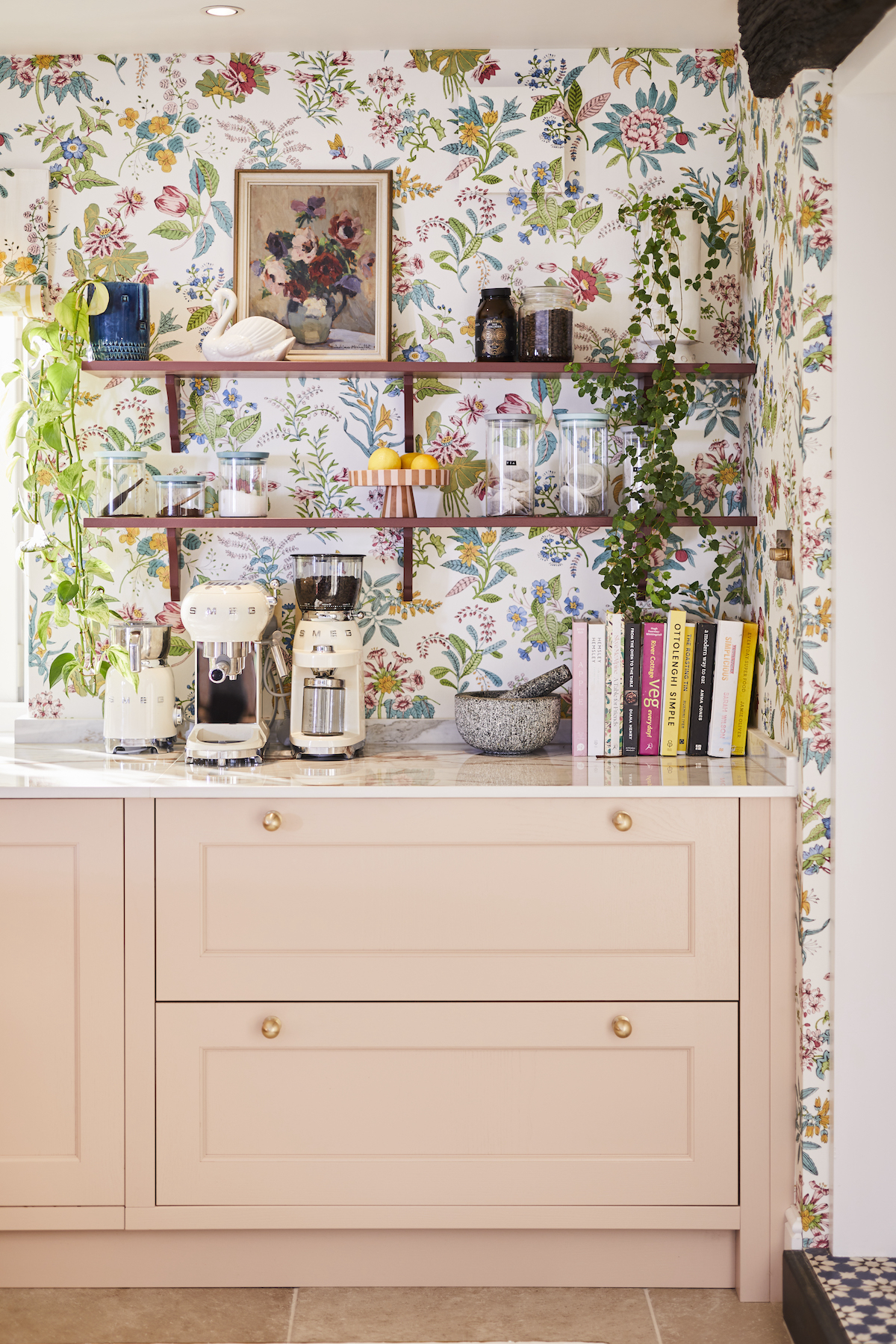
Ludlow cabinets in Chalk Blush, Magnet; Shelves in Burlington Red, Magnet; Coffee Maker in Cream, Smeg; Wallpaper in Woodland Floral by Harlequin x Sophie Robinson, Harlequin


The kitchen sink

The final zone is the sink area which works so well. I opted for a large sink with Quooker boiling tap that offers up regular hot and cold water, boiling water, plus chilled drinking water AND carbonated water. I’d go so far to say this feature is a firm family favourite. Once you’ve had a boiling tap you will never go back I promise you. I particularly like the vintage styling of this boiling tap as it fits in with the overall classic design, and the aged brass finish ties in perfectly with the Douglas handles in satin brass.

Magnet advised me to go with a Shock sink (available from December ’23), as these are especially designed to partner the boiling tap as they can withstand the 100 degree boiling water that the Quooker produces. Another  super hardwearing yet beautiful element is the worktops and boy aren’t they fabulous. I love the luxurious high gloss shine of the Dekton in decor Awake  as it bounces the light, so gloriously. It really adds to the bright and uplifting feel of the overall room. I absolutely love it!

We cited the dishwasher next to the sink and the china drawer, which includes sections for plates, bowls, mugs, glasses and cutlery next to that, and a cutlery drawer at the top, making unpacking the dishwasher a doddle. I am all for making my life easy!

Quooker brass boiling water tap and white sink in front of an open window looking out on the garden. A white worktop with gold vein running through it.

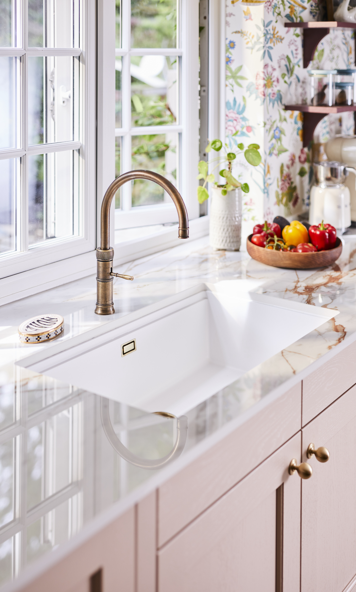
Fusion 4-in-1 Boiling water tap, Quooker at Magnet; Kiruna N-100XL Sink, Schock; Worktop by Dekton in decor ‘Awake’,  Douglas handles in satin brass, Magnet.

The kitchen island

My husband, Tom, only had one design request for this kitchen which was a set of bar stools, and I reluctantly conceded as I’m not a massive fan. But I must say I’m now on board. It’s nice to have Tom at the island with a refreshing drink while we catch up about our day. It’s precisely how he envisioned using the space, and it has become a favourite spot for us both.

The large island also adds to the  flow and maneuverability of the room. My previous kitchen was small and could easily feel cramped. It felt like someone was always standing in front of the drawer you wanted to open. This open plan space has three double doorways, so ensuring you can move around the island with ease or get access to the garden patio doors, even when people were sitting at the dining table, was really important.

Central Island in Burlingon Red with two bar stools in front of it. Three large vases with a beautiful tall floral display sit on top of a gloosy white worktop. In the background is the tall pantry in Harvest Yellow and floral wallpaper on the walls surrounding a country cottage window overlooking the garden.

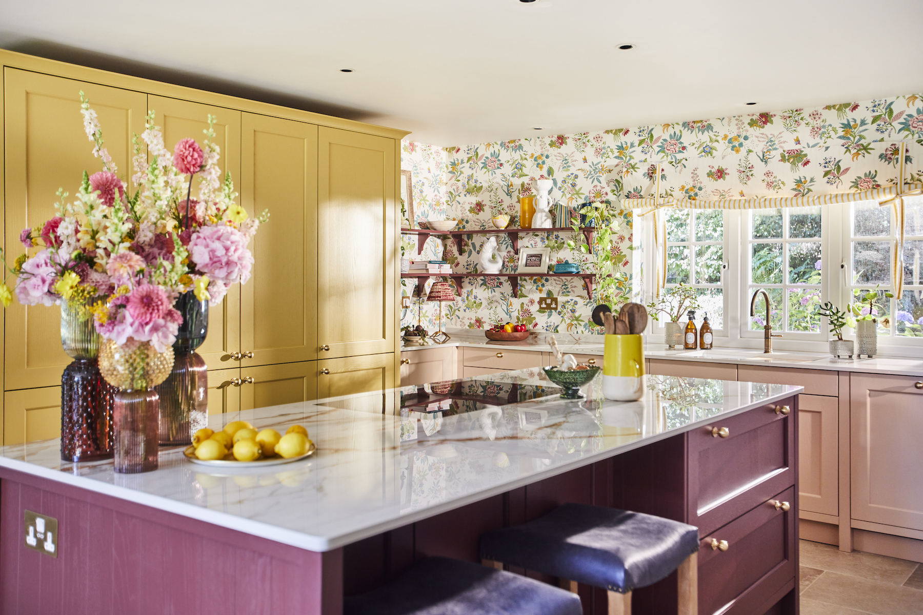
Island in Burlington Red, Magnet; Worktop by Dekton in Awake, Magnet; Trio of vases, Graham and Green; Universal induction hob, Smeg; Abbey leather Bar Stools, Oka; Integrated fridge, Smeg; Integrated freezer, Smeg.

The cocktail corner

My favourite little design gem must be the cocktail corner. Talk about adding a touch of  elegance! Now here’s a clever hack; I opted for open plan shelves at the back of the kitchen. Not only did this allow us to show case the gorgeous wallpaper but also helped create an airy open vibe. However, it left me with a dilemma, with no wall units, where to store all our lovely glassware? I had a stroke of genius.

There was an underutilised narrow alcove near the dining table. I decided to use this space to house a fabulous cocktail cabinet. We fitted matching Magnet Ludlow wall units, which are slimmer than standard base units, and topped them with marble worktop cut to fit. It’s made a really stylish focal point in the corner of the room and accentuates the rather quirky round window too, the one I always found rather naff and pointless. Well now I’ve found the perfect sun burst ornament to fit it, I actually love it! Cheers to that!

Dark wood dining table laid with blue crockery and glassware. Floral wallpaper on the walls surrounding a small round window with sun ornament in the centre. A shallow cabinet with marble worktop holds a collection of drinks and cocktail making equipment. Floor to window curtain with bold yellow and white diagonal stripes.

Sun ornament in window, Jonathan Adler; Crescent table lamp, Pooky; Ribbed hanging pendant by Emma Gurner, House of.com; Curtains in Paper Straw Citrine by Harlequin x Sophie Robinson, Harlequin; Wallpaper in Woodland Floral by Harlequin x Sophie Robinson, Harlequin.

So what would I change if I could do it all again? Absolutely nothing! Let me know what you think of my new kitchen in the comments below.


Five ideas to steal from my kitchen design:
  • Wallpaper in a bright, joyful and optimistic pattern creates a convivial atmosphere. You can use a matt decorators varnish over the top to protect it and make it wipeable if you want to.
  • High gloss worktops help bounce the light around and make the room feel even brighter and lighter.
  • Colour block your cabinetry to create a bespoke pantry cupboard look. This design element elevates the whole kitchen design making it appear even more bespoke.
  • Zone the areas of your kitchen to suit different activities, making sure everything is close to hand. Spend time imaging how you will use your kitchen during the planning phase.
  • Don’t have anything on display on worktops that isn’t beautiful to look at. Hide as much as you can in the cupboards, then opt for a few open shelves for your beautiful treasures.

This kitchen blog post is part of a wider paid collaboration with Magnet. All words and views expressed are my own.

  • DIY
  • Home Tours
  • Interior Design
How clever storage can make your kitchen more stylish Planning my dream kitchen with Magnet
  • Christmas
  • Interiors
    • colour crush
    • colour psychology
    • DIY
    • dream home makeovers
    • Home Office
    • Home Tours
    • Interior Design
    • Interior Styling
    • podcast
    • Sophie Robinson X Dunelm
    • Sophie Robinson x Harlequin
    • trends
  • Lifestyle
    • Business
    • Fashion/Beauty
    • Life
    • My House
    • Nosh
    • Travel
  • Rooms
    • Bathrooms
    • Bedrooms
    • Kids rooms
    • Kitchens
    • Living rooms
    • Outside
  • Videos
online influence award winner 2019
Interior Design Winner Sophie Robinson Insta
Videos

Listen

Listen Here

Online courses
by popular demand

Catch Sophie In All Her Colourful Glory On Instagram

February. Rain. More rain. And then just for varie February. Rain. More rain. And then just for variety… rain. The dog and I relished the excuse to stay tucked up at home. But inside? Big plans and some serious plotting around the kitchen table. February has that quiet, held-breath quality. Everything looks still, yet beneath the surface it’s all quietly preparing to burst into life. I’m more than ready for that spring light to unleash some very exciting plans! Who else is ready?!

FEBRUARY ROUND UP
	1.	Just how much rain?! Honestly. Biblical.
	2.	Creating shape and big ideas with @teamyo_weight_training .
	3.	Major shoot energy for my AW 2026 collection. So proud of this one.
	4.	Celebrating the fabulous new scents at @vyraoworld . Heaven in a bottle.
	5.	Catch-ups with these sirens @micboehm77  @yasminsewell Creative refuel.
	6.	Photoshoot at the house. @jadefarmiloemua claims best mug, obviously.
	7.	Lucy ready for hair and make-up. Born for backstage life.
	8.	I finally caved and bought an air fryer. Brilliant but why do Ugly.
	9.	Watching the pond like it’s Netflix. What will spawn this spring? 🐸
	10.	My lovely Dad staying with us and recuperating after a nasty illness. Tender days.
	11.	Healing sunlight breaking through when we needed it most.
	12.	Three generations, sofa-bound, watching the rugby. Proper joy.
	13.	14. The wonderful Wes Anderson exhibition at the @designmuseum . Go. Get inspired.
	15. February has its own special bleakness. I’m ready for sunshine on that sea.
	16.	Lucy fully committed to hibernation season. Respect.
	17.	An elegant mess. Story of my life.
	18.	Lucy taking the minutes at a very exciting team meeting. Promotion pending.
	19.	First signs of spring 🌼 Always right on time.
AD Still smiling after revealing my latest colourf AD Still smiling after revealing my latest colourful homewares collection with @Dunelmuk. Bringing a collection like this to life takes months of dreaming, designing and attention to detail, so sharing it with everyone felt incredibly special. Expect joyful colour, layered pattern and all the maximalist touches you know I love. The whole collection is now available to shop in store, online and on the Dunelm app. I could not be prouder. 💛
January. A grateful round up. Rolling into 2026 an January. A grateful round up.
Rolling into 2026 and chasing colour in all its forms, from piercing blue winter suns to raspberry red Moroccan sunrises. I knew I’d be ready for you, 2026. And we have started beautifully.

1. A quiet promise to myself to make 2026 as colourful as possible
2. New Year’s Eve… exactly as it began
3. And then how it went. A proper sweaty dance at @alphabetbrighton 
4. Hosting a bonfire at home with friends to burn away 2025. @jothornephotography 
5. Watching embers glow beneath a full moon. Emotional in the best way
6. Snow, low sun and the most perfect winter palette
7. Still walking it out! Bracing the cold with @sophieabbottartist @edwinaboase 
8. A much needed colour hit, hosting my interiors retreat with @elfennmarrakech 
9. Me and partner in crime @em_lappin  at @lallamarrakech 
10. The joyful jolt of colour only the Marrakech souks can deliver
11. Discovering the new @ritaalaoui_artist art installation at El Fenn
12. New moon meditation with the wonderful @alexadecastilho 
13. Gently shaping a new vision for 2026
14. Harnessing that wild horse energy for my vision board webinar
15. Proud moments unveiling my latest collection to the press at @dunelmuk 
16. Catch ups with my lovely TV chums @hardcastletowers @francescarowanplowden @jackkinsey @ritamillat 
17. Feeling genuinely excited about this collection and all the squeals it is delivering
18. Finally ticking off my 360 health scan at @nekohealth 
19. Becoming mildly obsessed with pastel, colour drenched interiors
20. It looks busy, but January has mostly been this. Rest. Reflection. Happy wintering.
Not going to lie, this might be one of my proudest Not going to lie, this might be one of my proudest makeovers ever…
My Dad and Mary’s modern French villa was all beige tiles, white walls and zero personality. So I did what I do best: turned it into a technicolour dreamscape inspired by the countryside views outside those gorgeous bifold doors.

Inspired by early  autumn leaves, emerald green fields, and piercing blue skies we set about making the inside of their home feel as joyful as the outside … now imagine all that bottled up into wallpaper, fabrics, cushions and colour-drenched furniture.

If you’ve ever thought bold colour overwhelming or that pattern was too much for open-plan spaces… this one’s for you. Because colour and pattern sings in nature, and it can work just as well in your home decor.

All wallpapers, rug and cushion fabrics are from my collection with @harlequinfw. Painting by @sophieabbottartist 

Full sourcing list, extra styling tips and a deeper dive into the design story are up now on A Life In Colour: head to my Substack via the link in bio to read more!
End of January check-in… and yes, the struggle to End of January check-in… and yes, the struggle to stay joyful is very real right now. Dark mornings, grey skies, energy running low.

That’s exactly why our homes matter so much at this time of year. They are our sanctuary. The place that should lift your mood, calm your nervous system and make you feel held when the outside world feels a bit, how can I put this...relentless. And this isn’t just a feeling or a design philosophy. It’s backed up by science. Research shows that colour, light, beauty and nature in our homes have a direct impact on mood, wellbeing and happiness. Small, intentional changes really can shift how you feel day to day.

I’d love to know… what brings you the most joy in your home right now? A colour, a room, a plant, a view, a ritual? Share it in the comments 💛

And if you’re ready to go deeper, my big January Sale ends this week.

If you want to truly understand colour psychology and learn how to curate a home that feels joyful, confident and completely you, comment ULTIMATE and I’ll send you the link to my online design school and your opportunity to make the biggest saving of the year.
These are the ingredients to making your home feel These are the ingredients to making your home feel as good as it looks. 

• Confident colour that creates the mood
• Beautiful pattern that delights the eye
• Layered texture that brings it all alive
• Personality in every corner, so it feels like home

Magic happens when you stop playing it safe and start designing a home that truly reflects you. A home that feels joyful, expressive and alive. But designing a home can feel overwhelming. Where do you start? How do you combine colours without it feeling chaotic? How do you clash patterns so it looks considered? How to express your unique personality without merely copying other people’s style?

That is exactly why I created my online design school. After more than 25 years as an interior designer, I have distilled my design process into clear, easy-to-follow courses that take you step by step through combining colours, balancing patterns and adding texture, so you can decorate with confidence and creativity.

And right now, my January Sale is on. You can save a huge 60% on my transformational courses, designed to completely change how you approach your home and how it makes you feel. If you are ready to embrace your creativity and deepen your passion for interior design  comment ULTIMATE and I will send you all the details.
Think Maximalism is ‘too much’, too messy, or only Think Maximalism is ‘too much’, too messy, or only for other people? 

I’m here to tell you: maximalism isn’t chaotic. It’s just misunderstood.

Once you understand how colour and pattern work together, decorating like a maximalist stops feeling intimidating and starts feeling instinctive. Your home starts feeling like you.

If you want to design your home with confidence, my Ultimate Interiors Bundle is exactly what you need. It includes three self-paced online courses that take you inside my design process, teaching you how to use colour and pattern so you can make bold choices that actually work, again and again. 

Right now, the Ultimate Interiors Bundle is a massive 60% off. Buy now, enjoy the saving, and start whenever you are ready to create a home that is completely yours.

Comment ULTIMATE and I’ll DM you the link to find out more.
Welcome to my witchy era! Who else wants to harnes Welcome to my witchy era! Who else wants to harness the Year of the Horse and use this dynamic energy to manifest your best year yet! 

A vision board is like a compass that will lead your goal settings and intentions with total clarity. To prepare i like to take lots of long walks and meditate on what it is so want more of in my life while gratefully letting go of what no longer serves me. 

Join me Wednesday for a live webinar on how to I create a Vision board that will ignite your passion and motivation to live a bold, creative and colourful life! Comment VB26 for the link.
Follow on Instagram
Sophie Robinson
  • © 2025 Sophie Robinson

    /
  • Contact/
  • About/
  • Design by MW

You're almost inside!

Leave me your best email to sign up for the Webinar

MG0001 Magnet Sophie using Tap 021 copy

You're almost inside!

Leave me your best email to sign up for the Webinar