

Planning my dream kitchen with Magnet

The time had finally arrived to bring my dream kitchen to life. After dedicating 25 years to working as an interior designer, it was finally my chance to design for myself. Seven years ago, when we purchased our home, we always intended to expand it luxuriously towards the South, seamlessly connecting the house with the garden. The existing layout featured a small, dimly lit, north-facing kitchen with views of the driveway. Meanwhile the living room was large and spacious with glorious views across the garden. But you’ve guessed it- like many of you we spend most of our time in the kitchen and only occasionally use the living room to watch TV in the evenings. So, at the time we purchased the house, it seemed obvious to add a kitchen extension to the back to remedy that problem. We made progress by estimating costs and obtaining planning permission in 2021. However, due to the uncertain economic climate, a significant recent increase in our mortgage, and the soaring prices of materials and labour, we made the tough decision at the end of last year to put the entire idea on hold.

The existing kitchen measures 4m x 3m and situated at the dark, north facing end of the house with views over the driveway. It isn’t big enough for family and friends around the table.
Nonetheless, my commitment to optimising our home’s functionality persisted. The light bulb moment was when I realised that we didn’t necessarily need more space; we needed the right kind of space. This could be achieved by swapping the kitchen and living room over. The living room was a spacious 7 x 5 meters, providing ample room for an open-plan kitchen and dining area which was the dream. By going the extra mile and installing large patio doors, we could directly access the garden. Meanwhile, the existing 3 x 4m kitchen would transform into a cosy TV snug. Used mostly in the evenings it doesn’t need the views, just a gloriously big TV and a big squashy modular sofa. It was a plan that would work to our budget!
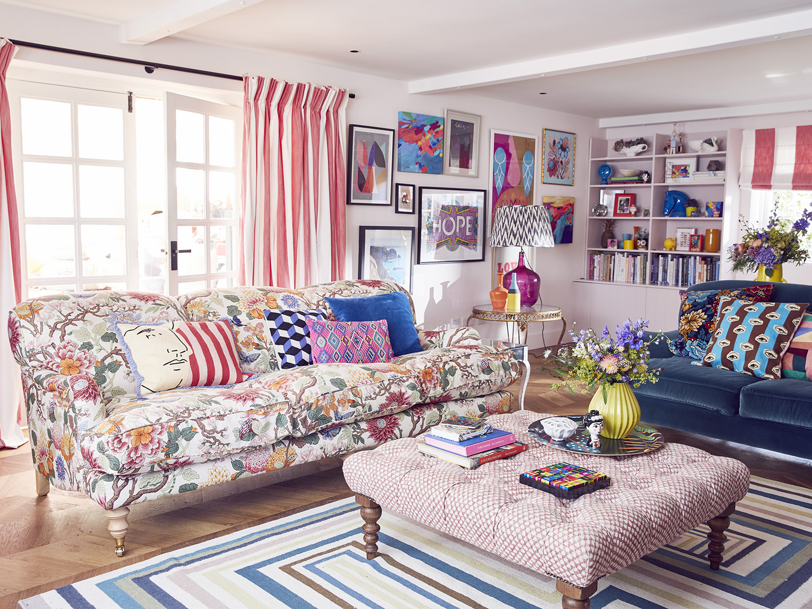
The generous sized 7 x 5 meter living room with views onto the garden would be better utilised as a family kitchen dining room.
Almost. Of course, planning the perfect kitchen required plenty of careful consideration. From the layout and storage requirements to cabinet colours and handles, not to mention appliances, lighting, walls, and floors, every detail mattered. I was fortunate to have the expertise of Magnet’s Head of Design, Jen Nash, working with me on this project. She is an absolute treasure trove of kitchen knowledge, and I thoroughly enjoyed delving into the finer details of kitchen design with her. While I’ve been a designer for over 20 years, you never ever stop learning and Jen is across all the latest innovations and products. After an in-depth discussion, where she grasped our kitchen needs, the brief was agreed; a sociable family space for cooking and entertaining, spilling out onto the garden.
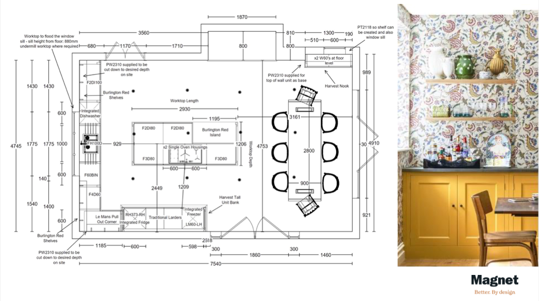
Jen from Magnet worked on the layout making sure that the kitchen housed enough storage as well as incorporating an open plan dining area with easy flow to the three different doorways.
Jen got to work meticulously planning out the layout. My focus was on the storage, assessing my current kitchen and ensuring each new area had the appropriate storage solution. Jen crafted an incredible larder-style cupboard to store all our food, complete with an integrated fridge, freezer, and a generous pantry. The island became the cooking area with double oven, hob, and worktop to prep, while the under counter cupboards housed the sink, dishwasher and china. I found it really helped if I tried to imagine myself using the kitchen and working out how I’d use the space in order to plan the different areas effectively. For example, having the china and cutlery stored next to the dishwasher makes unloading it quick and easy. Jen recommended including deep drawers for storage in favour of cupboards wherever possible as they are more space efficient. The dream was gradually taking shape!

A large larder style unit was designed to store all the food. From the integrated fridge, freezer, double pantry unit and pull out corner unit. Everything in one place!

Base units are paired with open shelves which will offer an area to display and help create an open airy feel. The sink, dishwasher and drawers for cutlery, glasses and china are all kept together for ease of use. A charging drawer would keep the unsightly dangle of wires off the work top.
Choosing the colour scheme was where I came into my own. Magnet was the perfect choice for me due to their wide range of 25 colours in their hand painted range. I was immediately drawn to the recently introduced Harvest yellow and Chalk blush. These vibrant yet soft hues were ideal for crafting the cheerful and convivial atmosphere I envisioned for the space. And why settle for two colours when three could be even better? I chose a Woodland floral wallpaper from my new collection at Harlequin to tie the entire room together. It has the palette of colours I love, and the motif connects beautifully with our woodland garden. From this design I could draw out options like Green Olives, Morris blue, or Burlington red to add to Harvest and Chalk Blush. Ultimately, I went with red as it complemented the warm colour family and stood out beautifully on the island unit.

I gathered design and colour inspiration from Pinterest and Instagram for the brief. The left hand image is a kitchen designed by Rita Konig and I love the wallpaper above the yellow cabinet. The other two images are from Sarah Brown Interiors. I was drawn to the colour combination of deep red, soft pink and warm yellow.
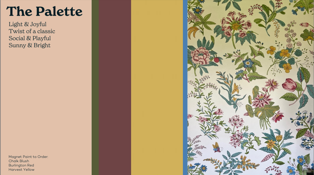
Jen and I created this core colour palette for the kitchen design. The wonderful Wonderland Floral wallpaper from my collection with Harlequin, was the palette that anchored the scheme together.
With cabinet colours and wallpaper selections in place, I turned my attention to flooring and countertops. When harmonising a palette of colours and textures in a kitchen design, ensuring tonal cohesion is crucial. The warm palette of yellow, pink, and red lent itself to brass metallic handles and taps. For the flooring, I opted for a warm beige limestone tile, which is a soft neutral for the rest of the vibrant scheme. When Jen showed me the absolutely stunning Awake by Dekton worktop which featured deep veins of gold, my heart skipped a beat. The striking gold coloured vein in the worktop only adds to the array of patterns in the room. The key to this level of pattern and colour mixing is to ensure all the colours work harmoniously, and they all sing together as they share the same warm gold undertone. When embracing maximalism, you need to not hold back so I found it quite thrilling to go bold on the wallpaper pattern, the worktop, and the colour choice too.
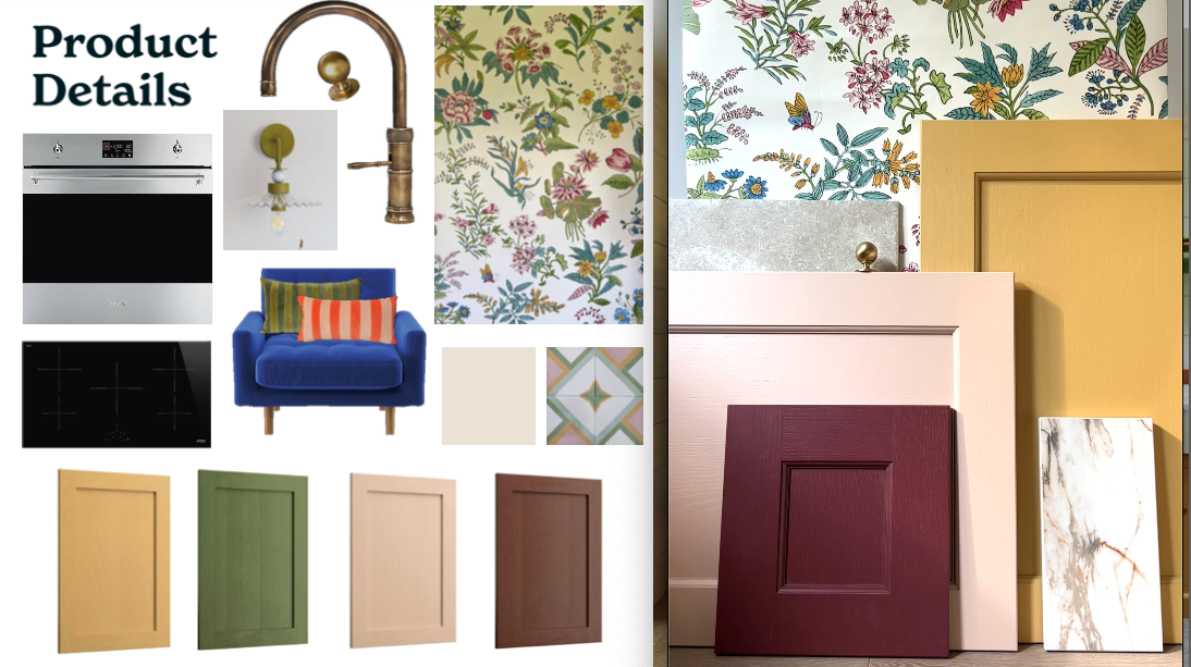
Finally, (so many decisions when designing a kitchen), I opted for open plan shelving rather than wall cabinets. This was agonising as the balance between planning enough storage without compromising on the overall aesthetic is a fine line. It was actually Tom and Arthur who talked me round, saying that seeing the wallpaper was more important. Well blow me down! Jen helped us all visualise the different options and the open shelves won hands down. After playing around with a few different shelf colour options, (yes you can have them hand painted with a choice of 25 colours too) I settled on Burlington red, to match them in with the island. This would help enhance the feeling of light and airiness in the room, and would provide more opportunity to see that amazing wallpaper and display my favourite cookbooks, art and objects.
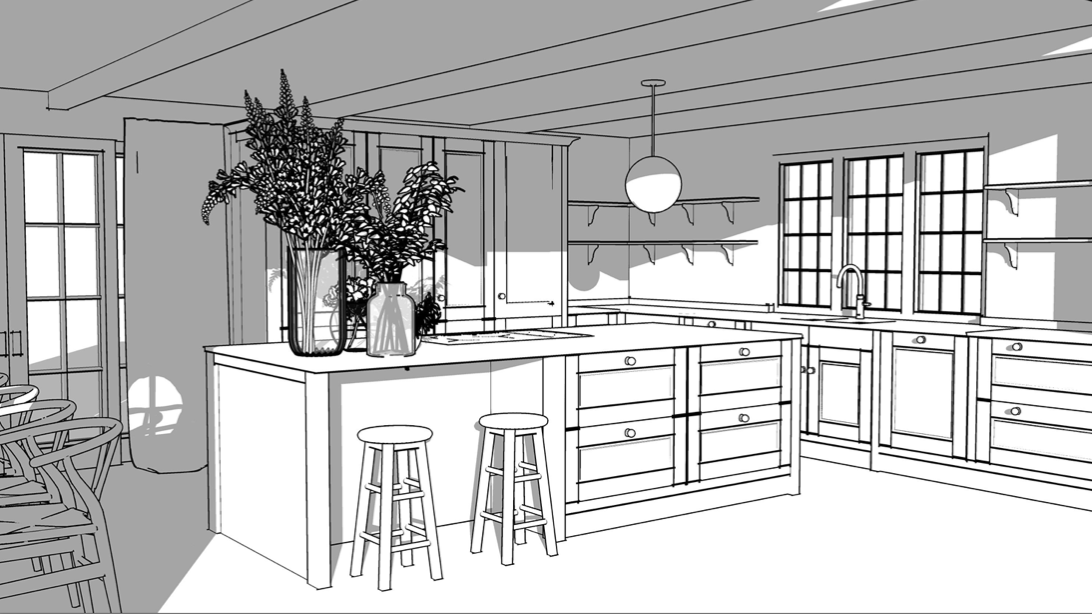
The illustrations that Magnet created for us really helped with the visualisation…just one thing missing…
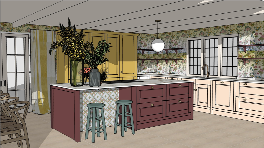
The colour! I’m so pleased with how the colour blocking across the larder unit, base units and island came out, and I’m confident the wallpaper will look great wrapped around the room.
I can’t tell you how much I enjoyed this design process with Jen. The pressure to get every detail, measurement and shelf bracket right is immense and it felt great to have a kitchen specialist at my side, as well as bouncing creative ideas. The Magnet visualisation tool was amazing at helping me, Tom and Arthur see how it was all going to work and look.
Make sure you come back here for the big reveal!
SIX TIPS FOR PLANNING THE PERFECT KITCHEN
-
- Asses your current kitchen and your storage needs. A stylish kitchen can only be a tidy kitchen so you need place to store everything.
- Imagine how you use your kitchen and try and envisage you moving around the proposed layout. Does the position of the fridge, hob, sink and dishwasher work for you?
- Deep drawers are more effective than cupboards. They save space and make it easier to access everything.
- Open shelves allow you to create a pleasing display of favourite things.
- Pack some personality into your kitchen design by choosing colours and patterns you love. Kitchens do not have to be boring!
- Draw on the expertise of a kitchen designer. They have specialist knowledge that will make sure you make the most out of every inch!
- Check out the Magnet buying guide for more tips on planning your dream kitchen. Next up I’ll be sharing pictures of the full reveal, so come back soon! You can ask me any questions about the planning process, in the comments section.
This kitchen blog post is part of a wider paid collaboration with Magnet. All words and views expressed are my own.


