

How I Colour Drench

From Dull to Dramatic: How Colour Drenching Brought My Snug to Life
There’s something magical about a space that completely wraps around you, where every surface is drenched in rich, velvety colour. It’s immersive, bold, and, most importantly, deeply maximalist. That’s why I love colour drenching—not as a contrast to my signature layered style, but as a way to enhance it.
And nowhere in our home showcases this better than our snug. It’s a small, north-facing room where we gather for TV in the evenings, so it needed to feel warm, cocooning, and inviting. Instead of fighting against its natural lack of daylight, I embraced deep, dramatic colour to create an enveloping retreat that feels like a jewel box within the home.
What is colour drenching?
Colour drenching is the technique of taking a single colour—or tonal variations of it—and using it across every surface. Walls, ceiling, skirting boards, doors, radiators—nothing gets left out. The result is seamless and immersive, creating a space that feels intentional and cohesive.
But here’s the key: colour drenching doesn’t mean flat or one-dimensional. In a maximalist space, layering is essential. I didn’t just stop at colour—I built depth with rich patterns, bold textiles, and statement artwork, making the space feel dynamic rather than monotone.

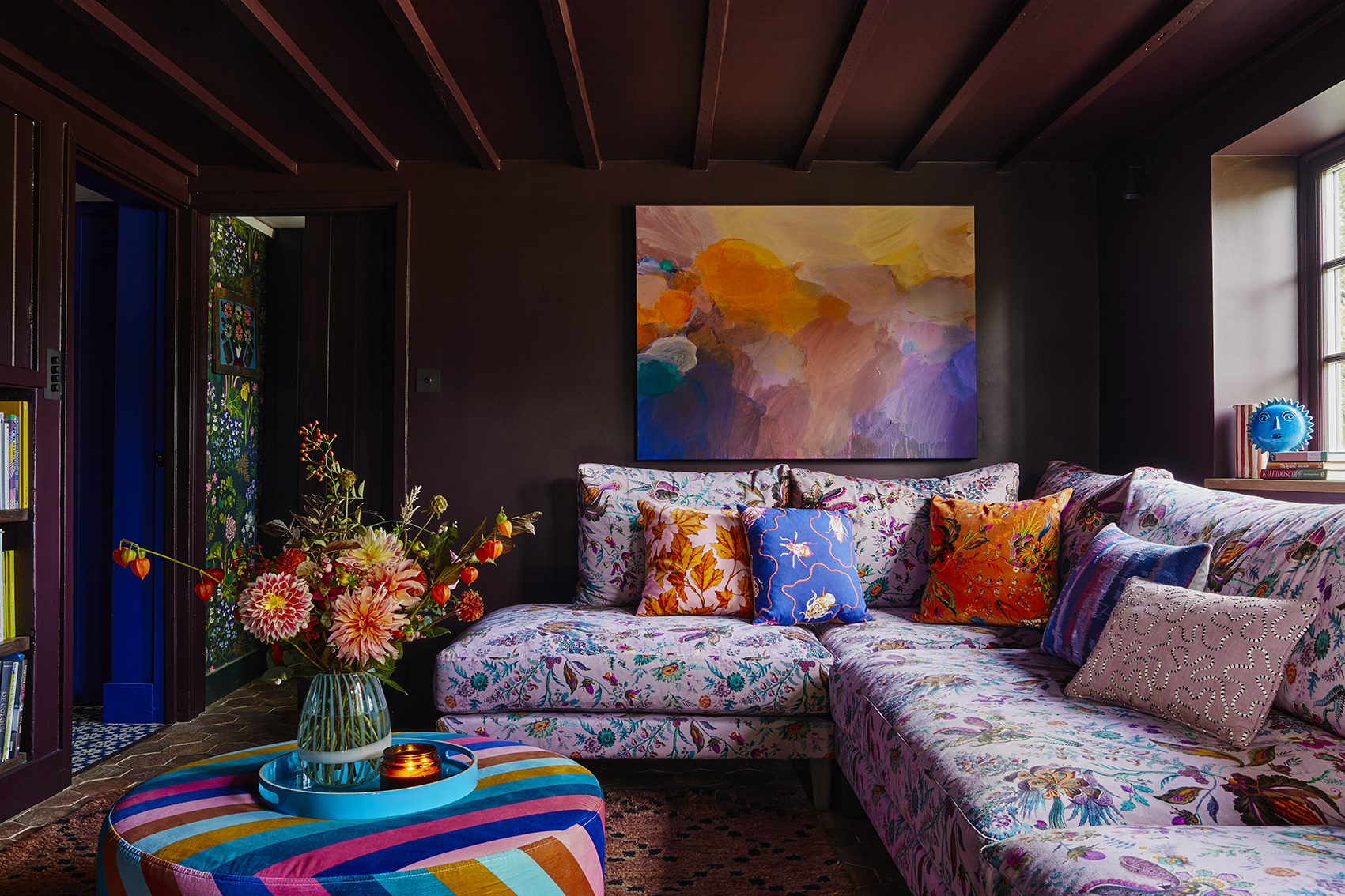
Colour drenching everything—from walls to radiators. Paint colour: Cordoba by Little Greene. Painting by Sophie Abbott. Dylan Footstool by Love your Home upholstered in Sherbert Stripe Lapis by Harlequin X Sophie Robinson
Why it works so well in darker rooms
One of the biggest misconceptions about north-facing rooms is that they should be painted in pale colours to ‘brighten’ them. But no amount of white paint will turn a dimly lit space into a sun-drenched haven. In reality, pale colours can make a room feel flat and lifeless.
Instead, I always say: go deep. In our snug, I chose Cordoba by Little Greene—a beautifully complex blackened brown with aubergine undertones. It has a velvety richness that shifts throughout the day, feeling dramatic yet cocooning. Rather than trying to fake brightness, it leans into the room’s natural mood, creating warmth and atmosphere.
And because the colour extends across every surface—walls, ceiling, woodwork—there are no jarring contrasts. The whole space feels connected, which makes it feel bigger, not smaller.

This colour drenched space is dramatic, cocooning, and ever-changing with the light. Grace Sofa by Love Your Home, covered in Wonderland Floral: Harlequin X Sophie Robinson. Cushions: Sophie Robinson available at John Lewis. Jugs on windowsill by Tate & Darby
Creating depth and contrast within a colour-drenched space
The trick to make a colour-drenched space sing is to introduce contrast within the palette. Instead of a flat block of colour, I played with tonal variations and textures to keep the room feeling rich and layered.
My Wonderland Floral fabric was the starting point for the scheme, bursting with burnt orange, electric turquoise, dusty mauves, and deep chocolates. Rather than adding a competing colour, I pulled shades from this fabric to layer into the space—velvets in warm aubergines, embroidered cushions in rich terracottas, and a patterned rug that ties it all together.
And the beauty of dark, dramatic walls? They make everything else pop. My artwork, including a painting by my best friend Sophie Abbott, stands out beautifully against the deep walls. Inspired by a Marrakech sunset, it brings in peaches, ochres, and soft lilacs—all colours that are echoed in the textiles, reinforcing the sense of harmony.
This Sophie Abbott painting, inspired by a Marrakech sunset, glows against the dark walls. Blue ceramic sun: Bitossi, Blue tray by Zazzoo. Moroccan Rug by Tate & Darby. Hexagonal terracotta floor tiles by Ca Pietra.
Why colour drenching makes maximalist decorating even better
Maximalism is all about creating a rich, layered space full of personality. Colour drenching doesn’t replace that—it amplifies it.
- It eliminates visual clutter. By removing stark contrasts (goodbye, bright white skirting boards!), the room feels more cohesive and immersive.
- It enhances everything in the space. Instead of competing against strong wall colours, artwork and textiles shine because of them.
- It makes a space feel designed, not accidental. When a single colour wraps around a room, it feels curated and intentional—no half-measures.
This snug is a perfect example. The deep walls don’t overwhelm the space; they define it. The layered patterns and textures prevent it from feeling flat, while the tonal variations within the palette create movement and interest.

Layered maximalism at its best—tonal walls set the stage for curated pieces to shine. Artwork by Becky Blair, lamp by Pooky, horse’s head by Bitossi, antique console table. Door painted in Ash Rose Light by Sanderson.
Why colour drenching isn’t going anywhere
For me, colour drenching isn’t a passing trend—it’s a design philosophy. It’s about committing to colour, making bold choices, and embracing the impact it has on a space. It works in grand, open-plan rooms just as beautifully as in small, intimate spaces like our snug.
If you’re hesitant, start with a smaller space—a hallway, a powder room, or even a ceiling in an otherwise neutral room. The more you embrace it, the more confident you’ll feel. And if you’re working with a darker space? Even better. Colour drenching will make it feel richer, warmer, and infinitely more inviting.
Colour drenching has the power to transform any space, making it feel richer, more inviting, and effortlessly stylish. If you’re ready to embrace bold, immersive colour, there’s no better way to do it.

My dog Lucy loves her spot on the sofa in my colour-drenched snug. Sofa: Love Your Home, upholstered in Wonderland Floral fabric: Sophie Robinson X Harlequin. Picture light: Pooky Light switch by Corston Architectural Detail.
And if you’re going all out with a brave colour drench, I need to see! Tag me on Instagram (@sophierobinsoninteriors) so I can swoon over your bold, brave and beautiful interiors! If you’re stumped at where to start and want to learn more, head over to my design school and learn about the power of Colour psychology or how to master Maximalism through my fabulous online courses and in-person events.


