fbpx
Sophie Robinson
  • Home
  • Workshops
    • Marrakech Retreat
    • Ban the beige
    • Masterclasses
  • Online Courses
  • Collaboration
  • Podcasts
  • Blog
  • About
    • About me
    • Work with me
    • Press
  • FAQs
  • Contact
  • DIY
  • Interior Design
  • Interiors
27 Feb 20

Six ways with wallpaper

Interior designer and colour lover Sophie Robinson shares some top tips on how to use wallpaper. In this entrance hall a classic floral design is combined with pale blue panelling and a modern diagonal striped tiled floor. #entrancehall #sophierobinson #panelling

I just love wallpaper. The opportunity to wrap a room in wall to wall pattern just fills me with joy! It reminds me when I was first dating my now husband, and he said to me “I hate wallpaper” and the thought of breaking up with him really did go through my mind. I thought this was possibly a hurdle that was going to prevent our happy homemaking future together. Eleven years of marriage later and I have him well and truly on board as you will witness from my own home renovation!

So with the ‘feature wall’ officially dead (or is it, more on that later), I thought it’s time to talk about new ways with wallpaper and how we can incorporate it in our homes.

PUT IT IN PANELS

Frame a statement wallpaper inside panels to stop it becoming too overbearing.  Alexandria wallpaper in Lapis by Designers Guild

If like me you love a big and bold designer wallpaper you may be faced with two hurdles. First the price, some of these amazing papers can be eye-wateringly expensive. Secondly, the fear that the print could actually overpower the room. Creating wall panels is a great way to address both. You cut down on the amount of paper you need and if you are remotely handy, you can then attempt to paper the panels yourself as there is no awkward cutting in or going around corners, which is another saving on hiring a professional. And by some of the walls remaining plain you dilute the impact of the print. You can create multiple panels around the room or simply create a dado rail and paper just above or below it. There are lots of ‘how-to’s’ on how to add wall panelling over on youtube but you can see my friend Wayne (who you may recognise off the telly) here.

PAPER THE STAIRS OR EVEN THE FLOOR

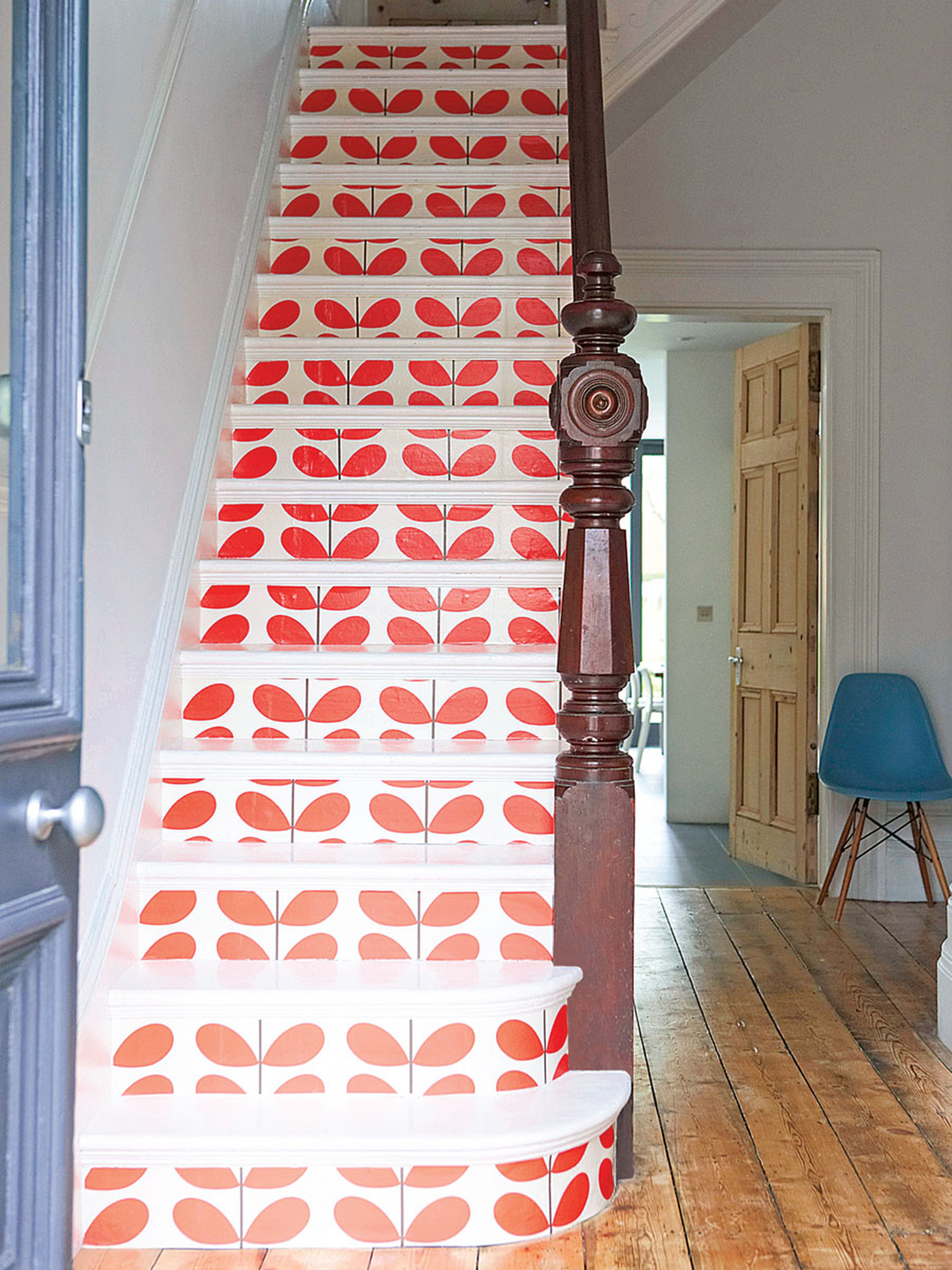
I love the effect of this graphic Classic stem wallpaper by Orla Kiely. This image is from Ideal Home magazine’s guide to wallpapering which you can read here. Photography by Jake Curtis

Using wallpaper in unexpected places an be a real head-turner. Pinterest is awash with ideas and inspo when it comes to papering your stairs and given the expense of stair runners, this can be a really effective upgrade to painted stairs. I love this design as shown as it really drawers the eye up. Tip is to just paper the up-risers, using a specialist floor paint on the treads, as they take serious wear and tear. However, in lighter traffic areas, you can even wallpaper your floor! Who knew? Well, I didn’t until I stumbled across the resourceful DIY expert Medina from Grillo Designs. If this perks your interest, you can read more here.

CREATE A MURAL

Belton Scenic wallpaper in Sunbeam, National Trust Papers at Little Greene

To make a room feel really bespoke I love to incorporate mural wallpapers. These are papers that are not just simply a repeat pattern but create a whole scene. You can even create your own murals from artwork or photography (if you have the rights). This is where I think a feature wall can still feel relevant. There are companies like Surface View who have a wonderful database of designs to choose from or can help you create your own. However, with the trend for larger scale wallpapers, many of the brands are creating more mural-esque designs that are bought in panels. This one above from Little Greene mimics those hand-painted Chinoiserie designs, popular in the grand houses of the 18th century. I’d still want this on all four walls though wouldn’t you, it would make an amazing bedroom!

UPDATE FURNITURE

Why stop at the walls, furniture can get a makeover too. Orange Feathered Wallpaper by Susi Bellamy

As we have already established, wallpaper is not just for walls. It can be cunningly be applied to furniture too. It’s a real interior designer’s trick to add textured wallpaper coverings to bespoke joinery, like fitted wardrobe doors for example. Choose a grasscloth for a more understated look. Or how about matching your furniture to your walls. I love the visual trick of papering this chest of drawers the same as the walls. Simply use a strong adhesive, I use watered down PVA glue to stick down the paper and then protect the whole thing with decorators varnish. On wardrobe doors, it’s helpful to place an edge of beading or trim all around otherwise the edges can lift and curl.

STICK IT TO THE CEILING

Create a statement fifth wall, with a full-on patterned wallpaper, image via the fabulous Instagram account @barij  Bari J Art & Design

This is probably the most out there idea and does take quite a big dose of commitment. Mostly because hanging wallpaper to the ceiling is back breaking and definitely one that should be handed over to the professionals in my view. I’ve had great success papering ceilings, as its a wonderful way of adding pattern without it overwhelming the room. It is a particularly great trick in small bedrooms or even the downstairs loo where you need to make an impact in a small area. In larger rooms, it can start to take over and I’d avoid it if your large room also has a low ceiling. High ceiling rooms look great, however, especially if you take the paper all the way down to the picture rail. Your biggest hurdle is finding a paper that works on the horizontal surface as most are designed for vertical walls and travel in a direction. So make sure the wallpaper print you choose makes sense when viewed in any direction.

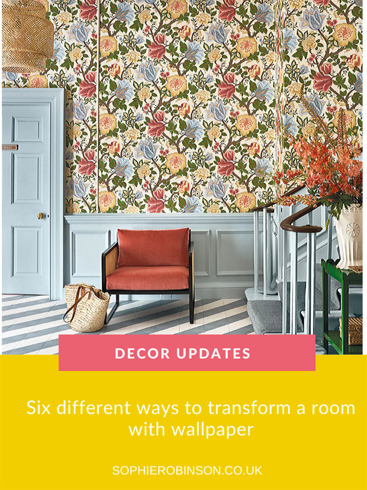
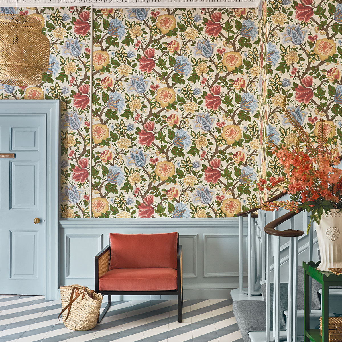
Featured image at top: The Pearwood Collection, Midsummer Bloom 116/4013 by Cole & Son

  • DIY
  • Interior Design
  • Interiors
Kate’s new book, wallpaper and retoxing, Podcast show notes S6 Ep5 Faux vs Real, Marrakech retreat & Granny chic, Podcast show notes S6 Ep4

Leave a Comment

Cancel Reply

Your email address will not be published.

  • Interiors
    • colour crush
    • colour psychology
    • DIY
    • dream home makeovers
    • Home Tours
    • Interior Design
    • Interior Styling
    • podcast
    • trends
  • Lifestyle
    • Business
    • Fashion/Beauty
    • Life
    • My House
    • Nosh
    • Travel
  • Rooms
    • Bathrooms
    • Bedrooms
    • Kids rooms
    • Kitchens
    • Living rooms
    • Outside
  • Videos

mailing
list

Videos

Listen

Listen Here

Online courses
by popular demand

Catch Sophie In All Her Colourful Glory On Instagram

Ah @the_rhs Chelsea! What a feast for the eyes! In Ah @the_rhs Chelsea! What a feast for the eyes! Inbetween biblical downpours, thunder and lightning, it was a wonderful day of colour, design and chatter with some wonderful women! I’m slowly falling in love with gardening and my phone roll is full of inspiration after being immersed in natures finest. Thanks @michelleogundehin and @hazelgardinerdesign @thesohoagencyuk for the company. And a big congratulations Hazel on this stunning floral installation. And don’t forget if you want to hang out and be inspired by all things colour then my FREE live webinar is on tonight (25th) at 7pm tonight! Hop on to my profile for the link to sign up. Cannot wait to share some inspirational colour filled time with you all 

#rhschelsea
This is the first room we decorated after our reno This is the first room we decorated after our renovations. The entrance to your home creates the first impression. It’s also the room you walk into first thing in the morning and when you return home at the end of a long day. It needs to create the right welcome and what that feels like is hugely personal. For me I chose my favourite colours, this powerful cobalt  blue has always been a colour I’m drawn to. My wardrobe is full of it. And the bright pink is another one that always makes me instantly happy. Together they are a striking combination and I think anyone who walks through my front door, immediately gets a sense of what I’m about. I’m passionate about creating interiors that authentically  reflect the people who live there. Studying the psychology of colour made it so much easier for me, giving me a deeper understanding on the affects of colour and streamlining my process. If you’d like to know how to unlock your colour super power, join me for a free webinar this Wednesday evening (available to up for 48 hours after). It an introduction into colour psychology for interiors and my hope is it inspires you to have the courage and conviction to know what’s right for you.  And for a deeper dive my online course Colour Psychology for interiors has opened for enrolment. All links to sign up are in my bio on my profile @sophierobinsoninteriors 
What does your hallway say about you? 
📷 @aluncallenderphoto 
CREDITS walls in lazuli by @zoffanyfw stair runner @roger_oates floor tiles @claybrookstudio door painted in rose ash @sanderson1860 

#colourpsychology #colourpsychologyforinteriors #banthebiege #punchyhome #hallway #boldcolourinteriors #colourlover
My kitchen, the heart of my home. The smallest, da My kitchen, the heart of my home. The smallest, darkest room in the house with no view, but that’s old houses for you! You’ll often find the kitchen in the worst place. So to amp up the joy I chose a forest green (hunters green by @zoffanyfw) for the cabinets to mirror the woodland outside. We sourced reclaimed school science lab work tops and I wrapped the room in one of my favourite papers, Rubarber by @borastapeter. Tom put in retro fit underfloor heating and we used reclaimed terracotta tiles from @ca_pietra_  so the floor looks as old as the house but feels so warm! . For the ugliest darkest room in the house it’s become our favourite because of the colours, patterns and rustic textures.that’s the power of great interior design! 
Next up in my series of posts about the psychology of colour is the Autumn personality. You’ll have a love of rich deep warm Colours, natural finishes, nature inspired patterns and period features. The autumn palette is warm, earthy abs rich and perfect for making spaces feel cosy and inviting. 
To learn more about the autumn personality, hop on up to my bio and click the link to be taken to the blog. And you can sign up to my FREE webinar I’m hosting next Wednesday if you’d like to learn more about this powerful framework. 
Meanwhile have a gorgeous weekend! 
📷 @aluncallenderphoto Styling @katemcphee 

#colourpsychology #banthebeige #autumnpersonality #colourpsychologyforinteriors #kitchen #greenkitchen #countryhomesandinteriors #countrykitchen #ihavethisthingwithcolor #myeclectichome #maximalistdecor
Come and join my FREE webinar on Colour Psychology Come and join my FREE webinar on Colour Psychology next Wednesday 25th at 7pm GMT 🤩 hop on up to the link in my bio @sophierobinsoninteriors to register.
My brilliant online course, Colour Psychology for Interiors, is open for enrolment this month, so if you fancy finding out a bit more about this utterly game changing framework I’d love to have you join. It’s SO MUCH more than ‘ red is energising’, ‘blue is calming’ stuff you’ve all heard before. This is a deep dive into discovering how colours work, how to harmonise them and discovering your own unique and authentic style. Only then can you create a home you live and one that supports you emotionally. I LOVE teaching this stuff because the feedback I get from students is mind blowing! Don’t take my word for it, sign up for the free webinar today! 😍 and if you’ve already done my course, please share in the comments below what you loved about it. 

#colourfulhome #colourpsychology #colourpsychologyforinteriors #banthebeige #colourlover #confidentcolour #confidentcolourscheming
Have you found your design mojo? Do you gravitate Have you found your design mojo? Do you gravitate towards a style of interiors that just feels so ‘you’. Making a home is so much more than creating beautiful squares for Instagram. It has to FEEL right and this is where the psychology of colour comes in. Colour is light, it has an energy which directly impacts your brain and emotions. And we all have a unique relationship to it. So rather than follow the crowd, be swayed by trends it’s so important to understand your own authentic relationship with colour. Over on the blog today I’m starting a series of posts all about the seasonal colour personalities. First up is spring which is all the joy, uplift and energy. My bathroom, pictured above, is very ‘spring’ with light reflecting walls, energetic patterns and bright colours. The mood  is uplifting, fresh and feel-good. Hop on up to my link in my profile to read the blog post in full and discover if you are a Spring personality and how to create rooms that reflect this joyful mood. 
Tap for credits
📷 @aluncallenderphoto 

#colourpsychology #colourpsychologyforinteriors #banthebeige #colourfulhome #colourlover #ihavethisthingwithcolor #spring #springbpersonality #colourfuldecorchallenge #homedecor #myeclecticmix #bathroom #bathroominspo
So proud of mr best mate @sophieabbottartist who o So proud of mr best mate @sophieabbottartist who opens her house this weekend to showcase her artwork in her home as part of Brightons artists open houses. She’s always been a creative whirlwind and keeps the joy of colour alive in her paintings inspired by the sea, and the local woodlands that surround her home in Brighton. For Sophie, colour gives her life, she’s the ultimate joy monger and I’m so blessed to have her as my side kick in life. If you get a chance today, pop round to heed for a bolt if the feel good vibes

#artistopenhouses #brighton #colourlover #banthebiege #ihavethisthingwithcolour
When you find the palette of colours you love, you When you find the palette of colours you love, you just wantto surround yourself  in every part of your home! This painting by @studiocoverdale really hits the mark for me, with all my favourites on one place. Today I’m opening my most popular online course, ‘Colour Psychology for a interiors’, ready  for your enrolment. This is my most popular and indeed  powerful course. It gets to the core of how colours work in harmony , how they effect you emotionally and how to bring all the design and pattern  elements together to make your home and your heart sing! I’m a Spring personality, and with that I adore all the busy patterns, bright and vibrational colours, plenty of pretty details and preferably all at once! While typical spring personalities prefer a more delicate and soft colour palette, my secondary season is Autumn, which prefers richer and punchier shades. Combined together my home is unique and perfect for me. I honestly rarely want to leave the house! And while this framework is an amazing tool for interior design, it’ll also give you colour confidence in every area of your life including your wardrobe. I can’t recommend it enough. When I started implementing this framework  in my own design practice six years ago it was absolutely game changing! While I’ve  always been confident with bold colour, this insight gave me the clarity to speed up my design process and get it right every time! Hop on over to the link in my bio to find out more. 
📷 @aluncallenderphoto 
#colourpsycholgy #colourlover #banthebiege #colourfulhome #colourmyhome #maximalistinteriors #boldbravebeautifulinteriors #dopaminedressing #dopaminedecor
The power of paint! I’ve been extolling it’s v The power of paint! I’ve been extolling it’s virtues my entire career. Roll a bold new hue on your walls and voila! Game changer. But on our recent podcast @mad_about_the_house explored the wider impact of paint on the environment. An astonishing 50 million litres makes it into landfill each year so it feels like, as serial decorators, we could all club together and do our bit to bring that figure down. 
It’s a minefield but over on my blog today I sum up my tips on how we can easily use less of it and round up the paint brands who are doing their bit to tackle the issues. From the ingredients in the tin, to recycling waste paint, to using pouches rather than tins, there is plenty of innovative ideas. Choosing natural paint feels like a good option and if you’re hooked on designer paint colours, it’s no more expensive. Last year I painted my bedroom Turquoise by @edwardbulmerpaint and I’m thrilled with the colour, quality and durability. Just goes to show lovely paint doesn’t have to cost the earth. Hop onto the link in my profile for the full post and if you know if a paint brand who are tackling the environmental issues raised, please give them a mention in the comments below.

#ecopaint #ecodecor #ecohome #paint #turquoise #bedroom #podcast #banthebiege #colourfulhome #colourlover #itsonlypaint #interiordecorating #interiordesign #colourscheme
Load More… Follow on Instagram
Sophie Robinson
  • © 2017 Sophie Robinson

    /
  • Contact/
  • About/
  • Design by MW

Don't forget to join!

You're almost inside!

Leave me your best email to sign up for the Webinar