fbpx
Sophie Robinson
  • Home
  • Workshops
    • Marrakech Retreat
    • Ban the beige
    • Masterclasses
  • Online Courses
  • Collaboration
  • Podcasts
  • Blog
  • About
    • About me
    • Work with me
    • Press
  • FAQs
  • Contact
  • colour crush
  • Interiors
18 Nov 15

Colour Crush: Electric Blue

Blue has confirmed itself as a favourite with the trendsetters. From the deepest inkiest indigo to pulsating Ultra marine we’re seeing it everywhere in interiors right now. And I have to fess up and say I’m a huge fan. In its purest hue it instantly brings to mind the work of Yves Klein who began experimenting with the most amazing ultramarine pigments in the late 1950’s, later know as International Klein Blue or IKB. He rather saucily had models cover themselves in paint and roll around the canvas, as ‘living brushes’. I saw the original collection on a school trip to Cologne and my love affair with the colour has never faded. And I’m not alone- over half the population vote blue as their number one favourite colour.


Work by Yves Klein

Work by Yves Klein


The history bit

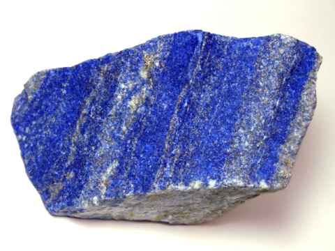
One of the reasons why I think this colour trend is so popular is because- well..its nothing new! Blue has been a popular decorating scheme for yonks. Its hard to imagine a time when blue was not that commonly available. David Mottershead, MD of Little Greene comments: “Blue is the richest of colours, and historically the most expensive to produce. In art, blue paint was reserved for depicting royalty, dignitaries and religious figures, and still to this day, holds the same luxurious appeal and hypnotic allure. “ Aside from plant based dyes like Indigo and Woad the earliest true blue was made from lapis Lazuli, a semi-precious mineral. No surprise it was reserved for the wealthiest clients.


lapis-lazuli-rough


How to decorate with blue

So how to decorate your walls with bright blue? It’s a colour that makes people understandably nervous with the fear that its just too chilling for our Northern climes. Ultramarine looks dazzling in Greece or the Cote d’Azur, but can it sizzle to the same effect in a semi in Solihull? I think that’s why we’ve been fixated with Duck Egg blue for so long- the paler more green tones help create a warmer feel. But ‘duck egg blue’ is so last decade darling! Lets get our heads around decorating with the new Blue hues in town.

Room designed by Marie Nichols www.marienichols.co.uk

Room designed by Marie Nichols www.marienichols.co.uk

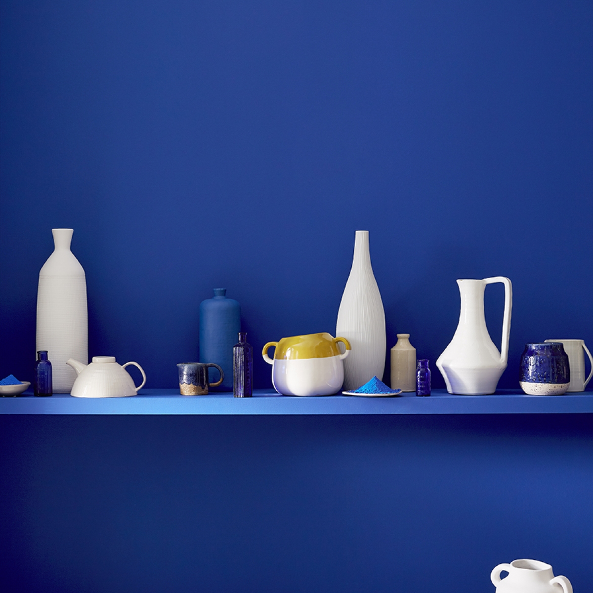
I think one of the most charming colour combinations is blue and white. It’s a total classic, think delft tiles, Chinese ‘willow’ patterns and even jolly striped Cornish ware. But latterly designers have been using this classic colourway to produce modern geometric prints.

Design by Sophie Robinson. Image from housetohome.co.uk

Design by Sophie Robinson. Image from housetohome.co.uk


All blues work really well with natural hues and materials. If you’re worried that your blue scheme will feel chilly, think about warming it up with some slubby natural linens, stone, leather and timber in favour of too much stark white, which only adds to the chill factor.


Blue and cream living room

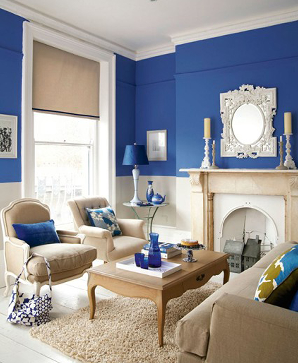
Image from House and Garden. Photograph by Nick Pope.


Complimentary colours to blue

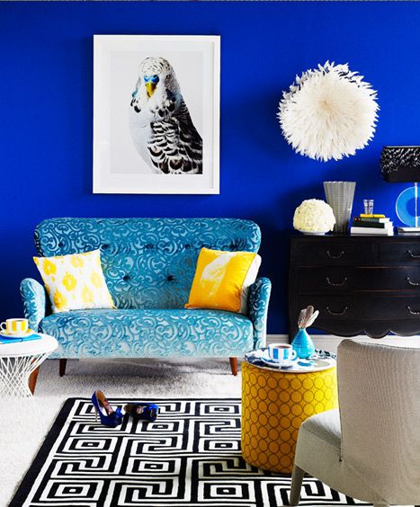
I think blue gets a real perk by teamed up with its complimentary colours, gold, yellow or orange. Think of some gilt frames on a deep blue walls, or a couple of yellow cushions and accessories in a blue and white scheme. My advice is to only add a wink of the accent colour- that way you keep the look sophisticated rather than playschool.

Dining room sarah Moore The Great Interior Design Challenge Farrow and Ball

This room designed by Sarah Moore for The Great Interior Design Challenge features walls painted in Dining Room blue by Farrow and Ball


Patterns in blue

Blue lends itself to bold patterns very well. Typically what springs to mind is blue and white ikats, nautical stripes or a striking modern geometric. When decorating with a bold and saturated hue I think it’s a good idea to pick patterns that can muscle up to it.

Blue and white bedroom

Image from housetohome.co.uk


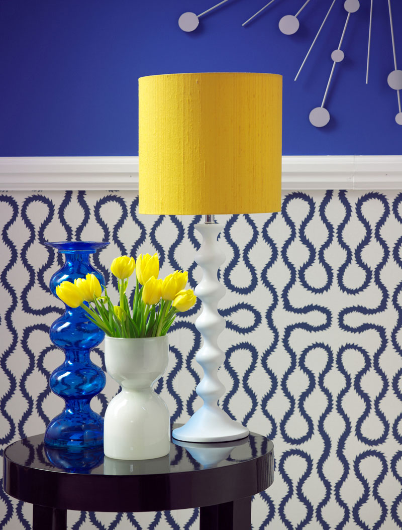
Using blue as an accent colour

Due to its distancing qualities, blue make s a great back drop, It’s a cool colour as a feature wall, if you haven’t the gall to daub it on all four walls! It can also make a great accent in a neutral scheme, as the saturated colour is just so fabulously arresting. A sumptuous velvet blue sofa looks oh so luxurious in a pale white scheme for example, or consider a really large abstract canvas in International Klein Blue. You could paint one yourself using Ultra 264 by Little Greene.

Bright blue sofa

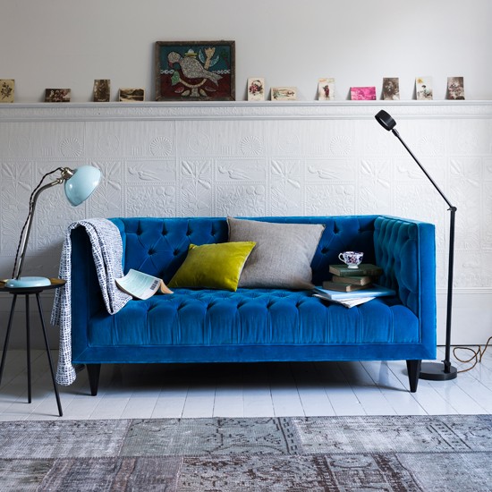
Image from House to home


The Science bit

Blue is what we call a cool colour, it recedes away from the eye making a room feel a litter larger than it really is. In it’s most vibrant form it’s the perfect wall colour for a sun filled room; it will enhance the brightness and richness of the colour. If you have a dark low light room I’d maybe consider a deeper navy that will look dramatic and cosseting highlighted by lamps and walls sconces.

blue and white bedroom

Bold blue positively vibrates in a sunny room, made all the more dazzling when coupled with bright white. Image from housetohome.co.uk

When we look at the psychological effects of blue on your mood, blue is a very restful colour and so great for rooms of quiet contemplation. Its the perfect choice for a place of work for example. It can also literally ‘give you the blues’ so avoid it as a wall colour if it affects you in this way. It famously suppresses the appetite which makes it a terrible choice for dining areas- and we rarely see it in used in kitchen designs- although if you do- it might be a great aid to nipping those fridge raids in the bud!

Blue home office

Image from housetohome.co.uk


  • colour crush
  • Interiors
How to choose the right colours for interior design 5 tips for decorating with feature wallpaper

comments

Carole on 20.11.15

Love the blues going on at the moment great article. My favourite is Royal or navy blue and purple with highlights of gold ! Fab

Reply
Sophie Robinson on 20.11.15

I don’t think any colour ‘sings’ like ultra marine- and I agree a touch of gold is the perfect partner. Glad you enjoyed the post x

Reply
Anna Hamill on 22.01.16

We went for it in our double reception rooms with Deep Space Blue from Little Greene Company, and absolutely love it. During the day it’s invigorating and vibrant; at night, moody and cosy. We’ve balanced things out with a lot of grey, white and rich warm browns (dark walnut and leathers). It’s definitely a trend I would encourage others to embrace.

Reply
Sophie Robinson on 22.01.16

You sound like you’ve nailed it! You’re so right that there’s no need to be afraid, just balance the vibrant hue with some softer neutrals and you create a home full of soul

Reply

Leave a Comment

Cancel Reply

Your email address will not be published.

  • Interiors
    • colour crush
    • DIY
    • Home Tours
    • Interior Design
    • Interior Styling
    • podcast
    • trends
  • Lifestyle
    • Business
    • Fashion/Beauty
    • Life
    • My House
    • Nosh
    • Travel
  • Rooms
    • Bathrooms
    • Bedrooms
    • Kids rooms
    • Kitchens
    • Living rooms
    • Outside
  • Videos

mailing
list

Videos

Listen

Listen Here

Bedlinen range

Shop

Colour Psychology for professionals

book your place!

Catch Sophie In All Her Colourful Glory On Instagram

DAY 18 of #easywininteriors and I’m getting the DAY 18 of #easywininteriors and I’m getting the paintbrush out! Giving old and unappreciated brown furniture of coat of colour is not just easy but quick too and you get ooodles of satisfaction giving something a new lease of life. Since the sun is starting to poke it’s head out it’s the perfect opportunity to fling open the windows, roll out the dust sheet, and calm your senses with the therapeutic strokes of a paint brush. I transformed these battered old Ercol chairs that I found at a car boot sale with an undercoat of Zinsser and a top coat of eggshell so they really can withstand the knocks. I love how the pink legs pick up on the pink in the wallpaper. I’ve got a couple of pots of chalk paint waiting in the wings. This just might be the weekend to tackle the bedside tables at last! Have a wonderful weekend  and I hope the sun shines on you wherever you are! 

CREDITS Reclaimed terracotta tiles @ca_pietra_  Borastapeter Rubarber wallpaper @wallpaperdirect Clock @newgateclocks Doors painted in Rose Ash Light @sanderson1860 Everything else is vintage 

#easywininteriors #kitchen #countrykitchen #upcycle #upcycledfurniture #countryliving #countrylivingmodernrustic #countrykitchen #greenkitchen #greenandpink #interiorinspo #interiordesign
DAY 17 of #easywininteriors is all about making do DAY 17 of #easywininteriors is all about making do with what you’ve got and making it work. For most of us, decorating our home and choosing all the things we want to go with it is a long if not a life time journey and there are plenty of compromises along the way. One of the ways I make do with things I’m less happy about is with distraction. You can use colour to draw the eye and highlight the bits you do like and similarly blend away the areas that need to fade into the back ground. For me joinery, radiators and my unattractive windows all get painted in the same colour so they fall to the background and then the cushions and artwork can come to the fore and catch your eye. I painted these lovely old solid wood doors bright yellow on a whim with some left over paint. It was a quick and easy way to inject a burst of  colour joy. So don’t discount doors and architraves as a fun way to play with colour, but only if you have nice ones. 
On the PODCAST today @mad_about_the_house and I discuss more ways you can make do. I interview leading interior designer and queen of colour and pattern @nicolahardingandco who has amazing insights on how to go about planning your schemes, conjure mouthwatering colour palettes and work with what you’ve got. And our style surgery is from Callum who finds himself stuck with a shiny blue green sofa which he doesn’t love and doesn’t know what to put with. Obviously cover it with cushions and distract the eye with A bright yellow door Callum! 

If you have a question for our style surgery do please send it in as we are lining them up for the next series and we’d love to hear from you! Drop us an email to thegreatindoorspod@gmail.com.You can here all our ramblings and insights on today’s show The Great Indoors and thankyou to @katetaylorldn for producing the show. 

#thegreatindoors #bluesofa #yellowdoor #banthebeige #interiorspodcast #podcast #interiordesign #interiorinspo
DAY 16 of #easywininteriors and I’m extolling th DAY 16 of #easywininteriors and I’m extolling the benefits of an occasional chair. I’ve always loved occasional chairs primarily for their decorative function. I’m a patterned fabric addict and so an occasional chair I’d another opportunity to add more pattern, more colour and another cushion to boot! But during these extended periods of lock down and staying at home I’ve appreciated the quiet little corners they offer. I’m lucky enough to find a space for one here on my landing but they can also find a home in a bedroom, a home office, under the stairs or indeed #lifegoals in the bathroom. So rather than playing second fiddle to THE SOFA put your occasional chair in pride of place and grab yourself 5 minutes solitude! Most of mine are junk shop funds bought back to live with my hoarded stash of remnant fabrics. So it’s time to raid grannies attic and  create a seat that makes you smile . 🥰  use the hashtags #easywininteriors to share your favourite corners of escape.

#easywininteriors #vintagearmchair #armchair #occassionalchair #colourlover #banthebiege
DAY 15 of #easywininteriors and I’m having a re DAY 15 of #easywininteriors  and I’m having a reshuffle on the bookcase to celebrate the happy Back To School vibes! 🙌 YES! This one is a work in progress because sorting your books as to the spine colour can be really meditative! I’m excited for you guys to share your colour coded bookcases using the hashtag #easywininteriors because I’ve seen some amazing examples on here! This idea can also include colour coding your ornaments or glassware collection too. Somehow grouping them in blocks  just intensifies the colour and I love the 🌈 effect. Happy faffing! 

#interiorinspo #interiorstyling #colourlover #banthebeige #faffthegaff #bookshelf #shelfie #shelfiestyling #rainbow #rainbowstyle #mycolourfulinterior #colourfulhomevibe
DAY 13 of #easywininteriors and Sundays here are o DAY 13 of #easywininteriors and Sundays here are often the day I get the house in order before the week starts again. It’s laundry day, the on-line shop gets done and if I can be bothered I might do some batch cooking. 💪 But the garden is also pulling our attention at this time of year and I spent yesterday picking up twigs that have littered the garden after the high winds and piled it all up for kindling. Satisfying! I’m not a naturally tidy or organised person  but I do feel like I’m winning at life once chores have been done and everything is in it’s place. And here lies the easy win. If you have systems in place it makes it so much easier! This shoe storage was game changing. Before the hall was littered with shoes and bags that I was always tripping over. So planning your storage and then using it is key to creating order and an element of calm. And once the storage is fit to bursting, it’s time to have a declutter. How do you keep the house feeling orderly and calm and do you use Sunday as a Sort It day too? #sortitsunday 

CREDITS walls in Lazuli and woodwork in Perfect white @zoffanyfw . Havana Bauta cement Tiles @claybrookstudio . Fabrics are vintage and @thestripescompany . Stair runner @roger_oates 

#easywininteriors #colourlover #banthebeige #hallwaydecor #hallway #interiorinspo #declutter #storageideas #shoestorage
DAY 12 of #easywininteriors and I’m back in the DAY 12 of #easywininteriors and I’m back in the bedroom and enjoying a well earned lie in this morning! My morning routine has been really important to me during lock down. In  his brilliant book ‘think like a monk’ @jayshetty talks about how a positive morning ritual sets you up for the day. Similarly a good night time ritual sets you up for a good nights sleep. Styling up your bedroom  to support these ideas really helps! I’ve taken to setting my wake up alarm an hour before the rest of the house so I can enjoy some quiet solitude before the day gets going. I make my coffee in my favourite mug and spend a while reading or exercising. But no phone scrolling! My bedside is laid out with everything I need including a big pile of books and a dish for my watch and specs. I charge my phone in the kitchen to keep it away from temptation! Admittedly I’ve never had a problem sleeping but I was hardly what you’d call a morning person. Now it’s my favourite time of the day! Have a gorgeous lazy weekend folks x

CREDITS wallpaper @mollymahonblockprinting bedside table is vintage. Lamp @pookylights Vases and dishes all vintage. Pillows and duvet @cocoandwolf Flat sheet and bedthrow @societyofwanderers 

#easywininteriors #bedroomdecor #countrybedroom #colourfiedhomes #colourstylehome #colourlover #banthebeige #patternclash #interiorstyling #interiordesign #interiorinspo #faffthegaff
DAY 11 of #easywininteriors and we are over half w DAY 11 of #easywininteriors and we are over half way there! Whoop whoop, March is  just nine short days away! And I can feel the Spring vibes! It’s getting lighter, the bluebells are coming and the birds are singing! But back to it, we’ve got work to do! Today I’m sharing how I switch my home from working day to home time, without leaving the house. It’s so important for our mental health that we can make that transition. I’ve worked from home for years so I’ve always done this, but I find it essential to tidy my desk/kitchen table at the end of everyday and get it out of sight. This often means piling up all my paper work, laptop, pen pot and putting it all into a tray. And if you don’t have a deep tray a cardboard box does the job. Then hide it in the cupboard, pop it on a shelf or slide it under the table. The key is that you can’t see it and it doesn’t encroach on your non-work life. Out of sight out of mind kind of thing. 
And you might notice in the back of this shot is my 2021 vision board. I keep this in my view everyday as it helps keep me focused, uplifted and motivated. Im hosting a live webinar next Tuesday on how and why I create vision boards for every aspect of my life, including my interiors. If you’d like to join me it’s 7pm 23/02/21 and I can promise a fun, creative and enlightening evening! Link to book is up in my bio if you fancy getting a boost of inspiration towards creating your dream home. 

Happy Friday and have a lovely weekend 😍

#workingfromhome #myhomeoffice #interiorstyling #visionboard #interiorinspo #interiorinspiration #homeoffice #creativeworkspace #colourlover #colourcolorlovers #banthebeige
DAY 9 of #easywininteriors and I’m going to make DAY 9 of #easywininteriors and I’m going to make it super easy after yesterday’s kitchen cupboard love, which I’ll be honest, felt a bit strenuous! So today is all about creating as simple but effective styling moment; a trio of vases. Three seems to be the magic number when it comes to styling your objects and I have a few tips . I like to make sure there is a mixture of sizes, colour and textures but all held together with a theme. These three work because they’re  all vintage, Picked up from various car boot sales over the years! You can create little trios all over your home from the sideboards, book shelves, worktops, bathrooms and side tables. Push the tall one to the back and bring the small one to the fore but it’s the lack of symmetry that makes it pleasing. And you don’t have to stop with just vases, a trio of objects works with picture frames, ornaments and candle sticks too. 

#easywininteriors #vintagestyle #howivintage #myvintagehome #interiorstyling #interiorstyle #interiorinspo #colourlover #banthebeige
Load More… Follow on Instagram
Sophie Robinson
  • © 2017 Sophie Robinson

    /
  • Contact/
  • About/
  • Design by MW

Don't forget to join!