

5 tips for decorating with feature wallpaper

I’m totally ditzy about pattern and so wallpaper is my go to when I want a room to rock some serious power dressing. My innate feeling is to always pull towards the bold designs. A really powerful print instantly injects some style and personality into a room and there are so many amazing designs on offer, my only dilemma is which one to choose! While I fall in the love with the bold designs they’re often not that easy to live with on all four walls. But they lend themselves perfectly to a feature wall idea. However Feature walls have been getting a hard rap by the design fraternity lately but I think they still demand a space in our decorating schemes. If you decide on a feature wall, have no fear, here are some tips on getting it right.
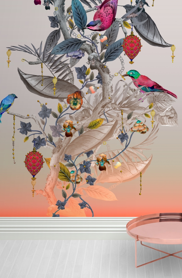
Eclesiastical Botanica wallpaper by Kit Miles Studio
Make sure you integrate the feature wallpaper in with the rest of your scheme. For example if you choose a design with a bold colour story or pattern, make sure you link in these designs somewhere in the rest of the scheme- in accessories like rugs, lampshades and cushions. Don’t go too matchy-matchy though!
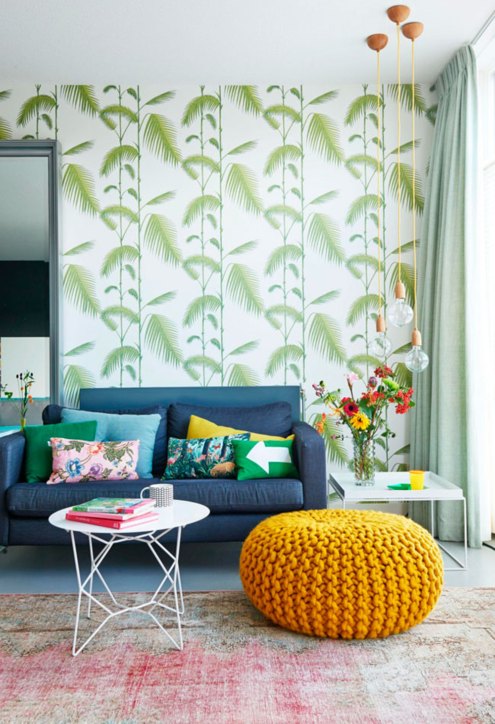
Palm wallpaper by Cole and Son. Image from VTWonen
A feature wallpaper should be positioned where you want to create a focal point in the room. Typically this is the headboard in the bedroom or the fireplace in the living room, any area you’d like highlighted could work.
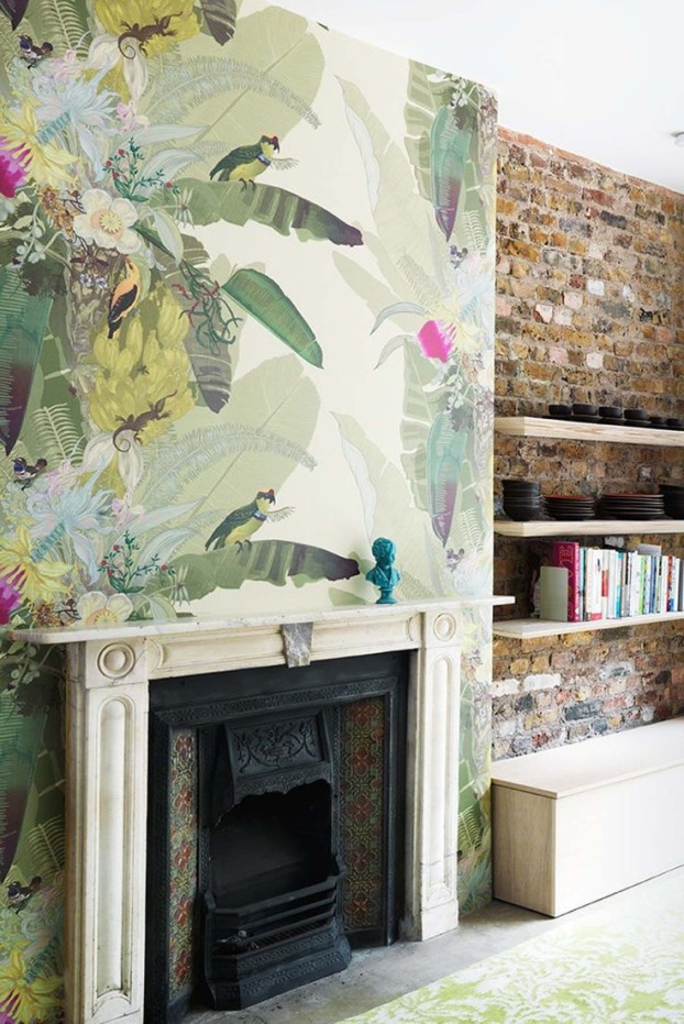
Place your wallpaper where you want the focal point in the room to be. Image from www.designclaud.com. Wallpaper by Timorous Beasties
Often people are worried that they will tire of a bold pattern. If you position it behind the sofa in the living room or the headboard in the living room, or use it in an occasional room like the hallway or guest bedroom, then you won’t have to look at it for long periods of time.
Circus wallpaper by Cole and Son
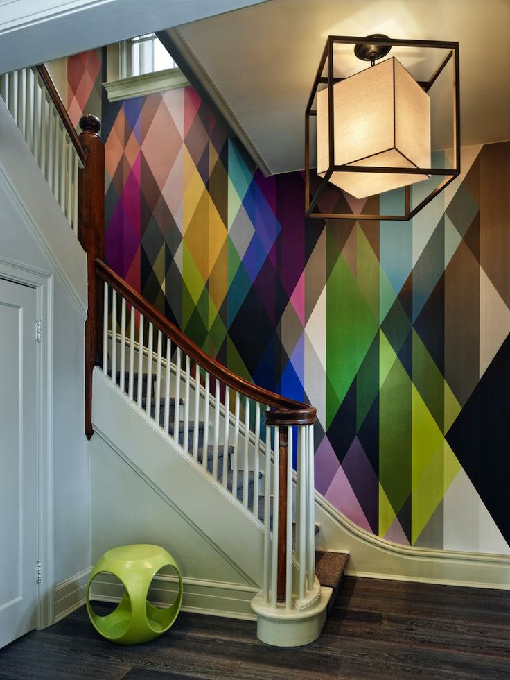
Walls with no windows and doorways work best for feature walls, as there is nothing to interrupt the design. If this is impossible due to the architecture of your home, or you live in a large open plan space, consider making a frame within the wall to fit your wallpaper within.

Wallpaper in panels by House of Hackney
Consider commissioning a mural wallpaper- this is a digitally printed image that can be resized and ordered to fit your wall perfectly. The only limited here is your imagination. Maps of the world have universal appeal but you can get them in a range of colourways to suit all interiors. Views of countryside or palm beaches are a little more kitsch but choose the right image and the effect can be really evocative and relaxing. Better still take your own award-winning photograph for a one off original.
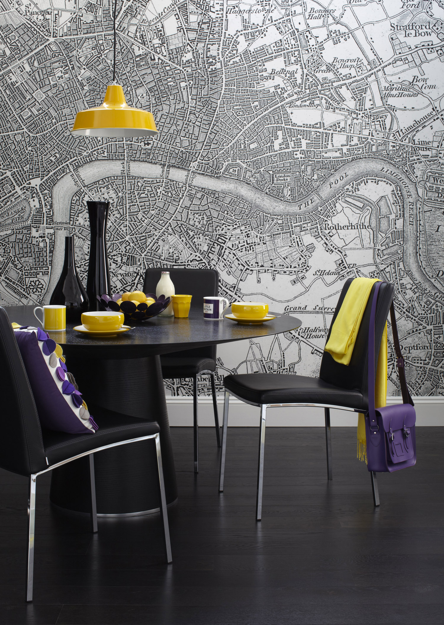
A map mural used as a feature wallpaper. Interior Design by Sophie Robinson for housetohome.co.uk
Here is my little black book of great design houses who do brilliantly bold wallpaper designs to get you inspired, in no particular order;
Please share with me where you have spotted some great bold designs, leave a message in the Comments below


