

How to choose the right colours for interior design
Ok, Ok, Its pretty obvious I’m on a crusade to get you all getting jiggy with the colour vibe. So I’ve decided in this post to get right back to basics. Sharpen your pencils boys and girls; we’re going back to school to learn a bit about the theory of colour. Out there in the wild wicked west of interiors it can feel very daunting when picking out your own colour scheme- which is possibly one of the reasons people go for the oh so obvious neutral shades. I’m cool with that if you a beige type of soul, but if you have an inkling that you’re a color lover- its time to get empowered!
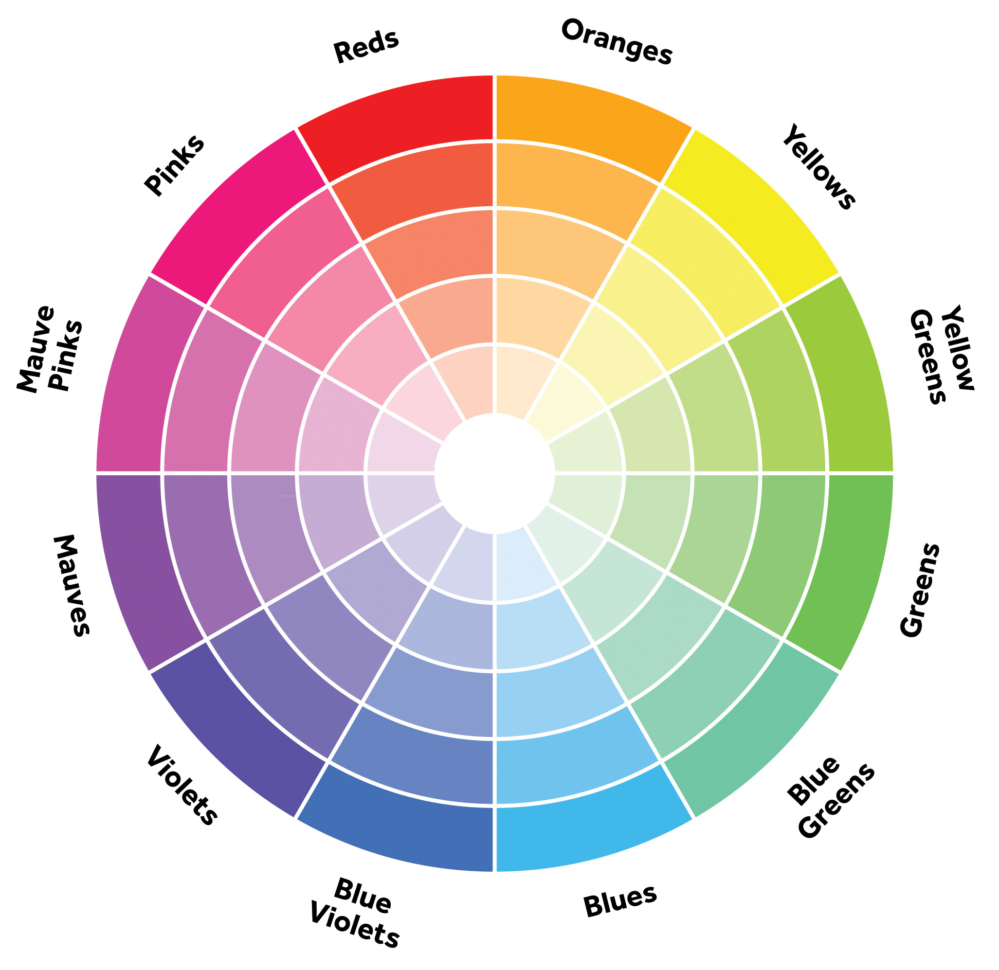
Ok- lets bring out the big guns- the Colourists secret weapon…•drum roll• the Colour Wheel!
The colour wheel is a fail-safe way of working out what works with what- anyone who works with colour; interior designers, artists and architects have all learned the theory. The classic colour wheel is made up of 12 hues- lets call one half the cool colours and the other the warm hues. You’ve then got your Primary, secondary and tertiary colours as you work away from the primary- you keeping up?!.
Dictionary corner:
Hue: a colour or shade. The attribute of discernable colour i.e. red, blue, yellow etc.
Primary Colours: Red, Blue and Yellow
Secondary Colours: Green Orange and purple
Tertiary colours: mix a primary with a secondary, and whaddya get? lime, turquoise, magenta etc.
Add white, black or grey to create a different tint, tone or shade from the original.
Tone: The particular quality of brightness, deepness, or hue of a shade of a colour. The general effect of colour or light and shade in a picture. Adding grey to a colour effects the tone
Shade: A colour, especially with regard to how light or dark it is or as distinguished from one nearly like it: “various shades of blue”. Add black to alter the shade of a colour.
Tint: A shade or variety of a colour. Add white to change the tint.
In the modern colour wheel you begin with red, blue and yellow as they are what all other colours derive from. The secondary colours are then made by mixing two of the primaries together…remember doing this in primary school! Tertiary colours are then made by mixing a primary with a secondary to give us lime green, turquoise, magenta, peach, deep purple and so much more. There are boundless tints, shades and tones wheeled out, by mixing different combinations, all called tertiary colours. We are very lucky that our paint manufactures know all this stuff, which is why we have such a mind-boggling choice on offer!

So get to the point! What colour goes with what, and what will look stylish in my home?
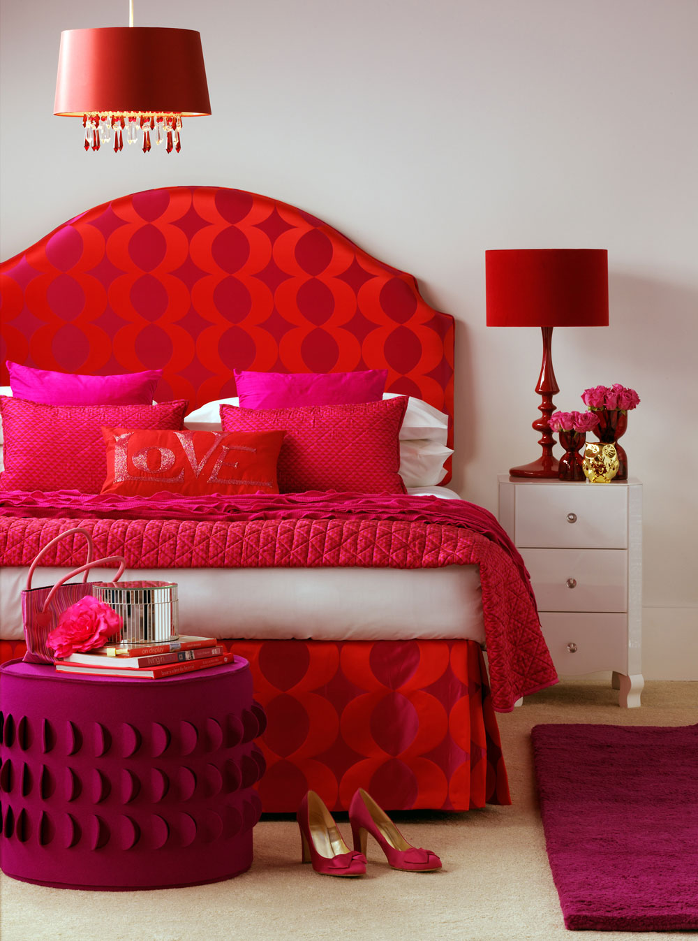
First up…Monochrome
Contrary to popular fashion dictate- monochrome isn’t black and white it is mono- chrome, or one-colour. The good news is they are easy-peasy to pull together, and even more easy on the eye. The bad news is they can appear boring. So, a great approach if you are designing a house to sell for example- monochrome will be a people pleaser for sure, but to live with all the time? Boring!! The key to getting your monochromatic scheme to sing is to use all the different tones and tints of the colour in mind. This is what will keep it interesting. And it makes using bold or contrasting patterns very simple to incorporate- as you just match them by colour.
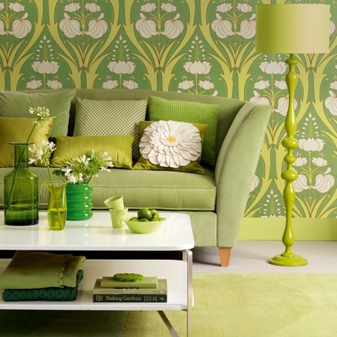
Image from housetohome.co.uk
Choose a colour and then work with that in different shades and tones. Take a look at a strip of Dulux or Crown paint chart- to see how it works. To be truly monochromatic, everything should be in your chosen hue- but I think it’s totally fine to mix neutrals like white, grey, metal and wood into the mix. You don’t need to look like you live in the emerald city!
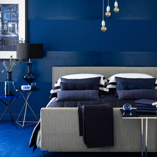
Image from housetohome.co.uk
Decorate with simplicity by using Harmonious colours
Choose two or more colours that sit side by side on the colour wheel and you get whats called a Analogous (you learn something new every day- try slipping that casually in converstaion), or more commonly known as Contrasting or Harmonious colours. Whatever, what you need to know is that this is where all the colours are easily friends- its like they come from the same family. So sit red next to pink, blue next to violet or yellow with green.
Designed by Sophie Robinson for Ideal Home. Photograph by Dominic Blackmore
I think this works particularly well if you enjoy decorating with Brights, as the intensity of colour is bold enough you don’t need the added energy of using a strong colour clash. Alternatively you can use three colours like red, orange and yellow, but I think the key to the success here is all three colours have the same tone and are balanced by large areas of white to keep things fresh.
Room styled by Lucyina Moody
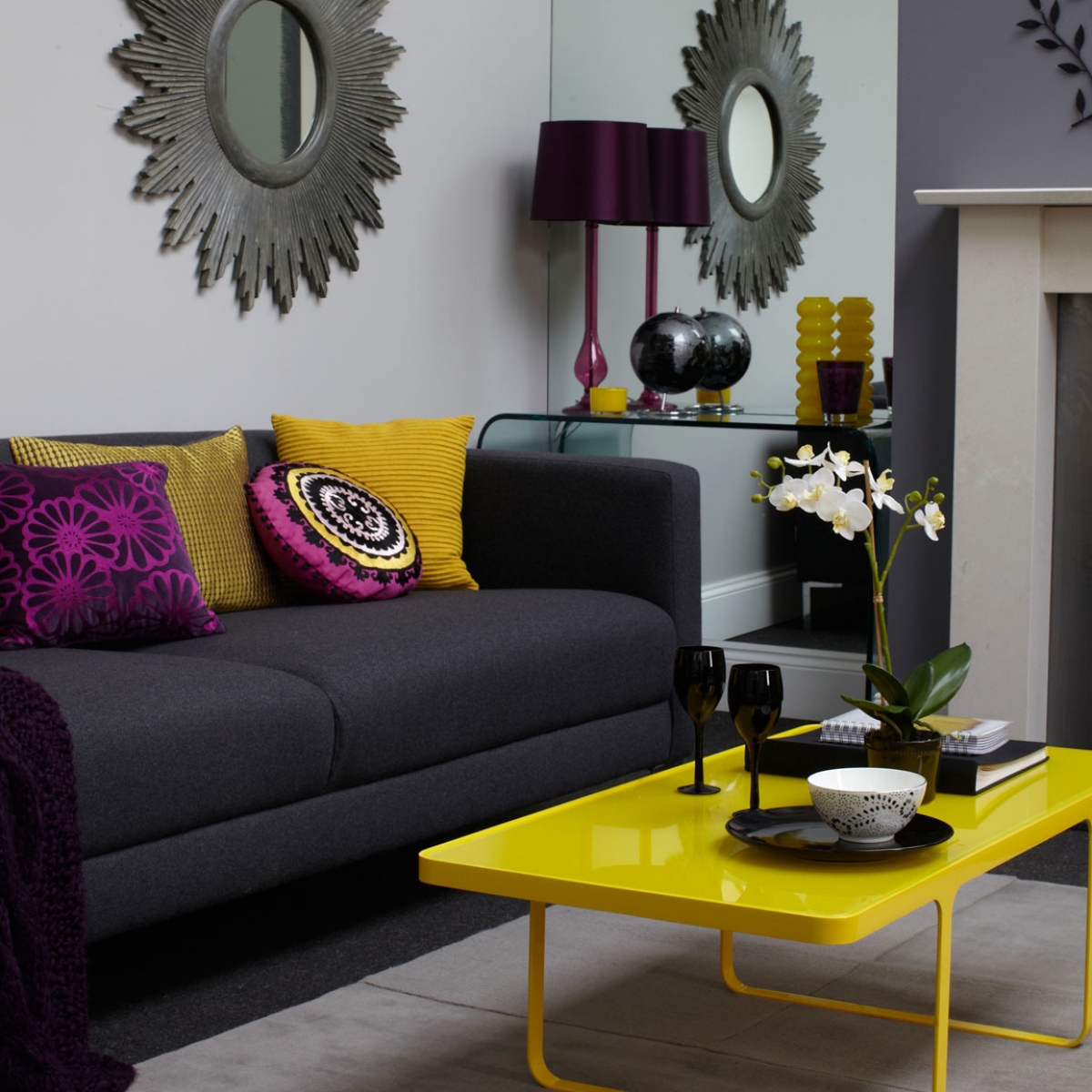
How to create Complimentary Colour schemes.
They often say opposites attract and it couldn’t be more true when we’re talking about colour schemes- but like any winning relationship just make sure you compliment each other. The contrast of the colours, positioned opposite one another on the colour wheel. I also think it works as you are often mixing warm and cool shades together. I love the way orange wood warms up an otherwise chilly blue scheme or a fresh green cuts through a suffocating red scheme. But the really important thing to know here is your complimentary colours create dynamic colour schemes! They are hugely entertaining but demand your attention. This is why I love using them!
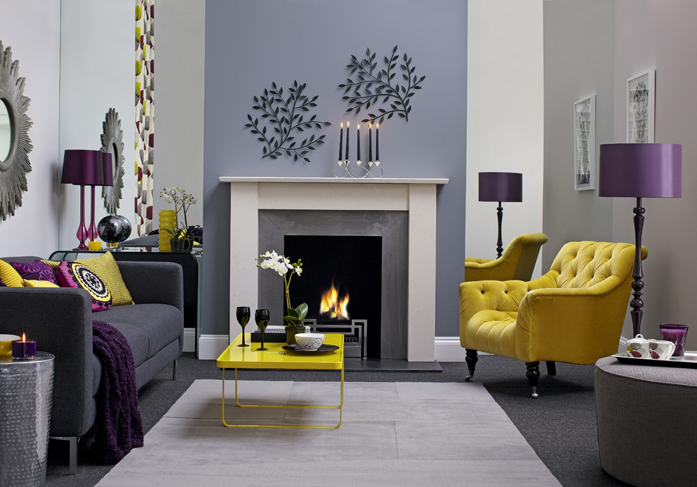
Room designed by Sophie Robinson for Ideal Home magazine
But then there’s the split Compliments and triad compliments- if you want to swat up by all means- be my guest, but at this stage I’d throw the colour wheel out the window and start having fun! Using a series of complimentary colours in your accessories are a great way to add some designer interest and energy into an existing neutral scheme. It’s no biggy- don’t get too afraid of commitment!
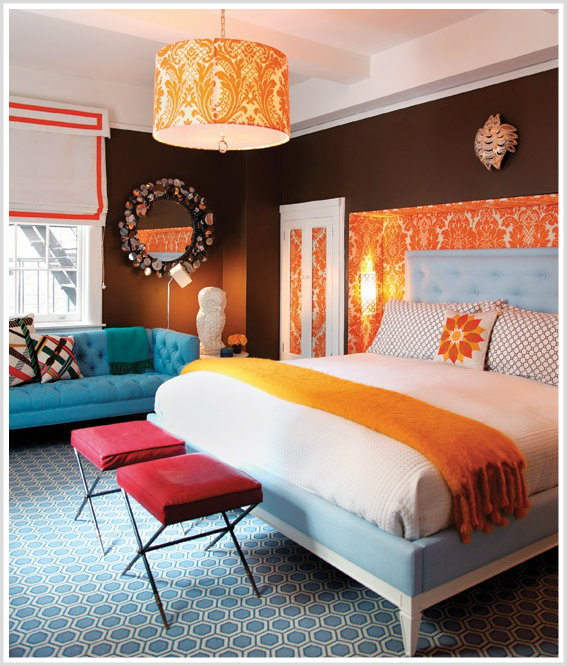
Room designed by Jonathon Adler
So there we have it- the colour wheel in a nutshell. Now I have never ever designed a room scheme by using a Colour wheel. For all my experience designing rooms, I like to go with my gut- and I’m sure that’s how a lot of designers work. So I’d advise that your next step would be to have some fun with a mood board and some paint chips. Interior design shouldn’t be painting by numbers- you’ll get the feeling when something looks smoking- so have a go…it’s only paint!!!
I’d like to mention a special shout out to designer and colour mentor Sim Barker, who reminded me to learn to love the colour wheel again. Check her out as she also offers great colour consulations for interiors at http://www.simbarker.eu/


