GET THE REPLAY OF THE VISION BOARD MASTERCLASS - LIFE IN COLOUR

Sophie Robinson
  • Home
  • Workshops
    • Marrakech Retreat
    • Home Masterclass
  • Online Courses
  • Collaboration
  • Podcasts
  • Blog
  • About
    • About me
    • Work with me
    • Press
  • FAQs
  • Contact
  • colour crush
  • Interiors
14 Dec 16

Colour Crush: Pantones Greeney

RM shot05 13 2p

So with the end of the a fairly dismal 2016 coming to an end it’s time to look for new shoots of optimism as we march into the new year. I LOVE a new year. I’m not interested in the parties and hangovers anymore. I’m talking about the exciting expectation of a blank canvas, a new sheet of paper that a new year promises. Out with the old and in with the new! We’ve been doing so much gardening this Autumn, including taking out over 100 Leylandi trees, that we are going to have the most almighty mother of a bonfire. I’ve been saving it for New Years day, to symbolise the end of the past year and making way for the new and throwing all our old cares into the fire. It’s very cathartic and highly recommend it. Go on, chuck it all on the fire!

Pantone-colour-of-the-year-on-page

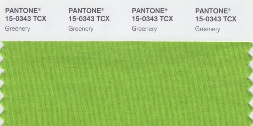
So my blank canvas will involve lots of decorating. We’ve got our annex to dec out as well as getting around to transforming the inside of my currently beige box of a house. (I know, I’ve been sooo slow getting around to it). So I’m always intrigued to see what taste makers and colour forecasters have in store for us. Those smart people at Pantone have declared their colour for 2017 as ‘Greenery’. Now Interiors passion for all things green is nothing new, so the hue in itself doesn’t surprise me. We’ve all been lusting over the Botanical trend for what feels like ages. But the tone. Its so perky and bright! And while we’ve all been sashaying around dark  spaces swathed in inky blues and charcoal grey I did find myself taken aback a bit. Pantone claim there is a real urge in the world for green and everything it stands for. Leatrice Eiseman, Director of the Pantone institute reflects:

“Satisfying our growing desire to rejuvenate and revitalise, Greenery symbolizes the reconnection we seek with nature, one another and a larger purpose”. Nice idea, I can sign up to that.


green succulents box plants

Image source

Interestingly this very vivid colour has so far missed the mark with the design aficionados. My knee jerk reaction was it felt dated and very 19090’s Changing Rooms. I’m picturing a Linda Barker moment complete with bamboo screen and rattan garden furniture. Then there were those that just saw pure Kermit the frog. Designers it would appear would rather see a more foresty green or sumptuous emerald. But this greenery green it’s far from sophisticated. It shouts. Look at me! I’m a juicy green apple! Pick me! But already I find myself intrigued and ready to embrace the new trend. I think I could enjoy adding some positive new shoots of green into my own forthcoming projects. I think it’ll add some bite.

pantones-bright-spring-palette-is-anything-but-boring-

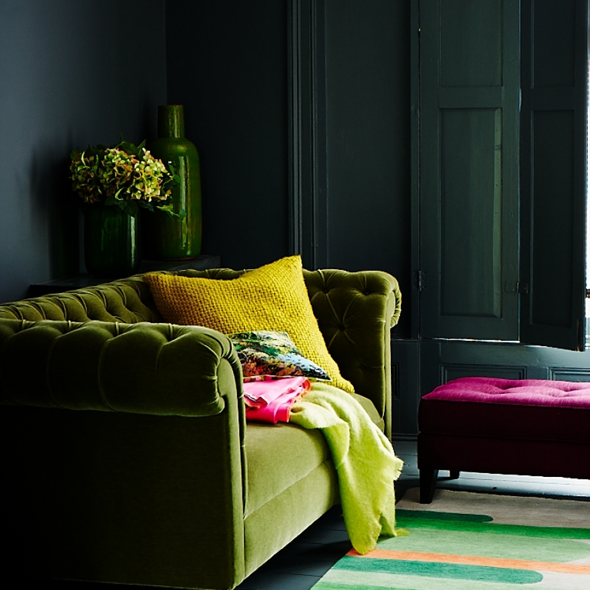
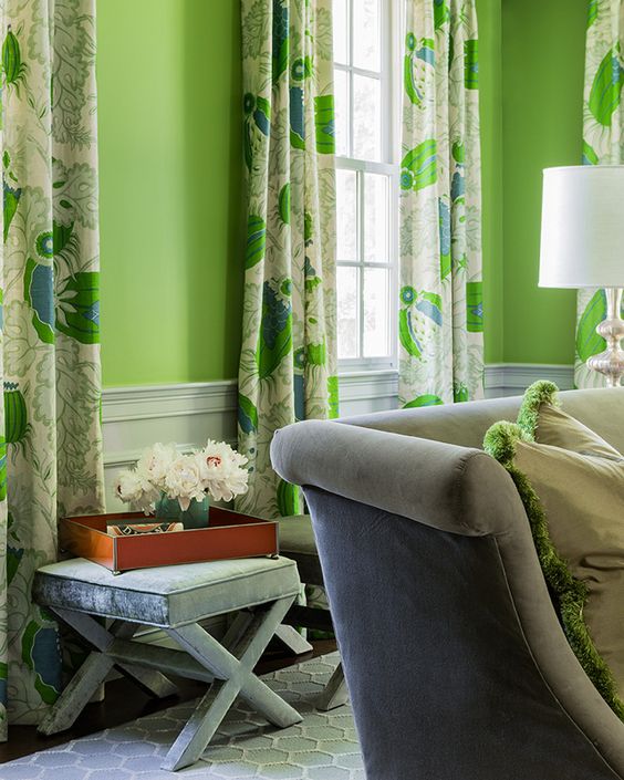
So here’s where I stand with the little powerhouse of a colour. First off I do kind of love its perkiness but I’m seeing it as a pop rather than a wall-to-wall affair. You could keep it fresh with its obvious crisp white but I’d much rather see it with the dark stuff. Green looks alluringly crisp next to the sultry greys and dark forest greens. There’s no easier way to add the colour by introducing some botanical prints and plants to the design. House plants are officially cool again if you missed the memo!

marksandspencer-green-sofa-black-walls-greenery-trend-pantone-2017

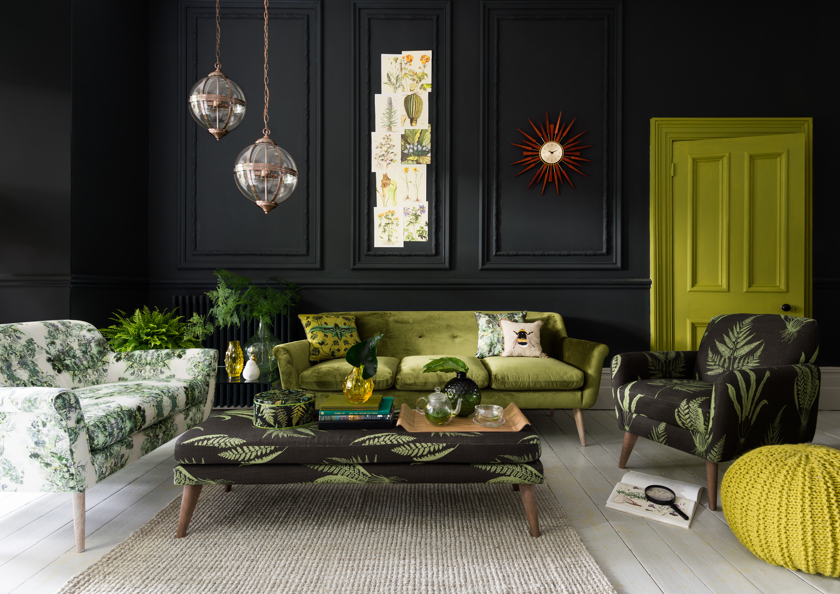
Image from Marks and Spencer

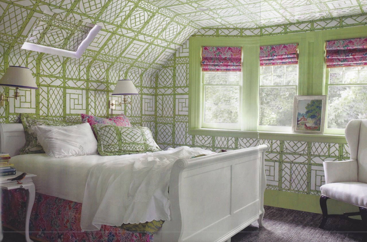
Green also sings like a lark next to crimson pink or Clementine orange. It’s one of my all time favourite colour combinations. When I think of apple green and I think classic trellis style wallpaper. Its quite a tried and tested way to decorate an attic bedroom in wall to wall and ceiling pattern as it helps to iron out the awkward angles. But in this bold graphic trellis doesn’t it look incredible. I know you’re all going to ask where it’s from ,but I don’t know, (can anyone help me?) but there are gazillions on the market so it’s a very easy look to get.

trellis wallpaper in attic bedroom green pink sleigh bed

image source

When using any punchy colour I think it’s also a great idea to team it with a punchy pattern. One of my all time favourite classic prints is this Carnival print from Christopher Farr. Then the liveliness of the green is perfectly balanced with a cool grey on woodwork and upholstery.

Image source

One of the hardest things about this particular hue is it has alot of yellow in it. It’s seriously high energy so you’ll need to think of the best type of room to use it in. To sunny and you’ll need shades. However it could make a wonderful welcome in a social space and tank up the crispness with some super sharp monochome. The key to this rooms success for me is the antique furniture and classic lantern. Because lime green can be a like a toddler on aspartame so you need to work hard to keep it classy. For me old gear always does that, it helps keeps brights classy. Withe the same sentimate if you have a classic or traditional home, consider a bright pop of green to make it feel young again.
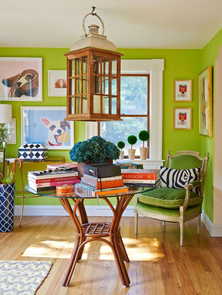
-christian-siriano-house-entrance-greenery-pantone-2017

image source

In fact I think black might be the perfect partner to this adolescent colour. I love this statement lamp from Pooky Lighting. The glass base really lets the light make this zesty green hum but it’s then quickly sobered up by a sensible black linen shade. If you have a grey interior design scheme already in place (and lets face it alot of us do!) then a little Greenery could be all you need to lift it into 2017 with some fresh optimism.


Pooky-Trixie-Table-Lamp-in-Green---130-Empire-Shade-in-Black-Silk-greenery- pantone-2017

image source

[Featured image styled by Mary Norden, Photographed by Adrian Briscoe for Red Magazine]

Save

Save

  • colour crush
  • Interiors
Why Christmas should be tacky Shiplap bathroom inspiration
  • Christmas
  • Interiors
    • colour crush
    • colour psychology
    • DIY
    • dream home makeovers
    • Home Office
    • Home Tours
    • Interior Design
    • Interior Styling
    • podcast
    • Sophie Robinson X Dunelm
    • Sophie Robinson x Harlequin
    • trends
  • Lifestyle
    • Business
    • Fashion/Beauty
    • Life
    • My House
    • Nosh
    • Travel
  • Rooms
    • Bathrooms
    • Bedrooms
    • Kids rooms
    • Kitchens
    • Living rooms
    • Outside
  • Videos
online influence award winner 2019
Interior Design Winner Sophie Robinson Insta
Videos

Listen

Listen Here

Online courses
by popular demand

Catch Sophie In All Her Colourful Glory On Instagram

April, you’ve been the reboot I needed! And it’s April, you’ve been the reboot I needed!

And it’s been a month of firsts…
First sea swim (bracing but invigorating)
First time as a mum to a 15-year-old (how did that happen?!)
First sunglasses of the year went on
First washing out on the line
And… my first proper deadlift at the gym 💪

I’m feeling full of that gorgeous spring energy now. Light, optimistic and ready for what’s next as May comes galloping in.
Who’s feeling it too?

1. Arthur’s birthday table setting
2. New bike taken out for a trip along Brighton sea front 
3. I’ve been cooking a lot for friends and family this month! Just to prove I can
4. Attended a fabulous Designers dinner to celebrate the new @wmorrisandco 
5. First deadlift with @teamyo_weight_training 
6. @interiordesignmasters is back on the box!
7. Waiting for the oak trees to break out into leaf
8. Finally got the washing line out!
9. Breathwork session with @wildwillowwellbeing @theacupuncturist 
10. New moon meditation at the fabulous home of @alexadecastilho 
11. Easter table setting 
12. . 
13. The brilliant @joshuaidehen live at @chalk
14. Movie nights
15. Suns out on Brighton Beach
16. First sea swim with @sophieabbottartist Was bracing! 
17. Mini makeover using my latest collection with @dunelmuk
18. @sophieabbottartist house ready for Artist Open Houses and Brighton festival 
19. Hair and makeup by @jadefarmiloemua 
20. It’s a wrap! Phew!
AD Sun’s out, the garden’s calling… and I might ha AD Sun’s out, the garden’s calling… and I might have just the thing! 🌸

If your outdoor space is feeling a little lack lustre, the quickest way to bring it to life is through colour, pattern and personality. You don’t need a full redesign. Just a few joyful prints, some feel good colour and you instantly shift the mood.

From bold tasseled parasols and squishy bench pads to playful outdoor lighting and characterful wall décor, my collection with @Dunelmuk is designed to make it easy and affordable. Whether you’ve got a tiny city terrace or a sprawling country garden, these are the pieces that instantly elevate a space and make it feel special.

I had so much fun creating this range, inspired by my travels to Marrakech, and seeing it come to life in real homes and gardens is always the best bit.

If you’re near Brighton, you can experience it in person as part of the Brighton Festival.
My best friend Sophie is opening her home for Artists Open Houses on the 8th, 9th, 10th May
from  11–4pm. Drop her a DM for details @sophieabbottartist 

Otherwise, you know where to go… pop into your local Dunelm or shop online and bring a little joy outdoors this bank holiday.

So Tell me, which piece are you adding to your garden first?

Beldi Parasol £89
Outdoor wall art  flowers £18
Beldi and Ourika Bench pads £45
outdoor cushions £22
Pavilion chair £69
Raid star tray £30
Mint jug £8 glasses £2.50
It’s Interior Design Masters episode 2 and this we It’s Interior Design Masters episode 2 and this week things got romantic!

The task was castle hotel bedrooms, all centred around a “romantic retreat” brief… and what I love most is how wildly different each interpretation turned out. Some designers ran with the medieval theme while others left it at the turret and went full whack whimsy. From bold and playful to soft and serene, it’s a showcase of diverse design aesthetics and proof that one style certainly doesn’t fit all.

As always, it’s not all just paint and pillows. Add in 4m-high ceilings, tricky stone mullion windows and some very traditional furniture that needed a fresh twist, and it’s no small feat. Once again I take my hat off to the amateur designers and am in awe of their creativity and ingenuity given the time and budget constraints. 

So… which room are you checking into? Let me know below 👇

@interiordesignmasters 
@frankieratford 
@jonniknightdesign 
@byajeetjugnauth 
@bensmithinteriors 
@duran_deedee 
@emmely 
@our_bears_home 
@liagoldinteriors 
@shaginterior
A little silliness, a little colour, a little faff A little silliness, a little colour, a little faffing … and suddenly life feels more beautiful 🌸

For me, it’s never just been about how my home looks. It’s how it feels to live in it. This is your reminder that creating a beautiful life isn’t about big, grand gestures… it’s built in the small, whimsical moments you make for yourself every day ✨
AD It takes an army to bring a collection together AD It takes an army to bring a collection together, and here is a sneak behind the scenes for my latest collection from @dunelmuk. 

The team is made up of photographer, stylists, art director, a team of PR and marketing folk, the social media crew, set builders, couriers, make up artists and me. Its a really busy day where we take over a location house and bring in flats for wall colour, hang pendant lights on tripods, steam bedlinen, plump pillows and arrange flowers. Its a real creative whirlwind and I feel blessed that I get to work with the best in the business. I’ve created three homewares collection with Dunelm and they have been just the best team of people to collaborate with, so this really is a happy reminder. I’m so proud of everything we have achieved, bringing my particular take on maximalism to your high street, so do check it all out in store and online while stocks last.

I’ve got another shoot, this time for my own exclusive collection at my house this week, ready for my AW ‘26 collection that will be launching very soon! Pinch me! And make sure you watch this space.
Interior Design Masters is BACK and it’s come out Interior Design Masters is BACK and it’s come out swinging…

Take ten bold new designers and give them a row of iconic British beach huts, with a first challenge that demands serious confidence. To decorate them in your signature style demands no playing it safe here.

The talent this year is strong. What I enjoyed was the brilliant mix of ideas, confidence and creativity. It’s a reminder that there is no one way to design a beautiful space… and that’s exactly what makes it so exciting.

Now I need to know…

Who would have won Stand Out Space for you?
Which beach hut are you mentally moving into?
And whose ideas are you absolutely stealing for your own home?

Watch @interiordesignmasters with @chattyman on BBC One and @bbciplayer Tuesdays at 8pm… then come straight back here and let’s get into it 👀

Also make sure to follow the budding Design Masters 

AJEET – @byajeetjugnauth 
BEN - @bensmithinteriors 
DURAN - @duran_deedee 
EMMELY - @emmely
FRANKIE - @frankieratford 
JONNI - @jonniknightdesign 
KATE - @our_bears_home 
LIA - @liagoldinteriors 
SOPHIE -  @shaginterior 
TEO - @teovillacci
Are you on board the Colour Revolution?! While the Are you on board the Colour Revolution?! While the majority of people continue to numb them selves out on neutrals a growing number of us are banning the beige and leaning into leading a full life in colour. 

The colours you love say everything about you and to you. It’s deeply personal and I’m passionate about helping people find their own colour palette. But it starts with listening to your heart. So what is your home saying to you?
A small room loves a deep rich dark colour. I knew A small room loves a deep rich dark colour. I knew that but my goodness the opinions! 

If you struggle to block out the well meant advise this is your sign to follow your gut and do what you want, it’s your house! 

This small room was once a cramped kitchen until we switched things up and made it our cosy TV Snug. I drenched the walls in the dark leathery red and its created a really atmospheric cocooning feeling, perfect for cosy movie night and box set binges. The jewel bright fabrics really pop too which is why I love it more! 

Wall colour is Cordoba @littlegreenepaintcompany . All fabrics are from my collection with @harlequinfw . Rug is vintage from @studiolidmarrakech and pictures by @beckyblairartist
Follow on Instagram
Sophie Robinson
  • © 2025 Sophie Robinson

    /
  • Contact/
  • About/
  • Design by MW

You're almost inside!

Leave me your best email to sign up for the Webinar

MG0001 Magnet Sophie using Tap 021 copy

You're almost inside!

Leave me your best email to sign up for the Webinar