

Designer Spotlight: Anna Starmer

I may just have found someone who’s love of colour surpasses my own! I was lucky enough to listen to Anna talking at a design event last year, giving one of her hot-ticket talks on colour trends and I was just entranced. Her passion, innate creativity and ability to construct mouthwatering colour palettes just blew me away and a fan girl crush was born! I’m so delighted that she agreed to this interview. She is the founder of Luminary Colour, which is a bi-annual colour and trend forecasting bible, created two years ahead of the season. She is also the author of two bestselling interiors books, The Colour Scheme Bible has sold over 450,000 copies worldwide and her latest offering, Love Colour is one of my favourites. Her insight into colour, trends and forecasting is invaluable and as a fellow creative I find it fascinating story of how she got to where she is today, how she has built a creative business around her family and takes her two young children on her global trips to source colour inspiration. Pull up a chair, make yourself a hot brew and enjoy this deep dive into the colour soaked world of Anna Starmer, colour expert and trend forecaster.
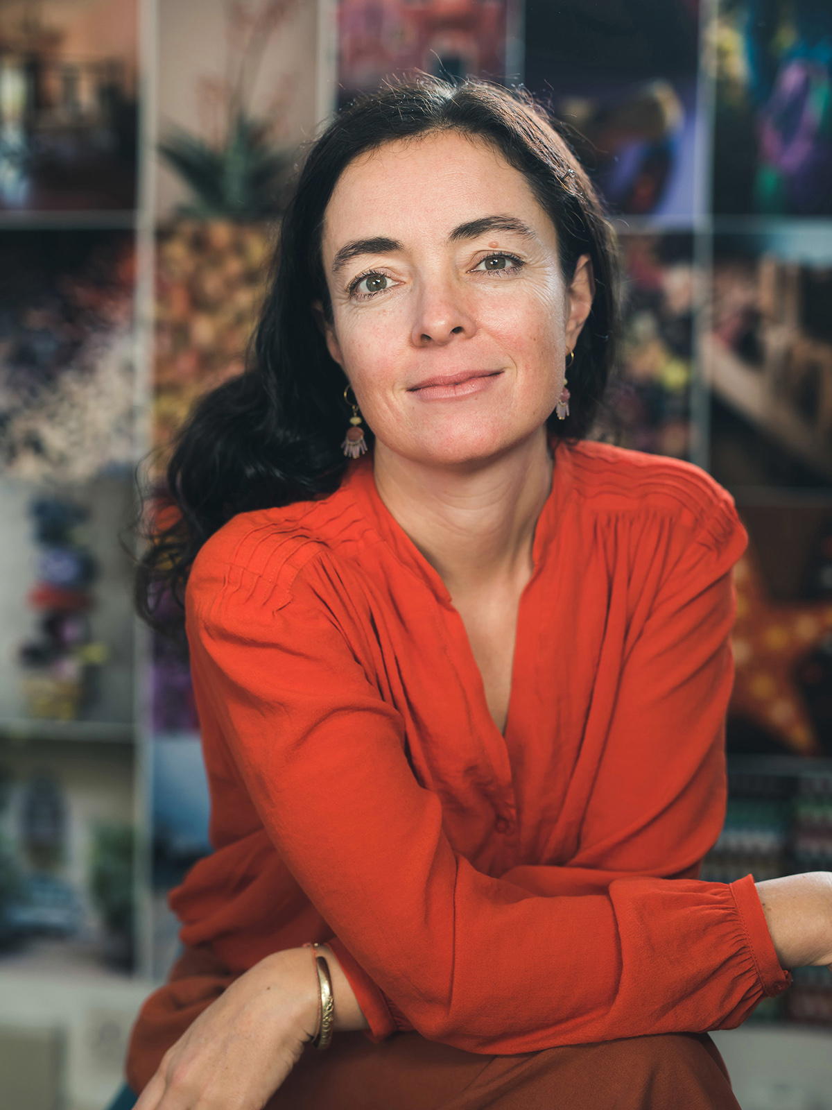
Portrait by Casey Moore
You have made a career from your love of colour, what sparked your passion?
I have always loved colour! As a child, I only really played with felt tip pens and colouring papers. I used to arrange things in my room in colour order and collect colourful objects.
I went to Chelsea College of Art in London to study textiles and achieved a degree in knitted textile design. I loved making sketchbooks and dyeing yarns, putting together colour palettes, painting and designing patterns on the print table. My work was always full of strong colours.
After leaving college I worked for 4 years in a trend and forecasting studio in London. Back then, trend was not a big part of design – as it is now; I had never heard of colour forecasting before. Working in a small studio I had many different roles. As well as designing knitted textiles and garments, I created photography, worked on future colour collections, developed themes for clients from Pantone to John Smedley. I loved the research, the curation of new trend stories, the studio photography and colour work for Pantone colour forecasting books – more than I liked knitting and textile design.
I simply love colour. I love what one colour does to another, how colours fire off each other. I love how a surface or texture interferes with colour, and how some colour combinations just blow you away they are so beautiful. I love creating images and writing stories which bring colours to life. I love bringing new colours to situations, which my clients might not have thought about. Colour makes people happy, the job I do brings people out of their day job and leads them on new journeys into creativity – I love it!
Which project has been a real highlight over your 20year career, and why?
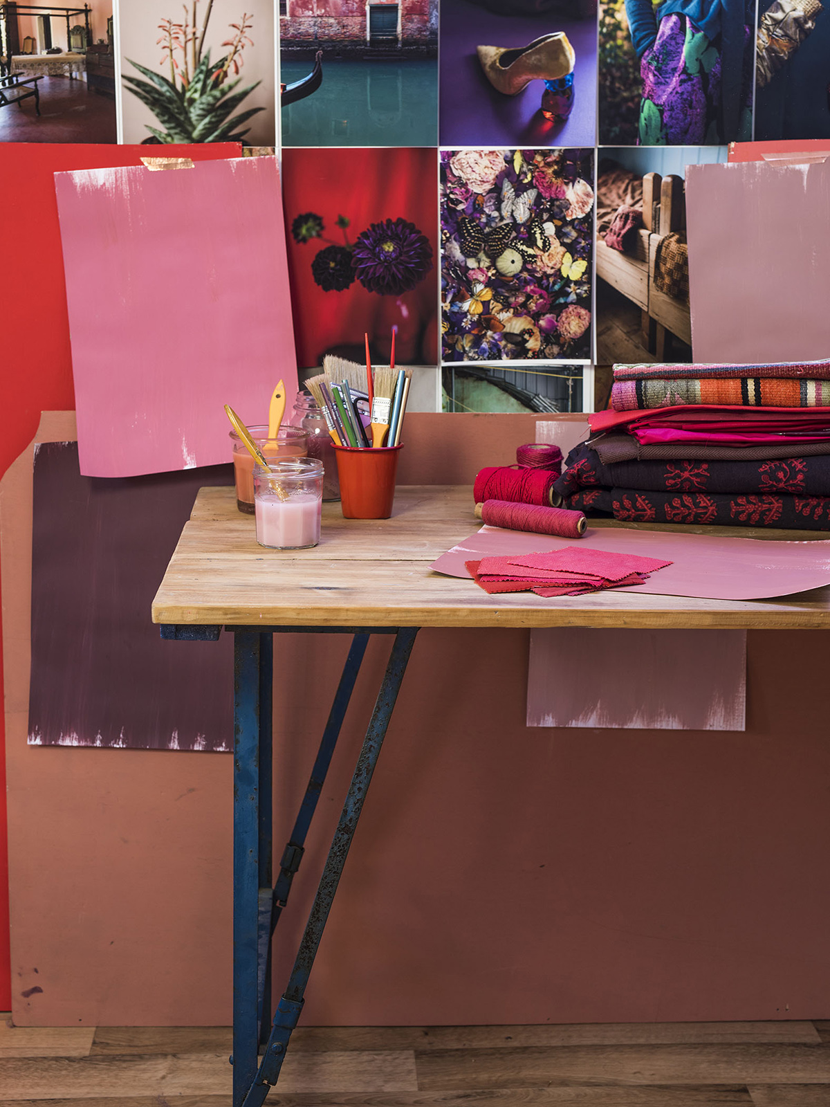
I am very proud of the business I have built up through my Luminary books. This year I will be publishing the 20th edition of Luminary. I started making the books in a shed in my back garden in North London when I was pregnant with my daughter. The book was completely handcrafted, printed on a desktop Epson and all fabrics gathered from London markets like Shephard’s Bush and Dalston! I now have a studio in East Sussex, and the books are manufactured entirely in the UK – I employ a UK based technical fabric dye house and specialist factories and printers to create the books. Over the last 10 years, I have built up a real reputation in the industry as one of the leading global colour forecasters. I have agents selling Luminary books all over the US, Korea, Australia, throughout Europe and the Far East. And I am supplying original and unique inspiration to globally renowned brands and designers. Luminary sells to a wide variety of clients as diverse as Estee Lauder and MAC cosmetics, Triumph and Victoria’s Secret lingerie, Gap and Anthropologie, J Crew and Boden. I am proud that my photography and colours are so versatile and can be used by so many different types of companies.
I am proud and grateful that I have managed to forge a career and a business that I love, which also lets me spend time with my family. It is a lot of hard work, and I do work long hours. But I have been able to often take my family on my research trips and share my inspirations with them.
Recent highlights include Curating a colour range for Dualit, then styling and photographing the Ad campaign. Working with colour for Manolo Blahnik, and being asked to photograph Charleston House, and write about Virginia Woolf’s love of colour – who is one of my all-time inspirations.

You work within the fashion and interiors industries, how are they different and do you prefer one to the other?
It can be tough working with fashion retail brands at the moment. Historically there was definitely more scope for innovation and pushing the boundaries with design and colour. I have loved developing the colour library for Marks and Spencer, and building future trend concepts with brands such as Monsoon, Jaeger and Primark. One of my major challenges in the current climate is that design teams and company directors alike are being pinched, cash flow is tight, sales are down. Every corner is being cut to try and improve profit margins. And unfortunately, this has resulted in poorer quality and cheaper clothing.
In my workshops and presentations, I firstly talk about how we are living as human beings. What are the big factors influencing our lifestyles right now – and then in turn, how is this influencing our purchasing habits and the items we want to buy. For several years many of my future stories have centred around themes such as ‘slowing down’, ‘buying less’, ‘changing consumer attitudes’, and searching for a calmer, cleaner way to live. As we witness the rise up in consciousness surrounding how our things are made, the pollution and devastation that our clothing and purchasing habits are reeking on the planet – it becomes a fundamental part of what I do to push my clients to think deeper about how they are manufacturing, and running their businesses.
I have noticed in recent years, that the home interiors market is light years ahead of the clothing industry in trying to achieve new more sustainable practices, and searching for new solutions to the global crisis’ that we face. I find myself ever more drawn to a desire to work with companies who want to try and change, to look for new answers. Compared to fashion retail, interior brands work on a much slower cycle, often having the same style and colours in stock season after season. The very nature of how we buy goods for our homes is slower, and so, much more ‘friendly’. We do not throw away a perfectly good sofa or kitchen cabinet – just to get a new colour!
But, there is a long way to go, the entire design industry needs to stop and reboot. Fundamentally the human race needs to alter the way it lives. We all need to actively change and work hard to turn back many of our modern ways of living. This is no longer a ‘trend’ or a ‘fad’, I truly believe that this must now be the manifesto for the world. We are living in frightening yet exciting times. We have the power and the knowledge to make a change and alter the future of the planet.

Throughout your travels you must find inspiration in so many forms, how do you interpret them into your predictions and projects? Tell us about your process from finding inspiration through to turning that into a tangible trend.
My job is to create new ideas each season for my clients. The colours and trends I put together in my books are built from pure inspiration. I have worked in design and retail for over 20 years. I created Luminary as I wanted to offer the design industry real and original ideas to work with. Each season I travel to a new country to take photographs, gather objects and treasures, meet and experience different cultures.
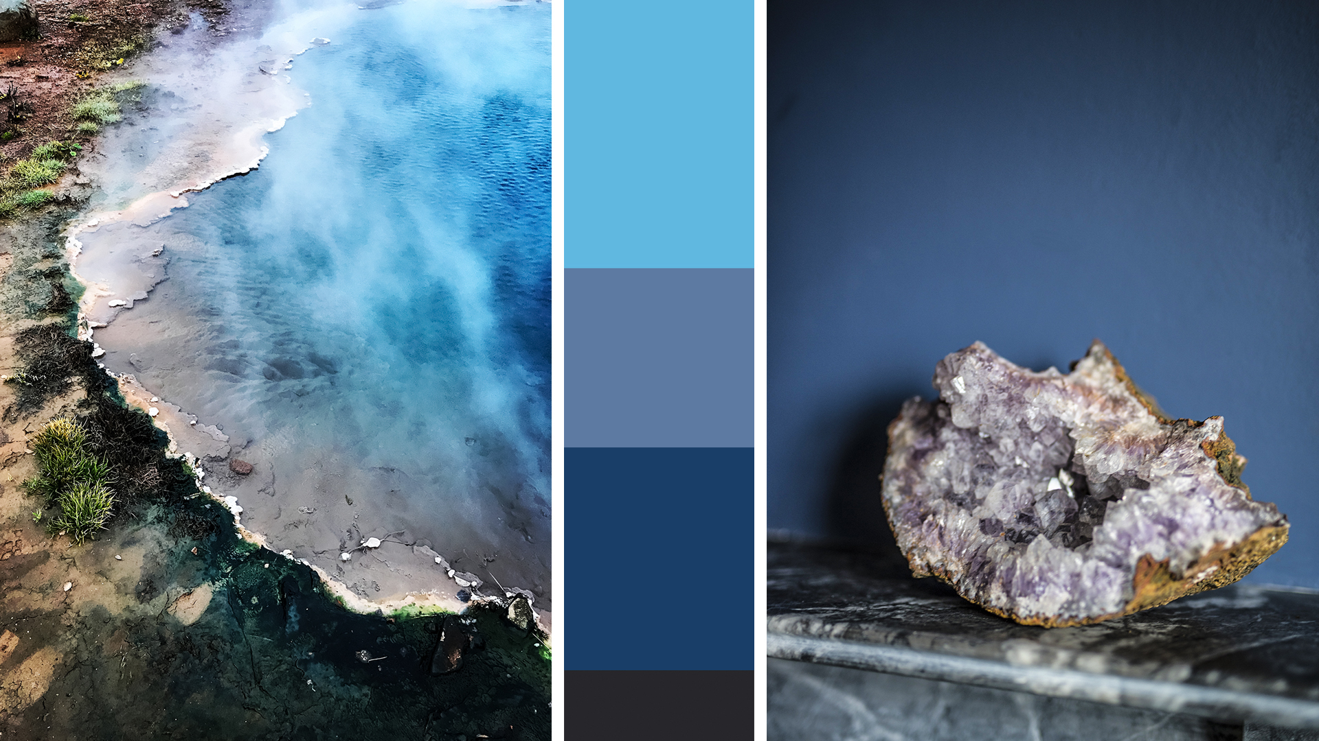
This time last year I started to create Luminary autumn winter 2019. I had a feeling to view raw and natural colours, to go somewhere unpopulated and extreme. So, we travelled to Iceland (my husband and 2 children always travel with me). Instead of looking at fashion in New York, or retail trends in Paris, I went and stood on the edge of a volcanic crater. I lay on the brightest green moss on black volcanic rocks with my 8-year-old son. I photographed glaciers and violet blue gasses bubbling out of geysers. And these are the things which have inspired the colours in my AW19 book. My ideas come from the heart, they are deeply felt and very personal
Each element of the Luminary book expresses a mood, telling a new story based on deep-rooted, connections, intuitions, desires and feelings. Luminary is so much more than a colour service, it is a very personal expression of what is happening in the world today. Luminary is a creative reaction to current and emerging cultural trends and global issues.
I am fascinated by people and places, how people live, different tribes, lifestyles, houses. I might photograph a beautiful modern barn conversion in Oxfordshire, street style in Brooklyn New York and the Flower Hmong people of Northern Vietnam, all in the space of a few weeks. I bring hundreds of images back to my studio and piece them together like a jigsaw puzzle to create original and thought-provoking colour and design inspirations. I feel there is a lot of repetition and ‘copycat’ out there in design. My ideas are driven by encouraging and inspiring designers, manufacturers, brand leaders and consumers alike to have faith in their own ideas and be true to what they love. Love Colour is driven by the idea that we all have a very unique view of colour and we are all inspired by so many things in the modern digital age. I love the idea that people take my books and interpret them in their own original way.
Can you describe a typical working day?
Breakfast with the family, take the children (Eva 11 and Jacomo 8) to school and then walk the dog (Tiger Lilly the lurcher). Go home and make lunch then head to my studio in Lewes.
Each day is very different. If I am working on a new book, then I am in my studio either doing shoots, editing or writing copy and designing layouts with my brother. Liaising with factories who produce the Luminary books, or my publishers and global agents.
I also work in-house with a range of different clients from high street fashion brands to small UK brands such as Dualit. If I am with a retailer, I will often be presenting seminars on design trends and colour influences to 100+ people. Then holding workshops with design teams to curate new collections, and look at colour ‘flow or timing on their shop floor. I also travel and am on shoots as I take all of my own photographs.

Can you divulge the next big colour trend, which is your favourite season and why?
I am currently on AW2020, I work 2 years ahead. There is a lot of green going on in 2020, through spring summer and into autumn winter. A variety of greens ranging from soft khaki and sage for interiors (especially kitchens) through to jewelled emerald and crystal malachite greens for clothing for autumn. As I look more and more to the natural world for inspiration and reassurance – I find that I can’t stop talking about greens. Greens are comforting, nurturing and reassuring. Greens are vivid, living and vital – representing hope, rebirth and new beginnings. I am talking a lot about 2020 being the start of a new era, a new decade, and a new platform for our industry and for humanity as a whole. Green represents these new challenges we face on the planet and helps to ground us, to put down roots and rethink the ways we live.

I know you often take your family travelling with you. How do you manage the life, work balance?
It’s not easy! And can be overwhelming. Our children have grown up living semi-nomadic, as we have a small house which we built when Eva was a baby in the mountains in Andalucía. They are used to being in different places and experiencing different cultures, people and food. They are open-minded and versatile. I think the trick is that we are a happy family unit, they feel safe and they enjoy the new experiences. Often, I have to go off alone to gather photographs or do a shoot, make a visit. But they are pretty adaptable and now both have their own cameras and can join. They are happy to sit at roadside cafes in Vietnam and eat noodles with the locals, they swam with giant turtles in Mexico and visited Frida Kahlo’s home. They are interested in the world and now like to actively get involved in planning our trips. We are lucky yes, but it is hard work, not a ‘holiday’ in many people’s sense of the word!!!
When we started a family we always wanted to travel with them. I aimed to carve out a working life which would incorporate travel. It takes a huge amount of organisation and forward planning to curate the trips we take. Often, we cover a lot of ground in a few weeks, travelling by night trains or internal flights help reach diverse places more quickly. Last summer we drove 3500 km across Uganda and Kenya. Our children were brilliant. We were well armed with the entire audiobook of the Hobbit and great friends to share the journey with! And it always helps if we can find a pool or a beach every 3-4 days, this chills everyone out! It must be a well-planned balance of work and rest. These trips are not usually luxurious or very relaxing! We are not in tourist centres, so often have to stay in local homes, hostels or bring all of our own food and camping equipment – as in Uganda. It is important for us to try and meet local people, and meet communities. That is hard and sometimes doesn’t happen at all……
It is really important for me that my work and life are one. I want to show my children what I do, that I love my work and to share my fascination with the wonder of the world. I want my children to grow up curious and open-minded, global and adaptable. I think humans in the future will need to be independent thinkers, solution builders and community spirits.

We love your book, Love Colour: Choosing colours to live with. What inspired you to write it and what would you most like people to get from the book?
I have written a couple of consumer books in the past. The Colour Scheme bible has sold really well and is still being reprinted 12 years on! So I was approached to write a new colour book for interiors by Ivy Press.
Love Colour is not a ‘how to’ book or a decorating manual. It is a book about colour which can be applied to many different design forms. Also, I really wanted a new platform for my photography, which reached beyond the internal design industry.
I wanted to create a book which helps consumers to have confidence in colour and to build their own style and ideas with colour and design. I feel more and more that we are all overwhelmed in too much choice. When choosing colours the choices on offer are too vast – making it harder and harder to remember which colours you really love. In Love Colour I suggest ways to gather ideas, create your own colour identity and then come back to which colours you love, and which colour schemes resonate the most with you.
Colour is personal, intuitive and transformational. Colour is instant, visceral and natural – we all have a unique understanding of how colour works. My books and my work aim to bring ideas and original global inspiration to people, to offer opportunities to inspire and ignite true colour passion.

What’s next for you in terms of your career or upcoming projects?
My latest book Luminary AW2020 is released end Feb 2019. I have a new colour project with Dualit booked in as well as my exciting collaboration with Charleston House. And I’m presenting a 2 day seminar programme in London in March.
Visit Anna’s amazing and inspirational website luminarycolour.com and make sure you follow her on Instagram @luminary_colour. And I really really urge you to buy Anna’s book ‘Love Colour’. It’s a sheer delight and a reference book for colour scheming inspiration for years to come, invaluable, and must have on any interior design enthusiast’s book shelf.
Thankyou to Anna for partaking in this interview and to Luisa Ferdenzi-Rouse for compiling it. All images are the copyright of Anna Starmer.


