fbpx
Sophie Robinson
  • Home
  • Workshops
    • Marrakech Retreat
    • Ban the beige
    • Masterclasses
  • Online Courses
  • Collaboration
  • Podcasts
  • Blog
  • About
    • About me
    • Work with me
    • Press
  • FAQs
  • Contact
  • Interior Design
  • Interiors
  • trends
28 Feb 19

Do you need to take any notice of colour trends and who sets them anyhow!

“Every year colour companies jostle for headlines with pronouncements on their ‘Colour of the Year’, magazines and forecasters publish and post annual trend reports, and many a declaration is made for what will be in, or out, for our homes in the year ahead. But where do such trends start? How can you tell truth from hyperbole? Or is it all marketing claptrap pushing paint and products you don’t need?”

A couple of weeks ago I attended a fascinating talk, hosted by Michelle Ogundehin, ex-editor in chief of Elle Decoration and my fellow panellist was Marianne Shillingford who is the Creative Director of Dulux. The evening was organised by Soho Home at the stunning Soho White City in London. High priestesses of design indeed, we three spent a fascinating hour discussing interior design Colour trends and the yearly reports that companies like Dulux and Pantone produce. Trend forecasters nominate a single colour as a reflection of the zeitgeist, which then goes on to affect the choices the design industry make, and therefore our purchases and the way we decorate our homes. As designers who work with colour all the time, Michelle was looking for our opinions on and around the topic. Do we actually need to take any notice and more pessimistically, is it all just a marketing ploy? So as you can imagine Marianne, who is at the heart of the decisions that Dulux a global colour powerhouse has to say when pushing the paint colours that get rolled out on our walls, had plenty to say! But in a nutshell Marianne comments…

“I have the view that colour trends are a tool for creativity.  The amount of research we do into finding colour palettes that tell a richer story of the world we live in that resonates with a global audience – is unrivalled in the world of paint which is a huge element of design in the built environment both inside and out.”

Do you need to take notice of interior design colour trends is a topic that Michelle Ogundehin, Sophie Robinson and Sophie Robinson discuss here at Soho house

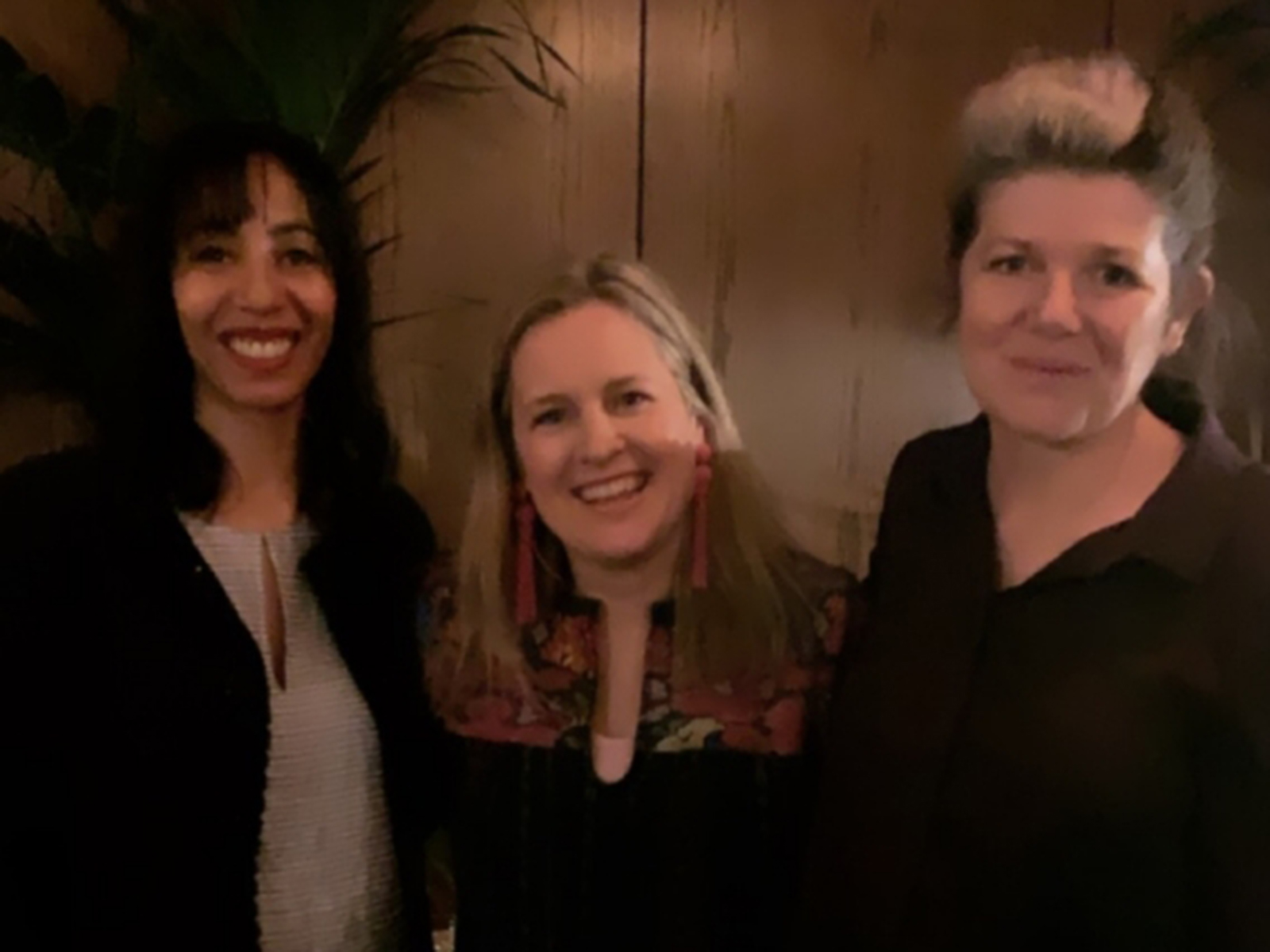
The moody interior of Soho house white city made Michelle, myself and Marianne look uncharacteristically lacking in colour!

So do we really buy into colours depending on what social, economic and political vibes are going down? The facts speak for themselves. Dulux, one of the world’s biggest and long-standing paint brands is privy to our purchasing trends over some 30 years. One thing they see over and over again is that bolder, brighter colours being a more popular choice with consumers in times of unrest. So Marianne assured me we can expect to see people choosing bolder more uplifting colours for their decor, in a time of political and economic turbulence. With this knowledge brands like Dulux instinctively know what colours to push. And for the record, their colour for 2019, Spiced Honey, is selling well.

interior design colour trends for 2019 as discused by colour experts Sophie Robinson, Michelle Ogundehin and Mariiane Shillingford from Dulux

Spiced Honey by Dulux certainly split opinions!

Spiced honey is billed as “all about awakening, kindness, resilience and optimism” and inspired by “the varied tones and remarkable properties of honey — natural, timeless and enduring, protective, rejuvenating and healing.” Dulux felt that the world needed a great big warm honey coloured cuddle to balance out the tetchy feeling of unease. My own feeling was Spiced honey was a bit, er, brown! Not a colour I personally find uplifting or optimistic, in fact, I’d go so far to say it positively puts me on a downer. Michelle agrees, that this colour isn’t giving her the feels either. She’s more moved to optimism by a punchy mustard, (which is a colour we are seeing everywhere in design right now, so she’s on the money). My go-to happy colour is more of a zesty lemon yellow but if I were channelling uplifting, rejuvenating and healing, I’d be flicking through the greens. So already three of us in the room have very different personal reactions to the mood and feeling that a colour creates.

My opinion on Colour trends is that I only ever really get excited about them when they play into my own personal taste and colour palette. And I think this is how it should be, as it seems madness that some creative body, completely removed, from your own personal experience should dictate our tastes. How can one colour fit all? For example, when Pantone declared Living Coral the colour for 2019, I squealed with delight, as this peppy bright hue would look perfect in my home, in my wardrobe and just generally makes me feel happy. It’s intensity and vibrancy really appeals to my own fun loving sensibilities, so much show that I proved myself ahead of the curve when I designed my bed linen range for Secret Linen store last year.

Interior design colour trends including living coral and spiced honey as discussed by colour experts in interior design sophie robinson, michelle ogundehin and marianne shillingford

The Hot coral pom pom bedlinen collection I designed for Secret Linen Store

But it literally made some peoples toes curl. “Living Coral is loud and strident, recalling cheap toilet roll colours and the sort of bridesmaids dresses that people refer to as meringues” quipped Michelle. She was so enraged she took to pen and paper in order to highlight the inappropriateness of a trend that purports positivity and optimism, with the label ‘Living Coral’, when in fact many of the oceans coral reefs are white and dying at an alarming rate. You can read her excellent pithy piece in Dezeen here, and she has a point. She certainly popped my balloon!

Michelle comments:

“I feel colour companies have an enormous opportunity to use their great might for good; to really help people understand the very real power of colour and it’s potentially transformative effect on the mind and body. And while some certainly do, I’m always terribly disappointed by those that I feel misread the zeitgeist, and to my perception, just use their annual Colour of the Year push as a giant marketing ploy to shift stuff that no-body needs or wants. It’s a huge missed opportunity to help people feel #happyinside.”

I generally find the reasoning of the colour trends fascinating but my view is they are more of a valuable steer for the industry. Trend forecasts are bought into by brands and designers to help them find clarity when producing a collection. For example, when I go to large trade shows like Maison and Objet I see very clear colour trends across the hall and it helps give the whole design arena cohesiveness. It helps buyers add to their collections that are then served up to us the consumer with visual clarity. And all they want to do is try and predict what mood we are going to be in and what we are likely to be drawn to. But this all feels a little binary to me and trends certainly don’t steer how I approach a room design.

Rather than thinking about what colour is in fashion, I like to think about how I want the room to feel and what colour is going to best achieve the mood, look and play to the light. I use colour psychology too to in order to work out what colour palette will suit the feeling of the room or the person living there. However, trends affect what we see on the high street, inside the magazines and on social media so maybe we can’t help but be swayed. I’ve recently painted my living room pale pink, a colour I doubt I would have considered a few years ago. However, after years of blush pink being in fashion and so visible in the media the drip drip drip has finally precipitated to make me view it almost as a neutral rather than the shock horror colour that my husbands sees it as!

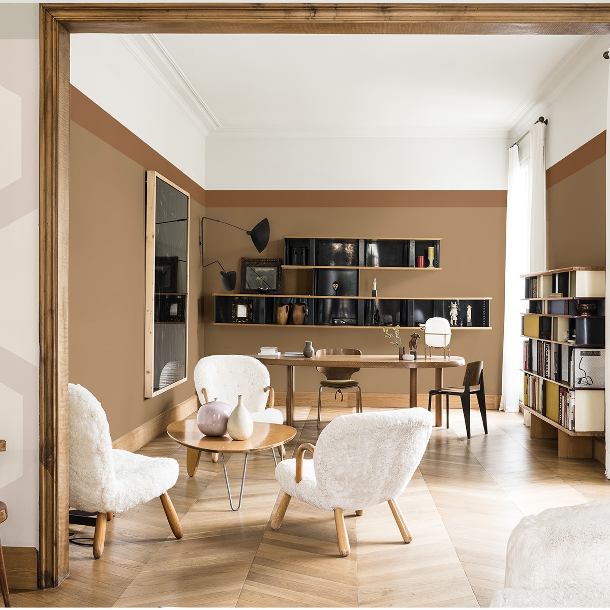
Dulux’s Spiced Honey playing a darker neutral part when combined with soft pinks

While Spiced honey just doesn’t sit with my own personal palette I can see when you start sitting it next to putty pinks and sombre navys it starts to look more interesting. And that’s the other misnomer about trends. Colour doesn’t stand alone, but alongside other colours to make up the full orchestra. Depending on what these other colours really change the tune. If Spiced honey had been sat next to the usual subjects like terracotta, brick, turmeric, it would have appeared old hat but by Dulux combining it with the unexpected it feels new and interesting and this is a great reminder to continue to feel playful with colour, until you find a palette that makes you go ‘Yes!’.

So how to colour trends affect you? The industries paint brands, retailers, print designers and stylists will be using them and I’m already seeing them coming through in the press packs. But ultimately it’s up to you is to decide if you buy into the look. When designing your own home, or a room for your client, I believe it’s important to cut through the trends and design something that’s authentic and individual to you. But it’s not that easy!

Cutting through the colour overwhelm is the main reason I masterminded my Ban the Beige workshop, next one hosted on June 13th in Brighton. I come to it with the prime intention of helping you find your own unique colour palette that really resonates with you and works for your home. It’s important to explore your own personal relationship with colour. It really is the most powerful tool you have in order to create a happy home so my message is, don’t listen to the trends, listen to your gut!

  • Interior Design
  • Interiors
  • trends
The Great Indoors podcast S2 Episode 5 Ten golden rules for making small spaces appear bigger

Leave a Comment

Cancel Reply

Your email address will not be published.

  • Interiors
    • colour crush
    • DIY
    • Home Tours
    • Interior Design
    • Interior Styling
    • podcast
    • trends
  • Lifestyle
    • Business
    • Fashion/Beauty
    • Life
    • My House
    • Nosh
    • Travel
  • Rooms
    • Bathrooms
    • Bedrooms
    • Kids rooms
    • Kitchens
    • Living rooms
    • Outside
  • Videos

mailing
list

Videos

Listen

Listen Here

Bedlinen range

Shop

Colour Psychology for professionals

book your place!

Catch Sophie In All Her Colourful Glory On Instagram

DAY 18 of #easywininteriors and I’m getting the DAY 18 of #easywininteriors and I’m getting the paintbrush out! Giving old and unappreciated brown furniture of coat of colour is not just easy but quick too and you get ooodles of satisfaction giving something a new lease of life. Since the sun is starting to poke it’s head out it’s the perfect opportunity to fling open the windows, roll out the dust sheet, and calm your senses with the therapeutic strokes of a paint brush. I transformed these battered old Ercol chairs that I found at a car boot sale with an undercoat of Zinsser and a top coat of eggshell so they really can withstand the knocks. ( here’s a tip, use a sag brush for spindly furniture) I love how the pink legs pick up on the pink in the wallpaper. I’ve got a couple of pots of chalk paint waiting in the wings. This just might be the weekend to tackle the bedside tables at last! Have a wonderful weekend  and I hope the sun shines on you wherever you are! 

CREDITS Reclaimed terracotta tiles @ca_pietra_  Borastapeter Rubarber wallpaper @wallpaperdirect Clock @newgateclocks Doors painted in Rose Ash Light @sanderson1860 Everything else is vintage 

#easywininteriors #kitchen #countrykitchen #upcycle #upcycledfurniture #countryliving #countrylivingmodernrustic #countrykitchen #greenkitchen #greenandpink #interiorinspo #interiordesign
DAY 17 of #easywininteriors is all about making do DAY 17 of #easywininteriors is all about making do with what you’ve got and making it work. For most of us, decorating our home and choosing all the things we want to go with it is a long if not a life time journey and there are plenty of compromises along the way. One of the ways I make do with things I’m less happy about is with distraction. You can use colour to draw the eye and highlight the bits you do like and similarly blend away the areas that need to fade into the back ground. For me joinery, radiators and my unattractive windows all get painted in the same colour so they fall to the background and then the cushions and artwork can come to the fore and catch your eye. I painted these lovely old solid wood doors bright yellow on a whim with some left over paint. It was a quick and easy way to inject a burst of  colour joy. So don’t discount doors and architraves as a fun way to play with colour, but only if you have nice ones. 
On the PODCAST today @mad_about_the_house and I discuss more ways you can make do. I interview leading interior designer and queen of colour and pattern @nicolahardingandco who has amazing insights on how to go about planning your schemes, conjure mouthwatering colour palettes and work with what you’ve got. And our style surgery is from Callum who finds himself stuck with a shiny blue green sofa which he doesn’t love and doesn’t know what to put with. Obviously cover it with cushions and distract the eye with A bright yellow door Callum! 

If you have a question for our style surgery do please send it in as we are lining them up for the next series and we’d love to hear from you! Drop us an email to thegreatindoorspod@gmail.com.You can here all our ramblings and insights on today’s show The Great Indoors and thankyou to @katetaylorldn for producing the show. 

#thegreatindoors #bluesofa #yellowdoor #banthebeige #interiorspodcast #podcast #interiordesign #interiorinspo
DAY 16 of #easywininteriors and I’m extolling th DAY 16 of #easywininteriors and I’m extolling the benefits of an occasional chair. I’ve always loved occasional chairs primarily for their decorative function. I’m a patterned fabric addict and so an occasional chair I’d another opportunity to add more pattern, more colour and another cushion to boot! But during these extended periods of lock down and staying at home I’ve appreciated the quiet little corners they offer. I’m lucky enough to find a space for one here on my landing but they can also find a home in a bedroom, a home office, under the stairs or indeed #lifegoals in the bathroom. So rather than playing second fiddle to THE SOFA put your occasional chair in pride of place and grab yourself 5 minutes solitude! Most of mine are junk shop funds bought back to live with my hoarded stash of remnant fabrics. So it’s time to raid grannies attic and  create a seat that makes you smile . 🥰  use the hashtags #easywininteriors to share your favourite corners of escape.

#easywininteriors #vintagearmchair #armchair #occassionalchair #colourlover #banthebiege
DAY 15 of #easywininteriors and I’m having a re DAY 15 of #easywininteriors  and I’m having a reshuffle on the bookcase to celebrate the happy Back To School vibes! 🙌 YES! This one is a work in progress because sorting your books as to the spine colour can be really meditative! I’m excited for you guys to share your colour coded bookcases using the hashtag #easywininteriors because I’ve seen some amazing examples on here! This idea can also include colour coding your ornaments or glassware collection too. Somehow grouping them in blocks  just intensifies the colour and I love the 🌈 effect. Happy faffing! 

#interiorinspo #interiorstyling #colourlover #banthebeige #faffthegaff #bookshelf #shelfie #shelfiestyling #rainbow #rainbowstyle #mycolourfulinterior #colourfulhomevibe
DAY 13 of #easywininteriors and Sundays here are o DAY 13 of #easywininteriors and Sundays here are often the day I get the house in order before the week starts again. It’s laundry day, the on-line shop gets done and if I can be bothered I might do some batch cooking. 💪 But the garden is also pulling our attention at this time of year and I spent yesterday picking up twigs that have littered the garden after the high winds and piled it all up for kindling. Satisfying! I’m not a naturally tidy or organised person  but I do feel like I’m winning at life once chores have been done and everything is in it’s place. And here lies the easy win. If you have systems in place it makes it so much easier! This shoe storage was game changing. Before the hall was littered with shoes and bags that I was always tripping over. So planning your storage and then using it is key to creating order and an element of calm. And once the storage is fit to bursting, it’s time to have a declutter. How do you keep the house feeling orderly and calm and do you use Sunday as a Sort It day too? #sortitsunday 

CREDITS walls in Lazuli and woodwork in Perfect white @zoffanyfw . Havana Bauta cement Tiles @claybrookstudio . Fabrics are vintage and @thestripescompany . Stair runner @roger_oates 

#easywininteriors #colourlover #banthebeige #hallwaydecor #hallway #interiorinspo #declutter #storageideas #shoestorage
DAY 12 of #easywininteriors and I’m back in the DAY 12 of #easywininteriors and I’m back in the bedroom and enjoying a well earned lie in this morning! My morning routine has been really important to me during lock down. In  his brilliant book ‘think like a monk’ @jayshetty talks about how a positive morning ritual sets you up for the day. Similarly a good night time ritual sets you up for a good nights sleep. Styling up your bedroom  to support these ideas really helps! I’ve taken to setting my wake up alarm an hour before the rest of the house so I can enjoy some quiet solitude before the day gets going. I make my coffee in my favourite mug and spend a while reading or exercising. But no phone scrolling! My bedside is laid out with everything I need including a big pile of books and a dish for my watch and specs. I charge my phone in the kitchen to keep it away from temptation! Admittedly I’ve never had a problem sleeping but I was hardly what you’d call a morning person. Now it’s my favourite time of the day! Have a gorgeous lazy weekend folks x

CREDITS wallpaper @mollymahonblockprinting bedside table is vintage. Lamp @pookylights Vases and dishes all vintage. Pillows and duvet @cocoandwolf Flat sheet and bedthrow @societyofwanderers 

#easywininteriors #bedroomdecor #countrybedroom #colourfiedhomes #colourstylehome #colourlover #banthebeige #patternclash #interiorstyling #interiordesign #interiorinspo #faffthegaff
DAY 11 of #easywininteriors and we are over half w DAY 11 of #easywininteriors and we are over half way there! Whoop whoop, March is  just nine short days away! And I can feel the Spring vibes! It’s getting lighter, the bluebells are coming and the birds are singing! But back to it, we’ve got work to do! Today I’m sharing how I switch my home from working day to home time, without leaving the house. It’s so important for our mental health that we can make that transition. I’ve worked from home for years so I’ve always done this, but I find it essential to tidy my desk/kitchen table at the end of everyday and get it out of sight. This often means piling up all my paper work, laptop, pen pot and putting it all into a tray. And if you don’t have a deep tray a cardboard box does the job. Then hide it in the cupboard, pop it on a shelf or slide it under the table. The key is that you can’t see it and it doesn’t encroach on your non-work life. Out of sight out of mind kind of thing. 
And you might notice in the back of this shot is my 2021 vision board. I keep this in my view everyday as it helps keep me focused, uplifted and motivated. Im hosting a live webinar next Tuesday on how and why I create vision boards for every aspect of my life, including my interiors. If you’d like to join me it’s 7pm 23/02/21 and I can promise a fun, creative and enlightening evening! Link to book is up in my bio if you fancy getting a boost of inspiration towards creating your dream home. 

Happy Friday and have a lovely weekend 😍

#workingfromhome #myhomeoffice #interiorstyling #visionboard #interiorinspo #interiorinspiration #homeoffice #creativeworkspace #colourlover #colourcolorlovers #banthebeige
DAY 9 of #easywininteriors and I’m going to make DAY 9 of #easywininteriors and I’m going to make it super easy after yesterday’s kitchen cupboard love, which I’ll be honest, felt a bit strenuous! So today is all about creating as simple but effective styling moment; a trio of vases. Three seems to be the magic number when it comes to styling your objects and I have a few tips . I like to make sure there is a mixture of sizes, colour and textures but all held together with a theme. These three work because they’re  all vintage, Picked up from various car boot sales over the years! You can create little trios all over your home from the sideboards, book shelves, worktops, bathrooms and side tables. Push the tall one to the back and bring the small one to the fore but it’s the lack of symmetry that makes it pleasing. And you don’t have to stop with just vases, a trio of objects works with picture frames, ornaments and candle sticks too. 

#easywininteriors #vintagestyle #howivintage #myvintagehome #interiorstyling #interiorstyle #interiorinspo #colourlover #banthebeige
Load More… Follow on Instagram
Sophie Robinson
  • © 2017 Sophie Robinson

    /
  • Contact/
  • About/
  • Design by MW

Don't forget to join!