fbpx
Sophie Robinson
  • Home
  • Workshops
    • Marrakech Retreat
    • Ban the beige
    • Masterclasses
  • Online Courses
  • Collaboration
  • Podcasts
  • Blog
  • About
    • About me
    • Work with me
    • Press
  • FAQs
  • Contact
  • Interior Design
  • Interiors
16 Sep 18

Dulux announce the Colour of the year 2019- my thoughts!
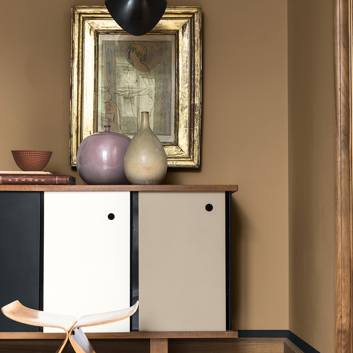
dulux colour of the year spiced honey 2019 autumn colour palette colour psychology sophie robinson warm neautral interior

Even though I protest so much about the dictatorship of trends, and how we shouldn’t feel pressurised to have our homes look any certain way, I must admit that at this time of year I always feel rather thrilled to see what’s been heralded as the next big thing that we are all going to buy into anyway!

So last week, to much speculation, Dulux announced there Colour of the Year for 2019. I’m not going to beat about the bush… at first I was massively underwhelmed but a week later, thoughts have percolated, and now my enthusiasm is a little peaked. Read on, as I’d be fascinated to know your thoughts too.

dulux colourfutures colour of the year spiced honey 2019 living room with warm neautral wall colour and modern mid century modern furniture

Spiced Honey by Dulux creates a warm and cosy wall colour. Use whites for a crisper more contemporary look. I especially love these sheepskin upholstered armchairs!

So drum roll the colour that all the best-dressed homes will be rolling out on their walls is called Spiced Honey. And its kind of a yellow/ brown buff envelope kind of colour. Buff as in brown rather than buff as in phwoar. Are you amazed I’m still standing? I agree when I first saw it I scoffed and though per-leeese! It’s beige!

But then you read a little bit about the intensive research into why this colour has been chosen and my interest perked up…a bit! Dulux is part of the global giant Akzo Nobel and their ColourFutures panel of experts is made up of people from all over Europe. Their lofty aim is to match a colour to the mood of the moment for the year ahead.

duluc colour of the year spiced honey colourfutures2019 beige neutral living room colour psychology autumn colour palette sophie robinson

Spiced honey adds depth and warmth but pairs well with softer lighter pastel shades.

Once again the trends forecasters predict that we are overwhelmed with the weight of the world, fast moving technology and politics make us want to retreat and cocoon and the warm soft tones of Spiced honey certainly create a cosy vibe. But it’s not all doom and gloom. By it’s very nature yellow is THE colour of positivity. Hélène van Gent, Head of the Global Aesthetic Centre, who chairs the ColourFutures™ panel comments:


“In 2019, as a society, we want to reach out, engage with our communities, make things better and ‘be the change’ – anything from supporting charities to small acts of neighbourly kindness. It’s time to act and Spiced Honey enables transformation inspiring a positive, emotional change.”


But when we shrink that down onto a smaller scale and how we want to make our homely spaces feel, then this very raw, warm shade of beige works well with it’s warm yellow undertones. Yellow is the colour of happiness, it uplifts and energises. Yet in it’s vibrant form it can be draining and over exhausting so not ideal in my view as a wall colour for main living areas. However I love it as an accent. But the more rustic beige tones of Spiced Honey makes for a mellower mood. And look to fashion and you can see the trend reflected there with the love of soft wool knits, trench coats and camel being a very fashionable palette. There is also a distinct retro vibe about this hue and I think looking back for inspiration and also reassurance I’m sure isn’t a coincidence.

dulux colour of the year colourfutures 2019 spiced honey with blush pink

I love the way a pastel blush pink and dirty mauves help to soften and feminise the strong tabacco wall colour. Living room painted in Spiced honey by Dulux

I love the way the designers at Dulux have created palettes with Spiced honey including blush pink, navy and aubergine- it suddenly becomes a much more edgy design palette. All palettes offered up by Dulux fall within the autumn personality (in terms of Colour Psychology), which is a great palette to design your home with. Warm, reassuring, solid and with a sense of authenticity, it really helps to support that sense of homeliness. And in this flaky fast moving trend obsessed world that a very refreshing trend indeed!

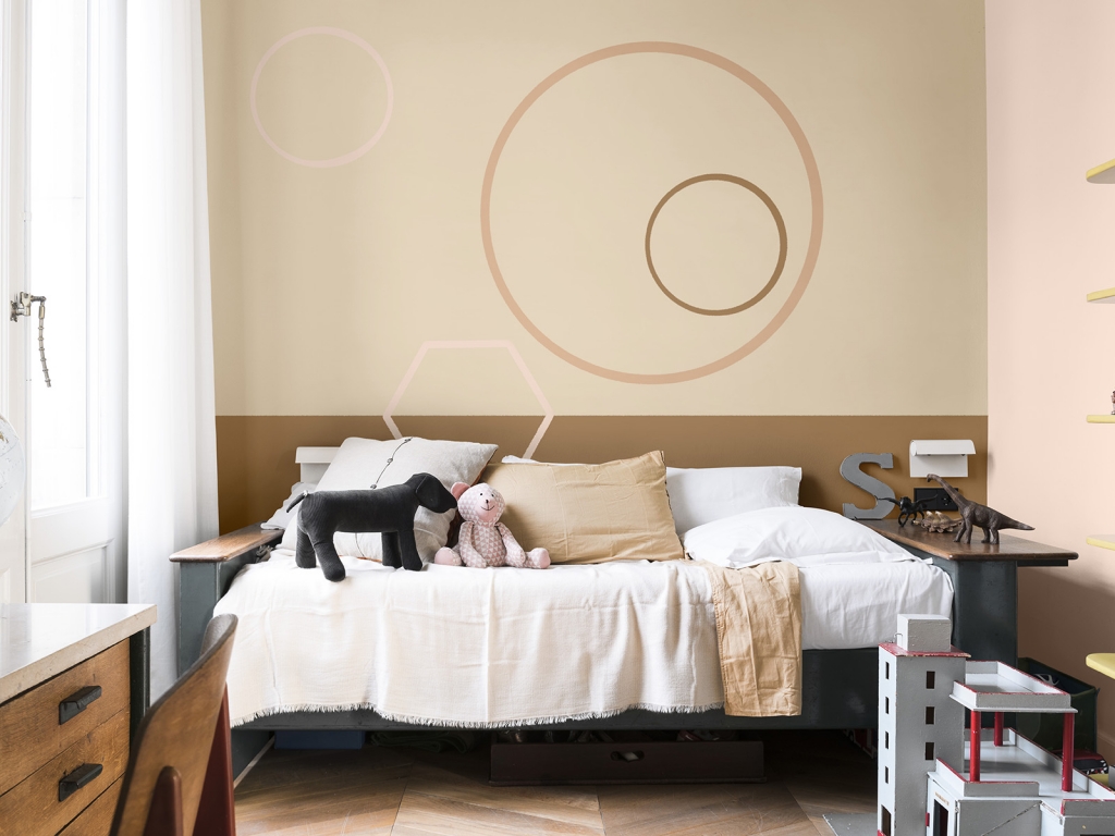
Think outside the box when introducing colour to your home. And don’t forget the ceiling is the fifth wall! Hear the dark warm hue has been rolled out on the ceiling which gives this pretty pastel bedroom some warmth. I think this would only work on a high ceiling though.

To find out what your colour palette is and what hues and styles support you psychologically then a still have a few spaces left on my London Colour workshop on the 2nd October. We’ll work together throughout the day to look past the trends and the designer paint charts to form a palette that you can then decorate any room in your home with confidence. You can grab one of the last spaces here.

  • Interior Design
  • Interiors
Sanderson launch fifty new paint colours New bed revealed in Mums annex renovation

comments

Caroline Wetherell on 22.10.18

I’m afraid Dulux can keep their spiced honey. It is not for me at all. I get the whole ‘reflecting the mood’ thing but really…? Nope.

I can work with it in an accessory piece or even, gulp, a sofa if pushed but on the walls? I’m really not buying it.
Hope I’m not sitting on the fence too much.

Reply
Jayne on 04.12.18

Its ‘old gold’ call it whatever, I like it as it’s very neutral and you can add what you want to add, add brown or mustard and your back in 1972. Add pink, and it’s 2018. Add black and your in Africa. . I refer to your colour crush blog back in November 16, pretty much the same as you reviewed, your ahead of them.

Reply

Leave a Comment

Cancel Reply

Your email address will not be published.

  • Interiors
    • colour crush
    • colour psychology
    • DIY
    • dream home makeovers
    • Home Tours
    • Interior Design
    • Interior Styling
    • podcast
    • trends
  • Lifestyle
    • Business
    • Fashion/Beauty
    • Life
    • My House
    • Nosh
    • Travel
  • Rooms
    • Bathrooms
    • Bedrooms
    • Kids rooms
    • Kitchens
    • Living rooms
    • Outside
  • Videos

mailing
list

Videos

Listen

Listen Here

Online courses
by popular demand

Catch Sophie In All Her Colourful Glory On Instagram

According to some recent research 24% of us look t According to some recent research 24% of us look to friends and family for design Inspiration, 21% to makeover tv shows and 18% to instagram. But while it’s great gathering ideas and opinions, ultimately creating a stylish home has to come from you if you are going to love the home you live in. The extraordinary Colour Psychology framework helps you unlock the colour palette that is perfect for you and gives you the superpower to create rooms that feel as good as they look. Suddenly other peoples opinions, trends, and influencers no longer hold sway. Creating a home is deeply personal, an exploration of what makes YOU happy. For me it’s all about the pattern, texture and plenty of intense colour. Tasteful grey interiors leave me feeling flat, I love the energy of a colour clash! If you want to understand your relationship with colour and how to design schemes that affect your emotions in a positive way, this is the last weekend to enrol in my online course, Colour Psychology for interiors. You can find the link to learn more up in my bio. It’s my most popular course to date and has transformed the way thousands of people feel about their interior spaces. 
Let me know what your happy colours are down in the comments below. 

Tap for credits 

📷 @aluncallenderphoto styling @katemcphee #colourpsychology #colourpsychologyforinteriors #banthebeige #ihavethisthingwithcolour #myeclectichome #patternclash #maximalistdecor #colourcourse #mycolourfulinterior #punchyhome #cosyhome #countryliving #bedroom
Did you know 50% of people use social media to fin Did you know 50% of people use social media to find inspiration on how to decorate their living rooms? I’m definitely one of them! That’s according to a study by Sky Glass, the streaming TV from @sky_uk . I’ve been investigating the latest interior trends we are lusting after, and how our living rooms are changing- as we say goodbye to three piece suites, and hello to sustainable vintage furniture, statement rugs, wall prints and cosy-ing up the sofa with throws and cushions. As you can see I’m all over the trends! If you head over to the @sky_uk channel today, I’ll also be answering some interior design questions all about styling your TV. Would love to hear what you think are the living room trends to watch. 
 #skyglass #ad 

#banthebeige #colourlover #livingroomdecor #livingroom #maximalistinteriors #livingroomdecore #livingroomdecorideas #homestyle #instahomedecor #chintz #colourmyhome #colourmehappy #cushionlove #styleithappy #florals #gallerywall #berberrugs #ihavethisthingwithpatterns #ihavethisthingwithcolour
Ah @the_rhs Chelsea! What a feast for the eyes! In Ah @the_rhs Chelsea! What a feast for the eyes! Inbetween biblical downpours, thunder and lightning, it was a wonderful day of colour, design and chatter with some wonderful women! I’m slowly falling in love with gardening and my phone roll is full of inspiration after being immersed in natures finest. Thanks @michelleogundehin and @hazelgardinerdesign @thesohoagencyuk for the company. And a big congratulations Hazel on this stunning floral installation. And don’t forget if you want to hang out and be inspired by all things colour then my FREE live webinar is on tonight (25th) at 7pm tonight! Hop on to my profile for the link to sign up. Cannot wait to share some inspirational colour filled time with you all 

#rhschelsea
This is the first room we decorated after our reno This is the first room we decorated after our renovations. The entrance to your home creates the first impression. It’s also the room you walk into first thing in the morning and when you return home at the end of a long day. It needs to create the right welcome and what that feels like is hugely personal. For me I chose my favourite colours, this powerful cobalt  blue has always been a colour I’m drawn to. My wardrobe is full of it. And the bright pink is another one that always makes me instantly happy. Together they are a striking combination and I think anyone who walks through my front door, immediately gets a sense of what I’m about. I’m passionate about creating interiors that authentically  reflect the people who live there. Studying the psychology of colour made it so much easier for me, giving me a deeper understanding on the affects of colour and streamlining my process. If you’d like to know how to unlock your colour super power, join me for a free webinar this Wednesday evening (available to up for 48 hours after). It an introduction into colour psychology for interiors and my hope is it inspires you to have the courage and conviction to know what’s right for you.  And for a deeper dive my online course Colour Psychology for interiors has opened for enrolment. All links to sign up are in my bio on my profile @sophierobinsoninteriors 
What does your hallway say about you? 
📷 @aluncallenderphoto 
CREDITS walls in lazuli by @zoffanyfw stair runner @roger_oates floor tiles @claybrookstudio door painted in rose ash @sanderson1860 

#colourpsychology #colourpsychologyforinteriors #banthebiege #punchyhome #hallway #boldcolourinteriors #colourlover
My kitchen, the heart of my home. The smallest, da My kitchen, the heart of my home. The smallest, darkest room in the house with no view, but that’s old houses for you! You’ll often find the kitchen in the worst place. So to amp up the joy I chose a forest green (hunters green by @zoffanyfw) for the cabinets to mirror the woodland outside. We sourced reclaimed school science lab work tops and I wrapped the room in one of my favourite papers, Rubarber by @borastapeter. Tom put in retro fit underfloor heating and we used reclaimed terracotta tiles from @ca_pietra_  so the floor looks as old as the house but feels so warm! . For the ugliest darkest room in the house it’s become our favourite because of the colours, patterns and rustic textures.that’s the power of great interior design! 
Next up in my series of posts about the psychology of colour is the Autumn personality. You’ll have a love of rich deep warm Colours, natural finishes, nature inspired patterns and period features. The autumn palette is warm, earthy abs rich and perfect for making spaces feel cosy and inviting. 
To learn more about the autumn personality, hop on up to my bio and click the link to be taken to the blog. And you can sign up to my FREE webinar I’m hosting next Wednesday if you’d like to learn more about this powerful framework. 
Meanwhile have a gorgeous weekend! 
📷 @aluncallenderphoto Styling @katemcphee 

#colourpsychology #banthebeige #autumnpersonality #colourpsychologyforinteriors #kitchen #greenkitchen #countryhomesandinteriors #countrykitchen #ihavethisthingwithcolor #myeclectichome #maximalistdecor
Come and join my FREE webinar on Colour Psychology Come and join my FREE webinar on Colour Psychology next Wednesday 25th at 7pm GMT 🤩 hop on up to the link in my bio @sophierobinsoninteriors to register.
My brilliant online course, Colour Psychology for Interiors, is open for enrolment this month, so if you fancy finding out a bit more about this utterly game changing framework I’d love to have you join. It’s SO MUCH more than ‘ red is energising’, ‘blue is calming’ stuff you’ve all heard before. This is a deep dive into discovering how colours work, how to harmonise them and discovering your own unique and authentic style. Only then can you create a home you live and one that supports you emotionally. I LOVE teaching this stuff because the feedback I get from students is mind blowing! Don’t take my word for it, sign up for the free webinar today! 😍 and if you’ve already done my course, please share in the comments below what you loved about it. 

#colourfulhome #colourpsychology #colourpsychologyforinteriors #banthebeige #colourlover #confidentcolour #confidentcolourscheming
Have you found your design mojo? Do you gravitate Have you found your design mojo? Do you gravitate towards a style of interiors that just feels so ‘you’. Making a home is so much more than creating beautiful squares for Instagram. It has to FEEL right and this is where the psychology of colour comes in. Colour is light, it has an energy which directly impacts your brain and emotions. And we all have a unique relationship to it. So rather than follow the crowd, be swayed by trends it’s so important to understand your own authentic relationship with colour. Over on the blog today I’m starting a series of posts all about the seasonal colour personalities. First up is spring which is all the joy, uplift and energy. My bathroom, pictured above, is very ‘spring’ with light reflecting walls, energetic patterns and bright colours. The mood  is uplifting, fresh and feel-good. Hop on up to my link in my profile to read the blog post in full and discover if you are a Spring personality and how to create rooms that reflect this joyful mood. 
Tap for credits
📷 @aluncallenderphoto 

#colourpsychology #colourpsychologyforinteriors #banthebeige #colourfulhome #colourlover #ihavethisthingwithcolor #spring #springbpersonality #colourfuldecorchallenge #homedecor #myeclecticmix #bathroom #bathroominspo
So proud of mr best mate @sophieabbottartist who o So proud of mr best mate @sophieabbottartist who opens her house this weekend to showcase her artwork in her home as part of Brightons artists open houses. She’s always been a creative whirlwind and keeps the joy of colour alive in her paintings inspired by the sea, and the local woodlands that surround her home in Brighton. For Sophie, colour gives her life, she’s the ultimate joy monger and I’m so blessed to have her as my side kick in life. If you get a chance today, pop round to heed for a bolt if the feel good vibes

#artistopenhouses #brighton #colourlover #banthebiege #ihavethisthingwithcolour
Load More… Follow on Instagram
Sophie Robinson
  • © 2017 Sophie Robinson

    /
  • Contact/
  • About/
  • Design by MW

Don't forget to join!

You're almost inside!

Leave me your best email to sign up for the Webinar