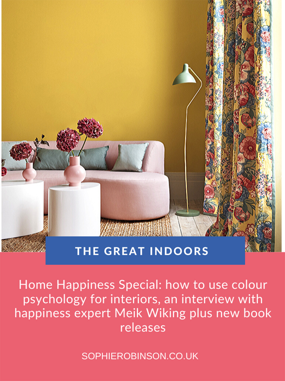
Home Happiness special – Podcast show notes S7 Ep1

Welcome to the new series of the Great Indoors podcast and at this time we are so relieved that we have managed to work out a way to record this remotely during this time of self isolation. I’m not going to lie, Kate and I struggle with the technicalities of recording under our duvet’s (it’s a sound quality thing) but I think it’s worth it! Just imagine us cramped inside a small den made of blankets, pillows and cushions. I’ve made mine in my son’s bedroom- which of course he loves! And my shockingly bad rural wifi which drops off every twenty minutes. Come on I’m milking it. Now leave us that five-star rating and gleaming review won’t you!
A huge thank you to our brand spanking new series sponsors, Geberit. We would like to share that they are a brand that pioneers energy-efficient and innovative bathroom designs so if you’ve been looking at your bathroom during lockdown, thinking it’s time for a redesign head on over to their website for some fresh ideas and inspiration.
You can listen to the episode in full here, and these are the show notes to support everything we discuss.
Today we’re tackling everything to do with how to up the happiness in your home. After being locked indoors for a month so far here in the UK, things are getting a little boring to say the least! We discuss the fascinating framework of colour psychology, I grab an interview with CEO of the Happiness Research Institute, Meik Wiking, and finally, a book round-up covering a couple of exciting new releases.
Colour psychology
Over to me in the duvet den! I’ve been using colour psychology to help me design interiors ever since I attended an incredible colour workshop with Fiona Humberstone . But it’s when I started applying the technology to my own interior design process that things really got exciting! I’ve been teaching it on my colour workshops over the past few years and have only this past week launched my new online course, Colour Psychology for interiors so thought it was time to let you lot in on the secret.
I’m fascinated at how people have very different reactions to colour and how we also have very different views on how to decorate our homes. This need to identify our authentic style coupled with our individual reaction to colour is all answered by The Wright Theory. This was a scientific piece of research by Angela Wright in the 1970s to ’90s to better understand the psychology of colour and our individual relationship to it. Just look at mine and Kate’s opposing views on ‘yellow’ for example. She recoils at the very mention of the name whereas I have to have a little splash of it throughout my home to give me a lift. I suspect I could get her on board with a saffron shade of yellow. So with the knowledge that one person’s primrose can be another’s poison, it’s vital that we have a good grip on what colours support us emotionally. And then use these as a palette to decorate our homes. If you are fascinated to know more about the science of colour psychology then you can buy Angela’s book here.
Angela was interested in how nature changes its colours throughout the seasons. So there are two aspects to this framework, one is our own reaction to colour and the other is colour harmony – how groups of colour sit together and create a feeling of well being. This is where the four seasonal personalities came to fruition, which I use throughout my projects and are the core content of this online course.
When broken down into these personalities we’re not just talking about colour but also the feeling and mood you can create in a room. So let’s take a brief look…
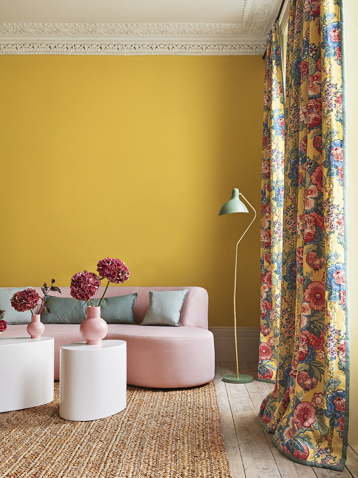
Spring
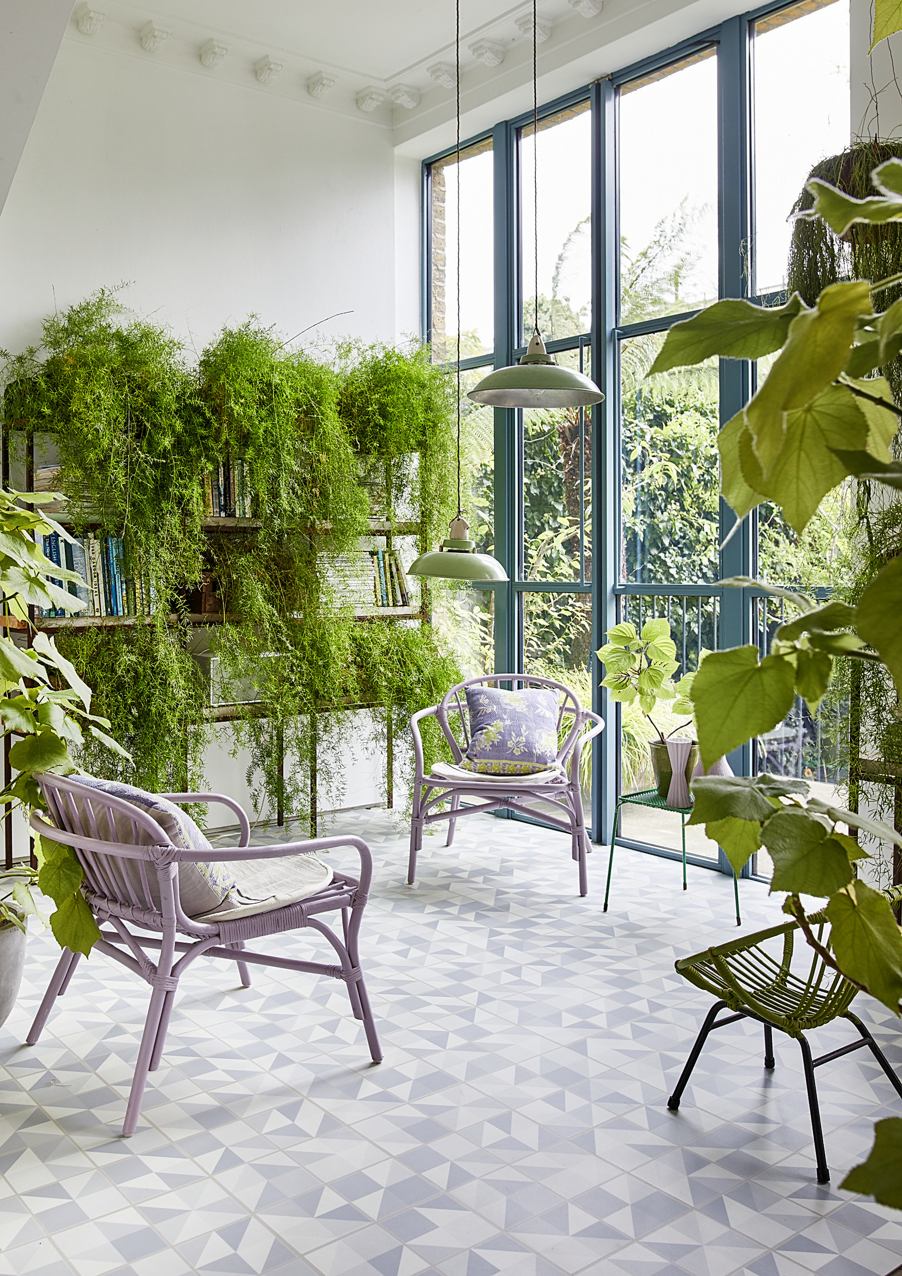
Spring people love oodles of natural light and a connection to the outdoors. A Spring interior is light and bright, joyful and uplifting. Starfloor Tile Puzzle Luxury Vinyl In Light Blue, CarpetRight.
When you think about the Spring season it creates a feeling of uplift, energy, newness and optimism, so the colours for this vibrant personality are equally buoyant, uplifting and youthful.
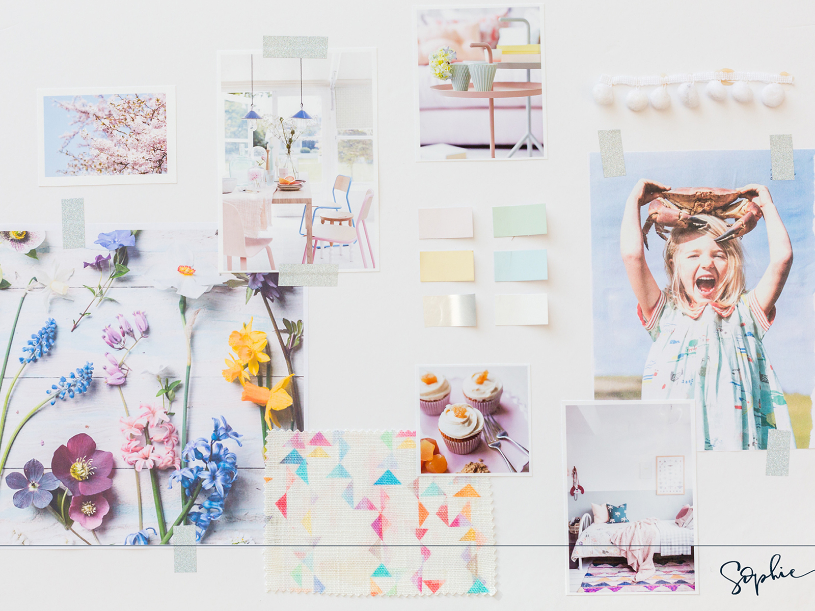
My mood board showing busy prints, reflective textures, and a joyful style supports the light loving Spring personality
Summer

A summer interior is elegantly understated. Cool greys and tonal colour schemes create a feeling of calm. Chichester kitchen by Neptune.
First up this isn’t full-on Hawaiian shirt with an inflatable flamingo vision of summer, more the lazy hazy days of summer. This time of year the palette is softer and sunbleached while the energy is lower while we’re slowing down, relaxing and taking that all-important holiday. The colours are fading and the flowers we find in nature aren’t quite so vibrant and perky, so think blousey hydrangeas, trailing wisteria and climbing roses. For this season the palette is very mid-tone which is the most relaxing to look at with a greyness at the core. There are no high contrast colours and nothing ‘pops’. The Farrow & Ball cool tones in their collection of colours, of which there are a lot, would be perfect.

Tactile textures, muted tones and graceful elegant styling supports the Summer personality
Autumn
An Autumn interior uses an intense colour palette and features rustic textures and flamboyant pattern. Fabrics by Linwood.
Autumn colours are much richer more intense and grounded with a splash of black at their core. I think Kate is a great example of the Autumn personality with her lovely deep chocolate walls, and although she has pink in her house it’s an earthy, blush tone. All her vintage furniture, fab library and love of books very much reflect this season creating a cosy and grounded environment. However, a golden shade of yellow would also be a popular Autumn colour but not sure there is any persuading!

My Autumn mood board shows the patterns, textures and styling elements that support and Autumn personality
Winter

The winter season is all about making a striking statement. Overscaled accessories, sharp lines and cutting edge design all support the winter personality. Kravitz suspension light, DelightFULL.
So lastly, winter is a season of extremes. Consider the landscape and its high contrast, striking sunlight and the trees look stark and architectural. Colours that support this personality type are equally icy, black, white, silver and chrome and saturated colours that make a statement. Think of those pricey penthouse apartments overlooking the city skyline – chances are a winter personality lives there, they tend to be very successful!

My winter mood board displays the geometric prints, stark minimal styling and cool colours favoured by the winter personality
I’ve discovered many people tend to decorate in the colours or style they think they should, rather than discovering what makes them happy and feel good. This just doesn’t work as you just won’t feel your best in a home that’s decorated in colours which don’t support you. So the take-home news is that colour is very personal and it’s crucial to discover what truly resonates with you. Read more about my online course here.
Interview with happiness expert, Meik Wiking

I was lucky enough to chat with Meik and his incredible insight and knowledge around the topic of happiness could not be more relevant than the situation we currently find ourselves in. Last year he launched some fresh scientific research on home happiness and as soon as we went into lockdown I was keen to hear his take on this surreal time.
The aim of the Happiness Research Institute is to look at the happiness, wellbeing and quality of life through a scientific perspective using data, studies and evidence to try and understand 1) how they can measure happiness 2) why some people are happier than others and 3) how quality of life can be improved.
Q. The first thing I wanted to ask was that home happiness came in second place in the research in what makes us happy, something I found really surprising.
Meik says: It’s an area that’s been overlooked when we look at factors that impact how we feel. It’s where most of us spend most of our time and we change our mood and behaviour depending on where we are.
Interestingly Meik notices that his mood changes depending on where he is as he (normally) travels a lot and also the hotel rooms also have an impact – so design comes in to play too.
Q. What does it take to feel happy in your home?
Meik says: We looked at comfort, safety and access to green areas and we did a huge study on what drives happiness throughout Europe. One of the most interesting findings was that it wasn’t about the square metres inside the home but it was the sense of space. Another interesting finding was that a lot of people dream of owning their own place and in some countries, it did explain some of the differences in satisfaction in our homes but in Germany, it was not the case where there are a lot of people that rent. We often find in happiness research that we are social beings and we compare ourselves with other people so if our friends and colleagues own their own homes, we are more likely to feel the need to own our own home.
As he was sitting there chatting to me, Meik was in his home office surrounded by personal items that he says trigger memories of happy times and it is even more important now as we are forced to stay at home. By sitting at his lovely desk it makes him want to write and research. If you try to work where your TV is the focus of the room you are more likely to want to sit on the couch and relax.
Miek’s top tips for feeling upbeat in these troubled times…
- Spend more time in the kitchen, bringing good food to the table can instantly boost your mood
- Spend more time with books – they allow us to travel even though we physically can’t
- Connect with people – thankfully we have the technology that allows us to
- Get outdoors – go on a daily adventure (away from people of course)
Check out Meik’s book The Little Book of Hygge which has sold over a million copies!
Book reviews
What better way to find a little escapism at the moment than with a good book, so here are a couple of our favourites that have hit the interiors section. We’ve selected a couple of great ones literally hot of the press.
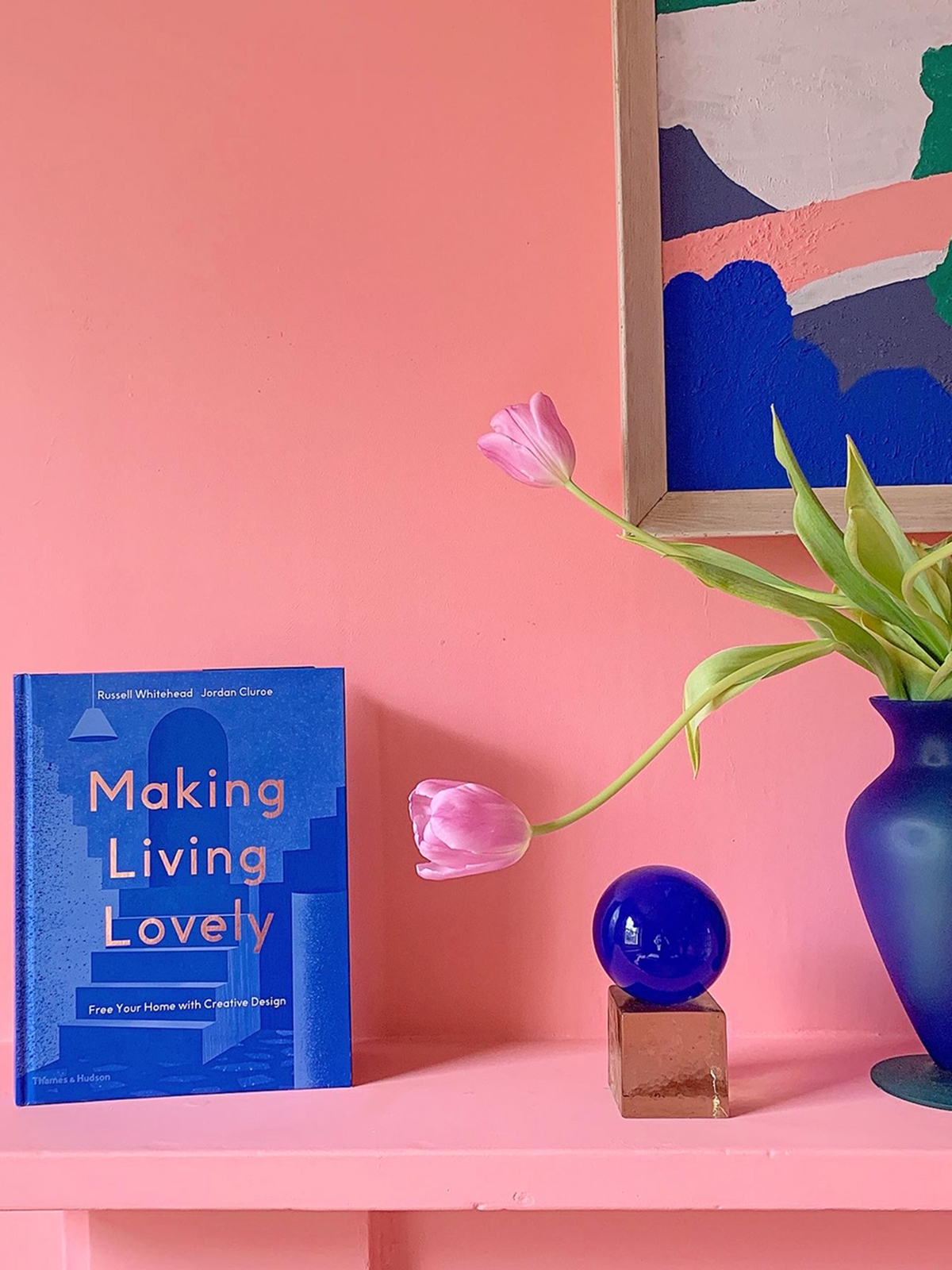
Launched today *klaxon*, friends of the podcast Russell and Jordan AKA 2LG have created this fabulous looking book, Making Living Lovely, designed to lift your spirits and free your home with creative design. Renowned for their bold, colourful and joyful design ethos, I was delighted to discover that they have a humble approach to design and so valuable insight to share. We also loved the fact that they acknowledge the rise in FOMO (Fear of Missing Out) due to all the beautiful images we are swayed by on Instagram and Pinterest rather than thinking about what we actually like. To help ease with the overwhelm when tackling interior design they break it down into an easy to follow road map where you choose three colours, three materials, three feelings and three functions and then give it a title and it gives you a clear path to designing a room. I like it when people keep it simple!

Next up, this book is a reader, not a flicker, as Kate puts it, Happy Inside by Michelle Ogundehin is out on 30th April but I recommend getting your pre-order in. Michelle trained as an architect and was famously Editor-in-Chief of ELLE Decoration UK for 13 years, and more recently TV presenter of Interior Design Masters, so she certainly knows her stuff. I loved this book mainly for its forthright and quite frankly very bossy tone! Not only does she cover all there is to know about design but also takes a holistic approach to how you consider your home. From toxins in cleaners to managing your wifi, all elements of wellbeing are tackled. Be prepared to invest some time into reading this as there is a lot of information to take on board and more importantly…make sure you take heed and do what you’re told!

Michelle’s shares a wonderful insight into how to create a palette of colours and textures for your home that will make sure it visually works every time and feel harmonious throughout.
Finally a huge thanks to Meik Wiking for taking the time to chat with us and suffering all my rural wifi woes. We really valued his expertise. Once again a big thanks to our new sponsors Geberit, for supporting the show and to our talented producer Kate Taylor who made this remote recording possible and so we can go on with the show!
Also and don’t forget our ever-growing Facebook group, an interior loving community which is a welcome escape right now! Its a fever pitch of creativity over there. And if you have a design dilemma for the podcast, make sure you send it to us on a voice memo to thegreatindoorspod@gmail.com