ULTIMATE MAXIMALIST COURSE BUNDLE - £400+ Savings - JANUARY SALE

Sophie Robinson
  • Home
  • Workshops
    • Marrakech Retreat
    • Home Masterclass
  • Online Courses
  • Collaboration
  • Podcasts
  • Blog
  • About
    • About me
    • Work with me
    • Press
  • FAQs
  • Contact
  • Home Tours
  • Interiors
  • podcast
19 Mar 20

House tour with Orla Kiely, Podcast show notes S6 Ep6

IMG 6990B

Before we get started, I wanted to say on behalf of Kate and I that we know you, like us, are probably pretty concerned about the coronavirus. It’s a strange and worrying time and at a time like this chat about cushions and paint might seem a bit trivial. But, on the other hand, it might be just the escapism and cheer we all need. So in that spirit, we particularly hope you enjoy this podcast.

Well, I can’t quite believe that we have reached the end of series six of the Great Indoors podcast. A huge thank you to our sponsors Topps Tiles for helping us to get this point, our fabulous producer Kate Taylor and of course you, our lovely listeners. Don’t forget to join our wonderful interiors community on Facebook and please do rate and review as we do read each and every one!

On with the show, (listen to the full episode here) This episode is all about our love affair with pattern and colour and our house tour with Orla Kiely delivers on all fronts! Pattern is popular appearing everywhere, walls, floors, sofas – you name it, you can stick a pattern on it! Kate thinks that tiles are a great way to introduce pattern on a small scale and that less is more – of course, I couldn’t disagree more – more is more! So whatever your tastes check out Topps Tiles‘s plethora of designs where there’s something for everyone.

Orla Kiely’s iconic stem prints went on to be one of the most recognisable motifs and is responsible for the introduction of adding bold pattern to handbags which really wasn’t that much of a thing before Orla came on the scene. Now her fabulous retro-inspired designs adorn furniture, wallpaper, textiles, homeware and accessories and even a limited edition of Citroen cars!

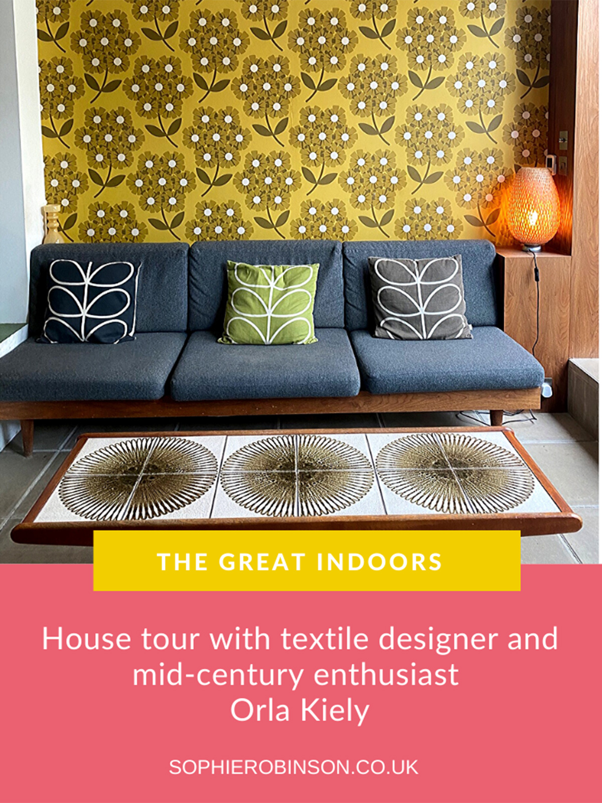
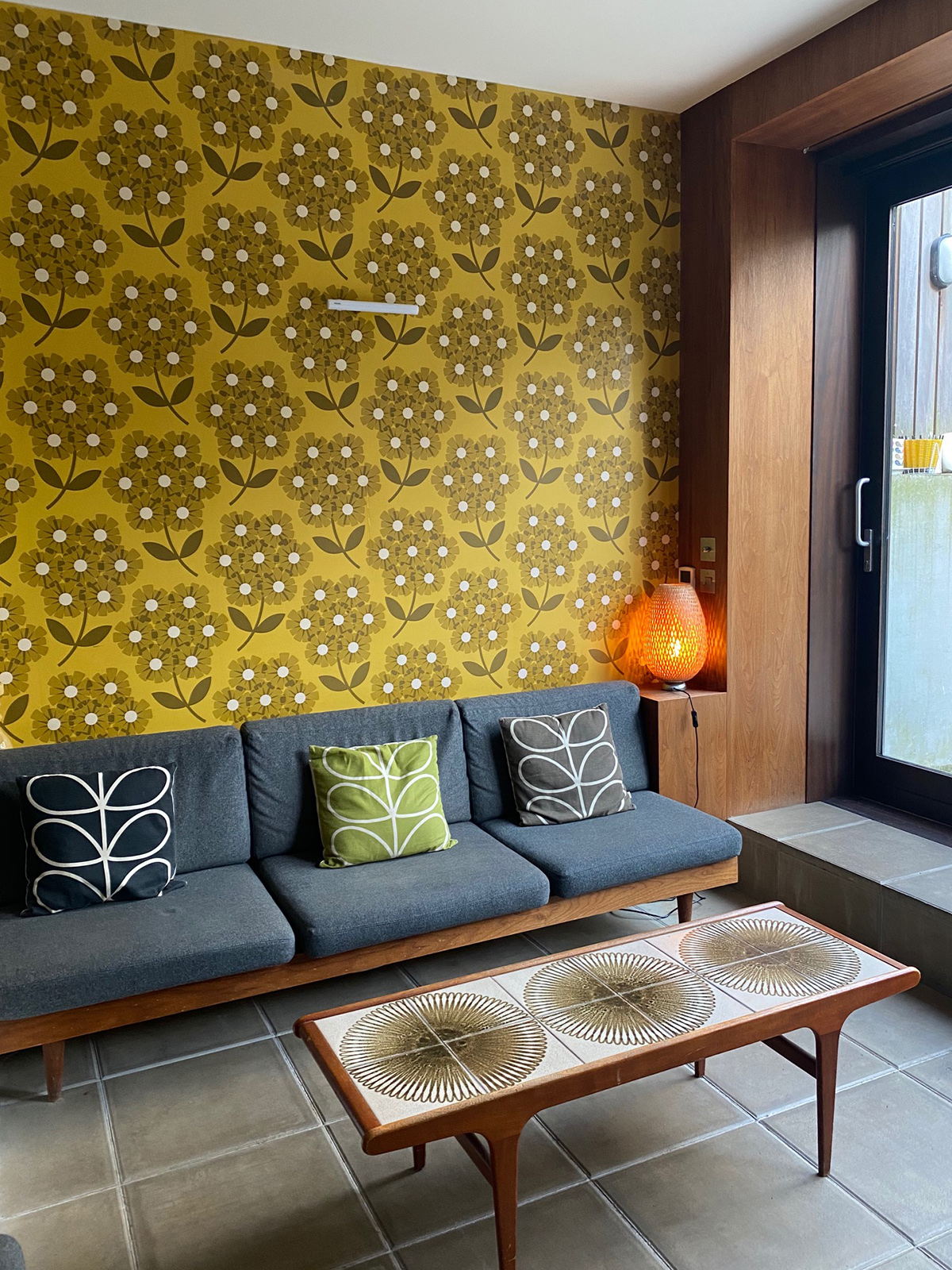
Orla’s South London home certainly packs a pattern punch and is a riot of colour too. I loved visiting her and getting an insight into how she decorates. We started off in the lovely open plan kitchen, dining living area on the lower ground floor of her Victorian terrace which clearly has a modern mid-century vibe although still works well in the Victorian home. Orla strived to keep the original Victorian features throughout the house, although in the basement there weren’t any to speak of, so she had full reign on how to design her kitchen/dining space and it has a much more modern and midcentury vibe as a result, complete with concrete floor, walnut frame windows and a dug out floor.

Orla cleverly used the same flagstones as the outside ones so when the doors are fully open the space flows perfectly.

The space is also unified by the use of walnut wood panelling from the back door frames, along the walls as a cladding and into the kitchen units. A really clever use of how a material can link an open plan space. Look at that wallpaper, one of Orla’s early designs, it seems I’m not alone in my passion for yellow as it’s also her go-to colour for it’s happy and bright character.


The working parts of the kitchen is cleverly tucked away from view

The hidden pantry in olive, green and yellow – Orla’s three core colours.

On the way up to the ground floor, we pass this idyllic library nook – I just adored the way this area has utilised a small space and the gloss yellow is heaven! I could quite easily make use of this space! Orla says her three hero colours are yellow, orange and olive and you see these repeated throughout her home which brings real harmony and so when she does pop the colour in unexpected places, the colour doesn’t feel random.

On to the large living room, which houses Orla’s fabulous collection of midcentury furniture and really oozes her unique sense of retro-meets-modern style. All of the original architectural Victorian details like the ceiling roses and cornicing are rightfully celebrated, but it was the huge picture window at the far end that got most of my attention. It was part of an addition from the previous owners but Orla had the large glass picture window installed to a very James-Bod esque effect! Also, note the walnut wall panelling again – a lovely red thread moment throughout the house.

I happened to mention what a gorgeous wall colour to which Kate happily pointed out is GREY! Orla feels a dark ‘grey’ is the ideal background for her brighter colours to pop, and I have to agree it really works in her setting as the perfect backdrop to get textiles and collection of art and ceramics.

Whilst there is a strong mid-century feel to this house it is not contrived or forced as all the pieces were carefully chosen by Orla because she truly loved them and suit her style and family needs. Combined with the tight colour palette throughout the house, it helps unify the home and creates consistency. Orla sits happily in the maximalist camp, and there are a variety of patterns, but all with her signature 60’s influence.

Onwards, up to the next floor but we’re stopped by what appeared to be some modern artwork, a resin set of panels but it’s actually a hidden door….

… concealing a fab shower with a glass ceiling so you’re bathed in natural light. Genius!

The tiles are Orla’s design and her tip for using patterned tiles is to plan down to the last detail and the smaller the patterns and tile the easier it is.


Upstairs to the master bedroom, and behind Olive’s (her 12 year pooch) chair is – what I thought was a floor to ceiling mirror – is actually glass separating the bedroom and bathroom creating more light in both.

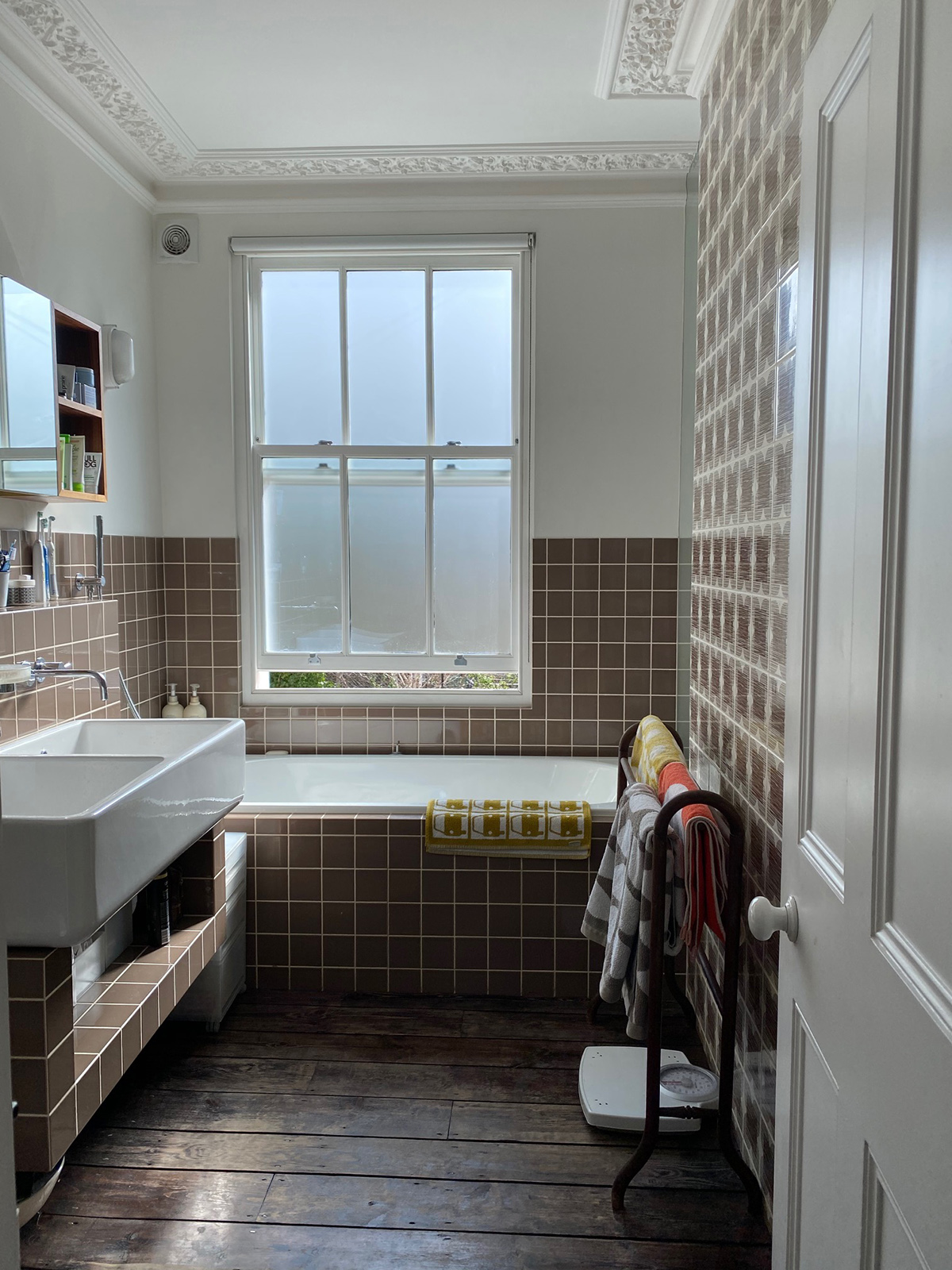
The red thread continues with Orla’s tile design also used in the kitchen and shower with co-ordinating gorgeous ‘milk chocolate’ brown plain tiles.

I’d like to thank Orla so much for having us visit her beautiful home, which felt just that, a home. If just a very stylish one too! The two Kate’s and I have devised a way to continue recording the podcast remotely and have full intention to keep broadcasting every other week. So we’ll see you in the Great Indoors!


  • Home Tours
  • Interiors
  • podcast
Home Happiness special – Podcast show notes S7 Ep1 Kate’s new book, wallpaper and retoxing, Podcast show notes S6 Ep5
  • Christmas
  • Interiors
    • colour crush
    • colour psychology
    • DIY
    • dream home makeovers
    • Home Office
    • Home Tours
    • Interior Design
    • Interior Styling
    • podcast
    • Sophie Robinson X Dunelm
    • Sophie Robinson x Harlequin
    • trends
  • Lifestyle
    • Business
    • Fashion/Beauty
    • Life
    • My House
    • Nosh
    • Travel
  • Rooms
    • Bathrooms
    • Bedrooms
    • Kids rooms
    • Kitchens
    • Living rooms
    • Outside
  • Videos
online influence award winner 2019
Interior Design Winner Sophie Robinson Insta
Videos

Listen

Listen Here

Online courses
by popular demand

Catch Sophie In All Her Colourful Glory On Instagram

Not going to lie, this might be one of my proudest Not going to lie, this might be one of my proudest makeovers ever…
My Dad and Mary’s modern French villa was all beige tiles, white walls and zero personality. So I did what I do best: turned it into a technicolour dreamscape inspired by the countryside views outside those gorgeous bifold doors.

Inspired by early  autumn leaves, emerald green fields, and piercing blue skies we set about making the inside of their home feel as joyful as the outside … now imagine all that bottled up into wallpaper, fabrics, cushions and colour-drenched furniture.

If you’ve ever thought bold colour overwhelming or that pattern was too much for open-plan spaces… this one’s for you. Because colour and pattern sings in nature, and it can work just as well in your home decor.

All wallpapers, rug and cushion fabrics are from my collection with @harlequinfw. Painting by @sophieabbottartist 

Full sourcing list, extra styling tips and a deeper dive into the design story are up now on A Life In Colour: head to my Substack via the link in bio to read more!
End of January check-in… and yes, the struggle to End of January check-in… and yes, the struggle to stay joyful is very real right now. Dark mornings, grey skies, energy running low.

That’s exactly why our homes matter so much at this time of year. They are our sanctuary. The place that should lift your mood, calm your nervous system and make you feel held when the outside world feels a bit, how can I put this...relentless. And this isn’t just a feeling or a design philosophy. It’s backed up by science. Research shows that colour, light, beauty and nature in our homes have a direct impact on mood, wellbeing and happiness. Small, intentional changes really can shift how you feel day to day.

I’d love to know… what brings you the most joy in your home right now? A colour, a room, a plant, a view, a ritual? Share it in the comments 💛

And if you’re ready to go deeper, my big January Sale ends this week.

If you want to truly understand colour psychology and learn how to curate a home that feels joyful, confident and completely you, comment ULTIMATE and I’ll send you the link to my online design school and your opportunity to make the biggest saving of the year.
These are the ingredients to making your home feel These are the ingredients to making your home feel as good as it looks. 

• Confident colour that creates the mood
• Beautiful pattern that delights the eye
• Layered texture that brings it all alive
• Personality in every corner, so it feels like home

Magic happens when you stop playing it safe and start designing a home that truly reflects you. A home that feels joyful, expressive and alive. But designing a home can feel overwhelming. Where do you start? How do you combine colours without it feeling chaotic? How do you clash patterns so it looks considered? How to express your unique personality without merely copying other people’s style?

That is exactly why I created my online design school. After more than 25 years as an interior designer, I have distilled my design process into clear, easy-to-follow courses that take you step by step through combining colours, balancing patterns and adding texture, so you can decorate with confidence and creativity.

And right now, my January Sale is on. You can save a huge 60% on my transformational courses, designed to completely change how you approach your home and how it makes you feel. If you are ready to embrace your creativity and deepen your passion for interior design  comment ULTIMATE and I will send you all the details.
Think Maximalism is ‘too much’, too messy, or only Think Maximalism is ‘too much’, too messy, or only for other people? 

I’m here to tell you: maximalism isn’t chaotic. It’s just misunderstood.

Once you understand how colour and pattern work together, decorating like a maximalist stops feeling intimidating and starts feeling instinctive. Your home starts feeling like you.

If you want to design your home with confidence, my Ultimate Interiors Bundle is exactly what you need. It includes three self-paced online courses that take you inside my design process, teaching you how to use colour and pattern so you can make bold choices that actually work, again and again. 

Right now, the Ultimate Interiors Bundle is a massive 60% off. Buy now, enjoy the saving, and start whenever you are ready to create a home that is completely yours.

Comment ULTIMATE and I’ll DM you the link to find out more.
Welcome to my witchy era! Who else wants to harnes Welcome to my witchy era! Who else wants to harness the Year of the Horse and use this dynamic energy to manifest your best year yet! 

A vision board is like a compass that will lead your goal settings and intentions with total clarity. To prepare i like to take lots of long walks and meditate on what it is so want more of in my life while gratefully letting go of what no longer serves me. 

Join me Wednesday for a live webinar on how to I create a Vision board that will ignite your passion and motivation to live a bold, creative and colourful life! Comment VB26 for the link.
Dark and moody colours can feel intimidating, but Dark and moody colours can feel intimidating, but my TV snug shows just how well they can work. The deep tones soften the space and create a calm, cocooning atmosphere, perfect for evenings spent watching TV, or retreating from the day.

Contrary to what you might think, this room really comes into its own in winter. Low light and long evenings make the colour feel enveloping and cosy. It’s a space that invites you to slow down, sink in, and make yourself comfortable.

I sampled so many different paints but Cordoba by Little Greene was the perfect choice for this room. It’s full of depth and warmth, and just the right amount of drama. 

And if you’re thinking about taking the leap yourself, my tip is: don’t fight the natural light you have, lean into it. Don’t be shy about colour drenching walls, woodwork and ceiling so the room feels seamless and intentional. In my snug, that richness is what makes it feel cosy and complete.

There’s no place I’d rather be on chilly evenings.
How do I explain this feeling to a minimalist? To How do I explain this feeling to a minimalist?

To some people this might look like too much, but for me, maximalism isn’t excessive, it’s pure self expression. I decorate my home to reflect the way I live and that’s full of bold uplifting, joy-giving colour. Every patterned textile, every artwork, every joyful little object earns its place because it makes me feel happy. 

And if I’m being honest a neutral room doesn’t make me feel calm, it makes me feel slightly depressed. My home lifts my mood, fires my creativity and gives me a little thrill every single day.

Now tell me… are you Team Minimal or Team Maximal? And what makes your heart sing at home?
There’s something about walking that has quietly h There’s something about walking that has quietly held me together this past year.

When life threw its challenges my way, my anxiety went into overdrive. I lost clarity, my head was foggy, and the overwhelm shut me down. But walking, one step in front of the other, slowly moved me in the right direction.

We all know walking is good for the body, but it’s also one of the most powerful tools for the mind. Moving helps process stuck emotions, those steady steps soothe racing thoughts, and the changing scenery opens up fresh ways of thinking. Being in nature grounds you. And the best part is, it’s free.

Whenever I’m preparing a new vision for my year or any creative project, I always start with a long solo walk. I take my journal, let the thoughts tumble out, and begin to find a clarity and direction again. Next step is to use my creativity to create a powerful vision board full of images that resonate with how I want to feel and who I want to be. Less of a to do list, more of an emotional reset. This works for me as it brings in the light, and more importantly keeps me inspired and motivated.

If you’re ready to gently clear the fog and get clear on what you want more of, my ‘Life in Colour Vision Board Masterclass’ is now on sale. I’m hosting on the 21st January, 7pm GMT (with a recorded replay available). Comment VB26 below and I’ll send you all the details. 

Can’t wait to see what we can create together this year!
Follow on Instagram
Sophie Robinson
  • © 2025 Sophie Robinson

    /
  • Contact/
  • About/
  • Design by MW

You're almost inside!

Leave me your best email to sign up for the Webinar

MG0001 Magnet Sophie using Tap 021 copy

You're almost inside!

Leave me your best email to sign up for the Webinar