

House update and the red thread theory – Podcast notes S6 Ep2

Welcome to our 2nd episode in the 6th series of the Great Indoors podcast and a huge thanks to our fab sponsors Topps Tiles. For the recording of this episode, we were all around at my house so it was a chance to get Kate’s opinions on the (slow) renovation progress. We also discuss Kate’s red thread theory to decorating, she also has some Stats on some recent colour and wellbeing research. We then round off by debating about the pro’s and con’s of panelling – and should you go yay or nay?? As ever, you can catch the full episode here and find all the info and links below!
Our last budget revamp special episode proved to be a popular one judging by the number of downloads! Thanks so much to all of you who tune in and share the podcast love with your interior design obsessed friends. Seems a lot of you have big plans for an update this year and we will be sharing more on the forthcoming trends but with reference to the podcast we discussed how deep blues are everywhere in interiors right now. Topps Tile of the year is called Syren, which is a fabulous midnight blue – and its curved shape makes it very on-trend at the moment, and Pantone announced their 2020 colour as Classic blue. I think this is the perfect shade for the bathroom as it has a calming and relaxing feel and the super trendy curve design will work in a modern or classic space.

Topps Tile of the year Syren in midnight blue. It is actually a really versatile shape that can be arranged in any direction allowing you to be creative and jazz up your scheme.
Renovation update

Our current Kitchen is a modest size but where we spend nearly all our time as a family
I had the opportunity to share with Kate my plans for the house…which are quite ambitious! So the biggest being an extension on the back of our Sussex farmhouse. We are at the very early stages of planning permsissions and designs so can’t get too excited just yet.Liek many, our kitchen is the hub of the home but is currently in the north end of the house, is fairly dark and has a view of the cars in the drive. The South end of the house however is light, with vfar reaching views across the garden and feilds but currently situated there is a rather cringe-worthy 1980s conservatory. So plan is to move the kitchen down that end, open it up onto the living room and transform the way we live and socialise. And I get to enjoy the view of the beautiful garden and my favourite willow tree. So Kate swiftly pressed me on designs and colours and off the top of my head I suggested yellow, (regular listeners will know yellow is Kate’s least favourite colour)!
Yellow is my happy colour, it’s warm and uplifting and to me, it’s all about how you want the space to feel and colour can really affect how we behave in a space. Which led us on nicely to some, get ready for it, stats from Kate (the stat queen herself)… Topps Tiles surveyed 2000 people to see what colours made them feel good and promoted well being, and the results were not what I expected!
Top 5 colours for wellbeing & health (according to the survey)
- green & yellow joint winners
- white
- blue
- red
- grey
Worst colours for wellbeing (again according to the survey)
- Black
- cream
- beige
- pink
- orange
It’s interesting that some these ‘worst’ colours are having some resistance although as we pointed out there’s no nuance – pink could be a bright fuschia pink all the way down to a plastery pink so they are miles apart and we all react to them in different ways. I was surprised to learn that only 1.5% of Brits are choosing to use pink – in all varying shades – in their living room. I think it is a great colour to have in your living space as you can tell!

My living room is a very soft and delicate shade, Sea Pink by Sanderson which works well in my fairly dark living room.
My white office
Painting my office white seemed like a good idea at the time as I thought it would be an ideal blank canvas against all the colour and pattern I work with every day. Truth is, I find it very depressing and I feel really uninspired being in there. I came across the most, what I think is, divine wallpaper by House of Hackney and although it’s totally the antithesis of plain white with its full-on colour and full-on pattern I just think if it was on the walls in my office I would actually feel inspired and be more creative.

My current office is painted white to enhance the light but I just find it totally uninspiring
So the lesson here folks, you have to think about how a room makes you feel when you walk in. If you love something and it sparks joy, go for it. My wallpaper of choice still has ‘my’ colours throughout and ties in my blue hallway and colourful accessories. I love high contrast colours which are invigorating and create a really striking scheme but for others, it will be their idea of hell! So, you can have any colour combinations you want but you have to choose the right tones for you.

The bold and beautiful Artemis wallpaper in Amaranth-pink by House of Hackney. Too much?! Never
On to the downstairs loo

My small downstairs loo has maximum impact with colourful tiles and wrap around wallpaper
So the smallest room in the house but this is often my favourite to do. It sits just off my cobalt blue hallway and I wanted the space to flow and have some continuity so the floor is the same. I then found the perfect shade of blue for the wall tiles at Topps, the Minton Hollins Victorian is a classic range, check out the dado and you can just about see the skirting – it’s all in the detail. It took me ages to find the right wallpaper, as I needed a pattern that can wrap all around and over the ceiling too. This is the perfect design, Splatter 213647 in Ink by Sanderson which feels just the right amount of quirky in such a small space. Top tip for wallpapering the ceiling is to choose your pattern carefully, you don’t want flowers or motifs looking out of place and in the wrong direction.
The red thread
This is something Kate has talked about on her blog and it’s the idea of creating different room schemes around the home and yet they all flow and have a common connection. This can be a very subtle and simple way of making your home flow, so much in fact that Kate thinks you may already be doing it without knowing! Although I’ve seen many houses that have not much of a thread at all! It can be difficult to identify what works for you and furniture seems to be a stumbling block for a lot of people so here are a few top tips:
- Look at the colour of the woods – they need to work tonally – don’t mix yellow tones and pink tones
- Use a rug to break up a wooden floor and wooden dining table for instance
- Use some (similar) wood pieces in other rooms to create cohesion
- If you are lucky enough to have a marble table, for example, use marble accessories in other rooms.
- You can use the materials as your red thread
- Did you spot mine? look at the kitchen cupboards, office and living room storage. All tongue & groove but at varying widths and with/without handles – clever eh!
- Keep to a tight colour palette
- If you are struggling you can check out our fab Facebook group to ask our great community.
Panelling
This has become a bit of an Instagram trend and I was contacted by @daisyangela_ , asking if there are interior design principles about beading, dado, wainscot height etc etc. and whether we had any thoughts we’d like to share! Well, of course, we had to rise to the challenge! Beading and panelling have taken Insta by storm, and I’m loving some of the results, namely @susannahhemmingsstylist and @thehousethatblackbuilt and @the_girl_with_the_green_sofa . Not to mention that Kate and I both have panelling in our homes too.
Chelsea from the Instagram account @thehousethatblackbuilt has added this beaded panelling to her grey bedroom. You can visit her Instagram page for a full tutorial on how to do it.
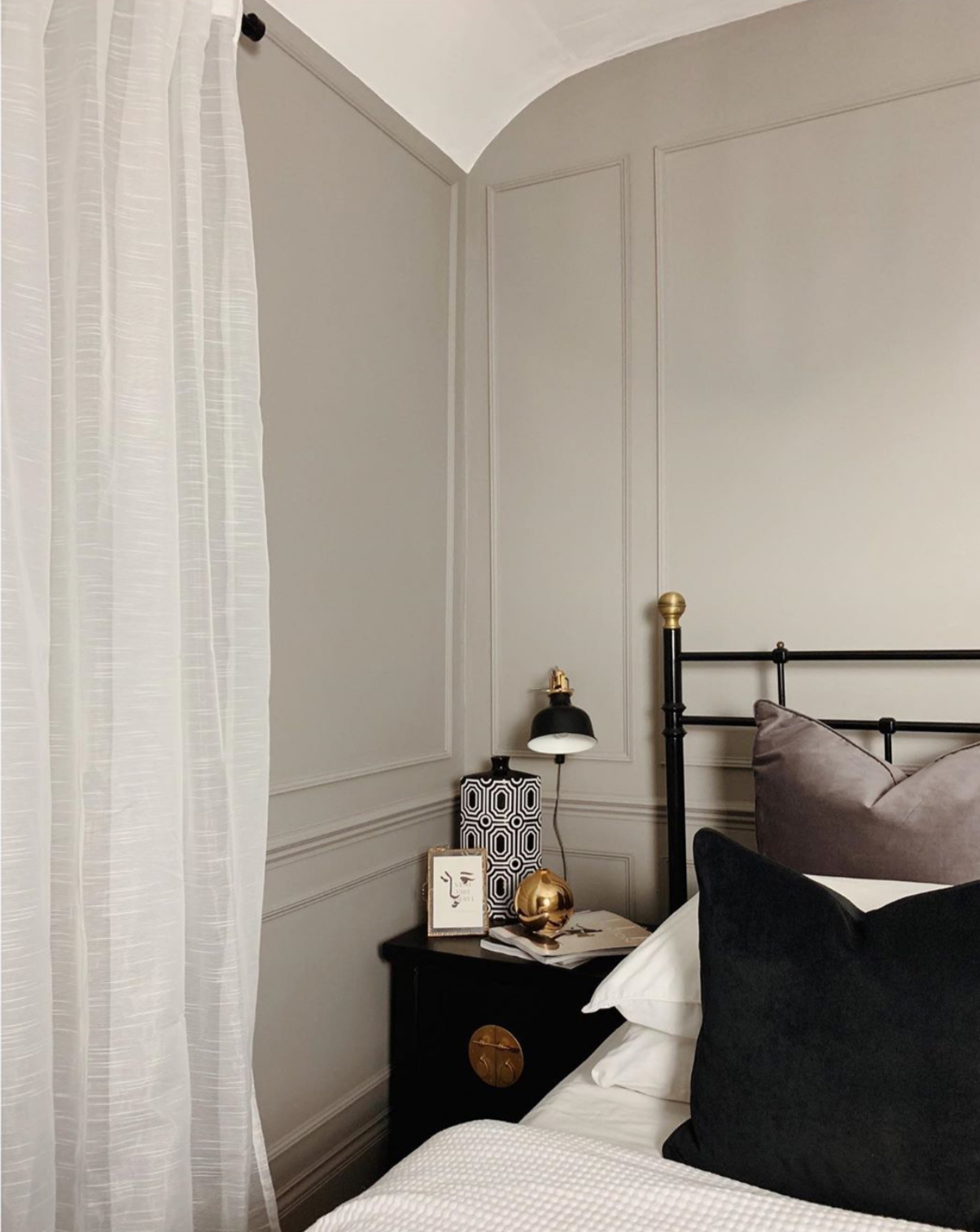
Kate took the modern approach and painted the dado and skirting the same colour as the wall which creates a more blended and subtle look.
These are period features so you have to think whether adding beading or panelling is in keeping with the age of the property. Kate has an aversion to strips of wood being applied in a grid or other formation, but I have to disagree, I think sometimes modern houses can be bare and lack character and charm so I think it’s a great way to add texture and interest.

Nicola Broughton shares her home on @the_girl_with_the_green_sofa where she created a bathroom panelled wall in her signature colour.
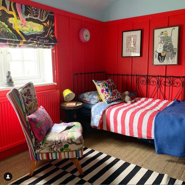
We added panelling to our sons room as it had little character. It also allowed us to play around with two colours. My son Arthur chose Atomic red and Gentle Sky for his bedroom from the Little Green paint chart
It just leaves me to say a huge thanks to Topps Tiles for their support, our fab producer Kate Taylor and of course you, our lovely listeners. Next time we chat to Oliver Heath and have a proper delve into his Brighton home. You may remember him from Changing Rooms back in the day, but he is now THE authority on biophilia, sustainability and wellbeing in the home and workplace. He is absolutely fascinating on his chosen subject so don’t miss it.


