

How to decorate with bold colour
As anyone who knows me will attest, I’m mad-bonkers-all-for decorating with colour. Its simply one of the most affordable and transformational ways to update your home, and better still all you have to do is invest in a tin of paint. Daubing a new hue on the walls is without doubt the easiest and yet most dramatic way to instantly inject a new look, a new mood or just simply add interest to your home. And why not try painting the walls yourself- (I’ve heard) it can be like therapy. Nothing seems more exciting than seeing a new colour roll out and onto the walls.
So it’s widely agreed that colour has the power to change the mood, set the theme, even alter the perceived size of your room with visual tricks. So as an interior designer, or home improver, you’ve gotta learn to Love Colour, Colour is your friend!
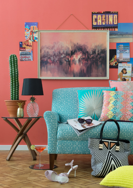
Image from Marks and Spencer
But the subject of decorating with colour is a huge topic, and I’m not about to write my thesis on the matter here. So for the sake of this blog post, I’m going to talk about decorating with Bold tones. To my delight the trend in interior design is behind decorating with bright hues. We’re seeing a move away from the washed out Scandi hues in favour of some zingy brights that carry some punch as well as desperately dark and murky hues.
Photograph by Joanna Henderson
Now, I understand decorating in this palette takes some guts, and it feels daunting with the worry of getting it wrong and then having to invest time and energy applying plenty of coats to block it out again. I’ve got some tips to give confidence in getting it right.
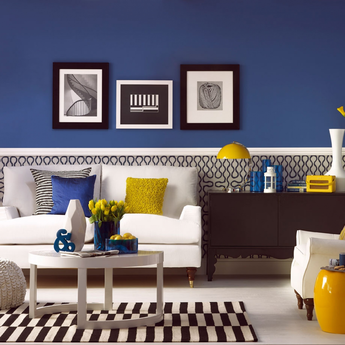
First up the trick to decorating with bold colour is to balance the look with contrasting neutrals. Whether that’s smart black and white for a up scale look or the softer natural tones of wood, creamy white or sultry grey.
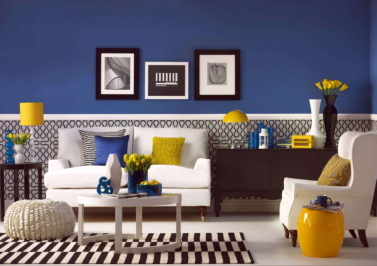
Designed by Sophie Robinson for Ideal Home. Photograph by Dominic Blackmore
Next add some natural accents. This could be some green foliage (I love ferns) or a little natural wood to counter balance the bold colours. Natural colours also add warmth, which can be a welcoming touch when you’re using strong acid brights or dark moody hues. A wooden floor, a leather armchair or an oak side table could be just enough.

Living room designed by Sophie Robinson for Ideal Home. Photograph by Simon Whitmore
Think about Colour Blocking (I have written a post on the very subject here) as there is no rule that says you have to go for out and out colour on all four walls (although I’d urge you to every time!) A fabulous feature wallpaper or one wall painted in a punchy colour can do the job. For example I love deep azure blue next to soft dove grey or a screaming canary yellow next to smokey black.
Found on escapadeblog.com
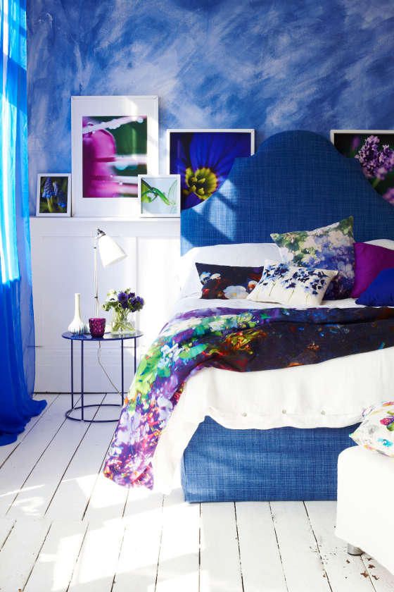
Also, colour doesn’t just apply to walls. Add colour in other ways, on furnishings and accessories. This is particularly relevant if you’re renting. A bright jewel coloured sofa in a pale grey room looks wonderful or a bright punchy pink headboard can create a dazzling focal point in a bedroom.
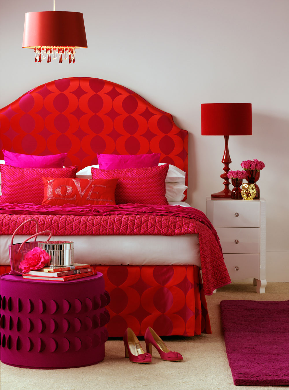
Designed by Sophie Robinson for Ideal Home. Photograph by Dominic Blackmore
I think it works well when you add an accent colour or two to your bold colour scheme (plus your neutrals). For example choose one colour as your dominant choice-this might be on the walls or sofa, then mix in some neutrals and naturals, then add the last 5% as an accent. This gives the look some pep and a little extra edge. My tip for success is to keep them all the same hue or saturation.
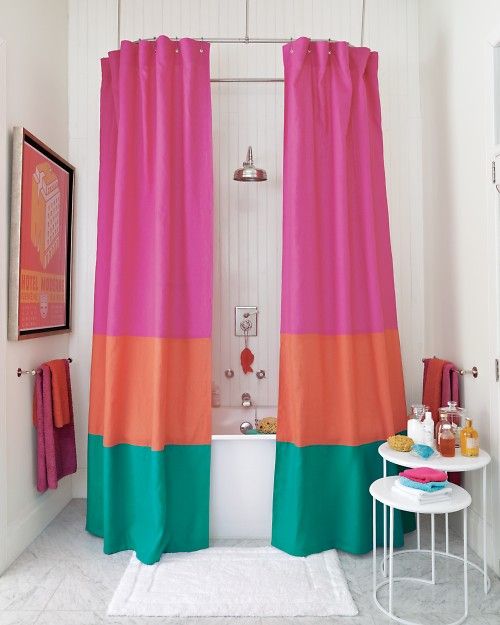
Found on bhg.com
Don’t be afraid to add pattern to your bold colour scheme- but I think bold prints work best as they can muscle up to the bold colours. Bold silhouettes, geometrics and large scale florals work well.

Photograph by Joanna Henderson
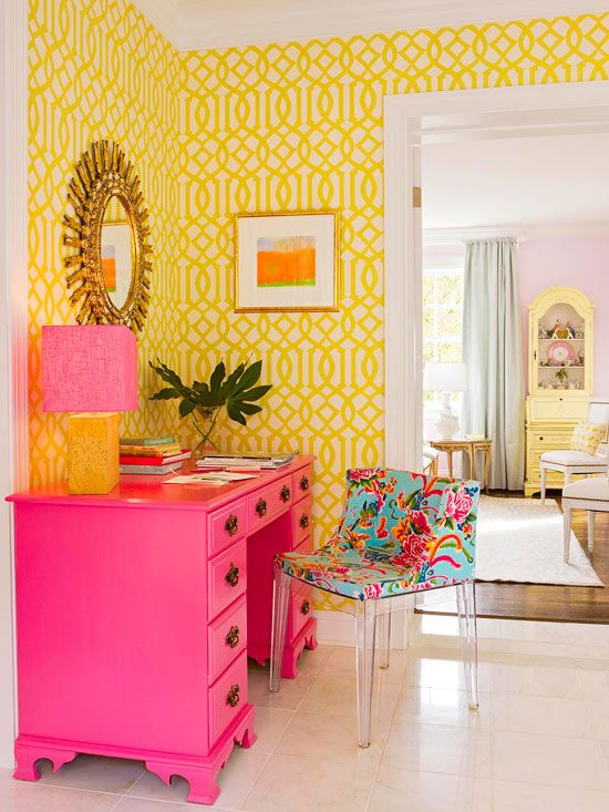
So where to start and find inspiration. You can start with a swatch of fabric or wallpaper and then pick out your colours from that with the knowledge that they all sit nicely together. Check out Harlequin, Designers Guild and GP & J Baker for some fantastic bold designs. For me, I love to decorate with a bold dark hue on the walls and then have fun collecting bright coloured artwork, fabrics and accessories that contrast dramatically.

Image from tallbox.org
You can watch me talk more on the subject of decorating with colour along with slides of my own projects on the housetohome website.


