ULTIMATE MAXIMALIST COURSE BUNDLE - £400+ Savings - JANUARY SALE

Sophie Robinson
  • Home
  • Workshops
    • Marrakech Retreat
    • Home Masterclass
  • Online Courses
  • Collaboration
  • Podcasts
  • Blog
  • About
    • About me
    • Work with me
    • Press
  • FAQs
  • Contact
  • Bedrooms
  • colour crush
  • Interiors
25 May 18

How to pick the perfect colour for your bedroom

Sophie Robinson  IHS 2018 Innovation home bedroom LR

Picking the perfect colour palette for any room is often a daunting task but crucial when scheming a bedroom. As with every room in your home you need to start thinking of the feeling you want to create as undoubtedly this will affect what colour palette you choose. In this post I take you through a few key colour options, and using the theory of Colour Psychology, help you pick the right one for you and enhance that feel good feeling. Since discovering the total game changing powers of Colour Psychology, and running courses for interior designers on how to use it to stream line the design process, I’m up for everyone getting their colour palette spot on. It makes it so easy to pull a scheme together and makes a room feel brilliant.


BLUE

This has to be one of my favourite hues for bedrooms as it’s so restful and calming. It’s a soothing hue that has a lovely clear clarity to it too. Picking your right tone though can be a mind field. Personally like to err on the warmer shades of blue (because I’m a Spring Autumn Colour personality!) but on a practical level beware that cool blues can feel chilly. Maybe  spare these hues for a sunny south facing room that needs cooling down. Otherwise pick a rich teal, soft duck egg if you want to warm cool room up. My personal choice is a deep blue with a bit of red in it like Lazuli which is what I’ve used for my recent bed linen range for Secret Linen Store. The lighter tones appear more serene and reflective but then the deep bottom of the pool blues can feel so deliciously dramatic and cosseting. Blues also pair up really well with hints warmer tones like coral, pink and yellow which is what I’ve done here.

Dazzling blue linen set for the secret linen store, part of an exclusive range designed by The Great Interior design judge Sophie Robinson

Dazzling blue 100% linen by Sophie Robinson for Secret linen store


RED

Not a popular choice for bedrooms as it’s a high-energy colour that can feel agitating and aggressive if it’s too full on all-over-the-walls. However theirs no denying it’s connotations with all things oo-er sexy so if you want an element of the boudoir in your bedroom a hint of red might just be the cheeky hint you need. Instead I’d maybe look at the warmer deeper tones of red like burgundy or claret. Dare I say it reds that appear more brown. They feel more sensuous than kiss me quick sexy. This image below works well as the velvet button upholstery bigs up the sensuous feel while the cool grey blue on the walls stops it feeling suffocating. Ravishing!


Bold yet sophisticated upholstered bed by Sofa.com

Knightsbridge double bed in Pumice house basket weave, sofa.com


PINK

Unlike red pink is the perfect colour for bedrooms. The soft warm fleshy tones are the most flattering wall colour for, err, viewing oneself in the nude don’t you know! From a colour psychology perspective pink is all things nurturing, soothing, intimate and reassuring. I think the blush tones have a real touch of glamour although its feminine connotations can make it a total no go for men. Just call it a nude neutral, tell him it’ll make you look hot in the buff, and see how you get on. I think it looks lovely with more masculine tones like navy or grey so you could always get around it that way
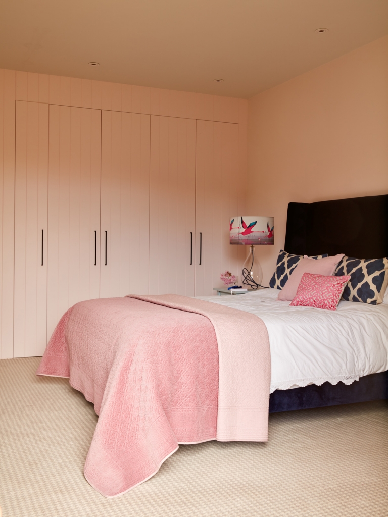
Walls painted in Nevada 6 by Dulux. Holly bed in midnight by Button and Sprung. Breaking dawn lamp by Anna Jacobs.


YELLOW

Generally I don’t think yellow is a great choice for bedrooms. Rolled out on all four walls and it’s going to make you look sallow. Not a look anyone is channeling I’m sure. Also like red it’s a very upbeat and energising colour so not conducive to rest. So unless you want to get out of bed with a hop skip and a jump then yellow is best avoided. However it’s a very positive feel good colour so I think it makes a good accent. For example a yellow headboard will give the room a cheering vibe but you don’t have to look at it when you are actually relaxing in bed. Team with cool blues or soft greys to balance the look.

Rose King Size Divan in Bespoke Zimmer and Rhode Saga Velvet Fabric by Button and Sprung


ORANGE

Think of soft peach, coral, and apricot and you can see how orange could create a very soft, warm and positive bedroom scheme. Another passionate colour it’s possibly more effective if you go for the pinker tones of orange rather than the red. It can also be a really luxurious hue. Just think of Hermes packaging with a sharp hint of charcoal grey to make a room feel special.

Orange wall painted in Charlottes Locks by Farrow and Ball. IStyled and designed by Sophie Robinson for Ideal Home.


GREEN

Green is the Doctor Feelgood of the colour spectrum. The colour of Mother Nature it always imbues the feel good vibes. It’s a great color for rest and recuperation and can bring a real sense of balance and wellness to a scheme. Again I’d be wary of using too much green in any room scheme, as it can quickly appear stagnant. Not so great for getting out of bed in the morning! Instead freshen it up with crisp white or make it feel pretty with its perfect partner pink.

Nature inspired bedroom scheme by Marks & Spencer

Bug Print Bedding Set, Watercolour stripe bed set, all Marks & Spencer


PURPLE

This should be a real contender for bedrooms. In terms of colour psychology it communicates luxury on the deeper end of the spectrum and spirituality when you get towards violets. It’s a bit of a marmite colour for most that dips in and out of fashion but currently lilac is very de rigour and the bedroom could be the perfect place for it. In my mind it can err towards tacky so keep purple classy and only invest in quality to stop it looking down market. And no crushed velvet anywhere!
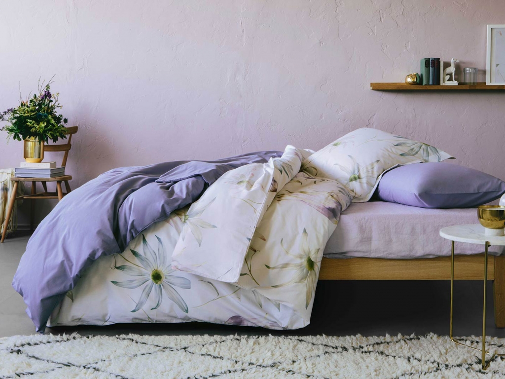
On trend mauve bedroom scheme by Zara Home

Floral print duvet cover and basic percale duvet cover, Zara Home


GREY

Still such a popular decorating colour grey is the go to neutral for many schemes. Its paler tones can make for a very sophisticated bedroom while the deeper ‘Downpipe’ shades can look robust and dramatic. Grey can look instantly chic and is easy to pull together. On the downside it can look flat and lifeless. I think it works best when teamed with other colours. Be that a sharp slice of black and white to add clarity and definition of softened with an accent colour like pink, yellow or purple. Also like any neutral scheme consider pepping it up with plenty of texture and metallic’s. Both gold’s and chrome metallic’s work equally well with grey.
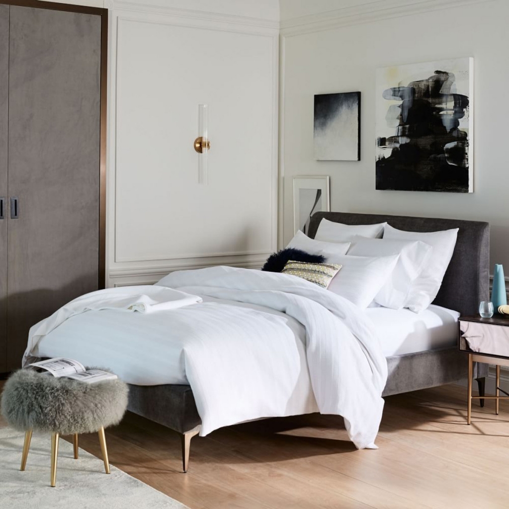
Modern monochrome bedroom by West Elm

Andes Deco upholstered bed, West Elm


WHITE

The colour of purity one would think this is an obvious choice for bedrooms. In it’s purest form I would say it’s too stark and could actually feel rather draining. In science terms white is all the colours reflected back at you and consequently rather exhausting to look at. Instead if you want that fresh and pure look consider an off white. There are too many to mention here but my go-to is the designer paint brands who are experts at mixing the right whites for our North European light. That all said there’s nothing more alluring than some clean crisp white cotton sheets.
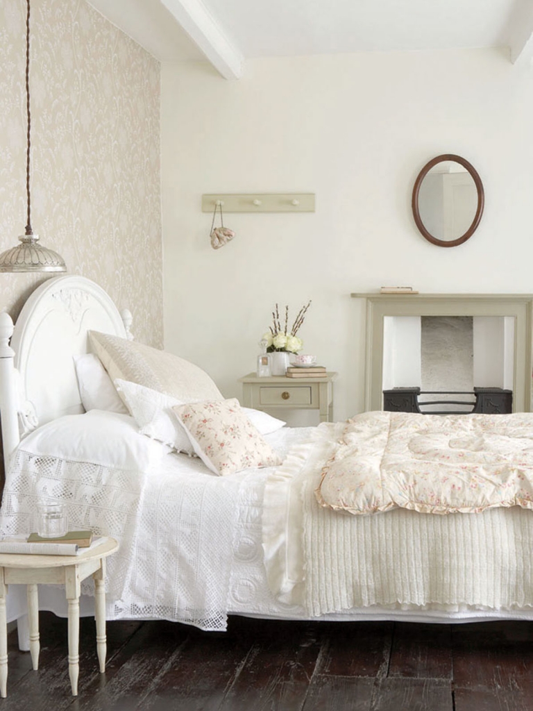
 

Little Greene serene and calming Bedford Square wallpaper bedroom

Wall in Bedford Square wallpaper and Portland Stone Pale, Little Greene


BLACK

The clichéd teenage Goths bedroom just got universally acceptable. Thanks in part no doubt to designer Abigail Ahern and her fearless approach to decorating on the dark side people have been daubing their walls inky dark shades up and down the land. It’s a gutsy approach to decorating and only really works when you go all out, ceilings floors and all. It makes a great space to be enjoyed at night with plenty of subtle mood lighting. Just good luck finding your socks in the morning!
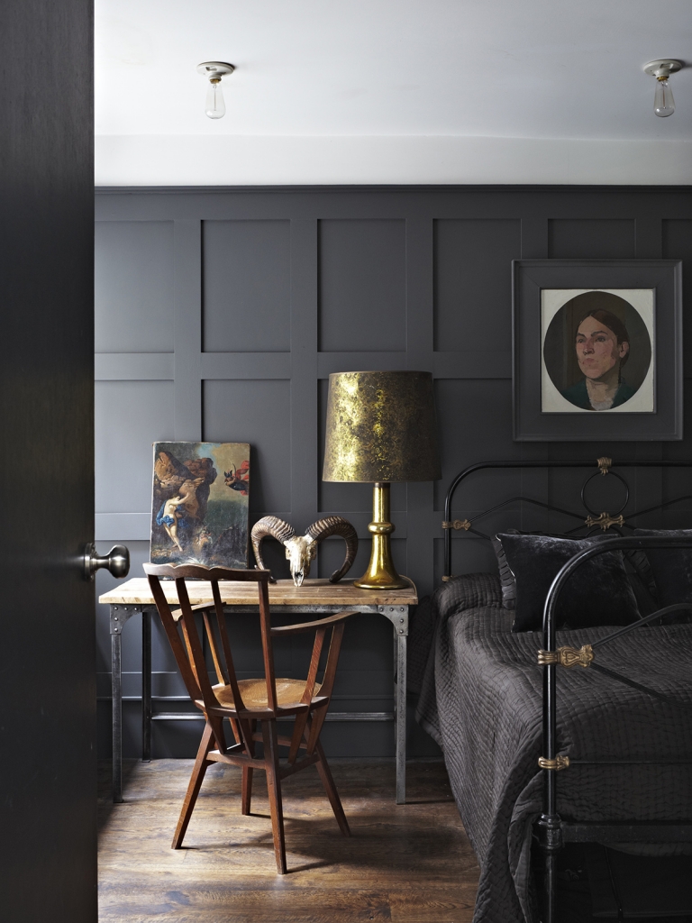
 

Dramatic bedroom with panelled walls in Railings by Farrow & Ball

Panelled wall in Railings Estate Eggshell, Farrow & Ball


For more insight and priceless pearls of wisdom on how to concoct your own knock out colour schemes join me for one of my sell out Colour workshops. Totally geared towards helping you formulate your own unique colour palette that’s perfect for you and your home, I take you through my creative processes on how to decorate powerfully.  I’m hosting my next event in London on the 2nd October. You can book your spot here

  • Bedrooms
  • colour crush
  • Interiors
Why under floor heating is on every interior designers wish list I’m looking for the next big thing in Interior Styling!
  • Christmas
  • Interiors
    • colour crush
    • colour psychology
    • DIY
    • dream home makeovers
    • Home Office
    • Home Tours
    • Interior Design
    • Interior Styling
    • podcast
    • Sophie Robinson X Dunelm
    • Sophie Robinson x Harlequin
    • trends
  • Lifestyle
    • Business
    • Fashion/Beauty
    • Life
    • My House
    • Nosh
    • Travel
  • Rooms
    • Bathrooms
    • Bedrooms
    • Kids rooms
    • Kitchens
    • Living rooms
    • Outside
  • Videos
online influence award winner 2019
Interior Design Winner Sophie Robinson Insta
Videos

Listen

Listen Here

Online courses
by popular demand

Catch Sophie In All Her Colourful Glory On Instagram

Not going to lie, this might be one of my proudest Not going to lie, this might be one of my proudest makeovers ever…
My Dad and Mary’s modern French villa was all beige tiles, white walls and zero personality. So I did what I do best: turned it into a technicolour dreamscape inspired by the countryside views outside those gorgeous bifold doors.

Inspired by early  autumn leaves, emerald green fields, and piercing blue skies we set about making the inside of their home feel as joyful as the outside … now imagine all that bottled up into wallpaper, fabrics, cushions and colour-drenched furniture.

If you’ve ever thought bold colour overwhelming or that pattern was too much for open-plan spaces… this one’s for you. Because colour and pattern sings in nature, and it can work just as well in your home decor.

All wallpapers, rug and cushion fabrics are from my collection with @harlequinfw. Painting by @sophieabbottartist 

Full sourcing list, extra styling tips and a deeper dive into the design story are up now on A Life In Colour: head to my Substack via the link in bio to read more!
End of January check-in… and yes, the struggle to End of January check-in… and yes, the struggle to stay joyful is very real right now. Dark mornings, grey skies, energy running low.

That’s exactly why our homes matter so much at this time of year. They are our sanctuary. The place that should lift your mood, calm your nervous system and make you feel held when the outside world feels a bit, how can I put this...relentless. And this isn’t just a feeling or a design philosophy. It’s backed up by science. Research shows that colour, light, beauty and nature in our homes have a direct impact on mood, wellbeing and happiness. Small, intentional changes really can shift how you feel day to day.

I’d love to know… what brings you the most joy in your home right now? A colour, a room, a plant, a view, a ritual? Share it in the comments 💛

And if you’re ready to go deeper, my big January Sale ends this week.

If you want to truly understand colour psychology and learn how to curate a home that feels joyful, confident and completely you, comment ULTIMATE and I’ll send you the link to my online design school and your opportunity to make the biggest saving of the year.
These are the ingredients to making your home feel These are the ingredients to making your home feel as good as it looks. 

• Confident colour that creates the mood
• Beautiful pattern that delights the eye
• Layered texture that brings it all alive
• Personality in every corner, so it feels like home

Magic happens when you stop playing it safe and start designing a home that truly reflects you. A home that feels joyful, expressive and alive. But designing a home can feel overwhelming. Where do you start? How do you combine colours without it feeling chaotic? How do you clash patterns so it looks considered? How to express your unique personality without merely copying other people’s style?

That is exactly why I created my online design school. After more than 25 years as an interior designer, I have distilled my design process into clear, easy-to-follow courses that take you step by step through combining colours, balancing patterns and adding texture, so you can decorate with confidence and creativity.

And right now, my January Sale is on. You can save a huge 60% on my transformational courses, designed to completely change how you approach your home and how it makes you feel. If you are ready to embrace your creativity and deepen your passion for interior design  comment ULTIMATE and I will send you all the details.
Think Maximalism is ‘too much’, too messy, or only Think Maximalism is ‘too much’, too messy, or only for other people? 

I’m here to tell you: maximalism isn’t chaotic. It’s just misunderstood.

Once you understand how colour and pattern work together, decorating like a maximalist stops feeling intimidating and starts feeling instinctive. Your home starts feeling like you.

If you want to design your home with confidence, my Ultimate Interiors Bundle is exactly what you need. It includes three self-paced online courses that take you inside my design process, teaching you how to use colour and pattern so you can make bold choices that actually work, again and again. 

Right now, the Ultimate Interiors Bundle is a massive 60% off. Buy now, enjoy the saving, and start whenever you are ready to create a home that is completely yours.

Comment ULTIMATE and I’ll DM you the link to find out more.
Welcome to my witchy era! Who else wants to harnes Welcome to my witchy era! Who else wants to harness the Year of the Horse and use this dynamic energy to manifest your best year yet! 

A vision board is like a compass that will lead your goal settings and intentions with total clarity. To prepare i like to take lots of long walks and meditate on what it is so want more of in my life while gratefully letting go of what no longer serves me. 

Join me Wednesday for a live webinar on how to I create a Vision board that will ignite your passion and motivation to live a bold, creative and colourful life! Comment VB26 for the link.
Dark and moody colours can feel intimidating, but Dark and moody colours can feel intimidating, but my TV snug shows just how well they can work. The deep tones soften the space and create a calm, cocooning atmosphere, perfect for evenings spent watching TV, or retreating from the day.

Contrary to what you might think, this room really comes into its own in winter. Low light and long evenings make the colour feel enveloping and cosy. It’s a space that invites you to slow down, sink in, and make yourself comfortable.

I sampled so many different paints but Cordoba by Little Greene was the perfect choice for this room. It’s full of depth and warmth, and just the right amount of drama. 

And if you’re thinking about taking the leap yourself, my tip is: don’t fight the natural light you have, lean into it. Don’t be shy about colour drenching walls, woodwork and ceiling so the room feels seamless and intentional. In my snug, that richness is what makes it feel cosy and complete.

There’s no place I’d rather be on chilly evenings.
How do I explain this feeling to a minimalist? To How do I explain this feeling to a minimalist?

To some people this might look like too much, but for me, maximalism isn’t excessive, it’s pure self expression. I decorate my home to reflect the way I live and that’s full of bold uplifting, joy-giving colour. Every patterned textile, every artwork, every joyful little object earns its place because it makes me feel happy. 

And if I’m being honest a neutral room doesn’t make me feel calm, it makes me feel slightly depressed. My home lifts my mood, fires my creativity and gives me a little thrill every single day.

Now tell me… are you Team Minimal or Team Maximal? And what makes your heart sing at home?
There’s something about walking that has quietly h There’s something about walking that has quietly held me together this past year.

When life threw its challenges my way, my anxiety went into overdrive. I lost clarity, my head was foggy, and the overwhelm shut me down. But walking, one step in front of the other, slowly moved me in the right direction.

We all know walking is good for the body, but it’s also one of the most powerful tools for the mind. Moving helps process stuck emotions, those steady steps soothe racing thoughts, and the changing scenery opens up fresh ways of thinking. Being in nature grounds you. And the best part is, it’s free.

Whenever I’m preparing a new vision for my year or any creative project, I always start with a long solo walk. I take my journal, let the thoughts tumble out, and begin to find a clarity and direction again. Next step is to use my creativity to create a powerful vision board full of images that resonate with how I want to feel and who I want to be. Less of a to do list, more of an emotional reset. This works for me as it brings in the light, and more importantly keeps me inspired and motivated.

If you’re ready to gently clear the fog and get clear on what you want more of, my ‘Life in Colour Vision Board Masterclass’ is now on sale. I’m hosting on the 21st January, 7pm GMT (with a recorded replay available). Comment VB26 below and I’ll send you all the details. 

Can’t wait to see what we can create together this year!
Follow on Instagram
Sophie Robinson
  • © 2025 Sophie Robinson

    /
  • Contact/
  • About/
  • Design by MW

You're almost inside!

Leave me your best email to sign up for the Webinar

MG0001 Magnet Sophie using Tap 021 copy

You're almost inside!

Leave me your best email to sign up for the Webinar