

London Design Week report, colour trends and Podcast show notes S5 Ep1
We couldn’t be more delighted to be entering our fifth series of the Great Indoors Podcast and we’re back with a brand new sponsor – big thanks to John Lewis & Partners for coming on board and bringing more interior design news, inspiration and chat to your ears!
We have lots of juicy topics and special guests coming up this series, but first, on today’s episode, we give you the lowdown on the London Design Festival and we’re talking colourful kitchens and all things colour. You can catch up on the whole episode here.
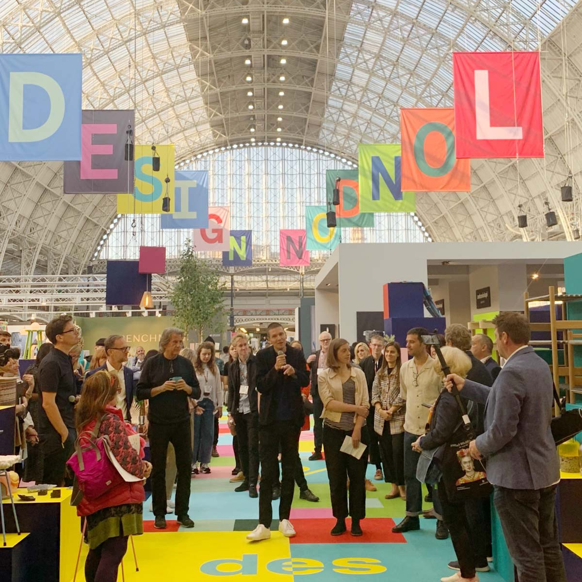
London Design Festival
This is a major date in the interiors calendar and quite a task to take on, so we decided to divide and conquer. I headed West to Focus at Chelsea Harbour Design Centre and 100% Design whilst Kate went East to the London Design Fair.
Between us, we saw lots of emerging trends from an array of international brands and designers but we did see some common themes, so here’s a round-up to whet your appetite.
All about the curves
We’ve seen the trend for curvaceous furniture for a while now, but this season we’re seeing lozenge-shaped rugs and scalloped edges especially by Floor Story who have collaborated with many talented designers. Like these two beauties below, by 2LG. Left, Portal in Pink; right, Pill in pink.
 Sustainability
This has been quite a buzz word for a while now but it was so refreshing to see it represented in such a big way at the festival, and it’s all about, re-use and re-purpose. Which leads me on to French Designer Clemence Grouin-Rigaux who makes furniture using a leather-look resin that can be moulded to make furniture including stools and tables and can you guess what waste she has re-purposed? She identified that 60 billion animals are slaughtered on the planet each year – 1 billion in the UK, so she has found a use for the blood. Yes, blood! When you think about it where does it actually go? As well as other abattoir waste she says, it all has an overwhelming effect on our natural eco-systems, our land, in our rivers and in our oceans.

Hidden Beauty Collection by Clemence Grouin-Rigaux
Another designer I spotted was Benjamin Stanton who recycles denim after discovering loads of legs that had been cut off jeans as someone was selling hot pants to sell at Glastonbury! As a product designer he thought he had to do something with them rather than watch them being burned. So he has laminated the denim and made pieces of furniture – my kind of upcycling!

Benjamin Stanton’s corrugated denim boards have been designed to store and display objects
Colour trends
As part of London Design Week, I was lucky enough to listen to a talk by Karl Johan Bertilsson, Creative Director at NCS Colour – a global colour forecasting company. He was very passionate about his job – I can certainly see why and he said that in order to choose colour you need to have two things – intuition and rationale although you need to have knowledge – so the stories behind these trends are key. Kate and I went on to discuss the Dulux Colour of the Year, and you can hear their ‘story’ behind the launch on this episode of the podcast where we spoke to Marianne Shillingford, the creative director of Dulux. You can also see my review on the Colour of the Year here.
This is a huge subject and there are lots of discussions and views on colour choice but at the end of it all, I say go with your gut and go with a colour that YOU would want to come home to, whether it’s a grey/green or neon pink!
Other new launches…..

Topps Tiles announced their Tile of the Year 2020, Syren. Shown here in midnight with a pink grout (we love a coloured grout) they certainly echo the ‘curve’ trend
Graham & Brown also announced their colour of the year as Adeline, a rich dark forest green.
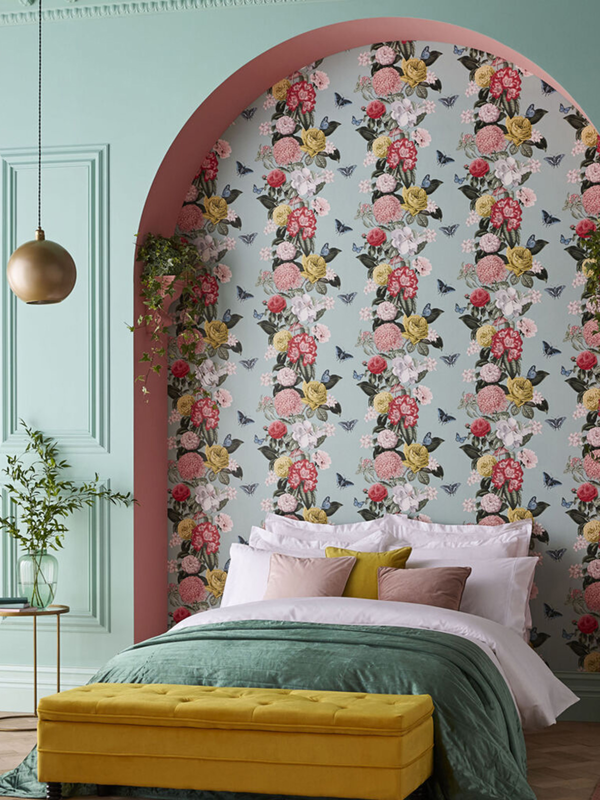
Another launch from Graham & Brown, but this time it’s a Wallpaper of the Year. Bloomsbury in Neo Mint is a re-worked design from a 20th Century archive – a beautiful blousy floral but has a modern edge with the fresh mint green ground.
Colourful kitchens
You heard it here first, Kate Watson-Smyth says ‘colourful kitchens’ – it’s a thing! We have started seeing them with many a kitchen company introducing new colours to their portfolio. Pluck kitchens showcased a lilac design with yellow interior at Clerkenwell Design Week – you can check it out on a previous post I did here.
Designer Rita Konig has collaborated with Plain English to create a new range of paint colours for their kitchens. There is a rule according to Rita, she says you need three or four different colours in a kitchen – the upper cabinets and lower cabinets, the island (if you have one) and paint the stools, if you choose to have stools!
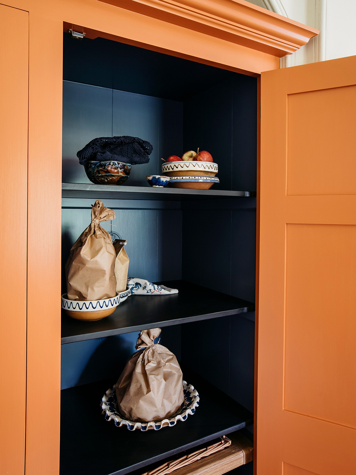
How about a larder painted in Candied Peel? yes, please!
My biggest piece of advice is to approach the kitchen as you would any other room in the house. It is an investment so why not choose what you love for a room you’re probably going to spend a lot of time in? Go for wooden doors so you re-paint them as and when you feel like a change. Or don’t forget you can simply paint the walls for a quicker and easier update.
A huge thanks to our fabulous producer Kate Taylor, our new sponsors John Lewis & Partners and to all our lovely listeners. Please do rate and review – it really helps! And don’t forget about our Facebook group.


