GET THE REPLAY OF THE VISION BOARD MASTERCLASS - LIFE IN COLOUR

Sophie Robinson
  • Home
  • Workshops
    • Marrakech Retreat
    • Home Masterclass
  • Online Courses
  • Collaboration
  • Podcasts
  • Blog
  • About
    • About me
    • Work with me
    • Press
  • FAQs
  • Contact
  • colour crush
  • Interior Design
  • Interiors
17 Sep 19

Dulux Colour of the year 2020

DULUX announces Colour of the Year 2020 Tranquil Dawn MEANING PALETTE 13

The swanky London address, the cute canapes, and sumptuously styled top floor wrap-around glass setting drew a crowd of elite press media and heavyweight influencers all waiting for the big drumroll; the unveiling of Dulux Colour of the year 2020. I’m not going to lie, I often find these pronouncements of a singled out hero colour massively underwhelming but the story behind the trend, why Dulux, a global brand that pulls in colour experts and trend forecasters from around the world to ponder on what single colour we will be rolling on our walls absolutely fascinating. And do they always get it right? I’ve not seen too many interiors in last years ‘Spiced Honey‘, but as I say, I think it’s less about the actual colour of the year and more about the story. So are you sitting comfortably? then I’ll begin….

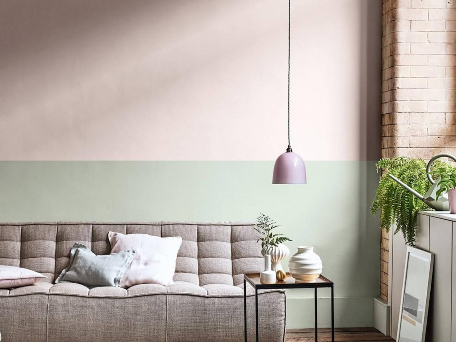
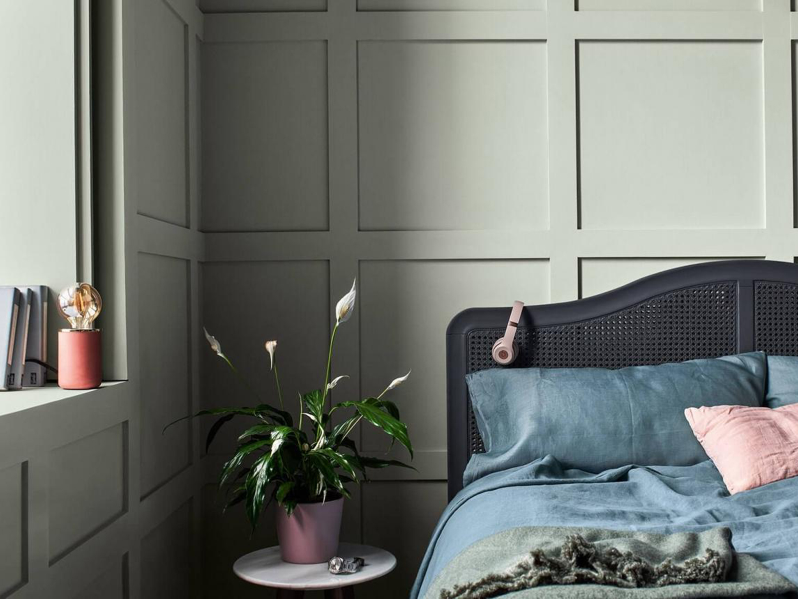
Soft grey and ethereal green, that blurs the lines between inside and out.

The headline opener is that ever-increasing advances in technology mean we are searching for meaning in this digital reality. It’s uncertain times indeed and with the onset of A.I and our fascination with social media profiles all forcing us to consider who we truly are, and indeed what we want and need. It turns out I’m not alone in feeling that the world is becoming forever fast and furious, chaotic and uncertain so Dulux proposes that we crave more balance, calm and structure in retaliation. There is also a massive up-swell in the whole ‘wellness’ trend across all genres and I’m particularly interested in how this is being picked up in interiors right now. We want to feel better in ourselves and look after ourselves and each other. There is perhaps no better place for that to happen than in our homes.

Dulux Creative Director Marianne Shillingford dressed the part at the press launch of COTY2020

Marianne Shillingford is the effervescent Creative Director of Dulux who fronted the launch and spoke with passion and authenticity about how “Dulux Colour of the year captures how we want to feel”. And with that, the curtain dropped and #COTY2020 was unveiled. “ The colour is soft, calm and nurturing. The Dulux Colour of The year is Tranquil dawn.” I’ll admit my heart didn’t somersault with excitement but I did have a strong hunch it was going to be green so allowed myself to feel a little smug!  It’s a quiet colour, almost a neutral as its just as much grey as it is green. Marianne comments “ Rather than creating a look around a sofa, we need to build a look around the person who owns the sofa.” And according to Dulux what the person needs is a calming grey-green and less excitement!

Tranquil Dawn connects our inside spaces with our outside spaces claims Dulux

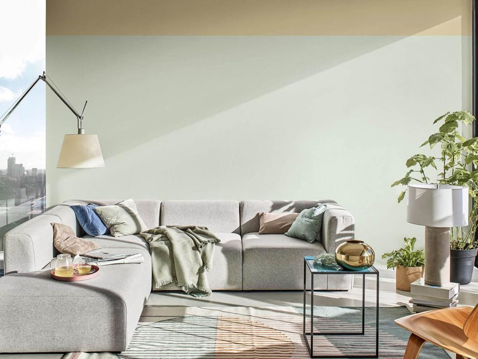
Tranquil Dawn connects our inside spaces with our outside spaces claims Dulux, and plays on the trend for all things wellbeing

The colour, in isolation, is not groundbreaking. It feels safe and almost familiar, and Marianne confirms that this was intentional. In uncertain times we crave the familiar and don’t need to be challenged by more newness in this sped up version of reality that we are living through. Tranquil Dawn is not intended to be shouty, shiny and groundbreaking. It’s the antithesis, it’s a feeling of home from home. Green has already been a massive story in interiors for the past few years but perhaps we’ve identified more of a lush hue to match in with the fascination with Biophilic design, veganism, house plants and botanical prints, all well established in our Instagram feeds. We want to nurture nature in our homes, and green is the colour of mother nature after all.

The fashion trend forecaster WGSN has nominated Neo mint as it’s colour for 2020 and my thinking is this is going to be a hugely influential, more of a refreshing spearmint than Dulux’s grey/green. As a colour, it has more energy and strength and perhaps feels more directional and thats more useful when it comes to fashion and product design. But a mass manufacturer like Dulux see’s their version of green shirking forward moving fashion and giving a nostalgic nod back to the softer celadon glaze greens. So which camp are your in? Neo mint or tranquil dawn. Is it all down to personal taste?

Just like the misty horizon that inspired Tranquil dawn Dulux predict horizontal line sin interiors to be another big trend when it comes to paint.

This is where colour forecasting can fall down as of course one colour cannot appeal to everyone and indeed a single colour effects people in different ways. One person’s tranquil is another person’s headache. I can’t see this particular hue coming to a wall in my home anytime soon, but thats not to say I don’t like it. It just doesn’t fit with my own personal palette. It also doesn’t mean it’s not a hugely versatile colour and the sentiments behind the choice I can get on board with. I can see it being used like a neutral against stronger more dramatic colours or bringing a little perky optimism to an existing all grey interior. It’s just that when I’m looking to colours that support me emotionally, make me feel connected to my best self then this colours is not my colour. So as I’m always saying, we can be interested in the trends, we can join in the conversation on how colour makes us feel, but we should never be slaves to them.

Dulux Colour of the year 2010 is “the colour that lies between the land and sky on a misty morning”. I notice that it changes quite signifiicantly depending on the light.

Want to find your happy hue? I have just two places left on my Ban the Beige workshop in London on the 10th October, where I share my tried and tested methods to help you discover your unique colour palette that works for you in your own home. Grab yourself a space here.


Dulux announce the Colour of the year 2020 as Tranquil Dawn, a soft muted green. #dulux #sophierobinson #colouroftheyear

  • colour crush
  • Interior Design
  • Interiors
House tour with Laura Jackson – Podcast show notes S4 Ep6 Back to school new intentions
  • Christmas
  • Interiors
    • colour crush
    • colour psychology
    • DIY
    • dream home makeovers
    • Home Office
    • Home Tours
    • Interior Design
    • Interior Styling
    • podcast
    • Sophie Robinson X Dunelm
    • Sophie Robinson x Harlequin
    • trends
  • Lifestyle
    • Business
    • Fashion/Beauty
    • Life
    • My House
    • Nosh
    • Travel
  • Rooms
    • Bathrooms
    • Bedrooms
    • Kids rooms
    • Kitchens
    • Living rooms
    • Outside
  • Videos
online influence award winner 2019
Interior Design Winner Sophie Robinson Insta
Videos

Listen

Listen Here

Online courses
by popular demand

Catch Sophie In All Her Colourful Glory On Instagram

April, you’ve been the reboot I needed! And it’s April, you’ve been the reboot I needed!

And it’s been a month of firsts…
First sea swim (bracing but invigorating)
First time as a mum to a 15-year-old (how did that happen?!)
First sunglasses of the year went on
First washing out on the line
And… my first proper deadlift at the gym 💪

I’m feeling full of that gorgeous spring energy now. Light, optimistic and ready for what’s next as May comes galloping in.
Who’s feeling it too?

1. Arthur’s birthday table setting
2. New bike taken out for a trip along Brighton sea front 
3. I’ve been cooking a lot for friends and family this month! Just to prove I can
4. Attended a fabulous Designers dinner to celebrate the new @wmorrisandco 
5. First deadlift with @teamyo_weight_training 
6. @interiordesignmasters is back on the box!
7. Waiting for the oak trees to break out into leaf
8. Finally got the washing line out!
9. Breathwork session with @wildwillowwellbeing @theacupuncturist 
10. New moon meditation at the fabulous home of @alexadecastilho 
11. Easter table setting 
12. . 
13. The brilliant @joshuaidehen live at @chalk
14. Movie nights
15. Suns out on Brighton Beach
16. First sea swim with @sophieabbottartist Was bracing! 
17. Mini makeover using my latest collection with @dunelmuk
18. @sophieabbottartist house ready for Artist Open Houses and Brighton festival 
19. Hair and makeup by @jadefarmiloemua 
20. It’s a wrap! Phew!
AD Sun’s out, the garden’s calling… and I might ha AD Sun’s out, the garden’s calling… and I might have just the thing! 🌸

If your outdoor space is feeling a little lack lustre, the quickest way to bring it to life is through colour, pattern and personality. You don’t need a full redesign. Just a few joyful prints, some feel good colour and you instantly shift the mood.

From bold tasseled parasols and squishy bench pads to playful outdoor lighting and characterful wall décor, my collection with @Dunelmuk is designed to make it easy and affordable. Whether you’ve got a tiny city terrace or a sprawling country garden, these are the pieces that instantly elevate a space and make it feel special.

I had so much fun creating this range, inspired by my travels to Marrakech, and seeing it come to life in real homes and gardens is always the best bit.

If you’re near Brighton, you can experience it in person as part of the Brighton Festival.
My best friend Sophie is opening her home for Artists Open Houses on the 8th, 9th, 10th May
from  11–4pm. Drop her a DM for details @sophieabbottartist 

Otherwise, you know where to go… pop into your local Dunelm or shop online and bring a little joy outdoors this bank holiday.

So Tell me, which piece are you adding to your garden first?

Beldi Parasol £89
Outdoor wall art  flowers £18
Beldi and Ourika Bench pads £45
outdoor cushions £22
Pavilion chair £69
Raid star tray £30
Mint jug £8 glasses £2.50
It’s Interior Design Masters episode 2 and this we It’s Interior Design Masters episode 2 and this week things got romantic!

The task was castle hotel bedrooms, all centred around a “romantic retreat” brief… and what I love most is how wildly different each interpretation turned out. Some designers ran with the medieval theme while others left it at the turret and went full whack whimsy. From bold and playful to soft and serene, it’s a showcase of diverse design aesthetics and proof that one style certainly doesn’t fit all.

As always, it’s not all just paint and pillows. Add in 4m-high ceilings, tricky stone mullion windows and some very traditional furniture that needed a fresh twist, and it’s no small feat. Once again I take my hat off to the amateur designers and am in awe of their creativity and ingenuity given the time and budget constraints. 

So… which room are you checking into? Let me know below 👇

@interiordesignmasters 
@frankieratford 
@jonniknightdesign 
@byajeetjugnauth 
@bensmithinteriors 
@duran_deedee 
@emmely 
@our_bears_home 
@liagoldinteriors 
@shaginterior
A little silliness, a little colour, a little faff A little silliness, a little colour, a little faffing … and suddenly life feels more beautiful 🌸

For me, it’s never just been about how my home looks. It’s how it feels to live in it. This is your reminder that creating a beautiful life isn’t about big, grand gestures… it’s built in the small, whimsical moments you make for yourself every day ✨
AD It takes an army to bring a collection together AD It takes an army to bring a collection together, and here is a sneak behind the scenes for my latest collection from @dunelmuk. 

The team is made up of photographer, stylists, art director, a team of PR and marketing folk, the social media crew, set builders, couriers, make up artists and me. Its a really busy day where we take over a location house and bring in flats for wall colour, hang pendant lights on tripods, steam bedlinen, plump pillows and arrange flowers. Its a real creative whirlwind and I feel blessed that I get to work with the best in the business. I’ve created three homewares collection with Dunelm and they have been just the best team of people to collaborate with, so this really is a happy reminder. I’m so proud of everything we have achieved, bringing my particular take on maximalism to your high street, so do check it all out in store and online while stocks last.

I’ve got another shoot, this time for my own exclusive collection at my house this week, ready for my AW ‘26 collection that will be launching very soon! Pinch me! And make sure you watch this space.
Interior Design Masters is BACK and it’s come out Interior Design Masters is BACK and it’s come out swinging…

Take ten bold new designers and give them a row of iconic British beach huts, with a first challenge that demands serious confidence. To decorate them in your signature style demands no playing it safe here.

The talent this year is strong. What I enjoyed was the brilliant mix of ideas, confidence and creativity. It’s a reminder that there is no one way to design a beautiful space… and that’s exactly what makes it so exciting.

Now I need to know…

Who would have won Stand Out Space for you?
Which beach hut are you mentally moving into?
And whose ideas are you absolutely stealing for your own home?

Watch @interiordesignmasters with @chattyman on BBC One and @bbciplayer Tuesdays at 8pm… then come straight back here and let’s get into it 👀

Also make sure to follow the budding Design Masters 

AJEET – @byajeetjugnauth 
BEN - @bensmithinteriors 
DURAN - @duran_deedee 
EMMELY - @emmely
FRANKIE - @frankieratford 
JONNI - @jonniknightdesign 
KATE - @our_bears_home 
LIA - @liagoldinteriors 
SOPHIE -  @shaginterior 
TEO - @teovillacci
Are you on board the Colour Revolution?! While the Are you on board the Colour Revolution?! While the majority of people continue to numb them selves out on neutrals a growing number of us are banning the beige and leaning into leading a full life in colour. 

The colours you love say everything about you and to you. It’s deeply personal and I’m passionate about helping people find their own colour palette. But it starts with listening to your heart. So what is your home saying to you?
A small room loves a deep rich dark colour. I knew A small room loves a deep rich dark colour. I knew that but my goodness the opinions! 

If you struggle to block out the well meant advise this is your sign to follow your gut and do what you want, it’s your house! 

This small room was once a cramped kitchen until we switched things up and made it our cosy TV Snug. I drenched the walls in the dark leathery red and its created a really atmospheric cocooning feeling, perfect for cosy movie night and box set binges. The jewel bright fabrics really pop too which is why I love it more! 

Wall colour is Cordoba @littlegreenepaintcompany . All fabrics are from my collection with @harlequinfw . Rug is vintage from @studiolidmarrakech and pictures by @beckyblairartist
Follow on Instagram
Sophie Robinson
  • © 2025 Sophie Robinson

    /
  • Contact/
  • About/
  • Design by MW

You're almost inside!

Leave me your best email to sign up for the Webinar

MG0001 Magnet Sophie using Tap 021 copy

You're almost inside!

Leave me your best email to sign up for the Webinar