fbpx
Sophie Robinson
  • Home
  • Workshops
    • Marrakech Retreat
    • Ban the beige
    • Masterclasses
  • Online Courses
  • Collaboration
  • Podcasts
  • Blog
  • About
    • About me
    • Work with me
    • Press
  • FAQs
  • Contact
  • Interior Design
  • Interiors
  • podcast
14 Jan 21

New year goals, decorating and trends, Podcast show notes S10 Ep1

So here we are at the start of a rather ‘different’ new year and although we are in another lockdown in the UK, I am pleased to report that Kate  and I are back inside our ‘duvet dens’ for more remote recording to bring you a fresj new new series of the Great Indoors podcast. In this first episode, we chat about the year ahead and ways we have found to cope withe the perpetual lock downs. We look forward to Kate’s very exciting new business venture and finally we give our views on the latest trends for this year. You can catch the full episode here.

Some of you would have seen my last post where I shared how I’m taking on 2021 and in particular my cold water therapy inspired by Wim Hof. Kate’s not quite feeling the urge to plunge into an ice bath and instead invested in a Peloton bike with the money she saved from her gym membership. How are you planning to take on the new year? Do get in touch, I’m @sophierobinsoninteriors on Insta and don’t forget our wonderful Facebook community, The Great Indoors podcast.

New Home Office

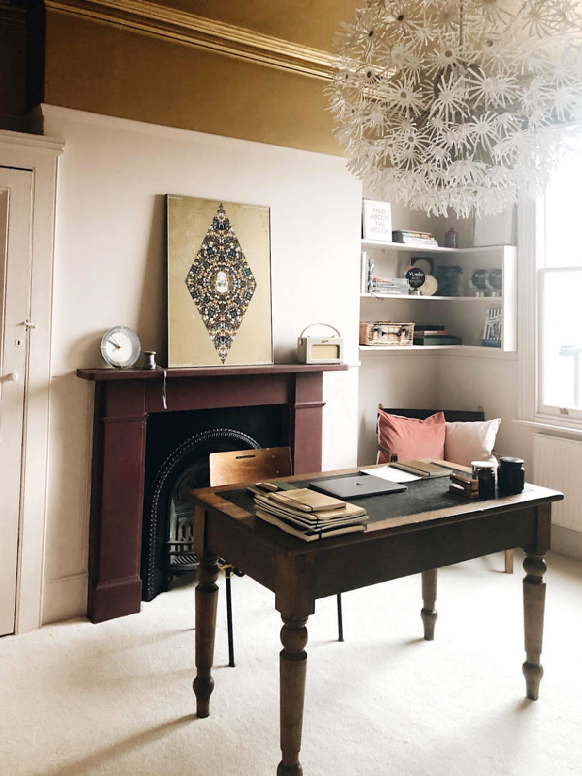
Kate will be saying goodbye to the gold ceiling in her current office

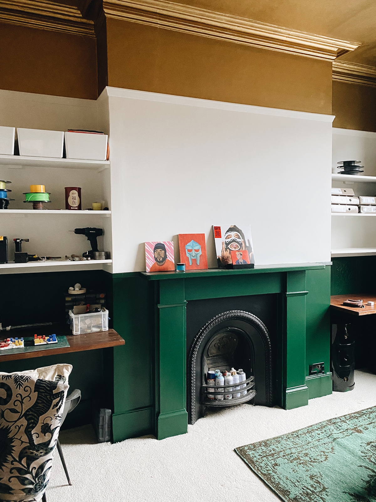
With us all now working from home again, Tom is finally in his new green office (oictured at the top of this post). I was keen to find out how the new decorating plans were going for Kate’s new office. The plan is for her 17 year old son Noah  to move into her office as she relates to his much smaller bedroom. But as Kate admits she ‘hot desks’ around the house, this is the perfect solution.

The makeover from office to teenage bedroom is achieved with a new paint colour, this gorgeous Puck by Little Greene.

Kate gave her son an ‘edited’ choice of paint colours that she would find acceptable. He was leaning towards a grey/blue and she wasn’t feeling it! He then spotted the sample of the Puck paint colour (above) and decided that was the one, so she had a paint war on her hands. Until the new Stone collection by Little Greene (launching 25th January) landed on Kate’s desk and she’s gone for Arras, a deep burgundy which she will use on panelling in gloss, just over halfway and then continue above and the ceiling with a very pale pink, Ferdinand. Personally, I think she should just go for it and do all the walls in Arras! What do you think?

The new Stone collection by Little Greene, the Arras colour as inspired Kate’s new office design- which is in progress.

Interior trends

Any normal January we would be talking about the new products and trends we spotted at all the trade shows and press events, but this year it is not to be. Despite still getting a ton of emails with new releases and trend news, I am just not feeling it! As Kate pointed out, the ‘trends’ are more about lifestyle, how we want to live our lives and how we want our homes to feel. We spending more time in our homes a lot more at different times of the day and need to transition through different feelings. From feeling focused in order to work, feeling we can zone our home to perform different tasks. Also, I think there’s is an issue with anxiety and coping with our mental wellbeing and using certain colours within our homes can help manage these issues – green, for instance, is a very soothing and grounding colour.

This is a more heartfelt way of decorating although it does pose some problems. Trends will usually tell us we have to paint our homes a certain colour, but when it comes to deciding what your happy colours are, you have to do a bit more work. I am running my Colour Psychology course this month and it’s already proving very popular as I think people are realising that it’s not a ‘one size fits all’ and perhaps you’re not confident with your relationship to colour and style and perhaps you are swayed by those around you.

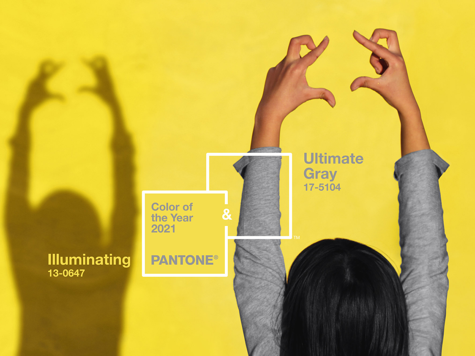
The recently announced Pantone Colour of the Year, Ultimate grey and Illuminating yellow was, I thought, quite an interesting mix, balancing an optimistic yellow with a more steady grey. Whereas Kate saw it as an endless road with double yellow parking lines. Just further evidence on how we all react to colour in very different ways. Even though Pantone does not predict colours just for interiors, I think this duo works really within a scheme. You have the calming influence of the grey which is cool and restful and then sliced through the sharp, tangy yellow and is a great opportunity to experiment. No, it’s not a new combo, we’ve seen it revived a few times since the Mid-Century era of design and is still going strong at Mini Moderns. We agreed that this time round trends were more about your lifestyle and how you want to feel and how to make your space work for you, rather than following a colour, pattern or look.

Online shopping

The Design Storey navigation floorplan.

There’s no doubt that the pandemic has made us into a nation of online shoppers and we may have discovered that we actually need more for our homes and all its new uses. Joining the retail world is our very own Kate, who will be launching Design Storey this Saturday (16th Jan) and I am so excited to see it!

The online shop idea sprang out of the frustration of trawling through pages and pages for the one item you want to buy, apparently otherwise known as doomscrolling! So it is essentially an edited collection of the best 50 best… sofas, table lamps, rugs etc., with ten on a page and 5 pages – simple (and genius!). Do check it out at Designstorey.shop, on instagram @designstoreyshop and Kate explains all about it in more detail here.

A huge thanks as ever, to our fab producer Kate Taylor, from Feast Collective. It’s great to be back and honestly our wonderful community of listeners gives us such a boost so thanks for all the likes and DM’s, your shares on social media and of course those raving reviews. We really appreciate the support during these testing times.

Green office credits: Walls painted in Sage & Onion, window in Lamp black, both Little Greene; Blind made by Willow & Bert Interiors, in Textile under Ekvatorn by Joseph Frank, Svenskt Tenn; Vintage Eames chair, Vine Street Vintage; Desk from Ikea, no longer available; Cushion, Fanny Shorter; Seagrass flooring, Alternative Flooring.


  • Interior Design
  • Interiors
  • podcast
5 ways to get inspired for your interior schemes How to take on 2021

comments

kiril polonsky on 02.02.21

Excellent post and am glad to read it. Thank you so much your idea very helpful and again thanks for sharing.

Reply

Leave a Comment

Cancel Reply

Your email address will not be published.

  • Interiors
    • colour crush
    • colour psychology
    • DIY
    • dream home makeovers
    • Home Tours
    • Interior Design
    • Interior Styling
    • podcast
    • trends
  • Lifestyle
    • Business
    • Fashion/Beauty
    • Life
    • My House
    • Nosh
    • Travel
  • Rooms
    • Bathrooms
    • Bedrooms
    • Kids rooms
    • Kitchens
    • Living rooms
    • Outside
  • Videos

mailing
list

Videos

Listen

Listen Here

Online courses
by popular demand

Catch Sophie In All Her Colourful Glory On Instagram

Ah @the_rhs Chelsea! What a feast for the eyes! In Ah @the_rhs Chelsea! What a feast for the eyes! Inbetween biblical downpours, thunder and lightning, it was a wonderful day of colour, design and chatter with some wonderful women! I’m slowly falling in love with gardening and my phone roll is full of inspiration after being immersed in natures finest. Thanks @michelleogundehin and @hazelgardinerdesign @thesohoagencyuk for the company. And a big congratulations Hazel on this stunning floral installation. And don’t forget if you want to hang out and be inspired by all things colour then my FREE live webinar is on tonight (25th) at 7pm tonight! Hop on to my profile for the link to sign up. Cannot wait to share some inspirational colour filled time with you all 

#rhschelsea
This is the first room we decorated after our reno This is the first room we decorated after our renovations. The entrance to your home creates the first impression. It’s also the room you walk into first thing in the morning and when you return home at the end of a long day. It needs to create the right welcome and what that feels like is hugely personal. For me I chose my favourite colours, this powerful cobalt  blue has always been a colour I’m drawn to. My wardrobe is full of it. And the bright pink is another one that always makes me instantly happy. Together they are a striking combination and I think anyone who walks through my front door, immediately gets a sense of what I’m about. I’m passionate about creating interiors that authentically  reflect the people who live there. Studying the psychology of colour made it so much easier for me, giving me a deeper understanding on the affects of colour and streamlining my process. If you’d like to know how to unlock your colour super power, join me for a free webinar this Wednesday evening (available to up for 48 hours after). It an introduction into colour psychology for interiors and my hope is it inspires you to have the courage and conviction to know what’s right for you.  And for a deeper dive my online course Colour Psychology for interiors has opened for enrolment. All links to sign up are in my bio on my profile @sophierobinsoninteriors 
What does your hallway say about you? 
📷 @aluncallenderphoto 
CREDITS walls in lazuli by @zoffanyfw stair runner @roger_oates floor tiles @claybrookstudio door painted in rose ash @sanderson1860 

#colourpsychology #colourpsychologyforinteriors #banthebiege #punchyhome #hallway #boldcolourinteriors #colourlover
My kitchen, the heart of my home. The smallest, da My kitchen, the heart of my home. The smallest, darkest room in the house with no view, but that’s old houses for you! You’ll often find the kitchen in the worst place. So to amp up the joy I chose a forest green (hunters green by @zoffanyfw) for the cabinets to mirror the woodland outside. We sourced reclaimed school science lab work tops and I wrapped the room in one of my favourite papers, Rubarber by @borastapeter. Tom put in retro fit underfloor heating and we used reclaimed terracotta tiles from @ca_pietra_  so the floor looks as old as the house but feels so warm! . For the ugliest darkest room in the house it’s become our favourite because of the colours, patterns and rustic textures.that’s the power of great interior design! 
Next up in my series of posts about the psychology of colour is the Autumn personality. You’ll have a love of rich deep warm Colours, natural finishes, nature inspired patterns and period features. The autumn palette is warm, earthy abs rich and perfect for making spaces feel cosy and inviting. 
To learn more about the autumn personality, hop on up to my bio and click the link to be taken to the blog. And you can sign up to my FREE webinar I’m hosting next Wednesday if you’d like to learn more about this powerful framework. 
Meanwhile have a gorgeous weekend! 
📷 @aluncallenderphoto Styling @katemcphee 

#colourpsychology #banthebeige #autumnpersonality #colourpsychologyforinteriors #kitchen #greenkitchen #countryhomesandinteriors #countrykitchen #ihavethisthingwithcolor #myeclectichome #maximalistdecor
Come and join my FREE webinar on Colour Psychology Come and join my FREE webinar on Colour Psychology next Wednesday 25th at 7pm GMT 🤩 hop on up to the link in my bio @sophierobinsoninteriors to register.
My brilliant online course, Colour Psychology for Interiors, is open for enrolment this month, so if you fancy finding out a bit more about this utterly game changing framework I’d love to have you join. It’s SO MUCH more than ‘ red is energising’, ‘blue is calming’ stuff you’ve all heard before. This is a deep dive into discovering how colours work, how to harmonise them and discovering your own unique and authentic style. Only then can you create a home you live and one that supports you emotionally. I LOVE teaching this stuff because the feedback I get from students is mind blowing! Don’t take my word for it, sign up for the free webinar today! 😍 and if you’ve already done my course, please share in the comments below what you loved about it. 

#colourfulhome #colourpsychology #colourpsychologyforinteriors #banthebeige #colourlover #confidentcolour #confidentcolourscheming
Have you found your design mojo? Do you gravitate Have you found your design mojo? Do you gravitate towards a style of interiors that just feels so ‘you’. Making a home is so much more than creating beautiful squares for Instagram. It has to FEEL right and this is where the psychology of colour comes in. Colour is light, it has an energy which directly impacts your brain and emotions. And we all have a unique relationship to it. So rather than follow the crowd, be swayed by trends it’s so important to understand your own authentic relationship with colour. Over on the blog today I’m starting a series of posts all about the seasonal colour personalities. First up is spring which is all the joy, uplift and energy. My bathroom, pictured above, is very ‘spring’ with light reflecting walls, energetic patterns and bright colours. The mood  is uplifting, fresh and feel-good. Hop on up to my link in my profile to read the blog post in full and discover if you are a Spring personality and how to create rooms that reflect this joyful mood. 
Tap for credits
📷 @aluncallenderphoto 

#colourpsychology #colourpsychologyforinteriors #banthebeige #colourfulhome #colourlover #ihavethisthingwithcolor #spring #springbpersonality #colourfuldecorchallenge #homedecor #myeclecticmix #bathroom #bathroominspo
So proud of mr best mate @sophieabbottartist who o So proud of mr best mate @sophieabbottartist who opens her house this weekend to showcase her artwork in her home as part of Brightons artists open houses. She’s always been a creative whirlwind and keeps the joy of colour alive in her paintings inspired by the sea, and the local woodlands that surround her home in Brighton. For Sophie, colour gives her life, she’s the ultimate joy monger and I’m so blessed to have her as my side kick in life. If you get a chance today, pop round to heed for a bolt if the feel good vibes

#artistopenhouses #brighton #colourlover #banthebiege #ihavethisthingwithcolour
When you find the palette of colours you love, you When you find the palette of colours you love, you just wantto surround yourself  in every part of your home! This painting by @studiocoverdale really hits the mark for me, with all my favourites on one place. Today I’m opening my most popular online course, ‘Colour Psychology for a interiors’, ready  for your enrolment. This is my most popular and indeed  powerful course. It gets to the core of how colours work in harmony , how they effect you emotionally and how to bring all the design and pattern  elements together to make your home and your heart sing! I’m a Spring personality, and with that I adore all the busy patterns, bright and vibrational colours, plenty of pretty details and preferably all at once! While typical spring personalities prefer a more delicate and soft colour palette, my secondary season is Autumn, which prefers richer and punchier shades. Combined together my home is unique and perfect for me. I honestly rarely want to leave the house! And while this framework is an amazing tool for interior design, it’ll also give you colour confidence in every area of your life including your wardrobe. I can’t recommend it enough. When I started implementing this framework  in my own design practice six years ago it was absolutely game changing! While I’ve  always been confident with bold colour, this insight gave me the clarity to speed up my design process and get it right every time! Hop on over to the link in my bio to find out more. 
📷 @aluncallenderphoto 
#colourpsycholgy #colourlover #banthebiege #colourfulhome #colourmyhome #maximalistinteriors #boldbravebeautifulinteriors #dopaminedressing #dopaminedecor
The power of paint! I’ve been extolling it’s v The power of paint! I’ve been extolling it’s virtues my entire career. Roll a bold new hue on your walls and voila! Game changer. But on our recent podcast @mad_about_the_house explored the wider impact of paint on the environment. An astonishing 50 million litres makes it into landfill each year so it feels like, as serial decorators, we could all club together and do our bit to bring that figure down. 
It’s a minefield but over on my blog today I sum up my tips on how we can easily use less of it and round up the paint brands who are doing their bit to tackle the issues. From the ingredients in the tin, to recycling waste paint, to using pouches rather than tins, there is plenty of innovative ideas. Choosing natural paint feels like a good option and if you’re hooked on designer paint colours, it’s no more expensive. Last year I painted my bedroom Turquoise by @edwardbulmerpaint and I’m thrilled with the colour, quality and durability. Just goes to show lovely paint doesn’t have to cost the earth. Hop onto the link in my profile for the full post and if you know if a paint brand who are tackling the environmental issues raised, please give them a mention in the comments below.

#ecopaint #ecodecor #ecohome #paint #turquoise #bedroom #podcast #banthebiege #colourfulhome #colourlover #itsonlypaint #interiordecorating #interiordesign #colourscheme
Load More… Follow on Instagram
Sophie Robinson
  • © 2017 Sophie Robinson

    /
  • Contact/
  • About/
  • Design by MW

Don't forget to join!

You're almost inside!

Leave me your best email to sign up for the Webinar