ULTIMATE MAXIMALIST COURSE BUNDLE - £400+ Savings - JANUARY SALE

Sophie Robinson
  • Home
  • Workshops
    • Marrakech Retreat
    • Home Masterclass
  • Online Courses
  • Collaboration
  • Podcasts
  • Blog
  • About
    • About me
    • Work with me
    • Press
  • FAQs
  • Contact
  • colour crush
  • Interior Design
  • Interiors
01 Oct 18

Sanderson launch fifty new paint colours

JT 0363

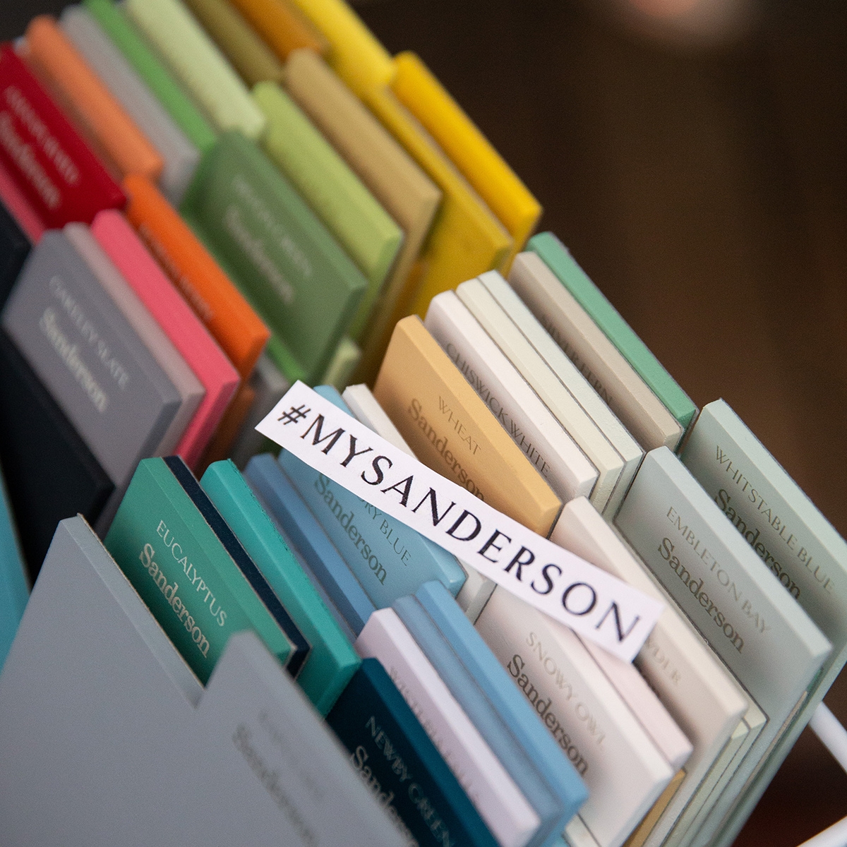
I recently hosted a wonderful Colour event for Sanderson to celebrate their launch of 50 new mouth-watering paint colours! I’ve always been a massive fan of the Sanderson brand, as a bastion of great British design and manufacturing, with all paints and papers manufactured here in the UK. I’ve also loved using their classic paints and fabrics throughout my interior design career and it’s always made it super easy that the paint, wallpaper and fabric collection are all designed to combine effortlessly. However when I found out they were dedicating a further 50 new colours to join the 104 on their current paint chart I couldn’t wait to find out what was in store.

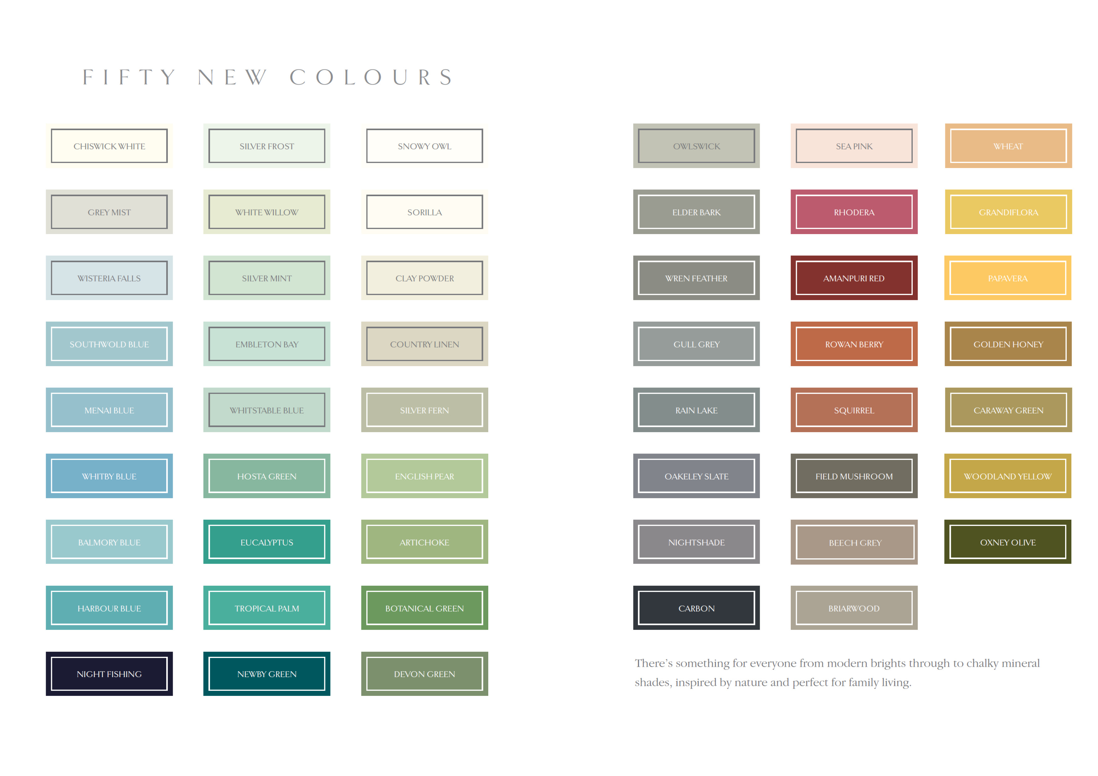
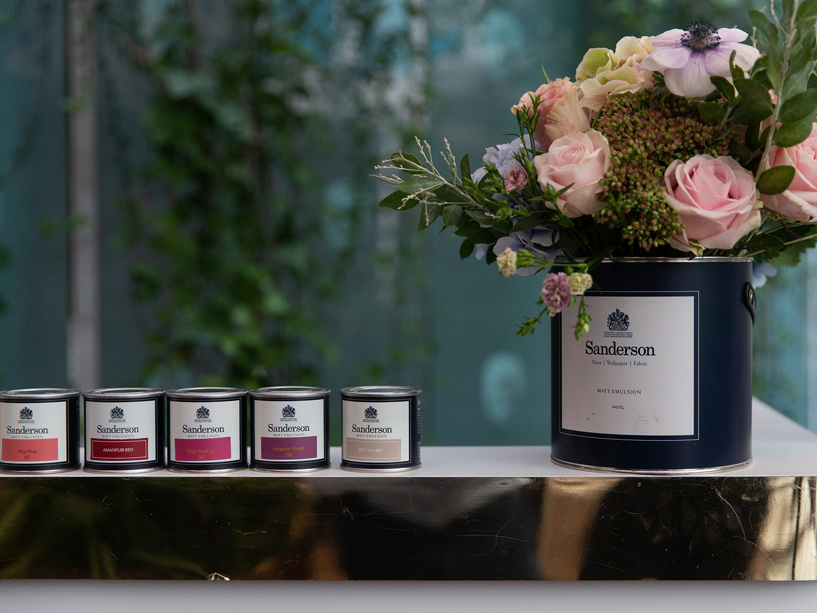
So the stable of the new range falls into the greens and blues palette, but with eight news greys, a smattering of neutrals and more tellingly some rich reds and ochre’s (which as a colour trend that’s coming next) it’s a well rounded bunch. There is a really sexy hue called Night fishing, which is a deliciously inky dark navy. I’ve used this recently on a DIYSOS project (yet to be aired) and it looked incredible! It has wonderful depth and drama and looks spectacular on all walls and woodwork. But overall I’d say the new colours are very liveable- all on the earthy Autumnal spectrum they will work perfectly in the UK’s northern light and bring warmth to any room, whether you go for the dramatic darks or easy to live with neutrals.

Interior designer Sophie Robinson hosts Sanderson Style Library colour event moodboarding

For my part in the launch I hosted a colour workshop for 18 hot-to-trot influencers in the most amazing setting, The Sanderson Hotel in Berner St, London. It was a favourite haunt of mine during my time working on magazines, where I do remember many a late night spent in the fabulous garden bar, supplementing my BBC salary by accepting drinks off flashy rich bakers, before me and my girlfriends hot footed it off into the night. But that’s a whole other blog post. Or maybe not! Needless to say it was the perfect setting to celebrate all things design. The amazing post modernist building was originally the head office for the Sanderson brand, before being reincarnated as a five star hotel in the nineties so it has great resonance for the design heritage of the Sanderson brand.Interior designer Sophie Robinson hosts Sanderson Style Library colour event moodboarding

But the Sanderson event was a much more grown up affair. I treated the guests to a VIP snippet of my Colour Psychology workshops, and using the new paint, paper and fabric collection, inspired the influencers to produce mouth-watering boards that reflected the mood they wanted to create in a room, rather than just focusing on the look. It was an amazing morning of creativity and I just loved to see the wide breadth if colour palettes and designs that were produced, as I pushed a few of the designers to think outside their comfort zone and start designing in a new and more focused way.

Interior designer Sophie Robinson hosts Sanderson Style Library colour event

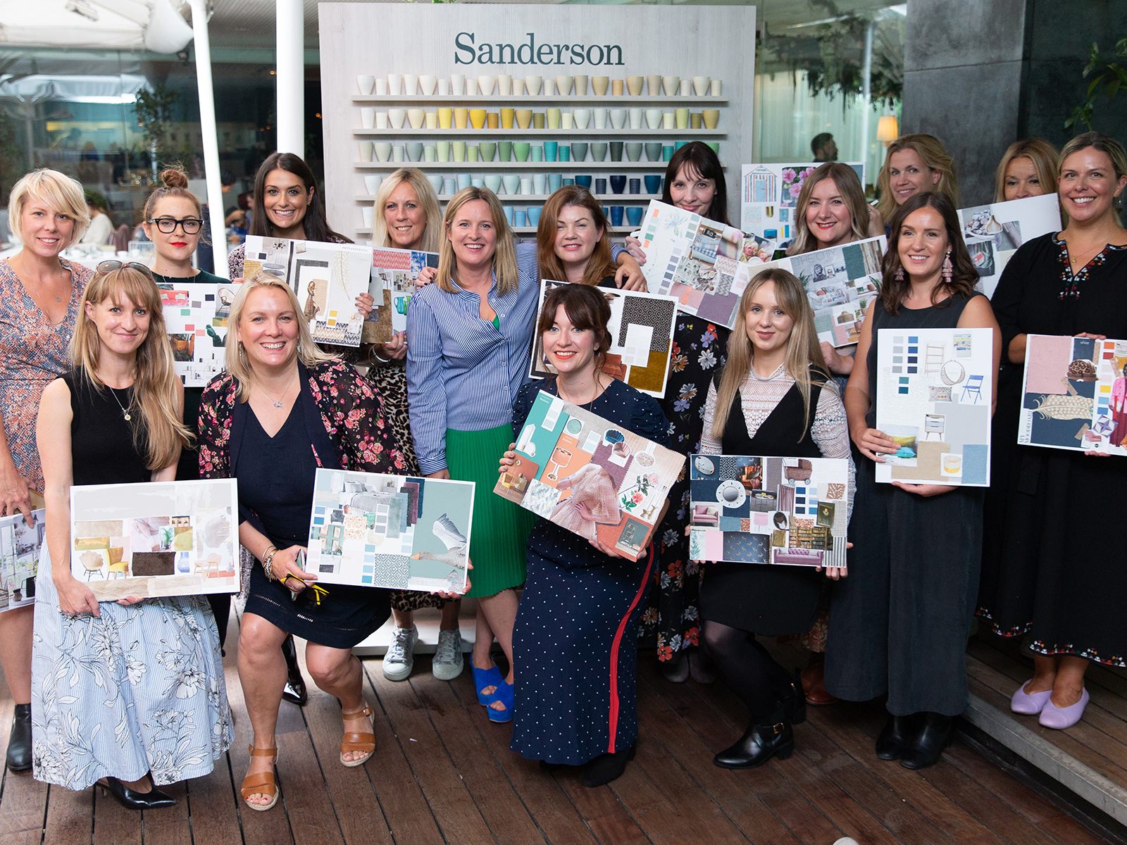
The colour workshop with the UK’s top interiors influencers was a huge success. Can you recongnise the faces of some of your favourite instagram accounts?

And it really inspired me too, as the Sanderson paint palette is where I’m completely at home. There are rich and intense brights but they all have lovely chalky warmth to them too. I’ve got my eye on Sea pink next, I think it might just be the right pink (for their are so many wrong ones!) for my living room re design.

Shaker style kitchen with metro tiles for amodern country look. green painted kitchen units in sanderson paints devon green

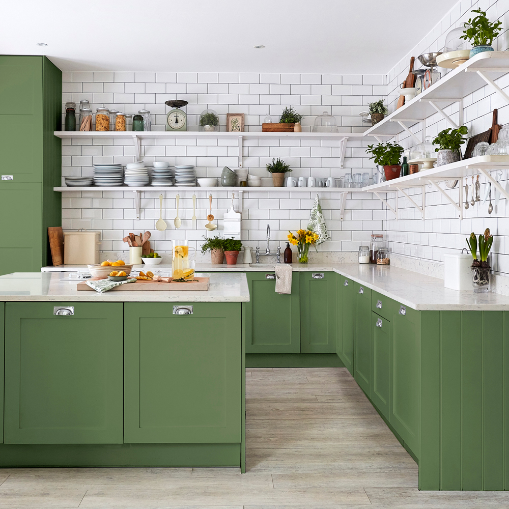
Green painted kitchens are set to be the next colour trend. This Devon Greene by Sanderson is the perfect tone for a modern country look.

inky dark blue batroom with tongue and groove panelled walls walls painted in Newton green by sanderson

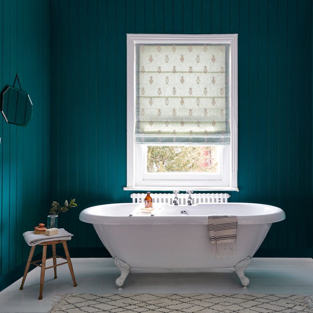
I love to see tongue and groove panelling used instead of tiles in bathrooms. This Newby Green from sanderson is cosy and cocooning but has a lovely deep warmth to it too.

lilac grey is set to be the new trend in interiors. this is oakley slate by sanderson

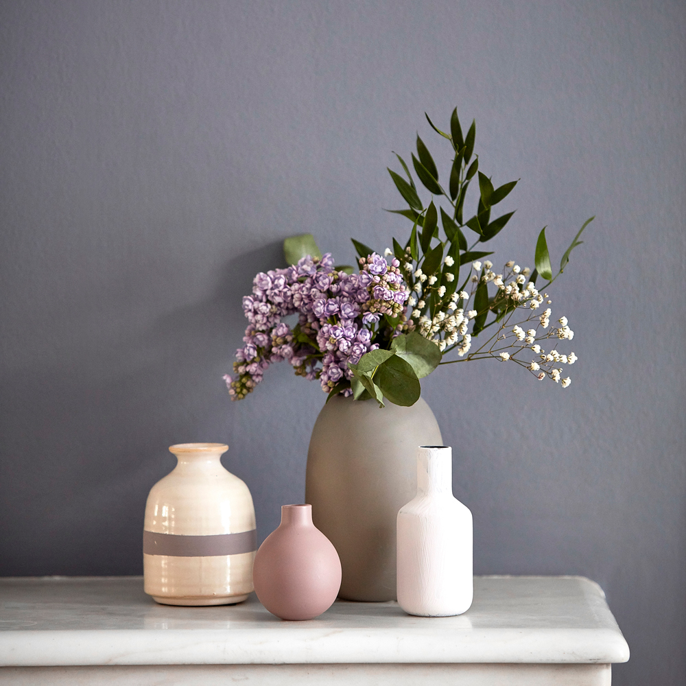
Pinks and cool lilac’s are set to replace grey as the go to neutral. This oakley Slate by sanderson is the perfect choice because it’s Elegant and understated and works well with other neutral tones.

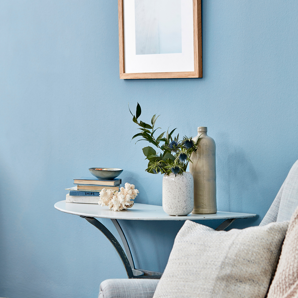
Blues are set to get brighter and this Menai blue by Sanderson is very livable. It reminds of of the coastal blues that we get here on the south coast and similarly it can be restful and uplifting at the same time.

sanderson paint palette

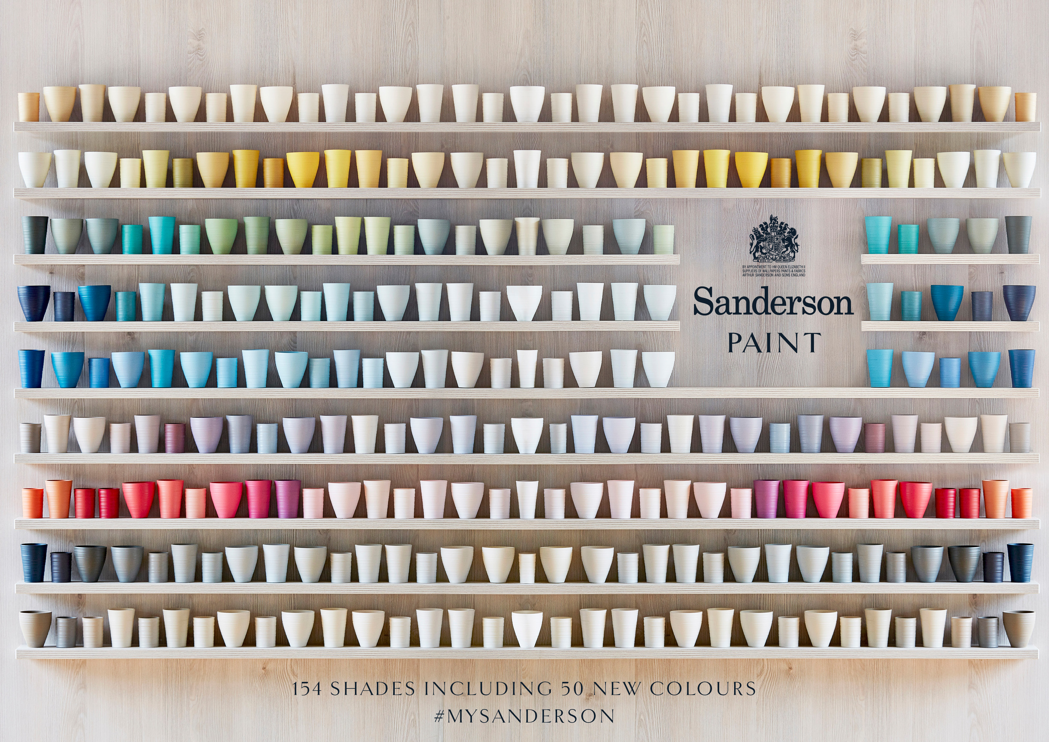
The complete collection of 104 colours, so beautifully illustrated on these delicate hand thrown clay pots.

Sanderson paint comes in three finishes – Active emulsion for busy family homes with the lowest sheen finish for high performance areas, Water-based eggshell, and Oil based eggshell. You can find out more on the Style Library website here.

Interior designer Sophie Robinson hosts Sanderson Style Library colour event new paint collection flowers

  • colour crush
  • Interior Design
  • Interiors
What you need to know about overlay water underfloor heating Dulux announce the Colour of the year 2019- my thoughts!
  • Christmas
  • Interiors
    • colour crush
    • colour psychology
    • DIY
    • dream home makeovers
    • Home Office
    • Home Tours
    • Interior Design
    • Interior Styling
    • podcast
    • Sophie Robinson X Dunelm
    • Sophie Robinson x Harlequin
    • trends
  • Lifestyle
    • Business
    • Fashion/Beauty
    • Life
    • My House
    • Nosh
    • Travel
  • Rooms
    • Bathrooms
    • Bedrooms
    • Kids rooms
    • Kitchens
    • Living rooms
    • Outside
  • Videos
online influence award winner 2019
Interior Design Winner Sophie Robinson Insta
Videos

Listen

Listen Here

Online courses
by popular demand

Catch Sophie In All Her Colourful Glory On Instagram

Not going to lie, this might be one of my proudest Not going to lie, this might be one of my proudest makeovers ever…
My Dad and Mary’s modern French villa was all beige tiles, white walls and zero personality. So I did what I do best: turned it into a technicolour dreamscape inspired by the countryside views outside those gorgeous bifold doors.

Inspired by early  autumn leaves, emerald green fields, and piercing blue skies we set about making the inside of their home feel as joyful as the outside … now imagine all that bottled up into wallpaper, fabrics, cushions and colour-drenched furniture.

If you’ve ever thought bold colour overwhelming or that pattern was too much for open-plan spaces… this one’s for you. Because colour and pattern sings in nature, and it can work just as well in your home decor.

All wallpapers, rug and cushion fabrics are from my collection with @harlequinfw. Painting by @sophieabbottartist 

Full sourcing list, extra styling tips and a deeper dive into the design story are up now on A Life In Colour: head to my Substack via the link in bio to read more!
End of January check-in… and yes, the struggle to End of January check-in… and yes, the struggle to stay joyful is very real right now. Dark mornings, grey skies, energy running low.

That’s exactly why our homes matter so much at this time of year. They are our sanctuary. The place that should lift your mood, calm your nervous system and make you feel held when the outside world feels a bit, how can I put this...relentless. And this isn’t just a feeling or a design philosophy. It’s backed up by science. Research shows that colour, light, beauty and nature in our homes have a direct impact on mood, wellbeing and happiness. Small, intentional changes really can shift how you feel day to day.

I’d love to know… what brings you the most joy in your home right now? A colour, a room, a plant, a view, a ritual? Share it in the comments 💛

And if you’re ready to go deeper, my big January Sale ends this week.

If you want to truly understand colour psychology and learn how to curate a home that feels joyful, confident and completely you, comment ULTIMATE and I’ll send you the link to my online design school and your opportunity to make the biggest saving of the year.
These are the ingredients to making your home feel These are the ingredients to making your home feel as good as it looks. 

• Confident colour that creates the mood
• Beautiful pattern that delights the eye
• Layered texture that brings it all alive
• Personality in every corner, so it feels like home

Magic happens when you stop playing it safe and start designing a home that truly reflects you. A home that feels joyful, expressive and alive. But designing a home can feel overwhelming. Where do you start? How do you combine colours without it feeling chaotic? How do you clash patterns so it looks considered? How to express your unique personality without merely copying other people’s style?

That is exactly why I created my online design school. After more than 25 years as an interior designer, I have distilled my design process into clear, easy-to-follow courses that take you step by step through combining colours, balancing patterns and adding texture, so you can decorate with confidence and creativity.

And right now, my January Sale is on. You can save a huge 60% on my transformational courses, designed to completely change how you approach your home and how it makes you feel. If you are ready to embrace your creativity and deepen your passion for interior design  comment ULTIMATE and I will send you all the details.
Think Maximalism is ‘too much’, too messy, or only Think Maximalism is ‘too much’, too messy, or only for other people? 

I’m here to tell you: maximalism isn’t chaotic. It’s just misunderstood.

Once you understand how colour and pattern work together, decorating like a maximalist stops feeling intimidating and starts feeling instinctive. Your home starts feeling like you.

If you want to design your home with confidence, my Ultimate Interiors Bundle is exactly what you need. It includes three self-paced online courses that take you inside my design process, teaching you how to use colour and pattern so you can make bold choices that actually work, again and again. 

Right now, the Ultimate Interiors Bundle is a massive 60% off. Buy now, enjoy the saving, and start whenever you are ready to create a home that is completely yours.

Comment ULTIMATE and I’ll DM you the link to find out more.
Welcome to my witchy era! Who else wants to harnes Welcome to my witchy era! Who else wants to harness the Year of the Horse and use this dynamic energy to manifest your best year yet! 

A vision board is like a compass that will lead your goal settings and intentions with total clarity. To prepare i like to take lots of long walks and meditate on what it is so want more of in my life while gratefully letting go of what no longer serves me. 

Join me Wednesday for a live webinar on how to I create a Vision board that will ignite your passion and motivation to live a bold, creative and colourful life! Comment VB26 for the link.
Dark and moody colours can feel intimidating, but Dark and moody colours can feel intimidating, but my TV snug shows just how well they can work. The deep tones soften the space and create a calm, cocooning atmosphere, perfect for evenings spent watching TV, or retreating from the day.

Contrary to what you might think, this room really comes into its own in winter. Low light and long evenings make the colour feel enveloping and cosy. It’s a space that invites you to slow down, sink in, and make yourself comfortable.

I sampled so many different paints but Cordoba by Little Greene was the perfect choice for this room. It’s full of depth and warmth, and just the right amount of drama. 

And if you’re thinking about taking the leap yourself, my tip is: don’t fight the natural light you have, lean into it. Don’t be shy about colour drenching walls, woodwork and ceiling so the room feels seamless and intentional. In my snug, that richness is what makes it feel cosy and complete.

There’s no place I’d rather be on chilly evenings.
How do I explain this feeling to a minimalist? To How do I explain this feeling to a minimalist?

To some people this might look like too much, but for me, maximalism isn’t excessive, it’s pure self expression. I decorate my home to reflect the way I live and that’s full of bold uplifting, joy-giving colour. Every patterned textile, every artwork, every joyful little object earns its place because it makes me feel happy. 

And if I’m being honest a neutral room doesn’t make me feel calm, it makes me feel slightly depressed. My home lifts my mood, fires my creativity and gives me a little thrill every single day.

Now tell me… are you Team Minimal or Team Maximal? And what makes your heart sing at home?
There’s something about walking that has quietly h There’s something about walking that has quietly held me together this past year.

When life threw its challenges my way, my anxiety went into overdrive. I lost clarity, my head was foggy, and the overwhelm shut me down. But walking, one step in front of the other, slowly moved me in the right direction.

We all know walking is good for the body, but it’s also one of the most powerful tools for the mind. Moving helps process stuck emotions, those steady steps soothe racing thoughts, and the changing scenery opens up fresh ways of thinking. Being in nature grounds you. And the best part is, it’s free.

Whenever I’m preparing a new vision for my year or any creative project, I always start with a long solo walk. I take my journal, let the thoughts tumble out, and begin to find a clarity and direction again. Next step is to use my creativity to create a powerful vision board full of images that resonate with how I want to feel and who I want to be. Less of a to do list, more of an emotional reset. This works for me as it brings in the light, and more importantly keeps me inspired and motivated.

If you’re ready to gently clear the fog and get clear on what you want more of, my ‘Life in Colour Vision Board Masterclass’ is now on sale. I’m hosting on the 21st January, 7pm GMT (with a recorded replay available). Comment VB26 below and I’ll send you all the details. 

Can’t wait to see what we can create together this year!
Follow on Instagram
Sophie Robinson
  • © 2025 Sophie Robinson

    /
  • Contact/
  • About/
  • Design by MW

You're almost inside!

Leave me your best email to sign up for the Webinar

MG0001 Magnet Sophie using Tap 021 copy

You're almost inside!

Leave me your best email to sign up for the Webinar