Shopping online and interview with Ruth Mottershead-Podcast show notes S10 Ep6
Hello and welcome to my show notes for the last episode of the Great Indoors podcast Series 10! I can’t quite believe we’re at the end of yet another lock down series and I would like to say a huge thank you to my wonderful co-host Kate Watson-Smyth, our fab producer Kate Taylor from Feast Collective for working her magic and of course our lovely listeners. Don’t forget to join our wonderful interiors community on Facebook and please do rate and review as we do read each and every one!
On with today’s show..
We offer a helping hand when buying furniture online – something most of us have had to get used to and we chat with Ruth Mottershead, Creative Director of Little Greene about their new Stone collection.
Buying furniture online
If, like Kate (and myself if I’m being honest) you find yourself buying things that are much smaller in reality than you had hoped, fear not, we have some helpful hints to save you the agony.
One common problem is ordering a sofa to find out that it won’t fit through the front door (speaking from experience) and it is very difficult to measure for that, especially around corners. Measuring is always a must whether buying online or in-store, but for big investment pieces, I find it very challenging not seeing the sofa in the flesh, trying out a bed or sitting around the dining table – but these are times where needs must! So here are some top tips:
- Look at the details further down the listing – what materials are used, is it flat-packed (these can be a little more flimsy), is it laminate, solid wood or chipboard?
- Look out for sustainability notes – does it used FSC timber?
- Look at the company’s images, if they have a beautiful Instagram account and their lifestyle shots of the furniture are beautifully styled and photographed then that usually reflects on the quality of the product.
- Delivery – will they offer a white glove delivery – which means they will assemble it for you. Some will charge, some do free, some will take away your old pieces. Getting rid of large pieces of furniture can be an extra cost and a real hassle so do look into that beforehand. Will they take the packaging away?
- Think about all the questions you would ask in a showroom – you may have to do quite a bit of research.
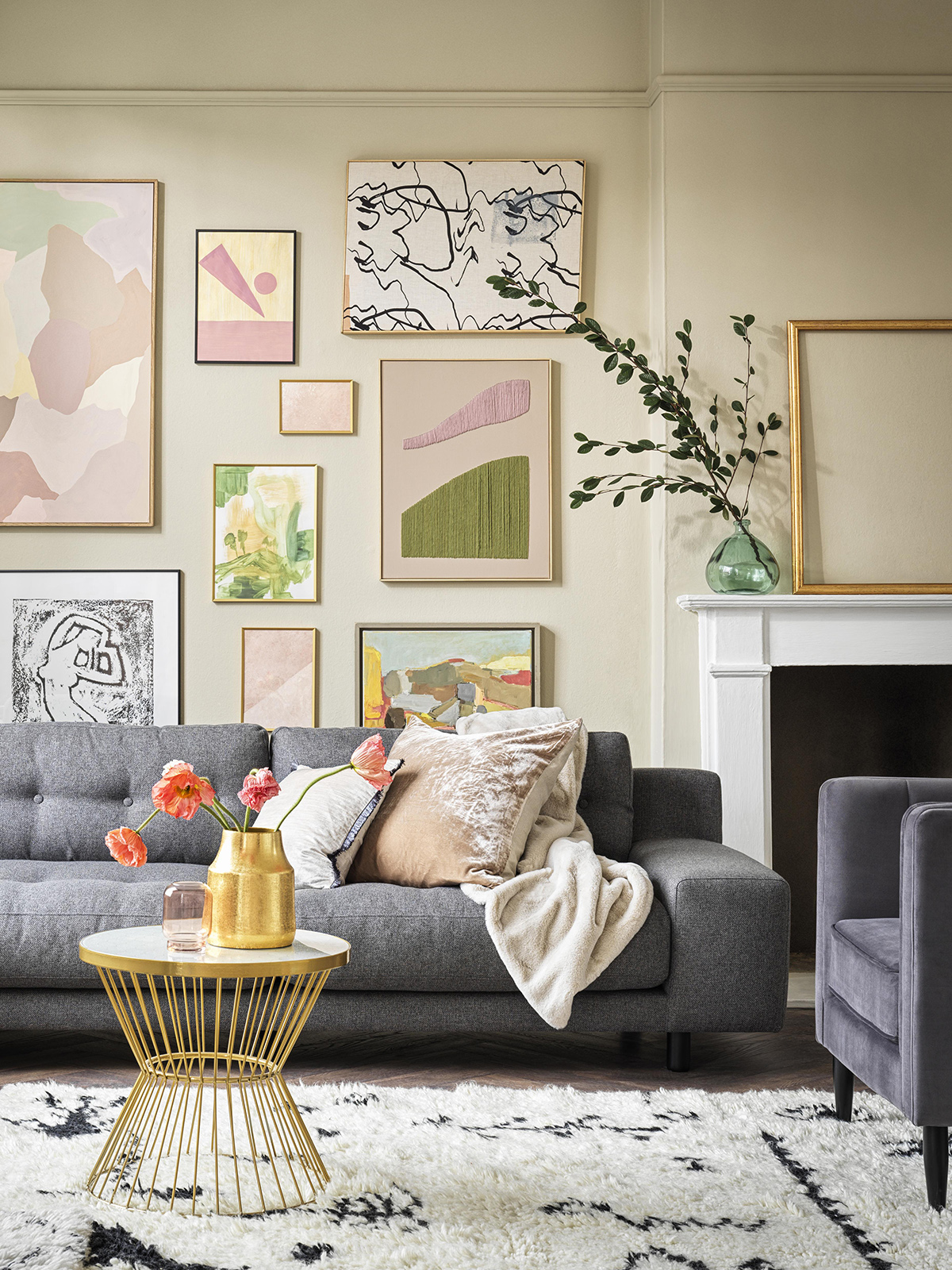
Hendricks 4 Seater Sofa, Habitat
Measuring: There was a bit of a dispute when it comes to passageways, Kate thinks you should have a minimum of a 90cm gap, especially between the sofa and a coffee table to be able to walk through with ease. When it comes to a dining table and chairs you do need space to get in and out of your seat of course. I’m quite a fan of masking out on the floor to help visualise the furniture within the space – some people go as far as using cardboard boxes!
Beds: If you think you have space for a king size mattress, for example, do remember to check the dimensions of the bed frame as you may find it quite a bit wider than the mattress. The positive thing about buying online is that you have every single measurement in front of you to double-check it will all fit in your home.
Mattresses – many online companies now send out their mattresses in a tightly bound roll and even pillows are neatly packaged making it super easy to access the tightest of spaces. A mattress is a big investment and it so important to get right, so do check out the return policy and whether they will soak up the cost of the return.
Samples: You know me I love a mood board and have collected quite a ‘few’ samples over the years. If you are ordering an investment piece online it is really important to get all the material samples – even in colours you may not have naturally gone for. You need to see it in the natural light, how it will work with the rest of your decor and have a good old feel of it. Some companies may charge for samples but it’s worth it otherwise you’ll be stuck with furniture you may not be happy with.
Reviews: I do love a review, I always scroll down! These can be quite useful as a guide – if the colour appears different to what’s shown, or if it’s as expected, is the customer service good, was the delivery hassle-free, etc etc. You do still need to be cautious and only order from a reputable company, go on recommendations and check out review sites like Trust Pilot.
If it looks too good to be true – it probably is too good to be true. As Kate pointed out, rugs, for example, you may think you have spotted a beautiful Persian rug for a steal but it is actually a printed design and not the real thing – there’s nothing wrong with a printed design, you just need to be sure what’s on offer.
Perusing: When you think about how much stuff is out there it can be very overwhelming, especially on the big key brand sites. Make sure you nail down your word search, the more info you include the less you will have to trawl through.
Kate has filtered out the choices for us with her online offering, Designstorey.shop where she has curated a selection of ’50 best’ to help take out the faff of endlessly searching and also inspire your decision.
I really hope that things will change and we will once again be able to shop and see things in reality. Do get in touch if you have any tips and tricks for buying online, @sophierobinsoninteriors @mad_about_the_house
Interview with Ruth Mottershead
Ruth Mottershead’s Instagram handle is @_paintgirl and it couldn’t be more fitting. She is the Creative Director at the small but very successful paint company Little Greene, which in its current form was founded by her father, David. Although it originally started its life back in the 1700s as the Little Greene Dye Works which made paint and dyes of the cotton industry. Now it is known and loved for its environmental values, gorgeous paint, wallpaper and fabulous colours and patterns that bring them to life.
Now, Ruth has one of my dream jobs and I visualise her in her lab coat and glasses concocting all sorts of paints and colours. Is this a true representation of your day to day job?
“Not quite. My job mainly covers design and marketing and creative direction for the brand, although I do give direction to our technicians and scientists in the lab creating new colour sand heavily involved in creating new wallpaper collections.”
Little Greene currently has 238 colours in the collection, which can be overwhelming. Seasonally they create a tight edit of colours on a scale colour card, the most recent one, The Stone collection features 36 colours.
I’m having palpitations at the thought of beige coming back. What are your thoughts behind this collection?
“I think beige has a bit of a bad reputation, does it deserve the bad press it gets? Beige quite simply is a mixture of yellow, brown and white and these new colours are much more complex, there are lots of different pigments and undertones.
We define a neutral as anything you can make with a naturally occurring pigment. So a neutral doesn’t have to be an off-white, beige or magnolia, it can be the rich dark greens or the muted reds. We format the card in columns from light to dark in graduating tone and you can use them in combination very easily – you can use one on the ceiling, one on the wall and one on the skirting board and they all work really well together.”
Grey has completed dominated interiors for over ten years and are we now looking at the much warmer neutrals?
“People still love grey, but we’ve seen a shift from cooler greys to now, greys based on yellows and red oxide for example, creating much warmer undertones.”
I find the off-whites and pale neutrals some of the hardest to choose, as do our listeners, do you have any tips on what colour to go for?
“Always stick to one white, don’t try and put different whites together within the same room. The perfect neutral for me is one that will sit well in any space. We have a few go-to off-whites that work really well if you have a North or South facing light – Slaked lime, French grey pale, Portland stone and French grey are perfect neutrals as they have a little bit of warmth and also a little bit of cool.”
How do you create a paint that has both warm and cool elements?
“The French Grey family has four different pigments – red, yellow black and grey so there are neutrals that have a bit of both in them, they’re not too cool, not too warm so will work in any interior. Pick a warmer neutral for a North facing room and a cooler neutral for a South facing room, then something in the middle for East and West.”
So we’ve picked the perfect white, have you got any advice on how to create a colour scheme in each room but still make your home feel cohesive?
“We talk about colours as brothers, sisters and cousins – families of colours, related colours. Going back to French grey, we know it works with Tuscan red as it has a touch of red. We have a useful tool, the Little Book of colour which has all the colours listed and tells you the pigments in each one. We created it because a lot of people were struggling to put colours together and this book will help them do that.”

Wall in Baluster, Little Greene
Are your customers confident with colour? What are your bestsellers?
“I have to put them in two groups, otherwise our bestselling colour would be white. I would say from a neutral standpoint, Loft white and Shirting are very popular – they are our brightest whites. Then French Grey Pale, French Grey and more recently Portland Stone. Then bolder tones, we know that navy blue has been a hit over the last few years, so Hicks’ Blue and Juniper Ash. We’ve seen a shift from blues to blue/greens, like teal, Harley Green, Goblin, Ho Ho Green all the way to neutral greens like Puck and Hopper.”
What does your house look like with all the creativity at your fingertips, are you re-decorating every weekend?
There was a time my husband would come home from work and I’d be painting the kitchen wall a different colour. Every time we produce a new colour card it’s too exciting not to put them up in the house. The same with wallpaper as well, so we have a lot of different colours in our house and don’t really have any neutrals.”
Where does your palette sit, are you on the super bright fun bus like me or dark and moody like Kate?
“We are partly on the fun bus in some rooms, although I guess we are a little more muted in our choices. We’ve got dark green (Livid) in the lounge 3/4 of the way up the wall and pink (China Clay Deep) on the ceiling. My husband makes wallpaper so we have a lot of wallpaper – in the hallway, kitchen, bedroom and nursery.”
Little Ivy is 11 weeks old, can you tell us what her nursery is like?
“We have a Sian Zeng jungle mural wallpaper on one wall, we’ve gone for Pea Green on the wall and a dark green (Pleat) on the ceiling so it’s a bit like a rainforest canopy. We’ve also used some Andrew Martin penguin fabric for the blinds and upholstered an antique chair. We’ve really gone to town on it as it’s our first baby.”
“I am very lucky to be working in this industry and to be around colour every day and being with my dad, he founded Little Greene and I remember helping him hand painting the colour cards on the kitchen table”
Tackling sustainability and the environment is core to your brand, is that something that your father set out to deal with from the get-go?
“Definitely, he felt there was a space in the market to create something that was environmentally friendly with the paint and the wallpaper but also creating good quality was important too. We work really hard to ensure our water-based paints are as good as the oil-based ones. Often decorators go for oil-based as they are traditional and they know that they are bombproof. We’ve managed to create oil-based products using naturally occurring vegetable oil.”
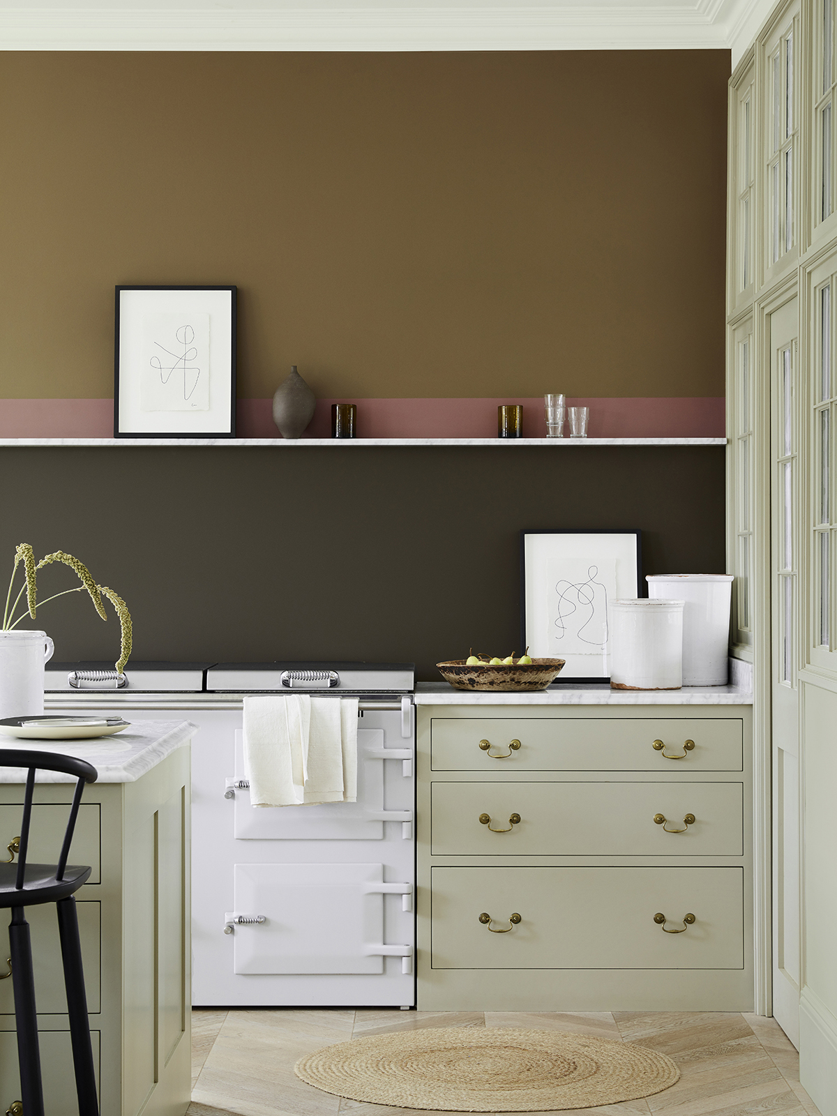
Wall from top, Light bronze green, Nether red, Elysian ground; units in Book Room Green, all Little Greene.
One question that comes up quite a lot-is designer paint and the price tag actually worth the money or do we get it colour matched for a cheaper price?
“All of our colours are unique, we create them ourselves and the pigments are quite complex, so you can get it matched but it won’t be the exact colour due to the complexity of the pigments.”
Why do we need to spend more on pigments?
“The quality, the reaction of colour within the light, the colour is deeper and richer than something that is made with two pigments. The overall quality, we put a lot of titanium oxide in our products so it won’t be falling off the walls, we are a family business, we put a lot of love into creating these collections.”
So after all the recent popularity of neutrals – I wasn’t sure whether to confess to Kate that I am toying with the idea of toning down the pink in my living room and go for a stone. I quite fancy a warm, nutty tone which I think will work well with my chintz sofa and Berber rug. So watch this space – I am only contemplating!!
If you have a design dilemma and would like to be the subject of our Style Surgery for the next series, do get in touch with us at thegreatindoorspod@gmail.com
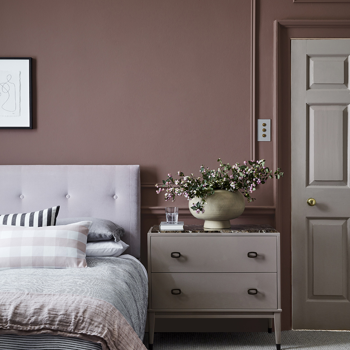
Image at top: Wall in Nether Red, Little Greene.


