fbpx
Sophie Robinson
  • Home
  • Workshops
    • Marrakech Retreat
    • Ban the beige
    • Masterclasses
  • Online Courses
  • Collaboration
  • Podcasts
  • Blog
  • About
    • About me
    • Work with me
    • Press
  • FAQs
  • Contact
  • Interior Design
  • Interiors
19 Nov 19

Ban the Beige colour workshop

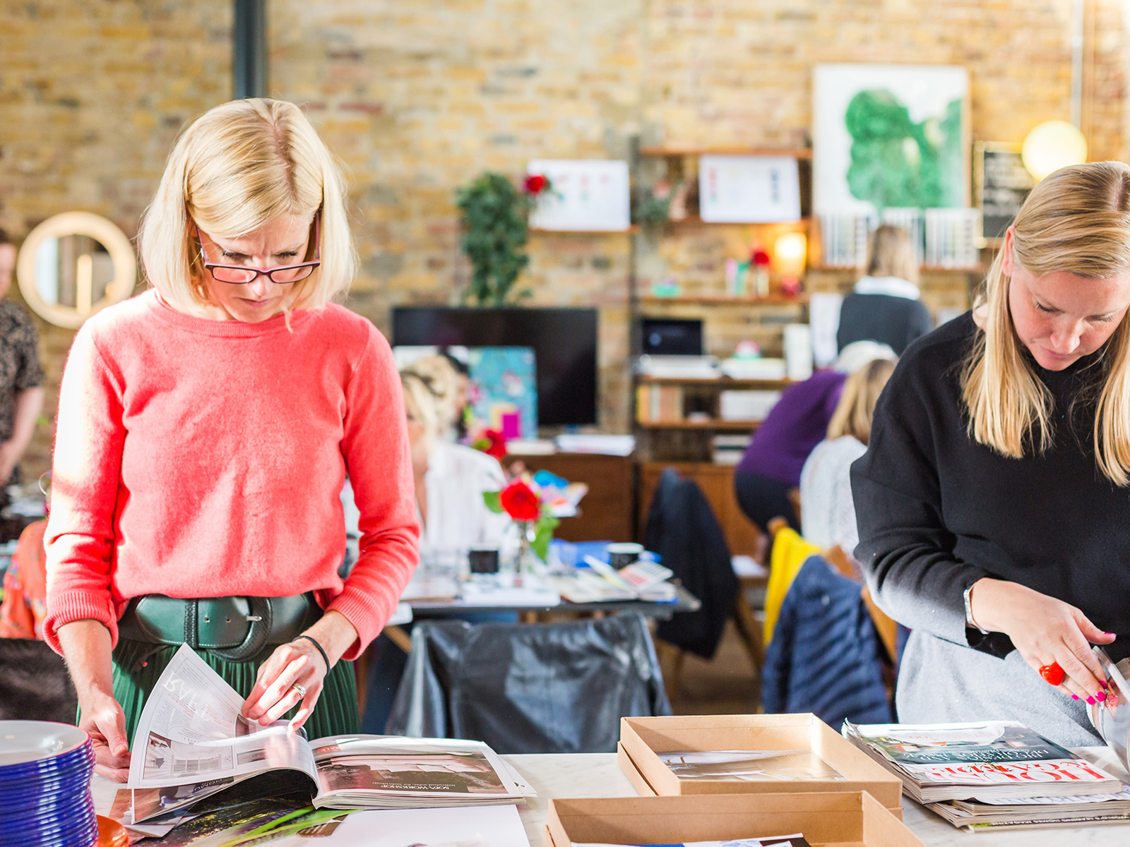
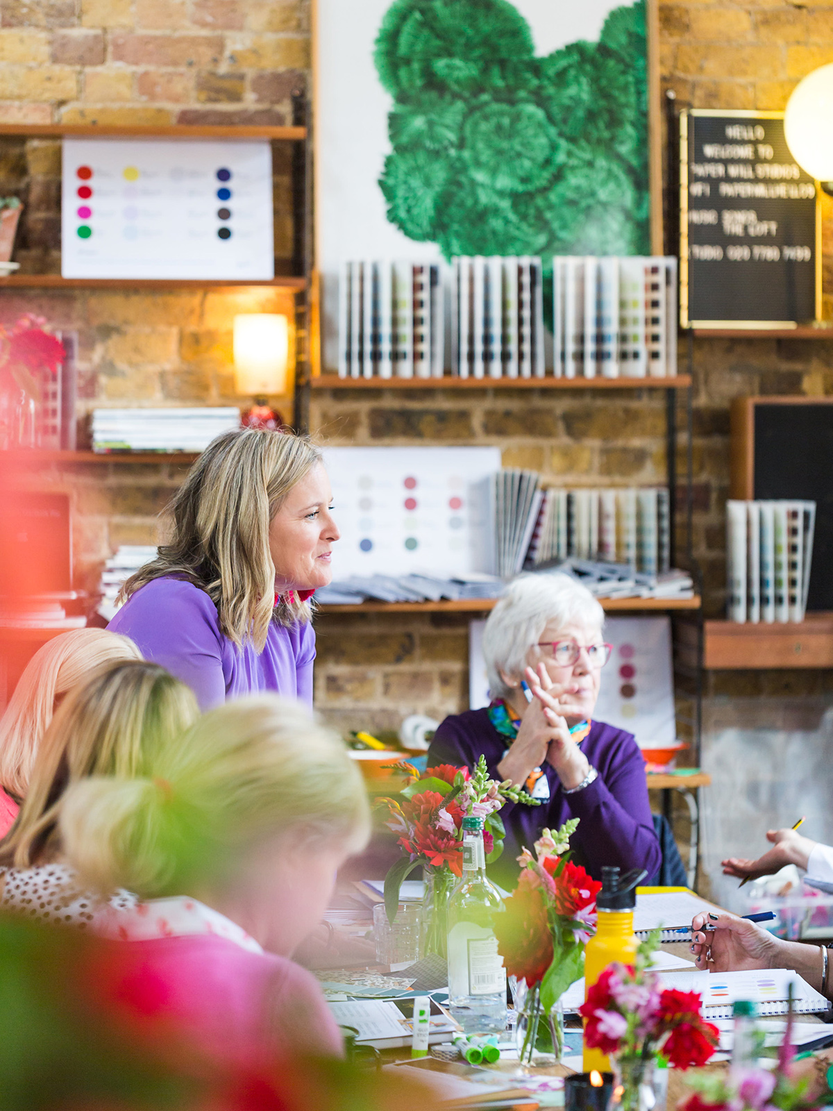
Last month I was thrilled to host my annual Colour workshop in the amazing Paper Mill Studios in East London. Another sell-out affair I had 16 Colour loving hopefuls for a full day immersed in all things colour. It’s a wonderful opportunity to take yourself away from the humdrum of the working week, away from the demands that can pull us away from our creativity and inspiration and really indulge in something you love, namely colour and interior design!

For me, these workshops are the highlight of my year and I’m just so grateful that people want to spend the day with me, exploring my favourite subject. I’m often fascinated at how stuck we can get around conjuring colour schemes for our homes. I believe that one of the ways to unlock our colour confidence is to get back introduced with your gut. We know deep down what colours we love, that lift us up and make us feel happy but somewhere along the lines angst about getting it right or making sensible investments just gets in the way. If we can allow ourselves to be playful with colour then it takes us in a new direction and a new colour confidence can be discovered. I’m really lucky that I get to play with colour and pattern every day and immerse myself in it. My studio is full of images, swatches and paint charts. But still, I can get overwhelmed.

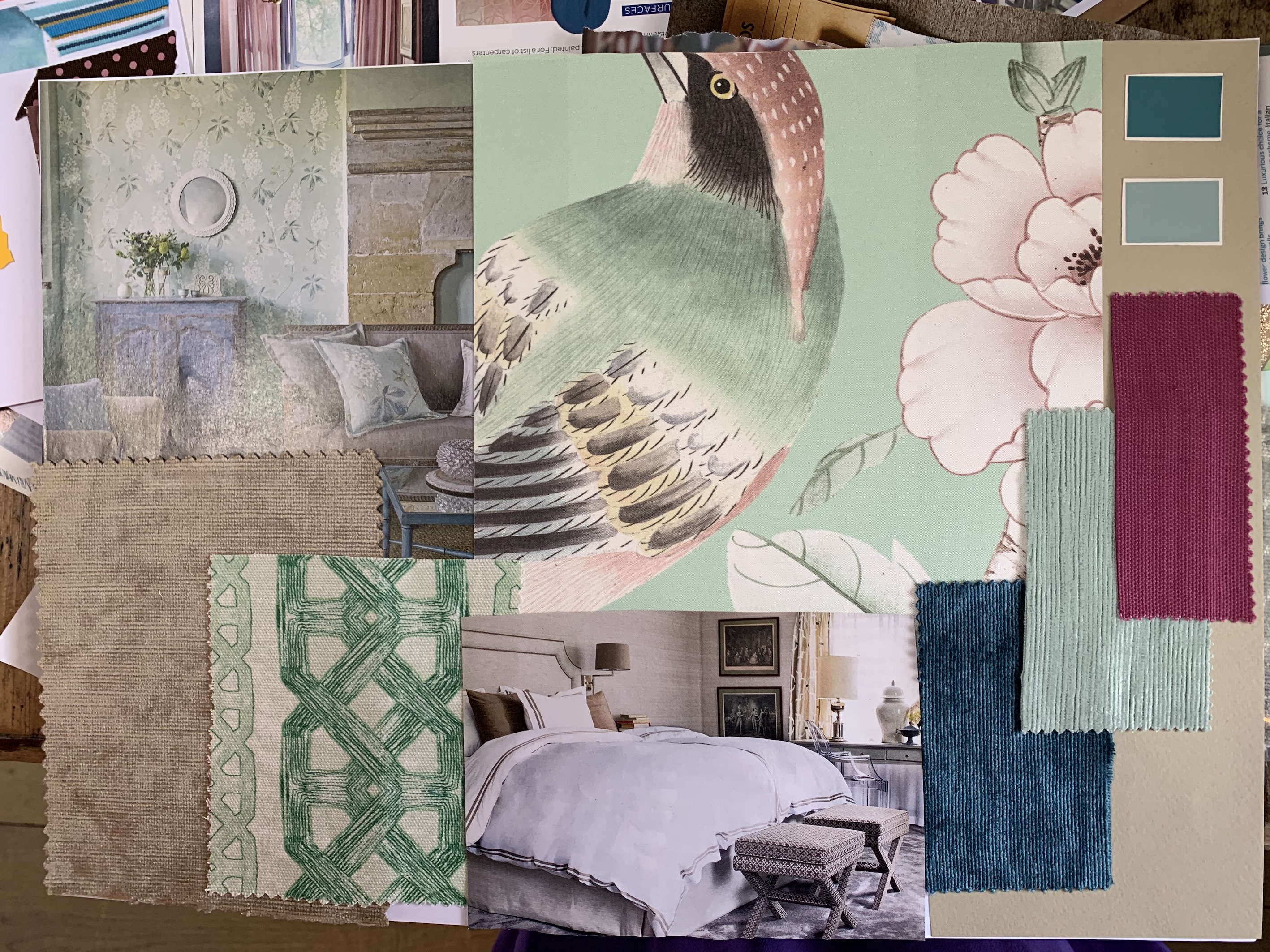
On this course, I take you through the methodology of how to go about pulling a colour scheme together. It’s really important to discover how colour makes you feel, so the focus isn’t solely on the look. Creating a room design is a 360-degree experience after all which is why pinning images alone is never a good way to design a room. By using the technique of making mood boards you can begin to get immersed in the nuance of colour and the texture too. On my workshop, the focus is on how you want the room to feel, and then learning how colour acts as a way to help create that feeling.

The process I use is loosely based on the Wright theory of colour psychology although over the years I’ve tweaked it to really help people work out what their unique colour palettes are and how they work together in harmony. We often have to design one room at a time in our homes, as we work ourselves around rather than masterminding the whole house. But having an overall colour palette to form a strong foundation for all your room designs really helps you create a unifying thread that helps the house hang together as one but also allowing each room to have a different feel. This is especially helpful if like me you love all the colours in the candy store and fret if it’s all going to look one hot mess. Creating a harmonious home is all about creating a collection of colours that have the same tonal qualities so that they sit comfortably next to one another. You also want to think long and hard about how you want to feel in a space.

The Spring Palette

Colours in this colour family are fresh, soft, buoyant and uplifting. The feeling they create is one of lightness and joy. There is nothing heavy or grounding in this palette and it’s all about enhancing the natural light in a room in a joyful and uplifting way.

The Summer Palette

These colours are mostly mid-tone and therefore non-challenging to look at, but indeed restful. They are cool and calm and usually have an undertone of grey. As a result, they create soothing, calm and elegant interiors, never busy or fussy but always understated.
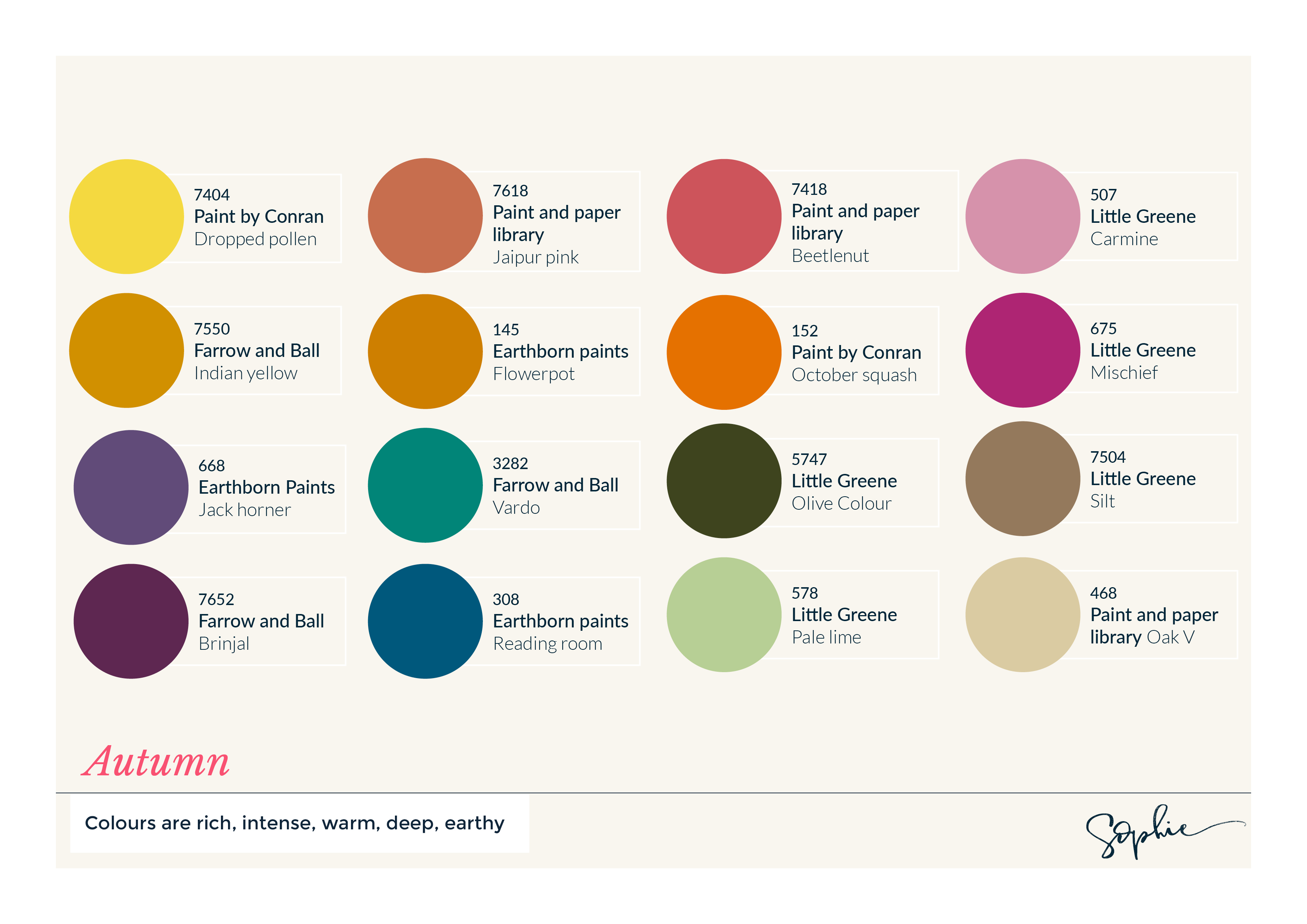
 

The Autumn Palette

Rich and robust these colours are warm and cosy at their core and create welcoming and vibrant spaces. Intense colours are favoured here from jewel brights to rustic woodland tones with plenty of natural woods and plants for the ultimate feel-good space. My colours sit in this season.

The Winter Palette

Its all about making cool stark statements, colours in this palette are striking with plenty of high contrast. The overall effect is assured and edgy so colours are cold, saturated and uncompromising. A quick-fire way to get some Pow into a scheme.

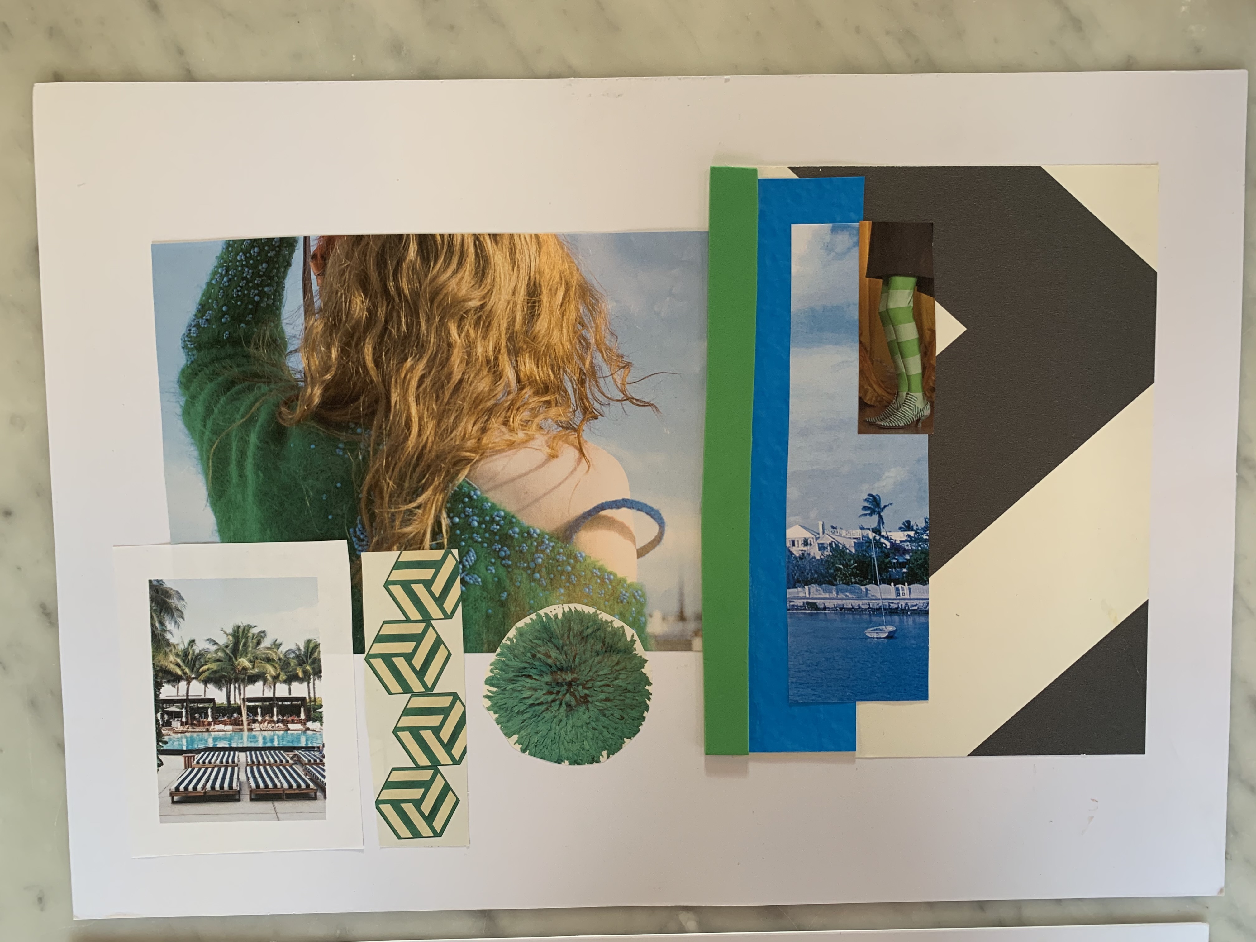
Once you have identified what feeling you want to create in the room or what colour palette you are personally drawn to you can start to source images and furnishings that go together with ease. The idea behind the mood board is that it gets us off our screen and out of our heads so we can start to design more emotionally. This is also a great way to experiment before you go making any commitments. Trying to get my guests to step away from the paint charts and furniture brochures is really hard though as so many people are chomping at the bit to decide on what elements go into the room. But nailing your colour palette first is essential if you are going to see the whole concept work from start to finish and will give you a deeper and more authentic scheme at the end.

We finish the day by learning some of my decorating tips and tricks and how I make my colour schemes work. A fabulous venue is top of the list then support from my great team Luisa and Antonia who are both interiors experts in their own right. The highlight, of course, is the incredible lunch that the adorable Saima from Hampstead kitchen puts on for us all. By this point, my guests have earned it!


Lunch is the highlight of the day with a colourful spread provided by The Hampstead Kitchen

If you fancy joining me in 2020 for my colour workshop, make sure you sign up to my mailing list as I’ll be releasing new dates by the end of the year. I hope to do one in Brighton and another one back in London. Meanwhile, wherever you are in the world you can sign up to my online course which outlines all the basics you need to follow to create a room scheme. I’m currently writing a course all about how to use colour, so watch this space!

A special thank you to the small brands who donated some handpicked gifts for my very very lucky guests to take home with them to enjoy!

Lemongrass & Cedarwood soothing hand lotion, Ubiety Instagram: @findubiety

Vegan faux leather pouch, Sarah Dunbar Design Instagram: @sarahdunbardesign

Studio vegan votive candle, Elm Rd Instagram: @elm.road

Notebooks, Katie Leamon Instagram: @katieleamon

  • Interior Design
  • Interiors
DIY SOS Bromsgrove reveal Small spaces, Christmas trends & nature inspired interiors-Podcast notes S5 Ep4

comments

G Brown on 21.11.19

looks fantastic and I must ask: WHERE did you get your earrings?

Reply
Sophie Robinson on 22.11.19

These ones are from Anthropologie

Reply

Leave a Comment

Cancel Reply

Your email address will not be published.

  • Interiors
    • colour crush
    • colour psychology
    • DIY
    • dream home makeovers
    • Home Tours
    • Interior Design
    • Interior Styling
    • podcast
    • trends
  • Lifestyle
    • Business
    • Fashion/Beauty
    • Life
    • My House
    • Nosh
    • Travel
  • Rooms
    • Bathrooms
    • Bedrooms
    • Kids rooms
    • Kitchens
    • Living rooms
    • Outside
  • Videos

mailing
list

Videos

Listen

Listen Here

Online courses
by popular demand

Catch Sophie In All Her Colourful Glory On Instagram

Relaxed wild flowers are having their moment. The Relaxed wild flowers are having their moment. The award winning gardens at the recent Chelsea flower show all showcased wild style flower gardens, celebrating the diversity of nature, supporting wildlife.  Their soft willowy randomness is a lovely antidote to the strict structures of life. I love to see wild flowers ( and a fair fee weeds!) in my garden and in the motifs I choose to decorate my house in. But partnered with a tight geometric creates the tension I enjoy. A little bit of structure, a little bit dishevelled, it is the perfect balance for me, shown here in the patterned tiled floor and botanical print chest. Helps me go with the flow without losing my way. ❤️ are you up for taking it to the wild side?!
Ban the beige hey?! Popping the colour as usual l Ban the beige hey?!

Popping the colour as usual lols. I’m lusting after this green and purple combo right now. What colours are lifting your vibe today?

Tap for credits 😉x 
#bantgebeige #colourlover 
#dopaminedressing
Who else is absolutely struggling today after the Who else is absolutely struggling today after the four day party weekend! I’ve abandoned my desk and resorted to tidying the house instead. Here is a rare glimpse of my sons tidy room! 
While Arthur chose this colour scheme 5 years ago, it’s still going strong but I’ve updated it with a large area rug from @alternativeflooring designed by @margoselbystudio . I’m a BIG FAN of big rugs and what I like about this one is you can order it in a specific size. I recommend 30-50cm clear of the skirting boards all round, tucked under the bed and armchair it feels luxurious and fills the room with more colour and pattern. Floors often go unthought of but is another place to add impact to your schemes. ✅

CREDITS [ad: press product]
Walls painted Atomic red, ceiling gentle sky @littlegreenepaintcompany 
Made to measure rug in Margo Selby loop @alternativeflooring Pouffe in Aluro green @evasonaike 
Blind made in textile Hawai by Joseph Franks @svenskttenn 
Bed linen in liberty Margaret Annie @cocoandwolf 
Kantha bed throw by @matthewwilliamson at @johnlewis 
Bed bolster in Casper Seagreen @linwood_fabric 
Cushions @finecellwork 
Wire Shelf @cotswoldco 
seletti bird lamp @amaraliving 
Armchair is vintage 
📷 @aluncallenderphoto 

#bedroom #boysroom #kidsroom #banthebeige #colourlover #mycolourfulinterior #colourfulhome
Happy jubilee! It has been a weekend of parties an Happy jubilee! It has been a weekend of parties and celebrations and a much needed 4 day break! I felt like a queen in this @needleandthreadlondon gown for the school jubilee ball and am wearing it again tonight for the @thefeverclub jubilee shenanigans. Dancing is so good for the soul, I’ve not done enough of it for too long! Feet are feeling it though so I’m ditching the heels and wearing the air max  with this dress tonight! How have you celebrated this weekend? 

Ad @needleandthreadlondon dress bought with press discount. 
#schoolball #ballgown  #costperwear #redress #jubilee #platinumjubilee
According to some recent research 24% of us look t According to some recent research 24% of us look to friends and family for design Inspiration, 21% to makeover tv shows and 18% to instagram. But while it’s great gathering ideas and opinions, ultimately creating a stylish home has to come from you if you are going to love the home you live in. The extraordinary Colour Psychology framework helps you unlock the colour palette that is perfect for you and gives you the superpower to create rooms that feel as good as they look. Suddenly other peoples opinions, trends, and influencers no longer hold sway. Creating a home is deeply personal, an exploration of what makes YOU happy. For me it’s all about the pattern, texture and plenty of intense colour. Tasteful grey interiors leave me feeling flat, I love the energy of a colour clash! If you want to understand your relationship with colour and how to design schemes that affect your emotions in a positive way, this is the last weekend to enrol in my online course, Colour Psychology for interiors. You can find the link to learn more up in my bio. It’s my most popular course to date and has transformed the way thousands of people feel about their interior spaces. 
Let me know what your happy colours are down in the comments below. 

Tap for credits 

📷 @aluncallenderphoto styling @katemcphee #colourpsychology #colourpsychologyforinteriors #banthebeige #ihavethisthingwithcolour #myeclectichome #patternclash #maximalistdecor #colourcourse #mycolourfulinterior #punchyhome #cosyhome #countryliving #bedroom
Did you know 50% of people use social media to fin Did you know 50% of people use social media to find inspiration on how to decorate their living rooms? I’m definitely one of them! That’s according to a study by Sky Glass, the streaming TV from @sky_uk . I’ve been investigating the latest interior trends we are lusting after, and how our living rooms are changing- as we say goodbye to three piece suites, and hello to sustainable vintage furniture, statement rugs, wall prints and cosy-ing up the sofa with throws and cushions. As you can see I’m all over the trends! If you head over to the @sky_uk channel today, I’ll also be answering some interior design questions all about styling your TV. Would love to hear what you think are the living room trends to watch. 
 #skyglass #ad 

#banthebeige #colourlover #livingroomdecor #livingroom #maximalistinteriors #livingroomdecore #livingroomdecorideas #homestyle #instahomedecor #chintz #colourmyhome #colourmehappy #cushionlove #styleithappy #florals #gallerywall #berberrugs #ihavethisthingwithpatterns #ihavethisthingwithcolour
Ah @the_rhs Chelsea! What a feast for the eyes! In Ah @the_rhs Chelsea! What a feast for the eyes! Inbetween biblical downpours, thunder and lightning, it was a wonderful day of colour, design and chatter with some wonderful women! I’m slowly falling in love with gardening and my phone roll is full of inspiration after being immersed in natures finest. Thanks @michelleogundehin and @hazelgardinerdesign @thesohoagencyuk for the company. And a big congratulations Hazel on this stunning floral installation. And don’t forget if you want to hang out and be inspired by all things colour then my FREE live webinar is on tonight (25th) at 7pm tonight! Hop on to my profile for the link to sign up. Cannot wait to share some inspirational colour filled time with you all 

#rhschelsea
This is the first room we decorated after our reno This is the first room we decorated after our renovations. The entrance to your home creates the first impression. It’s also the room you walk into first thing in the morning and when you return home at the end of a long day. It needs to create the right welcome and what that feels like is hugely personal. For me I chose my favourite colours, this powerful cobalt  blue has always been a colour I’m drawn to. My wardrobe is full of it. And the bright pink is another one that always makes me instantly happy. Together they are a striking combination and I think anyone who walks through my front door, immediately gets a sense of what I’m about. I’m passionate about creating interiors that authentically  reflect the people who live there. Studying the psychology of colour made it so much easier for me, giving me a deeper understanding on the affects of colour and streamlining my process. If you’d like to know how to unlock your colour super power, join me for a free webinar this Wednesday evening (available to up for 48 hours after). It an introduction into colour psychology for interiors and my hope is it inspires you to have the courage and conviction to know what’s right for you.  And for a deeper dive my online course Colour Psychology for interiors has opened for enrolment. All links to sign up are in my bio on my profile @sophierobinsoninteriors 
What does your hallway say about you? 
📷 @aluncallenderphoto 
CREDITS walls in lazuli by @zoffanyfw stair runner @roger_oates floor tiles @claybrookstudio door painted in rose ash @sanderson1860 

#colourpsychology #colourpsychologyforinteriors #banthebiege #punchyhome #hallway #boldcolourinteriors #colourlover
Load More… Follow on Instagram
Sophie Robinson
  • © 2017 Sophie Robinson

    /
  • Contact/
  • About/
  • Design by MW

Don't forget to join!

You're almost inside!

Leave me your best email to sign up for the Webinar