fbpx
Sophie Robinson
  • Home
  • Workshops
    • Marrakech Retreat
    • Ban the beige
    • Masterclasses
  • Online Courses
  • Collaboration
  • Podcasts
  • Blog
  • About
    • About me
    • Work with me
    • Press
  • FAQs
  • Contact
  • Interior Design
  • Interiors
05 Jun 17

Colour Psychology for Interiors: The Spring Personality

The spring personality os oerfect for a childs interior design scheme. Here warm orange and vibrant yellow work to make a soft yet uplifting colour scheme

Kicking of my series of posts that explore the theory of Colour Psychology and how it can work to help define a cohesive interior design scheme, kicks off taking a look at the Spring personality. In my previous post I talk about what Colour Psychology is and how I’m collaborating with Fiona Humberstone, The Brand Stylist, to devise a way that colour psychology can be utilised to devise knock out coherent room schemes. Check out the course we are running later this month here


The spring personality colours and patterns, by The Brand Stylist

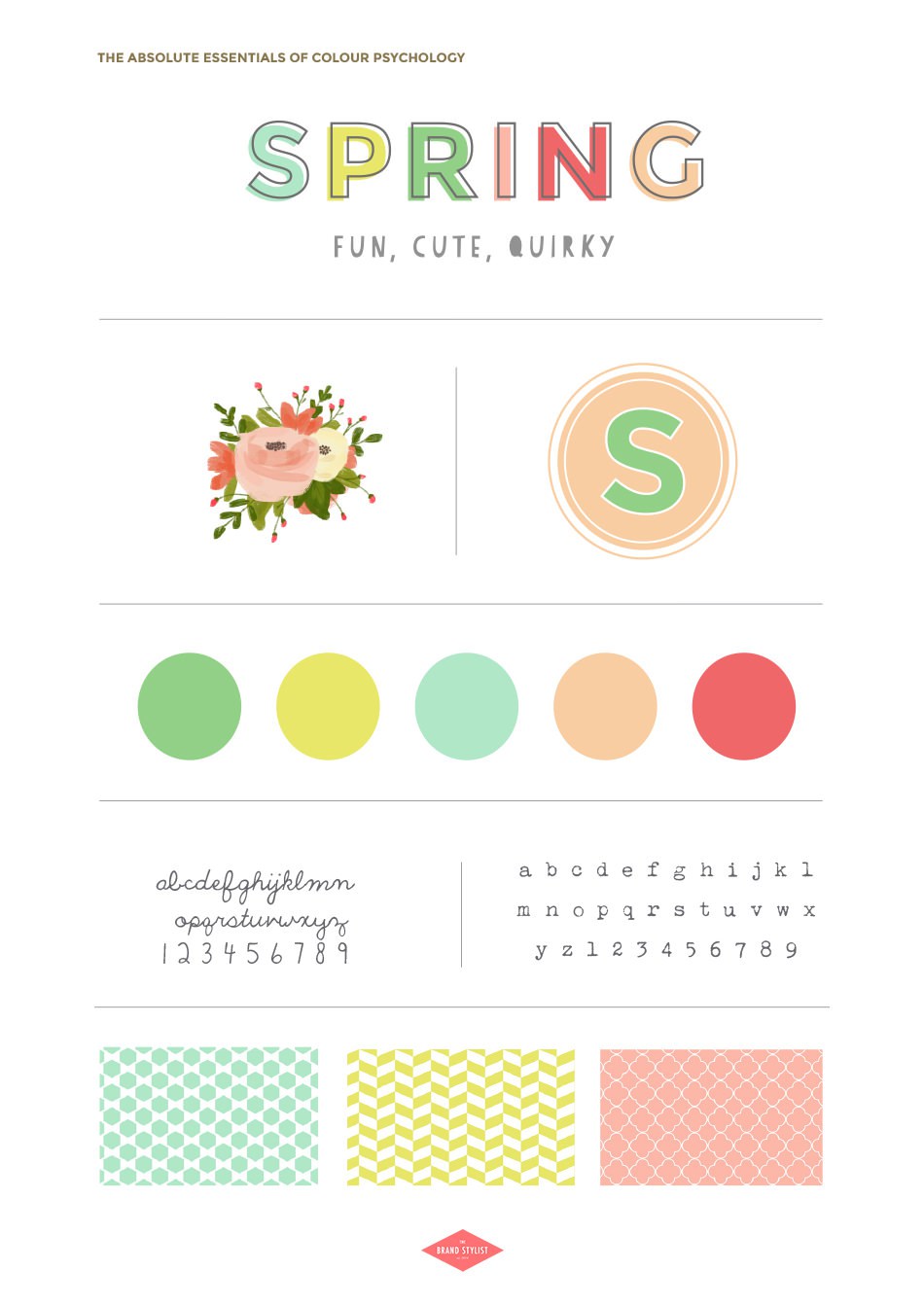
Image source: The Brand Stylist

So the theory goes that we fall into four groups, or personalities, that are for ease given the titles of the four seasons. This is because each personality type has affinities with each individual season. So when we think of Spring, we think of bright piercing sunlight, chirpy birdsong, vibrant green shoots and perky bright spring blooms.  The air is fresh while the sun’s warm is invigorating. It’s the season of pure creativity and optimism, new growth and fresh inspiration after a long and drawn out winter.


The Spring Personality blends block pastel colours with stronger vibrant brights. Large opem spaces and natural day light through large windows are kjet to getting this interior deisgn spring theme

Image Source: Little Big Bell

Just like the season, Spring People are bright, positive, enthusiastic and very big on getting things done. They crave spontaneity, are great adapters and are overflowing with ideas and enthusiasm. It goes without saying that they throw great parties and are total people persons. This delightful living room belonging to interiors expert Geraldine from Little Big Bell has all the spring attributes. A large airy space with lashings of natural light. The decor is made up of warm soft pastel shades, with clean line furniture and plenty of foliage and quirky displays. And Spring personalities do love a pom pom.


“Spring personalities multi-task well and love working with people, bouncing ideas around and bringing teams together. They are social animals and love to entertain. They think creatively and quickly- often their heads are literally spilling over with ideas- and are a real inspiration to those around them”

Fiona Humberstone, The Brand Stylist


Light and airy living room with wrap around large windows with voiles. Pastel modular sofa with morrocan berba rug and brass side table

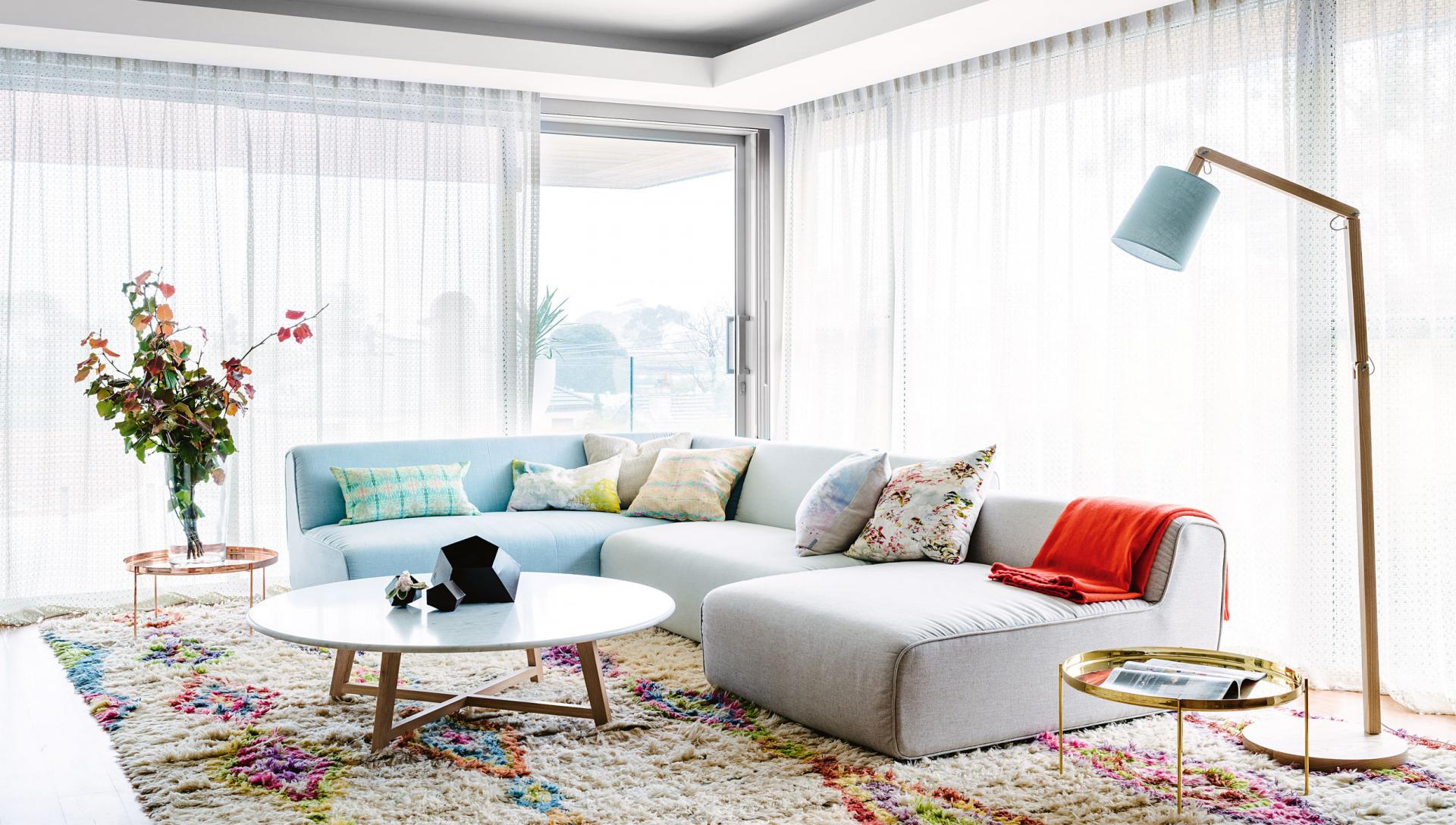
This room is seriously light and bright with large scale windows dressed in gossamer light voiles to maximise the light. Simple no-fuss modular furniture makes the perfect back drop for a collection of decorative cushions in pretty pastel prints. The high shine metallic coffee tables are also a key element of the Spring look.

KEY SPRING INTERIOR DESIGN ATTRIBUTES

Light and airy, plenty of natural light, large windows, simplicity, on trend, creative, light and bright hues, vibrant, contemporary, approachable, lived in, relaxed, crafty,  playful, clean colours, fresh flowers and plants


The Spring personality in terms of Colour Pscychology is fresh and vibrant and torally creative. This vintage workspace with its collection of botanical prints is set against fresh white tongue and groove walls. Image by Selina Lake, Botanical Style

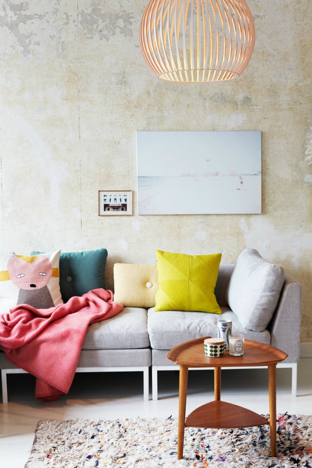
Image source: Botanical Style by Selina Lake

Spring personalities often need creative spaces where they can collect and display their ideas. Vintage and eclectic styles appeal to the spontaneous personality.

PRINTS AND TEXTURES

Circles, polka dots, ditsy florals, high gloss, sparkles, fine lines, hand drawn patterns, cotton, polished copper, pale wood.
Spring personality dining room with soft peach walls and bright yellow dining chairs.This dining room, from the interior designer Rita Konig,

Image source: House and Garden

This dining room, in the home of interior designer Rita Konig, is one of my all time favourite schemes. I love the warm pink walls coupled with the unexpected sunny yellow chairs. With the spring personality, you can always expect an element of the unexpected. The pale wood table and sparkling chandelier complete the look.

Scandi style living room with yellow cushion, grey sofa and mid century modern furniture

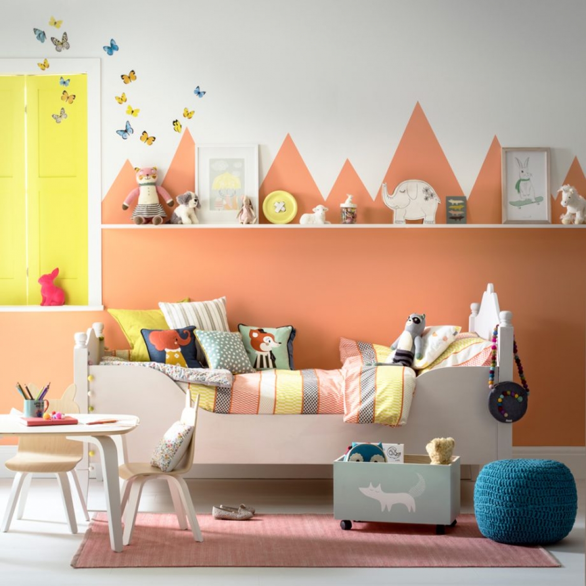
The Spring personality loves the clean and simple lines of Scandinavian furniture and aesthetic, but always leaning towards the joyful side so these graphic cushions in bright clean colours really lift the look.

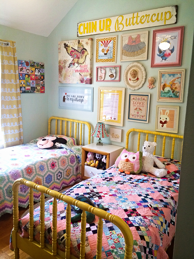
Children’s rooms are the perfect match for the joyful Spring personality. Naturally upbeat and happy spaces they suit the soft pastel colour palette and happy go lucky approach to design. You can induldge in the love of print and pattern and really play with colour. A tru Spring personality though would probably like less clutter, but I always say, more is more!

Vinatge inspired childrens room. The vibrant pastel shades and ditsy prints are typical of the spring personality

If you are a practicing interior designer or a student of interior design we’d love to see you on our Colour Psychology course where we’ll be exploring how you can use this technique to mail your clients brief in much more depth.

Save

Save

Save

Save

Save

Save

  • Interior Design
  • Interiors
My amazing time on DIY SOS Up your Interior Design game with Colour Psychology

Leave a Comment

Cancel Reply

Your email address will not be published.

  • Interiors
    • colour crush
    • colour psychology
    • DIY
    • dream home makeovers
    • Home Tours
    • Interior Design
    • Interior Styling
    • podcast
    • trends
  • Lifestyle
    • Business
    • Fashion/Beauty
    • Life
    • My House
    • Nosh
    • Travel
  • Rooms
    • Bathrooms
    • Bedrooms
    • Kids rooms
    • Kitchens
    • Living rooms
    • Outside
  • Videos

mailing
list

Videos

Listen

Listen Here

Online courses
by popular demand

Catch Sophie In All Her Colourful Glory On Instagram

Ah @the_rhs Chelsea! What a feast for the eyes! In Ah @the_rhs Chelsea! What a feast for the eyes! Inbetween biblical downpours, thunder and lightning, it was a wonderful day of colour, design and chatter with some wonderful women! I’m slowly falling in love with gardening and my phone roll is full of inspiration after being immersed in natures finest. Thanks @michelleogundehin and @hazelgardinerdesign @thesohoagencyuk for the company. And a big congratulations Hazel on this stunning floral installation. And don’t forget if you want to hang out and be inspired by all things colour then my FREE live webinar is on tonight (25th) at 7pm tonight! Hop on to my profile for the link to sign up. Cannot wait to share some inspirational colour filled time with you all 

#rhschelsea
This is the first room we decorated after our reno This is the first room we decorated after our renovations. The entrance to your home creates the first impression. It’s also the room you walk into first thing in the morning and when you return home at the end of a long day. It needs to create the right welcome and what that feels like is hugely personal. For me I chose my favourite colours, this powerful cobalt  blue has always been a colour I’m drawn to. My wardrobe is full of it. And the bright pink is another one that always makes me instantly happy. Together they are a striking combination and I think anyone who walks through my front door, immediately gets a sense of what I’m about. I’m passionate about creating interiors that authentically  reflect the people who live there. Studying the psychology of colour made it so much easier for me, giving me a deeper understanding on the affects of colour and streamlining my process. If you’d like to know how to unlock your colour super power, join me for a free webinar this Wednesday evening (available to up for 48 hours after). It an introduction into colour psychology for interiors and my hope is it inspires you to have the courage and conviction to know what’s right for you.  And for a deeper dive my online course Colour Psychology for interiors has opened for enrolment. All links to sign up are in my bio on my profile @sophierobinsoninteriors 
What does your hallway say about you? 
📷 @aluncallenderphoto 
CREDITS walls in lazuli by @zoffanyfw stair runner @roger_oates floor tiles @claybrookstudio door painted in rose ash @sanderson1860 

#colourpsychology #colourpsychologyforinteriors #banthebiege #punchyhome #hallway #boldcolourinteriors #colourlover
My kitchen, the heart of my home. The smallest, da My kitchen, the heart of my home. The smallest, darkest room in the house with no view, but that’s old houses for you! You’ll often find the kitchen in the worst place. So to amp up the joy I chose a forest green (hunters green by @zoffanyfw) for the cabinets to mirror the woodland outside. We sourced reclaimed school science lab work tops and I wrapped the room in one of my favourite papers, Rubarber by @borastapeter. Tom put in retro fit underfloor heating and we used reclaimed terracotta tiles from @ca_pietra_  so the floor looks as old as the house but feels so warm! . For the ugliest darkest room in the house it’s become our favourite because of the colours, patterns and rustic textures.that’s the power of great interior design! 
Next up in my series of posts about the psychology of colour is the Autumn personality. You’ll have a love of rich deep warm Colours, natural finishes, nature inspired patterns and period features. The autumn palette is warm, earthy abs rich and perfect for making spaces feel cosy and inviting. 
To learn more about the autumn personality, hop on up to my bio and click the link to be taken to the blog. And you can sign up to my FREE webinar I’m hosting next Wednesday if you’d like to learn more about this powerful framework. 
Meanwhile have a gorgeous weekend! 
📷 @aluncallenderphoto Styling @katemcphee 

#colourpsychology #banthebeige #autumnpersonality #colourpsychologyforinteriors #kitchen #greenkitchen #countryhomesandinteriors #countrykitchen #ihavethisthingwithcolor #myeclectichome #maximalistdecor
Come and join my FREE webinar on Colour Psychology Come and join my FREE webinar on Colour Psychology next Wednesday 25th at 7pm GMT 🤩 hop on up to the link in my bio @sophierobinsoninteriors to register.
My brilliant online course, Colour Psychology for Interiors, is open for enrolment this month, so if you fancy finding out a bit more about this utterly game changing framework I’d love to have you join. It’s SO MUCH more than ‘ red is energising’, ‘blue is calming’ stuff you’ve all heard before. This is a deep dive into discovering how colours work, how to harmonise them and discovering your own unique and authentic style. Only then can you create a home you live and one that supports you emotionally. I LOVE teaching this stuff because the feedback I get from students is mind blowing! Don’t take my word for it, sign up for the free webinar today! 😍 and if you’ve already done my course, please share in the comments below what you loved about it. 

#colourfulhome #colourpsychology #colourpsychologyforinteriors #banthebeige #colourlover #confidentcolour #confidentcolourscheming
Have you found your design mojo? Do you gravitate Have you found your design mojo? Do you gravitate towards a style of interiors that just feels so ‘you’. Making a home is so much more than creating beautiful squares for Instagram. It has to FEEL right and this is where the psychology of colour comes in. Colour is light, it has an energy which directly impacts your brain and emotions. And we all have a unique relationship to it. So rather than follow the crowd, be swayed by trends it’s so important to understand your own authentic relationship with colour. Over on the blog today I’m starting a series of posts all about the seasonal colour personalities. First up is spring which is all the joy, uplift and energy. My bathroom, pictured above, is very ‘spring’ with light reflecting walls, energetic patterns and bright colours. The mood  is uplifting, fresh and feel-good. Hop on up to my link in my profile to read the blog post in full and discover if you are a Spring personality and how to create rooms that reflect this joyful mood. 
Tap for credits
📷 @aluncallenderphoto 

#colourpsychology #colourpsychologyforinteriors #banthebeige #colourfulhome #colourlover #ihavethisthingwithcolor #spring #springbpersonality #colourfuldecorchallenge #homedecor #myeclecticmix #bathroom #bathroominspo
So proud of mr best mate @sophieabbottartist who o So proud of mr best mate @sophieabbottartist who opens her house this weekend to showcase her artwork in her home as part of Brightons artists open houses. She’s always been a creative whirlwind and keeps the joy of colour alive in her paintings inspired by the sea, and the local woodlands that surround her home in Brighton. For Sophie, colour gives her life, she’s the ultimate joy monger and I’m so blessed to have her as my side kick in life. If you get a chance today, pop round to heed for a bolt if the feel good vibes

#artistopenhouses #brighton #colourlover #banthebiege #ihavethisthingwithcolour
When you find the palette of colours you love, you When you find the palette of colours you love, you just wantto surround yourself  in every part of your home! This painting by @studiocoverdale really hits the mark for me, with all my favourites on one place. Today I’m opening my most popular online course, ‘Colour Psychology for a interiors’, ready  for your enrolment. This is my most popular and indeed  powerful course. It gets to the core of how colours work in harmony , how they effect you emotionally and how to bring all the design and pattern  elements together to make your home and your heart sing! I’m a Spring personality, and with that I adore all the busy patterns, bright and vibrational colours, plenty of pretty details and preferably all at once! While typical spring personalities prefer a more delicate and soft colour palette, my secondary season is Autumn, which prefers richer and punchier shades. Combined together my home is unique and perfect for me. I honestly rarely want to leave the house! And while this framework is an amazing tool for interior design, it’ll also give you colour confidence in every area of your life including your wardrobe. I can’t recommend it enough. When I started implementing this framework  in my own design practice six years ago it was absolutely game changing! While I’ve  always been confident with bold colour, this insight gave me the clarity to speed up my design process and get it right every time! Hop on over to the link in my bio to find out more. 
📷 @aluncallenderphoto 
#colourpsycholgy #colourlover #banthebiege #colourfulhome #colourmyhome #maximalistinteriors #boldbravebeautifulinteriors #dopaminedressing #dopaminedecor
The power of paint! I’ve been extolling it’s v The power of paint! I’ve been extolling it’s virtues my entire career. Roll a bold new hue on your walls and voila! Game changer. But on our recent podcast @mad_about_the_house explored the wider impact of paint on the environment. An astonishing 50 million litres makes it into landfill each year so it feels like, as serial decorators, we could all club together and do our bit to bring that figure down. 
It’s a minefield but over on my blog today I sum up my tips on how we can easily use less of it and round up the paint brands who are doing their bit to tackle the issues. From the ingredients in the tin, to recycling waste paint, to using pouches rather than tins, there is plenty of innovative ideas. Choosing natural paint feels like a good option and if you’re hooked on designer paint colours, it’s no more expensive. Last year I painted my bedroom Turquoise by @edwardbulmerpaint and I’m thrilled with the colour, quality and durability. Just goes to show lovely paint doesn’t have to cost the earth. Hop onto the link in my profile for the full post and if you know if a paint brand who are tackling the environmental issues raised, please give them a mention in the comments below.

#ecopaint #ecodecor #ecohome #paint #turquoise #bedroom #podcast #banthebiege #colourfulhome #colourlover #itsonlypaint #interiordecorating #interiordesign #colourscheme
Load More… Follow on Instagram
Sophie Robinson
  • © 2017 Sophie Robinson

    /
  • Contact/
  • About/
  • Design by MW

Don't forget to join!

You're almost inside!

Leave me your best email to sign up for the Webinar