fbpx
Sophie Robinson
  • Home
  • Workshops
    • Marrakech Retreat
    • Ban the beige
    • Masterclasses
  • Online Courses
  • Collaboration
  • Podcasts
  • Blog
  • About
    • About me
    • Work with me
    • Press
  • FAQs
  • Contact
  • Interior Design
  • Interior Styling
  • Interiors
  • Living rooms
  • Rooms
08 Aug 17

How to hang artwork like an interior designer

Arranging artwork has to be my favourite way to accessorise a home. You get to create a focal point, a striking opportunity to add some colour and by far one of the best ways to really personalise your space. BUT I see it done so wrong time and time again so I thought this would be a great little opportunity to give you a five minute master class on how it should be done.
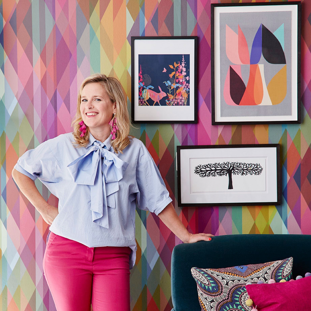
 

Gallery wall

How to hang artwork in a gallery wall style. Inside the colourful home of interior designer and stylist Sophie Robinson. The striking prism wallpaper by Cole and Son makes a great back drop to the teal sofaCredits from left; House by John Lewis Tiffany Lynch Birdy unframed print, £5. House by John Lewis picture frame in black, £18. Inalux Blossom 2 framed print, £150. Charlene Mullen Long Tree framed print, £75. Ellen Giggenbach Vision framed print, £95. Jill Ray, From The Cliff framed print, £70. Jacky al sammarraie forest perth framed print, £45. East Of India moon and back framed print, £20. Vitra sunburst clock in walnut , £249.

With my design mantra that more is more, this is my favourite way to hang a collection of art, where you gather together all your pictures and group them in one pleasing display. It makes a really strong focal point in a room which can help make a scheme look really together. One thing I really love about a gallery wall is the way it all can grow organically over time. You can switch pictures around and add and subtract. I hate to ever think a room is finished so this playful approach to design is what I really love to do. To get started I arrange all the pictures out onto the floor, and jig them around until I find a pleasing arrangement before popping them on the wall. A few tips on how to get a good layout.

interior designer sophie robinson shows how you create a gallery wall of artwork for your interior design scheme

  1. Pick a colour story so all your pictures will work and link together. This way you can have fun mixing the different styles and mediums. It makes sense that these colours are then also repeated throughout the room design. It’s no mistake that the pictures I’ve collected here match in with the bold wallpaper in my living room.
  2. You don’t have to match the frames but it can look more coherent if all the frames are a similar colour.
  3. Consider centering the gallery wall to a piece of furniture like a sofa or sideboard. If there is no furniture against the wall you can consider taking the gallery wall all the way to the floor, which looks really cool.
  4. Start with one of the larger pieces or hero painting and put this in the middle. Arrange all the other pictures around this one. Sometimes it works to center the pictures, and sometimes it works to line them up either left or right.
  5. Keep the gaps between the pictures similar throughout.
  6. Throw in an unexpected shape like a clock, mirror or plate to keep the feeling loose.
  7. Use command strips to hang the pictures- so you can easily move them around once they are up and you don’t need to worry about nailing too many holes in the wall. You can always put nails or screws in afterwards when you are settled on the arrangement.
  8. Don’t be afraid to be instinctive. Play around with the arrangement- this is more of an art than a science.
  9. Don’t think that artwork needs to be hung on a plain white or neutral coloured wall to look its best. Quite the contrary- I feel a dark hue works best, as the pictures really pop out. Having said that I’m a sucker for a bold wallpaper as I just love to break the rules!


Propped pictures

Stylishly propping pictures and artwork on a side board creates a lovely focal point in an interior design scheme, as seen in the home of interior stylist Sophie RobinsonCredits from left: Jacky Al Samarraie Guiseley framed print, £45. Picasso head 1946 farmed print, £195. Central park framed print, £85. All John Lewis. All other items, Sophie’s own.

This is a favourite with interior stylists as it gives a really lovely relaxed vibe. Again I like the impermanence of it so you can have fun switching it around later down the road. The key here is to prop pictures of different heights and and I think it works better if they are sightly layered and overlapped. Again I’d think of a colour story, which links them all together. Next you can create a nice arrangement of objects around it, to create different heights. A pile of heavy books in front or some nubs of blue tack will keep the pictures in position.


Symmetrical arrangement

Arranging artwork by hanging pictures in classic symmetry creates a great focal point in an interior design room scheme. dark teal walls shows off the prints really well, as seen in the home of interior designer Sophie RobinsonJulia Gash New York unframed print, £10. Julia Gash London unframed print, £10. Julia Gash Vegas unframed print, £10. Julia Gash Barcelona unframed print, £10. All John Lewis.

This is a very classic way of hanging pictures but I think again can create real impact. The trend for decorating in very dark colours means arrangements like this look particularly stunning. Precision is key with this one and its essential that you use a spirit level and measuring tape to form the perfect grid. As a rule of thumb I think around 5-8 cm gap looks good. Big point to make here is to hang your pictures nice and low! To often I see pictures too high up and it makes them look a little lost.


Create a focal point

A twin pair of palm tree lamps either side of a round wall mirror creates a strong focal point above this antique consol table, as seen in the home of interior designer Sophie Robinson
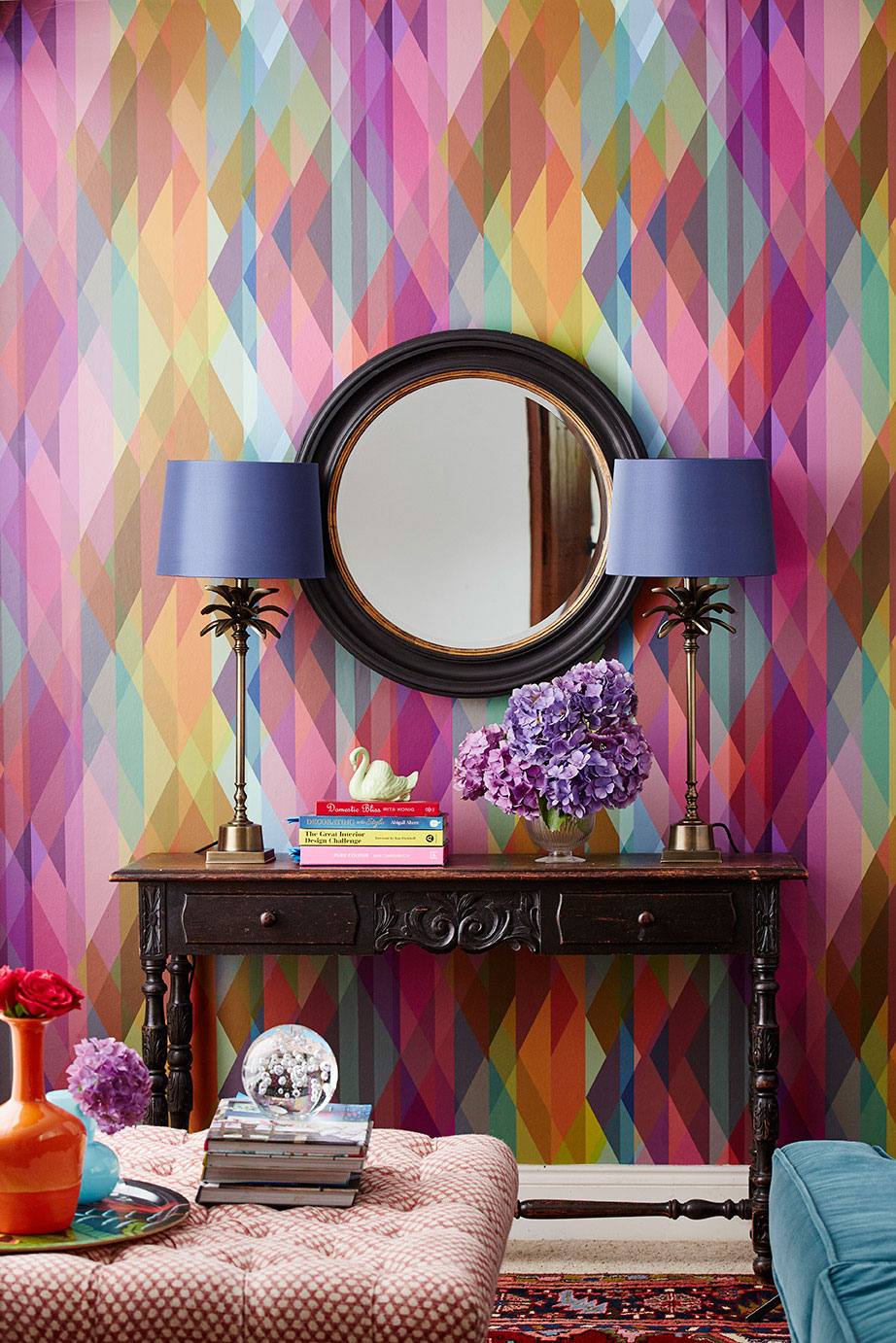
John Lewis circle wall mirror in black, £150. India Jane palm leaf stick lamp in brass, £145. Gemma tapered shade in navy, £30. All John Lewis. For more ideas on wall mirrors check out here.

A large-scale piece of wall art or a mirror is a great way to create a focal point within a room scheme. I like to maximise the impact with a little symmetry so a pair of stunning lamps either side for example really enhances the statement. Again make sure you hang your mirror or artwork nice and low so it is close to the console table or sideboard. It then looks pleasing if you break up the shape with vases and ornaments. This is where I like to break the symmetry, because I like a more relaxed feel in my home.


interior designer sophie robinson love shanging artwork in her home decor to make a space feel quirky and colourful. Wearing pink trusers and pale blue blouse with oversized pussy bow
Finally here are my five top tips to displaying art:
  1. More is more. Artwork looks great when it is grouped together either as a gallery wall or symmetrically in a grid or row.
  2. Avoid hanging your artwork too high. It looks better when it is hung close above a piece of furniture.
  3. Try and link your pictures together in some way- either by having a similar colour story throughout or similar frames
  4. Enjoy collecting artwork over time. This way you can add and subtract pieces, helping to keep your home feeling fresh and individual.
  5. Consider painting the wall behind the art wall a shade deeper than you dare. Painting look great against this contrast.


I teamed up with John Lewis with this one, who invited me to select artwork from their online store to hang in my home. I was seriously impressed with the selection and everything I have used is an in stock item- so you can get hold of it pretty quick. And they offer free home delivery which I LOVE. So if your walls are looking decidedly under dressed, then you can remedy it now without further a do! #ad

Photographs by Alun Callnender


Save

Save

Save

Save

Save

Save

Save

Save

Save

Save

Save

Save

Save

Save

Save

Save

Save

Save

Save

Save

Save

Save

Save

Save

Save

Save

  • Interior Design
  • Interior Styling
  • Interiors
  • Living rooms
  • Rooms
The annex build part 5- the day before Mum moves in! Happiness in the home project

comments

Sarah Mailer on 15.08.17

This was a brilliant read, Sophie. I love all your tips and ideas, which are varied to suit every style.

I am delighted that graphic and photographic prints have made a full resurgence, and I really enjoyed your mix of pieces and styling here. I don’t know about you, but I was starting to feel typographic art overload?! I’m also not a fan of the photo-canvas and so I’m delighted they didn’t make the cut here.

Thanks for another great article,

Sarah (aka GIRL ABOUT HOUSE)

Reply
Mia on 11.09.17

Beautiful interior design,loving the ideas, thepropped picture giving a really lovely relaxed vibe.Thanks for this brilliant article

Reply
Sophie Robinson on 11.09.17

My pleasure

Reply
Bella on 11.09.17

This was a brilliant article.Good looking one.love to make this type of hang artwork..

Reply
Sophie Robinson on 11.09.17

Thank you!

Reply
Kathleen on 15.09.17

Amazingly good looking!!! loving your tips and ideas.Stylish,modern and beautiful hang artwork for a house.Thanks.

Reply
Sophie Robinson on 19.09.17

Glad you found the feature useful x

Reply
Iris on 18.09.17

Wow!! It look really great.Good and useful article.Love the idea of hang artwork.Thanks.

Reply

Leave a Comment

Cancel Reply

Your email address will not be published.

  • Interiors
    • colour crush
    • colour psychology
    • DIY
    • dream home makeovers
    • Home Tours
    • Interior Design
    • Interior Styling
    • podcast
    • trends
  • Lifestyle
    • Business
    • Fashion/Beauty
    • Life
    • My House
    • Nosh
    • Travel
  • Rooms
    • Bathrooms
    • Bedrooms
    • Kids rooms
    • Kitchens
    • Living rooms
    • Outside
  • Videos

mailing
list

Videos

Listen

Listen Here

Online courses
by popular demand

Catch Sophie In All Her Colourful Glory On Instagram

Ah @the_rhs Chelsea! What a feast for the eyes! In Ah @the_rhs Chelsea! What a feast for the eyes! Inbetween biblical downpours, thunder and lightning, it was a wonderful day of colour, design and chatter with some wonderful women! I’m slowly falling in love with gardening and my phone roll is full of inspiration after being immersed in natures finest. Thanks @michelleogundehin and @hazelgardinerdesign @thesohoagencyuk for the company. And a big congratulations Hazel on this stunning floral installation. And don’t forget if you want to hang out and be inspired by all things colour then my FREE live webinar is on tonight (25th) at 7pm tonight! Hop on to my profile for the link to sign up. Cannot wait to share some inspirational colour filled time with you all 

#rhschelsea
This is the first room we decorated after our reno This is the first room we decorated after our renovations. The entrance to your home creates the first impression. It’s also the room you walk into first thing in the morning and when you return home at the end of a long day. It needs to create the right welcome and what that feels like is hugely personal. For me I chose my favourite colours, this powerful cobalt  blue has always been a colour I’m drawn to. My wardrobe is full of it. And the bright pink is another one that always makes me instantly happy. Together they are a striking combination and I think anyone who walks through my front door, immediately gets a sense of what I’m about. I’m passionate about creating interiors that authentically  reflect the people who live there. Studying the psychology of colour made it so much easier for me, giving me a deeper understanding on the affects of colour and streamlining my process. If you’d like to know how to unlock your colour super power, join me for a free webinar this Wednesday evening (available to up for 48 hours after). It an introduction into colour psychology for interiors and my hope is it inspires you to have the courage and conviction to know what’s right for you.  And for a deeper dive my online course Colour Psychology for interiors has opened for enrolment. All links to sign up are in my bio on my profile @sophierobinsoninteriors 
What does your hallway say about you? 
📷 @aluncallenderphoto 
CREDITS walls in lazuli by @zoffanyfw stair runner @roger_oates floor tiles @claybrookstudio door painted in rose ash @sanderson1860 

#colourpsychology #colourpsychologyforinteriors #banthebiege #punchyhome #hallway #boldcolourinteriors #colourlover
My kitchen, the heart of my home. The smallest, da My kitchen, the heart of my home. The smallest, darkest room in the house with no view, but that’s old houses for you! You’ll often find the kitchen in the worst place. So to amp up the joy I chose a forest green (hunters green by @zoffanyfw) for the cabinets to mirror the woodland outside. We sourced reclaimed school science lab work tops and I wrapped the room in one of my favourite papers, Rubarber by @borastapeter. Tom put in retro fit underfloor heating and we used reclaimed terracotta tiles from @ca_pietra_  so the floor looks as old as the house but feels so warm! . For the ugliest darkest room in the house it’s become our favourite because of the colours, patterns and rustic textures.that’s the power of great interior design! 
Next up in my series of posts about the psychology of colour is the Autumn personality. You’ll have a love of rich deep warm Colours, natural finishes, nature inspired patterns and period features. The autumn palette is warm, earthy abs rich and perfect for making spaces feel cosy and inviting. 
To learn more about the autumn personality, hop on up to my bio and click the link to be taken to the blog. And you can sign up to my FREE webinar I’m hosting next Wednesday if you’d like to learn more about this powerful framework. 
Meanwhile have a gorgeous weekend! 
📷 @aluncallenderphoto Styling @katemcphee 

#colourpsychology #banthebeige #autumnpersonality #colourpsychologyforinteriors #kitchen #greenkitchen #countryhomesandinteriors #countrykitchen #ihavethisthingwithcolor #myeclectichome #maximalistdecor
Come and join my FREE webinar on Colour Psychology Come and join my FREE webinar on Colour Psychology next Wednesday 25th at 7pm GMT 🤩 hop on up to the link in my bio @sophierobinsoninteriors to register.
My brilliant online course, Colour Psychology for Interiors, is open for enrolment this month, so if you fancy finding out a bit more about this utterly game changing framework I’d love to have you join. It’s SO MUCH more than ‘ red is energising’, ‘blue is calming’ stuff you’ve all heard before. This is a deep dive into discovering how colours work, how to harmonise them and discovering your own unique and authentic style. Only then can you create a home you live and one that supports you emotionally. I LOVE teaching this stuff because the feedback I get from students is mind blowing! Don’t take my word for it, sign up for the free webinar today! 😍 and if you’ve already done my course, please share in the comments below what you loved about it. 

#colourfulhome #colourpsychology #colourpsychologyforinteriors #banthebeige #colourlover #confidentcolour #confidentcolourscheming
Have you found your design mojo? Do you gravitate Have you found your design mojo? Do you gravitate towards a style of interiors that just feels so ‘you’. Making a home is so much more than creating beautiful squares for Instagram. It has to FEEL right and this is where the psychology of colour comes in. Colour is light, it has an energy which directly impacts your brain and emotions. And we all have a unique relationship to it. So rather than follow the crowd, be swayed by trends it’s so important to understand your own authentic relationship with colour. Over on the blog today I’m starting a series of posts all about the seasonal colour personalities. First up is spring which is all the joy, uplift and energy. My bathroom, pictured above, is very ‘spring’ with light reflecting walls, energetic patterns and bright colours. The mood  is uplifting, fresh and feel-good. Hop on up to my link in my profile to read the blog post in full and discover if you are a Spring personality and how to create rooms that reflect this joyful mood. 
Tap for credits
📷 @aluncallenderphoto 

#colourpsychology #colourpsychologyforinteriors #banthebeige #colourfulhome #colourlover #ihavethisthingwithcolor #spring #springbpersonality #colourfuldecorchallenge #homedecor #myeclecticmix #bathroom #bathroominspo
So proud of mr best mate @sophieabbottartist who o So proud of mr best mate @sophieabbottartist who opens her house this weekend to showcase her artwork in her home as part of Brightons artists open houses. She’s always been a creative whirlwind and keeps the joy of colour alive in her paintings inspired by the sea, and the local woodlands that surround her home in Brighton. For Sophie, colour gives her life, she’s the ultimate joy monger and I’m so blessed to have her as my side kick in life. If you get a chance today, pop round to heed for a bolt if the feel good vibes

#artistopenhouses #brighton #colourlover #banthebiege #ihavethisthingwithcolour
When you find the palette of colours you love, you When you find the palette of colours you love, you just wantto surround yourself  in every part of your home! This painting by @studiocoverdale really hits the mark for me, with all my favourites on one place. Today I’m opening my most popular online course, ‘Colour Psychology for a interiors’, ready  for your enrolment. This is my most popular and indeed  powerful course. It gets to the core of how colours work in harmony , how they effect you emotionally and how to bring all the design and pattern  elements together to make your home and your heart sing! I’m a Spring personality, and with that I adore all the busy patterns, bright and vibrational colours, plenty of pretty details and preferably all at once! While typical spring personalities prefer a more delicate and soft colour palette, my secondary season is Autumn, which prefers richer and punchier shades. Combined together my home is unique and perfect for me. I honestly rarely want to leave the house! And while this framework is an amazing tool for interior design, it’ll also give you colour confidence in every area of your life including your wardrobe. I can’t recommend it enough. When I started implementing this framework  in my own design practice six years ago it was absolutely game changing! While I’ve  always been confident with bold colour, this insight gave me the clarity to speed up my design process and get it right every time! Hop on over to the link in my bio to find out more. 
📷 @aluncallenderphoto 
#colourpsycholgy #colourlover #banthebiege #colourfulhome #colourmyhome #maximalistinteriors #boldbravebeautifulinteriors #dopaminedressing #dopaminedecor
The power of paint! I’ve been extolling it’s v The power of paint! I’ve been extolling it’s virtues my entire career. Roll a bold new hue on your walls and voila! Game changer. But on our recent podcast @mad_about_the_house explored the wider impact of paint on the environment. An astonishing 50 million litres makes it into landfill each year so it feels like, as serial decorators, we could all club together and do our bit to bring that figure down. 
It’s a minefield but over on my blog today I sum up my tips on how we can easily use less of it and round up the paint brands who are doing their bit to tackle the issues. From the ingredients in the tin, to recycling waste paint, to using pouches rather than tins, there is plenty of innovative ideas. Choosing natural paint feels like a good option and if you’re hooked on designer paint colours, it’s no more expensive. Last year I painted my bedroom Turquoise by @edwardbulmerpaint and I’m thrilled with the colour, quality and durability. Just goes to show lovely paint doesn’t have to cost the earth. Hop onto the link in my profile for the full post and if you know if a paint brand who are tackling the environmental issues raised, please give them a mention in the comments below.

#ecopaint #ecodecor #ecohome #paint #turquoise #bedroom #podcast #banthebiege #colourfulhome #colourlover #itsonlypaint #interiordecorating #interiordesign #colourscheme
Load More… Follow on Instagram
Sophie Robinson
  • © 2017 Sophie Robinson

    /
  • Contact/
  • About/
  • Design by MW

Don't forget to join!

You're almost inside!

Leave me your best email to sign up for the Webinar