fbpx
Sophie Robinson
  • Home
  • Workshops
    • Marrakech Retreat
    • Ban the beige
    • Masterclasses
  • Online Courses
  • Collaboration
  • Podcasts
  • Blog
  • About
    • About me
    • Work with me
    • Press
  • FAQs
  • Contact
  • DIY
  • Interior Design
  • podcast
11 Jul 19

Mid century modern, #dolessharm and garden updates – show notes S4 Ep1

Interior designer Sophie Robinson and journalist Kate Watson-Smyth The Great Indoors podcast, bright floral and rhubarb plants on dark green background wallpaper kitchen

So we are back! After a month off, (like grey, we didn’t go away, just having a little lie down) Kate and I have returned for another interior packed series of our podcast, The Great Indoors.  The team are delighted to be back and to say a huge thank you to our new sponsors Topps Tiles and our ever fabulous producer Kate Taylor. If you haven’t already, you can listen to the full episode here.

In the first episode, we discuss whether you should invest in the Mid-Century trend, cover the hot topic of the moment, sustainability, and share some great tips on how to update the garden this summer.

Mid-Century modern

We have all seen this trend in one form or another for quite a while now, and it just doesn’t seem to be going anywhere just yet! So why has it stood the test of time and why are we (or rather most of us) so enraptured with this style?

To start off with – a brief background for you. The style first took hold roughly in the 1930s up to the mid-1960s, particularly in the US as many of the German designers fled there following the closure of Bauhaus due to the war. Clearly distinguishable by the clean lines, organic streamlined forms, and not an embellishment in sight, the look was all about the form and function rather than the twiddly details.

It could have grown in popularity as many of us who remember our parents’ and grandparents’ homes they were usually furnished with dark, ornate and rather fussy pieces, so the light and airy feel of the mid-century style was a welcome relief and a little bit of a rebellion! However, it hasn’t always been such a favourite as I was lucky enough to pick up six Ercol dining chairs for £40 at a car boot sale back in 2006/7 – something you would not be able to do now!

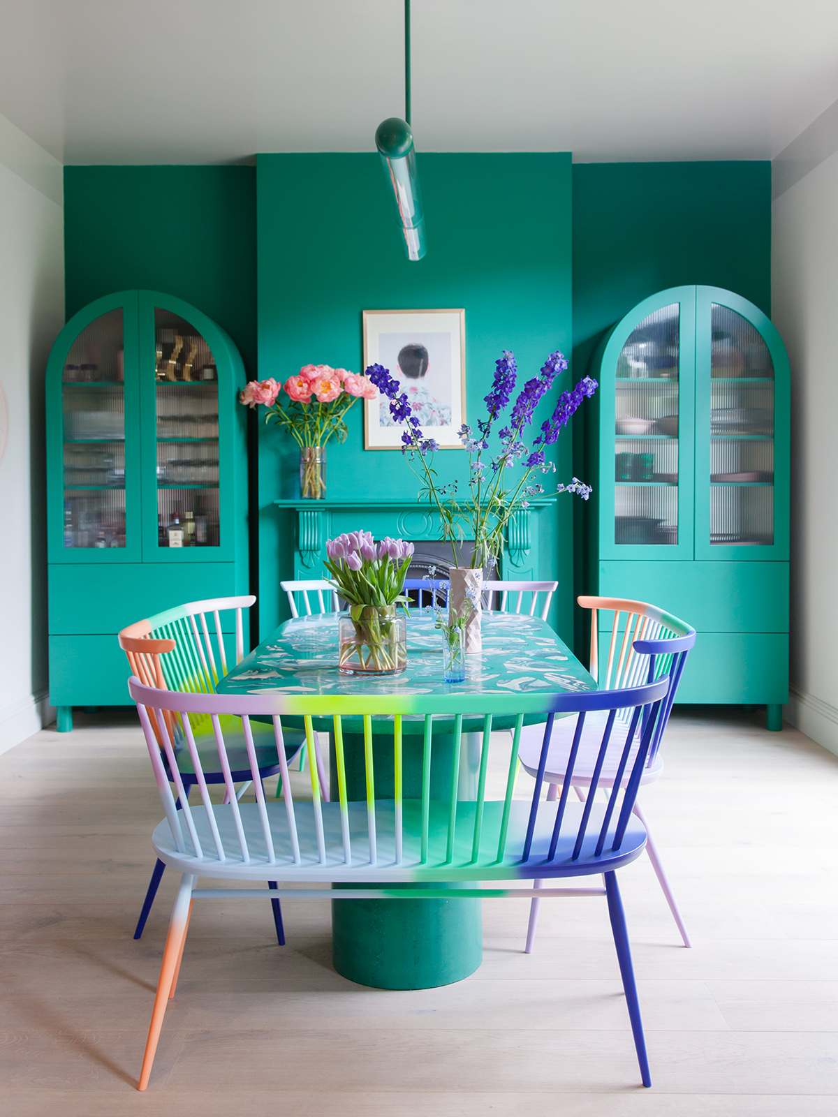
The classic Ercol Stacking chair has been given a facelift with a limited edition Cyan colourway to celebrate Furniture Village’s 30th birthday.

So in summary, the thoughts are that this trend is here to stay (and should stay) due to its versatility:

  • Looks great in any style of house/architecture and adds a simple yet sophisticated aesthetic
  • It works extremely well in small spaces as the pieces are naturally well proportioned – you won’t find anything oversized or cumbersome.
  • Great quality – pieces were built to last with expert craftsmanship
  • Can be mended and upcycled
  • Has both a warm, cosy and nostalgic feel while also ticking the modern and retro boxes

Classic companies like Ercol are able to re-invent themselves by collaborating with key designers to create future classics. The Originals Love Seat was given a makeover by 2LG.

Other mid-century designers to check out:

MissPrints, missprint.co.uk

Orla Kiely, orlakiely.com

Mini Moderns, minimoderns.com – their book Mid-Century Modern Living is a must!

Sustainability
country kitchen in dark green with mid century modern ercol chairs and pink kitchen tiles. Reclaimed hexagon terracotta floor tiles complete the modern country look

My country kitchen complete with reclaimed hexagon terracotta floor tiles by Ca’ Pietra and the aforementioned boot sale Ercol chairs which I painted.

With the recent increased awareness of disposable fast fashion, it has started to creep into interiors too, with more and more high street fashion brands adding furniture and homeware to their portfolio. Kate looked at this subject in more depth on her blog Mad About the House and in particular the disposable side of things and about how we can get rid of the stuff we have to make room for the stuff we want.

As many of us are, I feel the added pressure of how we can play a part in helping with this huge issue. Following my husband’s mission to make a difference, I watched the War on Plastic on BBC One and was overwhelmed by the huge amount of one-use plastic. So what can we do? We need to start asking questions – in particular, the companies we are buying our furniture and accessories from – what are they using for their packaging? If it’s wrapped in plastic would you still want it?

So going forward Kate is passionate to see people thinking twice about the companies they buy from, whether they have good packaging, a good recycling policy or made from sustainable materials. Kate would love to compile a resource for you on what companies are doing to help you weigh everything up before making that all important purchase. This is obviously going to be quite a task so Kate is enlisting your help for any input on some research you may have already carried out yourself. You can email her at kate@madaboutthehouse.com and please put #DoLessHarm in the subject field.

Onto the garden…

Now we finally have some sun, it’s time to enjoy the great outdoors! Kate has a bit of pergola envy as it’s her dream garden addition. She is keeping a close eye on Chelsea of @thehousethatblackbuilt on Insta as she has hers built at the end of her garden – painted black of course. Outside timber painted black makes a fab background for your outside space – just think of all that greenery against it.

Probably the easiest way to update the garden is with furniture and as Kate points out – comfort is key! Although be warned you may not want to move back inside for a while! I haven’t quite got there on the furniture front but for me, I simply drag out the odd rug and my multitude of cushions and hang out in my Morrocan inspired den under the willow tree – bliss!

Hayley Stuart’s genius garden makeover with her stencilled paving slabs taking centre stage

One of the most impressive things I’ve seen on Instagram is how Hayley Stuart transformed her garden by stencilling her plain grey concrete path and patio. Check out her Instagram feed @iamhayleystuart for more pics of this amazing space and you can see her step by step guide on how she did here.

One thing I spotted on our visit to the lovely Fearne Cotton‘s house was the astroturf or as it’s now referred to – artificial grass. It may not have been on everyone’s wish list but the technology has moved on considerably and there are so many varieties out there – although it can be quite pricey!

Another quick and easy surface solution is the Everscape system by Topps Tiles. The exclusive range features tiles in six colours that mimic different natural stones – they hard wearing and stain resistant and there’s no need to worry about laying a foundation thanks to the clever raised paving system.

Design crimes & cliches

Kate decided to feature a cliche this week – so not necessarily a crime but it’s those things that pop up everywhere that have become a cliche!

So first up… the gold pineapple despite both of us owning one in one form or another.

Ikea Stockholm rug (which I have) and Kate’s Dandelion pendant!

Do you remember the Garland light by Tord Boontje

The Eames Eiffel chair – a design classic but has been ripped off soooo much.

Please do let us know your design cliches in the comments below and we will be back with episode 2, featuring a tour of interior designer Kelly Hoppen’s home on the 25th July


Compiled and written by Luisa Ferdenzi

  • DIY
  • Interior Design
  • podcast
How to design your ultimate home workspace in the sky How to tap into your own creativity

comments

AMB on 15.07.19

I had the garland light! I loved it but it didn’t survive my many student lets and flat moves in my twenties. I was also quite wary of it – all it had was a bit of sticky rubber to insulate it and once it was removed it couldn’t go back on again!

Reply
Sophie Robinson on 19.07.19

I think mine ended up a mangles mess too!

Reply
Daisy Smith on 21.07.19

Hi Sophie, l love the mid-century modern trend and have been inspired by Palm Springs. My kitchen/ diner is white and I’m putting in colour with soft furnishings. However there is one wall at the end of the island (approx 1.5m wide) which looks very blank. Do you have any ideas to liven it up which would be in keeping with my theme?

Reply
Sophie Robinson on 23.07.19

this sounds like its begging for a feature wallpaper or mural, a large painting or a calooection of images that support the vibe you are trying to create

Reply

Leave a Comment

Cancel Reply

Your email address will not be published.

  • Interiors
    • colour crush
    • colour psychology
    • DIY
    • dream home makeovers
    • Home Tours
    • Interior Design
    • Interior Styling
    • podcast
    • trends
  • Lifestyle
    • Business
    • Fashion/Beauty
    • Life
    • My House
    • Nosh
    • Travel
  • Rooms
    • Bathrooms
    • Bedrooms
    • Kids rooms
    • Kitchens
    • Living rooms
    • Outside
  • Videos

mailing
list

Videos

Listen

Listen Here

Online courses
by popular demand

Catch Sophie In All Her Colourful Glory On Instagram

Ah @the_rhs Chelsea! What a feast for the eyes! In Ah @the_rhs Chelsea! What a feast for the eyes! Inbetween biblical downpours, thunder and lightning, it was a wonderful day of colour, design and chatter with some wonderful women! I’m slowly falling in love with gardening and my phone roll is full of inspiration after being immersed in natures finest. Thanks @michelleogundehin and @hazelgardinerdesign @thesohoagencyuk for the company. And a big congratulations Hazel on this stunning floral installation. And don’t forget if you want to hang out and be inspired by all things colour then my FREE live webinar is on tonight (25th) at 7pm tonight! Hop on to my profile for the link to sign up. Cannot wait to share some inspirational colour filled time with you all 

#rhschelsea
This is the first room we decorated after our reno This is the first room we decorated after our renovations. The entrance to your home creates the first impression. It’s also the room you walk into first thing in the morning and when you return home at the end of a long day. It needs to create the right welcome and what that feels like is hugely personal. For me I chose my favourite colours, this powerful cobalt  blue has always been a colour I’m drawn to. My wardrobe is full of it. And the bright pink is another one that always makes me instantly happy. Together they are a striking combination and I think anyone who walks through my front door, immediately gets a sense of what I’m about. I’m passionate about creating interiors that authentically  reflect the people who live there. Studying the psychology of colour made it so much easier for me, giving me a deeper understanding on the affects of colour and streamlining my process. If you’d like to know how to unlock your colour super power, join me for a free webinar this Wednesday evening (available to up for 48 hours after). It an introduction into colour psychology for interiors and my hope is it inspires you to have the courage and conviction to know what’s right for you.  And for a deeper dive my online course Colour Psychology for interiors has opened for enrolment. All links to sign up are in my bio on my profile @sophierobinsoninteriors 
What does your hallway say about you? 
📷 @aluncallenderphoto 
CREDITS walls in lazuli by @zoffanyfw stair runner @roger_oates floor tiles @claybrookstudio door painted in rose ash @sanderson1860 

#colourpsychology #colourpsychologyforinteriors #banthebiege #punchyhome #hallway #boldcolourinteriors #colourlover
My kitchen, the heart of my home. The smallest, da My kitchen, the heart of my home. The smallest, darkest room in the house with no view, but that’s old houses for you! You’ll often find the kitchen in the worst place. So to amp up the joy I chose a forest green (hunters green by @zoffanyfw) for the cabinets to mirror the woodland outside. We sourced reclaimed school science lab work tops and I wrapped the room in one of my favourite papers, Rubarber by @borastapeter. Tom put in retro fit underfloor heating and we used reclaimed terracotta tiles from @ca_pietra_  so the floor looks as old as the house but feels so warm! . For the ugliest darkest room in the house it’s become our favourite because of the colours, patterns and rustic textures.that’s the power of great interior design! 
Next up in my series of posts about the psychology of colour is the Autumn personality. You’ll have a love of rich deep warm Colours, natural finishes, nature inspired patterns and period features. The autumn palette is warm, earthy abs rich and perfect for making spaces feel cosy and inviting. 
To learn more about the autumn personality, hop on up to my bio and click the link to be taken to the blog. And you can sign up to my FREE webinar I’m hosting next Wednesday if you’d like to learn more about this powerful framework. 
Meanwhile have a gorgeous weekend! 
📷 @aluncallenderphoto Styling @katemcphee 

#colourpsychology #banthebeige #autumnpersonality #colourpsychologyforinteriors #kitchen #greenkitchen #countryhomesandinteriors #countrykitchen #ihavethisthingwithcolor #myeclectichome #maximalistdecor
Come and join my FREE webinar on Colour Psychology Come and join my FREE webinar on Colour Psychology next Wednesday 25th at 7pm GMT 🤩 hop on up to the link in my bio @sophierobinsoninteriors to register.
My brilliant online course, Colour Psychology for Interiors, is open for enrolment this month, so if you fancy finding out a bit more about this utterly game changing framework I’d love to have you join. It’s SO MUCH more than ‘ red is energising’, ‘blue is calming’ stuff you’ve all heard before. This is a deep dive into discovering how colours work, how to harmonise them and discovering your own unique and authentic style. Only then can you create a home you live and one that supports you emotionally. I LOVE teaching this stuff because the feedback I get from students is mind blowing! Don’t take my word for it, sign up for the free webinar today! 😍 and if you’ve already done my course, please share in the comments below what you loved about it. 

#colourfulhome #colourpsychology #colourpsychologyforinteriors #banthebeige #colourlover #confidentcolour #confidentcolourscheming
Have you found your design mojo? Do you gravitate Have you found your design mojo? Do you gravitate towards a style of interiors that just feels so ‘you’. Making a home is so much more than creating beautiful squares for Instagram. It has to FEEL right and this is where the psychology of colour comes in. Colour is light, it has an energy which directly impacts your brain and emotions. And we all have a unique relationship to it. So rather than follow the crowd, be swayed by trends it’s so important to understand your own authentic relationship with colour. Over on the blog today I’m starting a series of posts all about the seasonal colour personalities. First up is spring which is all the joy, uplift and energy. My bathroom, pictured above, is very ‘spring’ with light reflecting walls, energetic patterns and bright colours. The mood  is uplifting, fresh and feel-good. Hop on up to my link in my profile to read the blog post in full and discover if you are a Spring personality and how to create rooms that reflect this joyful mood. 
Tap for credits
📷 @aluncallenderphoto 

#colourpsychology #colourpsychologyforinteriors #banthebeige #colourfulhome #colourlover #ihavethisthingwithcolor #spring #springbpersonality #colourfuldecorchallenge #homedecor #myeclecticmix #bathroom #bathroominspo
So proud of mr best mate @sophieabbottartist who o So proud of mr best mate @sophieabbottartist who opens her house this weekend to showcase her artwork in her home as part of Brightons artists open houses. She’s always been a creative whirlwind and keeps the joy of colour alive in her paintings inspired by the sea, and the local woodlands that surround her home in Brighton. For Sophie, colour gives her life, she’s the ultimate joy monger and I’m so blessed to have her as my side kick in life. If you get a chance today, pop round to heed for a bolt if the feel good vibes

#artistopenhouses #brighton #colourlover #banthebiege #ihavethisthingwithcolour
When you find the palette of colours you love, you When you find the palette of colours you love, you just wantto surround yourself  in every part of your home! This painting by @studiocoverdale really hits the mark for me, with all my favourites on one place. Today I’m opening my most popular online course, ‘Colour Psychology for a interiors’, ready  for your enrolment. This is my most popular and indeed  powerful course. It gets to the core of how colours work in harmony , how they effect you emotionally and how to bring all the design and pattern  elements together to make your home and your heart sing! I’m a Spring personality, and with that I adore all the busy patterns, bright and vibrational colours, plenty of pretty details and preferably all at once! While typical spring personalities prefer a more delicate and soft colour palette, my secondary season is Autumn, which prefers richer and punchier shades. Combined together my home is unique and perfect for me. I honestly rarely want to leave the house! And while this framework is an amazing tool for interior design, it’ll also give you colour confidence in every area of your life including your wardrobe. I can’t recommend it enough. When I started implementing this framework  in my own design practice six years ago it was absolutely game changing! While I’ve  always been confident with bold colour, this insight gave me the clarity to speed up my design process and get it right every time! Hop on over to the link in my bio to find out more. 
📷 @aluncallenderphoto 
#colourpsycholgy #colourlover #banthebiege #colourfulhome #colourmyhome #maximalistinteriors #boldbravebeautifulinteriors #dopaminedressing #dopaminedecor
The power of paint! I’ve been extolling it’s v The power of paint! I’ve been extolling it’s virtues my entire career. Roll a bold new hue on your walls and voila! Game changer. But on our recent podcast @mad_about_the_house explored the wider impact of paint on the environment. An astonishing 50 million litres makes it into landfill each year so it feels like, as serial decorators, we could all club together and do our bit to bring that figure down. 
It’s a minefield but over on my blog today I sum up my tips on how we can easily use less of it and round up the paint brands who are doing their bit to tackle the issues. From the ingredients in the tin, to recycling waste paint, to using pouches rather than tins, there is plenty of innovative ideas. Choosing natural paint feels like a good option and if you’re hooked on designer paint colours, it’s no more expensive. Last year I painted my bedroom Turquoise by @edwardbulmerpaint and I’m thrilled with the colour, quality and durability. Just goes to show lovely paint doesn’t have to cost the earth. Hop onto the link in my profile for the full post and if you know if a paint brand who are tackling the environmental issues raised, please give them a mention in the comments below.

#ecopaint #ecodecor #ecohome #paint #turquoise #bedroom #podcast #banthebiege #colourfulhome #colourlover #itsonlypaint #interiordecorating #interiordesign #colourscheme
Load More… Follow on Instagram
Sophie Robinson
  • © 2017 Sophie Robinson

    /
  • Contact/
  • About/
  • Design by MW

Don't forget to join!

You're almost inside!

Leave me your best email to sign up for the Webinar