GET THE REPLAY OF THE VISION BOARD MASTERCLASS - LIFE IN COLOUR

Sophie Robinson
  • Home
  • Workshops
    • Marrakech Retreat
    • Home Masterclass
  • Online Courses
  • Collaboration
  • Podcasts
  • Blog
  • About
    • About me
    • Work with me
    • Press
  • FAQs
  • Contact
  • Interiors
  • podcast
14 Nov 19

Small spaces, Christmas trends & nature inspired interiors-Podcast notes S5 Ep4

IMG 8901

Hello and welcome to The Great Indoors Podcast. For this week’s episode, we have moved away from our usual podcast hubs to my bijou little holiday let in Brighton. Before we get on to that, a huge thank you to our sponsor John Lewis & Partners and our fab producer Kate Taylor.

On with the show, as we take a tour around my snug cottage we share some top tips on small space living, and yes, it’s that time of year again when we get to discuss Christmas trends and then finally we chat about why interiors are inspired by nature. If you haven’t done so already you can listen to us in full here and don’t forget our ever-growing Facebook group, it’s a fab interior-loving community, so please get involved and share your views and questions about the show.

(For all my Instagram followers out there you would have noticed that this little place is getting a makeover, so watch this space.)

Decorating small spaces

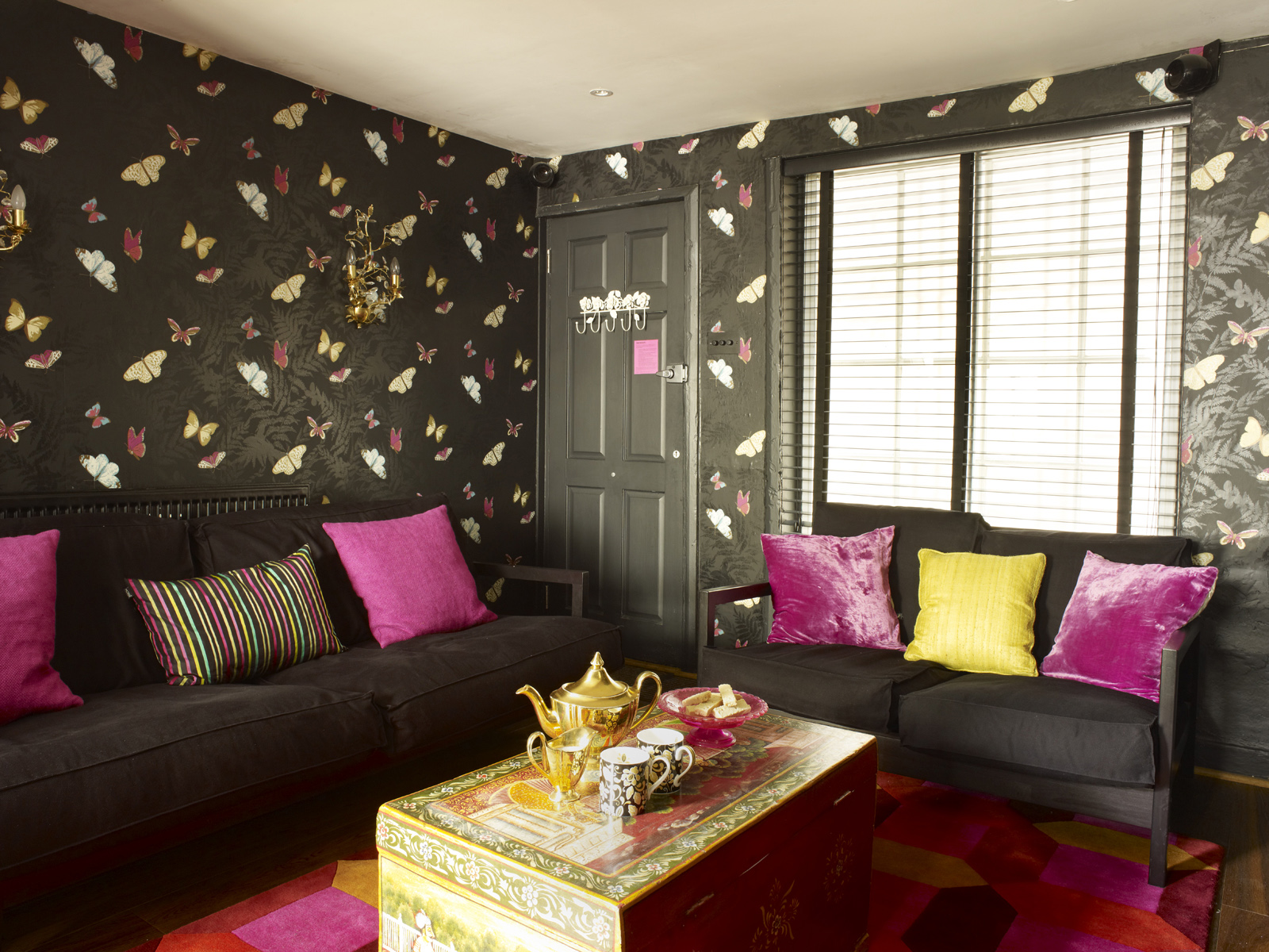
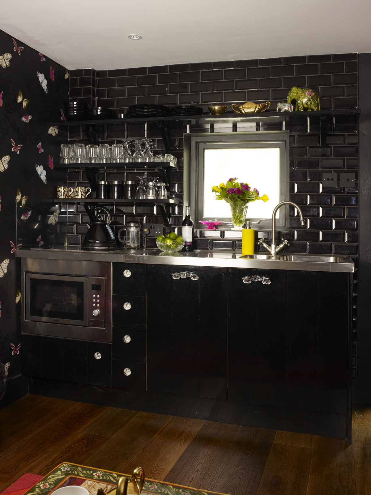
Kate’s initial reaction to my central Brighton cottage was a surprise to say the least, as she thought the design and colour scheme was very ‘un Sophie’ and thought she had walked into the wrong house. There is a reason however, I went dark with the scheme as it’s on a twitten alley so lacks lots of natural light. A common mistake is to go for white in a small, dark space but in actual fact, this can make it look quite grey and depressing so I say go for a dark and dramatic scheme and embrace the cosiness. As it is an open-plan space I went for black kitchen units, tiles and walls so that the kitchen would disappear and not jump out as soon as you enter the house.

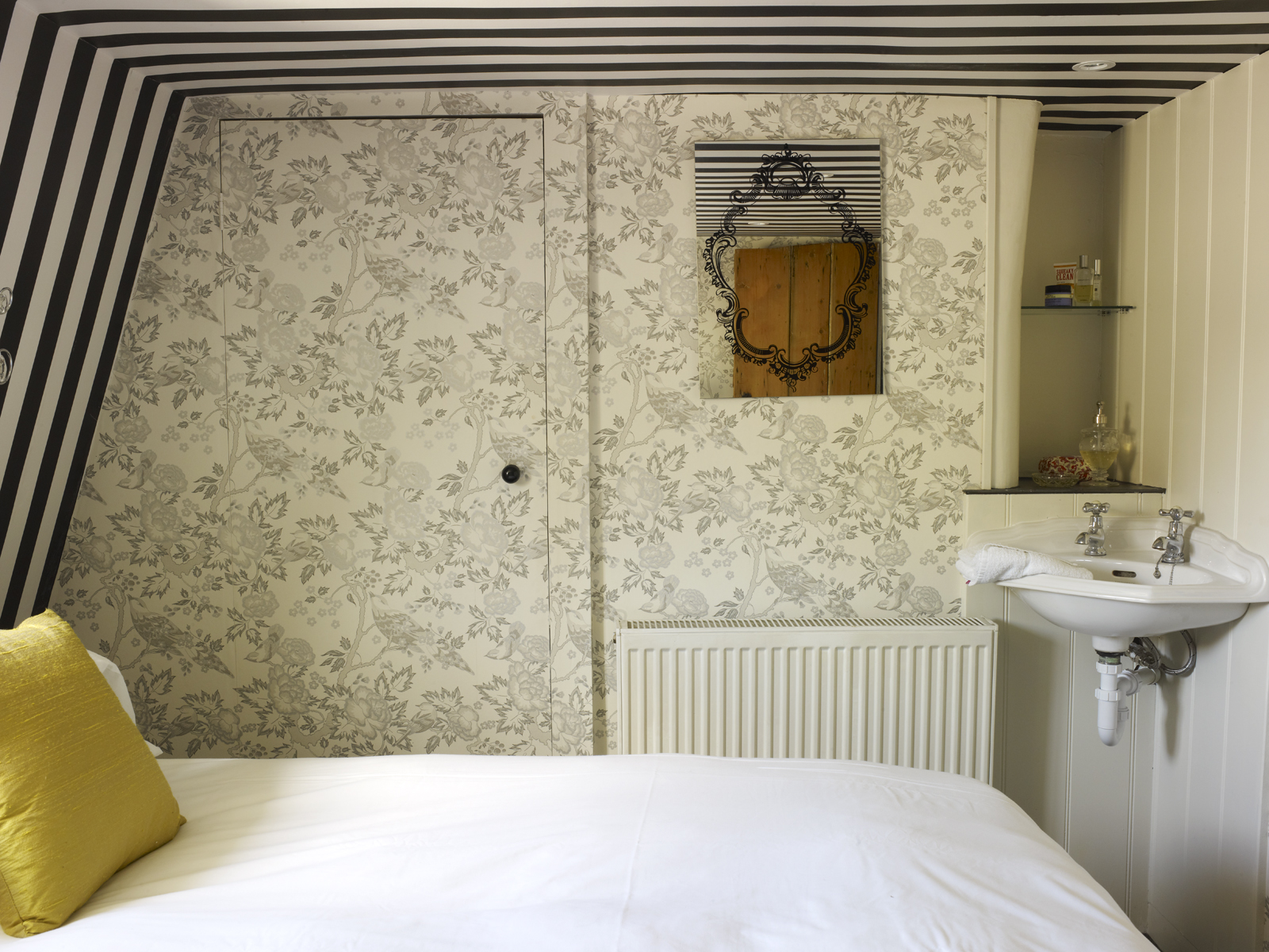
Up the narrow, steep staircase circa 1565, to the master bedroom with custom made shutters and a shiny/flock wallpaper which I think all needs a re-fresh so I’m tackling this room too.


Master bedroom with ogee trellis Du Barry flock wallpaper by Osborne & Little

Onto the bathroom…… wait for Kate’s reaction – if you don’t already know Kate doesn’t do yellow! The canary yellow bathroom features a double wet room as it was just too small a space to keep the original bath and as it’s a holiday let it was just a more practical option. Going full-on colour and full-on pattern in a small bathroom will make it fell really grand and luxurious.

I love wallpaper in the bathroom and my top tip is to obviously stick it down really well, and foil paper is especially tough and durable but above all invest in a good extractor fan. Check out a post I did on wallpapering a bathroom here.

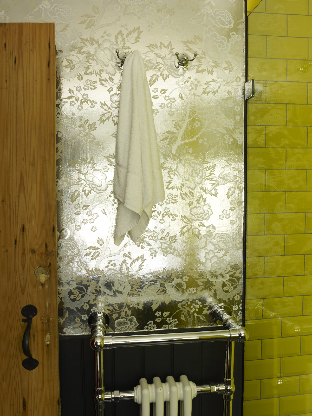
The bathroom is Wallpapered In Anna French Songbirds Foil and stood the test of time – ten years actually.


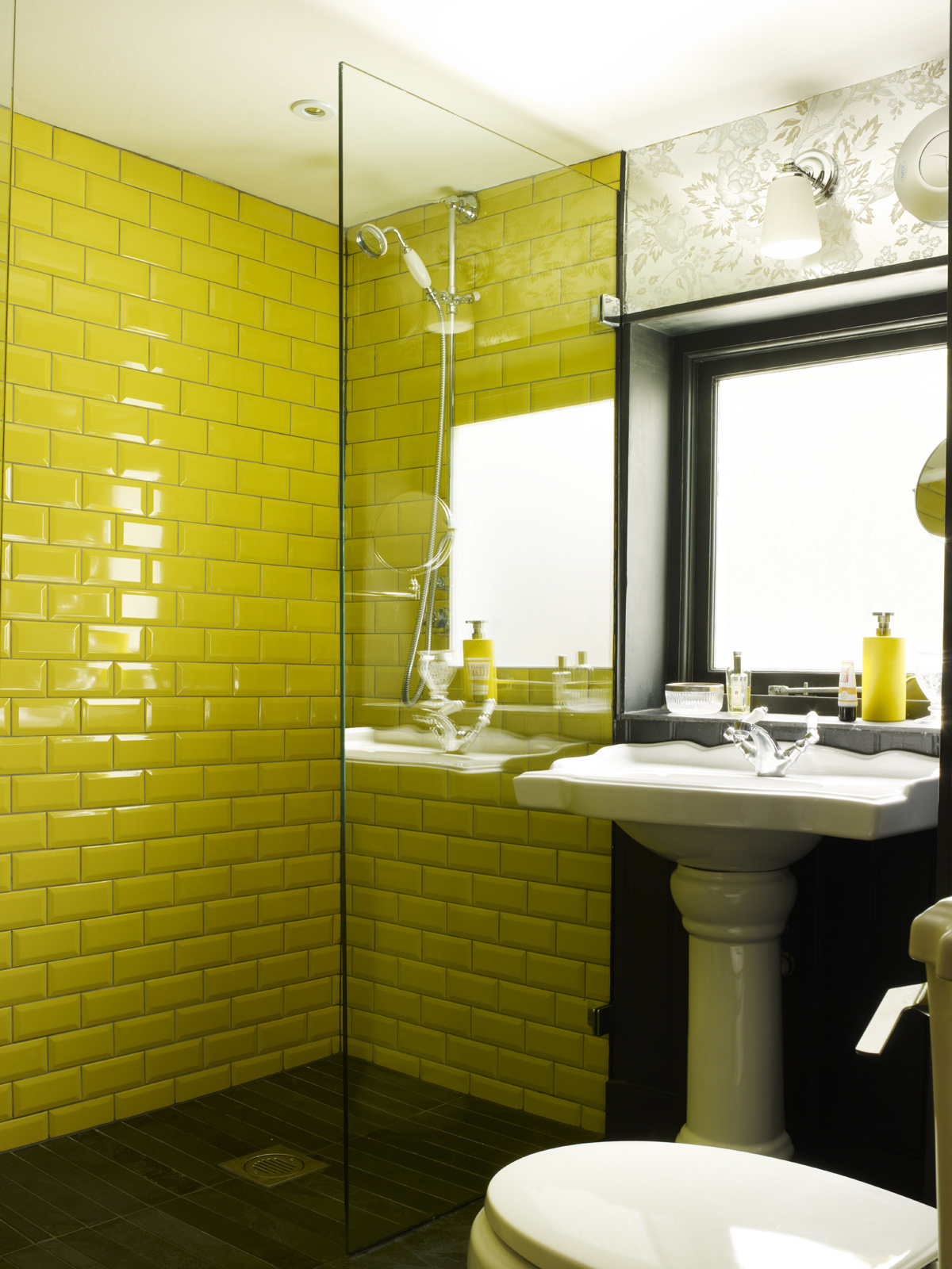
The Main Wet Shower Area Is Tiled And Then The Rest Of The Bathroom Is Wallpapered In A Beautiful Foil Paper Which Bounces The Light Around The Room

Up another narrow staircase via the landing featuring the Woods wallpaper by Cole & Son and I went for foil colourway to add interest and helps bounce light into the space.

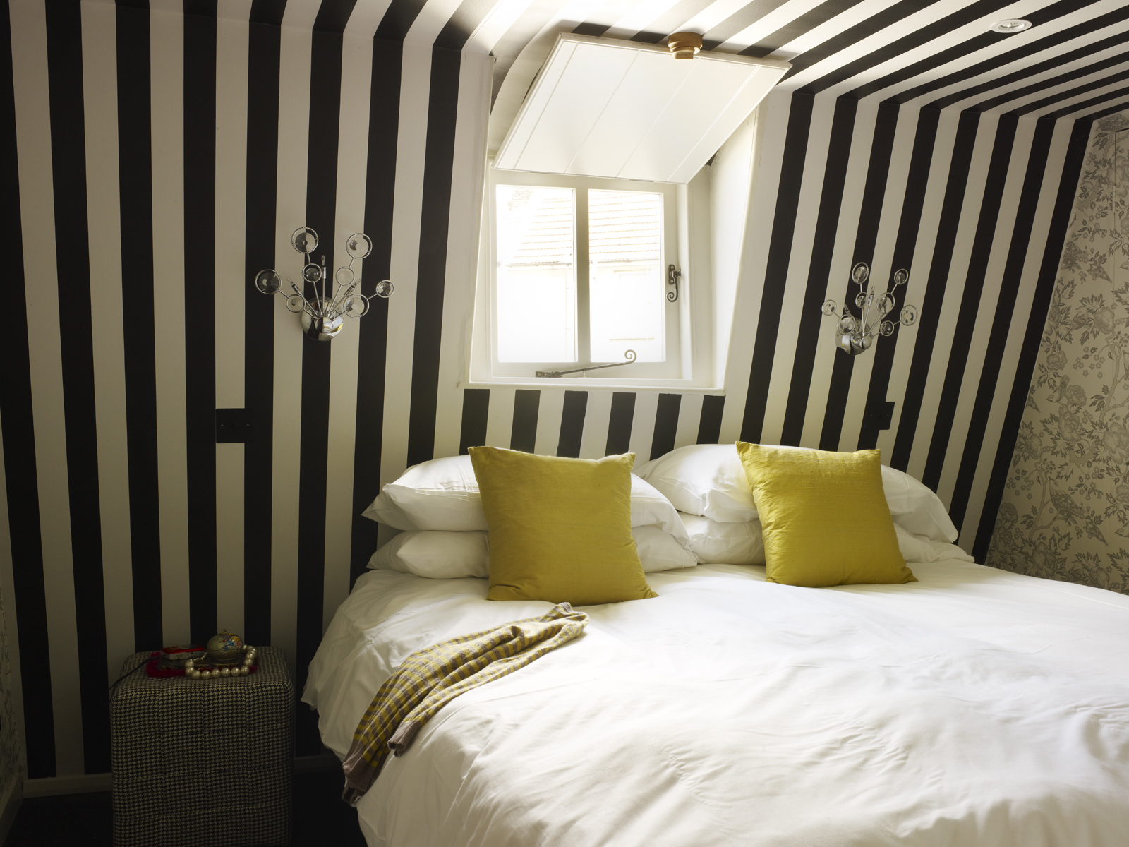
The twin bedroom also has the same Anna French wallpaper as the bathroom but not in the foil finish, adding a soft touch to balance out the strong stripes.

This twin attic bedroom room definitely got the Kate Watson-Smyth seal of approval. Another small space and another visual trick, a broad vertical stripe wallpaper leads the eye up and I carried it onto the ceiling creating a sense of height and space.

Through another door is a hidden tiny third bedroom which Kate said was more ‘me’. I created this bespoke headboard by covering pre-cut pieces of MDF with remnant fabrics and foam although I will have to double check with the builder husband about placing them on the wall!

If you have a small or guest bedroom, don’t worry about trying to squeeze in some storage furniture, just a row of hooks and some stylish coat hangers will be plenty for guests to hang their wares.

You know me I love colour clashing and I think the pink flock hangers look fab against the wall painted in Thai Sapphire by Little Greene. I won’t be touching this bedroom, ten years on I’m still loving it.

Christmas trends

Mr Christmas pointed out the rather large squirrel nestled in the Campfire theme Christmas tree – inspired by nature

So who better to chat about those annual trends than Mr Christmas himself AKA Dan Cooper, Christmas Buyer for John Lewis & Partners spends the whole year in search of those unique and interesting decorations.  We met up with him at the Oxford Street store to get some insider hints and tips. First things first, one thing I wanted to know (and prove to Kate) if tinsel has made a come-back? Through Kate’s thorough research, last year John Lewis’ tinsel sales were up by 11% – music to my ears.  And I’m pleased to say than Dan is on board the tinsel train too.

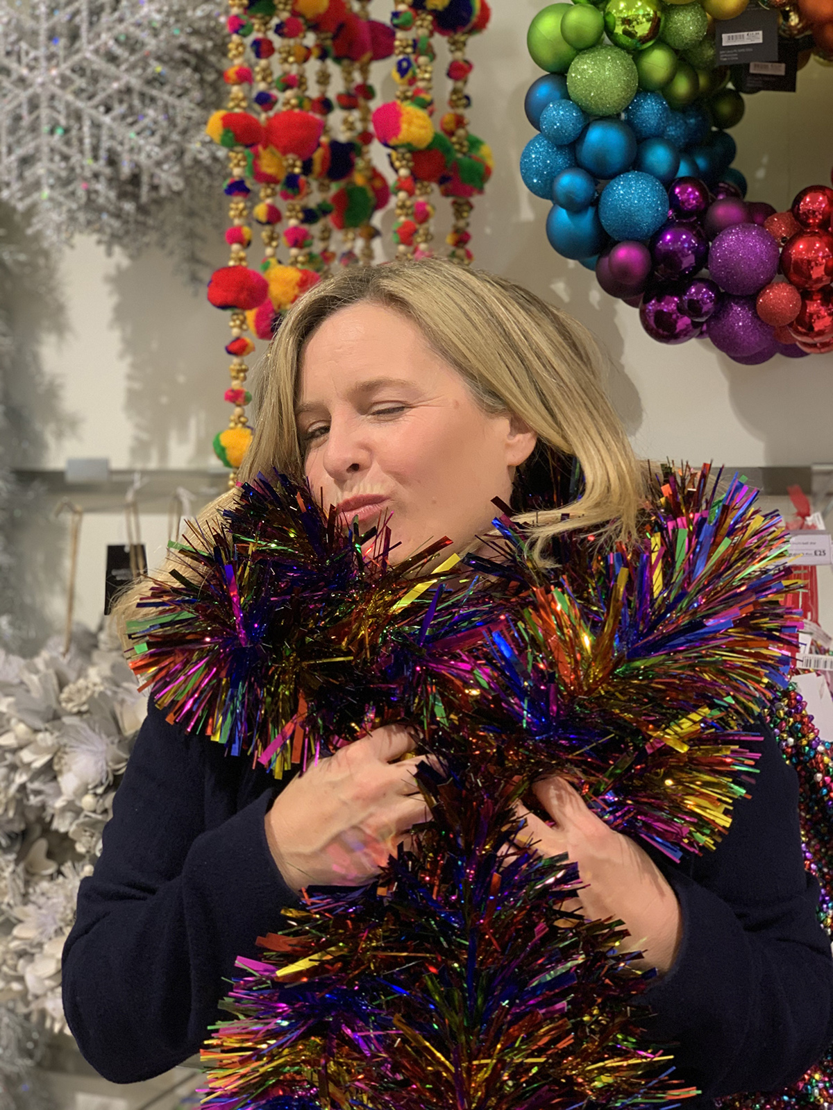
I know Kate would prefer the original tinsel, invented in Germany in 1610 (thanks  Kate for another stat), which was made from strips of beaten silver, but I think I’ll have to go with the full-on Rainbow Stripe Tinsel as modelled here by Moi.

So as for themes, this year The Sanctuary range features blush, on-trend pinks – not traditionally Christmas but Dan said there isn’t really such a thing a ‘traditional’ Christmas style and pretty much anything goes, as people want their trees to be more unusual and individual.  They are selling more and more unusual decorations – a glass backpack, for instance, has become a top seller as people are giving them as token gifts.

The rather pretty Sanctuary theme featuring blush and pastel tones is the latest look for trees this Christmas

Interestingly, Dan said that over the years people have become more aware of the interior the tree is going into, in the past, it was a stand-alone element and the tree didn’t relate. In recent years sales of blue-toned trees increased which presumably was reflected by the trend towards grey and neutral schemes.

Top tip… as the trend for ‘showing off’ the tree in the window to your neighbours may have worn off as we are now showing them off on Instagram. However, as Dan points out it is incredibly difficult to take a good shot of the Christmas tree, the lighting is never in the right place and coming from every direction, so customers are advised to use some larger pieces on the tree – hence the squirrel – to create a focal point.

Interiors inspired by Nature
william morris wallpaper, treliss from Standen house

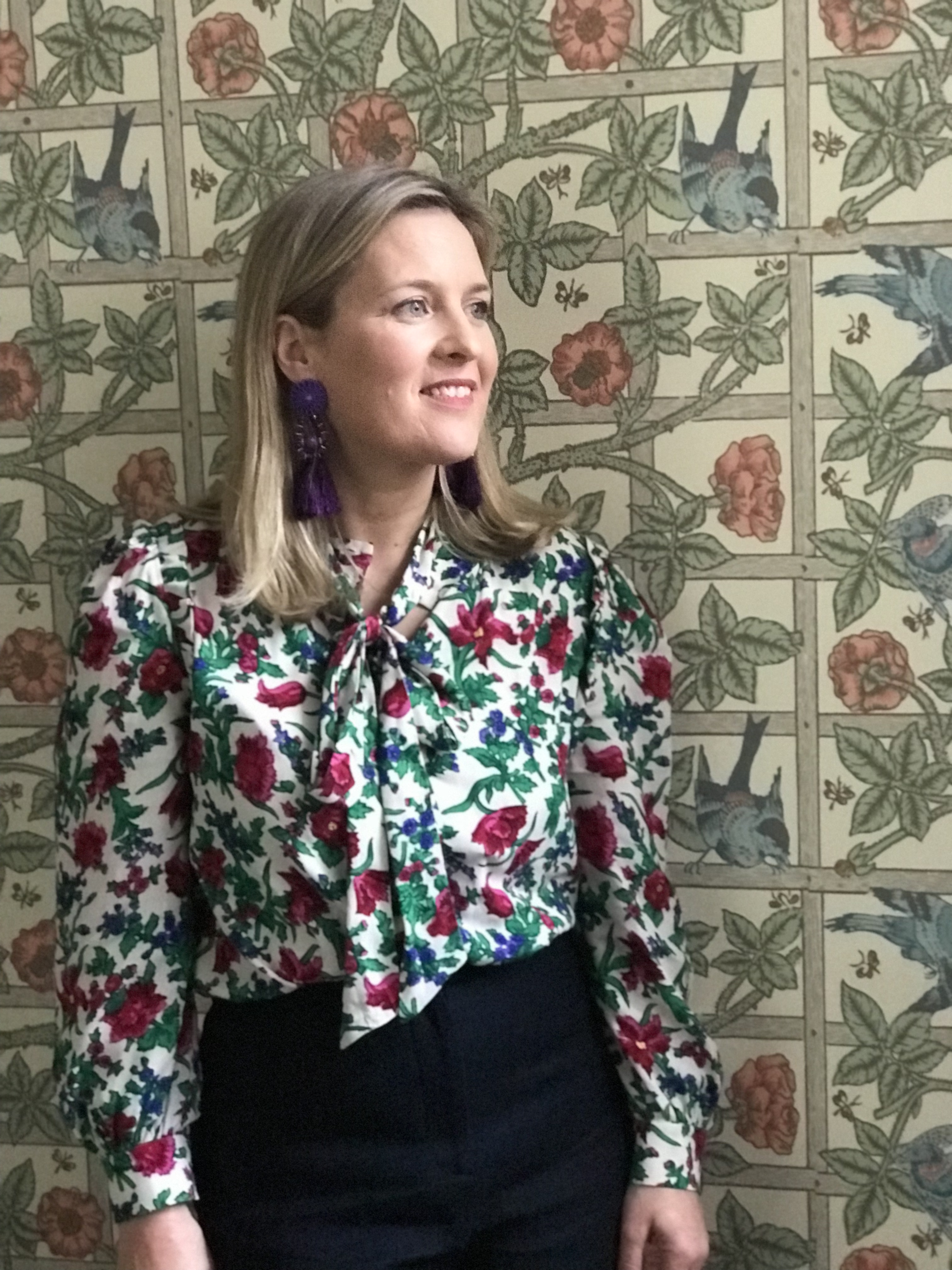
This is the Trellis wallpaper first designed by William Morris in 1864. This photo was taken in the amazing Standen House near East Grinstead. Well worth a visit for anyone who loves his original designs.

So, we know that green has been big news of late, we discussed Dulux’s colour of the year Tranquil Dawn (green), we’ve seen increased awareness of Biophilia and brands are collaborating with the Natural History Museum for example. Not forgetting William Morris is having a renaissance, on a range of accessories too, so as much as we chat about trends when you think about it our fascination with using the natural world as inspiration as been around forever. From animals and flora and fauna to botanicals, birds and butterflies, they are all motifs that have been used in interior design for ages. So where did this love for introducing nature come from? Cue research queen Kate – looking back at the Art Nouveau movement it was very much about the natural forms and structures which were meant to uplift and inspire, with the natural curves of plants and flowers. William Morris’ most popular design, trellis was inspired by the view from his study window in his country home, so it quite simply was typical English Country style.

But then came Art Deco which took a lead from industry, but it soon came round again with the quintessentially English country look which was popularised by American Nancy Lancaster who bought Colefax & Fowler in the 1940s, known for their country influences, with floral cushions and lampshades, all brought together with flowers depicted in the fabrics, in picture frames and with real flowers dotted around.

Florals seem to be just as popular now with designers taking that classic look, having fun with it and adding their own unique stamp on the style. This look is much easier to achieve than minimalism as pretty much anything goes – there are no rules!

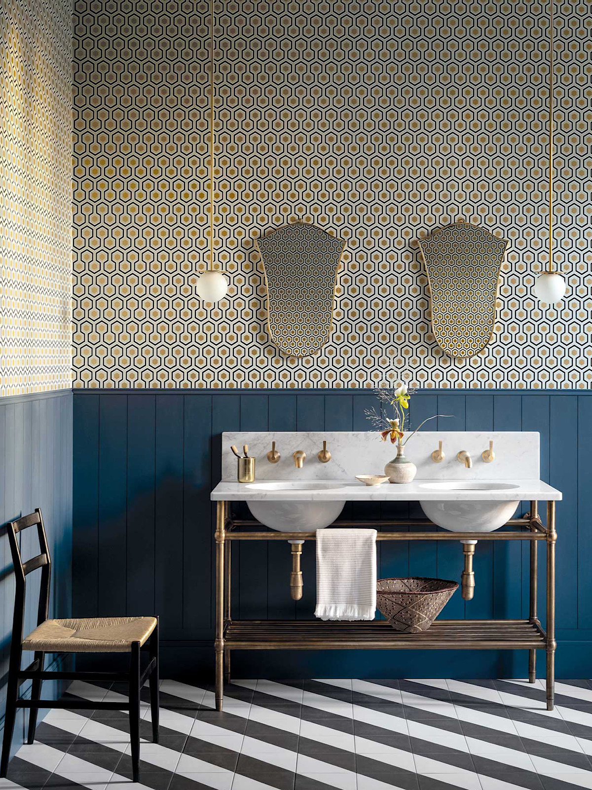
We could argue that even geomatics take their cue from nature, take the Hicks’ Hexagon wallpaper by Cole & Son, reminiscent of a bee’s honeycomb

So I think in summary, we just love adding nature to our interiors and having that connection as it makes us feel good and with recent reports on wellbeing in the home it just enforces that trends come and go but it’s the natural influences that are here to stay.

This blog post was compiled by Luisa Ferdenzi-Rouse


  • Interiors
  • podcast
Ban the Beige colour workshop Winter hibernation special – Podcast show notes S5 Ep3
  • Christmas
  • Interiors
    • colour crush
    • colour psychology
    • DIY
    • dream home makeovers
    • Home Office
    • Home Tours
    • Interior Design
    • Interior Styling
    • podcast
    • Sophie Robinson X Dunelm
    • Sophie Robinson x Harlequin
    • trends
  • Lifestyle
    • Business
    • Fashion/Beauty
    • Life
    • My House
    • Nosh
    • Travel
  • Rooms
    • Bathrooms
    • Bedrooms
    • Kids rooms
    • Kitchens
    • Living rooms
    • Outside
  • Videos
online influence award winner 2019
Interior Design Winner Sophie Robinson Insta
Videos

Listen

Listen Here

Online courses
by popular demand

Catch Sophie In All Her Colourful Glory On Instagram

February. Rain. More rain. And then just for varie February. Rain. More rain. And then just for variety… rain. The dog and I relished the excuse to stay tucked up at home. But inside? Big plans and some serious plotting around the kitchen table. February has that quiet, held-breath quality. Everything looks still, yet beneath the surface it’s all quietly preparing to burst into life. I’m more than ready for that spring light to unleash some very exciting plans! Who else is ready?!

FEBRUARY ROUND UP
	1.	Just how much rain?! Honestly. Biblical.
	2.	Creating shape and big ideas with @teamyo_weight_training .
	3.	Major shoot energy for my AW 2026 collection. So proud of this one.
	4.	Celebrating the fabulous new scents at @vyraoworld . Heaven in a bottle.
	5.	Catch-ups with these sirens @micboehm77  @yasminsewell Creative refuel.
	6.	Photoshoot at the house. @jadefarmiloemua claims best mug, obviously.
	7.	Lucy ready for hair and make-up. Born for backstage life.
	8.	I finally caved and bought an air fryer. Brilliant but why do Ugly.
	9.	Watching the pond like it’s Netflix. What will spawn this spring? 🐸
	10.	My lovely Dad staying with us and recuperating after a nasty illness. Tender days.
	11.	Healing sunlight breaking through when we needed it most.
	12.	Three generations, sofa-bound, watching the rugby. Proper joy.
	13.	14. The wonderful Wes Anderson exhibition at the @designmuseum . Go. Get inspired.
	15. February has its own special bleakness. I’m ready for sunshine on that sea.
	16.	Lucy fully committed to hibernation season. Respect.
	17.	An elegant mess. Story of my life.
	18.	Lucy taking the minutes at a very exciting team meeting. Promotion pending.
	19.	First signs of spring 🌼 Always right on time.
AD Still smiling after revealing my latest colourf AD Still smiling after revealing my latest colourful homewares collection with @Dunelmuk. Bringing a collection like this to life takes months of dreaming, designing and attention to detail, so sharing it with everyone felt incredibly special. Expect joyful colour, layered pattern and all the maximalist touches you know I love. The whole collection is now available to shop in store, online and on the Dunelm app. I could not be prouder. 💛
January. A grateful round up. Rolling into 2026 an January. A grateful round up.
Rolling into 2026 and chasing colour in all its forms, from piercing blue winter suns to raspberry red Moroccan sunrises. I knew I’d be ready for you, 2026. And we have started beautifully.

1. A quiet promise to myself to make 2026 as colourful as possible
2. New Year’s Eve… exactly as it began
3. And then how it went. A proper sweaty dance at @alphabetbrighton 
4. Hosting a bonfire at home with friends to burn away 2025. @jothornephotography 
5. Watching embers glow beneath a full moon. Emotional in the best way
6. Snow, low sun and the most perfect winter palette
7. Still walking it out! Bracing the cold with @sophieabbottartist @edwinaboase 
8. A much needed colour hit, hosting my interiors retreat with @elfennmarrakech 
9. Me and partner in crime @em_lappin  at @lallamarrakech 
10. The joyful jolt of colour only the Marrakech souks can deliver
11. Discovering the new @ritaalaoui_artist art installation at El Fenn
12. New moon meditation with the wonderful @alexadecastilho 
13. Gently shaping a new vision for 2026
14. Harnessing that wild horse energy for my vision board webinar
15. Proud moments unveiling my latest collection to the press at @dunelmuk 
16. Catch ups with my lovely TV chums @hardcastletowers @francescarowanplowden @jackkinsey @ritamillat 
17. Feeling genuinely excited about this collection and all the squeals it is delivering
18. Finally ticking off my 360 health scan at @nekohealth 
19. Becoming mildly obsessed with pastel, colour drenched interiors
20. It looks busy, but January has mostly been this. Rest. Reflection. Happy wintering.
Not going to lie, this might be one of my proudest Not going to lie, this might be one of my proudest makeovers ever…
My Dad and Mary’s modern French villa was all beige tiles, white walls and zero personality. So I did what I do best: turned it into a technicolour dreamscape inspired by the countryside views outside those gorgeous bifold doors.

Inspired by early  autumn leaves, emerald green fields, and piercing blue skies we set about making the inside of their home feel as joyful as the outside … now imagine all that bottled up into wallpaper, fabrics, cushions and colour-drenched furniture.

If you’ve ever thought bold colour overwhelming or that pattern was too much for open-plan spaces… this one’s for you. Because colour and pattern sings in nature, and it can work just as well in your home decor.

All wallpapers, rug and cushion fabrics are from my collection with @harlequinfw. Painting by @sophieabbottartist 

Full sourcing list, extra styling tips and a deeper dive into the design story are up now on A Life In Colour: head to my Substack via the link in bio to read more!
End of January check-in… and yes, the struggle to End of January check-in… and yes, the struggle to stay joyful is very real right now. Dark mornings, grey skies, energy running low.

That’s exactly why our homes matter so much at this time of year. They are our sanctuary. The place that should lift your mood, calm your nervous system and make you feel held when the outside world feels a bit, how can I put this...relentless. And this isn’t just a feeling or a design philosophy. It’s backed up by science. Research shows that colour, light, beauty and nature in our homes have a direct impact on mood, wellbeing and happiness. Small, intentional changes really can shift how you feel day to day.

I’d love to know… what brings you the most joy in your home right now? A colour, a room, a plant, a view, a ritual? Share it in the comments 💛

And if you’re ready to go deeper, my big January Sale ends this week.

If you want to truly understand colour psychology and learn how to curate a home that feels joyful, confident and completely you, comment ULTIMATE and I’ll send you the link to my online design school and your opportunity to make the biggest saving of the year.
These are the ingredients to making your home feel These are the ingredients to making your home feel as good as it looks. 

• Confident colour that creates the mood
• Beautiful pattern that delights the eye
• Layered texture that brings it all alive
• Personality in every corner, so it feels like home

Magic happens when you stop playing it safe and start designing a home that truly reflects you. A home that feels joyful, expressive and alive. But designing a home can feel overwhelming. Where do you start? How do you combine colours without it feeling chaotic? How do you clash patterns so it looks considered? How to express your unique personality without merely copying other people’s style?

That is exactly why I created my online design school. After more than 25 years as an interior designer, I have distilled my design process into clear, easy-to-follow courses that take you step by step through combining colours, balancing patterns and adding texture, so you can decorate with confidence and creativity.

And right now, my January Sale is on. You can save a huge 60% on my transformational courses, designed to completely change how you approach your home and how it makes you feel. If you are ready to embrace your creativity and deepen your passion for interior design  comment ULTIMATE and I will send you all the details.
Think Maximalism is ‘too much’, too messy, or only Think Maximalism is ‘too much’, too messy, or only for other people? 

I’m here to tell you: maximalism isn’t chaotic. It’s just misunderstood.

Once you understand how colour and pattern work together, decorating like a maximalist stops feeling intimidating and starts feeling instinctive. Your home starts feeling like you.

If you want to design your home with confidence, my Ultimate Interiors Bundle is exactly what you need. It includes three self-paced online courses that take you inside my design process, teaching you how to use colour and pattern so you can make bold choices that actually work, again and again. 

Right now, the Ultimate Interiors Bundle is a massive 60% off. Buy now, enjoy the saving, and start whenever you are ready to create a home that is completely yours.

Comment ULTIMATE and I’ll DM you the link to find out more.
Welcome to my witchy era! Who else wants to harnes Welcome to my witchy era! Who else wants to harness the Year of the Horse and use this dynamic energy to manifest your best year yet! 

A vision board is like a compass that will lead your goal settings and intentions with total clarity. To prepare i like to take lots of long walks and meditate on what it is so want more of in my life while gratefully letting go of what no longer serves me. 

Join me Wednesday for a live webinar on how to I create a Vision board that will ignite your passion and motivation to live a bold, creative and colourful life! Comment VB26 for the link.
Follow on Instagram
Sophie Robinson
  • © 2025 Sophie Robinson

    /
  • Contact/
  • About/
  • Design by MW

You're almost inside!

Leave me your best email to sign up for the Webinar

MG0001 Magnet Sophie using Tap 021 copy

You're almost inside!

Leave me your best email to sign up for the Webinar