fbpx
Sophie Robinson
  • Home
  • Workshops
    • Marrakech Retreat
    • Ban the beige
    • Masterclasses
  • Online Courses
  • Collaboration
  • Podcasts
  • Blog
  • About
    • About me
    • Work with me
    • Press
  • FAQs
  • Contact
  • Interiors
  • podcast
31 Oct 19

Winter hibernation special – Podcast show notes S5 Ep3

So we are halfway through the fifth season of The Great Indoors already and we would like to say a huge thanks to John Lewis & Partners for sponsoring us, our producer Kate Taylor and of course, you, our lovely listeners!

On with today’s show…and if you haven’t done so already, you can catch the episode here) On our winter hibernating special we discuss ways to cope with the changes that come about with the new season and we review some of the latest interiors books. We both agree that there is nothing better than hunkering down with a good book, and while Kate enjoys a juicy read, I love to flick through the pretty pictures and so our book review round up has something for everyone. But first of all….

Sleep

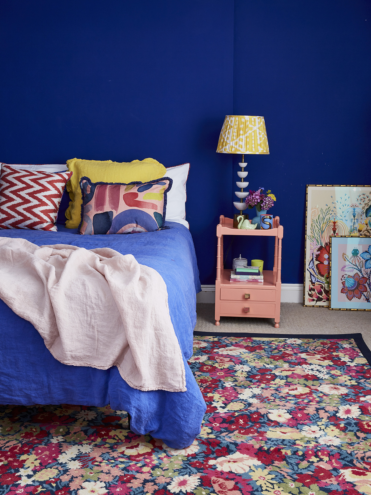
My blue bedroom. I don’t have any trouble sleeping! Rug Made By Alternative Flooring In Liberty Flowers Of Thorpe Summer Garden. Walls Painted in Smalt By Little Greene. Dazzling Blue bedlinen by Secret Linen Store. Photography By Alun Callender

Possibly my favourite pastime, I love to sleep and yet the nation is apparently in a sleep crisis! Kate was in her element with a notebook full of stats! In 1942 we had an average of 7.9 hrs sleep a night, by 2013 gone down to 6.9 hrs , and in 2016 the Centre of disease control and prevention weighted in to say a third of adults don’t get the minimum 7 hours required for health and wellbeing. So what can we do to make sure we get the best nights sleep possible?

A recent American study showed that those of us who have a blue bedroom has the best night’s sleep (that’s me!) then the next most soothing colour for the bedroom is moss green, then pale yellow (not sure I agree with that one) and then silver – which is weird but I think a pale grey would be restful! Then red is known to be bad for your heart rate and blood pressure so not ideal for the bedroom – however, my son’s bedroom has red walls and he has absolutely no problem sleeping. He’s a zonker like his mother.

A red bedroom for kids is a bad idea but my son sleeps well in hos and its imprtant to let kids hoose a colour for their bedroom

My son’s bedroom is Atomic red by Little greene. Red is a terrible choice for bedrooms but my son loves it and sleeps like a dream

As you may know by now I use colour psychology as a framework for many of my schemes and commissions and we often hear that the soft, cool, muted tones like pale blue, green and lilac, for instance, are relaxing and lower the rate. However, for me, I think they will have the opposite effect just look at my bedroom, not a soft, pale tone in sight. So as usual these are guidelines and not rules. Colour is a personal thing and take the time to work out what makes you feel happy and relaxed.


Dark bedrooms are a great choice for those of us who love to hunker down, and look great at night with wall lights.   John Lewis & Partners share my passion for colour in the bedroom – with all those gorgeous velvet textures it creates a warm and cosy vibe!

Some tips for creating a relaxing bedroom…
  • Declutter –  banish the laundry, clothes scattered on the floor and piles of books – don’t be distracted by things that could make you feel stressed
  • If full-on colour and pattern is a bit much for you, have more subtle, calmer colours and wallpapers that you can see from the bed and then really go for it on the headboard/wall so you don’t have to look at it while trying to relax at night.
  • No technology or devices allowed! Bedrooms are for sleeping and sex. No Tv or computers allowed!
  • Avoid a bedroom come office – if space is an issue try and screen it off or hide the work stuff so it’s not on view as psychologically it may make you feel anxious and your brain will not be able to switch off.
  • Sleeping is a very tactile experience so go for luxury in the form of soft and plush rugs next to the bed, quality bed linen and textures that you love to touch.
  • Buy the biggest bed you can fit in the room. You should be able to lie with your hands behind your head, without touching whoever is next to you.
  • Think of something cosy underfoot like a soft rug
  • Block out the light and sounds at night with thick interlined curtains and blinds. You can close the blind when the radiators are on and draw the curtains for extra cosiness at other times.
  • Invest in an electric blanket, 13 tog duvet and turn your heating down or off. And if your raving mad like Kate, you can even open the window!
On to probably the most important thing – the mattress.

After Kate’s family ‘fun’ day out at the John Lewis & Partners bed department she was told that firm isn’t always the way to go – there are many things to consider and with everyone at different weights and have very different sleeping habits – it definitely isn’t a one size fits all scenario. So, when lying on your side your spine should be straight and if a mattress is too firm it will push your hip and shoulder up which can, in turn, cause misalignment.  You also need a bed big enough for the both of you. I am lucky enough to have an Emperor (6ft) bed – but it had to be done as my husband is a very light sleeper!

In summary…

  • Try before you buy
  • Get some expert advice on the softness v firmness of your mattress
  • Go for as large as you can afford and fit into the room
  • Look into how you’re going to get rid of the old mattress to ensure it doesn’t end up in landfill! Will the company you’re buying one from dispose of it responsibly? John Lewis & Partners’ range of natural mattresses are chemical and glue free so they can be fully recycled which has to be the future right?
  •  Current advice is to change your mattress every 7 years so how we recycle after use is an issue.


My guest bedroom is a riot of pattern. Soft pinks and greens are great colours for sleep. I’ve chosen a subtle pattern for the walls from Molly Mahon and kept the busy pattern on the floor and Society of Wanderers bedlinen.

Getting ready for winter

As well as getting the slow cooker out, lighting the fire, snuggling up with a nice warm jumper and slippers and not forgetting my Himalayan salted cacao hot chocolate there are some practical things to consider too. We’re trying to watch how much energy we use and the underfloor heating we installed downstairs last year seems to be very efficient and we are super pleased with it, you can read about the installation here. Upstairs, however, we still have the traditional radiators, so, I’m now thinking that electric blankets are the way forward – teamed with a big fluffy duvet.

Don’t forget about the lighting – we’ve all been guilty of going for style over substance, and we do need a little extra at this time of year so think about where you need that extra light.

New interior books

As we are doing a winter special, who doesn’t love curling up with a good book on a winters evening! We have three great new book launches to share with you, kicking off with Faded Glamour by Pearl Lowe who we interviewed back in season 3 of the podcast and you can see my notes from the show here. I love this book, not only for the fabulous photography and the whole aesthetic but for the fact that I feel like I can totally lose myself in it and fantasise about being in a huge country pile stacked full of gorgeous vintage loot. It’s a sneak peek into a very glamorous world although as the title suggests they are a little rough around the edges, filled with vintage and pre-loved pieces. Be warned though it will give you the urge to visit the odd vintage fair or car boot sale as it certainly did for me!

Known for their dark and moody style and online homewares, it was quite a (pleasant) surprise to see this colourful book by Rockett St George.  Extraordinary Interiors in Colour came about as founders Lucy and Jane launched a paint collection of 18 colours last year, made by Craig & Rose, and they had to do a lot of research into colour, so were instantly hooked. The book is not just a great flicker as it does go into detail. For example, it takes a look at the history of colour, the technical, scientific and applied theory and some easy to implement tips on how to put schemes together. It’s also stacked full of fab fashionable interiors to boot. Our favourite subject was the way they had put together the trends through the decades, including what music we were listening to, what we were watching on TV and the looks and trends of the era.

Lastly, hot off the press from America, architect and founder of an award-winning consultancy for the workplace,  Donald Rattner introduces My Creative Space, which looks at the scientific study on the impact our surroundings have on our creativity. Whilst Kate and I work in the creative field and work at home this book is a fascinating read if you work at home or have a creative hobby. In summary, Rattner says that many books feature ideas on the where the home is the object of creativity i.e decorating and creating schemes and creative activities within the home, cooking for example, but this book shows how to use the home to motivate and encourage creativity. In addition to the somewhat expected advice, use natural light, bring nature in etc etc, he goes into the scientific explanations, why they work, and how you can do it. It’s a great book and an essential addition to any interior designers bookshelf.

If you enjoy the show, don’t forget our ever-growing Facebook group, it’s a fab interior-loving community, so please get involved and share your views and questions about the show there.

  • Interiors
  • podcast
Small spaces, Christmas trends & nature inspired interiors-Podcast notes S5 Ep4 House tour with Michelle Ogundehin – Podcast show notes S5 Ep2

Leave a Comment

Cancel Reply

Your email address will not be published.

  • Interiors
    • colour crush
    • colour psychology
    • DIY
    • dream home makeovers
    • Home Tours
    • Interior Design
    • Interior Styling
    • podcast
    • trends
  • Lifestyle
    • Business
    • Fashion/Beauty
    • Life
    • My House
    • Nosh
    • Travel
  • Rooms
    • Bathrooms
    • Bedrooms
    • Kids rooms
    • Kitchens
    • Living rooms
    • Outside
  • Videos

mailing
list

Videos

Listen

Listen Here

Online courses
by popular demand

Catch Sophie In All Her Colourful Glory On Instagram

Ah @the_rhs Chelsea! What a feast for the eyes! In Ah @the_rhs Chelsea! What a feast for the eyes! Inbetween biblical downpours, thunder and lightning, it was a wonderful day of colour, design and chatter with some wonderful women! I’m slowly falling in love with gardening and my phone roll is full of inspiration after being immersed in natures finest. Thanks @michelleogundehin and @hazelgardinerdesign @thesohoagencyuk for the company. And a big congratulations Hazel on this stunning floral installation. And don’t forget if you want to hang out and be inspired by all things colour then my FREE live webinar is on tonight (25th) at 7pm tonight! Hop on to my profile for the link to sign up. Cannot wait to share some inspirational colour filled time with you all 

#rhschelsea
This is the first room we decorated after our reno This is the first room we decorated after our renovations. The entrance to your home creates the first impression. It’s also the room you walk into first thing in the morning and when you return home at the end of a long day. It needs to create the right welcome and what that feels like is hugely personal. For me I chose my favourite colours, this powerful cobalt  blue has always been a colour I’m drawn to. My wardrobe is full of it. And the bright pink is another one that always makes me instantly happy. Together they are a striking combination and I think anyone who walks through my front door, immediately gets a sense of what I’m about. I’m passionate about creating interiors that authentically  reflect the people who live there. Studying the psychology of colour made it so much easier for me, giving me a deeper understanding on the affects of colour and streamlining my process. If you’d like to know how to unlock your colour super power, join me for a free webinar this Wednesday evening (available to up for 48 hours after). It an introduction into colour psychology for interiors and my hope is it inspires you to have the courage and conviction to know what’s right for you.  And for a deeper dive my online course Colour Psychology for interiors has opened for enrolment. All links to sign up are in my bio on my profile @sophierobinsoninteriors 
What does your hallway say about you? 
📷 @aluncallenderphoto 
CREDITS walls in lazuli by @zoffanyfw stair runner @roger_oates floor tiles @claybrookstudio door painted in rose ash @sanderson1860 

#colourpsychology #colourpsychologyforinteriors #banthebiege #punchyhome #hallway #boldcolourinteriors #colourlover
My kitchen, the heart of my home. The smallest, da My kitchen, the heart of my home. The smallest, darkest room in the house with no view, but that’s old houses for you! You’ll often find the kitchen in the worst place. So to amp up the joy I chose a forest green (hunters green by @zoffanyfw) for the cabinets to mirror the woodland outside. We sourced reclaimed school science lab work tops and I wrapped the room in one of my favourite papers, Rubarber by @borastapeter. Tom put in retro fit underfloor heating and we used reclaimed terracotta tiles from @ca_pietra_  so the floor looks as old as the house but feels so warm! . For the ugliest darkest room in the house it’s become our favourite because of the colours, patterns and rustic textures.that’s the power of great interior design! 
Next up in my series of posts about the psychology of colour is the Autumn personality. You’ll have a love of rich deep warm Colours, natural finishes, nature inspired patterns and period features. The autumn palette is warm, earthy abs rich and perfect for making spaces feel cosy and inviting. 
To learn more about the autumn personality, hop on up to my bio and click the link to be taken to the blog. And you can sign up to my FREE webinar I’m hosting next Wednesday if you’d like to learn more about this powerful framework. 
Meanwhile have a gorgeous weekend! 
📷 @aluncallenderphoto Styling @katemcphee 

#colourpsychology #banthebeige #autumnpersonality #colourpsychologyforinteriors #kitchen #greenkitchen #countryhomesandinteriors #countrykitchen #ihavethisthingwithcolor #myeclectichome #maximalistdecor
Come and join my FREE webinar on Colour Psychology Come and join my FREE webinar on Colour Psychology next Wednesday 25th at 7pm GMT 🤩 hop on up to the link in my bio @sophierobinsoninteriors to register.
My brilliant online course, Colour Psychology for Interiors, is open for enrolment this month, so if you fancy finding out a bit more about this utterly game changing framework I’d love to have you join. It’s SO MUCH more than ‘ red is energising’, ‘blue is calming’ stuff you’ve all heard before. This is a deep dive into discovering how colours work, how to harmonise them and discovering your own unique and authentic style. Only then can you create a home you live and one that supports you emotionally. I LOVE teaching this stuff because the feedback I get from students is mind blowing! Don’t take my word for it, sign up for the free webinar today! 😍 and if you’ve already done my course, please share in the comments below what you loved about it. 

#colourfulhome #colourpsychology #colourpsychologyforinteriors #banthebeige #colourlover #confidentcolour #confidentcolourscheming
Have you found your design mojo? Do you gravitate Have you found your design mojo? Do you gravitate towards a style of interiors that just feels so ‘you’. Making a home is so much more than creating beautiful squares for Instagram. It has to FEEL right and this is where the psychology of colour comes in. Colour is light, it has an energy which directly impacts your brain and emotions. And we all have a unique relationship to it. So rather than follow the crowd, be swayed by trends it’s so important to understand your own authentic relationship with colour. Over on the blog today I’m starting a series of posts all about the seasonal colour personalities. First up is spring which is all the joy, uplift and energy. My bathroom, pictured above, is very ‘spring’ with light reflecting walls, energetic patterns and bright colours. The mood  is uplifting, fresh and feel-good. Hop on up to my link in my profile to read the blog post in full and discover if you are a Spring personality and how to create rooms that reflect this joyful mood. 
Tap for credits
📷 @aluncallenderphoto 

#colourpsychology #colourpsychologyforinteriors #banthebeige #colourfulhome #colourlover #ihavethisthingwithcolor #spring #springbpersonality #colourfuldecorchallenge #homedecor #myeclecticmix #bathroom #bathroominspo
So proud of mr best mate @sophieabbottartist who o So proud of mr best mate @sophieabbottartist who opens her house this weekend to showcase her artwork in her home as part of Brightons artists open houses. She’s always been a creative whirlwind and keeps the joy of colour alive in her paintings inspired by the sea, and the local woodlands that surround her home in Brighton. For Sophie, colour gives her life, she’s the ultimate joy monger and I’m so blessed to have her as my side kick in life. If you get a chance today, pop round to heed for a bolt if the feel good vibes

#artistopenhouses #brighton #colourlover #banthebiege #ihavethisthingwithcolour
When you find the palette of colours you love, you When you find the palette of colours you love, you just wantto surround yourself  in every part of your home! This painting by @studiocoverdale really hits the mark for me, with all my favourites on one place. Today I’m opening my most popular online course, ‘Colour Psychology for a interiors’, ready  for your enrolment. This is my most popular and indeed  powerful course. It gets to the core of how colours work in harmony , how they effect you emotionally and how to bring all the design and pattern  elements together to make your home and your heart sing! I’m a Spring personality, and with that I adore all the busy patterns, bright and vibrational colours, plenty of pretty details and preferably all at once! While typical spring personalities prefer a more delicate and soft colour palette, my secondary season is Autumn, which prefers richer and punchier shades. Combined together my home is unique and perfect for me. I honestly rarely want to leave the house! And while this framework is an amazing tool for interior design, it’ll also give you colour confidence in every area of your life including your wardrobe. I can’t recommend it enough. When I started implementing this framework  in my own design practice six years ago it was absolutely game changing! While I’ve  always been confident with bold colour, this insight gave me the clarity to speed up my design process and get it right every time! Hop on over to the link in my bio to find out more. 
📷 @aluncallenderphoto 
#colourpsycholgy #colourlover #banthebiege #colourfulhome #colourmyhome #maximalistinteriors #boldbravebeautifulinteriors #dopaminedressing #dopaminedecor
The power of paint! I’ve been extolling it’s v The power of paint! I’ve been extolling it’s virtues my entire career. Roll a bold new hue on your walls and voila! Game changer. But on our recent podcast @mad_about_the_house explored the wider impact of paint on the environment. An astonishing 50 million litres makes it into landfill each year so it feels like, as serial decorators, we could all club together and do our bit to bring that figure down. 
It’s a minefield but over on my blog today I sum up my tips on how we can easily use less of it and round up the paint brands who are doing their bit to tackle the issues. From the ingredients in the tin, to recycling waste paint, to using pouches rather than tins, there is plenty of innovative ideas. Choosing natural paint feels like a good option and if you’re hooked on designer paint colours, it’s no more expensive. Last year I painted my bedroom Turquoise by @edwardbulmerpaint and I’m thrilled with the colour, quality and durability. Just goes to show lovely paint doesn’t have to cost the earth. Hop onto the link in my profile for the full post and if you know if a paint brand who are tackling the environmental issues raised, please give them a mention in the comments below.

#ecopaint #ecodecor #ecohome #paint #turquoise #bedroom #podcast #banthebiege #colourfulhome #colourlover #itsonlypaint #interiordecorating #interiordesign #colourscheme
Load More… Follow on Instagram
Sophie Robinson
  • © 2017 Sophie Robinson

    /
  • Contact/
  • About/
  • Design by MW

Don't forget to join!

You're almost inside!

Leave me your best email to sign up for the Webinar