fbpx
Sophie Robinson
  • Home
  • Workshops
    • Marrakech Retreat
    • Ban the beige
    • Masterclasses
  • Online Courses
  • Collaboration
  • Podcasts
  • Blog
  • About
    • About me
    • Work with me
    • Press
  • FAQs
  • Contact
  • podcast
17 Oct 19

House tour with Michelle Ogundehin – Podcast show notes S5 Ep2

A year ago today Kate Watson-Smyth and I set out on this new ‘podcast’ journey not quite knowing what to expect, and here we are on our 1st birthday and we have had the best time with some great guests, great sponsors and not forgetting our fab producer Kate Taylor. To mark the first year, we’re asking you, our listeners to get in touch with your favourite moments from the show, whether it’s insight, inspiration or my raucous moments of laughter, we’d love to hear from you and you can get in touch here thegreatindoorspod@gmail.com You could even record us your own clip on voice notes and email it to us, and you might make the show!

Moving on to today’s episode, we would like to say a huge thank you to our new sponsor John Lewis & Partners and please remember to rate and review us, it really does make all the difference, and don’t forget our thriving  Facebook group! Its a den of design lovers and a really lovely community.

Now, on with the show! (If you haven’t caught up, as always you can listen here.) We have been trying for ages to get an invite with the former Elle Decoration UK Editor-in-chief, writer, TV presenter and all-round Interiors expert Michelle Ogundehin and she’s not been easy to pin down. But dear listeners our persistence finally paid off and I’m so pleased because this house tour is all you could wish for and more! I mean what this woman doesn’t know about interiors surely isn’t worth knowing! Ten years as Editor of much loved and highly regarded Elle Decoration magazine means she knows her interiors onions. But what type of home does such a style maven live in? Michelle is deeply personal when it comes to her home and it’s never nor shall be featured in any magazines or blogs. So its a deep privilege indeed to be invited in. Thrilled we could take you with us!

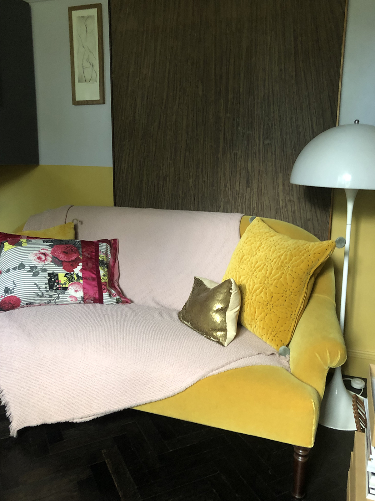
The yellow sofa in Michelle’s study is my idea of a happy place!

The first thing that possibly surprises when entering the picturesque Regency cottage was that it isn’t an uncompromising minimalist pad or the design museum you may expect. What it is is a very beautiful, warm and inviting space. I’d even go so far as saying homely, and I know Michelle would take that as a compliment. Michelle’s ethos on decorating your home, as is mine, it’s all about how the space makes you feel. And Michelle’s home makes you feel good!

The Floor

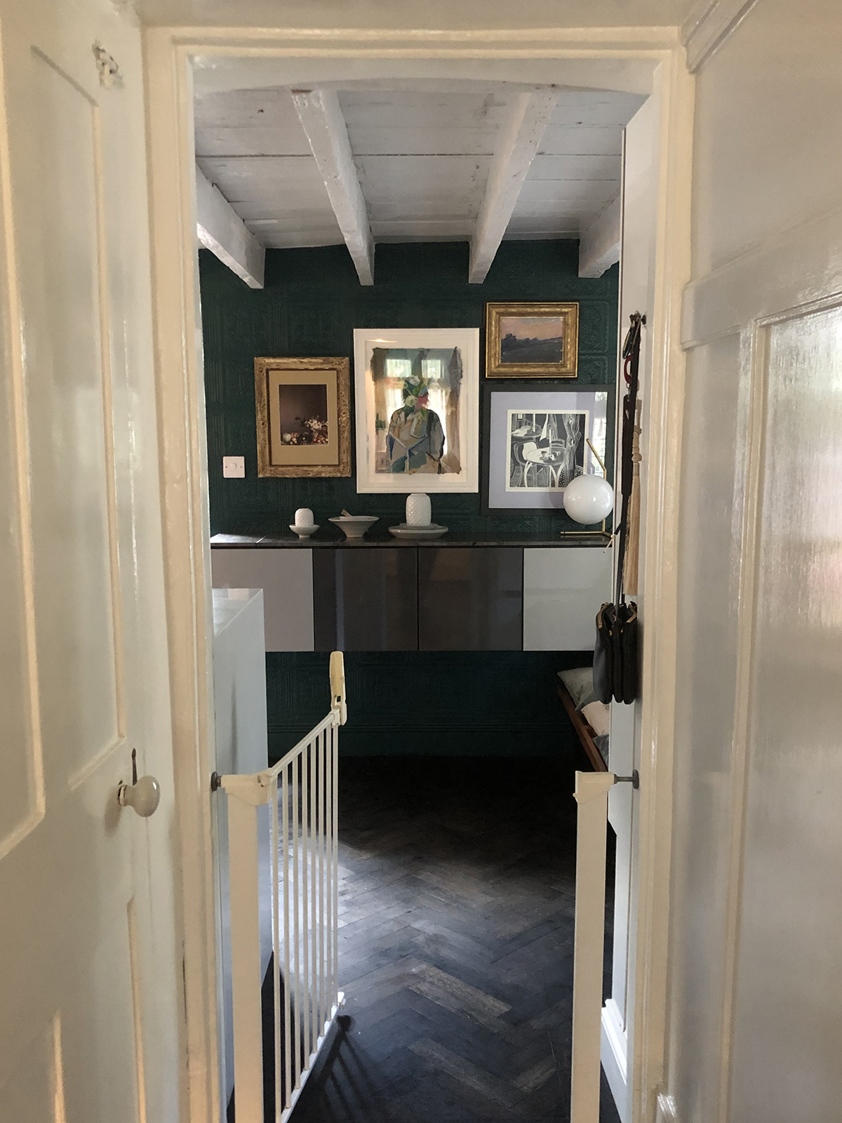
The gorgeous ebony chevron parquet flooring was created by laying the individual boards by hand which were then stained by Ecora.  Babygate is to keep her two adorable Basset hounds in the kitchen so they don’t trash the beautiful floor!

The beautiful dark parquet flooring was quite a process as it took a while for Michelle to get the finish she knew she wanted – as Michelle says you may not know what you want until you see it and then you’ll know if it feels right and so she kept experimenting until she found a colour that “was not too black, and not too brown” and kept going until in the words of Goldilocks “it was just right!”

The walls

Michelles study shelves are a display of pictures and momentoes that spark happy thoughts and memories.

Michelle has long been a fan of Anaglypta wallpaper and so has Kate, despite some long-held views that it belongs in your granny’s house. Michelle has given it a modern interpretation by adding it between panels and painting it in ‘bruise purple’ as she refers to it – officially it’s Arquerite by Little Greene. You’ll also notice the foxed mirror above the panelling which is actually a wallpaper – check out this paper by Cole & Son for similar, it’s available in three tones. Michelle has a talent for mixing textures, in one corner of the room there’s the textured Anaglypta, velvet curtains and the metallic hint from the foxed effect wallpaper panel. All in her signature bruised purple but it makes the space feel so calm and elegant.

Michelle’s colour palette has a calm and cohesive feel and every surface is a celebration in feel-good textures. Wood next to marble, next to velvet, next to textured papers. Heaven!

Some top tips..
  • Michelle says the walls are your biggest palette so you can try colours that resonate with you. She feels its a shame when all the walls, skirting and coving are the same colour so adopt a playful approach.
  • Don’t make the mistake of buying ‘one thing’ and then decorate around it – you need to start with the walls and then build up your palette of finishes first.
  • Be inventive and creative and think outside the box. One day Michelle was sitting at the dining table and pondered what it would feel like to paint an inch strip of mustard under the shelf that is only visible if you’re sitting down. So she tried it and loved.
  • Work out a palette that works for you for a cohesive look – the mustard stripe in the living room is echoed by the mustard ceiling in the kitchen and in the yellow sofa in the study. The Cararra marble in the fireplace is also in the kitchen and bathroom. It helps make a home feel cohesive if similar materials and colours are repeated throughout.
  • You can do tones of colours but stick to one palette – one set of colours, and one of set of materials – metals, woods, stones and tiles. Michelle’s palette repeats throughout the whole house.

Another modern little touch is a hidden strip of mustard under the shelf which can only be seen when seated or if you are under the age of eight.

  • Use gloss paint on the ceiling (all Blackened by Farrow & Ball downstairs) to add a sheen and to create a light and airy feel.
  • If using metals, use only two in a room and vary the finish to add interest – brushed, hammered or polished perhaps.
  • Take the time to figure out what colours, textures, fabrics and finishes mean to you and go with it.

We did wonder where the TV was – can you spot it? Yes, it’s the peach artwork, the very clever Frame TV turns into a work of art when not in use. The floating sideboard was created using Ikea cabinets and the doors are by Superfront which feature a very ‘on trend’ scallop design.

The bedroom

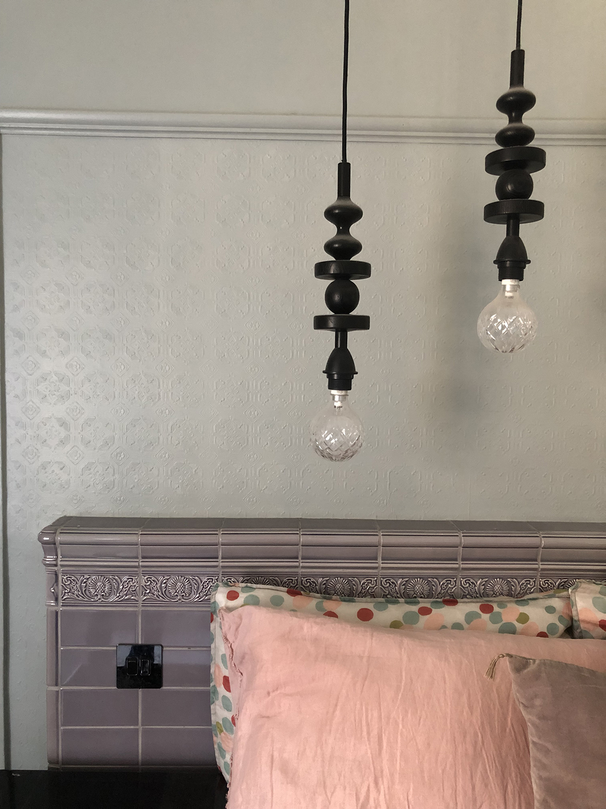
Michelle made this stunning headboard in London underground Victorian style tiles. Is it a grey wall though!?

Michelle believes that before you embark on decorating the bedroom think about how you want to feel – if you don’t sleep well all the best decor in the world won’t change that. For her and I suspect most of us, want it to feel like a retreat and a place of calm.

I’m not sure I’ve seen a tiled bedhead before but isn’t it fab. The lavender tiles are by H&E Smith who made the tiles for the London Underground. She discovered they do corner, dado and skirting tiles so was instantly sold. Not only is it a beautiful feature it has a practical function too as it doubles as a handy shelf and it houses the sockets for bedside lights.

The perfect hostess. Michelle baked us this sugar, gluten and dairy-free ‘cheese’ cake. It was heaven! All set on that Arabescato Saarinen table

Michelle’s key philosophy is the whole house should be a place to retreat to and get away from it all – and shouldn’t be limited to just a ‘spa’ type bathroom for example. Create a space that sparks that feeling the moment you walk in the door. I can report back that Michelle is very very tidy. Maybe this is the secret. I’ve taken note!

A huge thanks to our special guest Michelle Ogundehin, (you can read her blog here) for letting us have a snoop around her Brighton pad and don’t forget to check out her beautiful Instagram feed @michelleogundehin. Michelle has written a book, (due out next Spring) about her design philosophy and how to create your dream home in order to make you feel happy. Watch this space!


  • podcast
Winter hibernation special – Podcast show notes S5 Ep3 Colour crush: How to decorate with yellow and pink

Leave a Comment

Cancel Reply

Your email address will not be published.

  • Interiors
    • colour crush
    • colour psychology
    • DIY
    • dream home makeovers
    • Home Tours
    • Interior Design
    • Interior Styling
    • podcast
    • trends
  • Lifestyle
    • Business
    • Fashion/Beauty
    • Life
    • My House
    • Nosh
    • Travel
  • Rooms
    • Bathrooms
    • Bedrooms
    • Kids rooms
    • Kitchens
    • Living rooms
    • Outside
  • Videos

mailing
list

Videos

Listen

Listen Here

Online courses
by popular demand

Catch Sophie In All Her Colourful Glory On Instagram

Ah @the_rhs Chelsea! What a feast for the eyes! In Ah @the_rhs Chelsea! What a feast for the eyes! Inbetween biblical downpours, thunder and lightning, it was a wonderful day of colour, design and chatter with some wonderful women! I’m slowly falling in love with gardening and my phone roll is full of inspiration after being immersed in natures finest. Thanks @michelleogundehin and @hazelgardinerdesign @thesohoagencyuk for the company. And a big congratulations Hazel on this stunning floral installation. And don’t forget if you want to hang out and be inspired by all things colour then my FREE live webinar is on tonight (25th) at 7pm tonight! Hop on to my profile for the link to sign up. Cannot wait to share some inspirational colour filled time with you all 

#rhschelsea
This is the first room we decorated after our reno This is the first room we decorated after our renovations. The entrance to your home creates the first impression. It’s also the room you walk into first thing in the morning and when you return home at the end of a long day. It needs to create the right welcome and what that feels like is hugely personal. For me I chose my favourite colours, this powerful cobalt  blue has always been a colour I’m drawn to. My wardrobe is full of it. And the bright pink is another one that always makes me instantly happy. Together they are a striking combination and I think anyone who walks through my front door, immediately gets a sense of what I’m about. I’m passionate about creating interiors that authentically  reflect the people who live there. Studying the psychology of colour made it so much easier for me, giving me a deeper understanding on the affects of colour and streamlining my process. If you’d like to know how to unlock your colour super power, join me for a free webinar this Wednesday evening (available to up for 48 hours after). It an introduction into colour psychology for interiors and my hope is it inspires you to have the courage and conviction to know what’s right for you.  And for a deeper dive my online course Colour Psychology for interiors has opened for enrolment. All links to sign up are in my bio on my profile @sophierobinsoninteriors 
What does your hallway say about you? 
📷 @aluncallenderphoto 
CREDITS walls in lazuli by @zoffanyfw stair runner @roger_oates floor tiles @claybrookstudio door painted in rose ash @sanderson1860 

#colourpsychology #colourpsychologyforinteriors #banthebiege #punchyhome #hallway #boldcolourinteriors #colourlover
My kitchen, the heart of my home. The smallest, da My kitchen, the heart of my home. The smallest, darkest room in the house with no view, but that’s old houses for you! You’ll often find the kitchen in the worst place. So to amp up the joy I chose a forest green (hunters green by @zoffanyfw) for the cabinets to mirror the woodland outside. We sourced reclaimed school science lab work tops and I wrapped the room in one of my favourite papers, Rubarber by @borastapeter. Tom put in retro fit underfloor heating and we used reclaimed terracotta tiles from @ca_pietra_  so the floor looks as old as the house but feels so warm! . For the ugliest darkest room in the house it’s become our favourite because of the colours, patterns and rustic textures.that’s the power of great interior design! 
Next up in my series of posts about the psychology of colour is the Autumn personality. You’ll have a love of rich deep warm Colours, natural finishes, nature inspired patterns and period features. The autumn palette is warm, earthy abs rich and perfect for making spaces feel cosy and inviting. 
To learn more about the autumn personality, hop on up to my bio and click the link to be taken to the blog. And you can sign up to my FREE webinar I’m hosting next Wednesday if you’d like to learn more about this powerful framework. 
Meanwhile have a gorgeous weekend! 
📷 @aluncallenderphoto Styling @katemcphee 

#colourpsychology #banthebeige #autumnpersonality #colourpsychologyforinteriors #kitchen #greenkitchen #countryhomesandinteriors #countrykitchen #ihavethisthingwithcolor #myeclectichome #maximalistdecor
Come and join my FREE webinar on Colour Psychology Come and join my FREE webinar on Colour Psychology next Wednesday 25th at 7pm GMT 🤩 hop on up to the link in my bio @sophierobinsoninteriors to register.
My brilliant online course, Colour Psychology for Interiors, is open for enrolment this month, so if you fancy finding out a bit more about this utterly game changing framework I’d love to have you join. It’s SO MUCH more than ‘ red is energising’, ‘blue is calming’ stuff you’ve all heard before. This is a deep dive into discovering how colours work, how to harmonise them and discovering your own unique and authentic style. Only then can you create a home you live and one that supports you emotionally. I LOVE teaching this stuff because the feedback I get from students is mind blowing! Don’t take my word for it, sign up for the free webinar today! 😍 and if you’ve already done my course, please share in the comments below what you loved about it. 

#colourfulhome #colourpsychology #colourpsychologyforinteriors #banthebeige #colourlover #confidentcolour #confidentcolourscheming
Have you found your design mojo? Do you gravitate Have you found your design mojo? Do you gravitate towards a style of interiors that just feels so ‘you’. Making a home is so much more than creating beautiful squares for Instagram. It has to FEEL right and this is where the psychology of colour comes in. Colour is light, it has an energy which directly impacts your brain and emotions. And we all have a unique relationship to it. So rather than follow the crowd, be swayed by trends it’s so important to understand your own authentic relationship with colour. Over on the blog today I’m starting a series of posts all about the seasonal colour personalities. First up is spring which is all the joy, uplift and energy. My bathroom, pictured above, is very ‘spring’ with light reflecting walls, energetic patterns and bright colours. The mood  is uplifting, fresh and feel-good. Hop on up to my link in my profile to read the blog post in full and discover if you are a Spring personality and how to create rooms that reflect this joyful mood. 
Tap for credits
📷 @aluncallenderphoto 

#colourpsychology #colourpsychologyforinteriors #banthebeige #colourfulhome #colourlover #ihavethisthingwithcolor #spring #springbpersonality #colourfuldecorchallenge #homedecor #myeclecticmix #bathroom #bathroominspo
So proud of mr best mate @sophieabbottartist who o So proud of mr best mate @sophieabbottartist who opens her house this weekend to showcase her artwork in her home as part of Brightons artists open houses. She’s always been a creative whirlwind and keeps the joy of colour alive in her paintings inspired by the sea, and the local woodlands that surround her home in Brighton. For Sophie, colour gives her life, she’s the ultimate joy monger and I’m so blessed to have her as my side kick in life. If you get a chance today, pop round to heed for a bolt if the feel good vibes

#artistopenhouses #brighton #colourlover #banthebiege #ihavethisthingwithcolour
When you find the palette of colours you love, you When you find the palette of colours you love, you just wantto surround yourself  in every part of your home! This painting by @studiocoverdale really hits the mark for me, with all my favourites on one place. Today I’m opening my most popular online course, ‘Colour Psychology for a interiors’, ready  for your enrolment. This is my most popular and indeed  powerful course. It gets to the core of how colours work in harmony , how they effect you emotionally and how to bring all the design and pattern  elements together to make your home and your heart sing! I’m a Spring personality, and with that I adore all the busy patterns, bright and vibrational colours, plenty of pretty details and preferably all at once! While typical spring personalities prefer a more delicate and soft colour palette, my secondary season is Autumn, which prefers richer and punchier shades. Combined together my home is unique and perfect for me. I honestly rarely want to leave the house! And while this framework is an amazing tool for interior design, it’ll also give you colour confidence in every area of your life including your wardrobe. I can’t recommend it enough. When I started implementing this framework  in my own design practice six years ago it was absolutely game changing! While I’ve  always been confident with bold colour, this insight gave me the clarity to speed up my design process and get it right every time! Hop on over to the link in my bio to find out more. 
📷 @aluncallenderphoto 
#colourpsycholgy #colourlover #banthebiege #colourfulhome #colourmyhome #maximalistinteriors #boldbravebeautifulinteriors #dopaminedressing #dopaminedecor
The power of paint! I’ve been extolling it’s v The power of paint! I’ve been extolling it’s virtues my entire career. Roll a bold new hue on your walls and voila! Game changer. But on our recent podcast @mad_about_the_house explored the wider impact of paint on the environment. An astonishing 50 million litres makes it into landfill each year so it feels like, as serial decorators, we could all club together and do our bit to bring that figure down. 
It’s a minefield but over on my blog today I sum up my tips on how we can easily use less of it and round up the paint brands who are doing their bit to tackle the issues. From the ingredients in the tin, to recycling waste paint, to using pouches rather than tins, there is plenty of innovative ideas. Choosing natural paint feels like a good option and if you’re hooked on designer paint colours, it’s no more expensive. Last year I painted my bedroom Turquoise by @edwardbulmerpaint and I’m thrilled with the colour, quality and durability. Just goes to show lovely paint doesn’t have to cost the earth. Hop onto the link in my profile for the full post and if you know if a paint brand who are tackling the environmental issues raised, please give them a mention in the comments below.

#ecopaint #ecodecor #ecohome #paint #turquoise #bedroom #podcast #banthebiege #colourfulhome #colourlover #itsonlypaint #interiordecorating #interiordesign #colourscheme
Load More… Follow on Instagram
Sophie Robinson
  • © 2017 Sophie Robinson

    /
  • Contact/
  • About/
  • Design by MW

Don't forget to join!

You're almost inside!

Leave me your best email to sign up for the Webinar