GET THE REPLAY OF THE VISION BOARD MASTERCLASS - LIFE IN COLOUR

Sophie Robinson
  • Home
  • Workshops
    • Marrakech Retreat
    • Home Masterclass
  • Online Courses
  • Collaboration
  • Podcasts
  • Blog
  • About
    • About me
    • Work with me
    • Press
  • FAQs
  • Contact
  • Interior Design
  • Interiors
13 Aug 19

How to find your happy colours for your home

Happly Place Fest 1

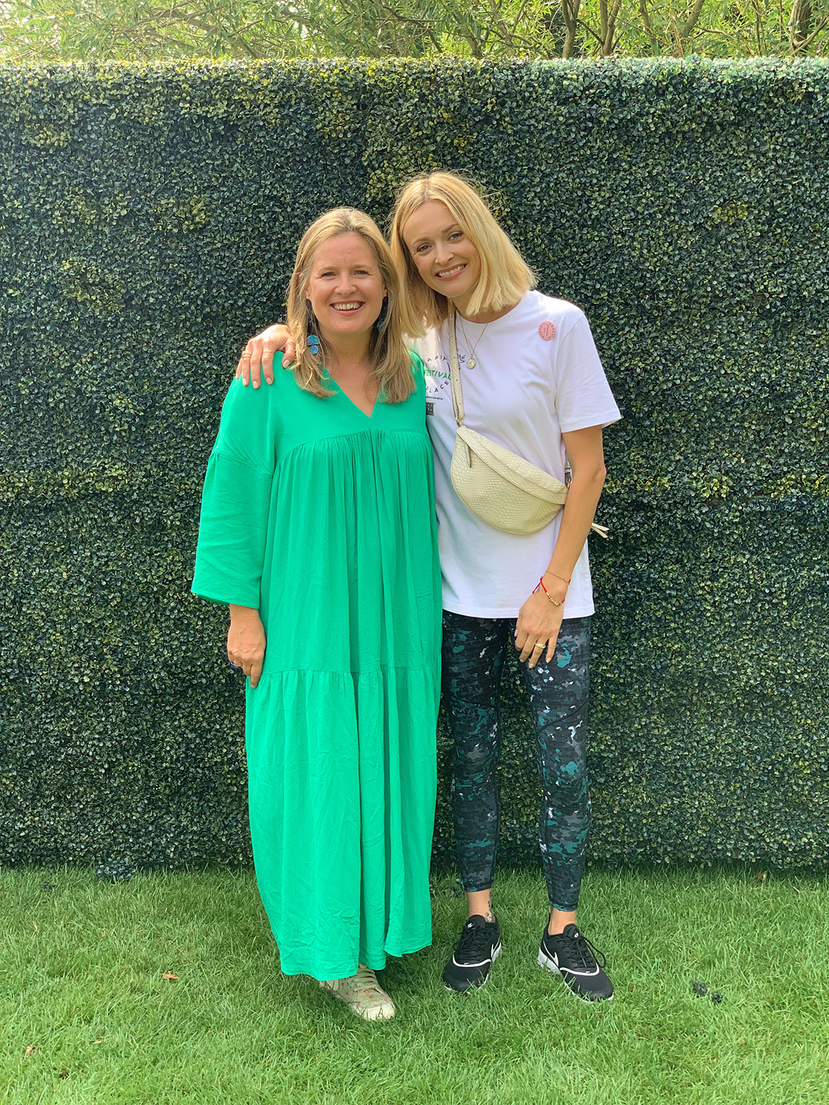
Last weekend I was invited to host a workshop at Fearne Cotton’s Happy Place festival in Chiswick House in London. It was a glorious weekend, the sun shone down on the yoga mats and everyone there gathered to feel the happy vibes. And they were there in abundance! The main talk stage hosted motivational speakers of wellbeing and self-improvement or self-acceptance. The enigmatic Russell Brand probably pulled the biggest crowds but we were also entertained by Bryony Gordon, inspired by Katie Piper and motivated by Dame Kelly Holmes.

You could get involved in open community yoga classes, improve your breath work and with my workshop, discover how to make your happy home. I was in the mindfulness and meditation tent, so creating a workshop with no visual aids was a real challenge, but it worked! I began by sharing the recent fascinating research from The Happiness Institute, which you can read more about on my recent blog post here. I then took the group through a guided visualisation, to help people get away from looking at rooms for inspiration, and instead focus on how you want your home to make you feel. I’d never tried anything like it before, but it was areal hit, so I’ll work out a way to record it and post it here some time soon!

So onto talking about colour, which is what I want to share with you on this blog, post today. We all have a very visceral response to colour and nowhere in your life is it going to have more impact than in your home. We spend 70% of our life at home and so getting your colours right, find what resonated with you and lifts you up is very important indeed!

This is a fun exercise that you can recreate by simply gathering some paint charts around you and taking a moment to really look at all the different colours one by one. . Just take a minute to look at a family of colours, on your paint chart, and decide if this is a colour you enjoy. How does it make you feel? And what sort of tone do you like best?

REDS

Red is a colour that is very arresting, its hot, attention-grabbing and confident. The colour of post-boxes and drive-throughs red has been used to make statements and stand out, grab our attention. Move towards the warmer and brown-tinted reds and they can feel cosy and assuring. Or mix a drop of pink and red can feel perky and fun. I love the cherry red used in the Cath Kidston branding for example. Too much red in a scheme can start to feel aggressive and overpowering, so think about how red affects you. Does it make you feel strong and assured or raging and irritable! This colour can be great in sociable areas like dining rooms but it may make a busy cooks kitchen feel too hot!

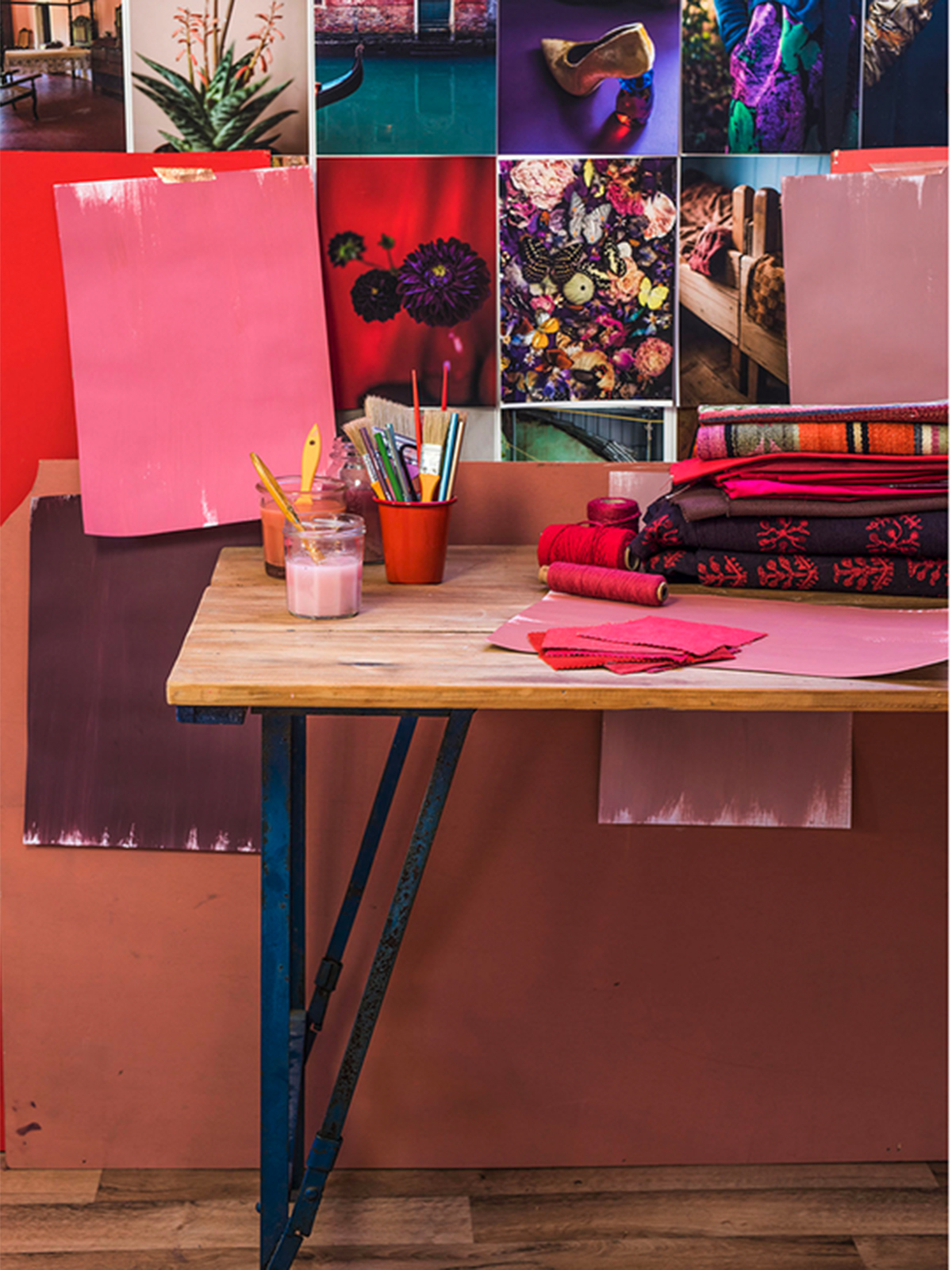
The very inspirational desk of colour guru Anna Starmer

PINKS

Pinks are massively in favour in interiors right now and I think they are a marvellous colour to introduce to your home. Literally the colour of love, pink is nurturing and cosseting, a colour to give you a mothering hug at the end of the day. Ideal for relaxation spaces like living rooms and bedrooms but not so such a good idea in a room where you want to feel motivated, like the home office for example. Again consider the shade of pink you are drawn too. If it’s a warm earthy plaster pink, a delicate petal pink or a cool grey pink.

Soft, delicates pink tones by Sanderson

YELLOWS

Always my happy colour, yellow literally is Little Miss Sunshine in a paint tin. The colour of positivity and optimism, it’s a great hue to introduce in your home. Less of a wall colour for me I’ll admit but I pop yellow in accessories throughout my home. A yellow front door has to be the ultimate warm welcome! Remember that yellow is very energising so avoid in places of relaxation, like bedrooms. Yellow can be a real marmite colour, so again take a moment to discover the yellow that sings to you, from delicate primrose, a strong citrus yellow through to an earthy mustard. And don’t forget yellow metal tones too like gold and brass.

Colour inspiration can come from anywhere, still life from Anna Starmer

BROWNS

Literally the colour of mother earth, brown is very grounding and another great colour to have in your home. If you think of timber that we use for flooring and furniture, chances are you already have plenty of brown in your home. I love my bright and saturated colour palette but I find shades of brown really help to calm the brights so I always make sure there are timber tones in my schemes. Again take a moment to discover what brown tones or timbers you are drawn to. From the pale woods like ash and beech to the rick honey tones of oak or the cool whitewashed and weathered shades of wood.

BLUES

Look at any paint chart and there will always bee a healthy amount of blues. A really versatile colour it’s cool and calming qualities make it a decorating favourite. It’s a colour that helps create a sense of space, depth but can feel cold so don’t use it in chilly north-facing rooms. It suppresses the appetite so a terrible colour for kitchens and dining rooms. So many blues to choose from but which is your hue? From pale a delicate sky blues, cool grey blues, rick teals or striking cobalt. Take some time to sit and stare at the world’s favourite colour and work out which one is for you.

A deep and rich blue tone is the perfect backdrop for bold and bright patterns, Sanderson

GREENS

Another great colour to always make sure you introduce in your home. It’s the colour of nature so has all the connotations of wellbeing, harmony and rejuvenation. Like yellow it’s rarely a wall colour for me (that’s my personal preference) but it’s essential to have a little pop of green throughout your home. These could be as simple as a humble pot plant. Again like blue, so many hues to choose from. You have the fresh leaf greens, sage, olive, and hunters green not to mention zesty lime. See what energy of green you are drawn to.

GREYS

A word on grey. In terms of colour psychology, grey, as a mix of pure white and black, is a neutral colour. It does nothing to us emotionally! At worst it can be a very draining colour, so expect to wake up tired in a grey bedroom. However, greys are rarely a pure mix of black and white. We have warm greys, green greys, pinkie greys and cool blue-greys to choose from. So when you are looking at grey, again consider what type of grey you love and the type of vibe you want to create. What is the background tone? Is it cool and still, or warmer and more energising? Or perhaps it’s icy and striking. Grey is a great backdrop for other colours. I particularly love greys with yellows as I think they balance each other perfectly. When done well grey can look really calming, and sophisticated but be careful of it also looking flat, cold and depressing!

Mid-grey wall in Kissing Gate and console painted in Hildey-hole by Earthborn

Once you have worked out what colour palette you love, by listening to your gut you can delve a little further into what your findings mean. I use the framework of colour psychology on my workshops to help people discover what colours they love and what palette will work coherently throughout their home.

If you have chosen colours that feel light, buoyant, clear and yet warm then you are probably a spring personality. The energy you love to create is fun, uplifting, youthful and lively but there is gentleness too. You can learn more about how to decorate in the spring personality here.

If you have chosen colours that are cool, calm and have a grey undertone to them then chances are you are a summer personality. You love colours that feel elegant, calm and graceful and have a timeless quality. To find out more about how to decorate using the summer colour palette, see my post here.

If the colours you have gravitated towards are more earthy, rich or flamboyant then you are an autumn personality. You love strong deep colours and a cosy and welcoming vibe and you are particularly drawn to natures colour palette. Find out more about how to decorate in the autumn palette here.

And finally, if you chose colours that are striking, saturated yet cool and even icy, then you are a winter colour palette. You probably wanted to know more about your two favourite colours, black and white. To discover more about your colour story, hop on over to my post about the winter personality here.

If you are fascinated by your colour palette and how you can use it powerfully in your home, then there are still places on my Ban The Beige workshop on the 10th October. Find out more here.

Otherwise, I’ll hopefully see some of you at the next Happy Place festival on the 7th-8th September at Tatton Park, Manchester.


  • Interior Design
  • Interiors
Anglian Styled By Me Competition winners House tour with Kelly Hoppen – show notes S4 Ep3
  • Christmas
  • Interiors
    • colour crush
    • colour psychology
    • DIY
    • dream home makeovers
    • Home Office
    • Home Tours
    • Interior Design
    • Interior Styling
    • podcast
    • Sophie Robinson X Dunelm
    • Sophie Robinson x Harlequin
    • trends
  • Lifestyle
    • Business
    • Fashion/Beauty
    • Life
    • My House
    • Nosh
    • Travel
  • Rooms
    • Bathrooms
    • Bedrooms
    • Kids rooms
    • Kitchens
    • Living rooms
    • Outside
  • Videos
online influence award winner 2019
Interior Design Winner Sophie Robinson Insta
Videos

Listen

Listen Here

Online courses
by popular demand

Catch Sophie In All Her Colourful Glory On Instagram

February. Rain. More rain. And then just for varie February. Rain. More rain. And then just for variety… rain. The dog and I relished the excuse to stay tucked up at home. But inside? Big plans and some serious plotting around the kitchen table. February has that quiet, held-breath quality. Everything looks still, yet beneath the surface it’s all quietly preparing to burst into life. I’m more than ready for that spring light to unleash some very exciting plans! Who else is ready?!

FEBRUARY ROUND UP
	1.	Just how much rain?! Honestly. Biblical.
	2.	Creating shape and big ideas with @teamyo_weight_training .
	3.	Major shoot energy for my AW 2026 collection. So proud of this one.
	4.	Celebrating the fabulous new scents at @vyraoworld . Heaven in a bottle.
	5.	Catch-ups with these sirens @micboehm77  @yasminsewell Creative refuel.
	6.	Photoshoot at the house. @jadefarmiloemua claims best mug, obviously.
	7.	Lucy ready for hair and make-up. Born for backstage life.
	8.	I finally caved and bought an air fryer. Brilliant but why do Ugly.
	9.	Watching the pond like it’s Netflix. What will spawn this spring? 🐸
	10.	My lovely Dad staying with us and recuperating after a nasty illness. Tender days.
	11.	Healing sunlight breaking through when we needed it most.
	12.	Three generations, sofa-bound, watching the rugby. Proper joy.
	13.	14. The wonderful Wes Anderson exhibition at the @designmuseum . Go. Get inspired.
	15. February has its own special bleakness. I’m ready for sunshine on that sea.
	16.	Lucy fully committed to hibernation season. Respect.
	17.	An elegant mess. Story of my life.
	18.	Lucy taking the minutes at a very exciting team meeting. Promotion pending.
	19.	First signs of spring 🌼 Always right on time.
AD Still smiling after revealing my latest colourf AD Still smiling after revealing my latest colourful homewares collection with @Dunelmuk. Bringing a collection like this to life takes months of dreaming, designing and attention to detail, so sharing it with everyone felt incredibly special. Expect joyful colour, layered pattern and all the maximalist touches you know I love. The whole collection is now available to shop in store, online and on the Dunelm app. I could not be prouder. 💛
January. A grateful round up. Rolling into 2026 an January. A grateful round up.
Rolling into 2026 and chasing colour in all its forms, from piercing blue winter suns to raspberry red Moroccan sunrises. I knew I’d be ready for you, 2026. And we have started beautifully.

1. A quiet promise to myself to make 2026 as colourful as possible
2. New Year’s Eve… exactly as it began
3. And then how it went. A proper sweaty dance at @alphabetbrighton 
4. Hosting a bonfire at home with friends to burn away 2025. @jothornephotography 
5. Watching embers glow beneath a full moon. Emotional in the best way
6. Snow, low sun and the most perfect winter palette
7. Still walking it out! Bracing the cold with @sophieabbottartist @edwinaboase 
8. A much needed colour hit, hosting my interiors retreat with @elfennmarrakech 
9. Me and partner in crime @em_lappin  at @lallamarrakech 
10. The joyful jolt of colour only the Marrakech souks can deliver
11. Discovering the new @ritaalaoui_artist art installation at El Fenn
12. New moon meditation with the wonderful @alexadecastilho 
13. Gently shaping a new vision for 2026
14. Harnessing that wild horse energy for my vision board webinar
15. Proud moments unveiling my latest collection to the press at @dunelmuk 
16. Catch ups with my lovely TV chums @hardcastletowers @francescarowanplowden @jackkinsey @ritamillat 
17. Feeling genuinely excited about this collection and all the squeals it is delivering
18. Finally ticking off my 360 health scan at @nekohealth 
19. Becoming mildly obsessed with pastel, colour drenched interiors
20. It looks busy, but January has mostly been this. Rest. Reflection. Happy wintering.
Not going to lie, this might be one of my proudest Not going to lie, this might be one of my proudest makeovers ever…
My Dad and Mary’s modern French villa was all beige tiles, white walls and zero personality. So I did what I do best: turned it into a technicolour dreamscape inspired by the countryside views outside those gorgeous bifold doors.

Inspired by early  autumn leaves, emerald green fields, and piercing blue skies we set about making the inside of their home feel as joyful as the outside … now imagine all that bottled up into wallpaper, fabrics, cushions and colour-drenched furniture.

If you’ve ever thought bold colour overwhelming or that pattern was too much for open-plan spaces… this one’s for you. Because colour and pattern sings in nature, and it can work just as well in your home decor.

All wallpapers, rug and cushion fabrics are from my collection with @harlequinfw. Painting by @sophieabbottartist 

Full sourcing list, extra styling tips and a deeper dive into the design story are up now on A Life In Colour: head to my Substack via the link in bio to read more!
End of January check-in… and yes, the struggle to End of January check-in… and yes, the struggle to stay joyful is very real right now. Dark mornings, grey skies, energy running low.

That’s exactly why our homes matter so much at this time of year. They are our sanctuary. The place that should lift your mood, calm your nervous system and make you feel held when the outside world feels a bit, how can I put this...relentless. And this isn’t just a feeling or a design philosophy. It’s backed up by science. Research shows that colour, light, beauty and nature in our homes have a direct impact on mood, wellbeing and happiness. Small, intentional changes really can shift how you feel day to day.

I’d love to know… what brings you the most joy in your home right now? A colour, a room, a plant, a view, a ritual? Share it in the comments 💛

And if you’re ready to go deeper, my big January Sale ends this week.

If you want to truly understand colour psychology and learn how to curate a home that feels joyful, confident and completely you, comment ULTIMATE and I’ll send you the link to my online design school and your opportunity to make the biggest saving of the year.
These are the ingredients to making your home feel These are the ingredients to making your home feel as good as it looks. 

• Confident colour that creates the mood
• Beautiful pattern that delights the eye
• Layered texture that brings it all alive
• Personality in every corner, so it feels like home

Magic happens when you stop playing it safe and start designing a home that truly reflects you. A home that feels joyful, expressive and alive. But designing a home can feel overwhelming. Where do you start? How do you combine colours without it feeling chaotic? How do you clash patterns so it looks considered? How to express your unique personality without merely copying other people’s style?

That is exactly why I created my online design school. After more than 25 years as an interior designer, I have distilled my design process into clear, easy-to-follow courses that take you step by step through combining colours, balancing patterns and adding texture, so you can decorate with confidence and creativity.

And right now, my January Sale is on. You can save a huge 60% on my transformational courses, designed to completely change how you approach your home and how it makes you feel. If you are ready to embrace your creativity and deepen your passion for interior design  comment ULTIMATE and I will send you all the details.
Think Maximalism is ‘too much’, too messy, or only Think Maximalism is ‘too much’, too messy, or only for other people? 

I’m here to tell you: maximalism isn’t chaotic. It’s just misunderstood.

Once you understand how colour and pattern work together, decorating like a maximalist stops feeling intimidating and starts feeling instinctive. Your home starts feeling like you.

If you want to design your home with confidence, my Ultimate Interiors Bundle is exactly what you need. It includes three self-paced online courses that take you inside my design process, teaching you how to use colour and pattern so you can make bold choices that actually work, again and again. 

Right now, the Ultimate Interiors Bundle is a massive 60% off. Buy now, enjoy the saving, and start whenever you are ready to create a home that is completely yours.

Comment ULTIMATE and I’ll DM you the link to find out more.
Welcome to my witchy era! Who else wants to harnes Welcome to my witchy era! Who else wants to harness the Year of the Horse and use this dynamic energy to manifest your best year yet! 

A vision board is like a compass that will lead your goal settings and intentions with total clarity. To prepare i like to take lots of long walks and meditate on what it is so want more of in my life while gratefully letting go of what no longer serves me. 

Join me Wednesday for a live webinar on how to I create a Vision board that will ignite your passion and motivation to live a bold, creative and colourful life! Comment VB26 for the link.
Follow on Instagram
Sophie Robinson
  • © 2025 Sophie Robinson

    /
  • Contact/
  • About/
  • Design by MW

You're almost inside!

Leave me your best email to sign up for the Webinar

MG0001 Magnet Sophie using Tap 021 copy

You're almost inside!

Leave me your best email to sign up for the Webinar